TT Livret
Text Regular
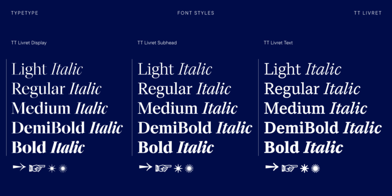
32 font styles
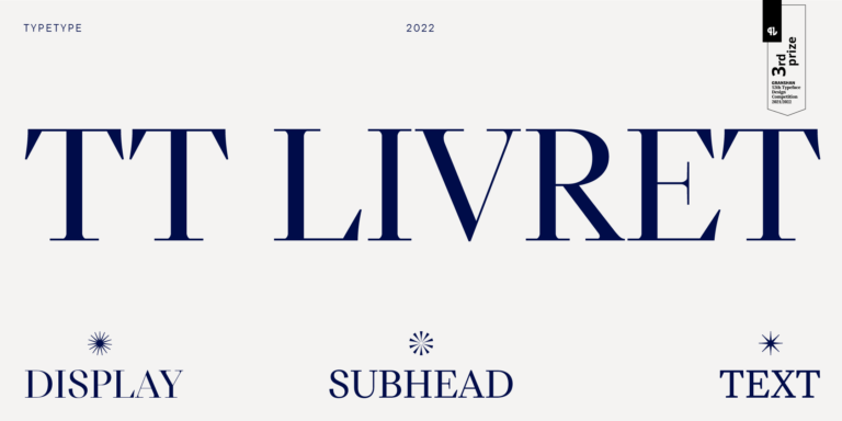
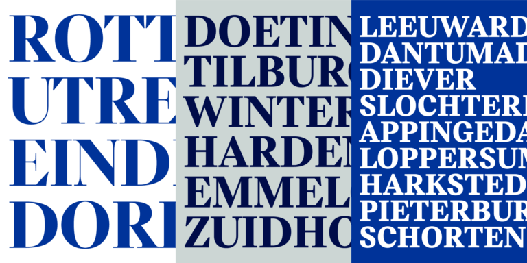
TT Livret is an elegant, modern and functional serif

If you are tired of overused typefaces and are looking for fonts similar to Gloucester, check out our best free-to-try Gloucester alternatives, which have similar characteristics as well as new, unique design features. Some of the fonts belong to the same type category, and others are suitable for the same tasks or have similar traits but stand out for their distinct details or proportions.
At TypeType, you’ll find cutting-edge fonts like Gloucester and even better: here are some stunning and not-so-ubiquitous Gloucester alternatives. Use this list of highest-quality Gloucester-like fonts as you prefer. Our list provides a broader range of options for choosing the best font match for your project and refreshing your designs. All fonts featured in this collection are available in multiple formats and at affordable prices, so you can find one to fit your every need!
Find a great Gloucester replacement font and try to recreate a similar mood and capture the feeling you aim for by using it in your designs. Each font presented on this page is a twin of the Gloucester font, practically identical to it.
TT Livret is an elegant, modern and functional serif
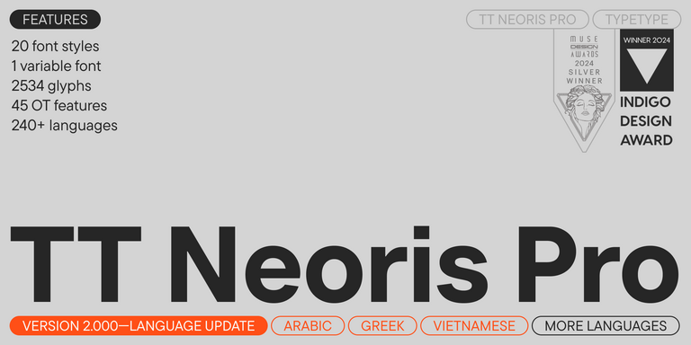
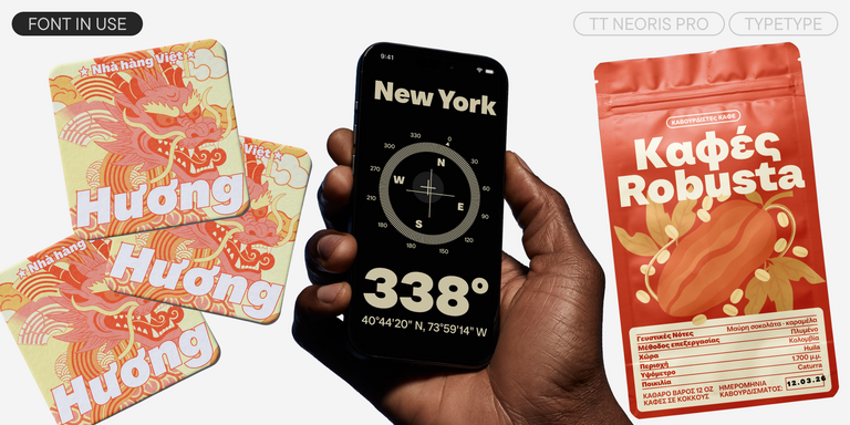
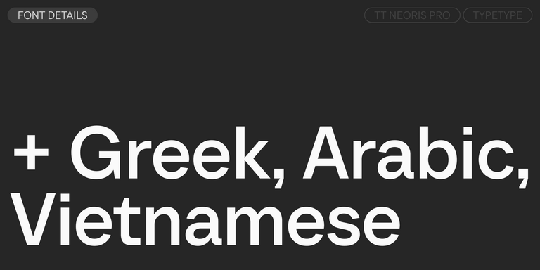
TT Neoris is an elegant Neo-Grotesque with unlimited potential and a font that encompasses all modern requirements and user desires.


TT Rationalist is functional and neutral slab serif typeface.


TT Bluescreens is a upgraded geometric sans serif with narrow proportions
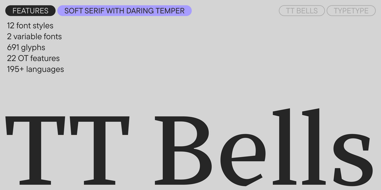

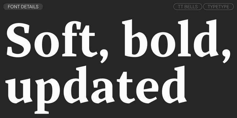
TT Bells combines the elegant softness of Antiqua with a complex and daring temper reflected in straight stroke terminals and arrowheaded serifs. The typeface is based on the broad nib, which creates these hallmark terminals and serifs.
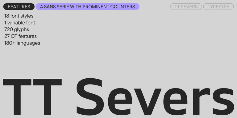

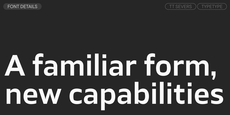
TT Severs is a geometric sans serif with emphasized elements of internal brackets. The main visual feature of TT Severs is the unusual form of internal ovals.


TT Regins is a Scottish modern serif. Striking contrast and sharp triangular serifs give this font a stern and commanding character, while refined forms, enlarged lowercase letters, and slightly condensed, static proportions add grace to its design.
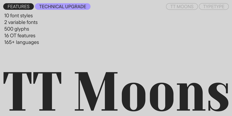
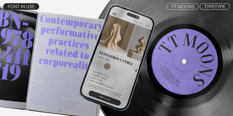
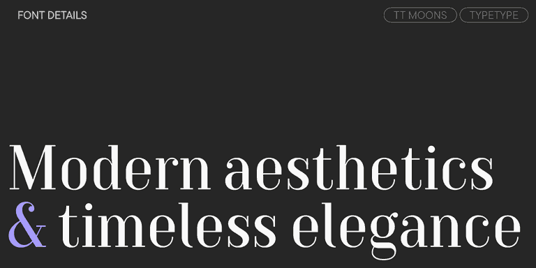
TT Moons is a slim and contrast serif. This font family works especially smart in classic design themes. TT Moons is a typeface of the glyptal modern typeface.
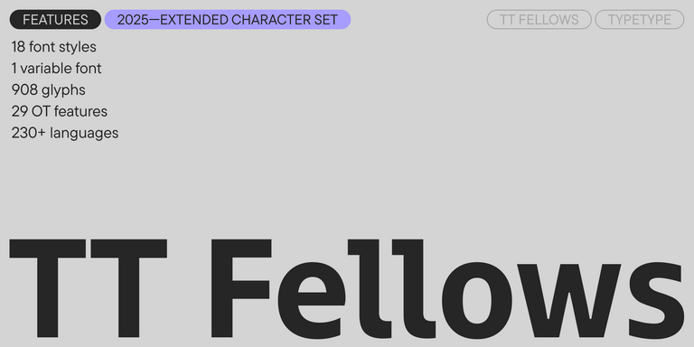
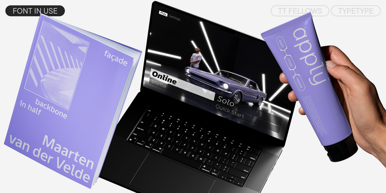
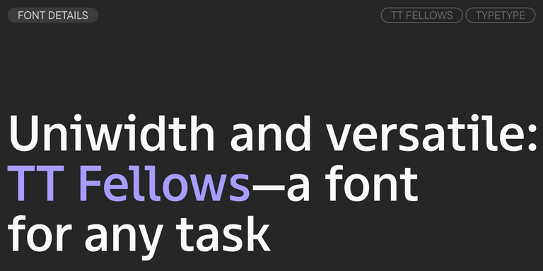
TT Fellows is a humanist sans serif with a mechanical touch.
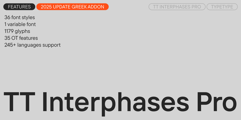
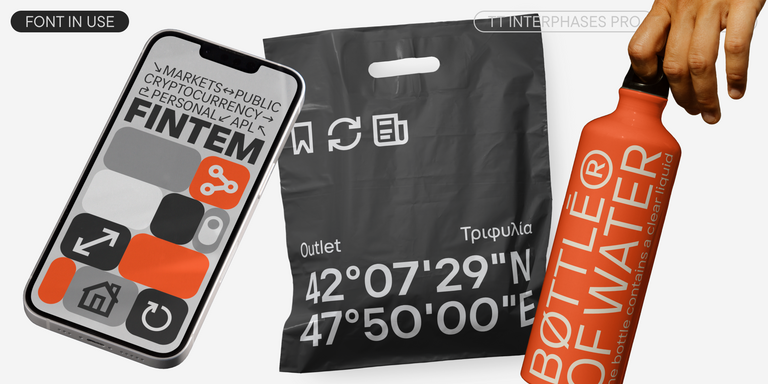
TT Interphases Pro is a neo-grotesque sans serif with equal-width proportions
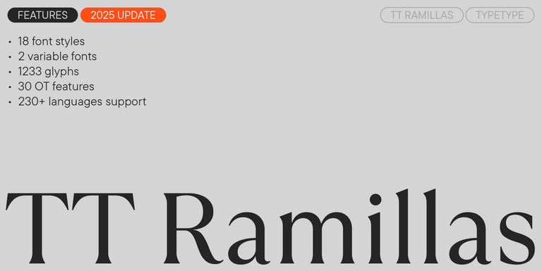
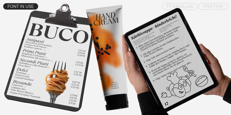
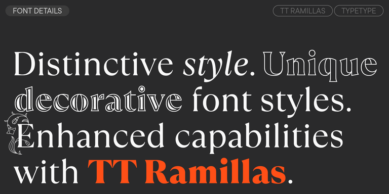
TT Ramillas is a contemporary serif with editorial versatility. It features decorative styles and ornamental initials with floral motifs.
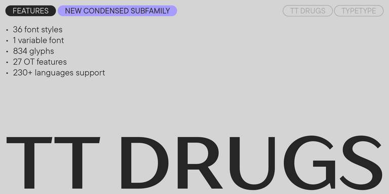
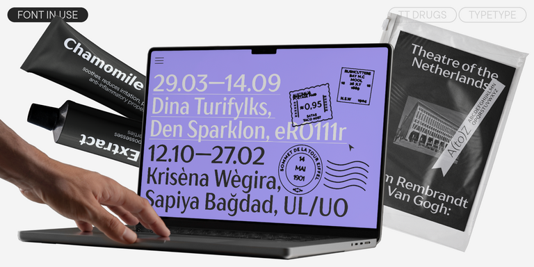
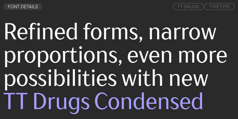
TT Drugs is a typeface that doesn`t feature serifs but stands out for its high contrast.

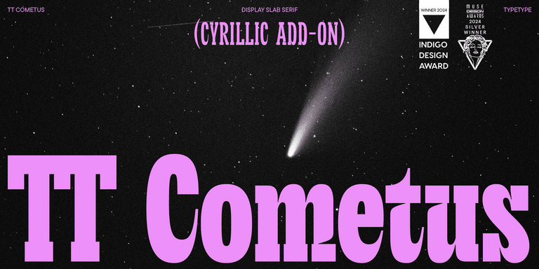
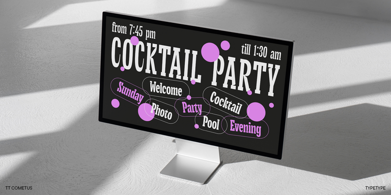
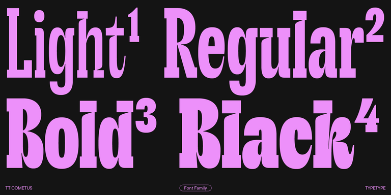
TT Cometus is an expressive typeface that captivates from the first time.
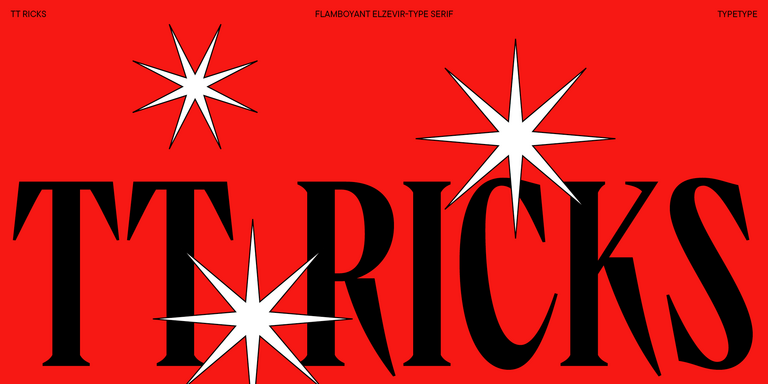
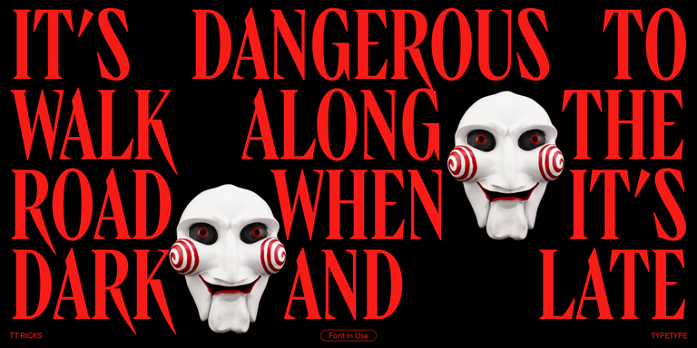
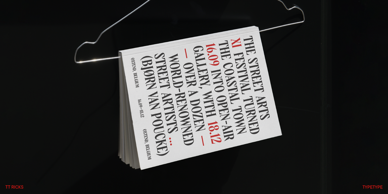
TT Ricks is a flamboyant elzevir-type serif, for which the words “cute” or “calm” are not a fitting definition.

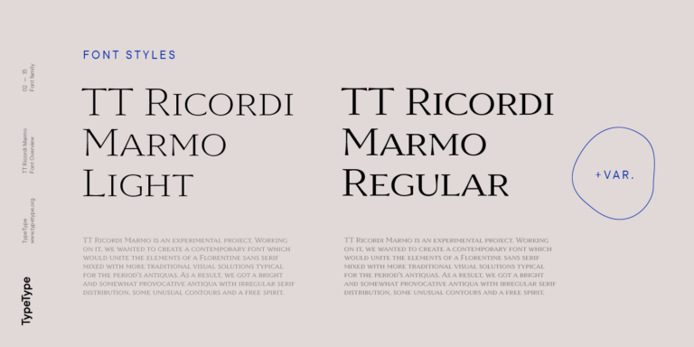
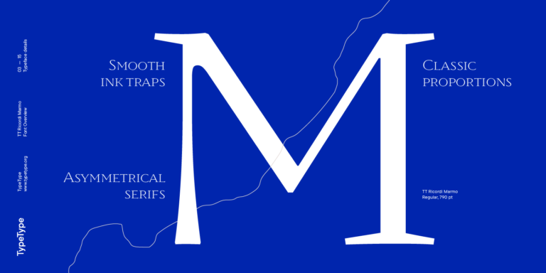
TT Ricordi Marmo is an original experimental project inspired by inscriptions at Basilica di Santa Croce in Florence.
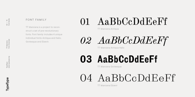
TT Marxiana Elzevir is a title or header font and is a compilation of monastic Elzevir that were actively used in the Niva magazine for all its prints.
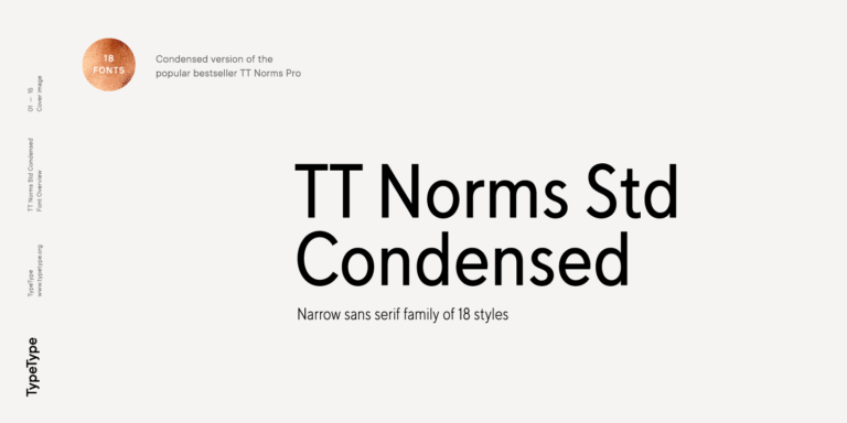
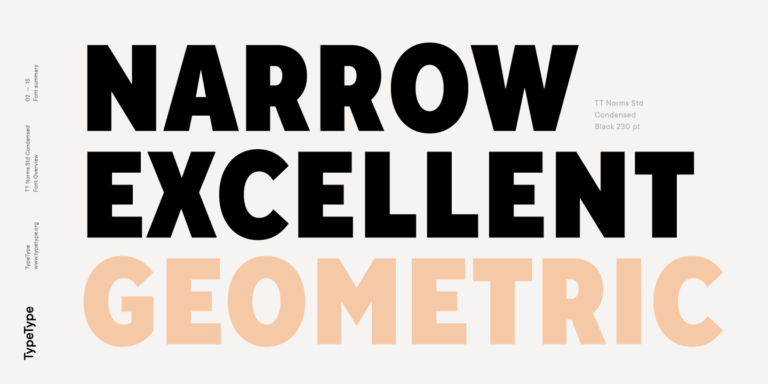
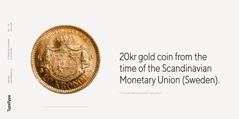
TT Norms Condensed continues to develop the ideas of neutrality and versatility stemming from our bestselling TT Norms.
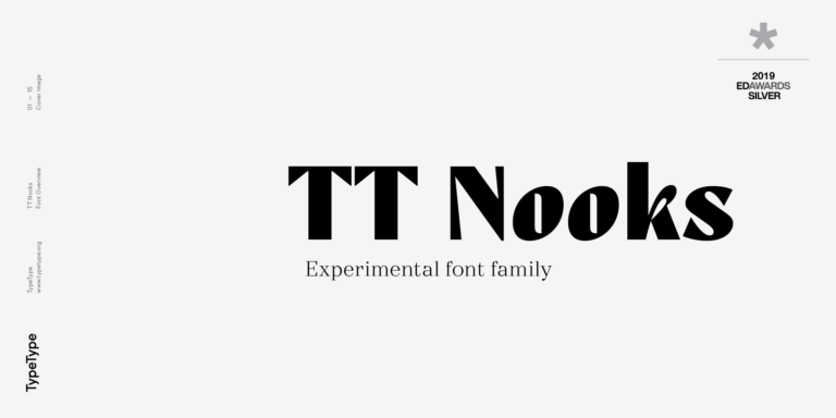
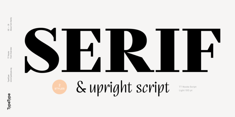
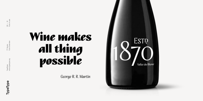
TT Nooks is an experimental project comprised of a high-contrast egocentric serif and an upright humanist italic.
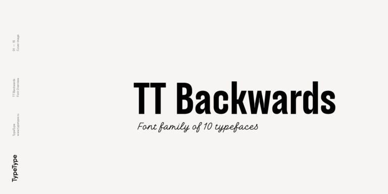
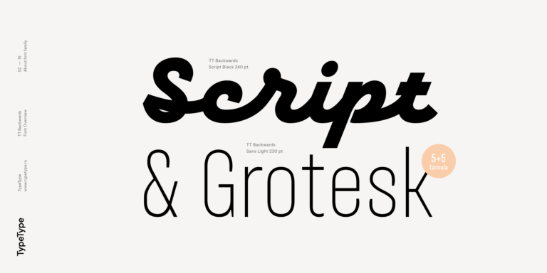
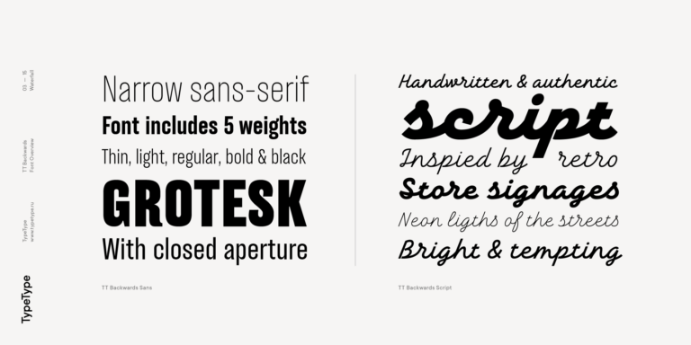
TT Backwards Sans is a narrow grotesque, which takes us back to the book design of late 70s and early 80s with its ductile characters.
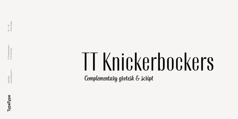
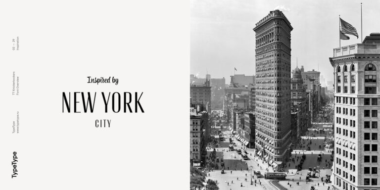
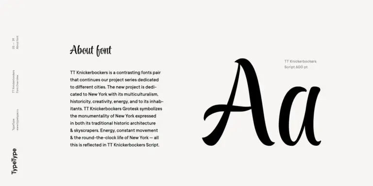
TT Knickerbockers Grotesk is a narrow contrast sans serif with characteristic elements sending us back to the 19th century in New York.
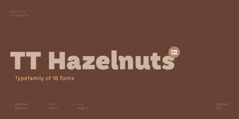
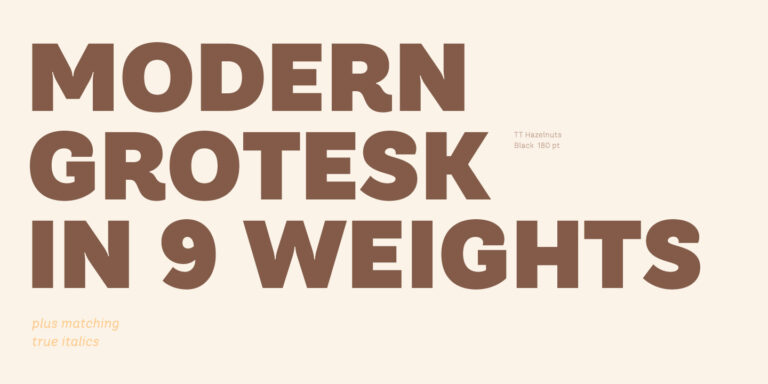
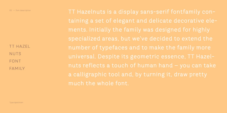
TT Hazelnuts is a display sans serif font family containing a set of elegant and delicate decorative elements.

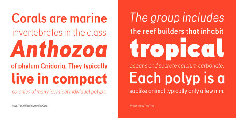
TT Corals is a modern humanistic sans serif which has many typical traits of the beginning of the 20th century. For an increased functionality of the font family, we`ve created 6 styles of various weights.
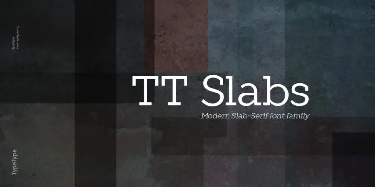
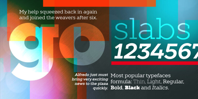
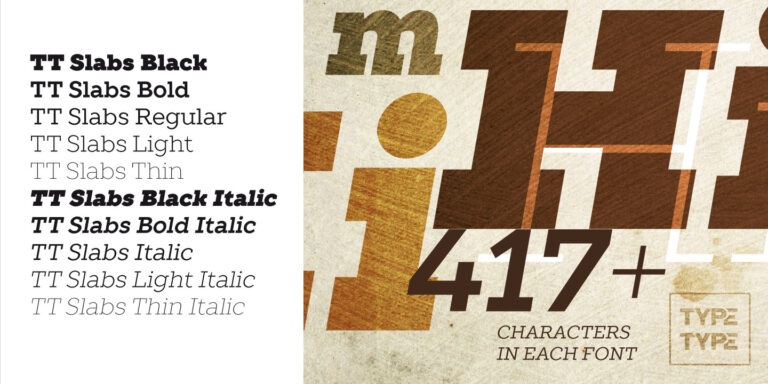
TT Slabs. Slab serif, also called «square serif». They originate shortly after the Industrial Revolution (1850), when the advertising industry began to grow.
MUSE Design Awards, part of the prestigious International Awards Associate (IAA) program, honors groundbreaking design excellence worldwide—spanning architectural marvels, transformative interiors, cutting-edge digital experiences, and pioneering industrial solutions.

Indigo Design Award is a globally recognized award dedicated to groundbreaking digital design. Spotlighting excellence in UX/UI, mobile apps, web interfaces, and digital solutions, it provides award-winners validation from top-tier experts while setting new benchmarks for emerging designers.