top_banner_ttnormspro0426
SchriftstudioSchriftartenGloucester

Ähnliche Schriftarten wie Gloucester

Alternativen zur Schriftart: Gloucester

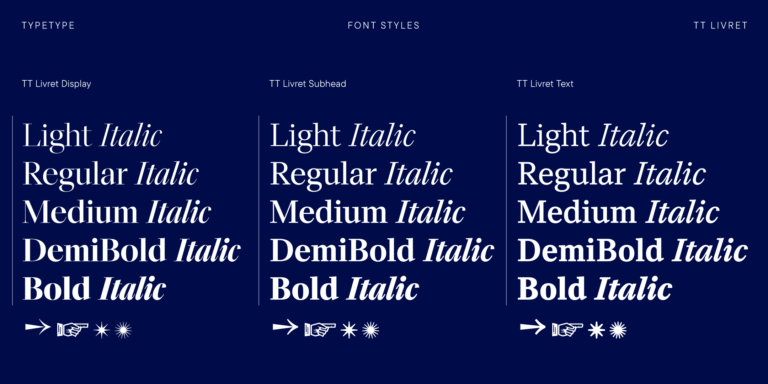
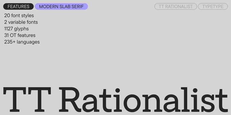
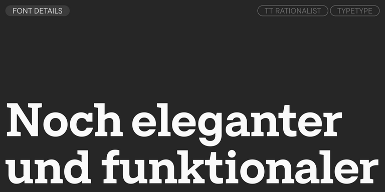
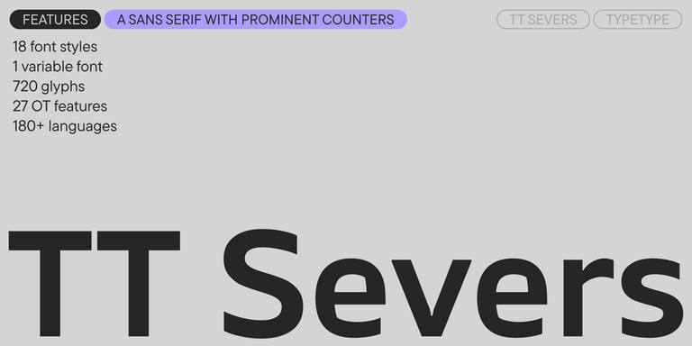
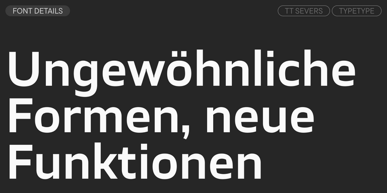
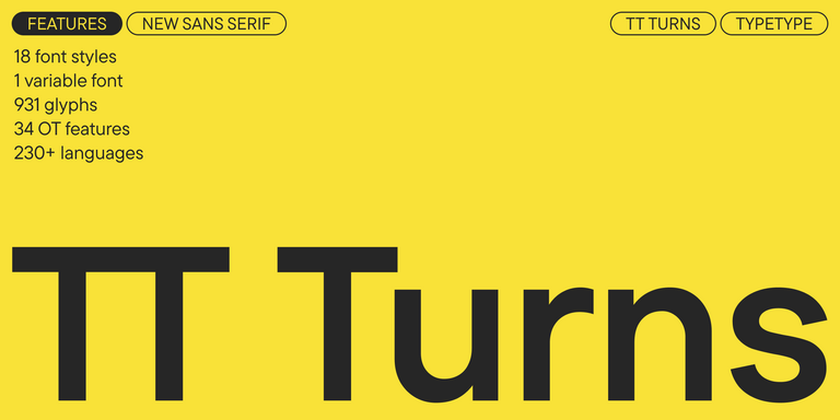
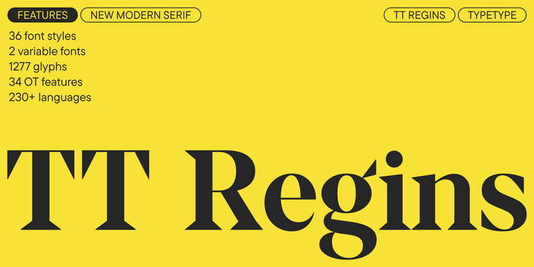
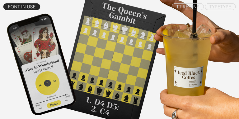
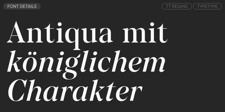
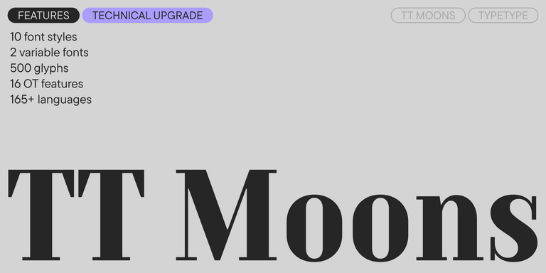
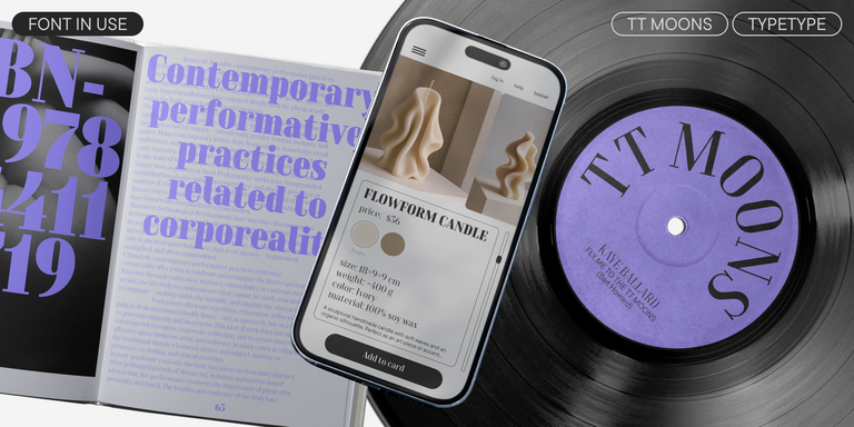
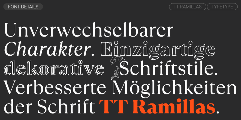
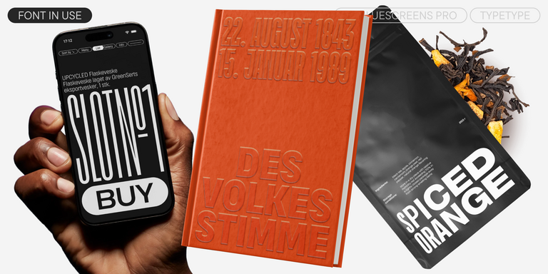
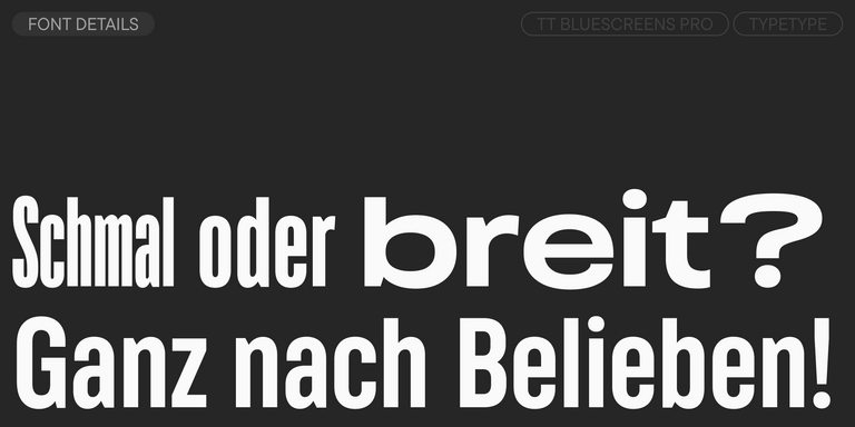
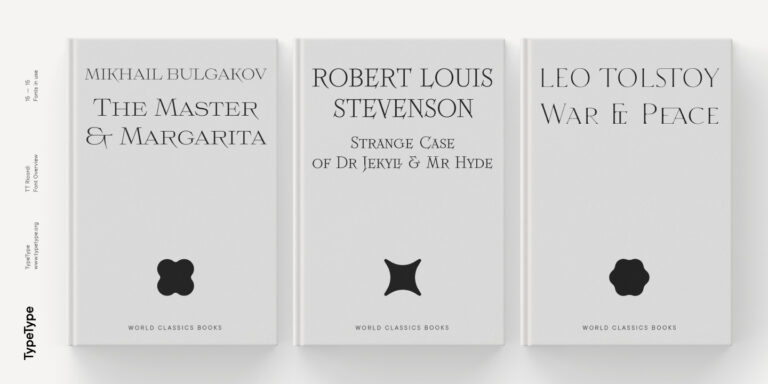
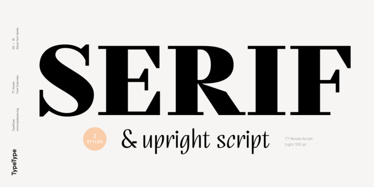
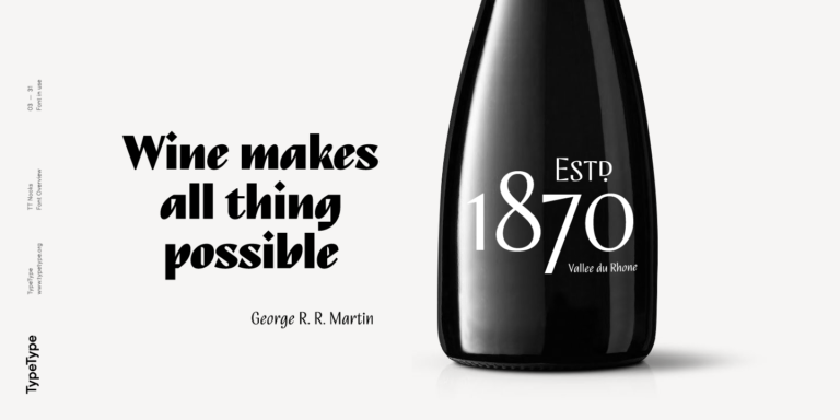
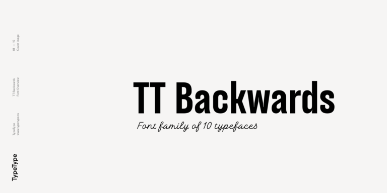
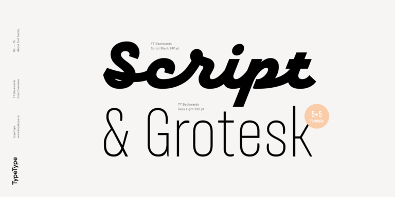
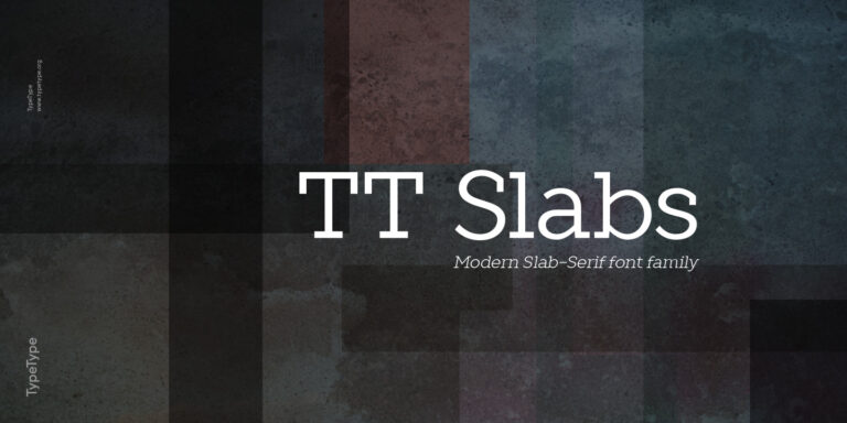
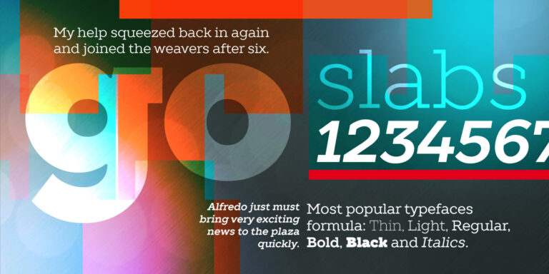
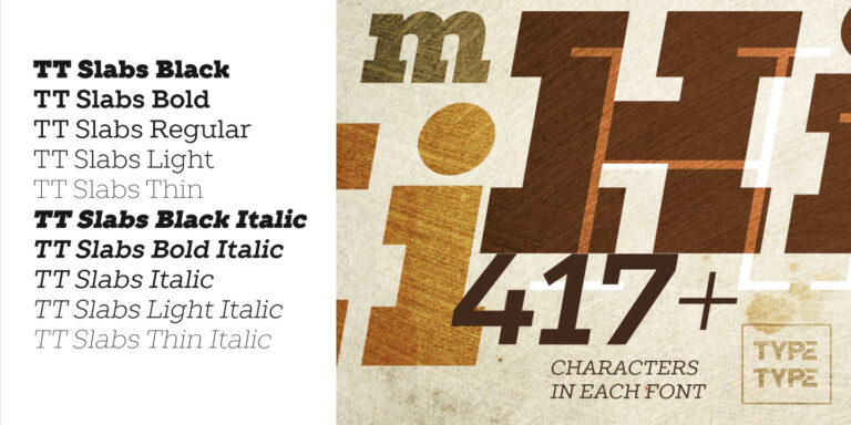
Wenn Sie genug haben von “abgedroschenen” Schriften und auf der Suche nach einer Kopfzeile ähnlich wie Gloucester sind, sehen Sie sich unsere besten Alternativen zu Gloucester an. Das sind Schriftarten, die ähnliche Eigenschaften haben, aber gleichzeitig neue und einzigartige Designmerkmale aufweisen. Sie gehören z. B. zur gleichen Schriftkategorie, eignen sich für die gleichen Zwecke und haben ähnliche Merkmale, unterscheiden sich aber in Details oder Proportionen.

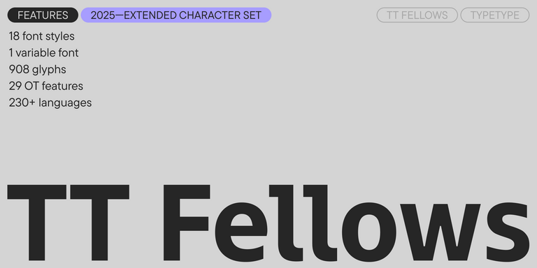
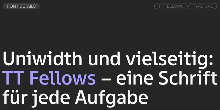
Bei TypeType finden Sie topaktuelle Schriftarten wie Gloucester und noch besser: hier sind einige großartige und nicht so gängige Alternativen zu Gloucester. Nutzen Sie diese Liste hochwertiger, an Gloucester erinnernder Schriften nach Ihrem Geschmack. Auf diese Weise können Sie eine noch passendere Schriftart für Ihr Projekt finden, Ihre Auswahl erweitern oder Ihr Design auffrischen. Alle Schriften in dieser Sammlung sind in verschiedenen Formaten und zu erschwinglichen Preisen erhältlich, so dass Sie für jeden Bedarf eine passende Schrift finden werden!

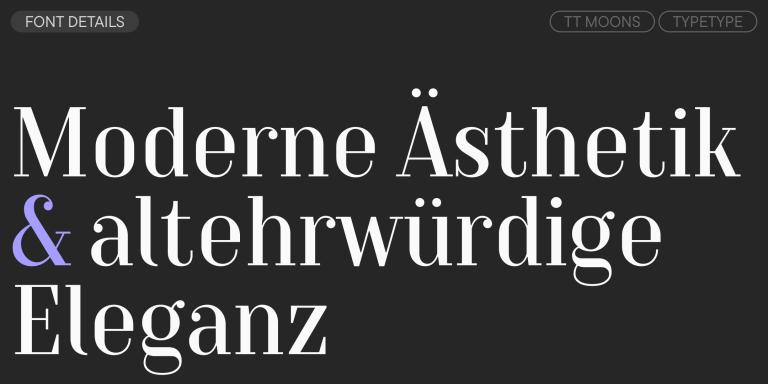
Finden Sie einen großartigen Ersatz für Gloucester und versuchen Sie, eine ähnliche Stimmung zu imitieren und das gewünschte Gefühl zu vermitteln, indem Sie sie in Ihren Designs verwenden. Jede auf dieser Seite vorgestellte Schriftart ist ein Zwilling der Schriftart Gloucester, und zwar ihr vollständiges Analog.

  • Victor jagt zwölf Boxkämpfer quer über den großen Sylter Deich.
  • Fix, Schwyz!” quäkt Jürgen blöd vom Paß.
  • The quick brown fox jumps over a lazy dog.
  • Typographie ist zweidimensionale Architektur und bedingt extra Qualitaet in jeder vollkommenen Ausfuehrung.
  • Aa Bb Cc Dd Ee Ff Gg Hh Ii Jj Kk Ll Mm Nn Oo Pp Qq Rr Ss Tt Uu Vv Ww Xx Yy Zz Ää Öö Üü ß
Zeilenabstand
1.1
Buchstabenabstand
0px
24 Stile

We continue to expand the line of the studio's main bestseller TT Norms® Pro!

Bestseller
TT Livret Text Regular
32 Stile

TT Livret is an elegant, modern and functional serif

TT Rationalist Regular
22 Stile

TT Rationalist is functional and neutral slab serif typeface.

TT Severs Regular
19 Stile

TT Severs is a geometric sans serif with emphasized elements of internal brackets. The main visual feature of TT Severs is the unusual form of internal ovals.

Neuheit
TT Turns Regular
19 Stile

TT Turns is a striking geometric sans serif with expressive elements. This versatile font works exceptionally well for running text, while at large point sizes, it takes on a distinct display character.

Neuheit
TT Regins Display Light
38 Stile

TT Regins is a Scottish modern serif. Striking contrast and sharp triangular serifs give this font a stern and commanding character, while refined forms, enlarged lowercase letters, and slightly condensed, static proportions add grace to its design.

TT Moons Regular
12 Stile

TT Moons is a slim and contrast serif. This font family works especially smart in classic design themes. TT Moons is a typeface of the glyptal modern typeface.

Bestseller
TT Neoris Regular
21 Stil

TT Neoris is an elegant Neo-Grotesque with unlimited potential and a font that encompasses all modern requirements and user desires.

TT Fellows Regular
19 Stile

TT Fellows is a humanist sans serif with a mechanical touch.

Bestseller
43 Stile

TT Interphases Pro is a neo-grotesque sans serif with equal-width proportions

Bestseller
TT Ramillas Regular
28 Stile

TT Ramillas is a fully reconsidered high contrast transitional serif, which is perfectly adapted to modern realities and requirements.

TT Cometus Regular
5 Stile

TT Cometus is an expressive typeface that captivates from the first time.

TT Globs Regular
4 Stile

TT Globs is the first font from the TypeType Starter Kit line.

91 Stil

TT Bluescreens is a upgraded geometric sans serif with narrow proportions

TT Ricordi Todi
3 Stile

The TT Ricordi font family is a collection of three display heading serifs.

TT Marxiana Antiqua
4 Stile

TT Marxiana is a pre-revolutionary font reconstruction project. These fonts were used in the layout of the «Niva» (nee-vah, «Cultivated field») magazine published by the A. F. Marx publishing house in St. Petersburg in 1887.

18 Stile

TT Norms Condensed continues to develop the ideas of neutrality and versatility stemming from our bestselling TT Norms.

TT Nooks Regular
8 Stile

TT Nooks is an experimental project comprised of a high-contrast egocentric serif and an upright humanist italic.

TT Backwards Sans Regular
10 Stile

TT Backwards Sans is a narrow grotesque, which takes us back to the book design of late 70s and early 80s with its ductile characters.

TT Hazelnuts Regular
18 Stile

TT Hazelnuts is a display sans serif font family containing a set of elegant and delicate decorative elements.

TT Bells Regular
14 Stile

TT Bells combines the elegant softness of Antiqua with a complex and daring temper reflected in straight stroke terminals and arrowheaded serifs. The typeface is based on the broad nib, which creates these hallmark terminals and serifs.

TT Corals Regular
12 Stile

TT Corals is a modern humanistic sans serif which has many typical traits of the beginning of the 20th century. For an increased functionality of the font family, we’ve created 6 styles of various weights.

TT Slabs Regular
20 Stile

TT Slabs. Slab serif, also called «square serif». They originate shortly after the Industrial Revolution (1850), when the advertising industry began to grow.