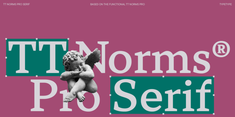
We continue to expand the line of the studio’s main bestseller TT Norms® Pro!
Fonts similar to Decalcomania JNL
Ordinary text faces often lose their voice when a headline, label or monogram needs a vintage, ornamental accent. That is the moment many designers start looking for Fonts similar to Decalcomania JNL. This page gathers TypeType alternatives that echo a comparable mood, share a category or fit the same display tasks, so you can compare options and test them directly in your own layout.
- All fonts 78
- Sans Serif 46
- Serif 21
- Slab Serif 6
- Display 44
- Script 9
- Variable 49
- Font sale 12
The Challenge Fonts similar to Decalcomania JNL Solve
A distinctive display typeface rarely has an exact twin. Its letterforms carry a specific atmosphere, and a design system built around it may later need a substitute for licensing, consistency or simple freshness. Searching for Fonts similar to Decalcomania JNL is therefore a balancing act between three goals: visual likeness, overall mood and practical requirements such as the range of weights you need or the media you work in. A close copy that fails in small sizes helps no one, while a less literal choice can keep the spirit of a project intact.
What Makes These Decalcomania JNL Alternatives Distinct
The typefaces gathered here are not clones. Some belong to the same broad type category, others suit the same tasks, and some share related traits while standing apart through their own details or proportions. That variety is intentional: it gives you room to refresh a design instead of reproducing it. When reviewing Fonts similar to Decalcomania JNL on this page, look at them as a spectrum rather than a ranking. One option may keep the decorative tone of a headline, another may handle longer lines more comfortably, and a third may give a brand a voice that feels familiar yet clearly its own.
Where Fonts similar to Decalcomania JNL Are Used
Requests for a replacement usually come from display work, where lettering is seen at large sizes and has to create an immediate impression. Headlines for editorial spreads, logotypes and monograms, product packaging, posters, event invitations and storefront signage are the most common scenarios. In each case the typeface acts as an image as much as a carrier of words, so small differences in contrast, spacing or ornament become visible at once. Designers also turn to Fonts similar to Decalcomania JNL when an existing identity needs a companion face for new materials, or when a retro-inspired campaign calls for something less familiar than the usual choices. Because context changes everything, judge each candidate inside the real layout rather than in an isolated specimen. Set the actual headline, place it next to photography, and compare how it behaves at the largest and smallest sizes you plan to use.
Explore TypeType's Fonts similar to Decalcomania JNL Collection
This collection brings together fourteen TypeType families: TT Rationalist, TT Bells, TT Jenevers, TT Regins, TT Ricordi Allegria, TT Ramillas, TT Tricks, TT Globs, TT Norms® Pro Serif, TT Livret, TT Ricordi Marmo, TT Ricordi, TT Marxiana and TT Tsars. They are listed as alternatives chosen for mood, category or purpose, not as a ranked list of closest matches, so the most reliable way to narrow them down is hands-on comparison. Type your own headline or brand name into the previews and view the candidates side by side. Pay attention to the characters that matter most to you. Shortlist two or three options, then place them in a draft of the actual project to see which keeps the atmosphere you want. Each family page offers further detail and ways to try it before you commit to a license.
- The quick brown fox jumps over a lazy dog.
- Pack my box with five dozen liquor jugs.
- Sphinx of black quartz, judge my vow
- 0123456789 !?.,:;—–()[]{}<> “quotes” ‘apostrophe’ @#%&*_+=/\| № $ € £ ₽ +−×÷=≠≤≥ … % © ® ™
- Aa Bb Cc Dd Ee Ff Gg Hh Ii Jj Kk Ll Mm Nn Oo Pp Qq Rr Ss Tt Uu Vv Ww Xx Yy Zz
TT Livret is an elegant, modern and functional serif
TT Rationalist is functional and neutral slab serif typeface.
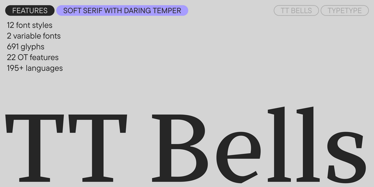
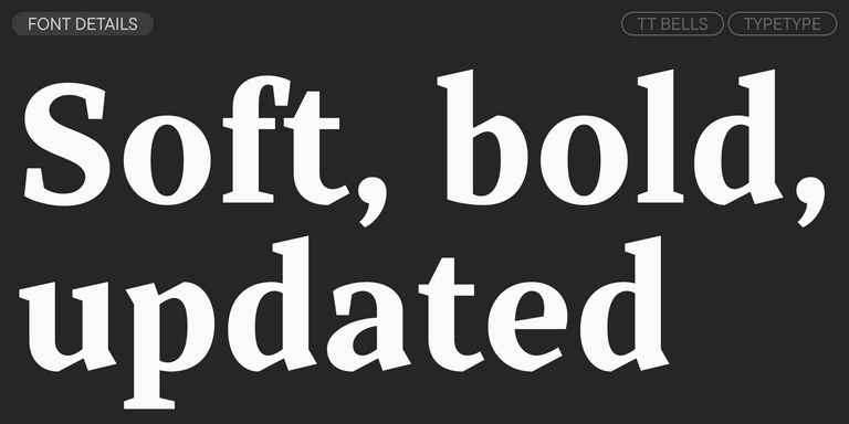
TT Bells combines the elegant softness of Antiqua with a complex and daring temper reflected in straight stroke terminals and arrowheaded serifs. The typeface is based on the broad nib, which creates these hallmark terminals and serifs.
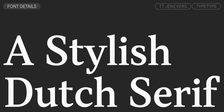
TT Jenevers is a modern serif with a Dutch flavor. The font family features the characteristic details peculiar to Dutch serifs—these are the asymmetrical shape of serifs and an irregular slant of ovals.
TT Regins is a Scottish modern serif. Striking contrast and sharp triangular serifs give this font a stern and commanding character, while refined forms, enlarged lowercase letters, and slightly condensed, static proportions add grace to its design.
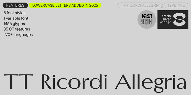
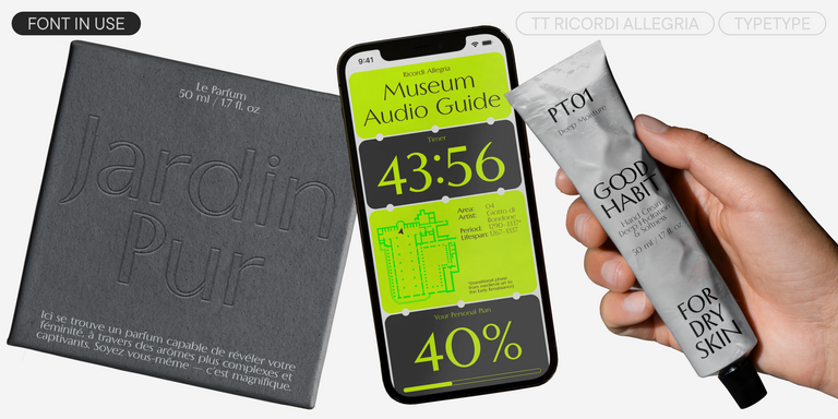
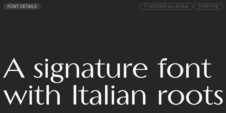
TT Ricordi Allegria is a sleek and intelligent contemporary Florentine grotesque.
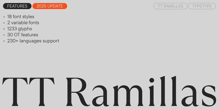
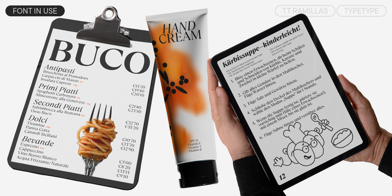
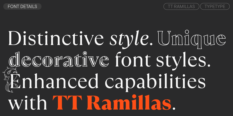
TT Ramillas is a contemporary serif with editorial versatility. It features decorative styles and ornamental initials with floral motifs.
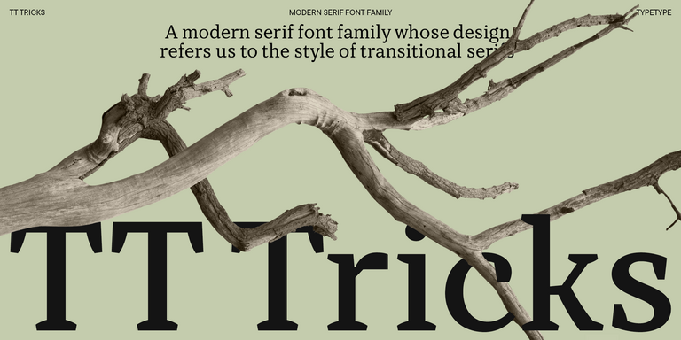
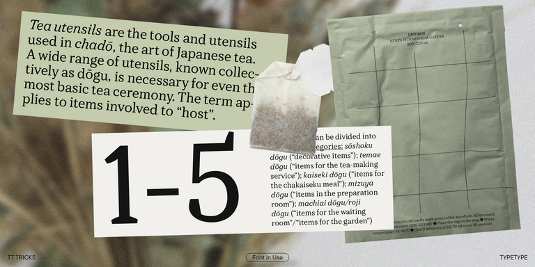
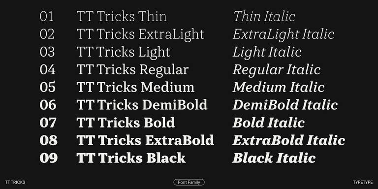
TT Tricks is a modern text serif with a design reflecting the style of Transitional serifs. This font has a calm, elegant, and moderately stern character.
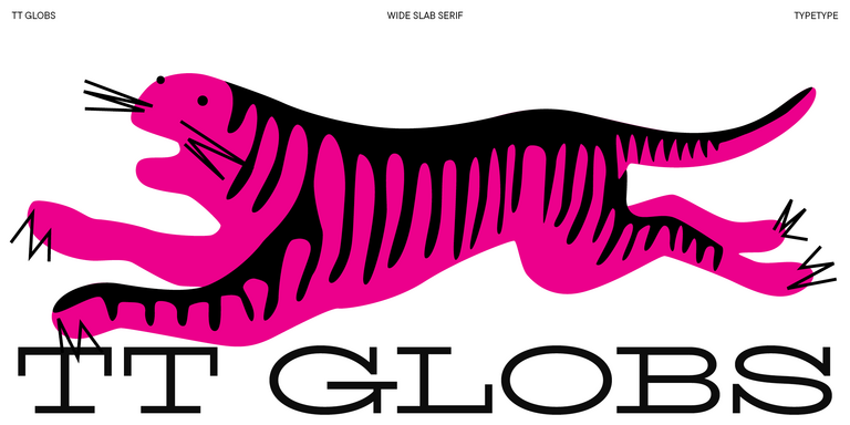
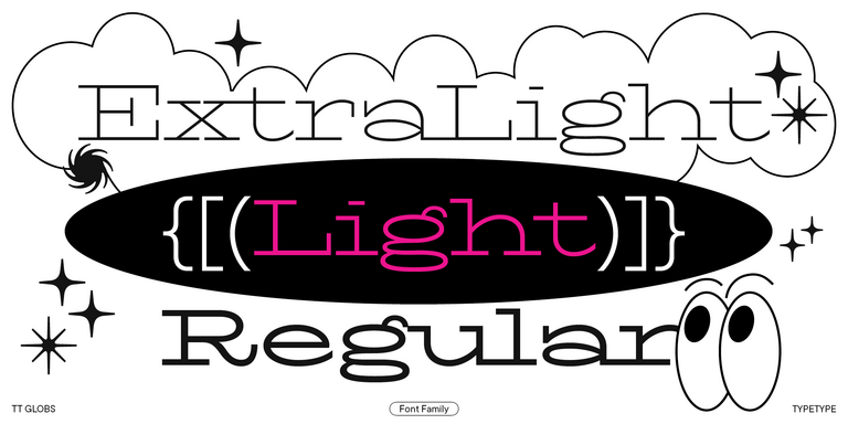
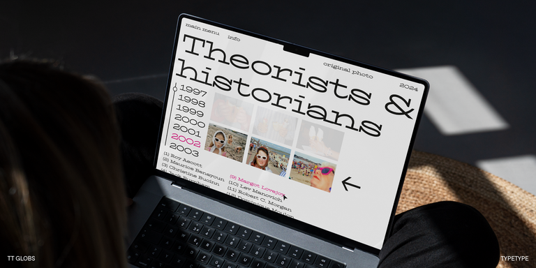
TT Globs is the first font from the TypeType Starter Kit line.
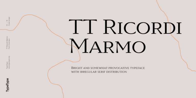
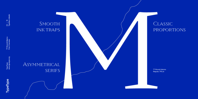
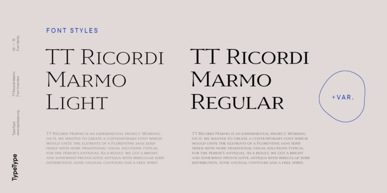
TT Ricordi Marmo is an original experimental project inspired by inscriptions at Basilica di Santa Croce in Florence.
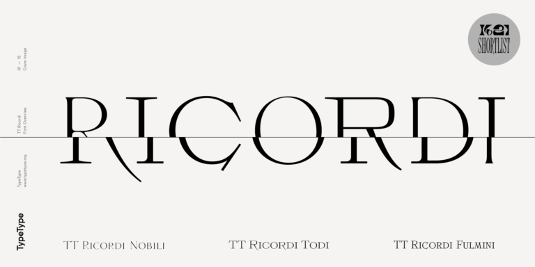
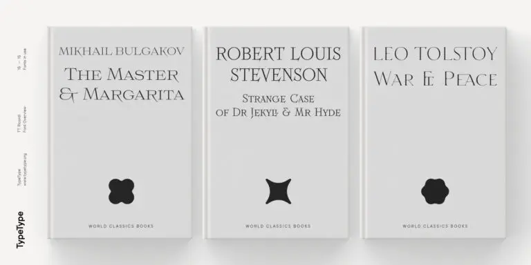
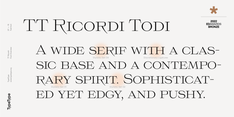
The TT Ricordi font family is a collection of three display heading serifs.
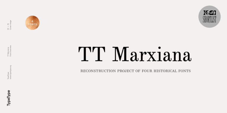
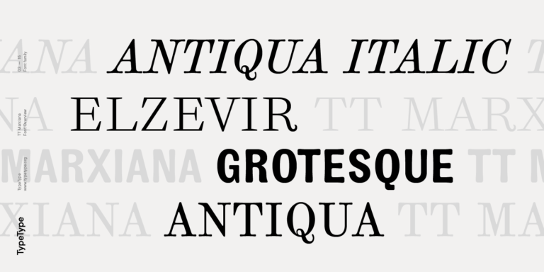
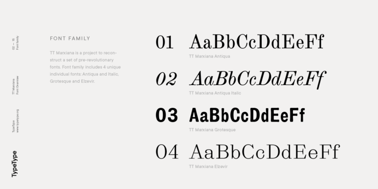
TT Marxiana Elzevir is a title or header font and is a compilation of monastic Elzevir that were actively used in the Niva magazine for all its prints.
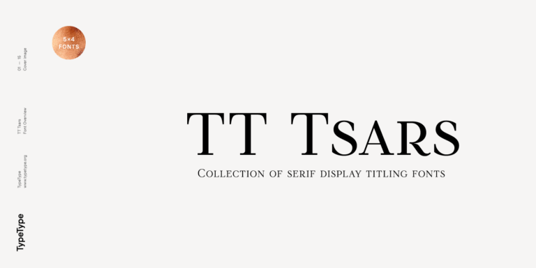
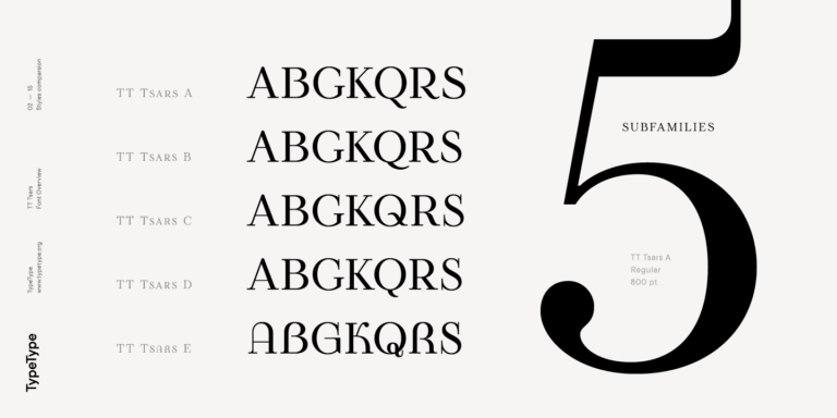
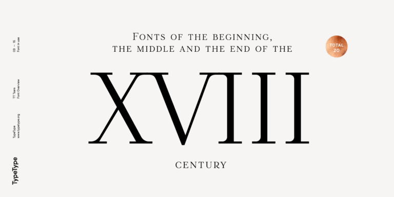
The TT Tsars font family is a collection of serif display fonts that are stylized to resemble the fonts of the beginning, the middle, and the end of the XVIII century.
What Are Fonts similar to Decalcomania JNL?
They are typefaces chosen as alternatives to the original design published by Jeff Levine. Rather than duplicating it, these options offer a comparable mood, belong to a related category or serve the same purpose, giving you a substitute with its own details and proportions, suited to display tasks.
Which Industries Use Decalcomania JNL Alternatives Most Often?
Decorative and vintage-inspired display typefaces commonly appear in retail, hospitality, food and beverage packaging, event design and publishing. Cafés, boutiques and craft producers often rely on expressive lettering to signal character, while event organizers use it for posters and invitations. The right choice always depends on your audience and medium.
Can Decalcomania JNL Alternatives Be Used for Branding?
Yes, provided the chosen typeface works across every touchpoint. Check legibility at logo and favicon sizes, make sure the letterforms feel distinctive enough to be recognized, and confirm that the family offers what your system needs. Test the shortlist on real brand assets before committing, and review the license for your intended use.
What Should Be Considered When Pairing a Decalcomania JNL Alternative?
Let the decorative face lead and give it a calm, readable partner for body copy. When combining Fonts similar to Decalcomania JNL with a text face, aim for clear contrast in role rather than competing ornament, keep the display choice for headlines and short phrases, and check that spacing and proportions feel balanced together.
Can You Buy TypeType Fonts for Commercial Projects?
Yes. The alternatives on this page can be tried and then licensed directly through TypeType for commercial work. Terms depend on how you plan to use the typeface, whether in print, on the web, in apps or in a logo, so check the license page for details before publishing any project.