In our font studio’s 10-year journey, we’ve designed 1.500.000+ glyphs. Try out TypeType fonts online!

We Have a Digital Font Catalog! Looking through our typefaces has become even more convenient. PDF Catalog of TypeType Fonts

Use font subscription! The full font library of 75+ fonts will always be at hand. See more

Type foundryBlogConverting TT Hoves Medium into an adapted TT Hoves GDTI

Converting TT Hoves Medium into an adapted TT Hoves GDTI

TT Hoves GDTI

Monospace, a branding agency from Germany, creates corporate identities and designs for projects. The company believes that through design it is possible to create a brand though which customer interactions will be enjoyable and long-term.

Monospace wanted to make changes to the TT Hoves Medium font.

Customization concerned several areas:

• it was required to make changes to the graphics of some characters and to make a display version of TT Hoves Medium;

• draw and embed two company logos into the font file;

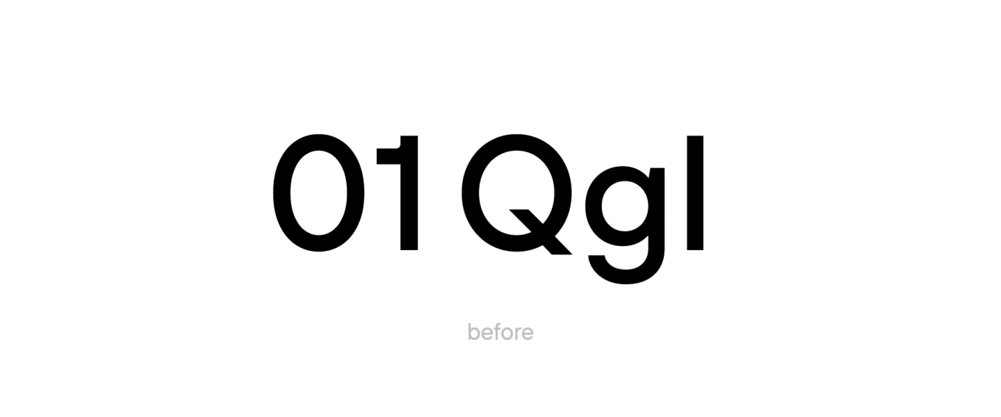
• set the alternative forms of characters 0, 1, Q, g, l as default;

• reduce the font file character composition: remove the Cyrillic alphabet, small caps, extended numbers and symbols;

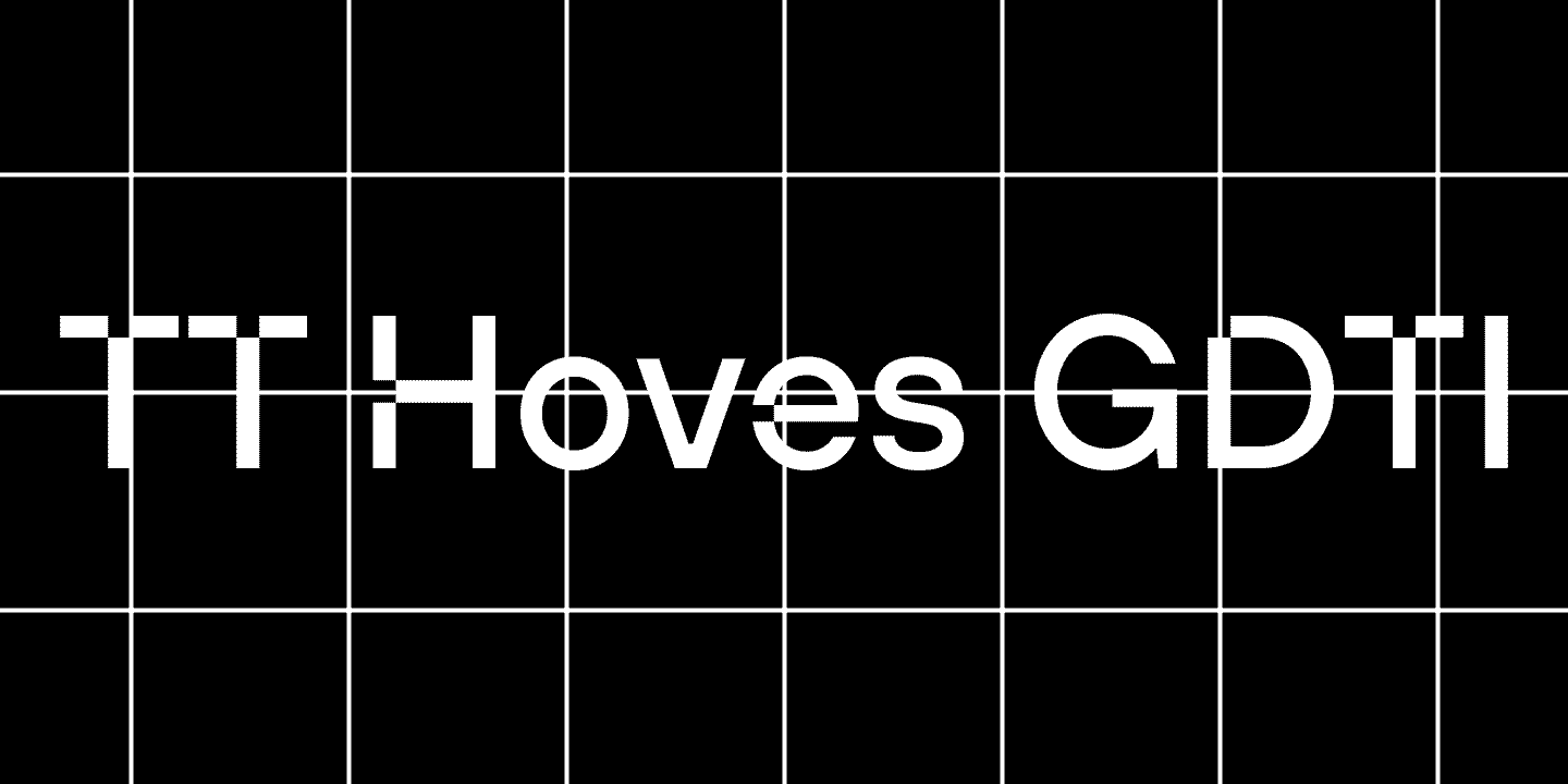
• change the name of the font to TT Hoves GDTI.

The team of TypeType designers and technical specialists has started customization.The designer changed the graphics of 39 original glyphs in one of the faces. Additionally, the style of glyphs with diacritics has been changed.
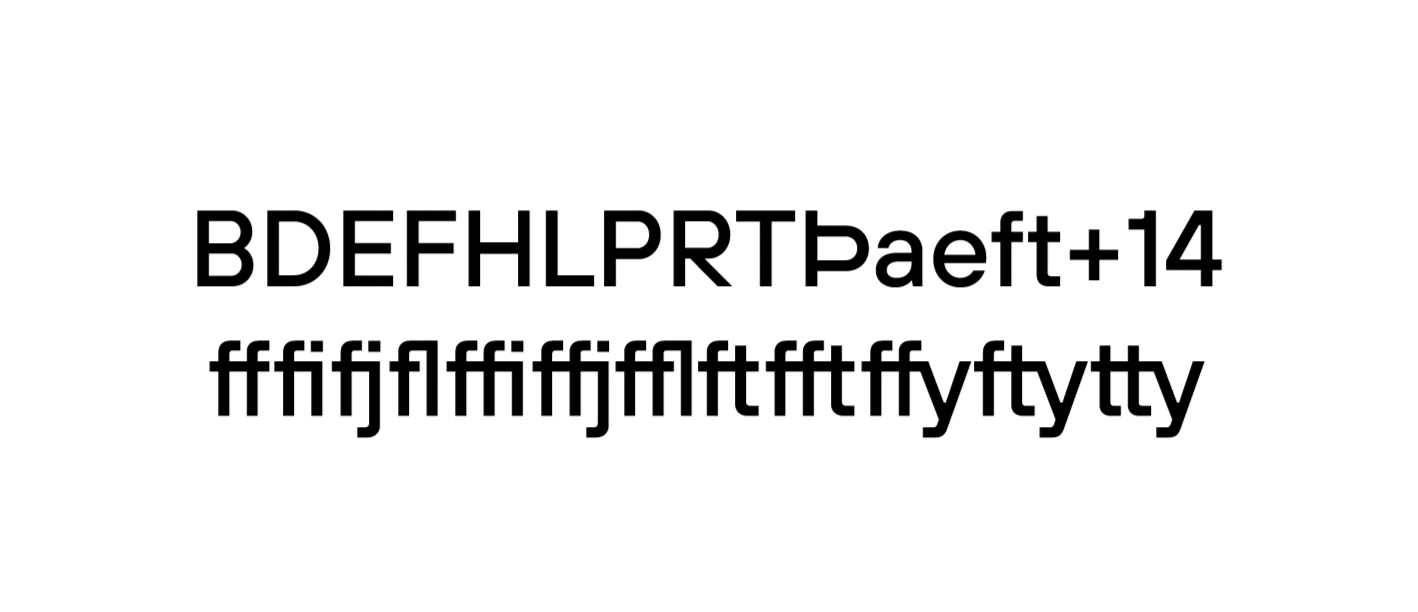
Converting TT Hoves Medium into an adapted TT Hoves GDTI

Glyph customization

TypeType technical specialists have swapped the alternative signs and the main ones.

Converting TT Hoves Medium into an adapted TT Hoves GDTI

Swapping default and alternative characters

Two company logos were added to the font file.

Converting TT Hoves Medium into an adapted TT Hoves GDTI

Adding logos

The font file itself has become lighter: the font character composition has been reduced from 1384 characters to 656 characters.

Before sending the font to the client, the team automatically hinted the font, and the name was changed to TT Hoves GDTI.

In the process of work, another addition appeared in changing the font: the company wanted to additionally customize the text version of TT Hoves. As a result, the alternative shapes of signs 0, 1, Q, g, l were set as default in 8 different styles of TT Hoves, that is, in 4 upright faces and 4 italics. This version of the font was also renamed TT Hoves GDTI Text.

As a result, TypeType provided Monospace Albert & Buettner GbR with customized versions of TT Hoves display and text fonts with smaller character composition, new graphics for some glyphs, and new names.

Latest publications

15+ Best Magazine Fonts for Perfect Editorial Designs

15+ Best Magazine Fonts for Perfect Editorial Designs

Magazines are a perfect backdrop for typography to express all its dimensions. Fonts, in this case, not only communicate information but also directly influence the design. They deliver the magazine’s message, reflecting its values and ideas. In this article, we discuss how to choose the best magazine font and compile a list of 15 relevant options for editorial designs on various themes.

See more
UniversiTTy: Lesson 9. Uppercase Characters. Detailed Contour Refinement

UniversiTTy: Lesson 9. Uppercase Characters. Detailed Contour Refinement

Welcome to the ninth lesson of our «UniversiTTy»! In this series, we guide you through the process of font design step by step. The font is a cohesive visual system. This can be seen on all levels: global (font type, weight, proportions, contrast, general forms) and at lower scales that encompass all graphic choices in individual characters. Let’s find out together how visual details influence the overall perception of fonts.

See more
15 Best Outline Fonts Approved by Designers in 2024

15 Best Outline Fonts Approved by Designers in 2024

Outline fonts are an excellent tool for adding variety to a design, making it attractive and bold. What do they look like? Where are they used? What font styles do they match?
We covered all these questions in this article and made a selection of the best outline fonts for different projects.

See more

See more

Corporate font for the Red Collar

Corporate font for the Red Collar

In this article we will tell and show how we created the corporate font for the Red Collar digital agency. The spirit that the client wanted to see in the font would be supposed to reflect the agency’s self-positioning: “It’s technological, but affordable; it is brave, bold, but fully responsible for the result”.

See more
TT Ricordi creation story

TT Ricordi creation story

The TT Ricordi font family is a collection of three display heading antiquas designed to significantly diversify the traditional font palette. With that, all three fonts are close in thickness and similar in their character compositions and are featured in the uppercase set and the small capitals set, which replaces lowercase characters.

See more
TT Autonomous creation story

TT Autonomous creation story

Today we want to share with you the short story of the TT Autonomous font creation. We’ll tell you what inspired the designers and what types of fonts are included in the family.

See more