ttcommonspro
Type foundry Blog Best Cursive Fonts in 2024: A Comprehensive Design Guide

Best Cursive Fonts in 2024: A Comprehensive Design Guide

Best Cursive Fonts in 2024: A Comprehensive Design Guide

Cursive fonts are a powerful design tool that can elevate your visual projects when used thoughtfully. However, the key is knowing how to apply them effectively and appropriately.

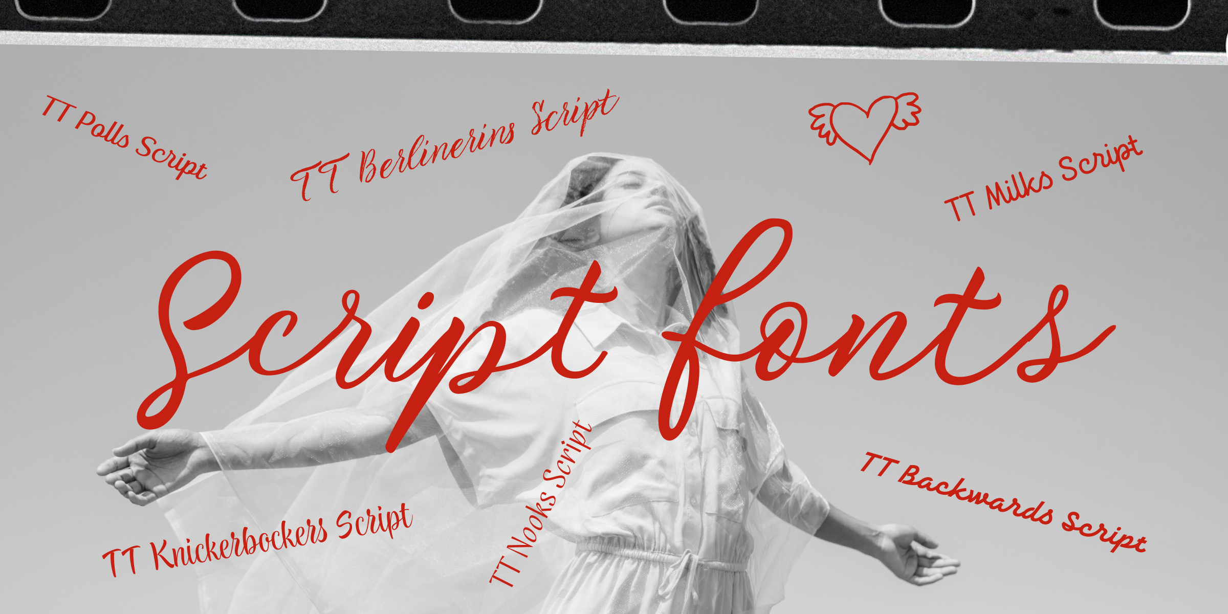
In this comprehensive guide, we’ll dive into the world of cursive fonts. You’ll learn what defines a cursive font, how it differs from traditional italic styles, and discover the most strategic ways to incorporate these unique typefaces into your design work. We’ve also curated a list of top cursive fonts from the TypeType’s collection to inspire your next creative project.

What Exactly is a Cursive Font?

Best Cursive Fonts in 2024: A Comprehensive Design Guide

A cursive font, also known as a script font, is a typographic design that captures the essence of personal handwriting. These fonts go beyond simple imitation, incorporating nuanced details that bring a human touch to digital typography. They often feature:

  • Smooth, organic line flows
  • Natural connecting strokes between letters
  • Unique flourishes and subtle «imperfections»
  • A sense of individual character and movement
Best Cursive Fonts in 2024: A Comprehensive Design Guide

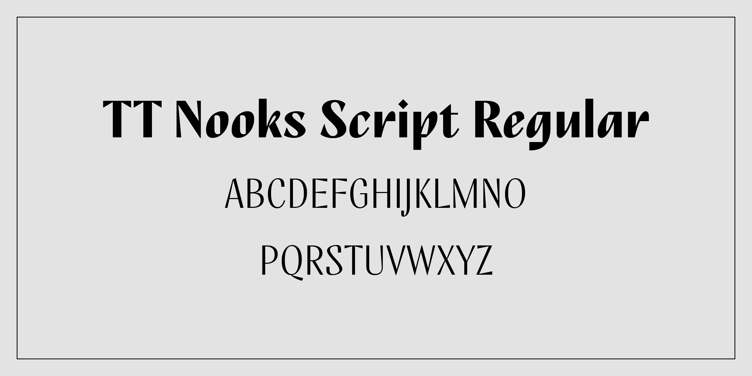
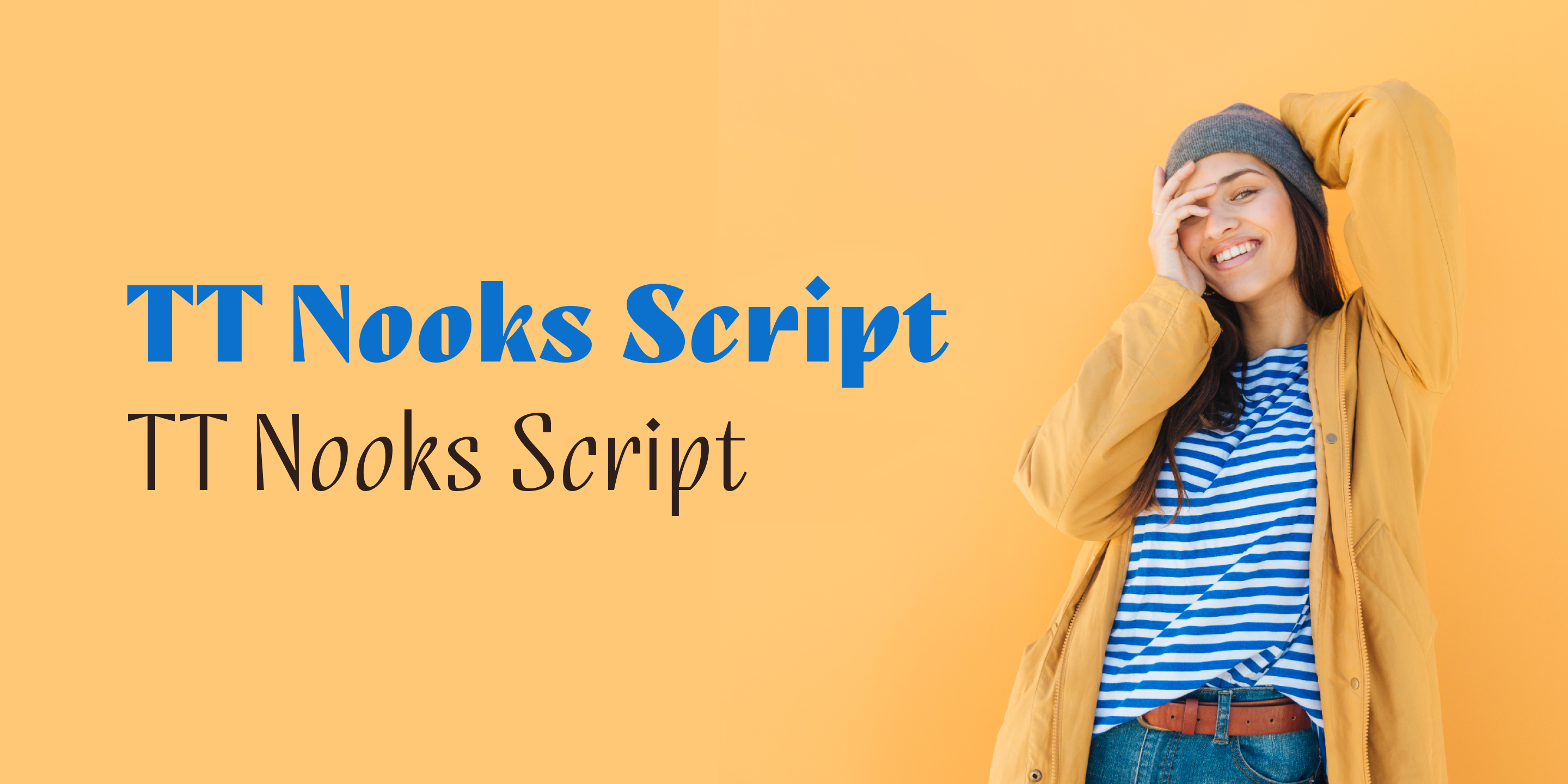
It’s crucial to understand that cursive fonts aren’t limited to italic designs. Some, like TT Nooks Script, demonstrate that these fonts can be equally expressive in an upright form.

When and How to Use Cursive Fonts
Best Cursive Fonts in 2024: A Comprehensive Design Guide

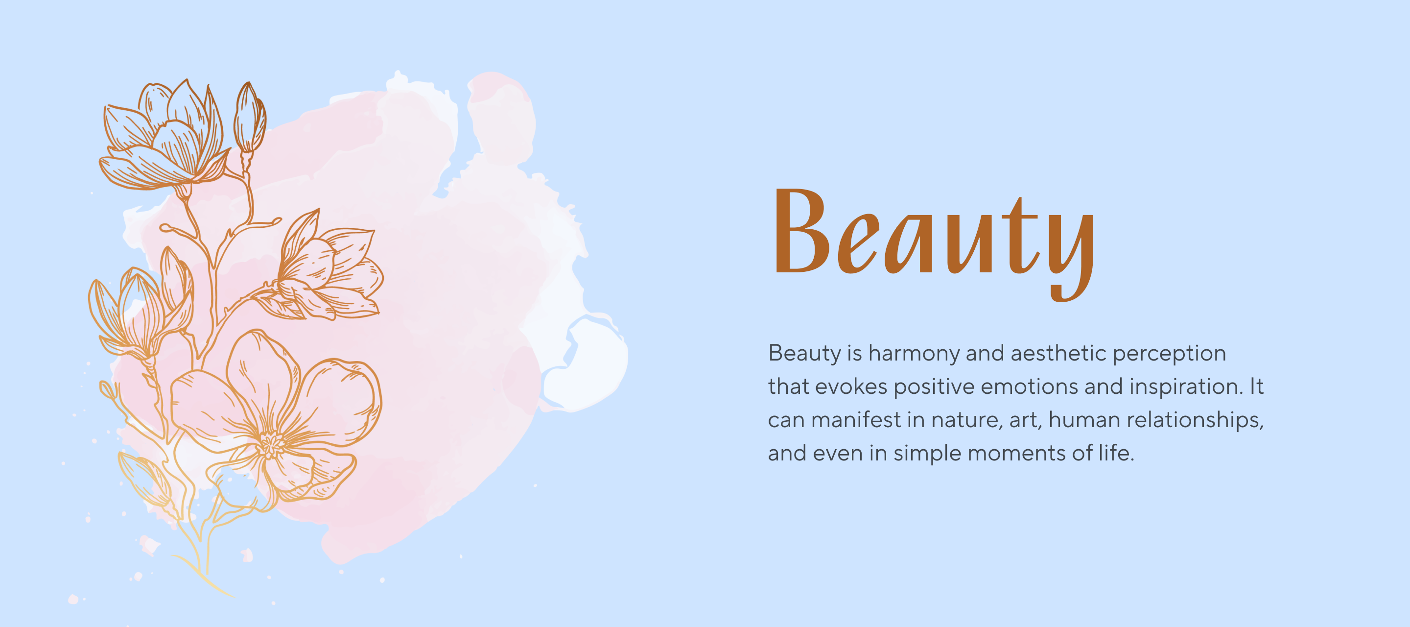
Cursive fonts primarily serve an accent function—they are designed to attract attention and create emphasis. Their purpose is to embellish the design and imbue it with a specific mood. They work best in large and medium sizes, as cursive fonts are not always suitable for text setting or use in small point sizes.

Let’s explore the versatile ways cursive fonts can transform your design approach.

Conveying Warmth and Authenticity
Best Cursive Fonts in 2024: A Comprehensive Design Guide

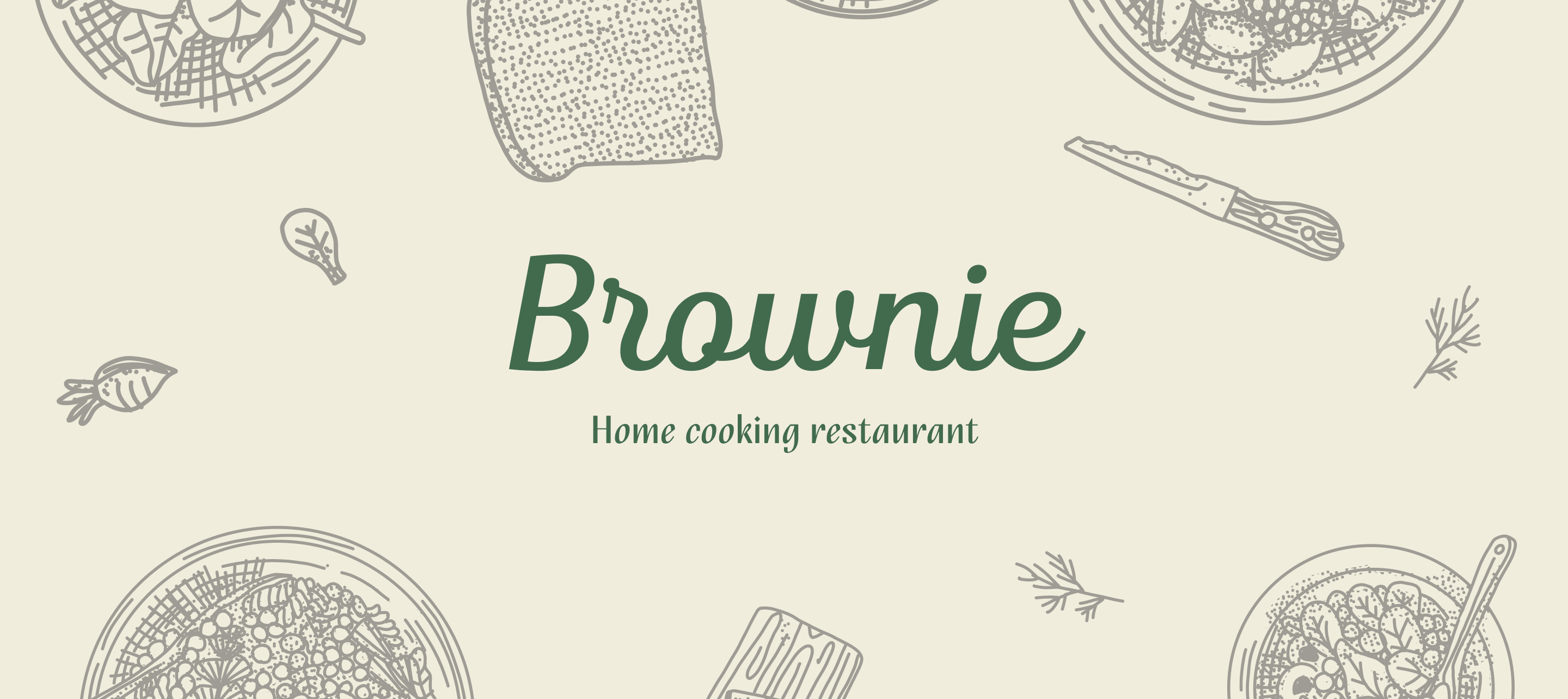
In a digital world craving human connection, cursive fonts offer a powerful way to inject warmth and personality into your design. This is especially important when you need to establish an emotional connection with your audience. Such fonts work well for brands that want to emphasize their story, personal approach to customers, and love for their work. This could be a handmade goods brand, a family restaurant, or a small coffee shop. Cursive fonts are often seen on greeting cards or invitations—they create the impression that the text is handwritten, making the message more personal and heartfelt.

Establishing Brand Individuality
Best Cursive Fonts in 2024: A Comprehensive Design Guide

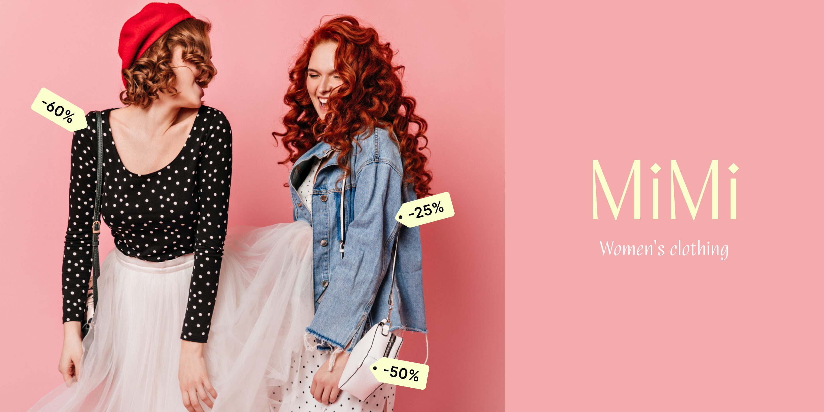
Cursive fonts can help a brand stand out from competitors. When used correctly, they can give the corporate style uniqueness, making it recognizable and distinctive. Cursive fonts are often used when creating logos. Such design tells the viewer that the brand has a creative, non-standard approach. Design studios, fashion brands, and creative enterprises can leverage these fonts to instantly communicate their innovative spirit.

Capturing Event Themes and Atmospheres
Best Cursive Fonts in 2024: A Comprehensive Design Guide

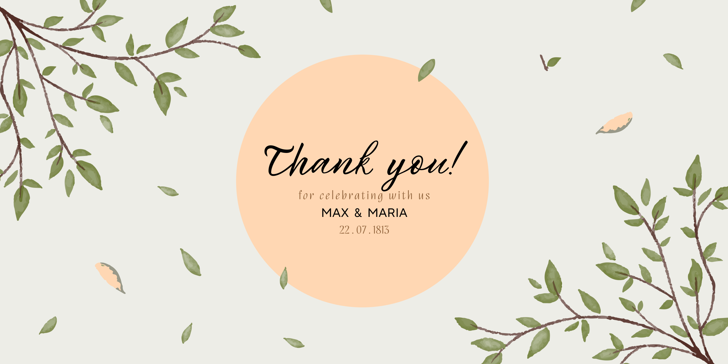
Event design is where cursive fonts truly come alive. Whether it’s a wedding, corporate event, or birthday celebration, the right script font can help convey the atmosphere of a celebration and emphasize the theme and style of the event. For example, elegant fonts work well for wedding invitations, informal and friendly fonts for birthday parties, and playful, cute fonts for children’s events.

Amplifying Creative Expression
Best Cursive Fonts in 2024: A Comprehensive Design Guide

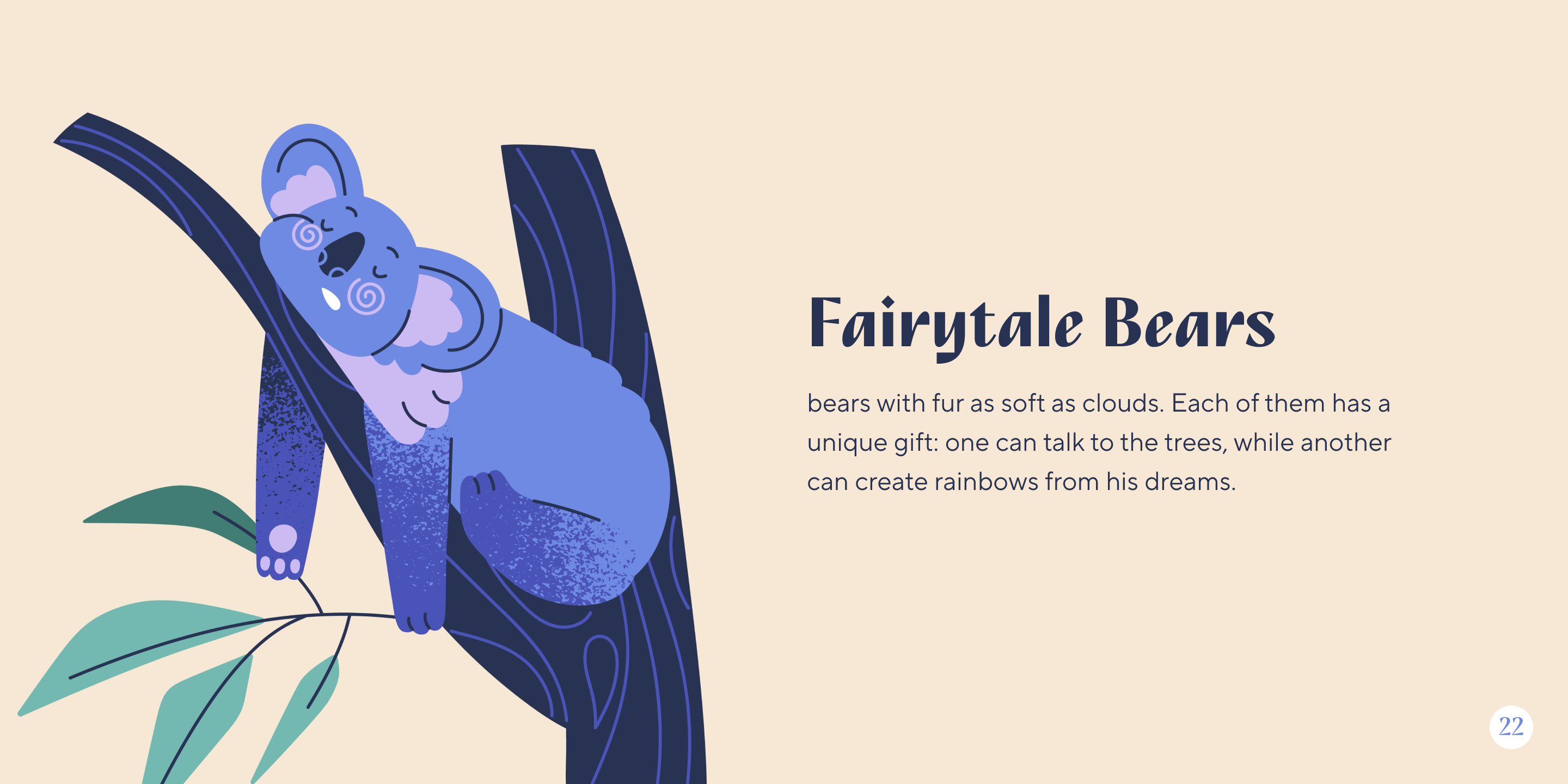
Illustrations, book covers, posters, and artistic projects benefit immensely from cursive fonts. They add expressiveness to the design, help emphasize a creative approach, add an element of creativity, and make the project unique.

Personalizing Digital Content
Best Cursive Fonts in 2024: A Comprehensive Design Guide

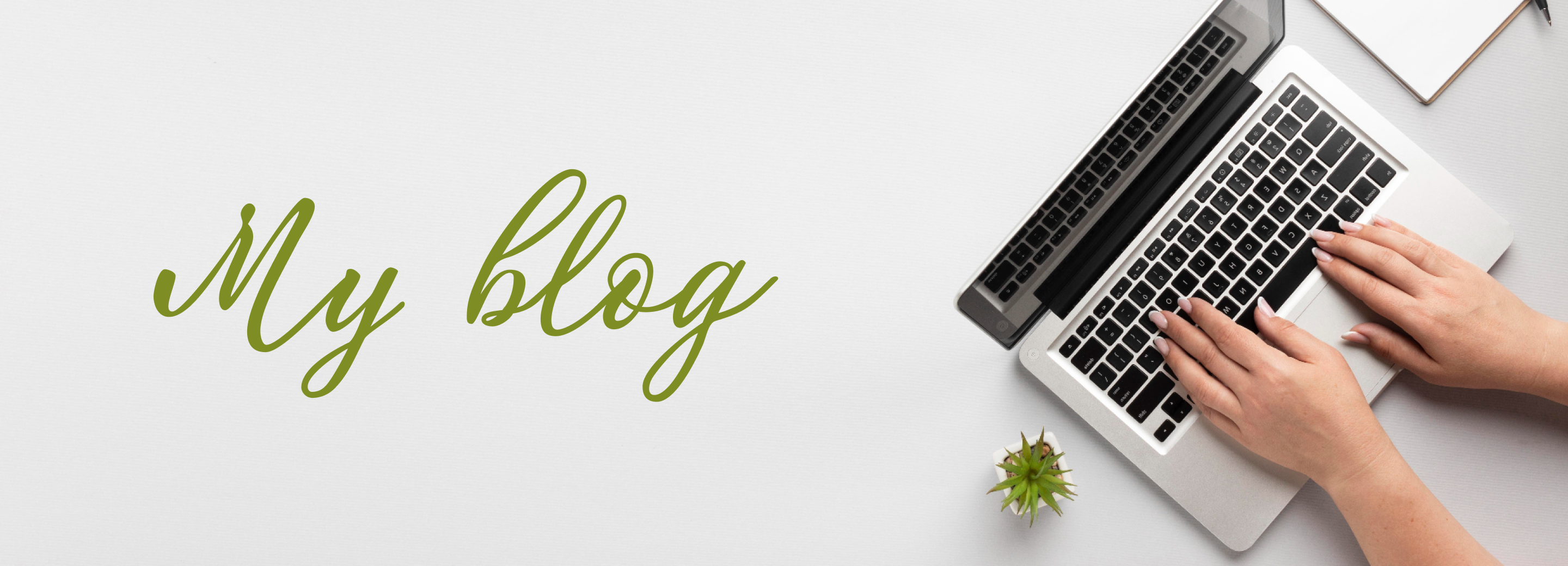
Cursive fonts can be used in blogs or social media to give content individuality. They help make posts more visually appealing and emphasize an informal communication style, bringing the author closer to their audience. If you’re a popular or aspiring blogger, take a look at this option.

Curated Handwriting Font Collection

In this section, we’ll showcase a comprehensive selection of cursive fonts from the TypeType collection, including our standard lineup and experimental fonts from the Piñata project. We’ve selected fonts with diverse typographic characteristics and styles to help you find appropriate options for various design needs and contexts.

TypeType Collection Highlights

TT Nooks Script
Best Cursive Fonts in 2024: A Comprehensive Design Guide

TT Nooks Script, which we’ve already mentioned, is part of the experimental TT Nooks font family. It’s a non-italic cursive font. In thin weights, it acquires more humanistic features and artifacts typical of continuous flat pen movement. In bold weights, its rhythm becomes very dense and dynamic, and the letter forms begin to geometrize.

TT Backwards Script
Best Cursive Fonts in 2024: A Comprehensive Design Guide

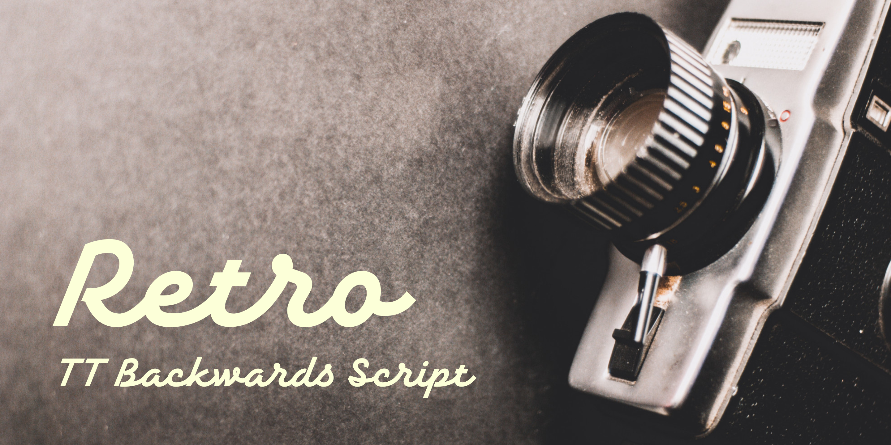
TT Backwards Script is part of an experimental font project inspired by USSR typography from the late 70s and early 80s. Store signs, posters, and book design—these were our sources of inspiration. The italic cursive font TT Backwards Script resembles writing from school notebooks. A good option for designing children’s products or educational projects.

TT Knickerbockers Script
Best Cursive Fonts in 2024: A Comprehensive Design Guide

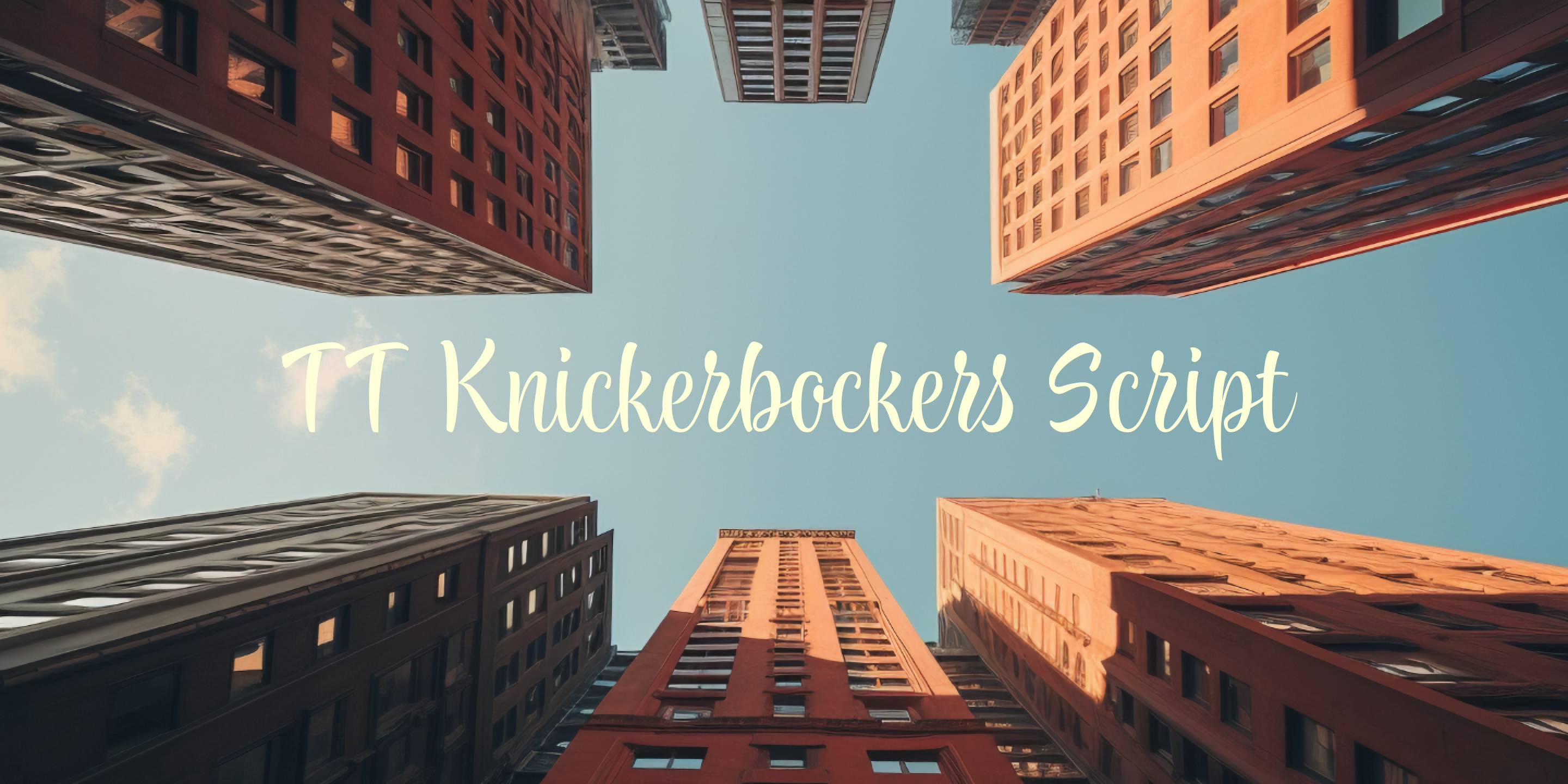
TT Knickerbockers is a professional font family that captures the best of New York’s multicultural spirit, rich history, and creative energy. This non-italic cursive font, TT Knickerbockers Script, offers a great option for designers looking for a unique and readable script. With its expressive design and easy-to-read style, the font reflects the city’s dynamic rhythm and 24/7 urban vitality, making it a top choice for various design projects.

TT Polls Script
Best Cursive Fonts in 2024: A Comprehensive Design Guide

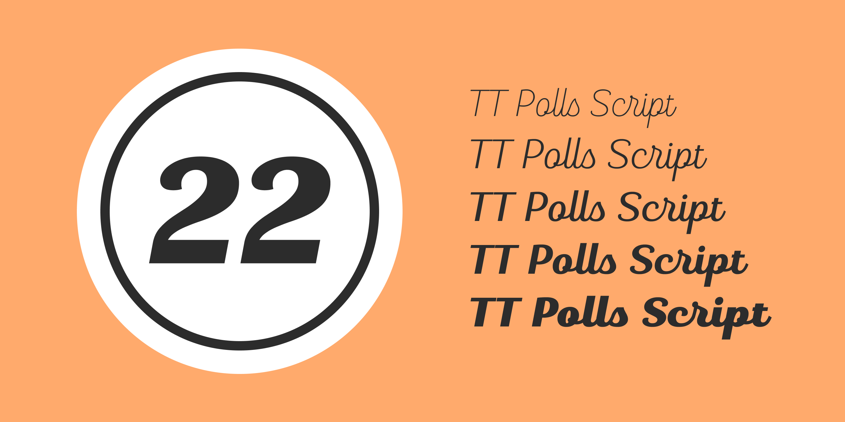
TT Polls Script is a professional cursive font from the TT Polls family, drawing inspiration from classic American sports graphics. This font offers a great option for designers looking to create unique designs in sports-related contexts. While it excels at branding for baseball jerseys and sportswear logos, its versatile style makes it a top choice for a wide range of design projects beyond athletic themes.

TT Berlinerins Script
Best Cursive Fonts in 2024: A Comprehensive Design Guide

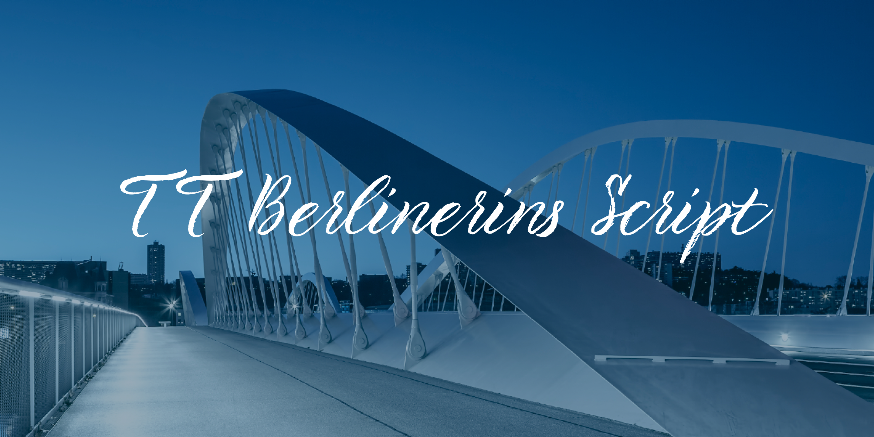
TT Berlinerins is a creative cursive font family that captures the vibrant spirit of Berlin. This italic script embodies the city’s contemporary essence—dynamic, elegant, and full of life. With its great design, the TT Berlinerins Script offers designers a unique font option for projects ranging from urban lifestyle blogs to modern city-themed websites, making it a versatile and professional choice for various creative applications.

TT Milks Script
Best Cursive Fonts in 2024: A Comprehensive Design Guide

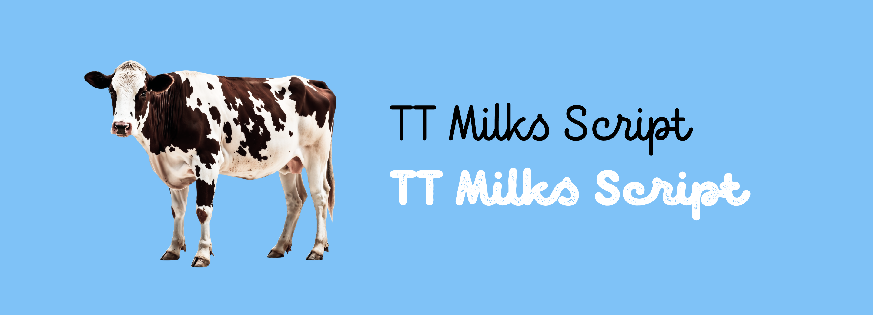
TT Milks Script is a set of cursive fonts within the TT Milks font family. Initially, we created this typeface for packaging design and dairy product branding, but its application is no longer limited to that specific domain. TT Milks Script is a non-italic cursive font, characterized by its soft and charming aesthetic. Expanding on this foundation, the TT Milks Casual Script offers two distinctive script styles, each featuring its own nuanced «worn» texture.

TT Lovelies Script
Best Cursive Fonts in 2024: A Comprehensive Design Guide

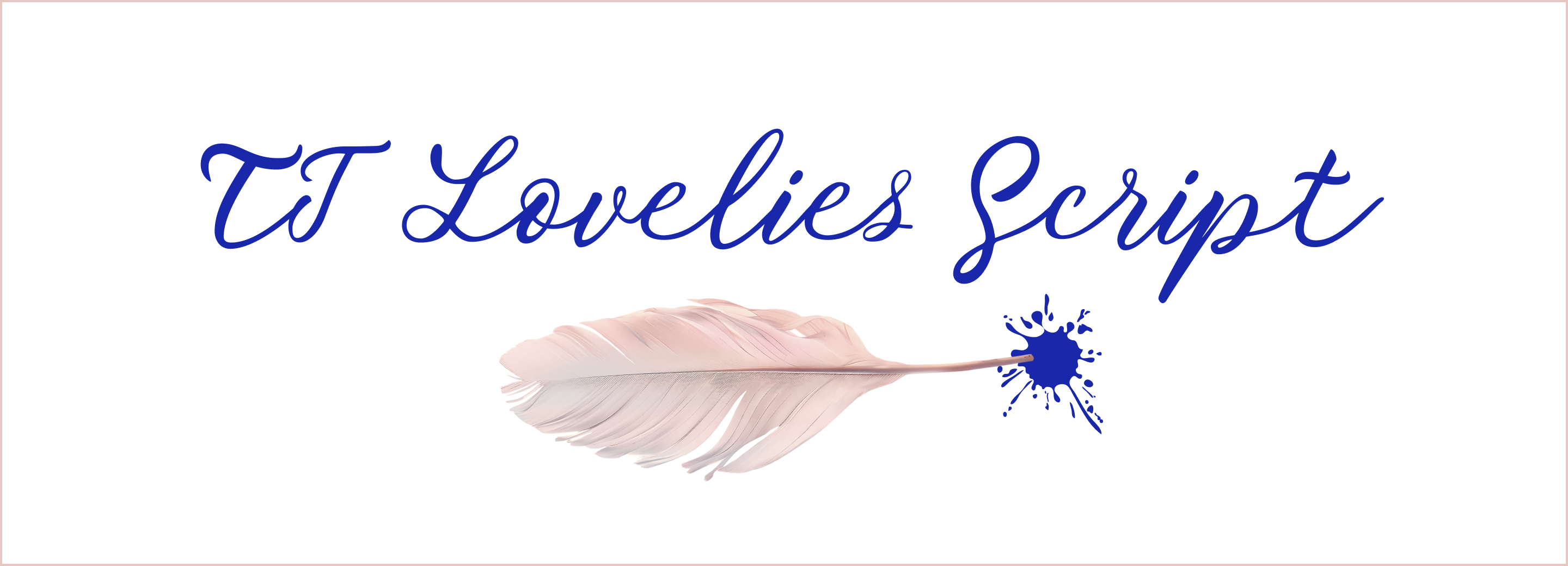
TT Lovelies Script represents one of the most challenging projects from our design studio. This dynamic, playful, and occasionally unpredictable italic cursive font stands out with its remarkable continuity. We drew inspiration directly from original calligraphy, crafting a typeface that captures the fluid, spontaneous essence of hand-drawn lettering.

Experimental Cursive Fonts by Piñata

Piñata is an experimental TypeType project where our designers created graphics and various decorative fonts. Within this collection, you’ll find accessible cursive fonts with diverse characters—from romantic and cute to cheerful and intentionally casual.

  • Disruptor’s Script—a dynamic cursive font with a self-assured rebellious character. The letters appear as if written with a brush pen, an effect created particularly through distinctive wear and varying stroke thicknesses
  • Gentlemen’s Script—a cursive font with gentlemanly qualities: sharp dynamism harmoniously coexisting with elegance and seriousness. The font allows for mimicking quick hand-drawn inscriptions while preserving their grace and style
  • Walls Regular & Walls Rough Regular—two cursive fonts styled to resemble marker and chalk writings
  • Marks—a font package crafted in the style of traditional American hand-painted signs (sign painting)
  • Idol—a warm and cozy non-italic cursive font that our designers initially drew and meticulously developed on paper before digitizing and transforming it into a fully functional typeface

The Future of Cursive Fonts
Best Cursive Fonts in 2024: A Comprehensive Design Guide

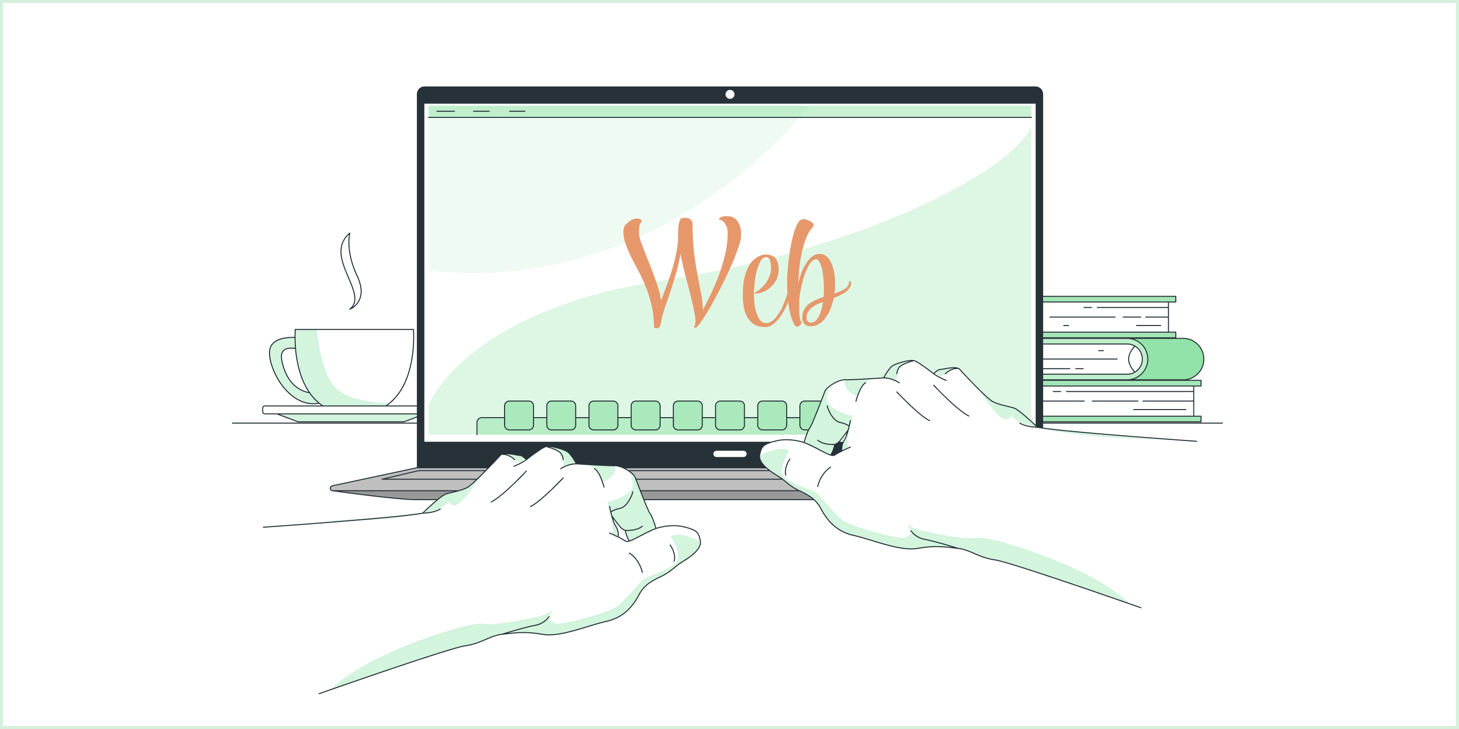
Cursive fonts continue to be a go-to choice for web design, marketing, and social media graphics. Their popularity is expected to persist into the next year, with designers increasingly leveraging these fonts to infuse text with warmth, authenticity, and an eco-friendly feel. By using cursive fonts, brands can create a more intimate emotional connection with their audience, which is particularly crucial as digital interactions become more impersonal and distanced.

Conclusion

Cursive fonts offer a powerful way to convey a unique mood and forge an emotional connection with your audience. We believe our curated collection includes the perfect font for your specific project. However, it’s essential to exercise caution: cursive fonts can quickly become difficult to read when used in lengthy passages or at smaller point sizes. The key is moderation and careful design balance—use them strategically to enhance, not hinder, your communication.

Latest publications

Best Ebook Fonts

Best Ebook Fonts

Choosing the right font for an ebook might seem like a simple task at first glance, but it actually requires a careful approach and consideration of several nuances. After all, digital media differs significantly from print. What exactly should you pay attention to? And how do you select the best font for reading ebooks? We’ll explain it all in this article!

See more
How to Choose the Best Infographic Fonts: Сomprehensive Guide

How to Choose the Best Infographic Fonts: Сomprehensive Guide

Infographics is a versatile and convenient tool that finds application everywhere: business, advertising, science, journalism, and more. This is a powerful way to communicate information in a simple, visual manner. Why is it so essential to choose the right font for your infographic, and how to do this? How do you pair fonts with each other? What fonts work best for marketplace infographics? Read on to find out!

See more
On Opposite Sides: Wide and Narrow Fonts

On Opposite Sides: Wide and Narrow Fonts

Wide and narrow fonts are among the newest trends in typography, graphic design, and web design. At first glance, some may seem odd and awkward, but when thoughtfully applied, they can infuse a project with freshness, boldness, relevance, and strength. What are narrow and wide fonts, what variations do they come in, and where are they used? Let’s explore this together in this article.

See more
How do you add a font to your computer? 

How do you add a font to your computer? 

How to install a new font on a PC? Users and designers face this question very often. Rest assured, there is nothing tricky in this process! This article provides a step-by-step guide to help you understand how to install downloaded fonts correctly on Windows and iOS-powered computers.

See more
Font Licensing: Complete Guide for Designers and Business Clients

Font Licensing: Complete Guide for Designers and Business Clients

In this article, you will find out what types of font licensing exist, how to choose a suitable font license and use it, how to verify and buy a commercial font license, and how to avoid unpleasant typeface licensing issues whether you are a designer or a client.

See more
Kerning, Tracking, Leading & Spacing in Typography: What’s the Difference?

Kerning, Tracking, Leading & Spacing in Typography: What’s the Difference?

Even seasoned designers sometimes mix up the concepts of kerning, tracking, spacing, and leading. Become a pro at distinguishing them! Learn the definitions of these concepts, explore their differences, and discover some helpful tips on how to use them while working on your fonts.

See more
Branching out: How Scandinavian Sans TT Firs Grew and Found Its Font Pair

Branching out: How Scandinavian Sans TT Firs Grew and Found Its Font Pair

In 2023, we breathed new life into the beloved Scandinavian sans serif TT Firs Neue by dramatically refining and renewing the typeface to comply with cutting-edge standards. Soon after, we introduced the text font pair for this typeface – an elegant TT Firs Text. This article is dedicated to how it all began, why we decided to update TT Firs Neue, what we added and modified, and how TT Firs Text was born.

See more
Top 10 Typography Trends of 2024

Top 10 Typography Trends of 2024

We live in a time when trends shift nearly every day, and typography design trends are no exception. We all encounter typography daily: on the web, in supermarkets, and on shop windows and signs. Outdated design, at the very least, induces boredom; at worst, it fosters distrust in the product or service. However, trendy design looks captivating and attractive.Experts and designers from the TypeType font studio are excited to share the key type trends of 2024 with you in this article. Stay trendy!

See more
15+ Best Magazine Fonts for Perfect Editorial Designs

15+ Best Magazine Fonts for Perfect Editorial Designs

Magazines are a perfect backdrop for typography to express all its dimensions. Fonts, in this case, not only communicate information but also directly influence the design. They deliver the magazine’s message, reflecting its values and ideas. In this article, we discuss how to choose the best magazine font and compile a list of 15 relevant options for editorial designs on various themes.

See more

See more

How to Choose the Best Infographic Fonts: Сomprehensive Guide

How to Choose the Best Infographic Fonts: Сomprehensive Guide

Infographics is a versatile and convenient tool that finds application everywhere: business, advertising, science, journalism, and more. This is a powerful way to communicate information in a simple, visual manner. Why is it so essential to choose the right font for your infographic, and how to do this? How do you pair fonts with each other? What fonts work best for marketplace infographics? Read on to find out!

See more
On Opposite Sides: Wide and Narrow Fonts

On Opposite Sides: Wide and Narrow Fonts

Wide and narrow fonts are among the newest trends in typography, graphic design, and web design. At first glance, some may seem odd and awkward, but when thoughtfully applied, they can infuse a project with freshness, boldness, relevance, and strength. What are narrow and wide fonts, what variations do they come in, and where are they used? Let’s explore this together in this article.

See more
How do you add a font to your computer? 

How do you add a font to your computer? 

How to install a new font on a PC? Users and designers face this question very often. Rest assured, there is nothing tricky in this process! This article provides a step-by-step guide to help you understand how to install downloaded fonts correctly on Windows and iOS-powered computers.

See more
Font Licensing: Complete Guide for Designers and Business Clients

Font Licensing: Complete Guide for Designers and Business Clients

In this article, you will find out what types of font licensing exist, how to choose a suitable font license and use it, how to verify and buy a commercial font license, and how to avoid unpleasant typeface licensing issues whether you are a designer or a client.

See more
Kerning, Tracking, Leading & Spacing in Typography: What’s the Difference?

Kerning, Tracking, Leading & Spacing in Typography: What’s the Difference?

Even seasoned designers sometimes mix up the concepts of kerning, tracking, spacing, and leading. Become a pro at distinguishing them! Learn the definitions of these concepts, explore their differences, and discover some helpful tips on how to use them while working on your fonts.

See more
Branching out: How Scandinavian Sans TT Firs Grew and Found Its Font Pair

Branching out: How Scandinavian Sans TT Firs Grew and Found Its Font Pair

In 2023, we breathed new life into the beloved Scandinavian sans serif TT Firs Neue by dramatically refining and renewing the typeface to comply with cutting-edge standards. Soon after, we introduced the text font pair for this typeface – an elegant TT Firs Text. This article is dedicated to how it all began, why we decided to update TT Firs Neue, what we added and modified, and how TT Firs Text was born.

See more
Top 10 Typography Trends of 2024

Top 10 Typography Trends of 2024

We live in a time when trends shift nearly every day, and typography design trends are no exception. We all encounter typography daily: on the web, in supermarkets, and on shop windows and signs. Outdated design, at the very least, induces boredom; at worst, it fosters distrust in the product or service. However, trendy design looks captivating and attractive.Experts and designers from the TypeType font studio are excited to share the key type trends of 2024 with you in this article. Stay trendy!

See more
15+ Best Magazine Fonts for Perfect Editorial Designs

15+ Best Magazine Fonts for Perfect Editorial Designs

Magazines are a perfect backdrop for typography to express all its dimensions. Fonts, in this case, not only communicate information but also directly influence the design. They deliver the magazine’s message, reflecting its values and ideas. In this article, we discuss how to choose the best magazine font and compile a list of 15 relevant options for editorial designs on various themes.

See more
UniversiTTy: Lesson 9. Uppercase Characters. Detailed Contour Refinement

UniversiTTy: Lesson 9. Uppercase Characters. Detailed Contour Refinement

Welcome to the ninth lesson of our «UniversiTTy»! In this series, we guide you through the process of font design step by step. The font is a cohesive visual system. This can be seen on all levels: global (font type, weight, proportions, contrast, general forms) and at lower scales that encompass all graphic choices in individual characters. Let’s find out together how visual details influence the overall perception of fonts.

See more