TT Livret
Text Regular
32 font styles
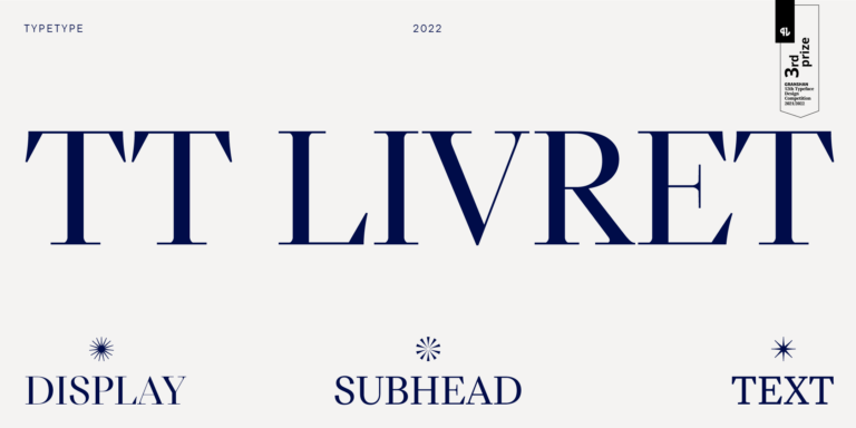
TT Livret is an elegant, modern and functional serif

If you are tired of overused typefaces and are looking for fonts similar to Canterbury, check out our best free-to-try Canterbury alternatives, which have similar characteristics as well as new, unique design features. Some of the fonts belong to the same type category, and others are suitable for the same tasks or have similar traits but stand out for their distinct details or proportions.
At TypeType, you’ll find cutting-edge fonts like Canterbury and even better: here are some stunning and not-so-ubiquitous Canterbury alternatives. Use this list of highest-quality Canterbury-like fonts as you prefer. Our list provides a broader range of options for choosing the best font match for your project and refreshing your designs. All fonts featured in this collection are available in multiple formats and at affordable prices, so you can find one to fit your every need!
Find a great Canterbury replacement font and try to recreate a similar mood and capture the feeling you aim for by using it in your designs. Each font presented on this page is a twin of the Canterbury font, practically identical to it.
TT Livret is an elegant, modern and functional serif


TT Regins is a Scottish modern serif. Striking contrast and sharp triangular serifs give this font a stern and commanding character, while refined forms, enlarged lowercase letters, and slightly condensed, static proportions add grace to its design.
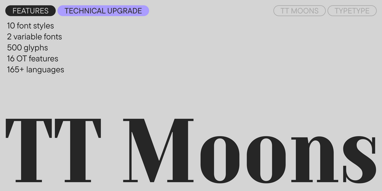
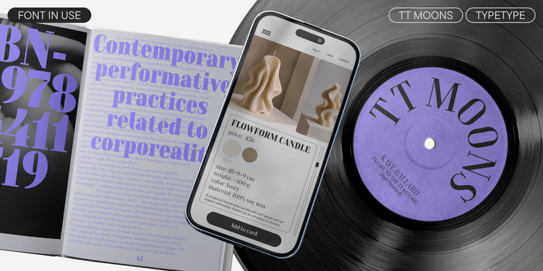
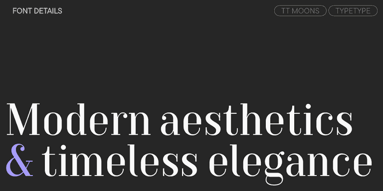
TT Moons is a slim and contrast serif. This font family works especially smart in classic design themes. TT Moons is a typeface of the glyptal modern typeface.
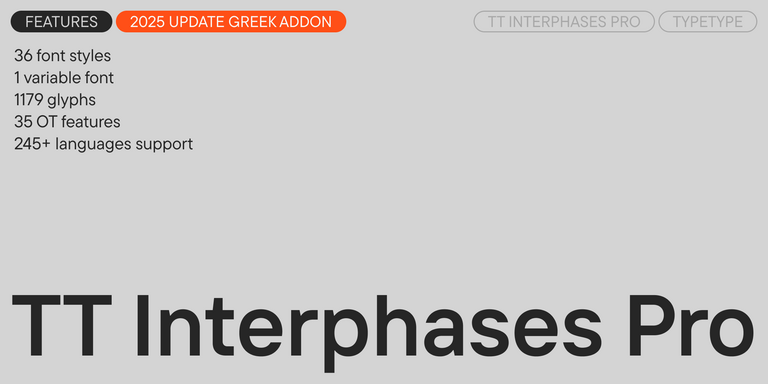
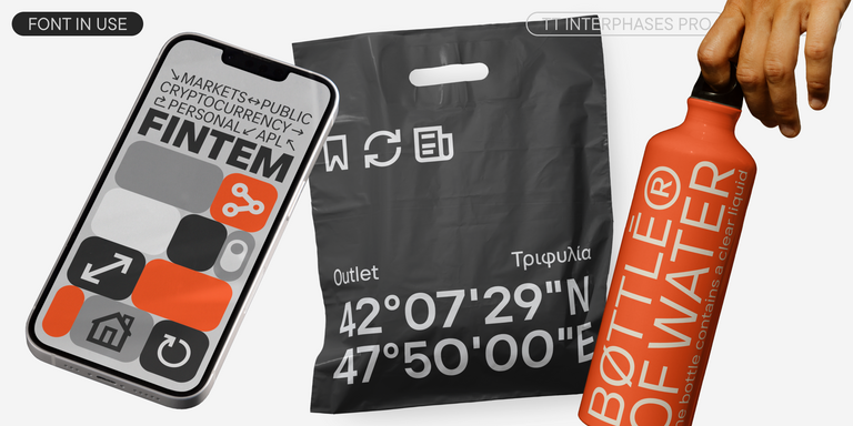
TT Interphases Pro is a neo-grotesque sans serif with equal-width proportions
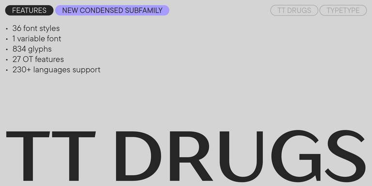
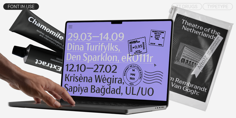
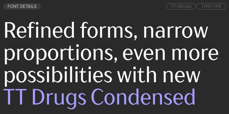
TT Drugs is a typeface that doesn`t feature serifs but stands out for its high contrast.
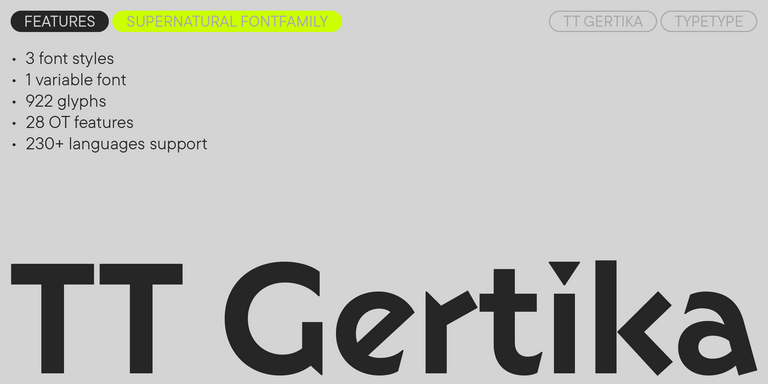
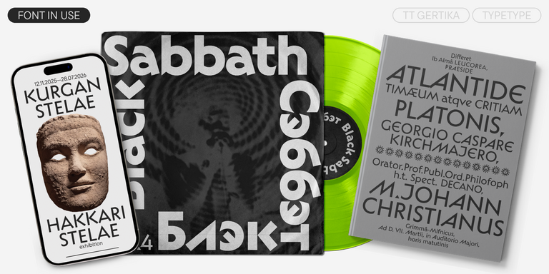
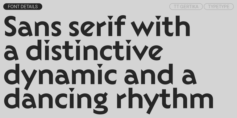
TT Gertika is a geometric sans serif with a dynamic character and a dancing rhythm. This font`s idea originates from the lettering featured on an American poster from the late 1930s.
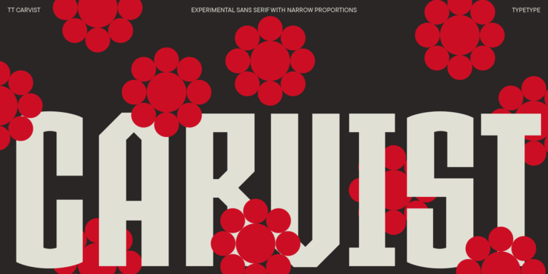
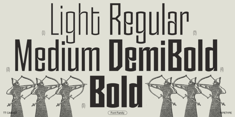
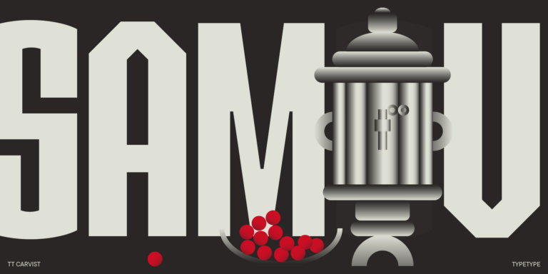
TT Carvist—peculiar, playful, and courageous—this font does an excellent job of grabbing attention!
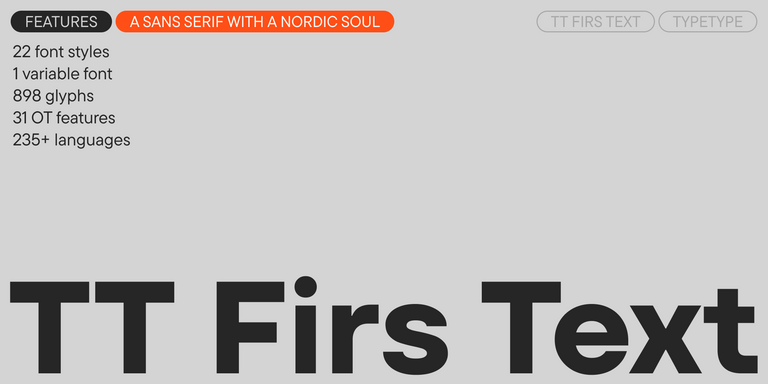
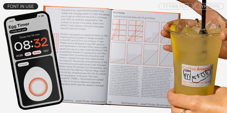
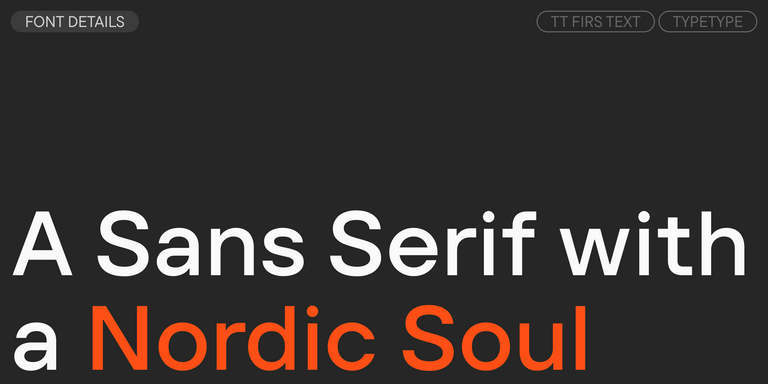
We have released a brand-new font. Meet TT Firs Text—a geometric sans serif with a Nordic character!
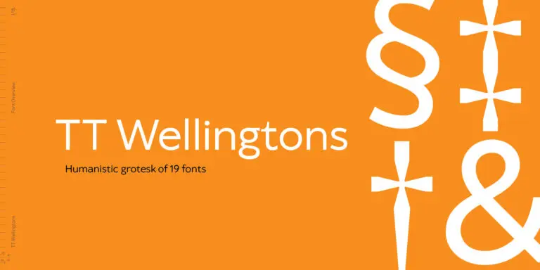
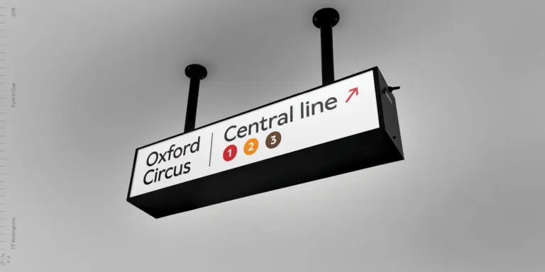
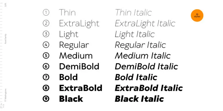
TT Wellingtons is an attempt to combine the style of English humanist sans serifs of the early 20th century with the requirements for modern geometric grotesques.

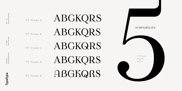
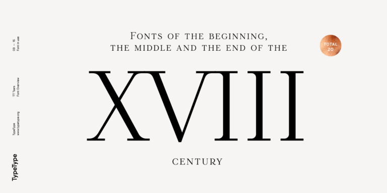
The TT Tsars font family is a collection of serif display fonts that are stylized to resemble the fonts of the beginning, the middle, and the end of the XVIII century.
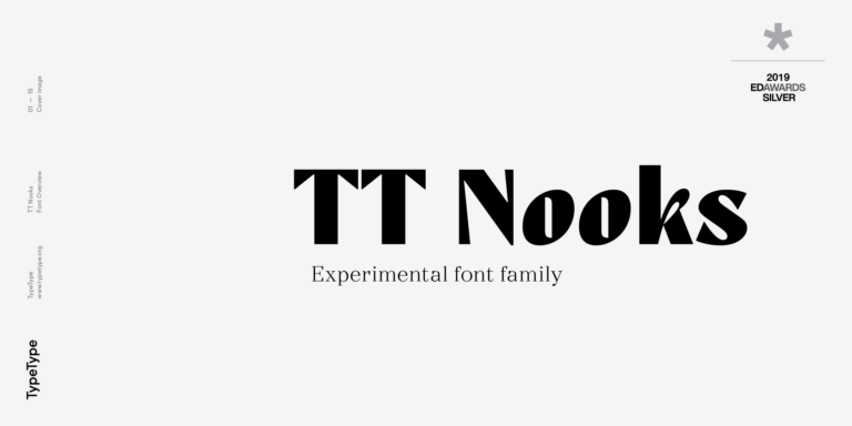
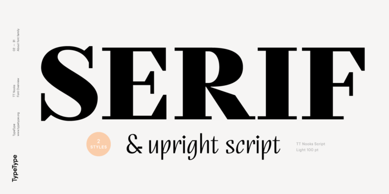
TT Nooks is an experimental project comprised of a high-contrast egocentric serif and an upright humanist italic.
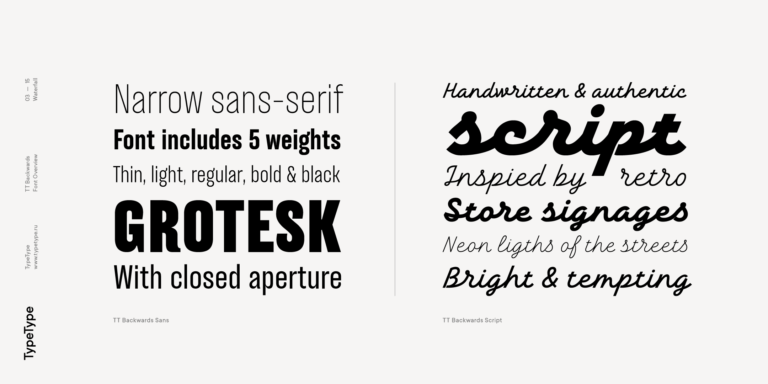
TT Backwards Sans is a narrow grotesque, which takes us back to the book design of late 70s and early 80s with its ductile characters.


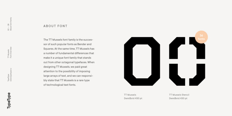
When designing TT Mussels, we paid great attention to the possibility of imposing large arrays of text, and we can state that TT Mussels is a rare type of technological text fonts.
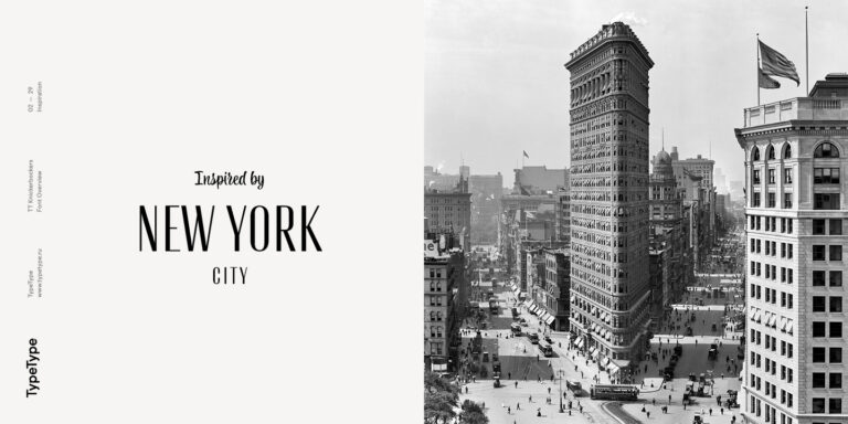
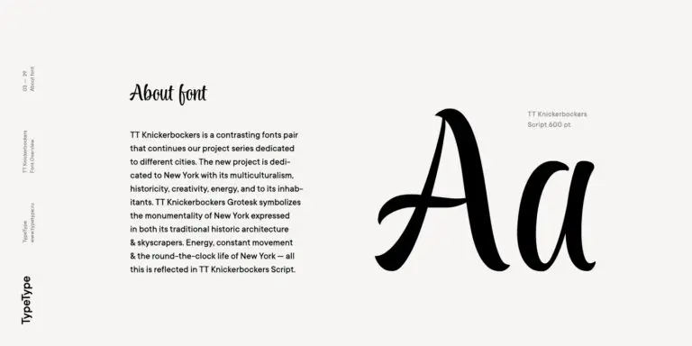
TT Knickerbockers Grotesk is a narrow contrast sans serif with characteristic elements sending us back to the 19th century in New York.
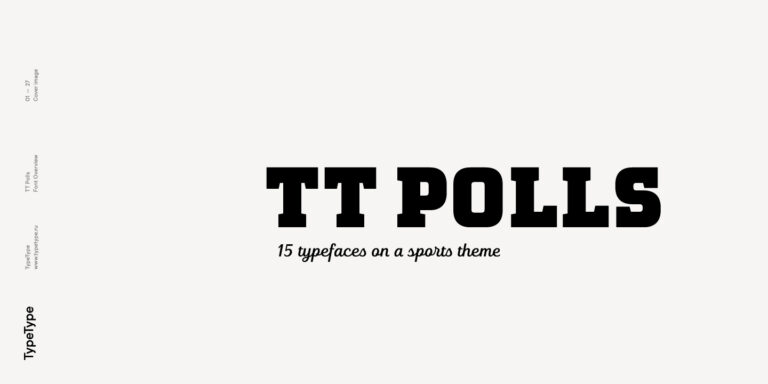
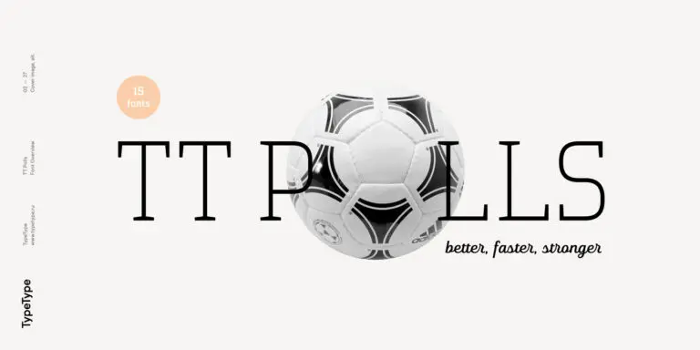
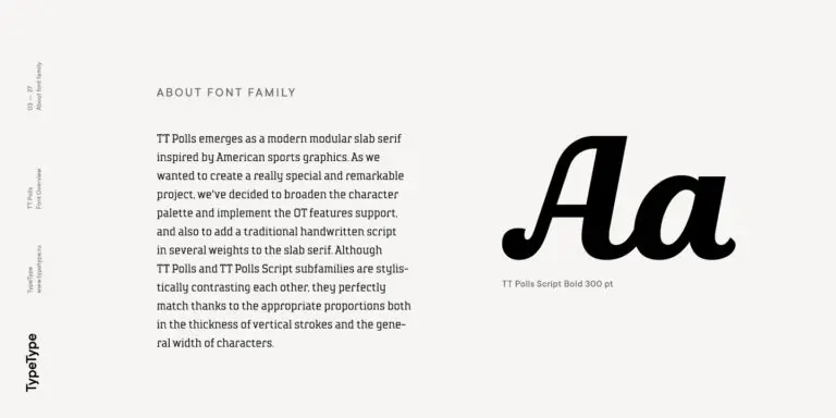
TT Polls is the modern modular slab serif family for using in sports-related design.
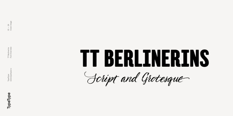
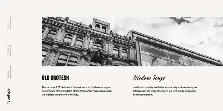
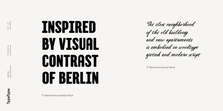
TT Berlinerins is a grotesque inspired by the wood-type poster types of the first third of the 20th century is responsible for the historic component of Berlin.
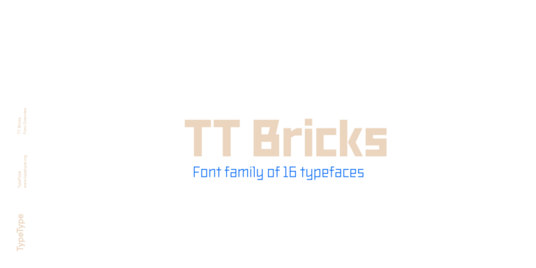
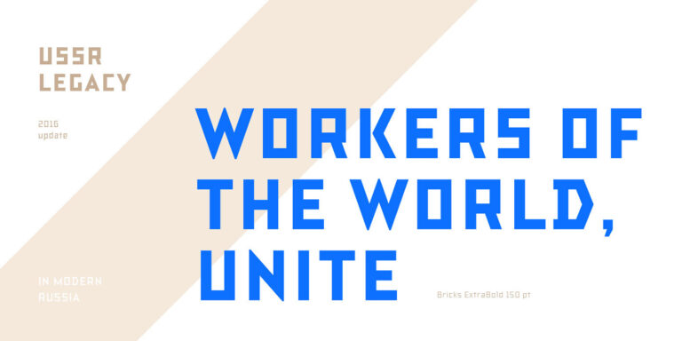
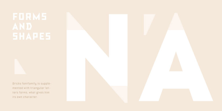
TT Bricks is the answer for lovers of Soviet culture. We`ve tried going back a hundred years and rethinking the constructivist era.