Si necesitas una sans serif clara y funcional, pero estás cansado de las fuentes típicas y buscas algo similar a DIN® Next, considera nuestras alternativas. Conservan la misma estética técnica, pero ofrecen más posibilidades para un diseño moderno.
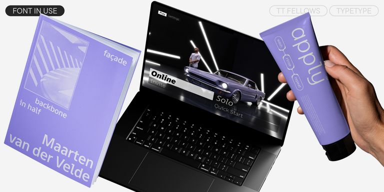
Las fuentes de la selección de TypeType son excelentes reemplazos del original: funcionan igual de bien en señalización, interfaces e identidad corporativa, y además aportan un toque de personalidad a tu proyecto.
Si estás cansado de las fuentes desgastadas y busca tipos de letra similares a DIN® Next, consulta nuestras principales alternativas a DIN® Next. Estas son fuentes que tienen características similares, pero al mismo tiempo tienen características de diseño nuevas y únicas. Por ejemplo, pertenecen a la misma categoría de fuentes, son adecuadas para los mismos fines y tienen características similares, pero difieren en detalles o proporciones.
En TypeType encontrarás fuentes de vanguardia, tales como DIN® Next e incluso mejores: aquí hay algunas alternativas excelentes y menos comunes a DIN® Next. Utiliza esta lista de fuentes de alta calidad con apariencia DIN® Next que se adapten a tus gustos. De esta manera podrás elegir una fuente aún más adecuada para tu proyecto, ampliar la selección o actualizar tu diseño. Todas las fuentes que aparecen en esta colección están disponibles en diferentes formatos y a precios asequibles, por lo que podrás encontrar una que se adapte a cada necesidad.
Encuentra un excelente reemplazo para DIN® Next e intenta emular un estado de ánimo similar usándolo en sus diseños. Cada fuente presentada en esta página es un doble de la fuente DIN® Next, de hecho, su análogo completo.
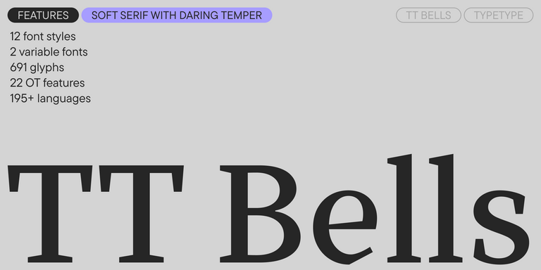
TT Bells combina la elegante suavidad de las Antiqua con un carácter complejo y audaz reflejado en terminales rectos y serifas en forma de flecha. La tipografía está basada en la pluma de punta ancha, responsable de estos característicos terminales y serifas.
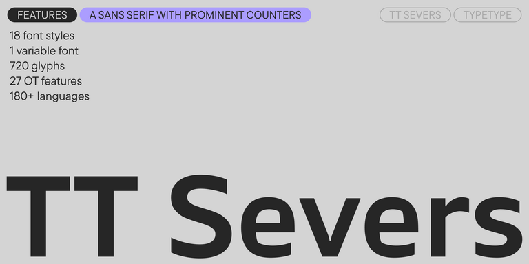
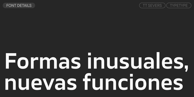
TT Severs es una sans serif geométrica con elementos internos enfatizados. La principal característica visual de TT Severs es la forma inusual de sus óvalos interiores.
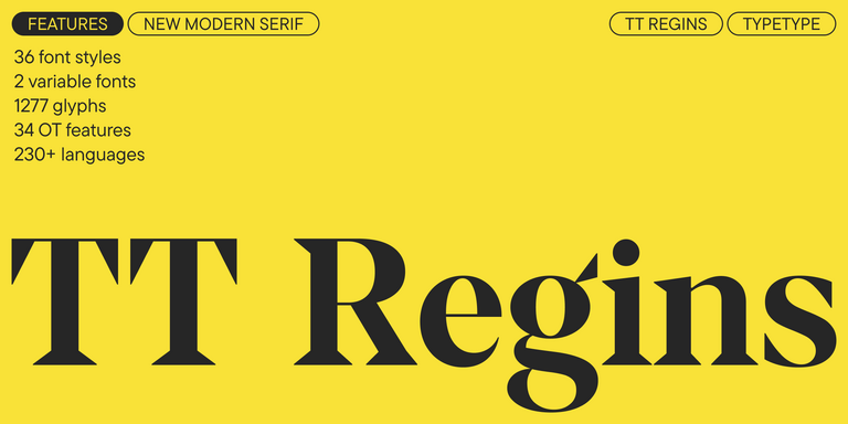
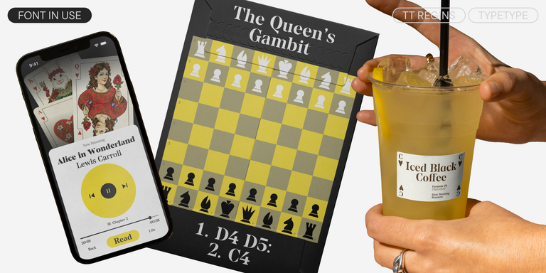
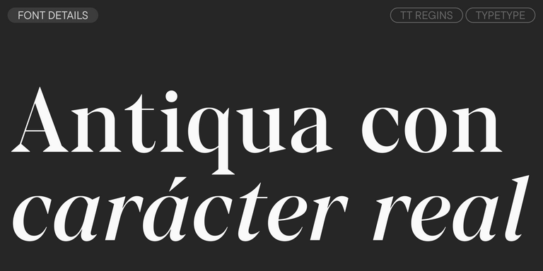
TT Regins es una serif moderna escocesa. Su fuerte contraste y sus afiladas serifas triangulares le otorgan un carácter severo y dominante, mientras que las formas refinadas, las minúsculas ampliadas y las proporciones ligeramente condensadas y estáticas aportan elegancia al diseño.
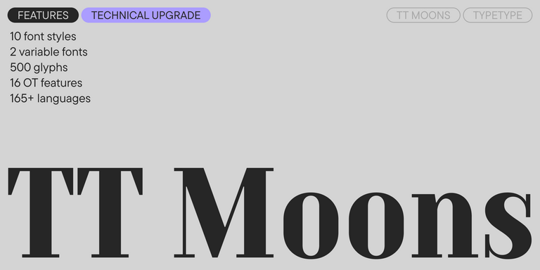
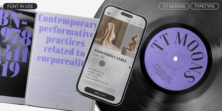
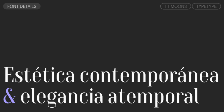
TT Moons es una serif estilizada y contrastada. Esta familia tipográfica funciona especialmente bien en diseños de estilo clásico. TT Moons pertenece al estilo de las tipografías modernas glyptal.
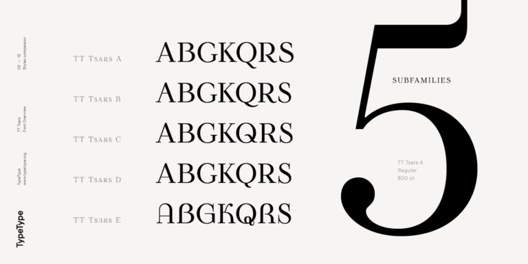
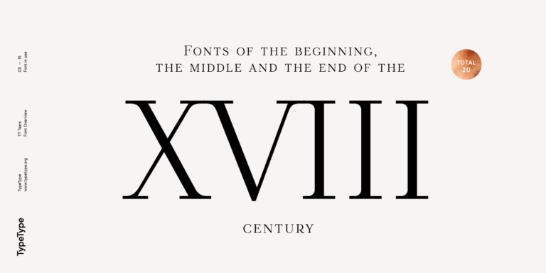
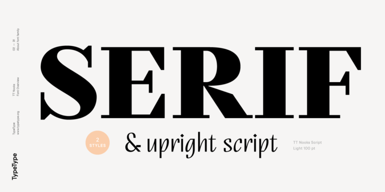
La familia tipográfica TT Tsars es una colección de fuentes serif display estilizadas para evocar las tipografías de principios, mediados y finales del siglo XVIII.
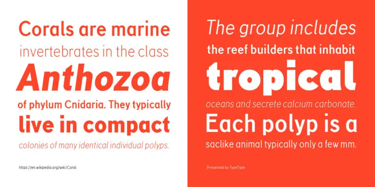
TT Corals es una moderna sans serif humanista con numerosos rasgos característicos de principios del siglo XX. Para ampliar la funcionalidad de la familia tipográfica, hemos creado 6 estilos con diferentes grosores.
Etiquetas relacionadas para fuentes similares a DIN® Next