top_banner_ttnormspro0426
Type foundryFonts & StylesStylish For Facebook

Stylish Fonts For Facebook

When a Facebook campaign needs coordinated post images, cover artwork, and advertising graphics, typography helps establish a consistent visual direction. Stylish Fonts For Facebook brings together TypeType options to consider for those designed assets. Compare candidates against your message, layout, and brand identity, then test your selection before choosing a license appropriate to your intended use.

Purpose: Stylish For Facebook

Where Stylish Fonts For Facebook Are Used

Retail campaigns, restaurant announcements, and service promotions offer different contexts for using Stylish Fonts For Facebook. A product image might need a short headline, while an event graphic may need a clear sequence of date, location, and booking details. These are illustrative applications, not claims about particular customers or industries. Start with the information the viewer needs, then give each element an appropriate typographic role. The focus here is artwork created for Facebook: post images, cover compositions, and advertising creatives. Choosing a typeface for that artwork is distinct from changing Facebook’s interface or styling native post text.

What Makes These Typefaces Distinct

There is no single technical category that defines stylish typography for Facebook. Its character comes from the relationship between letterforms, spacing, imagery, and the message being communicated. A treatment that suits an expressive campaign may feel out of place in a restrained brand presentation. Evaluate the overall composition rather than assuming every option on this page shares the same construction or capabilities. This is a selection of downloadable typefaces for design work, not a tool for producing decorative characters to paste into a profile name. Individual family details should guide comparisons where specific features matter.

How to Choose Stylish Fonts For Facebook for Your Project

Begin with a representative graphic containing your actual headline, supporting copy, and any essential details. Keep the layout unchanged while comparing candidates so you can judge the typography rather than unrelated design differences. Look first at visual tone: does the treatment feel consistent with the rest of your brand material? Next, assess hierarchy. The main message should be easy to identify without competing with a date, price, or call to action. Review the artwork at its intended viewing size, not only enlarged on your working screen. Check longer wording as well as short headlines, since line breaks can change the balance of a composition. Verify the characters you need on each family’s page and through permitted trial testing. Before publishing, review the applicable license terms and ask TypeType for clarification if your planned workflow raises questions.

Explore TypeType's Stylish Fonts For Facebook Collection

The collection includes TT Commons™ Pro, TT Norms® Pro, TT Severs, TT Jenevers, TT Regins, TT Hoves Pro, TT Ramillas, TT Wellingtons, TT Livret, and TT Marxiana. Treat these names as starting points for comparison rather than predetermined recommendations for a particular campaign. Open the individual family pages to examine the available information and narrow your shortlist according to the work you need to produce. TypeType offers trial versions of the listed families, allowing you to evaluate candidates subject to the trial terms. Keep notes on your tests so that the final decision reflects your project requirements rather than an isolated sample. For help with selection or licensing, contact the design or client care teams through the website form. Trial availability does not establish unrestricted commercial permission; confirm the appropriate license and its current terms before using your chosen family in published work.

  • The quick brown fox jumps over a lazy dog.
  • Pack my box with five dozen liquor jugs.
  • Sphinx of black quartz, judge my vow
  • 0123456789 !?.,:;—–()[]{}<> “quotes” ‘apostrophe’ @#%&*_+=/\| № $ € £ ₽ +−×÷=≠≤≥ … % © ® ™
  • Aa Bb Cc Dd Ee Ff Gg Hh Ii Jj Kk Ll Mm Nn Oo Pp Qq Rr Ss Tt Uu Vv Ww Xx Yy Zz
Leading
1.1
Tracking
0px
Bestseller
TT Norms® Pro Regular
104 font styles

The bestseller TT Norms® Pro—a geometric sans serif, trouble-free workhorse

Bestseller
104 font styles

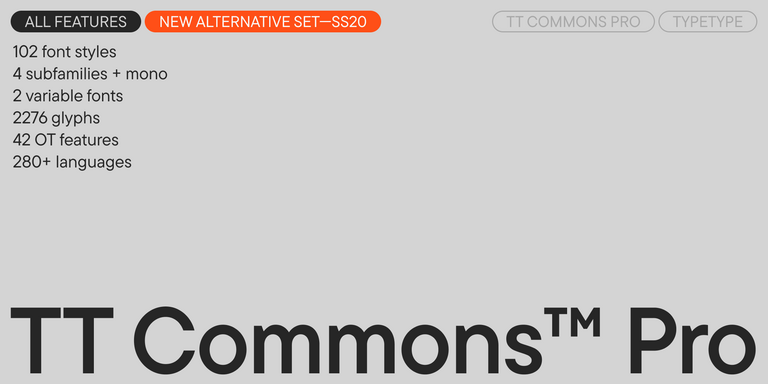
TT Commons™ Pro is a completely redesigned version of the well-established classic font family TT Commons.

Bestseller
TT Hoves Pro Regular
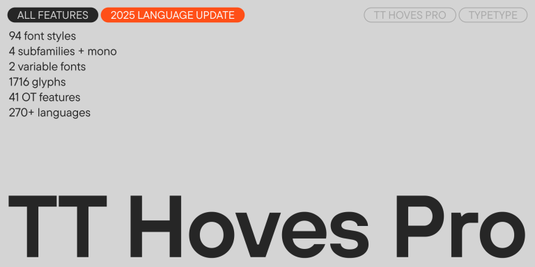
96 font styles

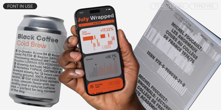
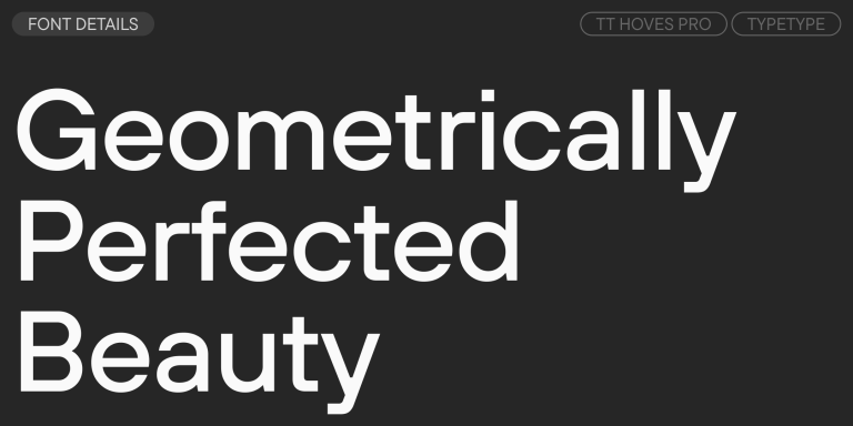
TT Hoves Pro is a versatile sans-serif with a recognizable geometry

Bestseller
TT Livret Text Regular
32 font styles

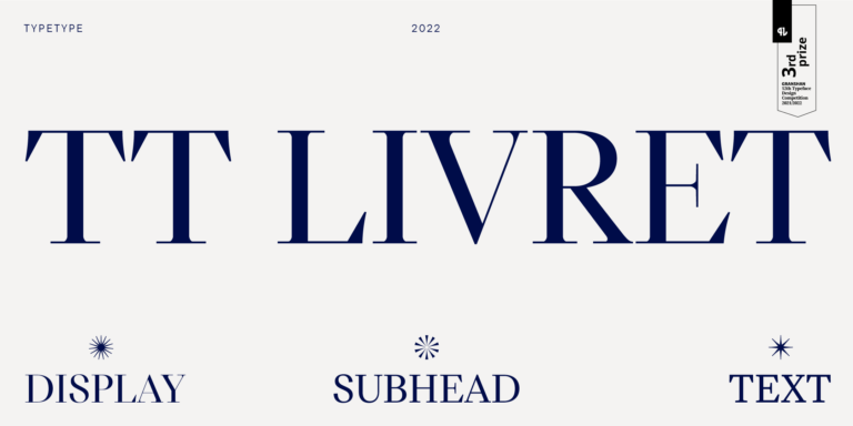
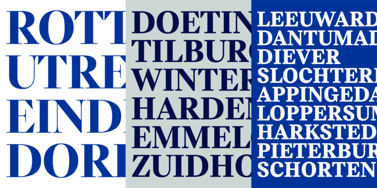
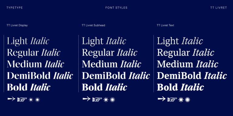
TT Livret is an elegant, modern and functional serif

TT Severs Regular
19 font styles

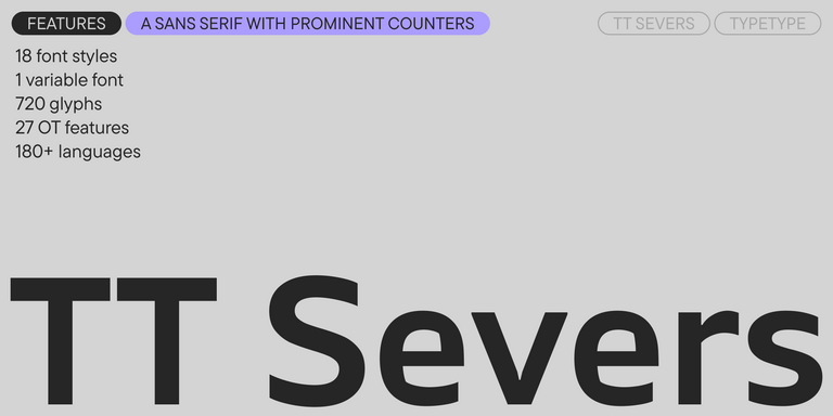
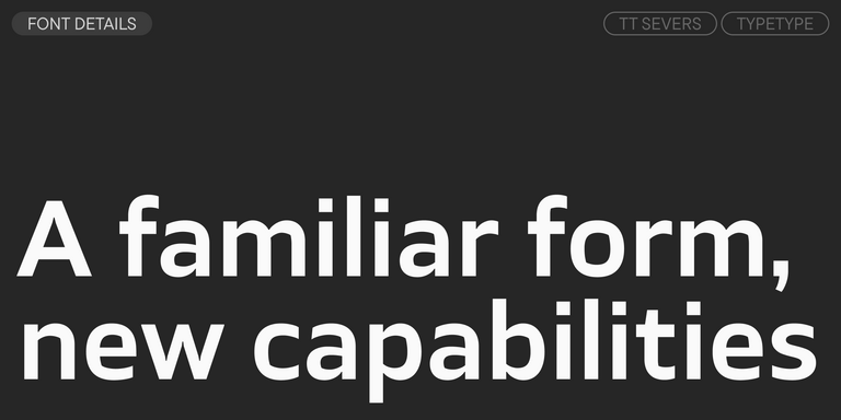
TT Severs is a geometric sans serif with emphasized elements of internal brackets. The main visual feature of TT Severs is the unusual form of internal ovals.

TT Jenevers Regular
14 font styles

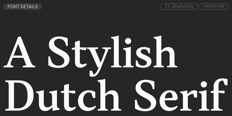
TT Jenevers is a modern serif with a Dutch flavor. The font family features the characteristic details peculiar to Dutch serifs—these are the asymmetrical shape of serifs and an irregular slant of ovals.

New
TT Regins Display Light
38 font styles

TT Regins is a Scottish modern serif. Striking contrast and sharp triangular serifs give this font a stern and commanding character, while refined forms, enlarged lowercase letters, and slightly condensed, static proportions add grace to its design.

Bestseller
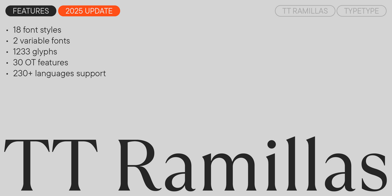
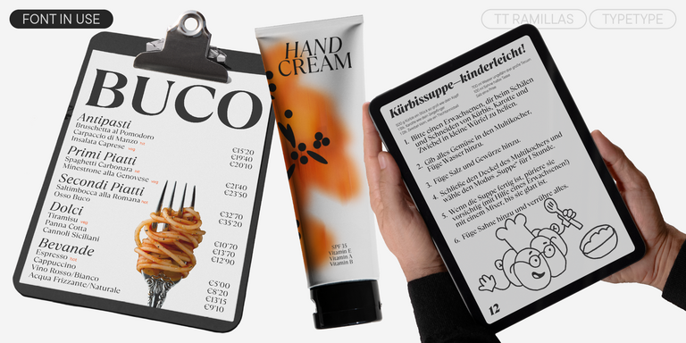
TT Ramillas Regular
28 font styles

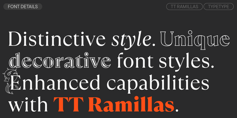
TT Ramillas is a contemporary serif with editorial versatility. It features decorative styles and ornamental initials with floral motifs.

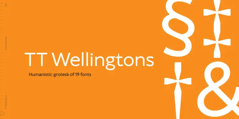
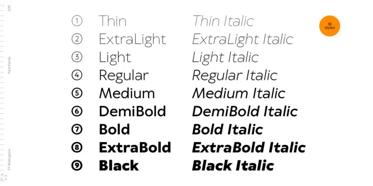
TT Wellingtons Regular
19 font styles

TT Wellingtons is an attempt to combine the style of English humanist sans serifs of the early 20th century with the requirements for modern geometric grotesques.

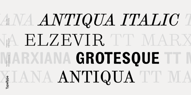
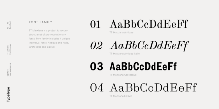
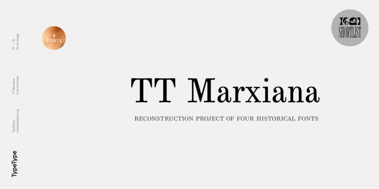
TT Marxiana Elzevir
4 font styles

TT Marxiana Elzevir is a title or header font and is a compilation of monastic Elzevir that were actively used in the Niva magazine for all its prints.

What Are Stylish Fonts For Facebook?

Here, the phrase describes typefaces selected for creating Facebook-related graphics, rather than one fixed visual style. Their suitability depends on the tone and composition of your artwork. This page presents design resources, not a generator for decorative profile names or copy-and-paste post text.
Which Industries Use These Typefaces Most Often?

Retail, hospitality, professional services, and creative businesses are useful examples of contexts for Facebook promotional graphics. No industry usage ranking is established here. Consider the communication task instead: announcing an offer, presenting a service, or sharing an event may each require a different typographic approach.

Can These Typefaces Be Used for Branding?

Yes, subject to an appropriate license. Establish consistent roles for headlines, supporting text, and recurring details, then test those choices alongside your existing imagery and colors. Reusing a considered typographic system across related graphics can support a coherent presence without requiring every composition to look identical.

What Should Be Considered When Pairing These Typefaces?

When pairing Stylish Fonts For Facebook, assign a clear purpose to each choice. Test headline and supporting-text treatments together in an actual graphic, checking contrast, hierarchy, and readability at the intended size. Avoid adding a second family unless it makes the message or structure clearer.

Can You buy TypeType Fonts for Commercial Projects?

Yes. TypeType provides a route to request or obtain a suitable commercial license and offers trial downloads for evaluation. Do not treat a trial as unrestricted commercial permission. Check current terms for your intended use, or contact the team through the website form for assistance.

Contact us!