


TT Livret
Text Regular
32 font styles



TT Livret is an elegant, modern and functional serif

TypeType’s selection of Fonts similar to Norman brings together seven candidates for comparison with your chosen reference. Start with the specimens, then assess which options preserve the qualities your project needs. Visual resemblance is one consideration; fitting your wording, layout, and intended reading size matters just as much when deciding which alternatives deserve a closer look.
This selection includes TT Bells, TT Ricordi Allegria, TT Ramillas, TT Tricks, TT Livret, TT Geekette, and TT Alientz. Treat Fonts similar to Norman as a starting point for evaluation rather than a ranking of identical substitutes. Open the individual specimens and product information to investigate each candidate in context. Keep your Norman reference alongside them so that differences are visible, not recalled from memory. A useful shortlist might include one option that appears close in its letterforms and another that works for the same layout despite a different appearance. Let that distinction guide your initial comparison.
A useful alternative can resemble a reference visually, serve a comparable design purpose, or do both. Those relationships are not interchangeable. Compare letter construction, relative widths, stroke contrast, spacing, and the balance between capitals and lowercase. Then step back: does the overall texture convey the feeling you need? A similar individual letter does not guarantee similar behavior across a paragraph. Conversely, a candidate with noticeably different details may still support the intended hierarchy. These are comparison criteria, not shared characteristics guaranteed across the selection. Identify which qualities matter before deciding whether a difference is helpful or distracting.
Branding, headlines, editorial pages, and digital layouts offer different settings in which to evaluate Fonts similar to Norman. For a brand concept, set the actual name and supporting message rather than relying on an attractive specimen word. Check whether the character remains coherent across a short signature and a longer announcement. In editorial work, compare a title, introduction, and representative paragraph to see how the proposed replacement affects hierarchy and reading rhythm. For digital layouts, examine the same content at the sizes and widths people will encounter. Watch for awkward wrapping, crowded navigation labels, or details that become difficult to distinguish. These exercises assess your project, not a claimed specialty of any listed candidate. Keep the surrounding imagery, colors, and spacing consistent during the first comparison so that typography remains the variable under review. Afterwards, adjust the layout to understand what each option needs.
Begin by identifying the exact Norman reference you intend to replace, including the version and appearance shown in your sample. Save a reference specimen and note the qualities you want to retain. Next, select a few candidates from this collection and set identical wording at the intended sizes. Include punctuation, numerals, and any characters your project requires. Compare both close details and the full composition; equal point sizes alone may not produce an equivalent visual scale. Test the strongest candidates in the actual layout, recording changes to line breaks, spacing, and hierarchy. Separate essential requirements from preferences so that resemblance does not outweigh usability. Before choosing, consult each candidate’s current product information for character coverage, available files, and any evaluation options. Review the applicable licensing information for your planned use. If a requirement remains unclear, resolve it before committing the design to production.
TT Livret is an elegant, modern and functional serif
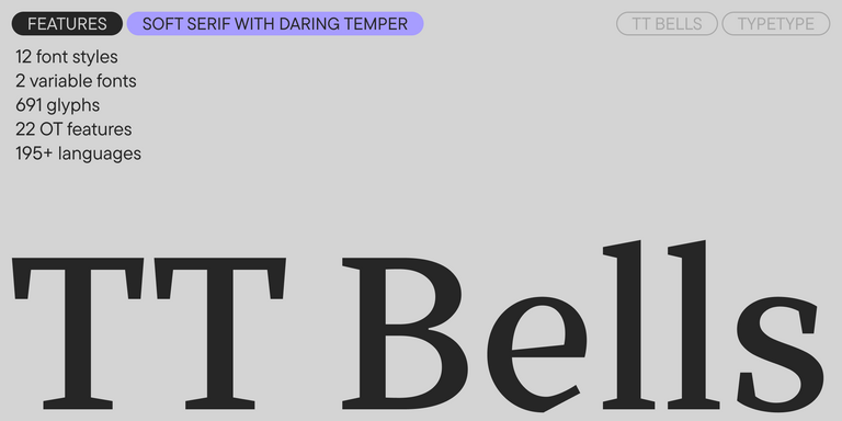

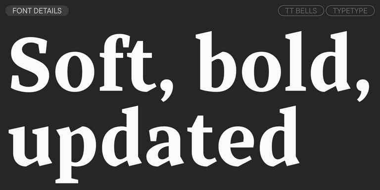
TT Bells combines the elegant softness of Antiqua with a complex and daring temper reflected in straight stroke terminals and arrowheaded serifs. The typeface is based on the broad nib, which creates these hallmark terminals and serifs.
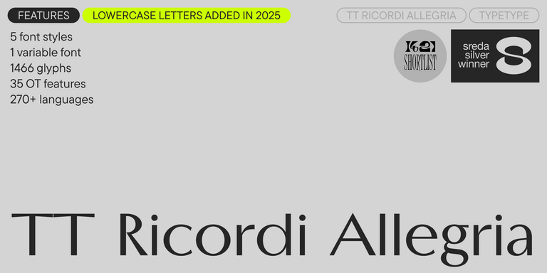
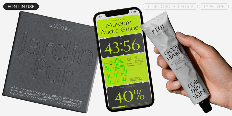
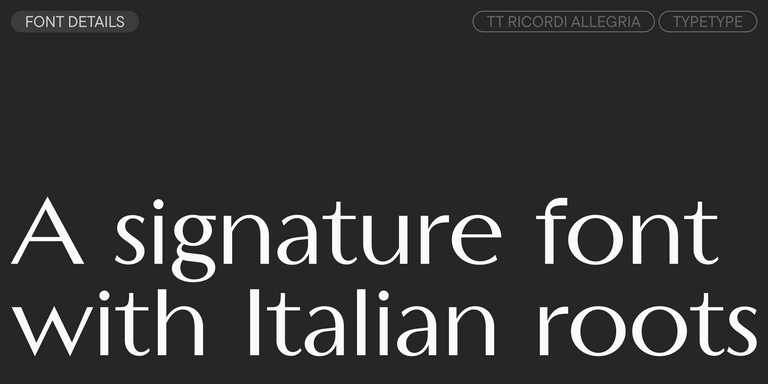
TT Ricordi Allegria is a sleek and intelligent contemporary Florentine grotesque.
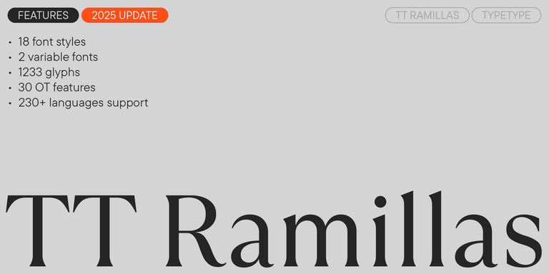
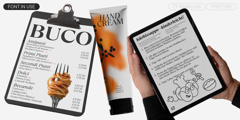
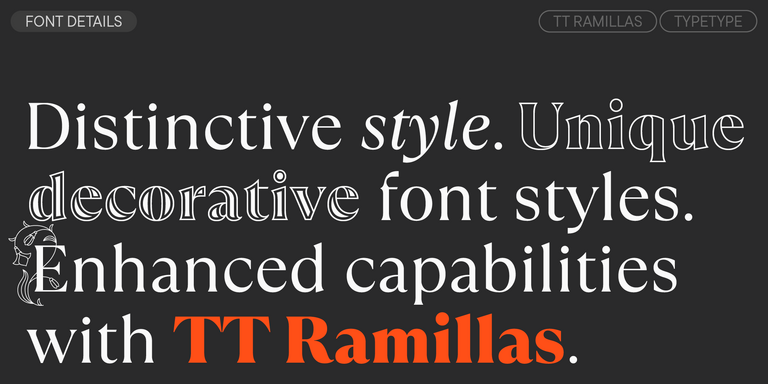
TT Ramillas is a contemporary serif with editorial versatility. It features decorative styles and ornamental initials with floral motifs.
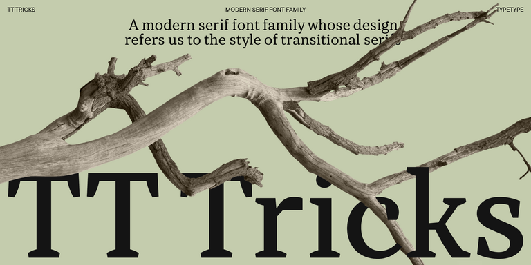
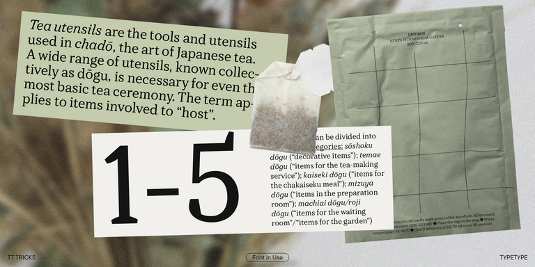
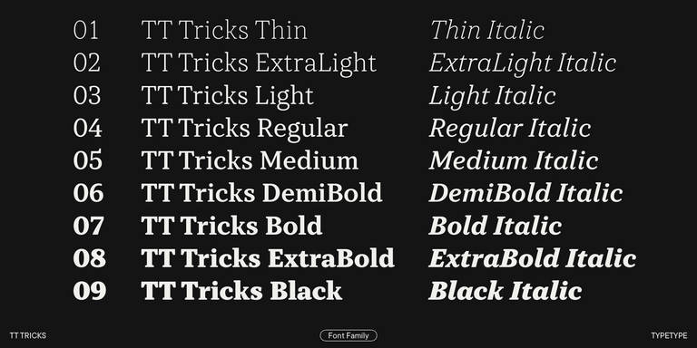
TT Tricks is a modern text serif with a design reflecting the style of Transitional serifs. This font has a calm, elegant, and moderately stern character.
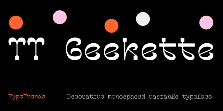
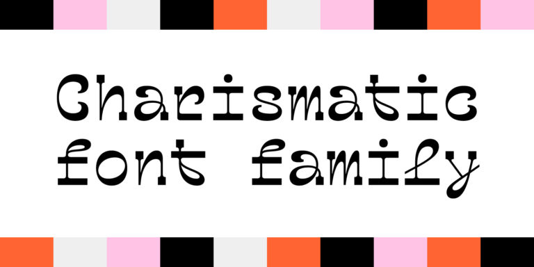
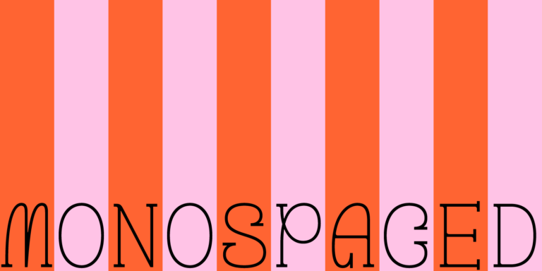
TT Geekette is an experimental variable serif with friendly and flexible character of shapes.
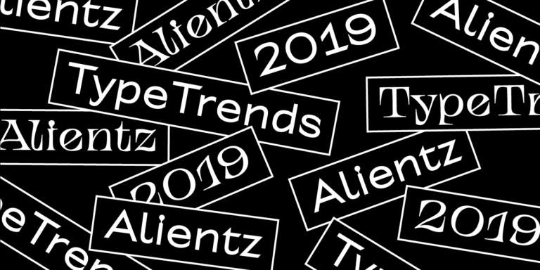
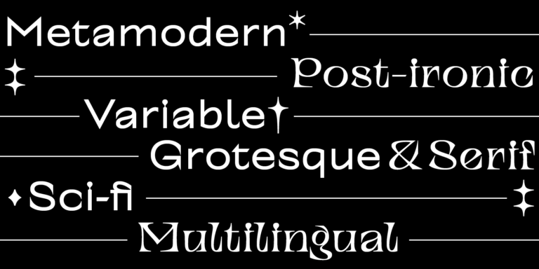
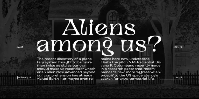
TT Alientz is a variable typeface that allows the user to make a visual journey from an extraterrestrial grotesque to a very prickly display serif.
They are alternatives considered because they may resemble a Norman reference or support a comparable design task. Relevant traits to assess include letterforms, proportions, spacing, and overall appearance. Inclusion in this selection does not establish identical shapes or guarantee that a replacement will preserve existing line breaks.
Industry alone is not a reliable basis for choosing an alternative, and this selection does not establish adoption by sector. Whether your project concerns publishing, retail, or digital services, evaluate the audience, intended tone, reading conditions, and application requirements using representative content from the actual design.
Assess a candidate with the actual brand name, tagline, and supporting text before committing to it. Compare its behavior in a logo concept and broader layouts, including smaller applications. Visual suitability and permission are separate questions, so also check the applicable licensing terms for your intended use.
When pairing Fonts similar to Norman, test the shortlisted option beside your supporting typeface in a realistic hierarchy. Compare apparent size, visual density, spacing, and readability. Seek enough contrast to distinguish roles without creating competing focal points, then review headings and paragraphs together at their intended sizes.
Use each candidate’s TypeType product page and current licensing information to check purchasing options, trial availability, and permitted commercial uses. Trying a typeface is not the same as having permission to deploy it. Confirm that the applicable terms cover your planned application before publishing or distributing the design.