top_banner_ttnormspro0426
Type foundryFonts & StylesKlein

Fonts similar to Klein

Fonts similar to Klein can preserve its geometric clarity or offer a different approach to the same brief. Klein combines Futura-inspired construction with humanist touches and grotesque details. This selection covers understated options for everyday typography and more expressive display faces. Start with the role you need to replace, then compare proportions, texture, and readability in your own layouts.

Similar to: Klein

Fonts similar to Klein for Everyday Typography

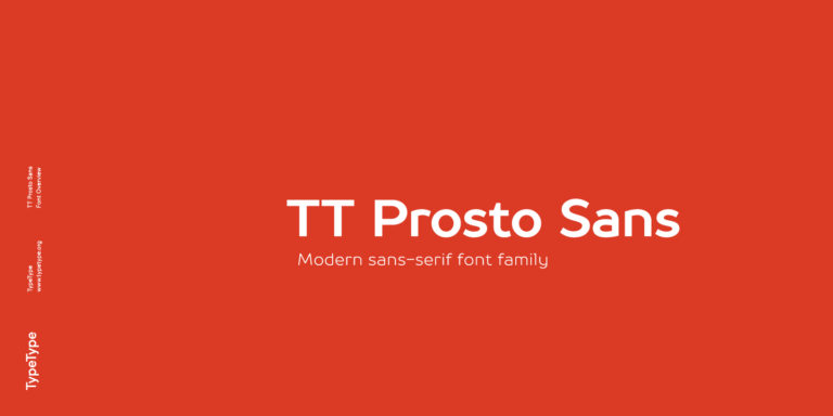
Fonts similar to Klein are worth separating by function before comparing individual letters. For an understated geometric direction, start with TT Norms® Pro and TT Commons™ Pro. Both are geometric sans serifs; their neutral base styles make them sensible candidates when the brief spans headings and longer reading. TT Prosto Sans offers another route through open grotesque forms and a straightforward character. These are alternatives to evaluate, not identical reproductions. Consider whether the replacement should preserve Klein’s restrained tone or introduce a change in personality. A corporate identity may benefit from continuity, while a redesign can accommodate a more noticeable departure.

Expressive Alternatives for Headlines and Campaigns

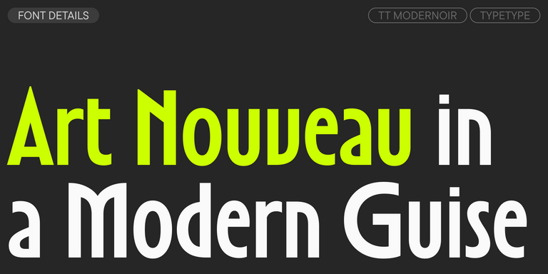
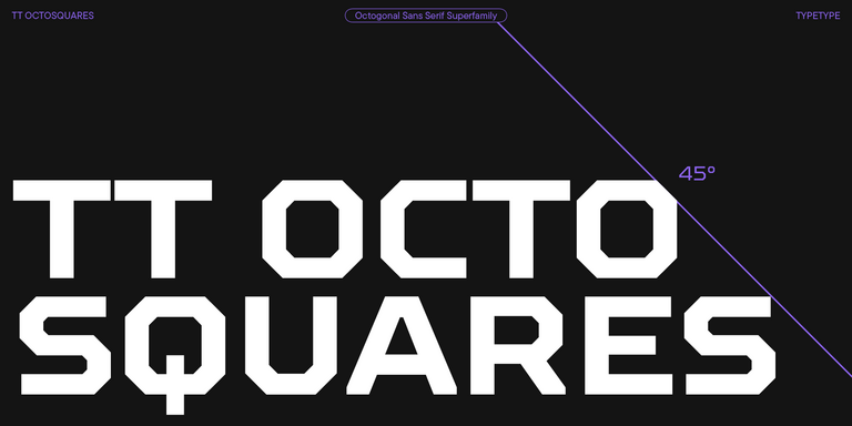
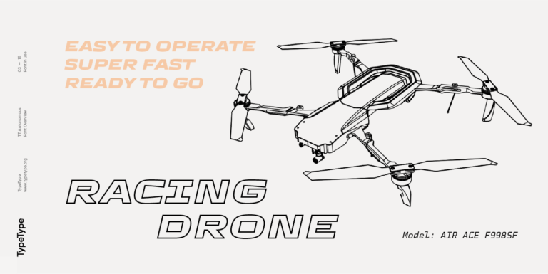
For posters and campaigns, consider a more deliberate departure from Klein’s restrained character. Fonts similar to Klein on this page include several expressive display options. TT Runs brings irregular character proportions, while TT Modernoir introduces fluid lines and Art Nouveau influences. TT Octosquares takes an octagonal, futuristic direction, and TT Autonomous uses wide, angular forms with a technological character. Choose these when changing the mood matters more than preserving an existing typographic system. Give distinctive shapes room to work, keep supporting copy quieter, and judge the result alongside photography, illustration, and the overall composition.

How to Compare Fonts similar to Klein in Real Layouts

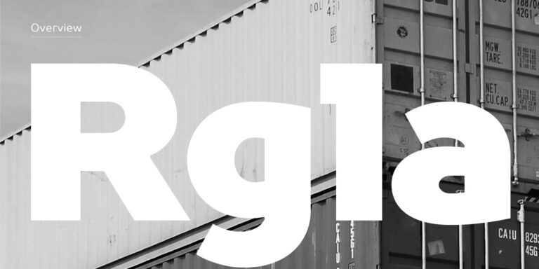
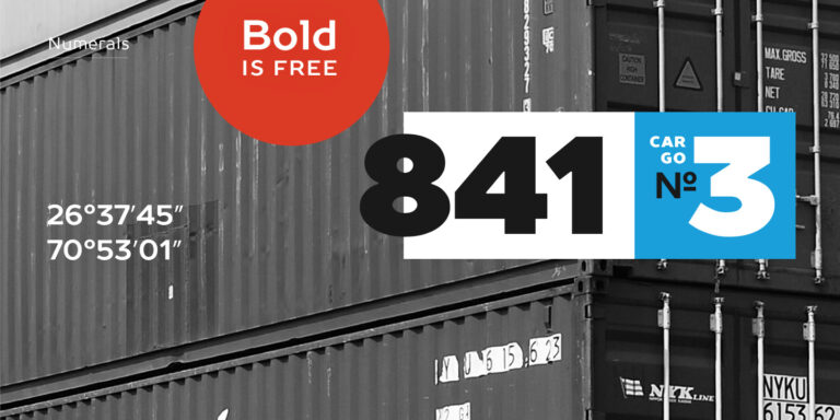
Klein has separate display, text, and condensed versions, with a higher x-height in the text version for smaller sizes. Fonts similar to Klein should therefore be tested against the particular subfamily you are replacing. Begin with equivalent roles rather than matching weight names alone. Set a paragraph, a short heading, navigation labels, and a string of prices. Compare lowercase height, character width, spacing, and the balance of round and straight forms. Examine a, g, R, and numerals, then check punctuation and any accented characters your project requires. Keep the layout constant for an initial comparison, but adjust size and leading when assessing comfortable reading. For an existing website or publication, review changed line breaks and text overflow before committing. A convincing replacement should handle ordinary content as well as a carefully chosen specimen. Include the lightest and boldest styles you actually need, plus italics wherever emphasis is part of the design.

Test and License Fonts similar to Klein

Use this collection to build a shortlist, then open each family’s page to review available styles, character coverage, and testing options. Choose the styles your project needs rather than assuming a complete family is necessary. Download trial versions for evaluation and client mockups before purchasing a commercial license. A trial is not permission to publish finished work. Plan licensing around the actual deliverables: printed materials, a public logo, live website text, and application embedding may require different permissions. TypeType lists Desktop, Logo, Webfont, and App licenses separately. For projects involving several channels, check each intended use instead of treating one purchase as universal coverage. Also establish who will install the files and whether a client or contractor needs access. Resolve these details before handover so the approved typography can be used throughout production. Keep the selected styles and usage requirements together with the project’s design specifications.

  • The quick brown fox jumps over a lazy dog.
  • Pack my box with five dozen liquor jugs.
  • Sphinx of black quartz, judge my vow
  • 0123456789 !?.,:;—–()[]{}<> “quotes” ‘apostrophe’ @#%&*_+=/\| № $ € £ ₽ +−×÷=≠≤≥ … % © ® ™
  • Aa Bb Cc Dd Ee Ff Gg Hh Ii Jj Kk Ll Mm Nn Oo Pp Qq Rr Ss Tt Uu Vv Ww Xx Yy Zz
Leading
1.1
Tracking
0px
Bestseller
TT Norms® Pro Regular
104 font styles

The bestseller TT Norms® Pro—a geometric sans serif, trouble-free workhorse

Bestseller
104 font styles

TT Commons™ Pro is a completely redesigned version of the well-established classic font family TT Commons.

TT Runs Regular
19 font styles

TT Runs is a very stylish and charismatic display sans serif with irregular proportions of some characters.

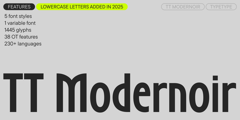
TT Modernoir Regular
6 font styles

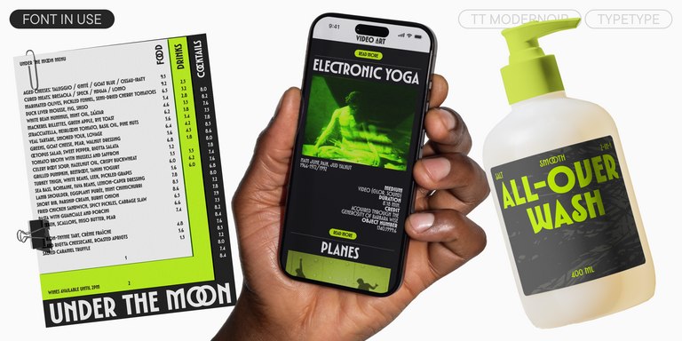
TT Modernoir is a display sans serif with dynamic proportions. Fluid lines and delicate Art Nouveau forms in this typeface blend seamlessly with the rhythmic flow and improvisational freedom of jazz.

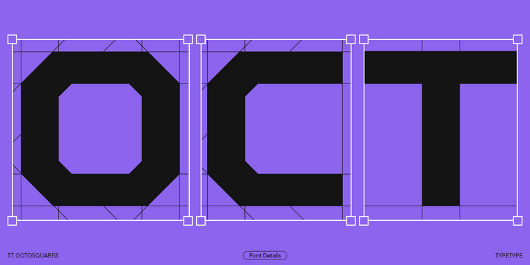
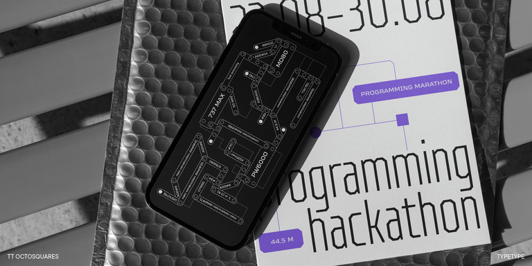
TT Octosquares Regular
73 font styles

TT Octosquares is a fresh, revised, expanded, and significantly improved version of our first commercial font TT Squares & its narrow version.

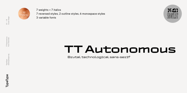
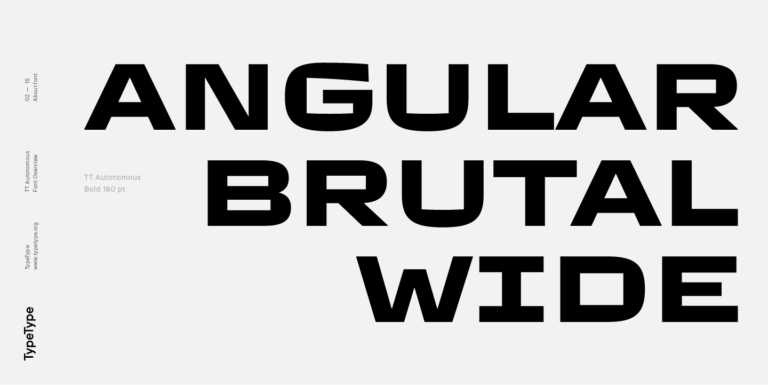
TT Autonomous Regular
32 font styles

TT Autonomous is a modern techno sans serif with wide angular proportions.

TT Prosto Sans Regular
20 font styles

TT Prosto Sans is a font family for any tasks. You can use this font almost everywhere.

What Are Klein Alternative Fonts?

Fonts similar to Klein are alternatives considered for a comparable geometric style or design task. The category includes both restrained workhorse families and expressive display options. Similarity does not guarantee identical letterforms, spacing, language coverage, or line breaks when replacing an existing design.

Which Industries Use These Typefaces Most Often?

Consider them for technology branding, retail packaging, publishing, hospitality, and cultural projects. The right choice depends less on an industry label than on the content: a booking interface needs clear small text, while an exhibition poster can support a more distinctive headline.

Can Klein Alternatives Be Used for Branding?

Yes. Fonts similar to Klein can support an identity across a wordmark, packaging, presentations, and digital layouts. Decide whether typography should feel neutral or expressive, then define a manageable set of styles. Assess the name alongside longer messaging rather than approving the identity from a logo alone.

What Should Be Considered When Pairing Klein Alternatives?

Give each typeface a distinct role. A restrained geometric sans can support an expressive serif headline; an unusual display face usually needs quieter body copy. Compare apparent size, stroke weight, and paragraph texture, and avoid combining similar designs unless the difference serves a clear purpose.

Can You Buy or Download TypeType Fonts for Commercial Projects?

Yes. Commercial licenses are available through TypeType, while free trial versions are intended for evaluation rather than finished commercial work. Choose permissions that cover your intended use and check the relevant terms before publication. Downloading a trial does not grant commercial usage rights for final deliverables.

Contact us!