The German marketing analytics platform Adjusthas addressed TypeType with a request to customize the TT Norms® Pro font. Adjust provides services for company development all around the world.
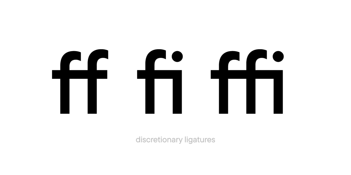
They were completely satisfied with the license for TT Norms® Pro they purchased, but one inconvenience resurged in the testing process: standard ligatures of the font were turned on by default, which turned out to be inconvenient for Adjust while using the basic version of the font.
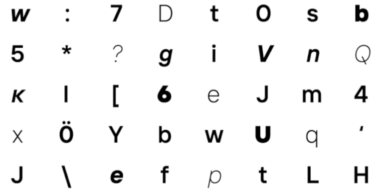
The company wanted the text set in TT Norms® Pro to look crisp without turning the ligatures on.
Such a task is no problem for TypeType because a client’s comfort while using our fonts should be at the maximum. TypeType’s technical specialists moved TT Norms® Pro ligatures from the standard ligatures feature into the discretionary ligatures one. Our team made the ligatures unavailable by default in all font faces, but if necessary they could still be turned on.
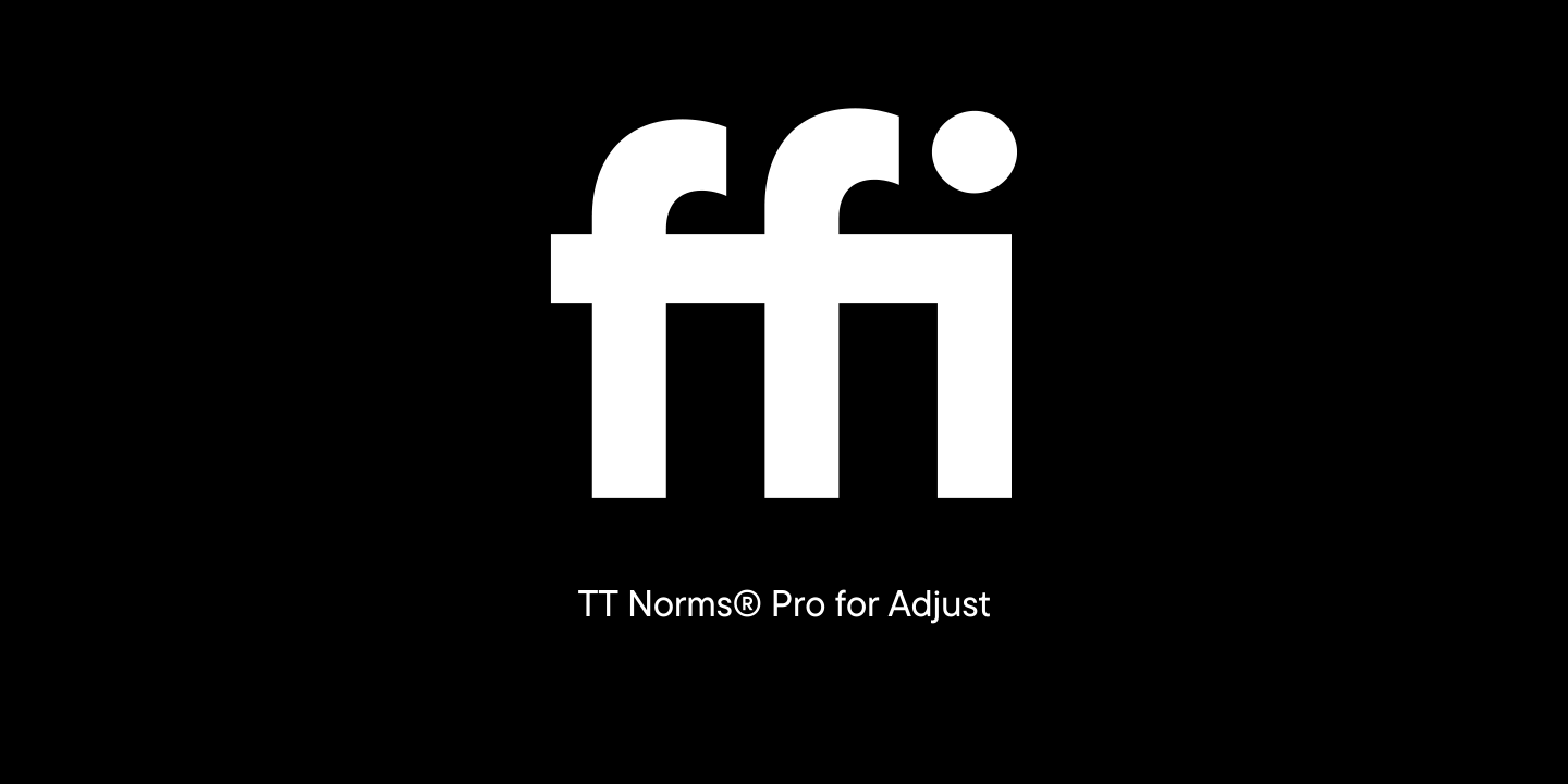
The customized version of TT Norms® Pro with the changed order of ligature display was then sent off to Adjust. The font has become more convenient for the company with the alternative display of glyphs on the screen and they could now use TT Norms® Pro to the fullest.
Below you can see what the changes to the font looked like:
While we often discuss letters in our articles, numbers in typography typically receive less attention. However, this topic is fascinating and more complex than it might appear at first glance. That’s why we’ve dedicated this article entirely to numerals! In this article, you’ll learn about different types of numerals, their purposes, the unique characteristics of each style, and where to find them in fonts.
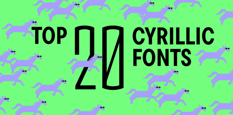
Finding high-quality and original Cyrillic fonts can be challenging, as the market primarily offers typefaces with Latin support. However, at our studio, we emphasize broad language support—particularly in our typefaces that support numerous Cyrillic-based languages. In this article, we’ve compiled a selection of functional and modern fonts with Cyrillic support from TypeType’s collection, suitable for various projects.
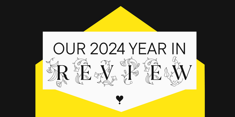
2024 has been an incredibly productive and significant year for TypeType. We released new fonts and updated existing ones, received awards, made our website more user-friendly, and shared knowledge about font design. In short, this year brought us numerous changes, and now it’s time to look back, reflect on our achievements, and outline plans for the future.
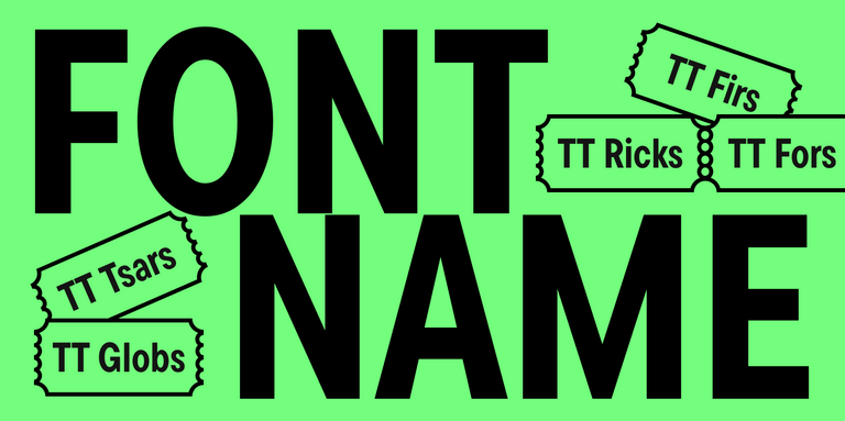
We often get asked how typeface designers come up with names for their fonts. It’s not as straightforward as it might seem, as each studio and individual designer has their unique approach. In this article, we’ll explore different aspects of font naming—from creative considerations to legal implications.
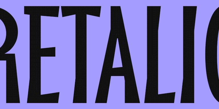
Many of our readers are undoubtedly familiar with the term “italic” as we frequently discuss these slanted and cursive fonts in our articles. However, the term “retalic” might be unfamiliar even to those well-versed in typography. Let’s explore this unique font style and its applications in modern design.
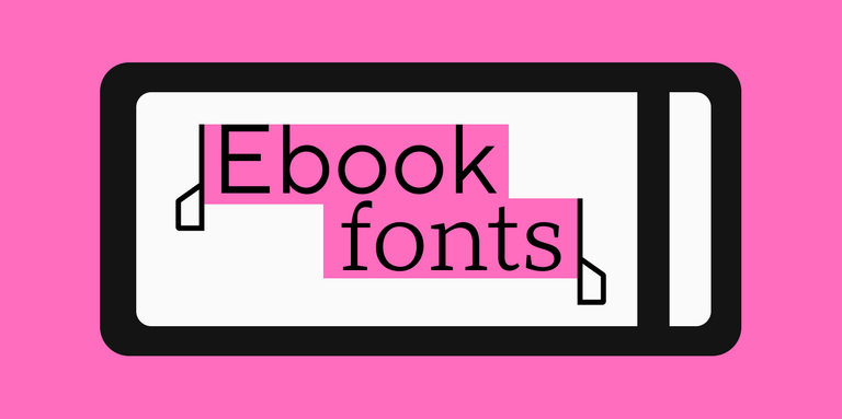
Choosing the right font for an ebook might seem like a simple task at first glance, but it actually requires a careful approach and consideration of several nuances. After all, digital media differs significantly from print. What exactly should you pay attention to? And how do you select the best font for reading ebooks? We’ll explain it all in this article!
Cursive fonts are a powerful design tool that can elevate your visual projects when used thoughtfully. However, the key is knowing how to apply them effectively and appropriately. In this comprehensive guide, we’ll dive into the world of cursive fonts. You’ll learn what defines a cursive font, how it differs from traditional italic styles, and discover the most strategic ways to incorporate these unique typefaces into your design work.
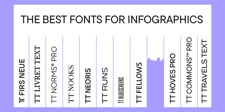
Infographics is a versatile and convenient tool that finds application everywhere: business, advertising, science, journalism, and more. This is a powerful way to communicate information in a simple, visual manner. Why is it so essential to choose the right font for your infographic, and how to do this? How do you pair fonts with each other? What fonts work best for marketplace infographics? Read on to find out!
Wide and narrow fonts are among the newest trends in typography, graphic design, and web design. At first glance, some may seem odd and awkward, but when thoughtfully applied, they can infuse a project with freshness, boldness, relevance, and strength. What are narrow and wide fonts, what variations do they come in, and where are they used? Let’s explore this together in this article.
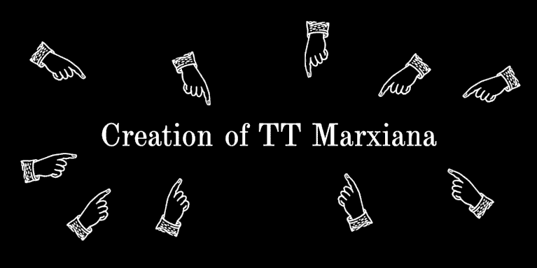
TT Marxiana is a pre-revolutionary font reconstruction project. These fonts were used in the layout of the “Niva” (nee-vah, “Cultivated field”) magazine published by the A. F. Marx publishing house in Saint Petersburg. In our project we decided to focus on a very specific set of fonts that were used in preparation and printing of the “Niva” magazine in 1887 — Antiqua, Antiqua Italic, Grotesque, and the Elzevir.
We decided to try to tell you about the creation of a complex font family TT Interphases at independent font foundry. We hope you enjoy our story and discover something interesting and new.