Explore TypeType's Fonts similar to Vogatron Collection
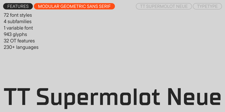
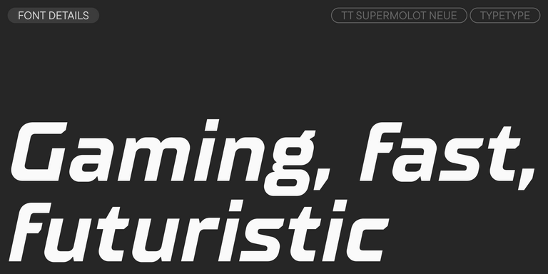
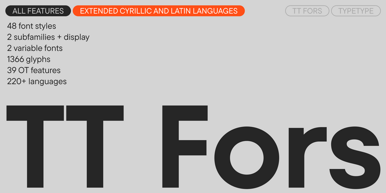
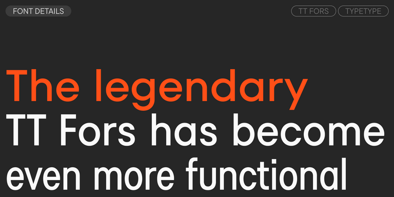
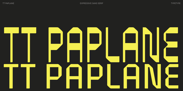
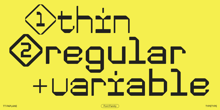
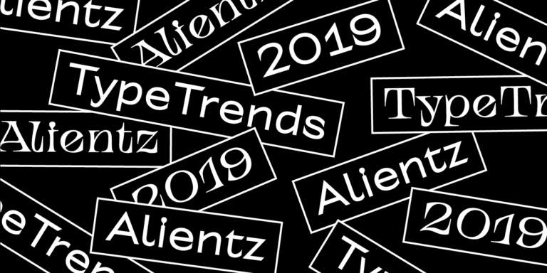
The candidates on this page are TT Neoris Pro, TT Supermolot Neue, TT Bluescreens Pro, TT Hoves Pro, TT Fors, TT Paplane, and TT Alientz. Fonts similar to Vogatron should be assessed individually, without assuming that their position in a list indicates a closer match. Open each family’s page and look at its specimens before narrowing your selection. Keep two questions separate: does the lettering resemble your reference, and does it solve your design problem? A candidate can be useful for one reason without satisfying the other. Record those differences so your shortlist reflects deliberate choices rather than first impressions.
What Makes Fonts similar to Vogatron Fonts Distinct
Similarity depends on which version of Vogatron you are comparing and which characters appear in your design. Set identical wording at comparable visible sizes, then examine letter width, proportions, curves, terminals, and internal spaces. Follow with spacing and the rhythm of whole words: similar individual letters can still produce a different texture across a line. Compare uppercase and lowercase separately when both matter to the project. These are evaluation criteria, not promised shared features of the listed families. Decide which details carry the reference’s identity and which differences you can accept before treating any candidate as a convincing replacement.
Where Fonts similar to Vogatron Fonts Are Used
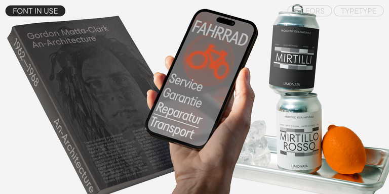
Branding, editorial headlines, and promotional layouts provide different settings in which to evaluate Fonts similar to Vogatron. For a wordmark, focus on the particular letter sequence and whether its silhouette communicates the intended tone. For an editorial heading, examine line breaks, emphasis, and the relationship with surrounding text. In promotional work, assess the message alongside imagery, color, and available space rather than judging an isolated specimen. These are testing contexts, not claims of established use for any listed family. A close visual resemblance may be less valuable if the replacement changes a headline’s fit or weakens the hierarchy. Conversely, a visibly different candidate may serve the same communication goal more effectively. Try your shortlist in representative applications, including the smallest and largest settings you expect to use. The result should support both the desired impression and the practical demands of the layout.
How to Choose a Fonts similar to Vogatron Font for Your Project
Start by identifying the exact reference version and collecting representative text from your project. Include names, numerals, punctuation, and any required language characters rather than relying on a short sample. Next, compare candidates from this collection at intended output sizes, using consistent conditions for the initial assessment. Move the strongest options into actual layouts and test them with your supporting typeface. Note changes to line length, spacing, hierarchy, and readability before making adjustments. Then inspect the selected family’s information to verify available variants, character coverage, and any technical requirements relevant to delivery. Check current ordering options and licensing terms separately from visual suitability. If a trial is available, confirm its permitted uses before testing it. Finish by documenting why the chosen candidate works: preserving a specific detail, fitting the composition, or meeting a communication need is a more useful basis for selection than an unsupported closest-match label.