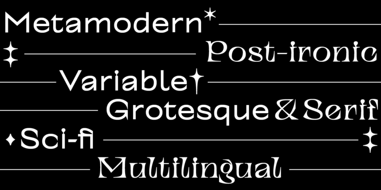
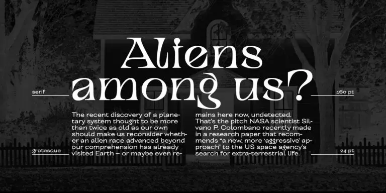
Explore TypeType’s Collection of Fonts similar to Slussen
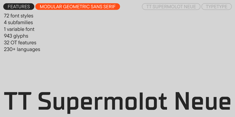
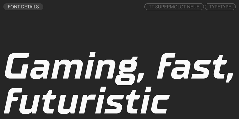
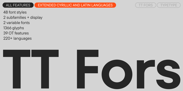
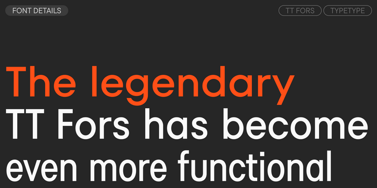
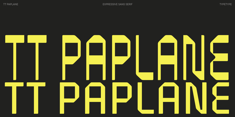
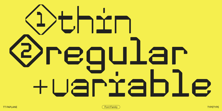
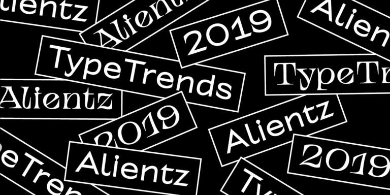
The selection includes TT Supermolot Neue, TT Bluescreens Pro, TT Hoves Pro, TT Fors, TT Paplane, and TT Alientz. Treat these Fonts similar to Slussen as candidates to examine, not as interchangeable replacements or a ranking of closeness. An alternative might appeal because of its letterforms, its proportions, or how it handles a particular composition. Another may offer a different appearance while answering the same brief. Begin by comparing a representative headline and paragraph across the six families. This gives you a starting point for deciding which candidates deserve a closer look in the context of your project.
What Makes These Alternatives Distinct
Similarity is easier to judge when the comparison stays consistent. Set identical wording at comparable sizes, then examine letter shapes, relative widths, spacing, and the overall texture of each specimen. When evaluating Fonts similar to Slussen, separate individual details from the impression of a complete line or paragraph. A resemblance in a few characters does not necessarily produce the same rhythm throughout a layout. Conversely, a visibly different candidate may still support the intended tone and hierarchy. Keep notes on what changes and whether those changes help your design, rather than treating every difference as a reason to reject an option.
Where Fonts similar to Slussen Are Used
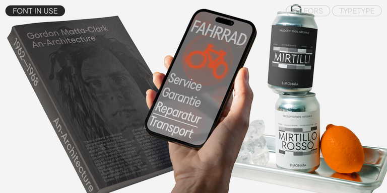
Brand identity, headings, and longer passages provide different testing contexts for Fonts similar to Slussen. For an identity project, place a candidate in representative applications: a brand name, a short message, and supporting information. Look for a consistent voice without assuming that a successful wordmark guarantees equally effective reading text. For headings, use the actual line lengths and available space; a change in proportions can alter wrapping and emphasis. For longer passages, inspect paragraph texture, punctuation, and comfort at the intended reading size. These are evaluation scenarios, not guarantees about any listed family. A publisher, retailer, or service business can use the same comparison process, but the audience and communication task should determine the decision. Assess the complete composition, including imagery and surrounding text, so that an attractive isolated specimen does not become the only basis for choosing a replacement.
How to Choose Fonts similar to Slussen for Your Project
First, write down what you want to retain: the mood of a reference, the amount of text that fits, or the relationship between headings and supporting copy. Use the collection to build a shortlist against those priorities. Next, set the same project text in each candidate and compare it within an unchanged layout. Include difficult content such as long names, numerals, punctuation, and any required accented characters. Then test the full hierarchy alongside your intended companion typeface, adjusting sizes and spacing only after the initial comparison. Before committing, check the selected family’s product information for the required character coverage, available variants, and file formats. Review applicable trial and license terms for your intended use. Keep the final specimens together with your notes: a decision grounded in actual project material is more useful than a general claim that one alternative is the closest.