TT Modernoir
Regular
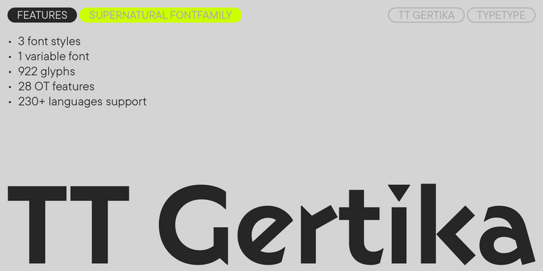
6 font styles
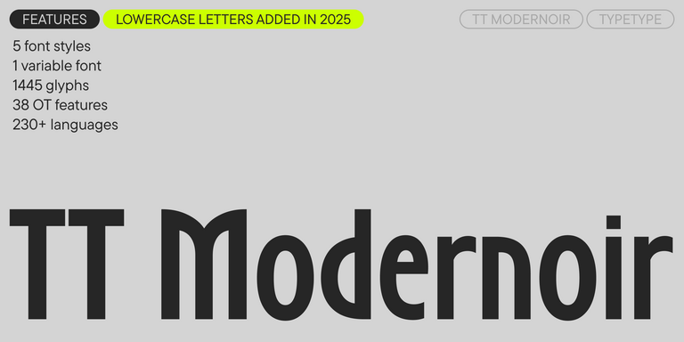
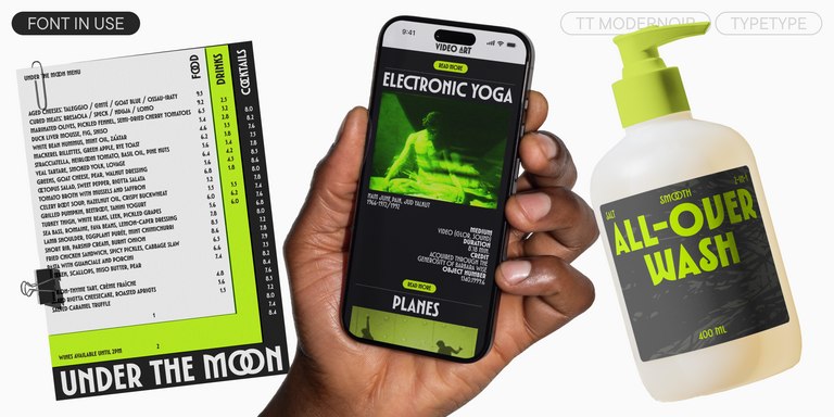
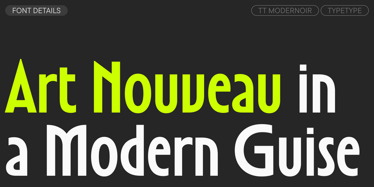
TT Modernoir is a display sans serif with dynamic proportions. Fluid lines and delicate Art Nouveau forms in this typeface blend seamlessly with the rhythmic flow and improvisational freedom of jazz.