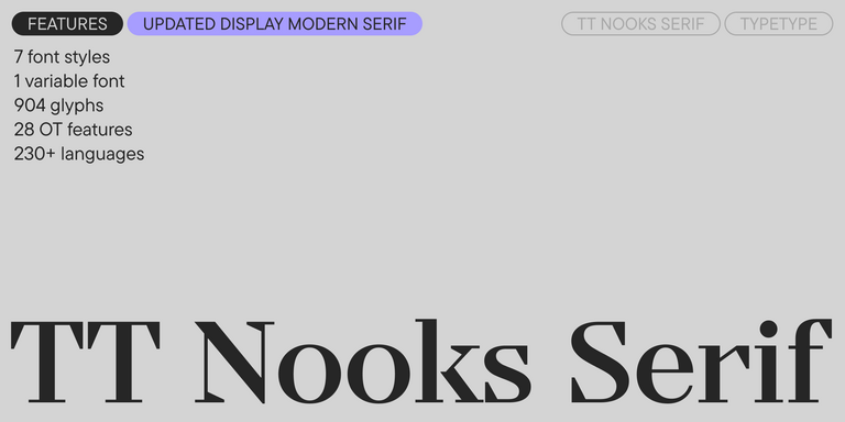
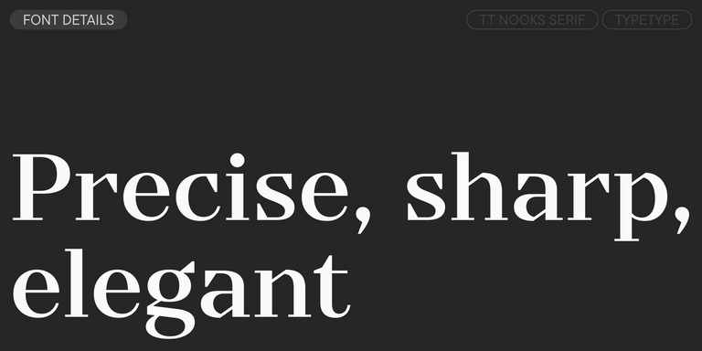
TT Nooks Serif is a display modern serif with a slight touch of egocentricity. It has a sharp and firm, yet elegant and stately character.
Fonts similar to Morella
Character, proportion and mood decide whether a replacement feels right, and a name alone rarely tells you that. This page gathers Fonts similar to Morella from the TypeType range: seven families that share a category, a task or a general feeling with the original while bringing their own details. Compare them in your own layouts and choose the one that keeps the intended tone of the project.
- All fonts 78
- Sans Serif 46
- Serif 21
- Slab Serif 6
- Display 44
- Script 9
- Variable 49
- Font sale 12
What Makes Fonts similar to Morella Distinct
A close alternative is defined by more than surface resemblance. Designers usually weigh several things at once: whether a typeface belongs to the same category, how its proportions sit on the page, how much contrast its strokes carry, and which small details give it personality. Mood matters as much as geometry. The Fonts similar to Morella gathered here cover a spectrum. Some sit near the original in category and purpose, while others share only a task or a general feeling and stand apart through distinct proportions or detailing. That range gives you room to match closely or to refresh the look deliberately.
Where Morella Alternatives Are Used
Brands aimed at audiences who notice visual clichés are often the first to look for a replacement. When a familiar typeface starts appearing on every shelf and screen, switching to a less common design helps a company keep its voice recognisable. Studios reach for Fonts similar to Morella when refreshing an identity without losing its established mood, when designing packaging that must stand out in a crowded category, or when setting headlines for campaigns and editorial layouts. In each scenario, the aim is continuity of feeling combined with a detail that feels new.
How to Choose From Fonts similar to Morella for Your Project
Start by testing candidates side by side in real content. Set a headline, a paragraph and a short caption, then look at the results at the sizes your project will actually use. This shows quickly which of the Fonts similar to Morella holds the tone you need and which only resembles it at display scale. Next, check the practical side on each family page. Confirm that the weights and variants cover your hierarchy, from bold headings to lighter supporting text. Review language support if the project runs in several markets, since a missing character set can stop a rollout. Make sure the available file formats suit your workflow for print, web or apps. Finally, read the license scope before committing. A logo, a website, a mobile app and printed packaging may each call for different coverage, so match the terms to your real usage.
Explore TypeType's Fonts similar to Morella Collection
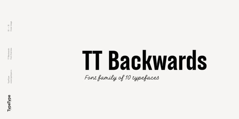
This selection brings together seven TypeType families: TT Nooks Serif, TT Backwards, TT Knickerbockers, TT Polls, TT Berlinerins, TT Milks and TT Lovelies Script. Each was chosen because it relates to the original through category, purpose or overall impression, yet none is meant as a copy. Treat the list as a shortlist to evaluate rather than a ranking. Browse the individual pages to see specimens, character sets and the full range of weights before narrowing your choice. Placing two or three candidates into the same mockup often reveals differences that are hard to spot in isolation: the rhythm of a line, the way capitals behave in a logotype. Once a favourite emerges, the same page lists the formats and license options available for it, so you can move from testing to production without leaving the TypeType site.
- The quick brown fox jumps over a lazy dog.
- Pack my box with five dozen liquor jugs.
- Sphinx of black quartz, judge my vow
- 0123456789 !?.,:;—–()[]{}<> “quotes” ‘apostrophe’ @#%&*_+=/\| № $ € £ ₽ +−×÷=≠≤≥ … % © ® ™
- Aa Bb Cc Dd Ee Ff Gg Hh Ii Jj Kk Ll Mm Nn Oo Pp Qq Rr Ss Tt Uu Vv Ww Xx Yy Zz
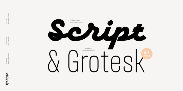
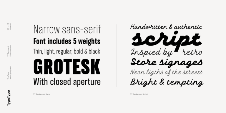
TT Backwards Sans is a narrow grotesque, which takes us back to the book design of late 70s and early 80s with its ductile characters.
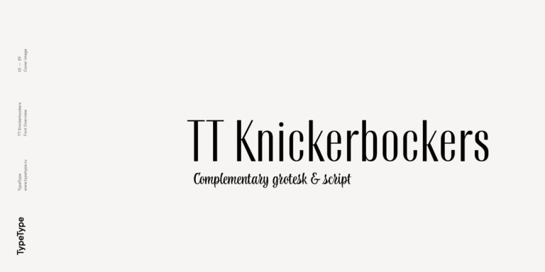
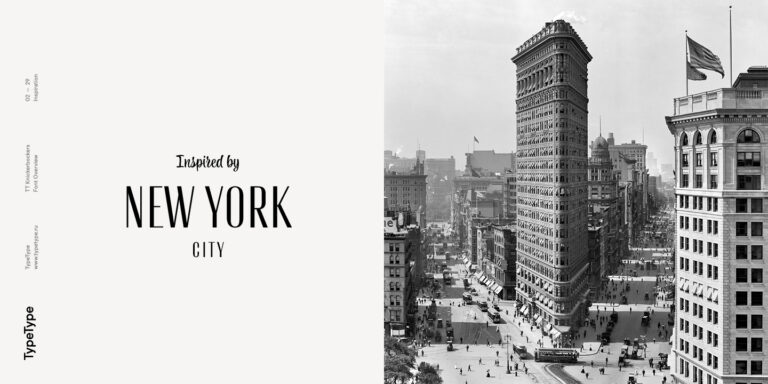
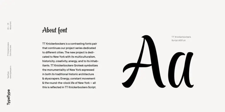
TT Knickerbockers Grotesk is a narrow contrast sans serif with characteristic elements sending us back to the 19th century in New York.
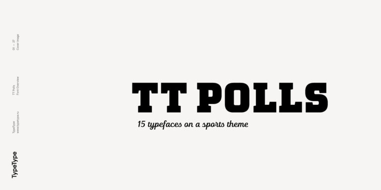
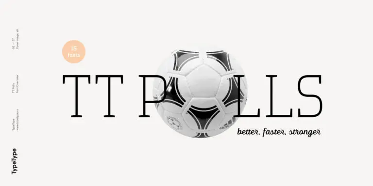
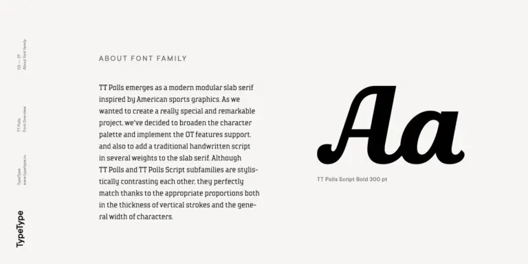
TT Polls is the modern modular slab serif family for using in sports-related design.
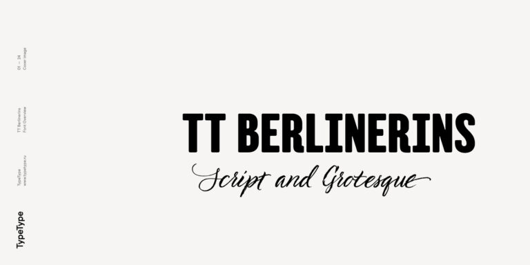
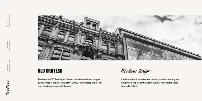
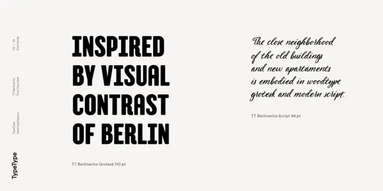
TT Berlinerins is a grotesque inspired by the wood-type poster types of the first third of the 20th century is responsible for the historic component of Berlin.
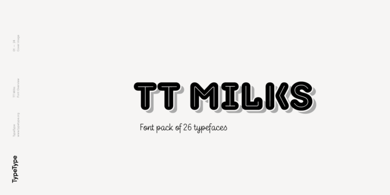
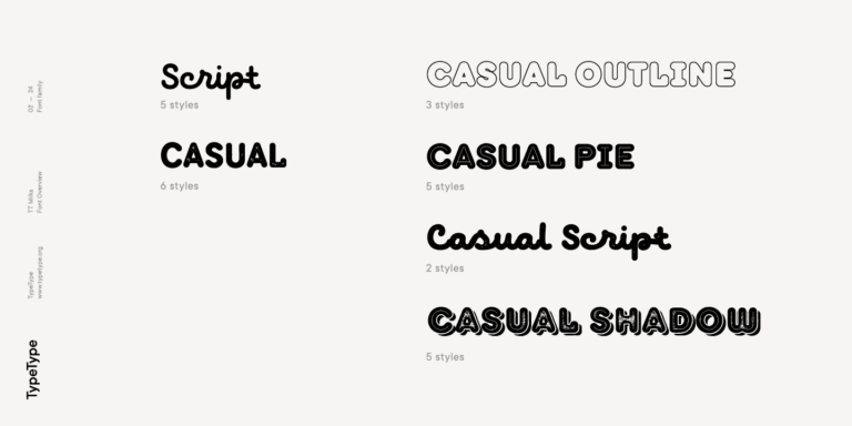
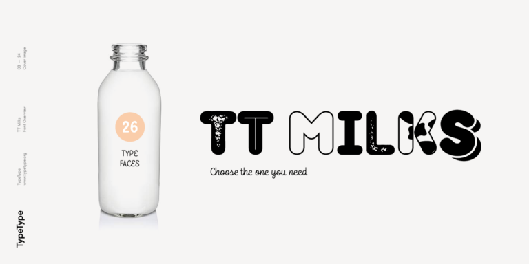
TT Milks is a Collection of typefaces for branding
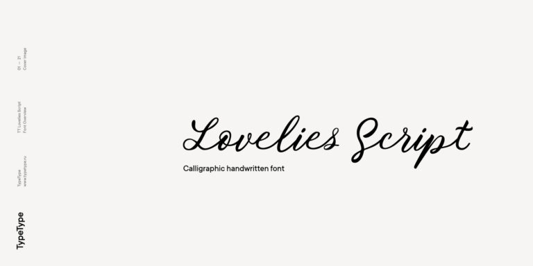
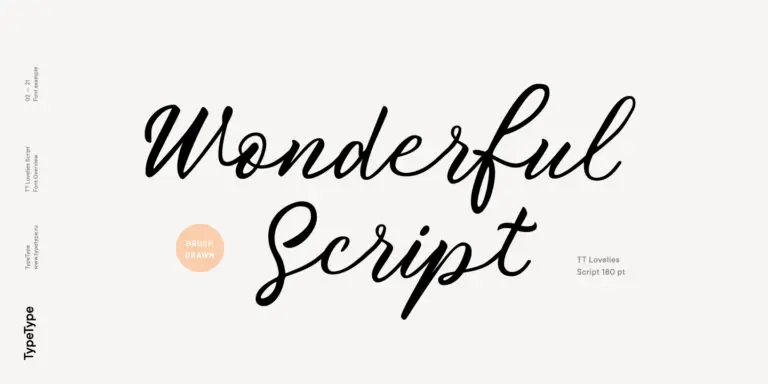
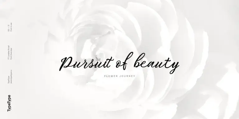
Without any false modesty, we can say that TT Lovelies Script is one of the most complicated projects we have ever carried out—there are 1115 glyphs, more than 2000 contextual alternates, 10000 kerned pairs, and a large number of OT features, including ligatures and Old Style numbers.
What Are Fonts similar to Morella?
They are typefaces that share a category, mood or typical use case with Morella while contributing details of their own. A good alternative keeps the overall impression a design relies on, yet differs enough in proportions or finishing touches to make the work feel fresh and less predictable to its audience.
Which Industries Use Morella Alternatives Most Often?
Suitability depends on the character of each family and on the needs of a specific project. Branding, packaging, publishing and advertising are common areas where designers test such replacements, especially when a familiar look has become overused. Try each candidate in your own materials to confirm it fits the sector and audience.
Can Morella Alternatives Be Used for Branding?
Yes. A less common typeface can help a brand look less generic while keeping a comparable tone. Test it in a logo, headlines and running text to see how it performs across touchpoints, and check that the license covers logo creation and the commercial channels where the identity will appear.
What Should Be Considered When Pairing Morella Alternatives?
Aim for clear contrast. When one of the Fonts similar to Morella carries headlines, pair it with a calmer companion for text, or create distinction through weight rather than adding many families. Limiting a layout to two typefaces usually keeps hierarchy readable, and testing pairs in real content confirms that their proportions work together.
Can You Buy TypeType Fonts for Commercial Projects?
Yes. Each family listed here has its own TypeType page with details on trial versions, available formats and license options. Review the terms there to match your intended use, whether print, web, apps or branding, and choose the license that covers your project before putting the typeface into production.