


TT Espina
Regular
7 font styles
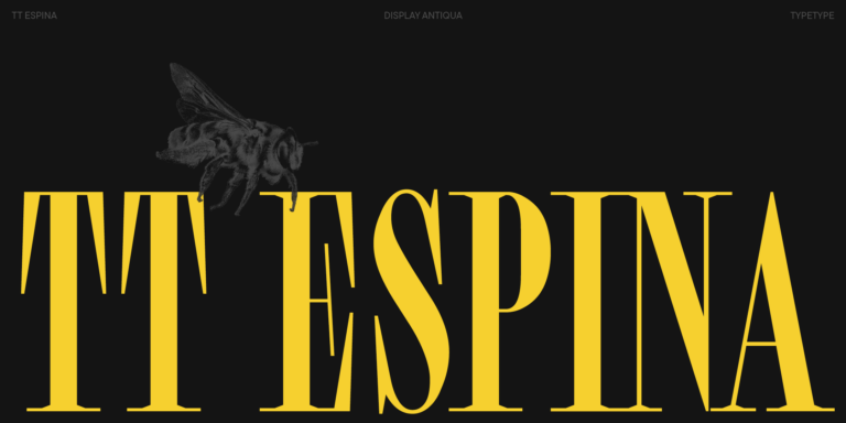
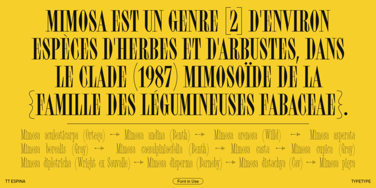
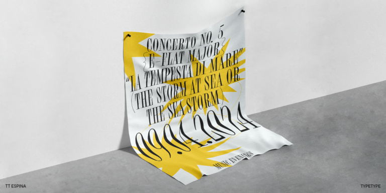
TT Espina is a display antiqua with expressive serifs

The Locket Fonts selection brings together five TypeType families with contrasting approaches to shape, rhythm, and detail. Explore expressive serifs, rounded lettering, and angular designs for your next identity, publication, or packaging brief. Compare the options by the role they need to play, whether that is a distinctive title, a short product name, or readable supporting text.
Three serif families establish the more decorative side of Locket Fonts. TT Espina combines narrow proportions with high contrast and pronounced serifs, offering a starting point for a compact, expressive headline. TT Tsars draws on eighteenth-century book titling and uses small capitals in place of lowercase, so consider it for titles and short inscriptions rather than conventional paragraphs. TT Geekette takes another direction: it combines monospaced construction with flexible curves, while variable controls can alter contrast and remove serifs. Choose among these approaches according to the wording and tone of the piece, not decoration alone.
Not every project calls for decorative serifs. Within Locket Fonts, TT Rounds Neue offers a soft, rounded sans serif direction, with lighter styles that feel restrained and heavier weights that become noticeably fuller. Its family supports both headings and running text. TT Mussels provides an angular counterpoint through octagonal construction and a technological character, while also being designed to handle longer passages. A stencil version adds a separate option for display work. Try the rounded approach for an approachable product identity, or test the angular one when the brief calls for sharper, more technical lettering.
Assess Locket Fonts with more than a single display word. Build a sample that includes the longest heading, a paragraph, prices, dates, and any abbreviations your project requires. Begin with the size at which each element will actually appear. Check whether fine strokes remain visible, whether counters stay open, and whether adjacent letters are easy to distinguish. For a label, proof the artwork at its intended printed dimensions; for a website, review narrow screens and realistic content lengths. Pay particular attention to language coverage: inspect the accented characters, punctuation, and currency symbols you need rather than relying on a broad language count. When combining families, decide which handles headlines and which carries detailed information. Match their apparent size and visual weight, then adjust line spacing. A useful pairing should keep the reading order clear even before photographs, color, or other graphic elements are added to the page.
Browse the collection to compare previews, then open a family page for its available styles, character set, and OpenType features. Download a free trial for layout testing and client presentations; evaluation access does not permit finished commercial use. Before purchasing, list the actual deliverables and choose licenses that cover them. TypeType offers separate Desktop, Logo, Webfont, and App options, so a printed package, a public wordmark, and live website text should not be treated as the same use. Select the styles needed for production rather than automatically buying every weight. Establish who will install the files and whether contractors or clients will need access. Check these requirements against the relevant terms before handing over editable artwork. Keep the approved style names, license details, and installation requirements with the project documentation, so the design team and client know what is available for ongoing work.
TT Espina is a display antiqua with expressive serifs
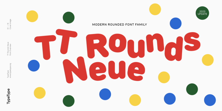
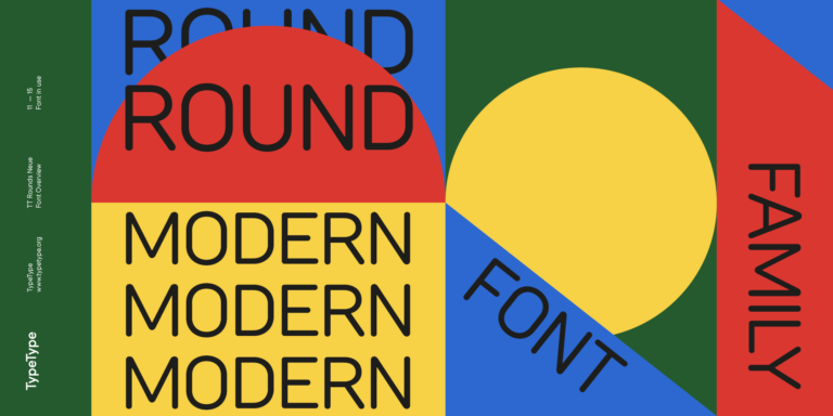
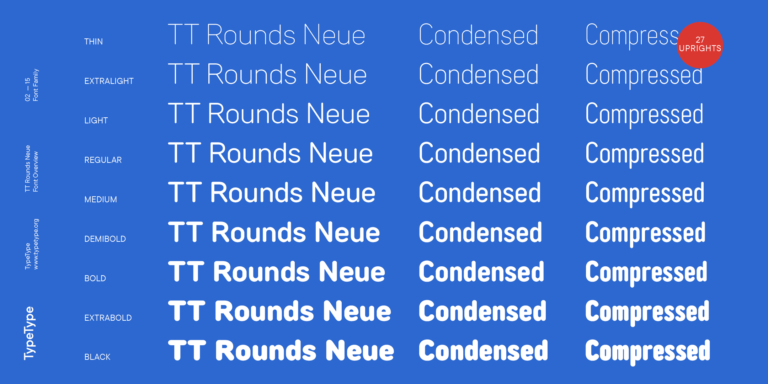
TT Rounds Neue soft, friendly, rounded sans serif fontfamily
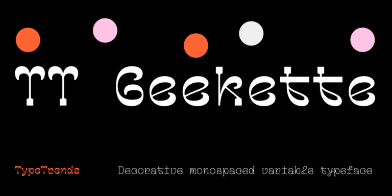
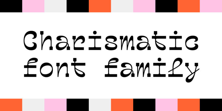
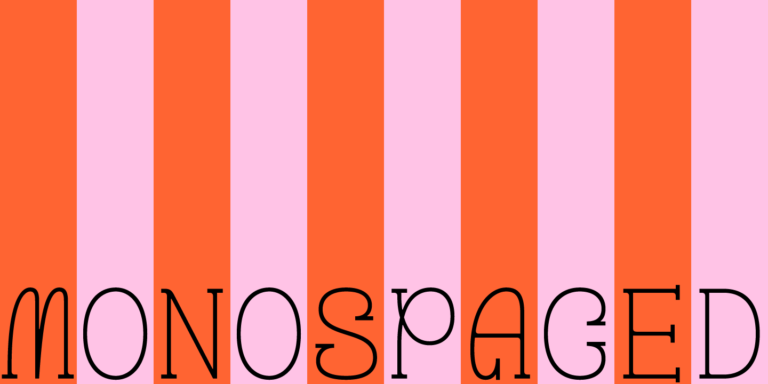
TT Geekette is an experimental variable serif with friendly and flexible character of shapes.
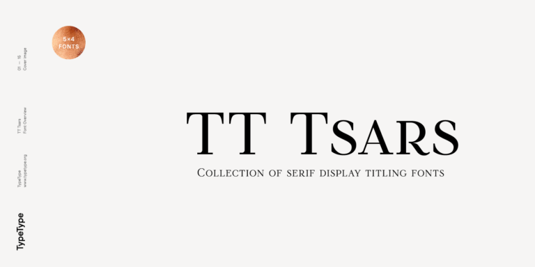
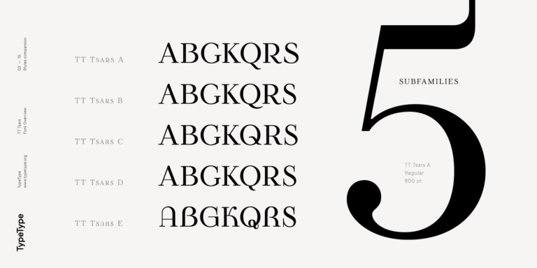
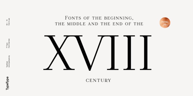
The TT Tsars font family is a collection of serif display fonts that are stylized to resemble the fonts of the beginning, the middle, and the end of the XVIII century.
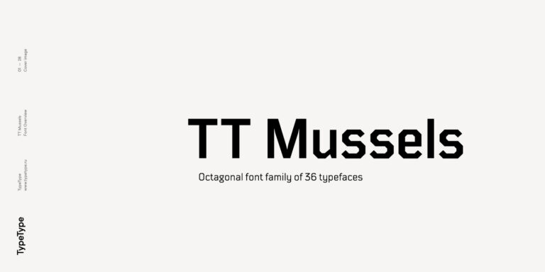
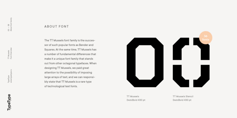
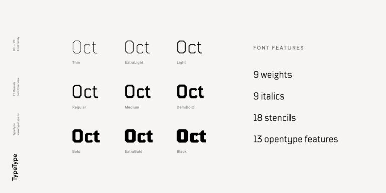
When designing TT Mussels, we paid great attention to the possibility of imposing large arrays of text, and we can state that TT Mussels is a rare type of technological text fonts.
These are five independent TypeType families presented under the Locket catalog tag. The selection covers several design approaches rather than one shared visual style. Each family has its own styles and character set, so the tag should not replace a closer look at individual specimens.
Consider these designs for publishing, food packaging, hospitality, children's products, and technology branding. Choose the family around the audience and information hierarchy: a historical book cover, a playful snack label, and a technical brochure call for different typographic decisions, even within this selection.
Yes, with the appropriate commercial permissions. Test the business name, product range, and supporting messages before committing to a style. An identity needs more than a striking wordmark: establish how typography will work on packaging, presentation slides, small labels, and customer-facing documents.
Start with contrast in construction, then check compatibility in weight and apparent size. Keep a distinctive display face for short passages and choose a calmer companion for detailed information. Limit competing features; hierarchy should come from size and spacing as well as letterforms.
Yes. Free trials let you evaluate a family before purchasing, but commercial publication requires an appropriate license. Choose the required styles and intended uses on the product page. Check the terms for installation, embedding, and any access needed by your client or production partners.

Indigo Design Award is a globally recognized award dedicated to groundbreaking digital design. Spotlighting excellence in UX/UI, mobile apps, web interfaces, and digital solutions, it provides award-winners validation from top-tier experts while setting new benchmarks for emerging designers.

Granshan is the world’s foremost design contest for non-Latin typography. Celebrating writing systems like Cyrillic, Arabic, Greek, and Indic scripts, this unique initiative serves as a global platform for preserving and evolving letterforms beyond the Latin alphabet.

As one of the design world’s most coveted accolades, the Red Dot Design Award recognizes excellence in three key areas: industrial design, brand communication, and conceptual innovation. Separate expert juries—featuring leading designers, professors, and specialists—curate each category with exacting standards.