


TT Livret
Text Regular
32 font styles



TT Livret is an elegant, modern and functional serif

TypeType’s Ebert Fonts collection brings together TT Globs, TT Livret, TT Ricordi, TT Knickerbockers, and TT Corals. Start with these five families, then examine each one against your project’s visual and practical requirements. Available trials let you evaluate candidates, while TypeType’s design and client-care teams can help with questions about selection and the appropriate license.
The five families listed here offer a starting point for comparing typefaces within TypeType’s Ebert tag. TT Globs, TT Livret, TT Ricordi, TT Knickerbockers, and TT Corals are separate candidates to examine, not interchangeable recommendations. Begin with the family that interests you, then review the others before narrowing your selection. Look at specimen text alongside the available family details, keeping your intended application in mind. Membership under this label is a way to navigate the selection; it should not be taken as evidence of an affiliation, a shared origin, or a particular visual relationship.
Ebert serves as the label for this selection, rather than a typographic classification that establishes how every member looks. Assess the individual designs instead of assuming that their names indicate particular proportions, shapes, or moods. In specimens, examine letter construction, spacing, and the rhythm of words across a line. These are useful comparison criteria, not promised characteristics shared by all five families. Keep your test text consistent so that differences remain easy to judge. A clear comparison should help you describe what attracts you to a candidate and whether that quality supports your intended message.
Project and brand design are the starting points for evaluating this selection. Rather than choosing by industry label alone, consider what the typography needs to communicate and where people will encounter it. A brand presentation, for example, can provide a useful test setting without implying that any listed family is already used by a particular business. Place a candidate into representative layouts and check whether it supports the intended tone, reading order, and balance with imagery. If your project involves both prominent wording and supporting text, assess those roles separately. Try realistic amounts of copy instead of relying only on a short sample that looks appealing in isolation. Include long names, brief labels, and other content that reflects the actual brief. The aim is to establish suitability through your own application, not to treat the Ebert tag as a guarantee of performance across sectors or formats.
Work through the collection with a short checklist based on your brief. First, review specimens and verified family details, noting the options relevant to your intended use. Next, shortlist candidates and compare them in the same layouts, with the same wording and comparable settings. This makes your decision easier to explain to colleagues or clients. Use the available trials to investigate questions that specimens alone cannot resolve, following the applicable trial terms. Record what works and what needs further checking rather than selecting solely from an attractive preview. Before committing, confirm that the appropriate license covers your intended use; trial availability is not a substitute for that confirmation. If family selection or licensing remains unclear, contact TypeType’s design or client-care team through the website form. Bring a concise description of the project and your questions so the conversation can focus on the decision you need to make.
TT Livret is an elegant, modern and functional serif
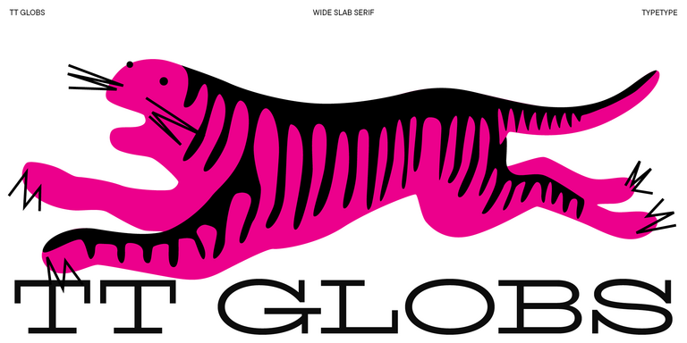
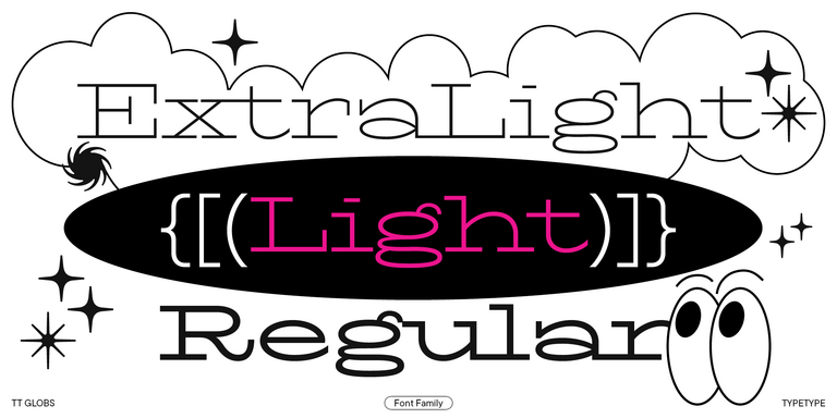
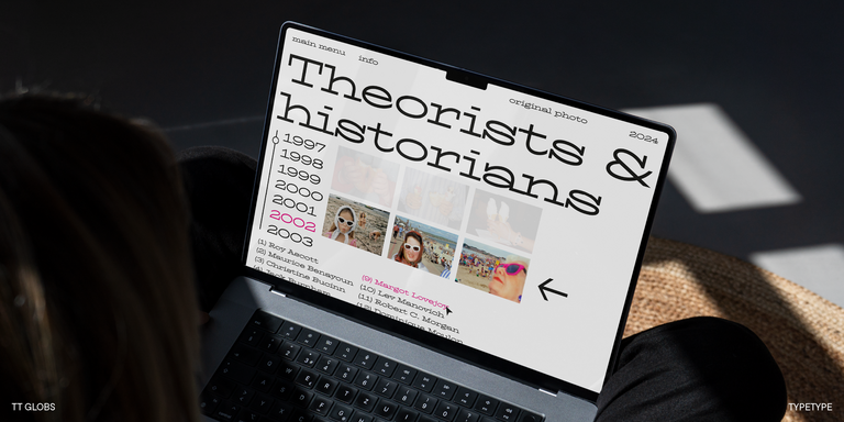
TT Globs is the first font from the TypeType Starter Kit line.
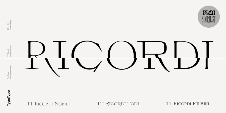
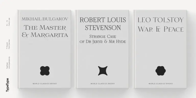
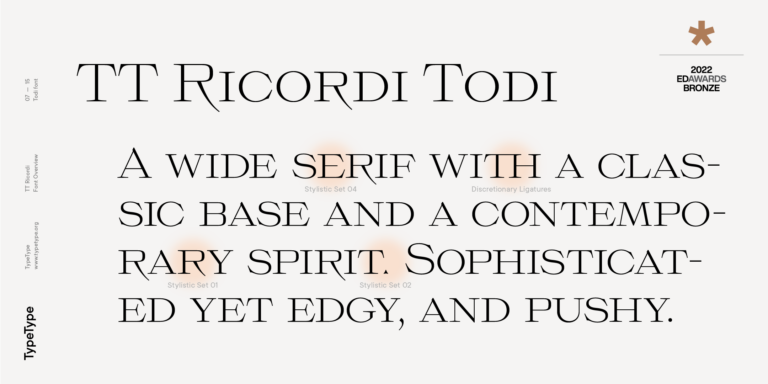
The TT Ricordi font family is a collection of three display heading serifs.
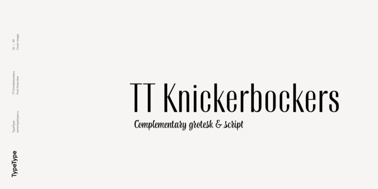
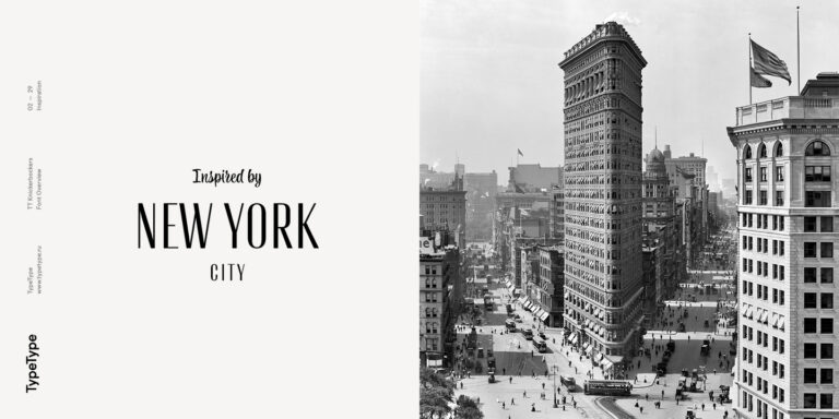
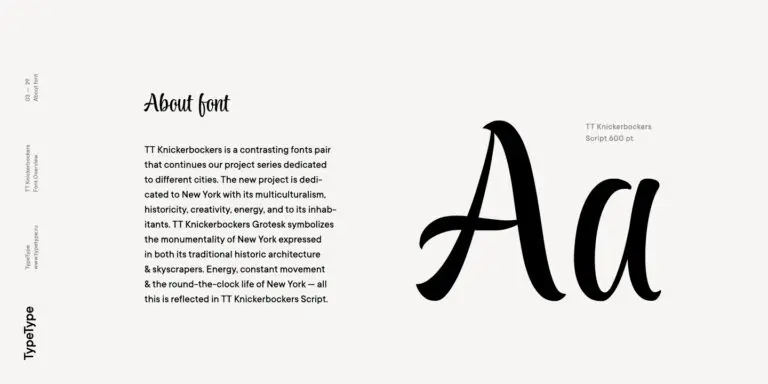
TT Knickerbockers Grotesk is a narrow contrast sans serif with characteristic elements sending us back to the 19th century in New York.
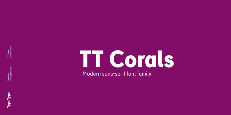

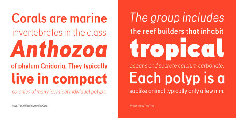
TT Corals is a modern humanistic sans serif which has many typical traits of the beginning of the 20th century. For an increased functionality of the font family, we`ve created 6 styles of various weights.
This is the label for a TypeType selection containing TT Globs, TT Livret, TT Ricordi, TT Knickerbockers, and TT Corals. Treat it as a browsing category, not a definition of shared visual traits. Review each family individually to understand its appearance and relevance to your brief.
The category does not establish which industries use these families most often. Industry fit is better assessed through the communication needs of an individual project. Consider the audience, intended tone, and reading conditions, then test a candidate in representative layouts before deciding whether it is suitable.
You can evaluate the listed families for brand design by comparing them with the brand brief and representative applications. Check whether the typography conveys the intended character and creates a consistent hierarchy. Confirm the appropriate license before commercial use; inclusion here does not establish endorsement by any brand.
When pairing Ebert Fonts with another typeface, test hierarchy, contrast, and coherence in the actual layout. Give each choice a clear role, then check whether readers can distinguish headings from supporting copy. Judge combinations using realistic content rather than assuming that two families belong together because they share a tag.
TypeType accepts requests for an appropriate commercial license and offers trial downloads for evaluation. Check the current terms for your intended use rather than treating a trial as unrestricted commercial permission. For help with selection or licensing questions, contact the design or client-care team through the website form.