Fonts similar to Comic Opera JNL: Key Characteristics
Comic Opera JNL is a wide, bold sans serif with Art Deco influences, developed from lettering on a 1930s WPA performance poster. The family includes upright and oblique styles. Fonts similar to Comic Opera JNL can retain that broad silhouette without recreating its historical character. For a period-inspired theatre announcement, the lettering’s atmosphere may be essential; for contemporary packaging, width and visual weight might matter more. A geometric alternative can support the second brief while changing the first. Establish whether the project needs a recognizable retro treatment or simply a strong display voice before choosing between the available directions.
TypeType Alternatives for Different Design Directions
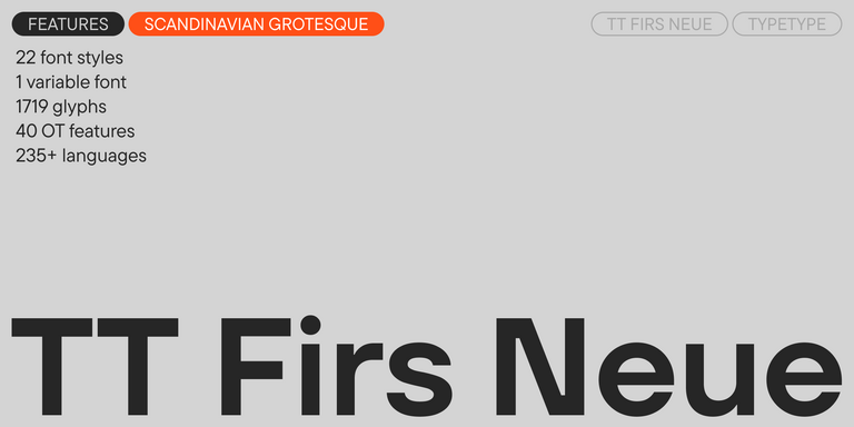
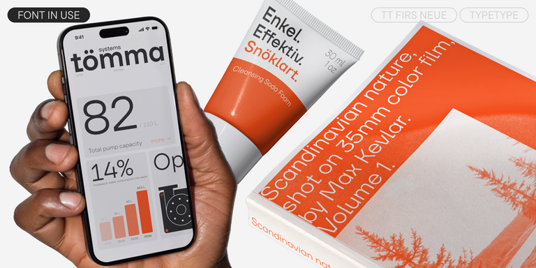
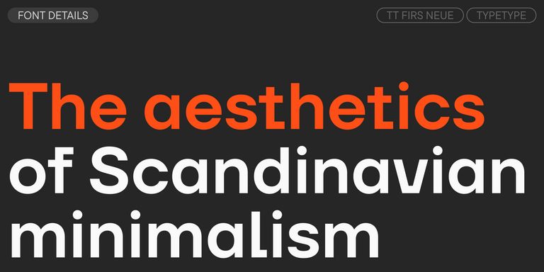
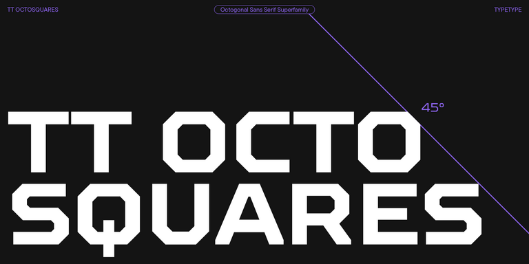
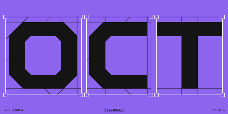
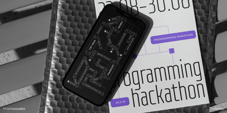
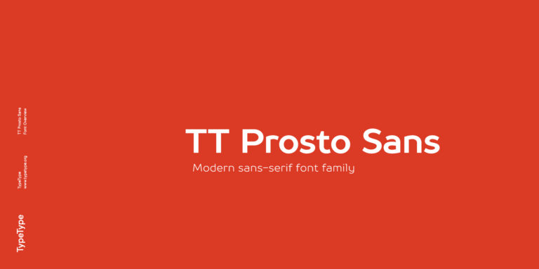
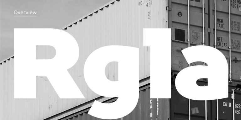
Fonts similar to Comic Opera JNL include several distinct TypeType directions. For width and weight, start with TT Hoves Pro Expanded Bold or Black: the family combines recognizable geometry with a restrained character. TT Octosquares Expanded Bold is worth comparing when angular, octagonal shapes suit the brief; its futuristic styling suggests a different mood from the reference. These are starting points for comparison, not identical redrawings. The selection also includes TT Norms® Pro, TT Commons™ Pro, TT Firs Neue, TT Neoris Pro, and TT Prosto Sans, giving projects additional contemporary sans serif options beyond a single prominent headline.
Choosing Fonts similar to Comic Opera JNL for Your Layout
Use the actual title or product name to judge a replacement. Match the apparent capital height before comparing line length: identical point sizes do not always produce equally sized lettering. Fonts similar to Comic Opera JNL should also be assessed through their internal spaces and stroke weight, not width alone. Compare round letters such as O and C with the diagonals of M and the leg of R; these details help reveal whether the result feels geometric, angular, or closer to the intended reference. Test punctuation and numerals alongside the headline, especially when dates or prices form part of the composition. Prefer a designed expanded style over stretching letters horizontally. Then place the chosen treatment beside supporting copy and inspect the hierarchy at the final output size. Leave enough separation between a heavy title and smaller information so that the layout remains structured rather than uniformly loud.
Try and License Fonts similar to Comic Opera JNL
Explore the collection through the individual family pages, where available styles, character sets, and technical features can be reviewed together. Check the required alphabets and accented characters before committing to a multilingual project. Consider whether the identity also needs lighter weights, italics, or additional widths for later applications. TypeType provides free trial versions for evaluation, including layout tests and client presentations; these are not licenses for commercial publication. Once a direction is approved, select the specific styles and permissions needed for the finished deliverables. Desktop, Logo, Webfont, and App licenses address different applications, so a wordmark, printed packaging, and embedded website text should not automatically be treated as one use. Confirm who will install or access the files, which channels the work will appear in, and whether the selected permissions have a limited term. Once the requirements are clear, purchase the selected styles with the corresponding licenses through the family page.