Explore TypeType's Fonts similar to Via Roma Display Collection
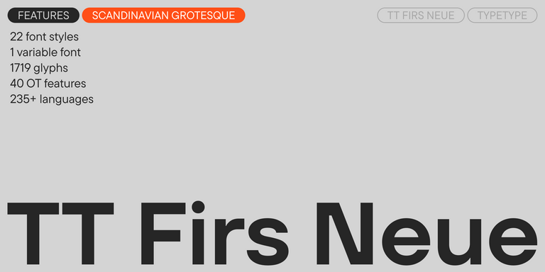
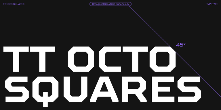
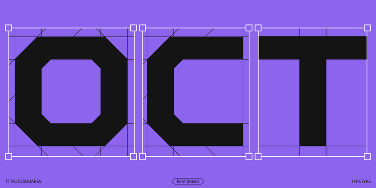
Use this page of Fonts similar to Via Roma Display as a starting point for evaluating TT Commons™ Pro, TT Norms® Pro, TT Hoves Pro, TT Firs Neue, TT Octosquares, and TT Prosto Sans. These six families are candidates to examine, rather than a ranking of identical replacements. Open each family page and review its specimens against the reference you have in mind. Note which options deserve a closer look and why: the overall impression, a particular detail, or suitability for your layout. This gives your initial shortlist a clear purpose before you move into detailed comparison.
What Makes These Typefaces Distinct
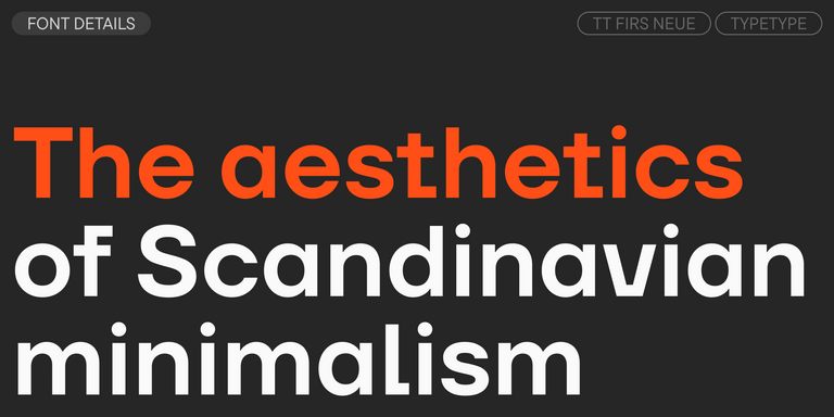
Evaluating Fonts similar to Via Roma Display involves two separate questions: does a candidate resemble the reference, and does it meet the same project needs? Those answers may differ. Set identical wording side by side to examine letter shapes, relative widths, spacing, and the rhythm of a line. Look at individual characters as well as complete words; a convincing overall impression can depend on more than one distinctive letter. Keep the comparison conditions consistent so that differences in size or presentation do not drive your judgment. Treat resemblance as something to assess, not something guaranteed by inclusion here.
Where Fonts similar to Via Roma Display Are Used
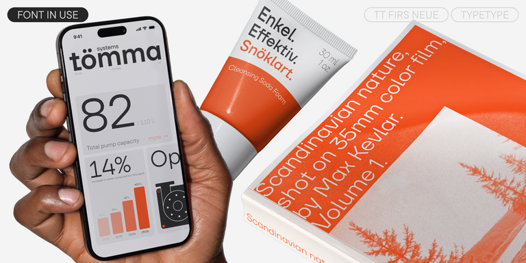
Test Fonts similar to Via Roma Display in the materials your project actually requires. A brand presentation, a headline, or a promotional layout can provide a useful evaluation setting; none should be treated as a confirmed specialty of every family listed here. For a brand asset, consider whether the lettering supports the intended identity alongside imagery and color. For a headline, check how the words occupy the available space and whether line breaks preserve the intended emphasis. For promotional material, review the relationship between the main message and supporting information. Audience expectations matter too: the appropriate choice depends on what readers need to understand and how the design should feel. Compare candidates within the same layout before changing other elements. This helps you distinguish the contribution of the typeface from the effects of composition, imagery, or scale, and keeps the decision tied to a real communication task.
How to Choose Fonts similar to Via Roma Display for Your Project
Narrow the collection by writing down your essential requirements before making a final selection. Prepare a specimen containing actual project wording, including names, punctuation, numerals, and any required language characters. Review each candidate at the intended sizes rather than relying on a single enlarged sample. Check line lengths, line breaks, and the balance between short labels and longer passages wherever those occur in your design. Record any adjustments a replacement would require, and decide whether those changes are acceptable within the project scope. Then verify the relevant family information: the available options, character coverage, and technical details needed for production. Check current purchasing information and licensing terms for the intended application before adoption. If trial access is offered, review its conditions separately from commercial permissions. Choose the candidate that meets your documented priorities, rather than assuming that the closest visual resemblance will automatically be the right practical fit.