The Challenge Swift Fonts Solve
Searching for Swift Fonts can lead to two different tasks: configuring text in software and deciding how that text should look. This page addresses typeface selection. For an app project, the challenge is to find letterforms that express the intended identity without making navigation, instructions, or longer passages harder to read. A default choice may not deliver the desired tone, but an alternative still needs careful evaluation. Start with actual interface content and compare candidates in context. The category name alone does not establish SwiftUI compatibility, and implementation questions should be assessed separately from the visual decision.
What Makes These Typefaces Distinct
Swift and SwiftUI describe a development context, not a shared visual style. There is no single set of proportions, shapes, or spacing that defines a suitable choice for every app. Instead, compare specimens for the qualities your design needs: distinguishable characters, readable passages, clear differences between heading levels, and an appropriate tone. Check how each candidate handles short labels as well as longer sentences. Review individual family information for available features rather than assuming them from a name. A useful comparison keeps wording, layout, and intended text sizes consistent so that differences are easier to judge.
Where Swift Fonts Are Used
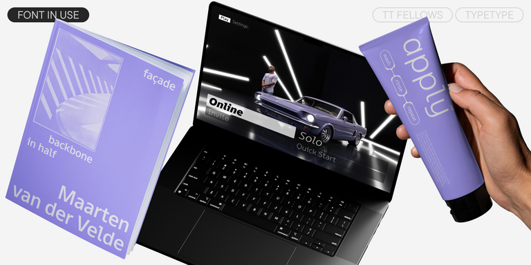
App interfaces provide several contexts for evaluation: navigation labels, onboarding instructions, section headings, notifications, and supporting explanations. Each places a different demand on typography. A brief heading can carry more personality, while a dense settings screen asks readers to distinguish options quickly. These are possible testing scenarios, not evidence that the listed families have been deployed in particular products or industries. Related brand materials introduce another set of checks. Compare an app screen with a landing page, presentation, or campaign layout to see whether the same identity remains recognizable across formats. Test with realistic content, including long names, numbers, punctuation, and any languages your project requires. Review narrow layouts and enlarged text where relevant. The aim is to establish suitability for your own audience and interface rather than choosing solely from a large display specimen or an appealing family name.
Explore TypeType's Swift Fonts Collection
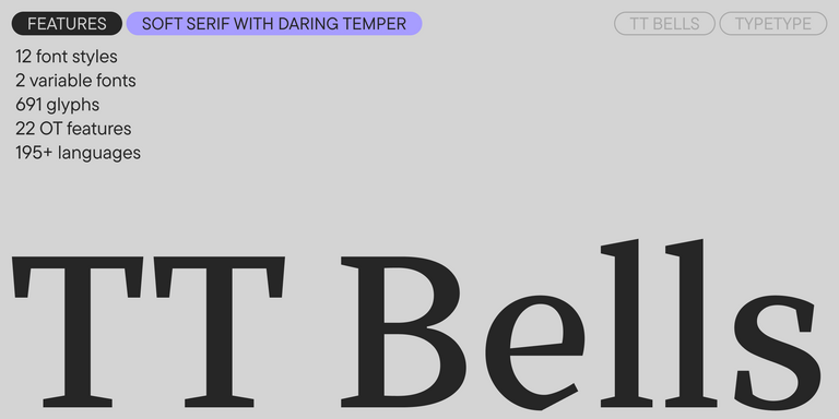
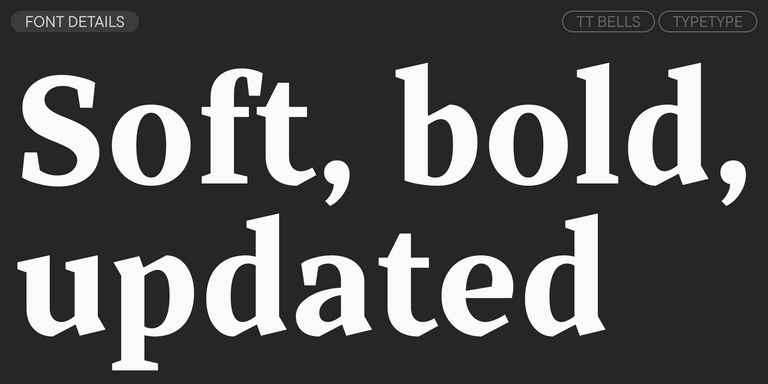
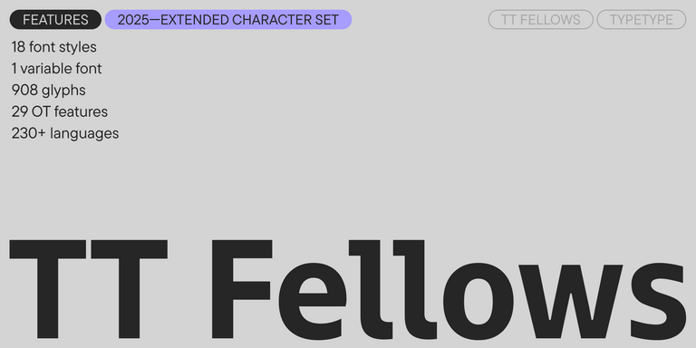
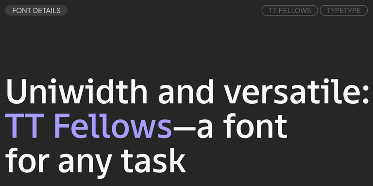
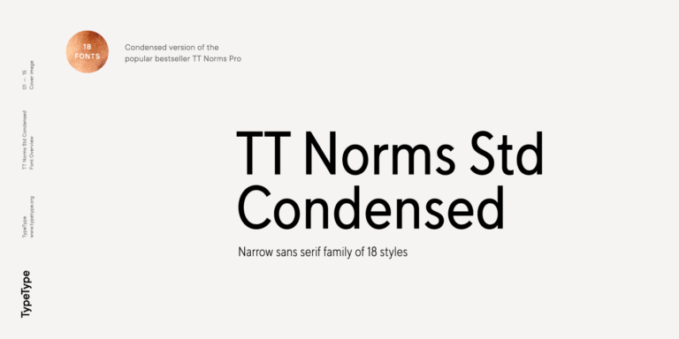
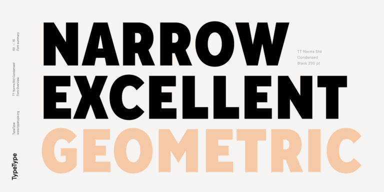
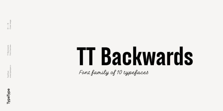
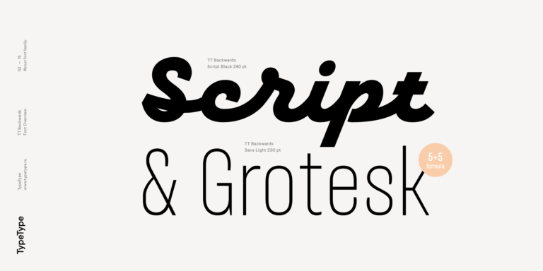
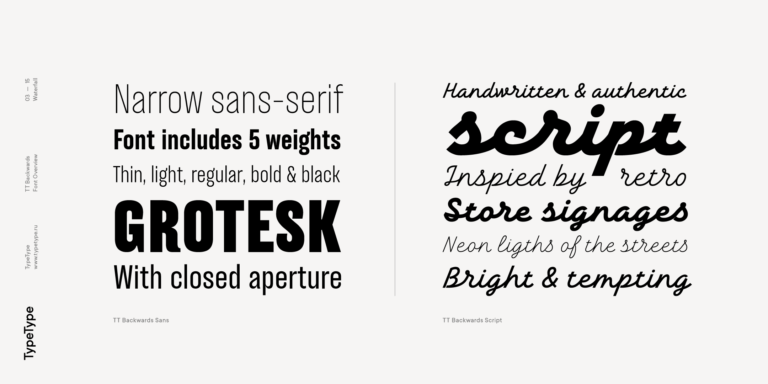
The collection includes TT Commons™ Pro, TT Bells, TT Fellows, TT Norms® Std Condensed, and TT Backwards. Use these names as a shortlist for investigation, not as recommendations for predetermined interface roles. Open the individual family pages and review their specimens and specifications before deciding which candidates deserve a closer test. TypeType offers trial versions and access to design or client-care advice through its website contact form. Check the trial terms before evaluating a family in your workflow, and keep trial access separate from permission to release a commercial product. For a Swift or SwiftUI project, establish the technical requirements with your development team and ask TypeType to clarify any relevant product details. Before adoption, confirm the appropriate license for the intended distribution, including whether app embedding is covered. This sequence helps turn a visual preference into a considered project decision.