top_banner_ttnormspro0426
Type foundryFonts & StylesRoss Dress For Less

Ross Dress For Less Fonts

Bold, open letterforms and a cheerful, no-nonsense tone define the retail look many designers associate with off-price shopping: clear at a distance, friendly up close and quick to read. This page gathers Ross Dress For Less Fonts from TypeType as independent alternatives for that aesthetic, not the retailer's own typeface, so you can compare five families, test trial versions and request a commercial license.

Tags: Ross Dress For Less

What Makes Ross Dress For Less Fonts Distinct

When designers describe a Ross-style retail look, they usually mean typography that works hard without drawing attention to itself. The priorities are legibility from across a parking lot, strong contrast against colored backgrounds and a tone that feels approachable rather than exclusive. Letters need to hold up in bold headlines and still stay clear in smaller supporting copy. It is worth stating plainly that this selection offers alternatives inspired by that general impression. TypeType does not claim that any family here is the retailer's typeface, and the brand's own lettering is not part of the offer. The goal is a comparable mood, not a replica.

Where Ross Dress For Less Fonts Are Used

Brands aimed at value-conscious shoppers need type that communicates quickly, and that need shapes where this style appears. Typical applications include storefront and aisle signage, price tags, clearance banners and seasonal sale posters. Fashion and discount e-commerce teams bring the same approach to product listings, promotional emails and checkout banners, while marketing departments carry it into flyers, circulars and social ads. Each of these formats rewards clear hierarchy between a headline, a price and a short call to action. Since every project balances these elements differently, it makes sense to browse the families listed below and judge each one against your own layouts.

How to Choose a Ross Dress For Less Font for Your Project

Start with the real conditions your typography will face. Set a sample price tag, a sale headline and a paragraph of product copy, then check readability at both small and large sizes, including on screens and printed material viewed from a distance. Next, open each product page to confirm which weights and variations are available; a retail system often needs a heavy weight for announcements and a lighter one for details. Language support matters too, especially for chains that operate in several markets, so review the supported scripts listed on the page rather than assuming coverage. Tone deserves equal attention. Some brands want warmth and friendliness, others prefer a straightforward, efficient voice, and the right family should match that personality without competing with photography or color. Finally, download the trial versions and place them in actual mockups before deciding which license to request.

Explore TypeType's Ross Dress For Less Collection

This collection brings together five TypeType families: TT Nooks Serif, TT Firs Text, TT Wellingtons, TT Trailers and TT Backwards. Each family has its own product page, where you can review the available weights, character set and supported languages before committing. Comparing them side by side is the fastest way to see which one fits a particular brand voice or campaign. Trial versions of every family can be downloaded free of charge for testing in drafts and presentations. When a project moves toward launch, commercial use requires a license, which you can request through the form on the website. If you are unsure which option suits your brief or which license type to choose, the design and client care teams can advise on both the typography and the licensing process.

  • The quick brown fox jumps over a lazy dog.
  • Pack my box with five dozen liquor jugs.
  • Sphinx of black quartz, judge my vow
  • 0123456789 !?.,:;—–()[]{}<> “quotes” ‘apostrophe’ @#%&*_+=/\| № $ € £ ₽ +−×÷=≠≤≥ … % © ® ™
  • Aa Bb Cc Dd Ee Ff Gg Hh Ii Jj Kk Ll Mm Nn Oo Pp Qq Rr Ss Tt Uu Vv Ww Xx Yy Zz
Leading
1.1
Tracking
0px
TT Nooks Serif Regular
8 font styles

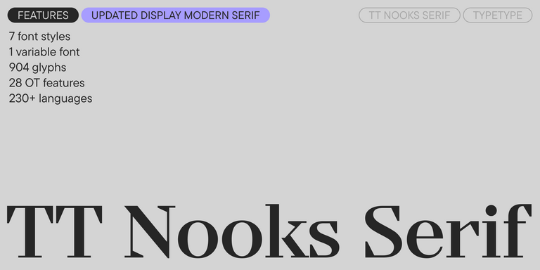
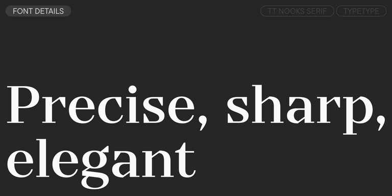
TT Nooks Serif is a display modern serif with a slight touch of egocentricity. It has a sharp and firm, yet elegant and stately character.

New
TT Firs Text Regular
23 font styles

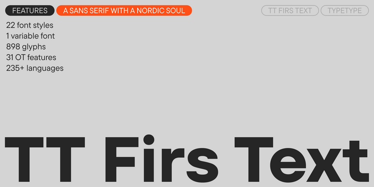
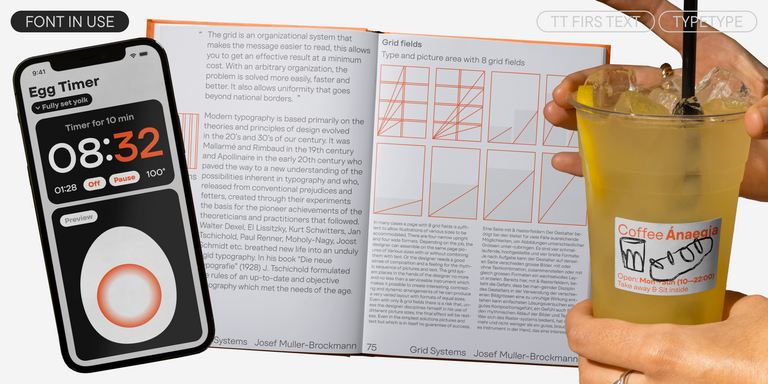
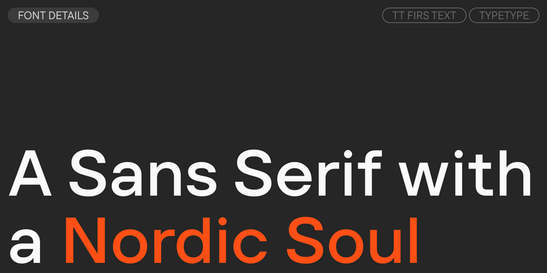
We have released a brand-new font. Meet TT Firs Text—a geometric sans serif with a Nordic character!

TT Wellingtons Regular
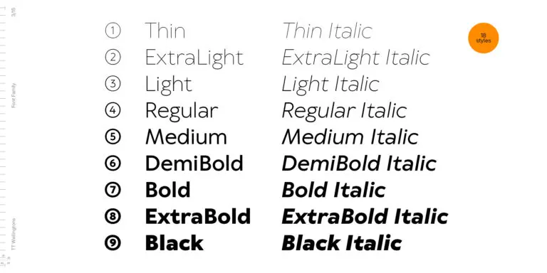
19 font styles

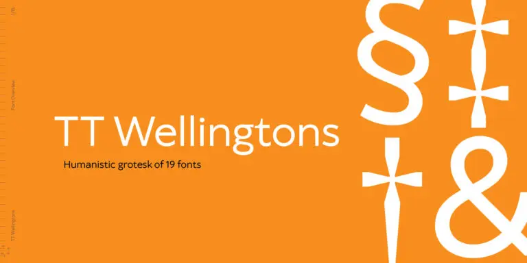
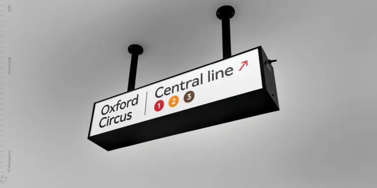
TT Wellingtons is an attempt to combine the style of English humanist sans serifs of the early 20th century with the requirements for modern geometric grotesques.

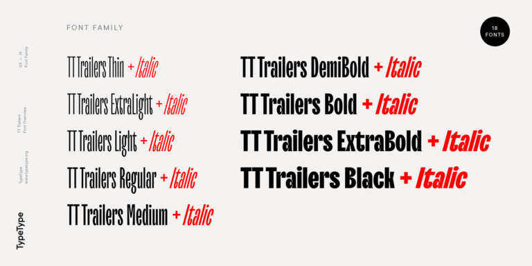
TT Trailers Regular
19 font styles

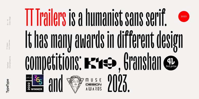
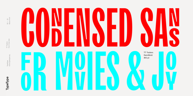
The starting point of the TT Trailers project was the idea to develop a new generation of narrow typefaces for use in movie credits and posters.

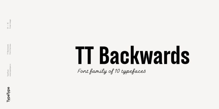
TT Backwards Sans Regular
10 font styles

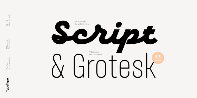
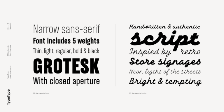
TT Backwards Sans is a narrow grotesque, which takes us back to the book design of late 70s and early 80s with its ductile characters.

What Are Ross Dress For Less Fonts?

This is a TypeType tag that groups typefaces suited to a retail aesthetic inspired by the Ross Dress For Less brand: clear, approachable and readable at a glance. It is not the retailer's official or confirmed typeface, and none of the listed families is presented as the brand's lettering.

Which Industries Use Ross Dress For Less Typefaces Most Often?

The style is most relevant to off-price and discount retail, fashion and apparel stores, home goods chains and online marketplaces. Promotional advertising also relies on it, from weekly circulars to digital banners, because these formats need prices, offers and store names to register instantly with busy shoppers.

Can Ross Dress For Less Fonts Be Used for Branding?

Yes. Retail brands can apply these families to logos, signage, packaging and campaigns once the appropriate license is in place. Aim for your own identity rather than imitating the Ross logo directly, and check for trademark conflicts with legal counsel before finalizing a mark that sits close to an established retailer.

What Should Be Considered When Pairing Ross Dress For Less Fonts?

A reliable approach is to combine one family for headlines with another suited to running text, then test contrast in weight, width and style. Before building pairs from Ross Dress For Less Fonts, check each product page for available weights and characters, and preview combinations in real price tags and banners.

Can You Download TypeType Fonts for Commercial Projects?

You can download trial versions of every family on this page free of charge for testing and client presentations. Commercial use requires a suitable license, which you request through the form on the TypeType website. The client care team can help you identify the right license type for your project.

Contact us!