top_banner_ttnormspro0426
Type foundryFonts & StylesPalma

Fonts similar to Palma

TypeType’s collection brings together seven alternatives to consider alongside Palma. Fonts similar to Palma can offer a comparable visual impression or serve a similar design purpose without matching every detail. Start with the listed candidates, compare their specimens against your reference, and use your project’s actual text and layouts to decide which options deserve a closer look.

Similar to: Palma

Explore TypeType's Fonts similar to Palma Collection

Fonts similar to Palma presented here include TT Nooks Serif, TT Backwards, TT Knickerbockers, TT Polls, TT Berlinerins, TT Milks, and TT Lovelies Script. Treat these seven names as a starting point for comparison rather than a ranking of visual closeness. Review each candidate’s specimens before narrowing your selection; a name alone does not establish its relationship to Palma. Keep a short comparison sheet recording what you notice and what still needs testing. This gives you a useful overview of the available choices without assuming that every candidate shares the same construction, proportions, or role in a layout.

What Makes These Alternatives Distinct

Similarity can describe appearance, purpose, or both. Fonts similar to Palma should therefore be assessed against the qualities you actually want to retain. A visual alternative might evoke a comparable impression, while a task-based replacement may solve the same layout problem through different details. Compare letterforms, relative proportions, spacing, and the rhythm of complete words rather than relying on a single character. Use a reliable Palma specimen as your reference and note differences as carefully as resemblances. The useful distinction is not simply whether two samples look alike, but whether their similarities matter to the project you are developing.

Where Fonts similar to Palma Are Used

A brand asset, an editorial headline, or a packaging mockup can provide a practical setting for evaluating Fonts similar to Palma. These are testing scenarios, not evidence that every listed candidate suits every application. Choose the setting that reflects your assignment and place a shortlisted option into the existing composition. For a brand asset, assess whether the lettering supports the intended tone alongside imagery and color. For a headline, check line breaks and the balance between the title and surrounding content. For packaging, examine the relationship between the main message and smaller supporting information. Consider the audience and viewing conditions throughout: a convincing specimen may produce a different result within a crowded composition or at a reduced size. Comparing realistic mockups helps separate an appealing first impression from a choice that consistently communicates the right message within the space and hierarchy your project requires.

How to Choose Fonts similar to Palma for Your Project

Begin with a reliable Palma reference and identify what your replacement must preserve: an overall mood, particular letter shapes, or the balance of a finished composition. Then select a few candidates from this collection and compare identical sample text at the intended sizes. Include words from the project rather than relying exclusively on specimen phrases. Check required characters, punctuation, and numerals, and inspect how each candidate works beside your existing companion typeface. Test several representative layouts so that one attractive sample does not determine the entire decision. Record any changes to line breaks, spacing, or visual hierarchy that would require adjustments. Once the shortlist is settled, consult the relevant TypeType pages for current trial availability and licensing information. Confirm that the available options cover your planned use before committing. The aim is a considered replacement, not an assumption that the original can be exchanged without affecting the design.

  • The quick brown fox jumps over a lazy dog.
  • Pack my box with five dozen liquor jugs.
  • Sphinx of black quartz, judge my vow
  • 0123456789 !?.,:;—–()[]{}<> “quotes” ‘apostrophe’ @#%&*_+=/\| № $ € £ ₽ +−×÷=≠≤≥ … % © ® ™
  • Aa Bb Cc Dd Ee Ff Gg Hh Ii Jj Kk Ll Mm Nn Oo Pp Qq Rr Ss Tt Uu Vv Ww Xx Yy Zz
Leading
1.1
Tracking
0px
TT Nooks Serif Regular
8 font styles

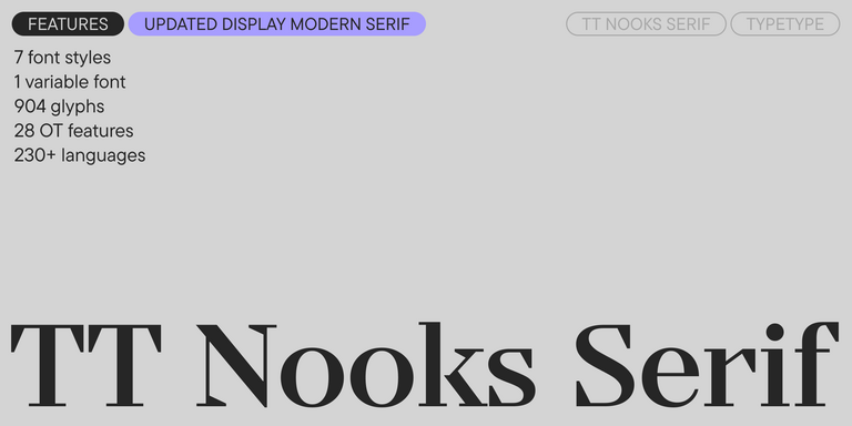
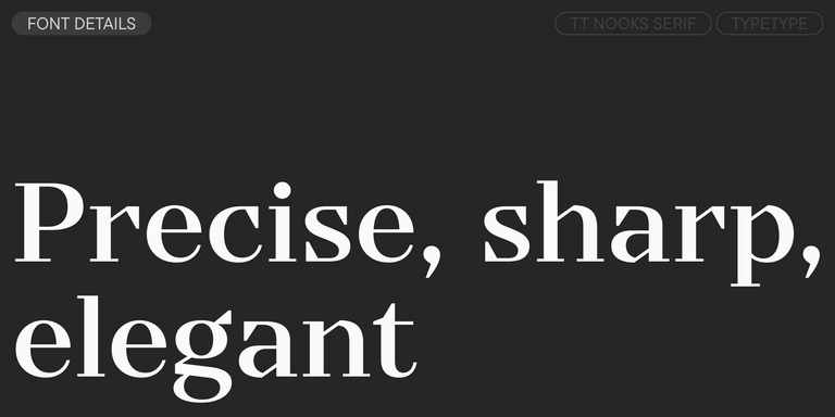
TT Nooks Serif is a display modern serif with a slight touch of egocentricity. It has a sharp and firm, yet elegant and stately character.

TT Backwards Sans Regular
10 font styles

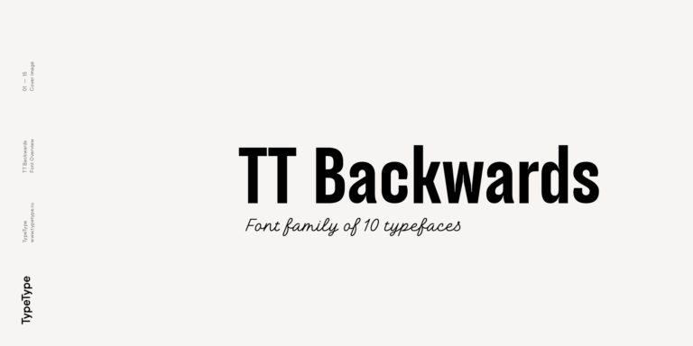
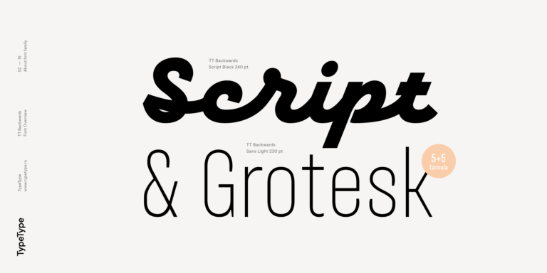
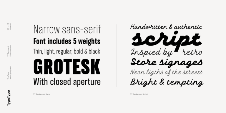
TT Backwards Sans is a narrow grotesque, which takes us back to the book design of late 70s and early 80s with its ductile characters.

2 font styles

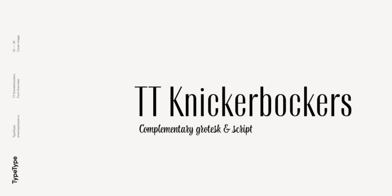
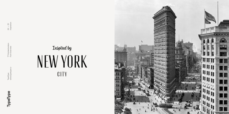
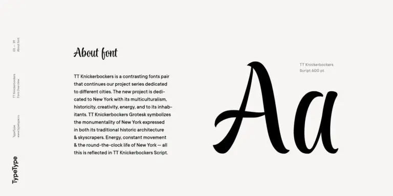
TT Knickerbockers Grotesk is a narrow contrast sans serif with characteristic elements sending us back to the 19th century in New York.

TT Polls Regular
15 font styles

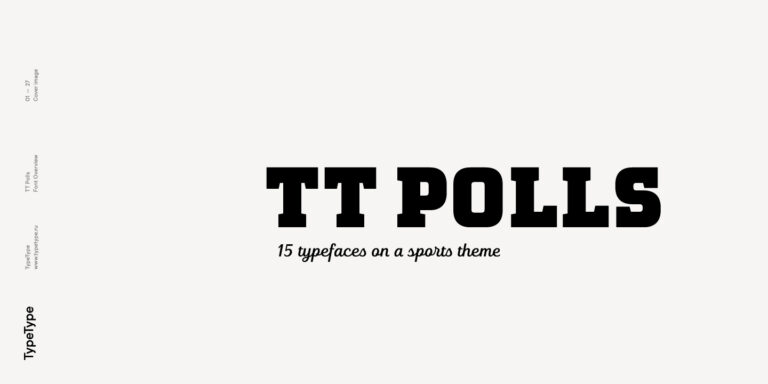
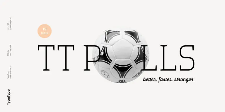
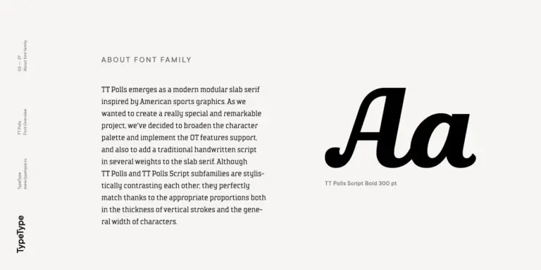
TT Polls is the modern modular slab serif family for using in sports-related design.

TT Berlinerins Grotesk
2 font styles

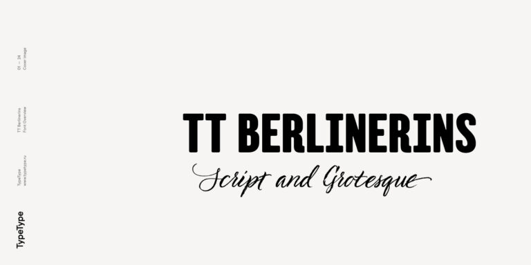
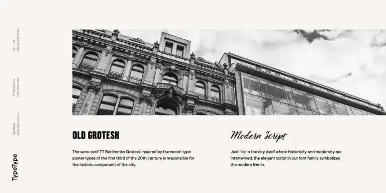
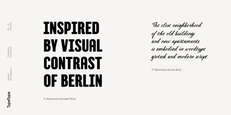
TT Berlinerins is a grotesque inspired by the wood-type poster types of the first third of the 20th century is responsible for the historic component of Berlin.

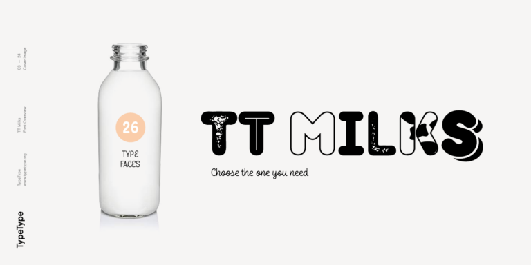
TT Milks Script Regular
26 font styles

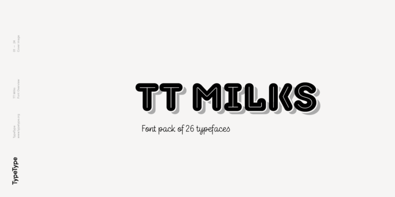
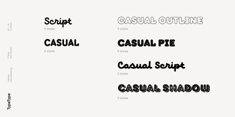
TT Milks is a Collection of typefaces for branding

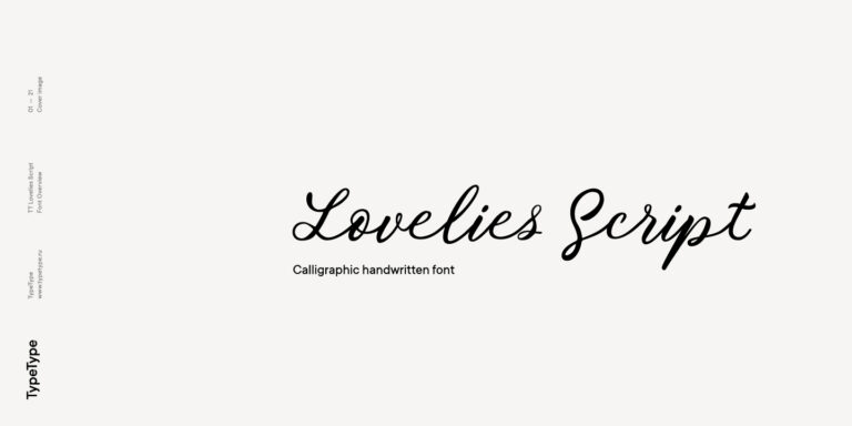
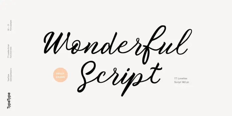
1 font style

Without any false modesty, we can say that TT Lovelies Script is one of the most complicated projects we have ever carried out—there are 1115 glyphs, more than 2000 contextual alternates, 10000 kerned pairs, and a large number of OT features, including ligatures and Old Style numbers.

What Are Fonts similar to Palma?

These are candidates to assess for a comparable visual impression or a similar design purpose. The selection does not establish exact equivalence or a single closest match. Compare specimens to identify which letterforms, proportions, and details support the qualities you want to retain.

Which Industries Use These Alternatives Most Often?

Suitability depends on the communication task rather than the Palma label; there is no established industry ranking for this selection. Assess a candidate in a sector-specific mockup using realistic copy, imagery, and hierarchy. Judge whether the result addresses your audience and practical layout requirements.

Can These Alternatives Be Used for Branding?

Consider them for branding by testing tone, distinctiveness, and consistency across representative assets. Compare the same name, tagline, and supporting copy in each candidate. A convincing result should work beyond one isolated composition. Separately, verify that the relevant license covers the intended brand applications.

What Should Be Considered When Pairing These Typefaces?

When pairing Fonts similar to Palma, test the candidate and its companion in one realistic layout. Look for clear hierarchy, purposeful contrast, and comfortable reading. Adjust size and spacing before judging compatibility, and compare both short headings and supporting passages rather than isolated alphabet samples.

Can You Browse TypeType Fonts for Commercial Projects?

Yes, you can review TypeType’s candidates while planning a commercial project. Consult each relevant product page for current trial options, pricing, and license information. Trial access should not be treated as permission for commercial use. Confirm the applicable terms against your intended use before proceeding.

Contact us!