The bestseller TT Norms® Pro—a geometric sans serif, trouble-free workhorse
Krita Fonts
Adding lettering to a digital painting often exposes a gap: the typefaces bundled with an operating system rarely match the mood of an illustration, comic page or poster. The Krita Fonts selection on this page gathers ten TypeType families that artists can install and then pick in the Text tool, so titles, captions and speech balloons receive the same care as the artwork itself.
- All fonts 78
- Sans Serif 46
- Serif 21
- Slab Serif 6
- Display 44
- Script 9
- Variable 49
- Font sale 12
The Challenge Krita Fonts Solve
Krita does not come with its own type catalogue. Its Text tool draws on whatever families are installed on the computer or placed in the dedicated folder within the Krita resource directory. That leaves many artists working with a short list of system defaults that feel generic next to detailed brushwork. A newly added family can also seem to be missing, often because the Text tool filters its list by writing system. Choosing well-made Krita Fonts, installing them properly and checking that filter turns lettering from an afterthought into a deliberate part of the composition, with a typographic voice that suits the subject.
What Makes Krita Fonts Distinct
Any installed family can appear in Krita, so what sets good Krita Fonts apart is how they perform on a painted canvas. Letterforms need to stay legible over textured backgrounds and at reduced sizes when artwork is exported for screens. A family with several weights gives room to build hierarchy between a headline and a caption without switching typefaces. Display text, meanwhile, benefits from a character that echoes the artwork. Families in this selection, such as TT Commons Pro, TT Norms Pro, TT Hoves Pro and TT Tsars, are best previewed in context and judged against the actual illustration.
Where Krita Fonts Are Used
Text turns up in Krita work more often than many expect. Comic artists letter panels, sound effects and chapter titles directly on the page. Illustrators add names, dates or short quotes to editorial pieces and prints. Poster and cover artists combine painted imagery with prominent headlines, while concept artists label turnarounds, callouts and presentation boards for art directors. Social graphics, stream overlays and zines round out the list. In each case, Krita Fonts carry information and set tone at once, so the chosen family should support the narrative rather than compete with it. Where the finished file goes matters too. Trial versions suit sketches, layout tests and personal experiments. Once artwork is sold, published, commissioned by a client or used to promote a product, the typeface inside it needs a suitable license, so plan that step before final delivery.
Explore TypeType's Krita Fonts Collection
This page brings together ten TypeType families: TT Commons Pro, TT Norms Pro, TT Hoves Pro, TT Neoris Pro, TT Interphases Pro, TT Frantz, TT Trailers, TT Bluescreens Pro, TT Alientz and TT Tsars. Each has its own page where the family structure can be reviewed before committing to a project, and every family in the collection is technically verified by the studio and available as a trial version. A practical workflow is simple: pick two or three candidates, install the trial files on your system or in Krita's resource directory, then set a few lines of real copy over the artwork. Comparing options on the actual canvas reveals far more than a specimen alone. When a direction is settled, a license request can be sent through the website, and TypeType's design and client care teams can advise on which license type fits the intended use.
- The quick brown fox jumps over a lazy dog.
- Pack my box with five dozen liquor jugs.
- Sphinx of black quartz, judge my vow
- 0123456789 !?.,:;—–()[]{}<> “quotes” ‘apostrophe’ @#%&*_+=/\| № $ € £ ₽ +−×÷=≠≤≥ … % © ® ™
- Aa Bb Cc Dd Ee Ff Gg Hh Ii Jj Kk Ll Mm Nn Oo Pp Qq Rr Ss Tt Uu Vv Ww Xx Yy Zz
TT Commons™ Pro is a completely redesigned version of the well-established classic font family TT Commons.
TT Hoves Pro is a versatile sans-serif with a recognizable geometry
TT Neoris is an elegant Neo-Grotesque with unlimited potential and a font that encompasses all modern requirements and user desires.
TT Bluescreens is a upgraded geometric sans serif with narrow proportions
TT FRANTZ IS AN EXPERIMENTAL VARIABLE FONT, DISTINGUISHED BY ITS SLIMNESS AND LIGHTNESS. THE VARIATION IN THE FONT AFFECTS THE CHANGE IN THE HEIGHT OF THE MEAN LINE—BY MOVING THE AXIS ADJUSTMENT SLIDER YOU CAN EASILY RAISE OR LOWER THE MEAN LINE OF THE FONT.
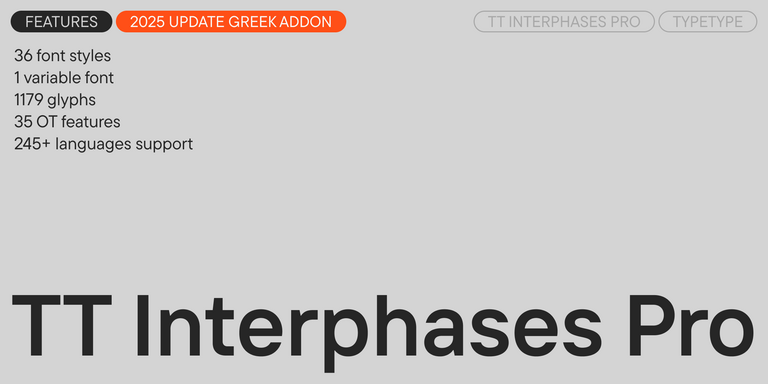
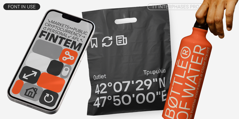
TT Interphases Pro is a neo-grotesque sans serif with equal-width proportions
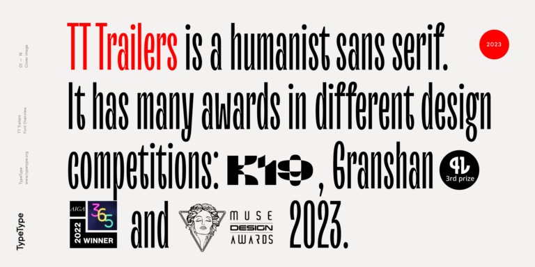
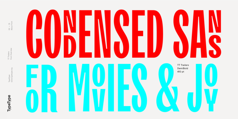
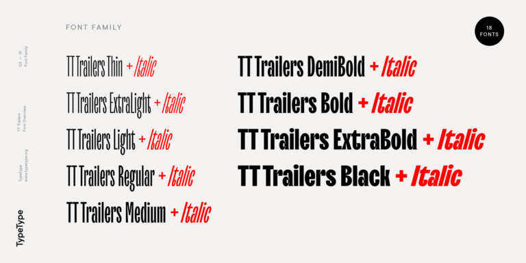
The starting point of the TT Trailers project was the idea to develop a new generation of narrow typefaces for use in movie credits and posters.
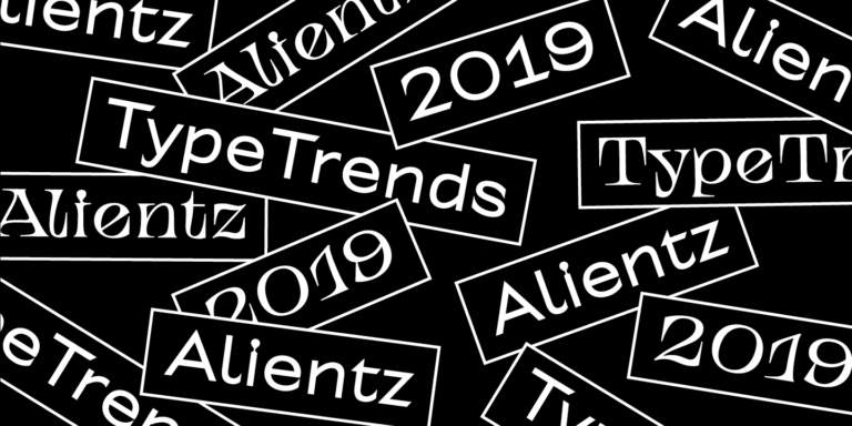
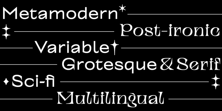
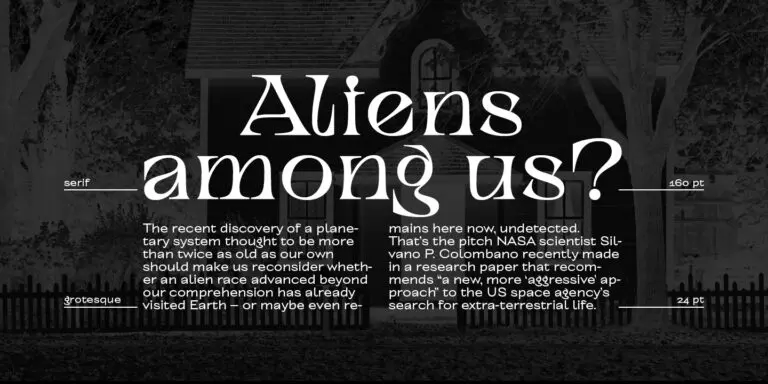
TT Alientz is a variable typeface that allows the user to make a visual journey from an extraterrestrial grotesque to a very prickly display serif.
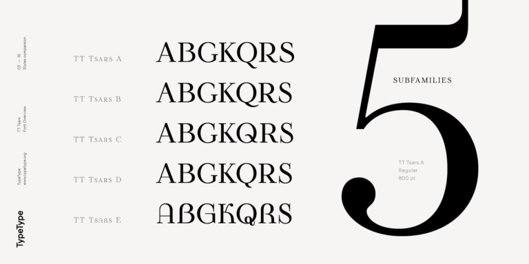
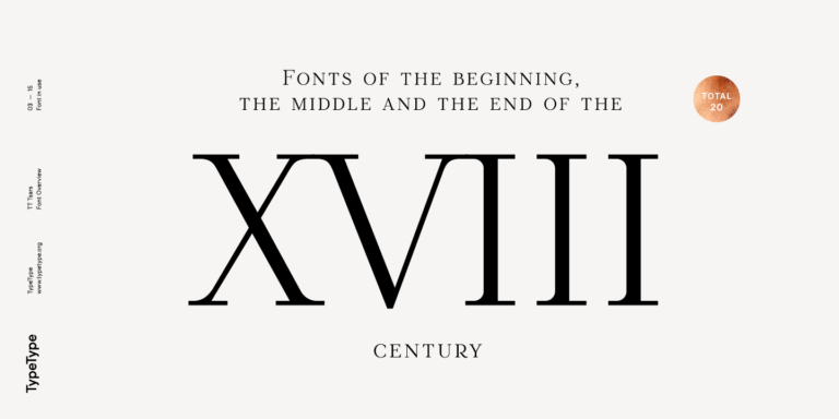
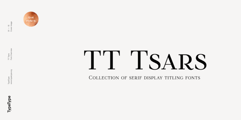
The TT Tsars font family is a collection of serif display fonts that are stylized to resemble the fonts of the beginning, the middle, and the end of the XVIII century.
What Are Krita Fonts?
The term describes any typeface installed on a computer or added to Krita's resource directory and then selected in the Text tool; Krita has no exclusive format of its own. This page gathers TypeType families that artists can install and try in paintings, comics and posters before choosing one for a finished piece.
Which Industries Use Krita Typefaces Most Often?
Most use comes from illustration, comics, game development and concept art, where artists add titles, lettering and annotations directly to painted work. Designers who prepare posters, covers, merchandise artwork and social media graphics in Krita also rely on well-chosen type to keep text readable and consistent with the visual direction.
Can Krita Typefaces Be Used for Branding?
Yes, provided the same licensed family is used across every tool involved, so artwork painted in Krita matches layouts built elsewhere. Branded output, such as packaging illustrations, campaign visuals or commercial mascots, requires a license that covers that use. TypeType's team can help identify the appropriate license type for a specific brand project.
What Should Be Considered When Pairing Typefaces in Krita?
A reliable approach is to combine a restrained text family for captions and body copy with a more expressive display family for headlines. When selecting Krita Fonts from this page, check that weights contrast clearly, test the pair on the real canvas with trial versions, and make sure both stay legible at export size.
Can You Buy TypeType Fonts for Commercial Projects?
Yes. Trial versions can be installed on your system or in Krita's resource directory to test typefaces in sketches and layouts. Commercial use, including client work, published comics and sold prints, requires a suitable license, which can be requested through the TypeType website. The client care team can advise on the right license type.