Ivory Fonts for Compact Headlines and Technical Typography
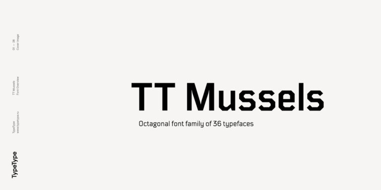
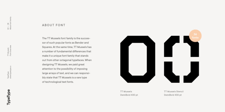
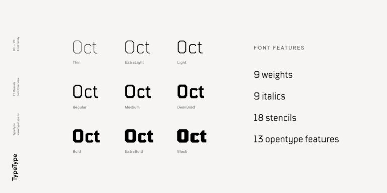
Two families in Ivory Fonts offer contrasting starting points for structured typography. TT Bluescreens Pro spans five widths, from condensed to expanded proportions, with matching italics and variable controls. Its origins in movie posters and credits make it a useful candidate for titles and tightly organized layouts. TT Mussels combines octagonal construction with attention to extended reading, and includes a stencil version for more pronounced display treatments. Compare the former when width flexibility is central to the brief, and the latter when angular details should remain visible across both short headings and longer passages.
Art Deco, Poster Lettering, and Folded Shapes
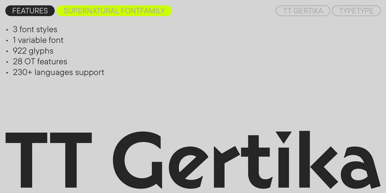
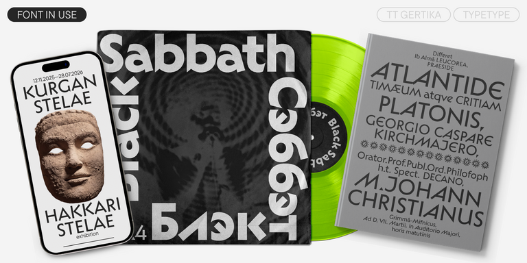
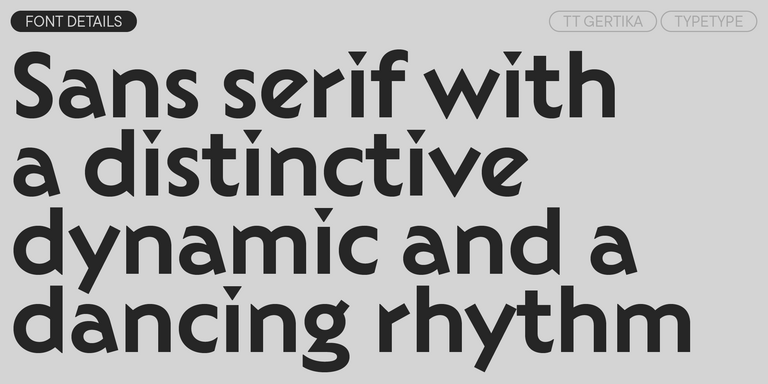
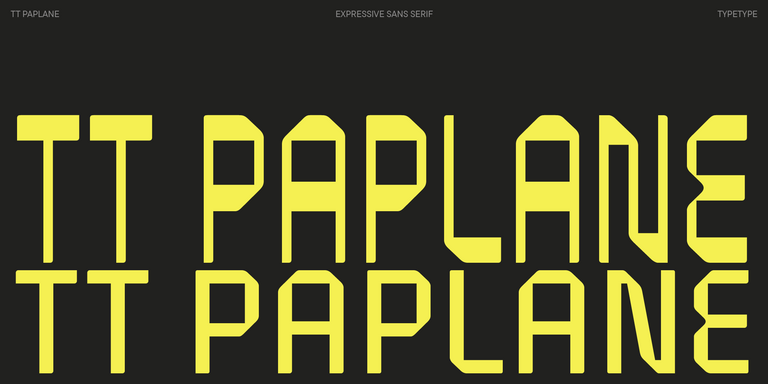
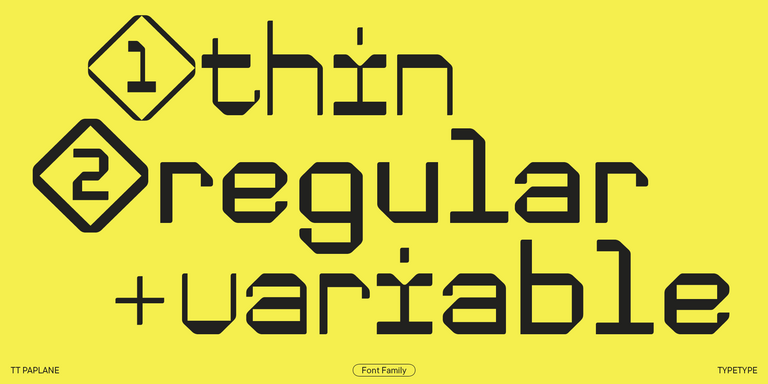
For a more expressive direction, Ivory Fonts includes TT Frantz, TT Gertika, and TT Paplane. Frantz combines narrow proportions and Art Deco references with an adjustable midline that leaves letter widths unchanged. Gertika draws on poster lettering from the late 1930s, combining geometric shapes with sharp cuts and a lively rhythm. Paplane follows the logic of folded paper strips, using squared forms and angled cuts. Try Frantz for a perfume label, Gertika for an exhibition identity, or Paplane for playful packaging. These approaches offer different moods, so let the message determine which details deserve emphasis.
How to Select and Pair Ivory Fonts
When working with Ivory Fonts, separate display impact from the needs of everyday reading. A distinctive title does not establish that the same treatment will suit instructions, captions, or navigation. Start with one representative composition: a long headline, a short paragraph, several numbers, and the smallest text required in the final piece. Compare the space each style occupies and the clarity of enclosed shapes at the intended size. Give a strongly characterized headline a quieter companion, adjusting apparent size and weight before adding another typeface. For variable designs, compare useful intermediate settings as well as the extremes. Record the chosen axis values so the treatment remains consistent across applications. Include punctuation, currency symbols, and accented characters in the proof. On packaging, check the actual printed dimensions; online, review narrow screens and changing content lengths. Favor the combination that preserves hierarchy without making every line compete for attention.
Preview and License Ivory Fonts
Use this collection to move from visual comparison to a production shortlist. Open each family page to inspect its styles, character coverage, and OpenType features, then test the required files in the software used for the project. TypeType offers free trials for evaluation and client mockups, not finished commercial use. For production, choose permissions according to the deliverables: Desktop, Logo, Webfont, and App licenses address different uses. Establish whether the work involves printed artwork, a publicly used wordmark, live website text, or application embedding. Also identify who needs installation access and whether a client will edit the materials after handover. Select the styles required for those tasks and review the relevant terms before purchasing. Confirm these responsibilities with the client while the production scope is clear. Keep the chosen family names, permitted uses, and license records with the design specification, so future updates start with clear licensing information.