top_banner_ttnormspro0426
Type foundryFonts & StylesGunter

Fonts similar to Gunter

Fonts similar to Gunter offer different ways to approach bold, characterful headlines. TypeType’s selection includes TT Firs Neue, TT Hoves Pro, and TT Octosquares. For packaging, campaign graphics, or a wordmark, start with the quality that matters most: unusual letter shapes, a broad silhouette, or a quieter design that can extend beyond the main title.

Similar to: Gunter

Fonts similar to Gunter: Bold Shapes and Retro Character

Gunter combines serif and sans serif elements in a bold display design influenced by the 1960s and 1970s. Its horizontal emphasis, playful cuts, and looping details create an unconventional silhouette; an alternate set provides more traditional capitals. Fonts similar to Gunter can be selected for that graphic presence without reproducing every detail. Distinguish a close visual replacement from a change in direction: a geometric sans serif may retain headline weight while removing the decorative character. For a redesign, identify which qualities belong to the identity and which can change before comparing the options.

Compare Three Distinct TypeType Directions

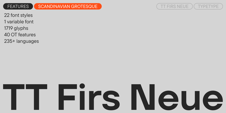
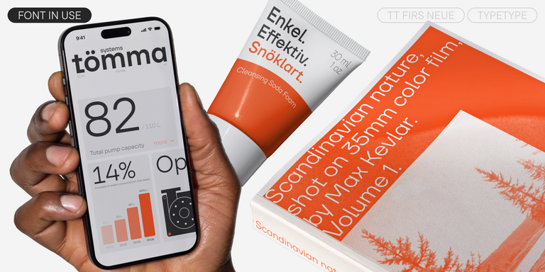
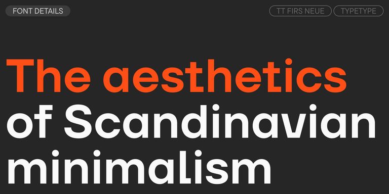
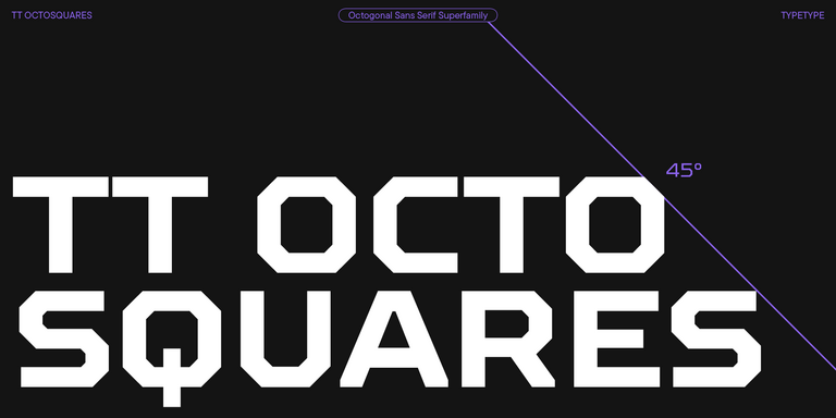
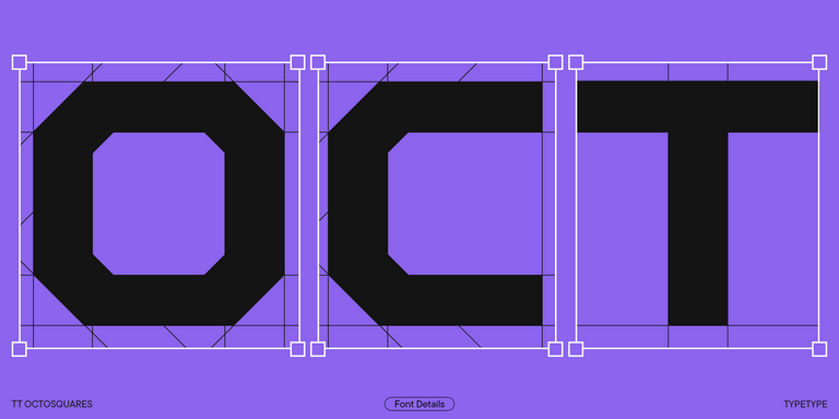
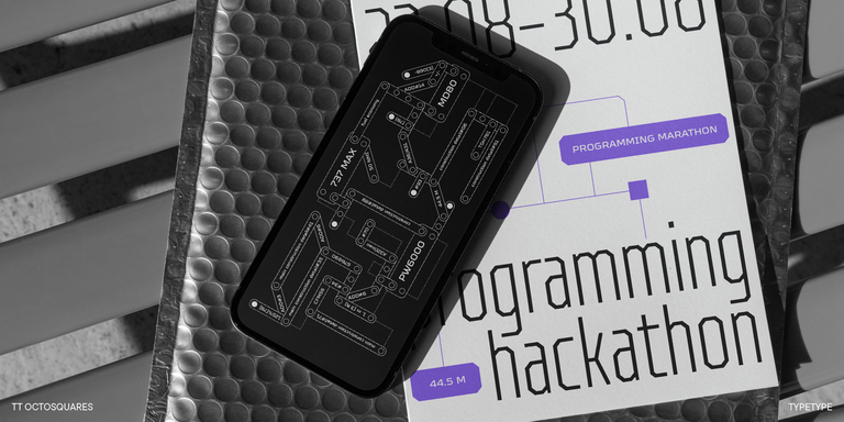
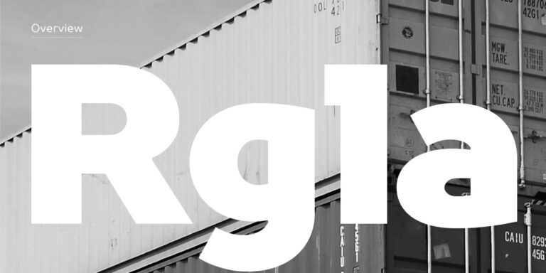
For expressive details, consider TT Firs Neue: its Scandinavian construction includes ink traps and alternate glyph shapes. TT Hoves Pro offers a more restrained geometric approach; try Expanded Bold when the brief calls for substantial width. TT Octosquares takes another direction with octagonal forms and a segmented appearance, making it a candidate for sharper, futuristic compositions. Fonts similar to Gunter are most useful when compared at the style level rather than by family name alone. These options address different aspects of a display brief, from unusual internal details to broad proportions or angular construction.

Choosing Fonts similar to Gunter for Branding and Headlines

Test the complete brand name or campaign headline, including its actual mixture of capitals and lowercase. Fonts similar to Gunter should be judged through the shape of the word, not a single striking letter. Look at the enclosed spaces in a, e, and g, the rhythm of repeated characters, and the relationship between straight strokes and curves. Where alternatives are available, compare them in context rather than selecting the most decorative form automatically. A distinctive capital may work in a short wordmark but interrupt the rhythm of a longer headline. Set the design on a narrow mobile banner as well as a generous poster to see where spacing and line breaks need adjustment. For packaging, include the product description and size alongside the name. Reserve the strongest treatment for the main message so that useful information remains easy to locate. Avoid stretching letters to force a fit.

Browse Fonts similar to Gunter in the TypeType Collection

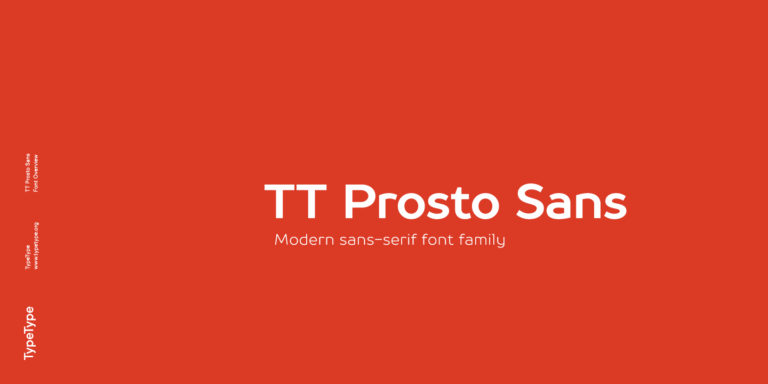
The collection also includes TT Norms® Pro, TT Commons™ Pro, and TT Prosto Sans. Explore these alongside the more expressive candidates when the brief extends to supporting text, navigation, or a broader identity system. Open the individual family pages to review available styles and character sets. Build a sample containing the required languages, numerals, and punctuation, then test the chosen weights in working layouts. TypeType’s free trial versions allow evaluation and client presentations, but not use in finished personal or commercial projects. Once the design is approved, select licenses for the actual applications. Desktop artwork, a public logo, and text embedded on a website have different usage requirements. Establish which deliverables need editable text and who needs access to the files before purchasing. Keep the selected style names and license documentation with the project so that later updates use the same approved design.

  • The quick brown fox jumps over a lazy dog.
  • Pack my box with five dozen liquor jugs.
  • Sphinx of black quartz, judge my vow
  • 0123456789 !?.,:;—–()[]{}<> “quotes” ‘apostrophe’ @#%&*_+=/\| № $ € £ ₽ +−×÷=≠≤≥ … % © ® ™
  • Aa Bb Cc Dd Ee Ff Gg Hh Ii Jj Kk Ll Mm Nn Oo Pp Qq Rr Ss Tt Uu Vv Ww Xx Yy Zz
Leading
1.1
Tracking
0px
Bestseller
TT Norms® Pro Regular
104 font styles

The bestseller TT Norms® Pro—a geometric sans serif, trouble-free workhorse

Bestseller
104 font styles

TT Commons™ Pro is a completely redesigned version of the well-established classic font family TT Commons.

Bestseller
TT Hoves Pro Regular
96 font styles

TT Hoves Pro is a versatile sans-serif with a recognizable geometry

Bestseller
TT Firs Neue Regular
23 font styles

TT Firs Neue is a contemporary reincarnation of the good old TT Firs sans serif.

TT Octosquares Regular
73 font styles

TT Octosquares is a fresh, revised, expanded, and significantly improved version of our first commercial font TT Squares & its narrow version.

TT Prosto Sans Regular
20 font styles

TT Prosto Sans is a font family for any tasks. You can use this font almost everywhere.

What Are Fonts similar to Gunter?

They are alternatives for projects seeking Gunter’s bold display presence or an interpretation of its retro character. The reference combines serif and sans serif elements rather than fitting neatly into either category. A suitable replacement depends on whether distinctive details or overall impact matter more.

Which Industries Use These Display Typefaces Most Often?

Consider them for fashion, food and beverage packaging, entertainment, and creative services. Gunter was developed with social media in mind. For a related treatment, focus on applications where a short message carries the composition, such as campaign titles, product names, or promotional covers.

Can Fonts similar to Gunter Be Used for Branding?

Yes, with permissions covering the intended use. For a TypeType wordmark displayed publicly, review the Logo license. Beyond the mark itself, check whether the identity needs quieter supporting styles, multilingual text, or compact versions for labels before choosing the full typographic system.

What Should Be Considered When Pairing Display Fonts?

Give the expressive design the headline role and choose a quieter companion for longer passages. Contrast weight, width, or detail without making every element compete. Assess the pair using actual copy, and keep names, descriptions, prices, and navigation distinct within the reading hierarchy.

Can You Buy or Download TypeType Fonts for Commercial Projects?

Yes. Purchase the required styles with licenses matching their use in the finished project. Free trial downloads are for evaluation, not commercial release. Check the terms for each medium, including print, logos, website embedding, advertising, and applications, before publishing or sharing production files.

Contact us!