What Makes Gnarly Fonts Distinct
Gnarly Fonts is a category label, not a formal typographic classification with a fixed set of features. Its value lies in helping you investigate a visual direction rather than prescribing one appearance. When examining specimens, look at how individual letters are treated, how words hold together, and whether the result creates the impression your brief requires. Visual impact and readability are useful criteria to assess, not qualities to assume across every listed family. A striking isolated character may behave differently in a full headline, so judge the complete message as well as its individual parts.
Where These Typefaces Are Used
Brands aimed at audiences who respond to a distinctive visual voice could consider this category for identity work or campaign messaging. Possible placements include posters, packaging, and promotional headlines, provided the selected typeface supports the intended tone. These are directions to test, not fixed applications for every family. For an audience scanning a package, immediate recognition might matter more than an unusual detail; for a poster, the relationship between lettering and imagery may guide the decision. Let the viewing conditions and the reader’s task determine whether a candidate belongs in that particular layout.
How to Choose a Typeface from Gnarly Fonts for Your Project
Begin with a short brief that states the message, audience, and role of the typography. Set several candidates in the same project wording so that differences are easier to judge. Include a typical headline, a longer phrase, and any names or numerals central to the design. Next, assess each sample at its intended size rather than relying only on an enlarged specimen. Check whether the wording remains clear and whether its tone agrees with the rest of the identity. If the layout needs supporting text, compare the proposed pairing in context: hierarchy should remain evident without both voices competing for attention. Keep a shortlist based on those practical tests. Before committing, consult each family’s details for your specific requirements and review the applicable license information. This separates an appealing first impression from a choice that works throughout the actual project.
Explore TypeType's Gnarly Fonts Collection
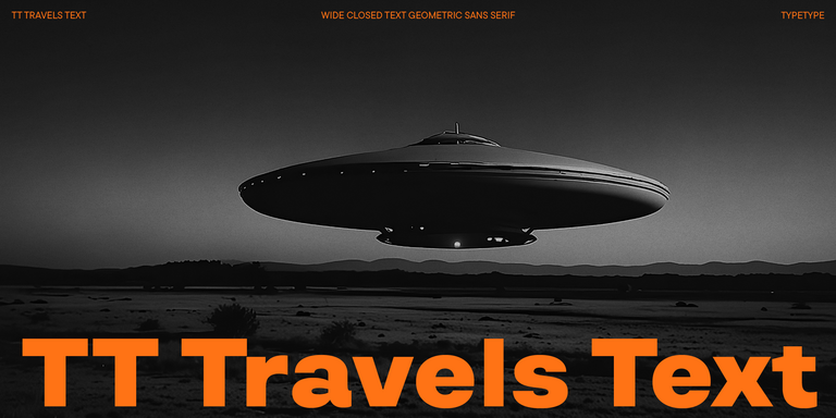
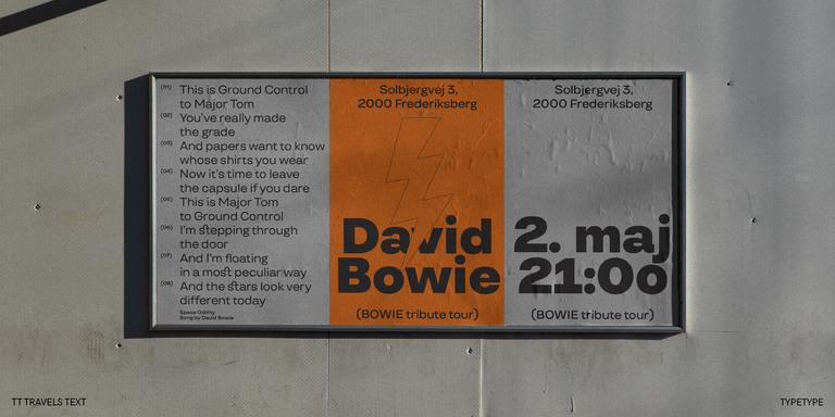
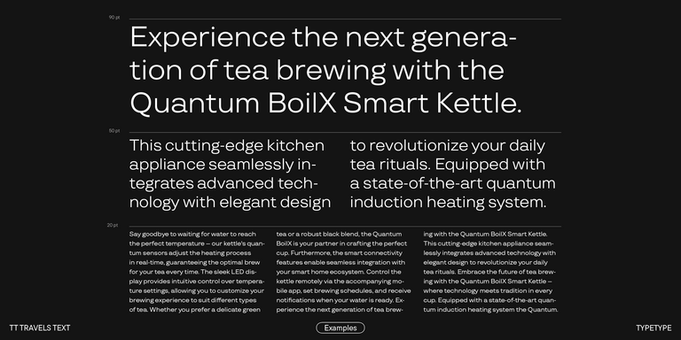
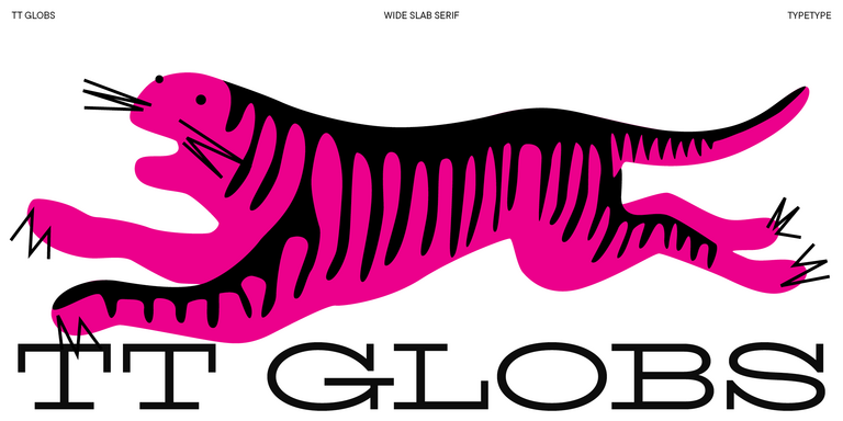
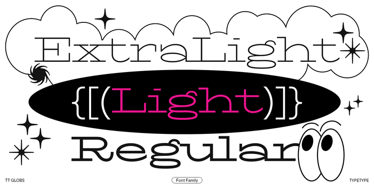
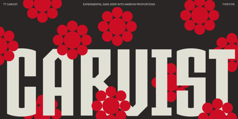
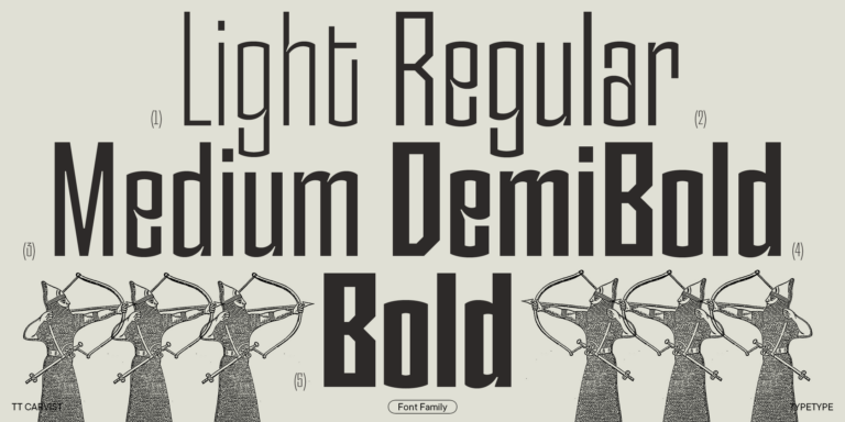
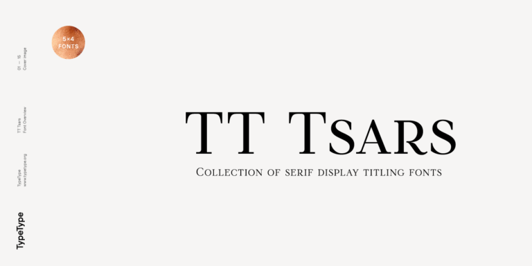
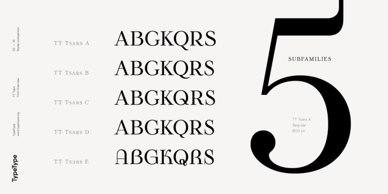
The collection includes TT Neoris Pro, TT Travels Text, TT Globs, TT Carvist, and TT Tsars. Use these five names as entry points for closer examination, without assuming that the category makes them interchangeable. Their individual specimens and family information should guide your next step. TypeType offers trial versions of the listed typefaces, allowing you to evaluate candidates before deciding on a suitable license. Check the trial terms before using those files in a project, and distinguish evaluation access from permission for a commercial release. When you have identified a candidate, you can submit a license request. If questions remain, TypeType’s design or client care teams can offer advice through the website’s contact form. Explain your intended application and the requirements you need clarified, so the conversation can focus on the decision ahead rather than on the category label alone.