Fonts similar to Dirty Stains: Ink Bleed and Display Character
Dirty Stains by Ikiiko is a sans serif built around an ink-bleed effect, with rough contours and smeared edges. Fonts similar to Dirty Stains can approach that reference through weight, silhouette, or surface texture, but these qualities are not interchangeable. A heavy geometric design can preserve emphasis without reproducing irregular ink marks. For a grunge-led brief, the distressed finish may be essential; for a broader identity, cleaner outlines may be more useful. Separate those priorities before choosing a replacement. Judge the shape of the whole word first, then consider how much texture the composition actually needs.
Compare Expressive TypeType Alternatives
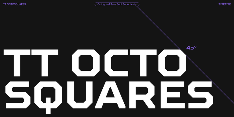
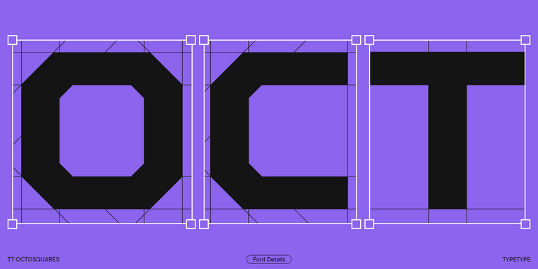
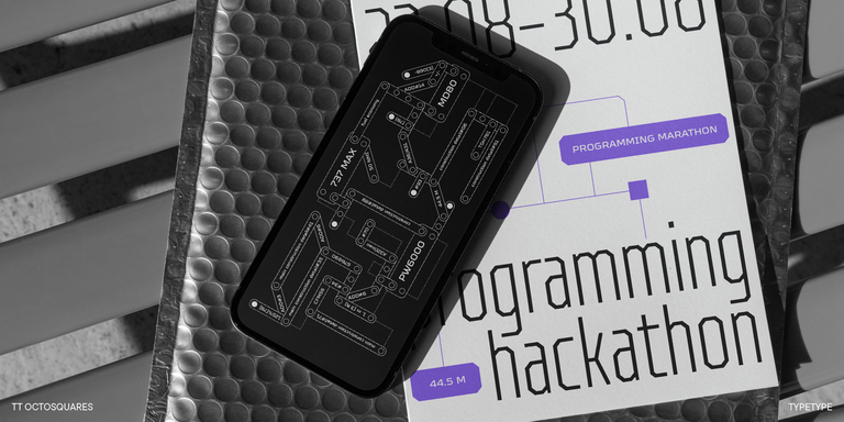
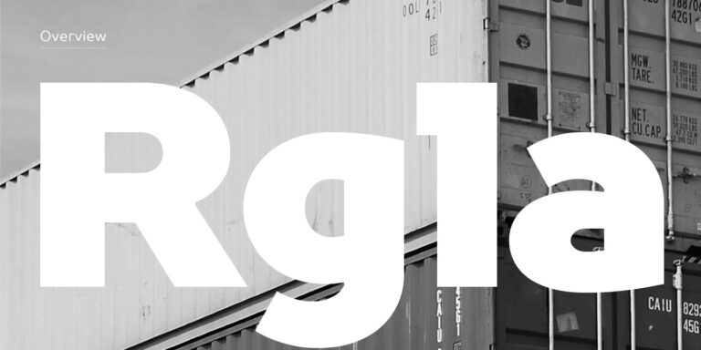
Fonts similar to Dirty Stains in this selection offer several approaches to expressive lettering. TT Runs combines wide proportions with unconventional contrast; try Bold or Black when a broad, energetic silhouette matters most. TT Octosquares has an octagonal construction with clipped terminals. Consider it for event graphics or covers with a sharper, more technological mood. TT Bricks builds its characters from simple triangular and rectangular forms, giving poster titles a deliberately constructed appearance. These three provide different kinds of emphasis: generous width, segmented geometry, and angular simplicity. Choose according to the composition rather than the category label.
Using Fonts similar to Dirty Stains in Posters and Branding
A concert announcement, an editorial cover, and a clothing label can all use assertive lettering without sharing the same layout. Fonts similar to Dirty Stains should be chosen for the space and reading distance involved. On a poster, give the main title a clear silhouette and reserve quieter typography for dates, venues, and booking information. For apparel graphics, consider how the wordmark interacts with seams, folds, and the printing area. In an editorial composition, let the heading work with the photograph rather than filling every available gap. Keep decorative treatments concentrated in the main message, particularly when the background already contains grain or collage. A brand system can use an expressive display choice for campaigns while maintaining a calmer style for product details and navigation. That division gives the identity room to vary without forcing the same visual intensity into every application.
Browse Fonts similar to Dirty Stains in the TypeType Collection
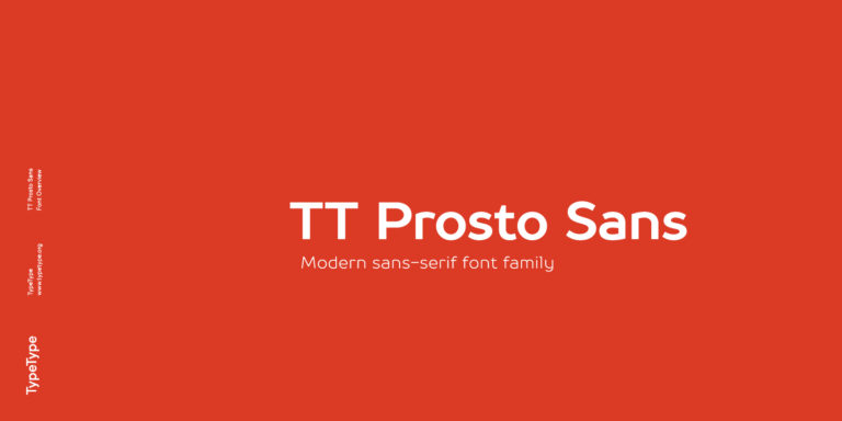
The collection also includes TT Norms® Pro, TT Commons™ Pro, and TT Prosto Sans. Enter your wording in the previews and open individual pages to review styles, character coverage, and features. Include accented letters, numbers, and punctuation in the sample instead of relying on an English pangram. Compare the candidates at matched apparent height, since equal point sizes can produce different visual scales. Inspect counters and spacing in the smallest planned version, and proof printed applications on the intended material. TypeType provides free trial versions for evaluation, including mockups and client presentations; these do not authorize commercial publication. Before purchasing, identify the required styles and delivery formats. Desktop, Logo, Webfont, and App permissions cover different uses. Check the applicable terms for your finished work rather than treating a trial download as a production license. Confirm who needs to install the files and whether the project involves embedding rather than static artwork.