Fonts similar to Allister Rough: Handmade Serif Character
Allister Rough draws on English oldstyle and transitional typography, combining historical serif forms with handmade lettering. Decor 1 supplies three variations per letter, Decor 2 offers two, and Caps combines capitals with small capitals; the family also includes Extras. Fonts similar to Allister Rough can follow its decorative character, period references, or typographic structure. Those are different kinds of similarity. An expressive serif may suit the same illustrated cover without recreating the original’s handmade finish. Decide whether the replacement needs varied letterforms, small capitals, or simply a distinctive headline before comparing individual styles.
Historical Alternatives: TT Marxiana and TT Tsars
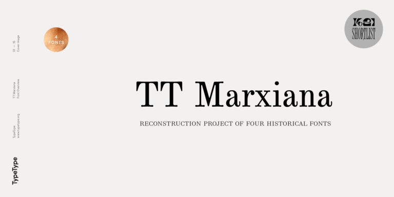
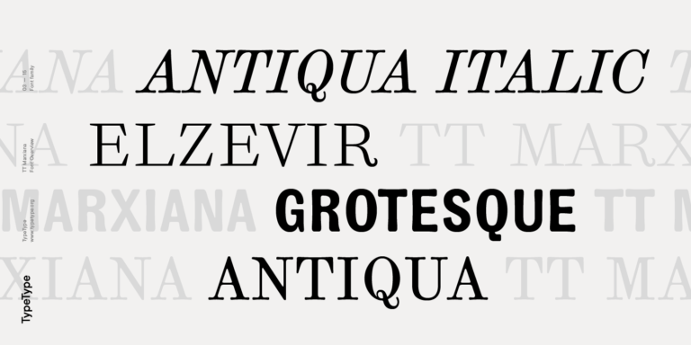
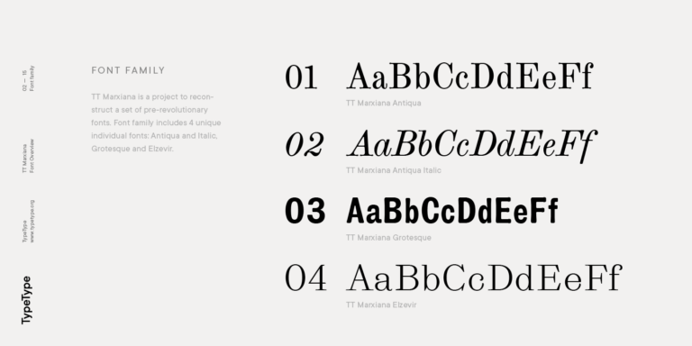
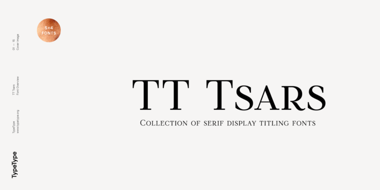
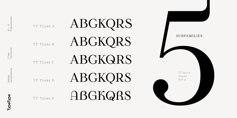
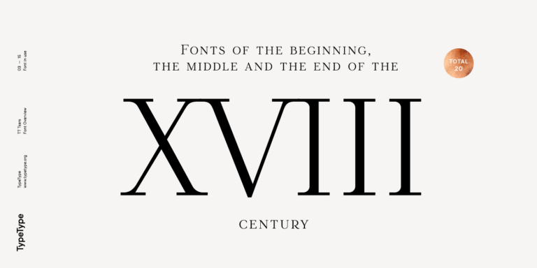
Fonts similar to Allister Rough take a historical direction with TT Marxiana and TT Tsars. Within TT Marxiana, Elzevir offers sharp headline forms and alternate swash capitals. Antiqua preserves printing artifacts and includes a stylistic set with deliberately rough details, making it worth testing for an aged print impression. TT Tsars draws on eighteenth-century title lettering and uses small capitals in place of lowercase. Consider it for a book title or heritage-inspired label where the capital structure matters more than irregular texture. These options address specific aspects of the reference rather than reproduce its complete character.
Choosing Fonts similar to Allister Rough for Contemporary Layouts
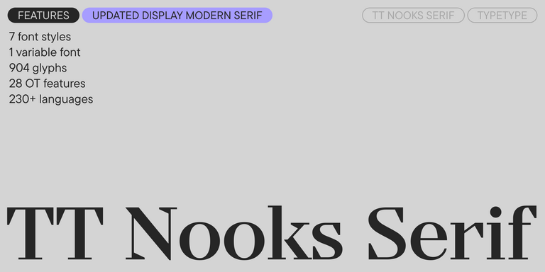
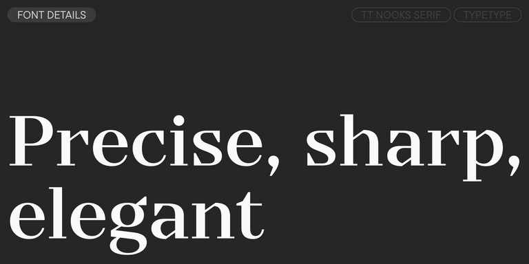
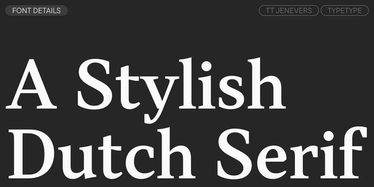
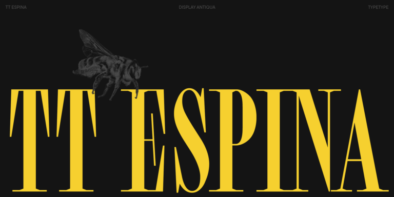
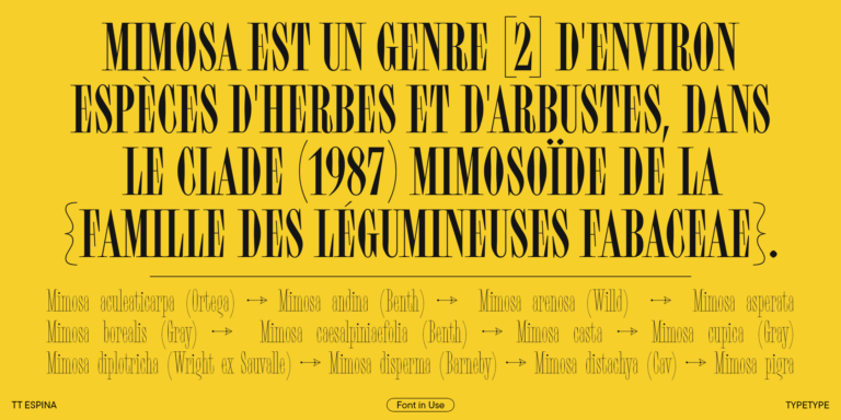
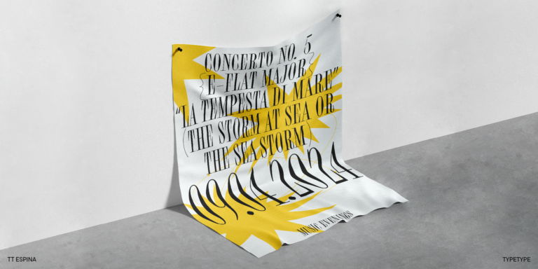
Fonts similar to Allister Rough can also move toward cleaner outlines while retaining distinctive serif details. TT Jenevers combines asymmetrical serifs with differently angled ovals and includes small capitals and stylistic sets. Consider it when an identity needs both a characterful name and supporting text. TT Nooks Serif provides wide proportions, high contrast, and slightly squared shapes. TT Espina takes the opposite approach to width, pairing narrow characters with prominent serifs and diamond-shaped bowls. A broad name across a book jacket and a long title on a narrow label may therefore suggest different starting points. Set each candidate in the actual wording, including repeated letters and accented characters. Compare word spacing, line breaks, and the shapes inside letters at the intended size. Avoid condensing a wide style simply to preserve an existing line break. Keep the treatment that gives the composition a coherent rhythm, not merely the most striking isolated initial.
Browse and Try Fonts similar to Allister Rough
Explore the collection using a working sample: the main heading, a description, a date, and required symbols. The page previews provide controls for leading and tracking, so compare spacing as well as letter shapes. Open individual family pages to inspect available styles, character coverage, and OpenType options. Where alternates or small capitals matter, test them in the application used for final production. Print a proof on the intended stock for packaging or stationery, and check a reduced version for online listings. Compare dark lettering on a light background with reversed text on a dark background. TypeType’s free trials are available for evaluation and client mockups, not commercial release. Before purchasing, distinguish static artwork from logos, website embedding, and app use, and choose the corresponding permissions. Record the selected styles alongside the approved layout so that later editions, translated packaging, and additional formats remain consistent with the original design decision.