Mission Fonts: Five TypeType Families to Compare
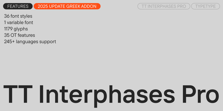
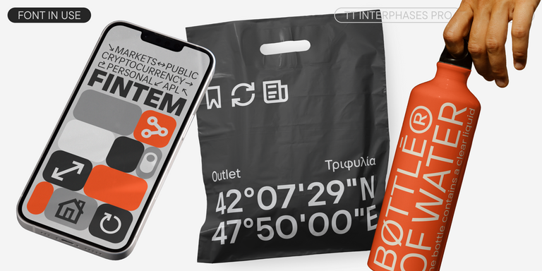
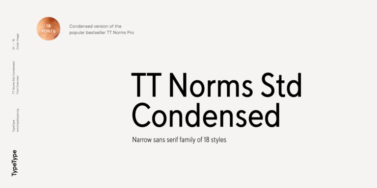
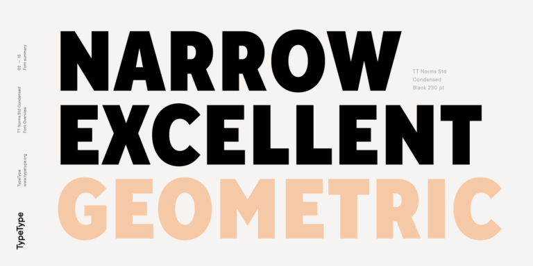
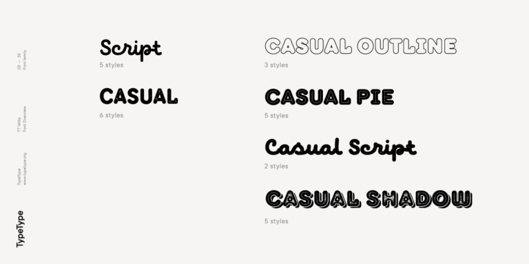
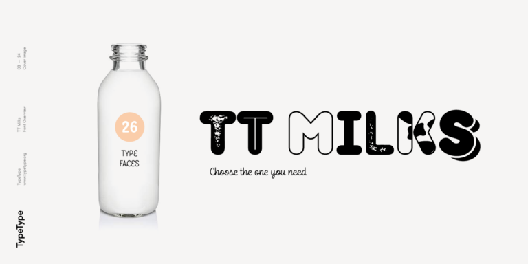
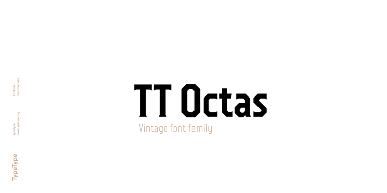
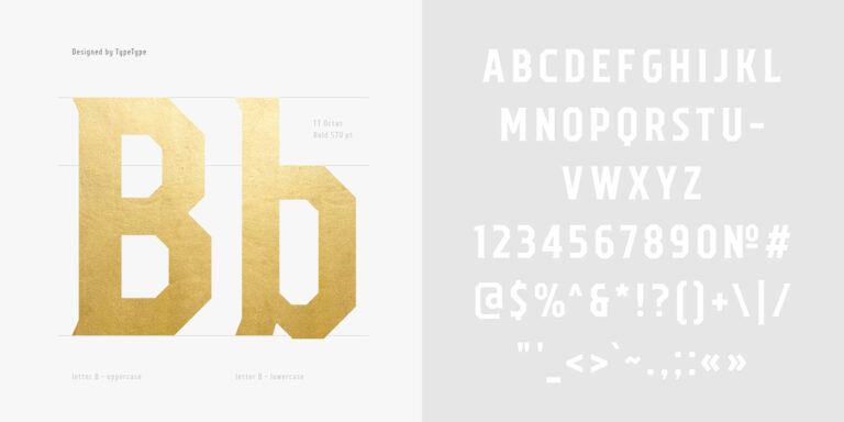
The Mission Fonts selection includes TT Commons™ Classic, TT Interphases Pro, TT Norms® Std Condensed, TT Milks, and TT Octas. These designs differ substantially in construction. TT Commons™ Classic uses geometric forms and restrained detailing, while TT Interphases Pro takes a neo-grotesque approach developed for interfaces. TT Norms® Std Condensed offers narrower proportions. TT Milks introduces script and decorative treatments, including textured variations. TT Octas replaces circular forms with octagonal shapes and adds small serifs. Start with the distinction that matters to your design: neutral structure, compact width, handwritten character, or a more angular silhouette.
Choosing a Direction for Packaging, Editorial, and Digital Design
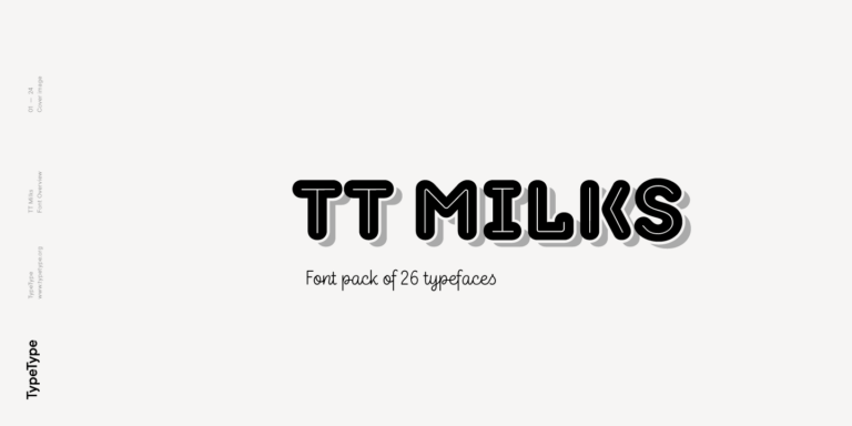
Let the format guide your choice within Mission Fonts. For a food label, consider TT Milks, originally conceived for dairy packaging, when the brief calls for decorative lettering. Reserve clear space for ingredients, quantities, and product variants. For an article or company presentation, try a restrained sans serif with distinct weights for titles and supporting information. A narrow treatment can be worth exploring for a tall, compact heading. On a website, begin with the reading tasks: navigation, descriptions, prices, and form labels. Build the design around those requirements rather than carrying a decorative headline style into every element.
Pairing Mission Fonts Across Headlines and Body Text
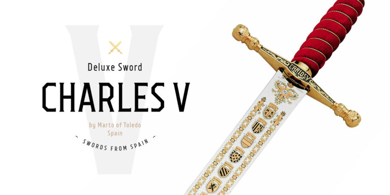
Assign each typeface a specific job before combining styles. With Mission Fonts, one direction to explore is TT Milks Script for a short headline and TT Commons™ Classic for the accompanying paragraph. Another is an angular TT Octas title above quieter supporting copy. Treat these as design proposals, not interchangeable presets. Compare lowercase proportions rather than relying on point size alone, then adjust the hierarchy so secondary text remains present without competing. Give a script heading room to retain its rhythm instead of forcing it into tightly spaced capitals. For a restrained identity, try different weights within one family before adding another. For multilingual layouts, confirm the required characters in both choices and include real names, punctuation, and currency symbols in the proof. Finally, review the full composition in color and monochrome. The hierarchy should remain understandable when photography, illustration, or a colored background is removed.
Mission Fonts: Browse the Collection and Plan Your License
Browse the collection, open the relevant family pages, and select the weights or subfamilies your project requires. Use TypeType’s free trial versions to prepare working layouts and client mockups before purchasing. Include the smallest text size, the longest heading, and any specialist characters in that evaluation. Trials are for testing, not finished personal or commercial work. Once the direction is approved, match the license to the actual use. TypeType offers Desktop coverage for printed materials and merchandise, Webfont licensing for live website text, App licensing for embedding in applications, and a separate Logo license for public logo use. Account for every planned channel rather than treating a desktop purchase as universal permission. During handover, record the selected styles, the license holder, and the intended applications. Clarify any need to share files with contractors before delivery, so the production team has the permissions required for its work.