Welcome to the tenth lesson of our « UniversiTTy »! In this series of articles, we guide you through the process of font design step by step. That’s why we suggest going through the earlier articles in the series before diving into this one.
Last time, we focused on the detailed development of uppercase characters. Now, it’s time to concentrate on basic lowercase ones.
Your teacher is TypeType Design Lead Antonina Zhulkova. Antonina has been working in font design for more than 5 years now. She’s the concept author and lead designer of projects like TT Neoris, TT Ricordi Allegria, TT Globs, and Ivi Sans Display. Also, she took part in the creation of TT Fellows, TT Fors, TT Interphases Pro, TT Commons and many other typefaces.
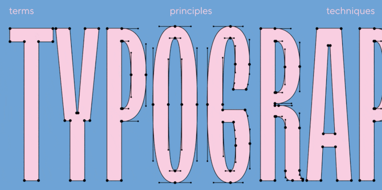
Lowercase characters
Lowercase characters are most often used to type large amounts of text, so they are used much more frequently than uppercase letters. This is also why they usually represent the entire typeface—they help us form an opinion about the font as a whole. So, we recommend paying close attention to lowercase characters. The process of designing them is logically very similar to that of uppercase characters, given that the development stages are the same in both cases. However, lowercase characters certainly have their own specifics.
Historically, lowercase characters formed later than uppercase letters and are marked by the emergence of minuscule forms. Minuscule letters feature many similarities in logic and proportions and a noticeable influence of calligraphy: unlike uppercase characters, lowercase letters were written on paper, not carved in stone. To me, lowercase characters of the Latin alphabet are a joy to work with. The logic behind many forms is quite similar, yet there’s still a lot of creative freedom.
Lowercase letter parameters
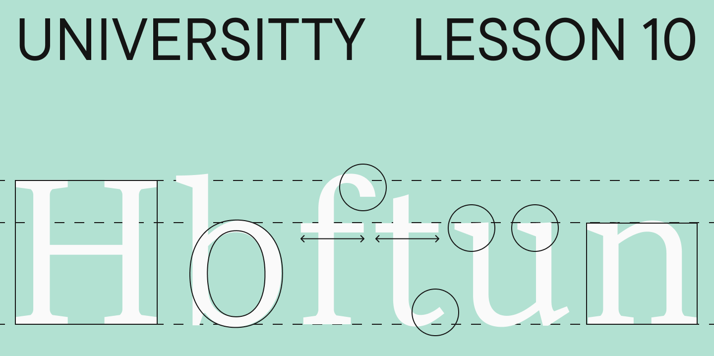
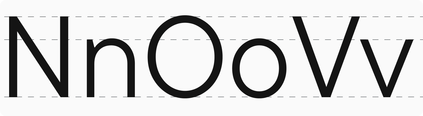
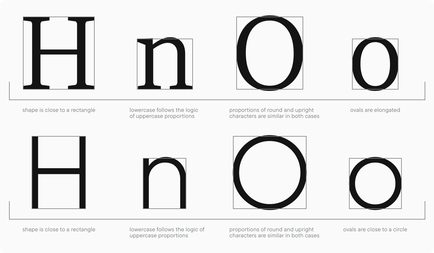
Just like with uppercase letters, the main characters when working with lowercase will be « n, » « o, » and « v » (for the Cyrillic-based alphabets, « н » is used instead of « n« ). Before beginning the work on the rest of the characters, we should go back to the completed uppercase letters and compare the basic lowercase ones with them. Also, at this stage, returning to the sketches and adjusting them based on the modified uppercase letters are recommended.
As we already know, lowercase letters are always drawn lighter than uppercase to keep typesetting density uniform. Within a font family, this difference will increase from lighter font styles to bolder. The weights of the lowercase characters should coordinate well among themselves and pair nicely with the uppercase letters.
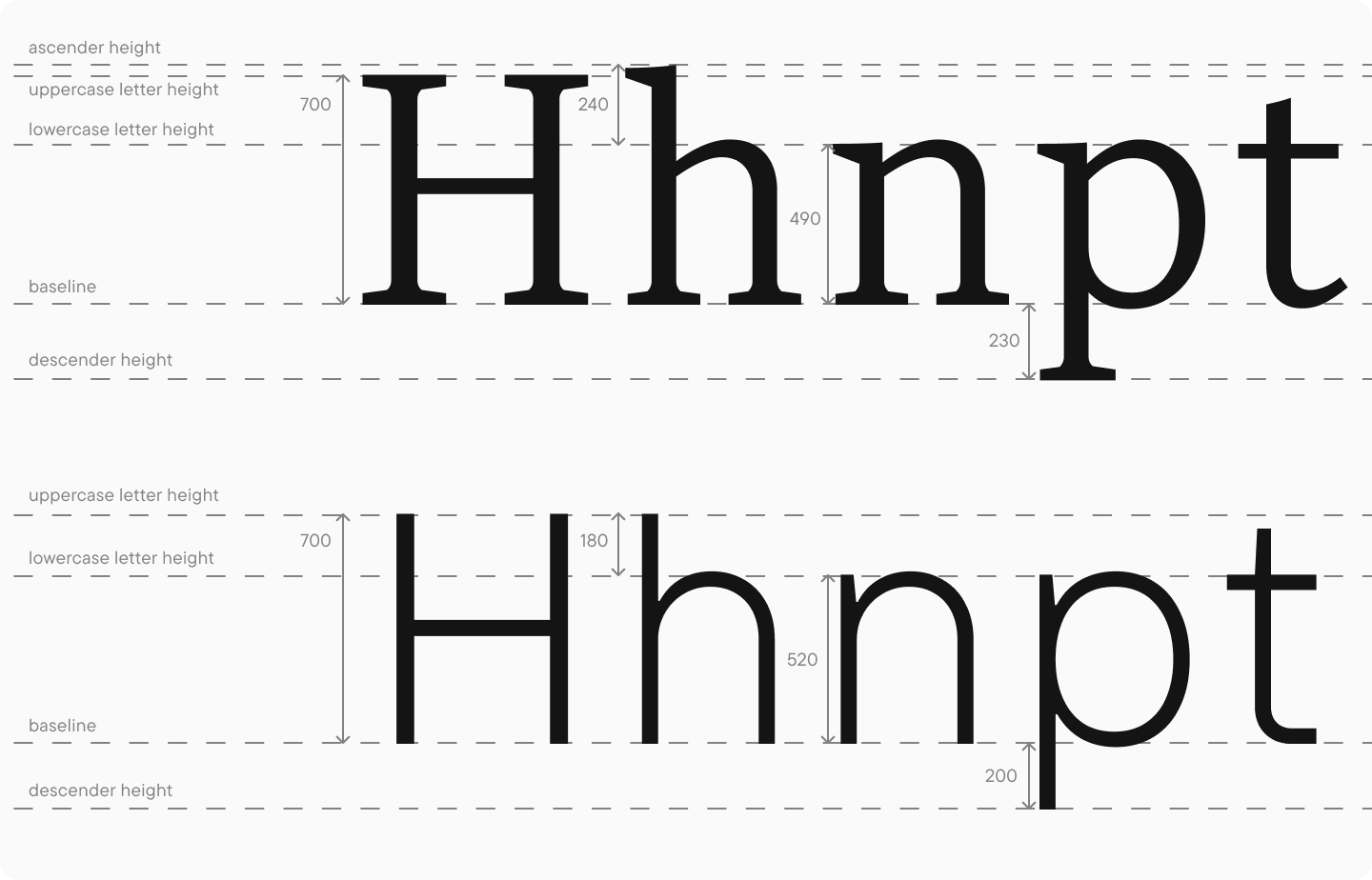
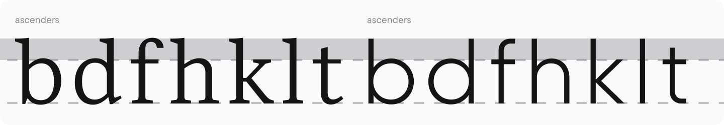
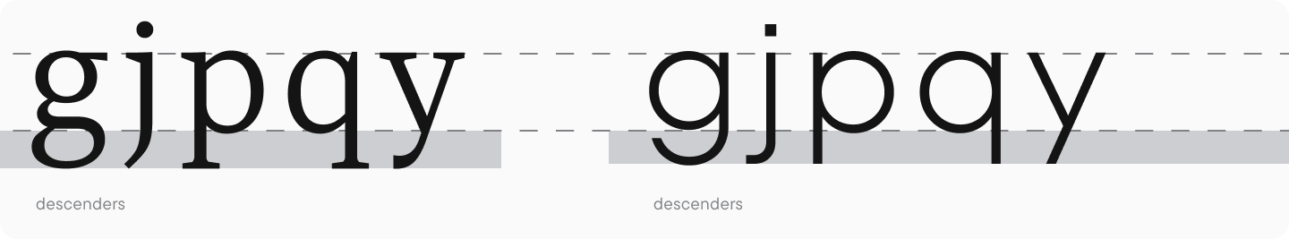
Another important parameter is the height of the lowercase characters and the size of ascenders and descenders. This parameter influences the text’s readability and its character.
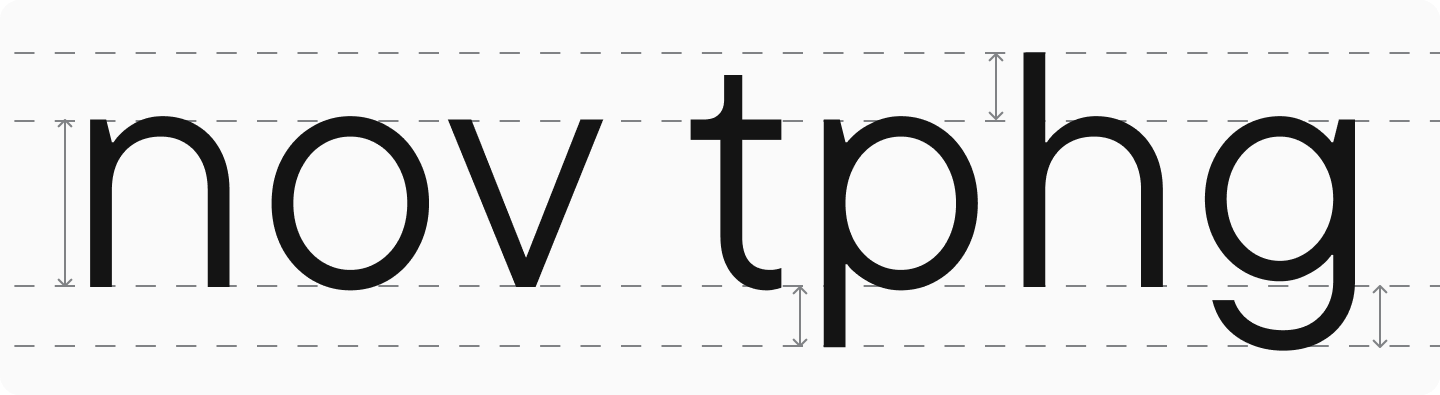
The ascender and descender sizes are closely connected with the lowercase character heights, so it’s better to begin working on them when the main uppercase and lowercase letter sizes have been determined. After settling on the main lowercase letter height, you should pass over to the ascender and descender heights.
In neutral fonts, ascenders and descenders most frequently have relatively the same length. In addition, ascenders and descenders must not be noticeably higher or lower than uppercase characters. The exception is the letter « t, » which historically features a small ascender. When dealing with display fonts, the approach to these character elements can be more free.
I would like to warn you against drawing very long ascenders and descenders (this can be found, for instance, in old-style or calligraphic fonts). When typing text with long ascenders or descenders, you must assign substantial line spacing values to avoid overlapping lines. Widely spaced lines, in turn, significantly decrease readability, as our eyes and brains find it difficult to catch the beginning of the following line without losing the thought.
Another issue with long ascenders and descenders may appear in several programs after export; for example, in Microsoft Word and other text editors. Each letter of a font sits in its own « cell » with a pre-determined height (for example, 1000 units per Em, which we have already discussed). Many text editors display the outlines only within these cells, and the elements extending beyond the cell borders may be cropped even if you still see them in the font editor or Adobe editors.
Lowercase letter proportions
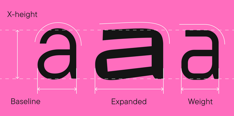
Similar to uppercase letters, you should move on to character proportions after determining the weights and heights of lowercase letters. As I have already mentioned, lowercase characters historically have less dynamic proportions, but there is still a difference between them. The logic of their proportions should follow the uppercase characters to make them look like a single unit together. For instance, if uppercase characters are narrow, lowercase characters should be narrow, too.
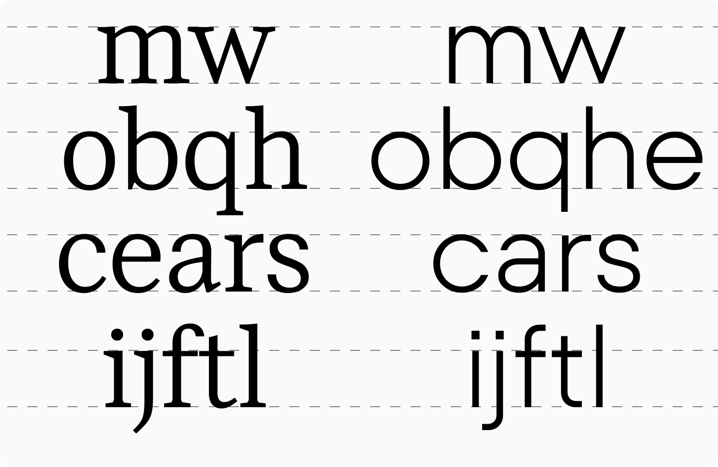
If you divide characters into groups by width, four categories similar for serifs and sans serifs can be distinguished:
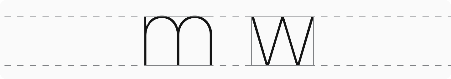
- The widest characters: « m » and « w« ;
2. Medium width characters: « o, » « b, » « d, » « p, » « q, » « g, » « a » (single-story form), « n, » « h, » « u, » « k, » « v, » « x, » « y, » « z« ;

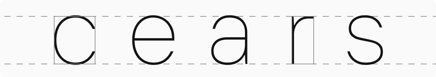
3. Narrower characters: « c, » « e, » « a » (double-story form), « r, » « s« ;
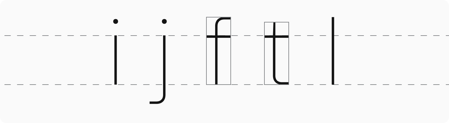
4. The narrowest: « i, » « j, » « f, » « t, » « l« ;
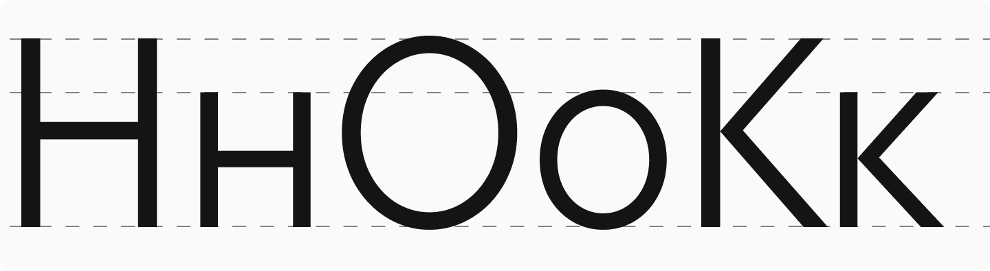
You should stick to these basic proportions when working on lowercase characters. However, the style of the font and its visual idea can introduce changes, and it’s worth aligning with those as well. Lowercase letterforms repeating the uppercase ones (« o, » « c, » « k, » « o, » « s, » « v, » « w, » « x, » « z« ) should also follow the logic of the uppercase ones. To balance the typesetting, these repeated characters are designed in proportion to the base characters « n » and « o » aligning with the relationships of uppercase characters to « H » and « O. »
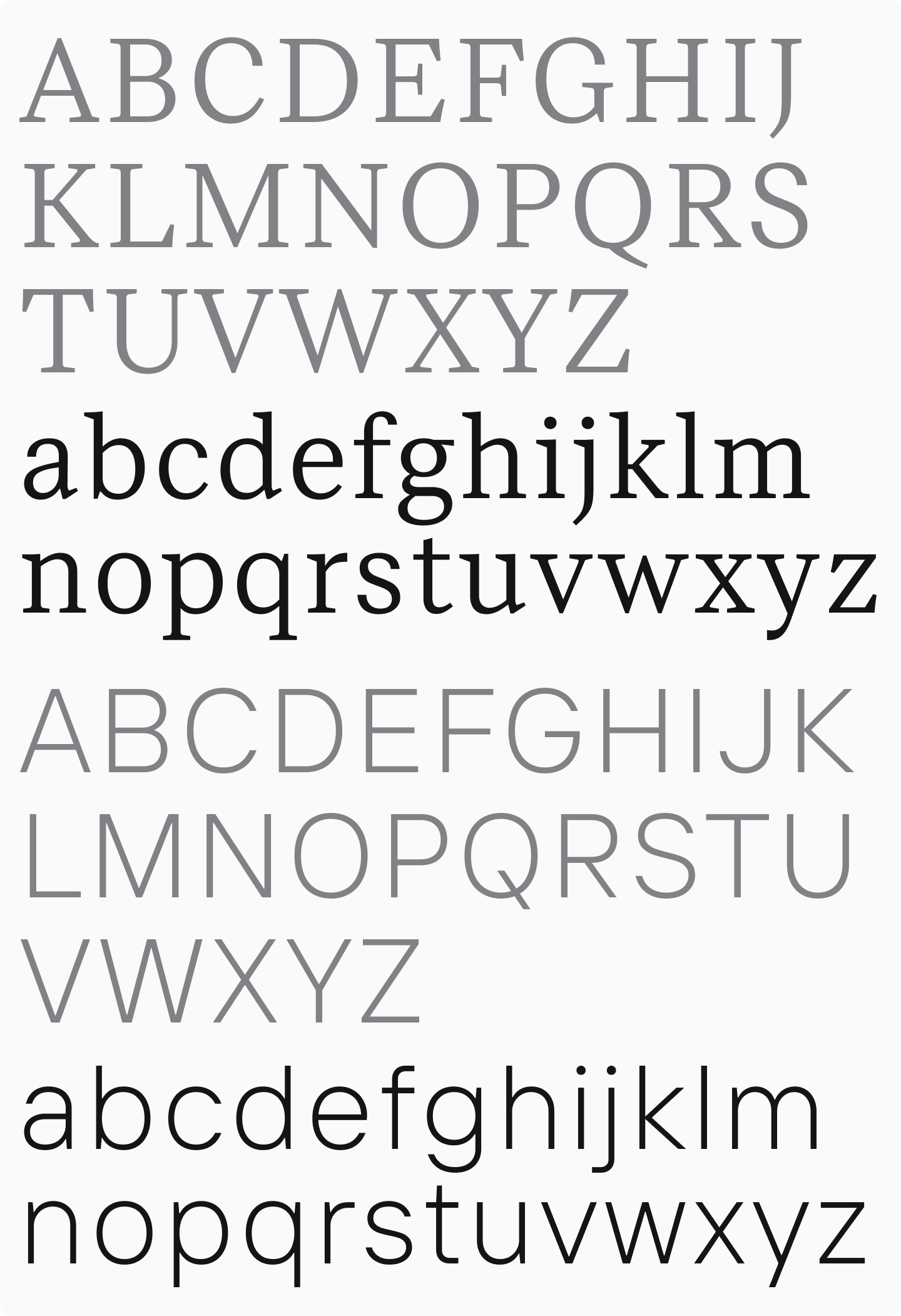
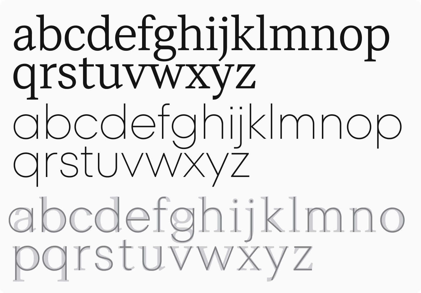
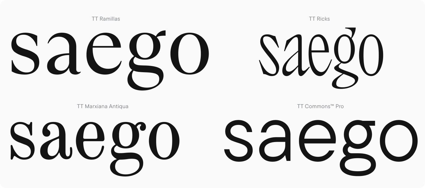
Now, let’s compare lowercase character proportions in a text serif and dynamically proportioned geometric sans serif.
Just like with uppercase letters, lowercase characters can also be subdivided into groups to work with them comprehensively (« n » and « o » are added to compare consistency and are not necessary to include in the group):
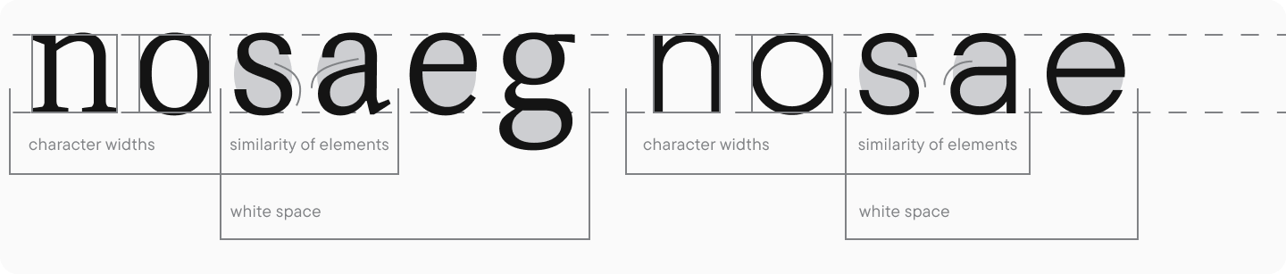
- « n, » « v, » « o » — working with the base characters, their proportions, and weights;

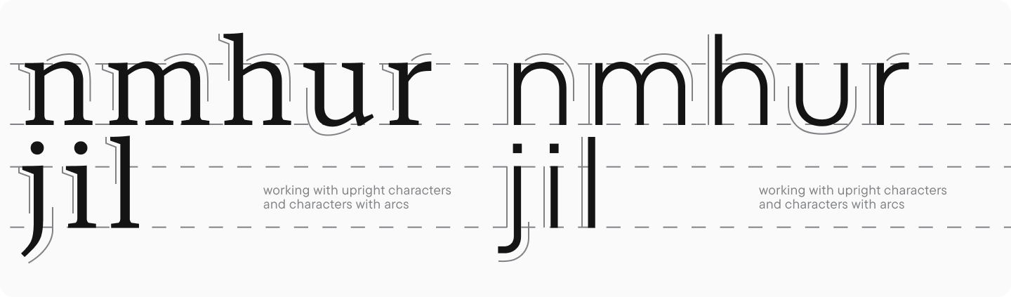
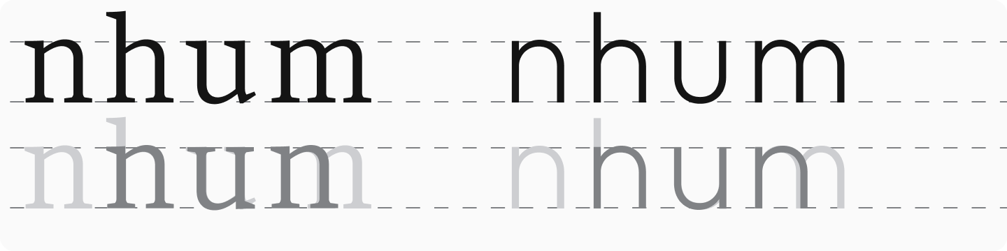
2. « n, » « m, » « u, » « h, » « r, » « i, » « j, » « l » — working with vertical and arched characters, analyzing their relation to one another;
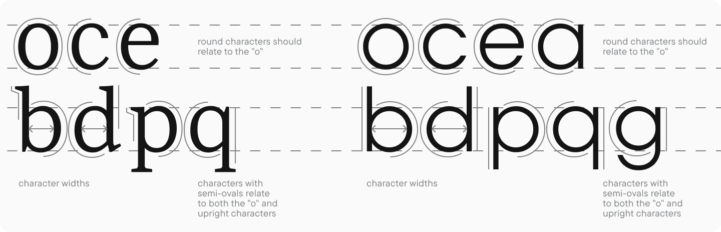
3. « o, » « c, » « e, » « a » (single-story), « b, » « d, » « p, » « q, » « g, » « h » — working with rounded characters and characters featuring bowls. Round-shaped characters (« c » and « e« ) should align with « o, » and characters featuring bowls (« b, » « d, » « p, » « q, » « g« ) should align in form and proportions with both « o » and vertical characters with ascenders and descenders;
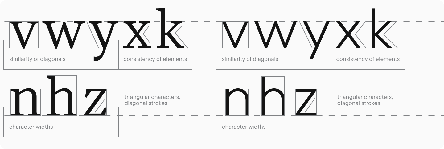
4. « v, » « w, » « y, » « n, » « x, » « z, » « h, » « k, » « x » — working with triangular-shaped characters and characters featuring diagonal strokes;
5. « n, » « a » (double-story), « e, » « s, » « a, » « g » (double-story), « o » — working with double-story characters, their proportions and inner negative space;
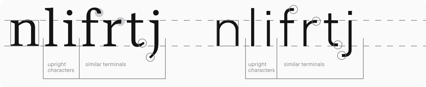
6. « n, » « i, » « f, » « j, » « l, » « t, » « r » — working with narrow letters and similar elements (terminals);
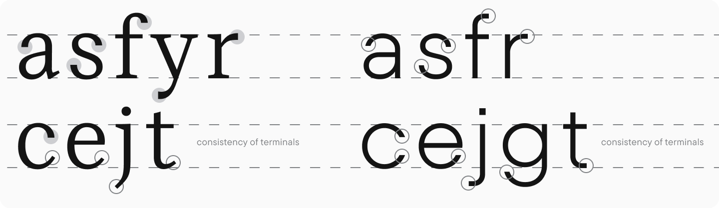
7. « a, » « c, » « e, » « j, » « f, » ‘t, » « s, » « g, » « y » (if there is a terminal), « r » — working with terminal consistency;
8. « b, » « d, » « f, » « h, » « k, » « l, » « t » — working with ascenders;
9. « g, » « j, » « p, » « q, » « y » — working with descenders.
For illustration, two differently proportioned fonts are used: a text serif with relatively static proportions and a geometric sans serif with dynamic proportions.
Essential traits of lowercase characters
Subdividing characters into groups is still quite abstract and doesn’t allow us to consider all the specifics of lowercase glyph design. That’s why we’ll focus more on these details.
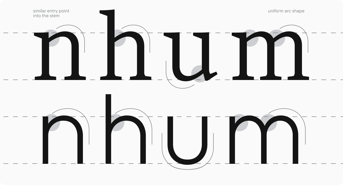
Characters with arcs: « n, » « m, » « u, » « h, » and « r »
All elements of arcs should be visually and proportionally similar. « n » and « h » most often have the same width, and « u » is made equal in width or narrower than « n » because its inner negative space seems larger because of the opened top part. The letter « m » is a wide character, and the size of each arc should be smaller than the width of the letter « n » or else « m » in the text will seem too bulky.
The design of these characters should be similar, as they carry the same meaning. The letter « u » can be an exception in some geometric sans serifs, in the cases where this glyph looks like just an arc without the right side stem. This form is featured in the famous font Futura by Paul Renner, and designers today use this particular form as a homage. In display typefaces, maintaining this principle ensures a more unified text appearance, but the structure should follow the font’s design vision.
Round characters and characters with bowls
The letters « c » and « e » must be tightly bound with « o, » and these glyphs must feature an identical round shape (we are now addressing general principles; the forms in display fonts may differ). In neutral fonts, these three letters are proportionally similar to one another, and the width decreases gradually from « o » to « c« ; the letter « e » falls in between and approaches the width of the letter « o. » This happens because of the amount of negative space in the character. The letter « c » features the largest amount of negative space because of its open form, and we compensate this « white » with width. Besides, the terminals of « c » and « e » are very similar in form. We are going to cover lowercase glyph terminals a little later.
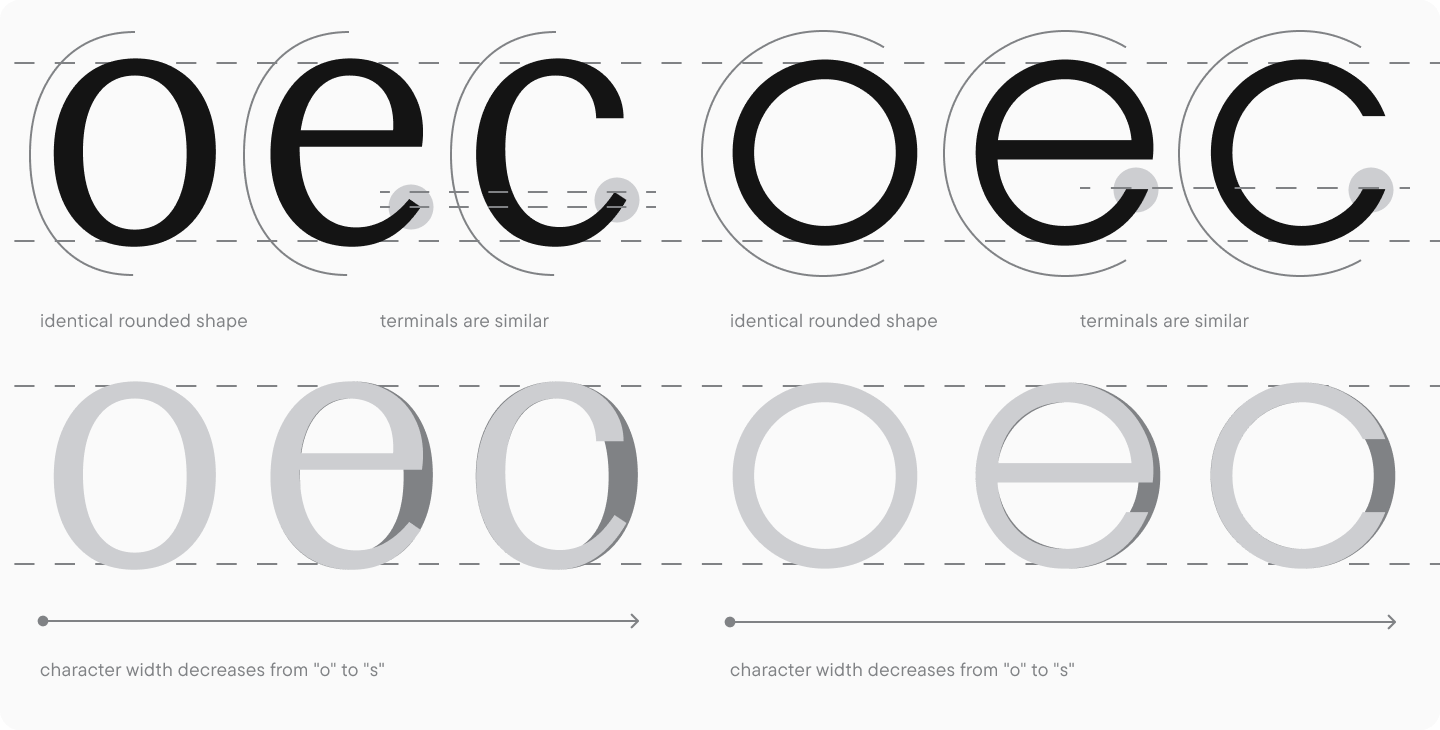
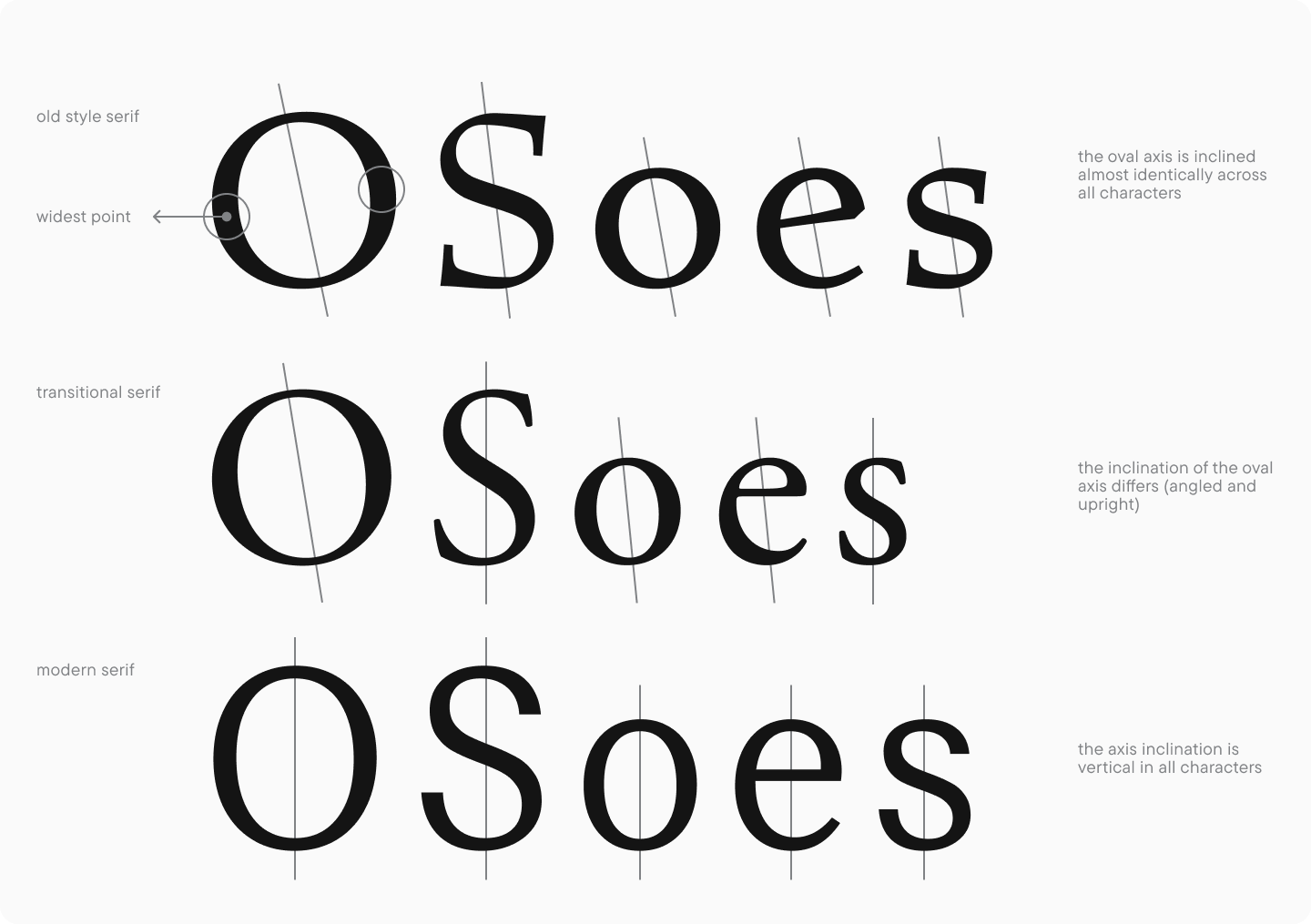
When working on serif fonts, it’s important to remember the rules of contrast distribution and oval axes in « c, » « e, » and « o » (the issue of contrast in serifs was covered in the previous lesson). These parameters are strongly influenced by the font’s style. So, in Renaissance-style and modern serif fonts, they will be identical, and in Transitional serifs, they will vary depending on the design. It’s necessary to maintain the same logic throughout uppercase and lowercase characters and compare them with the letter « s, » which also features a slanted axis.
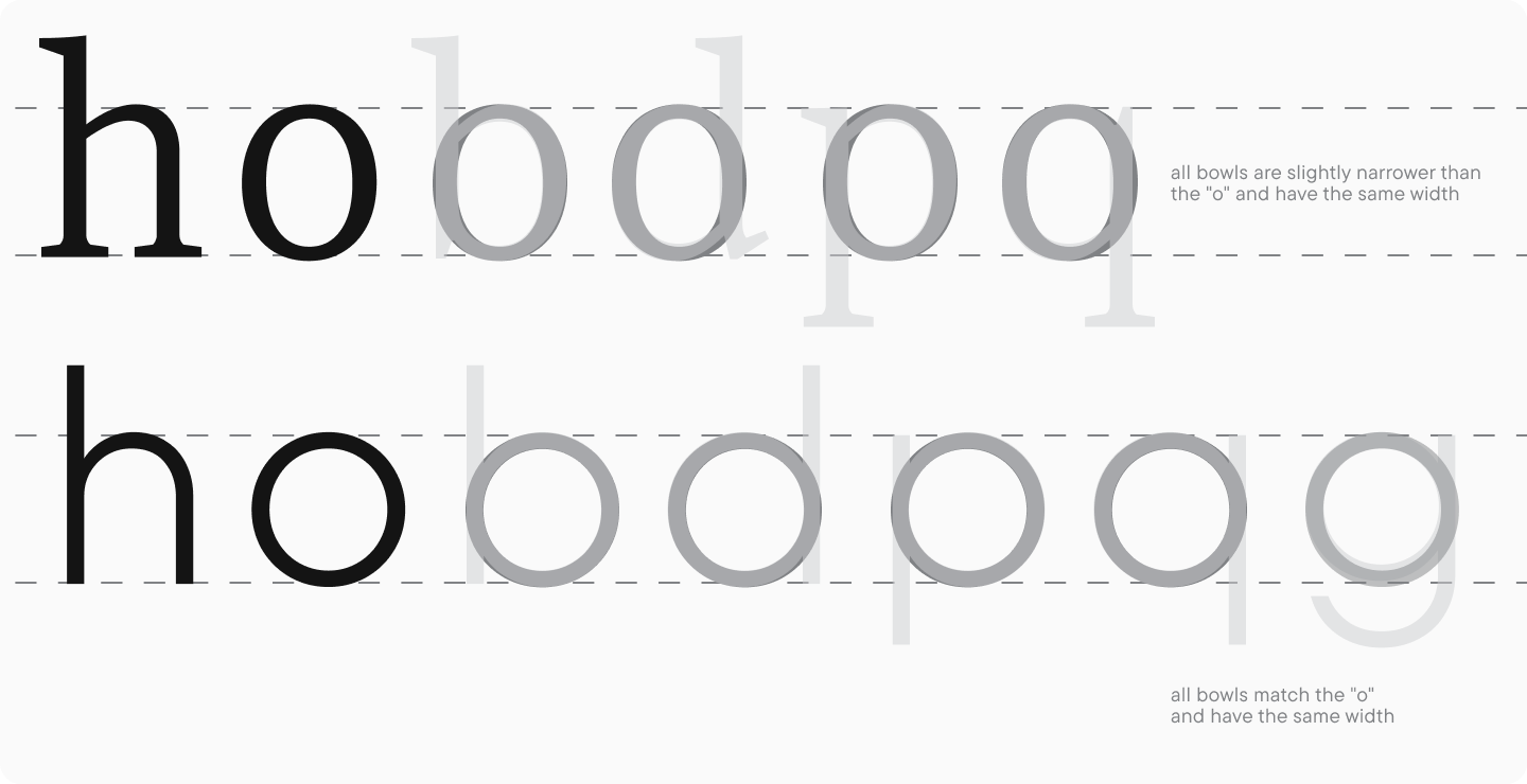
All characters with bowls should harmonize with « o, » as well as the characters with arc, ascenders, and descenders, such as « h. » Their proportions vary more than those of the letters « е » and « с » and depend on the lowercase letter proportions.
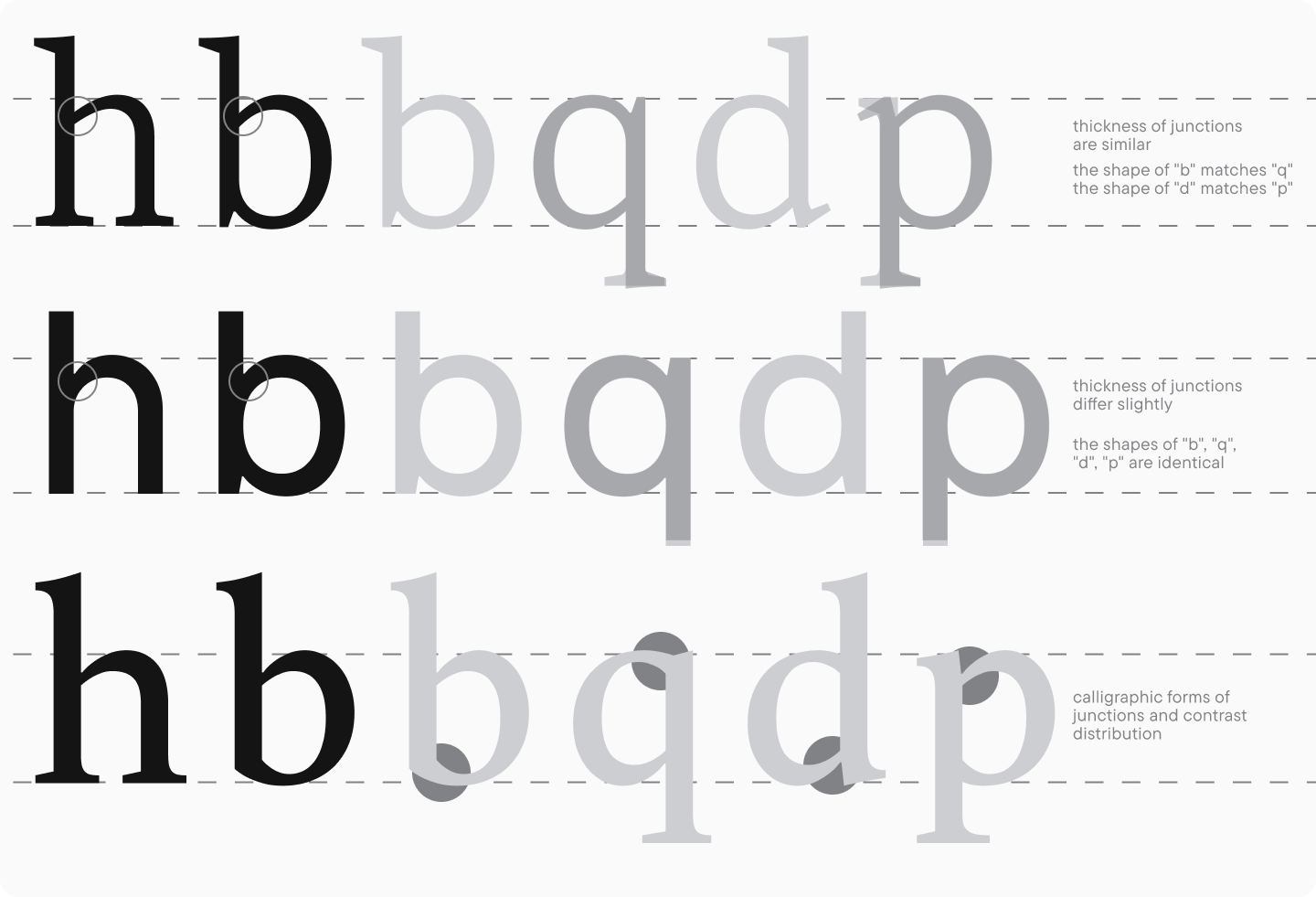
In sans serif fonts, the bowls of the letters « b, » « d, » « p, » « q, » and « g » (single-story) are often designed identical in form. In serif font, on the contrary, the stem junction points at the top and bottom are different. This goes back to calligraphic tradition and depends on the movement of the writing tool: the more noticeable its traces are in the font, the more differences you will see between junction points. In classical Antiquas, these points may be identical, as this style gravitates more to geometric construction than a writing tool.
The bowl forms of « b » and « q, » « d, » and « p » usually mirror each other or appear to do so (these letters are mirrored vertically and horizontally at the same time). In the letter pairs « b » and « d« , « p » and « q » may differ. The single-story « g » featured a narrower and higher-positioned bowl in relation to the lower baseline to increase the amount of negative space in the glyph.
Another essential detail that will benefit the font is the correlation between the junction points of letters with ovals and letters with arcs. If the junction points harmonize with one another, all glyphs look more coherent in the text setting. If you are looking for visual contrast between two character groups, you may deliberately add variations to these points.
Double-story characters
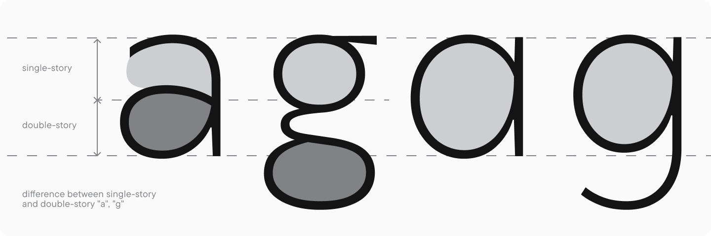
This character group is the most challenging to design. Double-story letters are called so because of their construction, which may be divided into two parts vertically. The letters « a » and « g » are considered double-story, also featuring single-story options. Based on their structure and meaning, « e » and « s » can also be associated with them. These characters make it possible to effectively emphasize the font’s unique personality and idea.
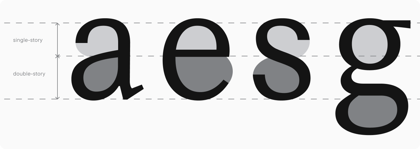
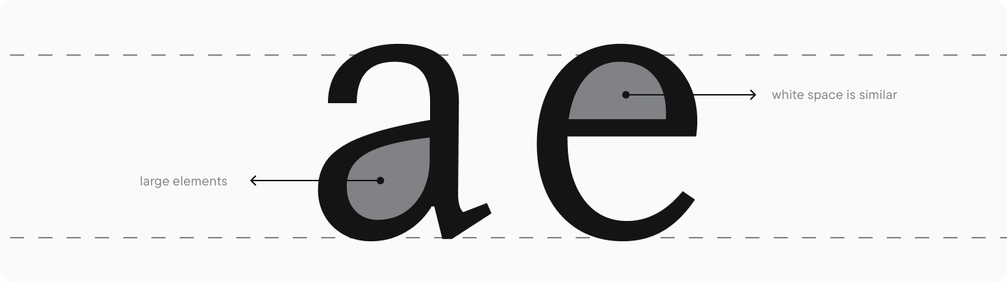
The letters « a, » « s, » and « e » should be well-balanced in terms of the amount of black, which is achieved through visual compensation of weights. Also, both glyph parts should have similar character of the inner negative space.
These glyphs have numerous interconnected features. First, the proportions of « a, » « s, » « e » are similar (the letter « g » aligns better with the round-shaped characters, with proportions based on the letter « o« ). Second, these letters should also share structural features.
The closed negative space in the letters « а » and « е » and its open part should have similar weights, meaning that if « a » features a small loop, then the upper part of the letter « e » should be quite small.
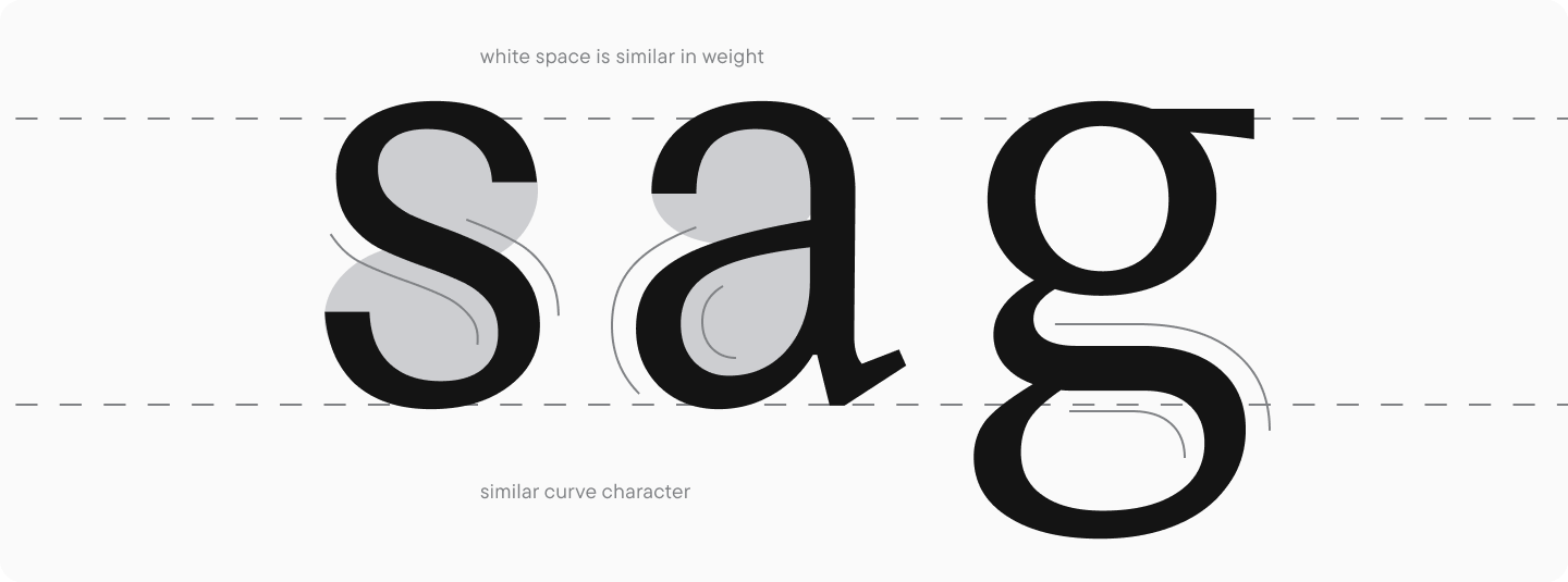
The curves of the bowls of « a, » the spine of « s, » and the loops of « g » can share similar shapes for a cohesive visual rhyme, but this aspect depends on the overall style of the font. The form of the letter « g, » for instance, may be different, just like the middle stroke in « a. »
The double-story « g » is the most complicated letter in the font, so it always requires a lot of work and attention. This form is most often present in serif fonts; that’s why, to draw it correctly, you should refer to historical examples that fit your style. The main principle of this form is that a smaller upper bowl (which should harmonize with the « o« ) goes together with a larger loop. The form of the loop may vary: it can be slanted or upright, closed or open. Remember the ear of « g« ; as well, as it should match the other lowercase glyph elements, such as teardrops or serifs.
I recommend analyzing the designs of these letters in different fonts and considering the reasons why they have a certain look. This will broaden your understanding of how these glyphs are shaped.
The letters « f, » « t, » « l, » « j, » « i »
These plain and simple glyphs are, nonetheless, very important for typesetting. The contents of this group may vary depending on the glyph style. For example, if « l » has a terminal, it falls into the same category as « f, » « t, » and « j. » The same goes for the letter « j« : its form in serifs and sans serifs is often different from other glyphs, this is essential to remember. Additionally, the uppercase « J » form often has features similar to the lowercase, so they should be analyzed and designed together.
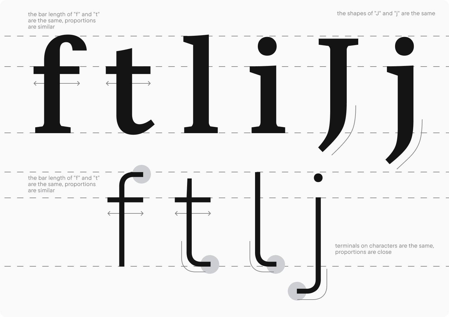
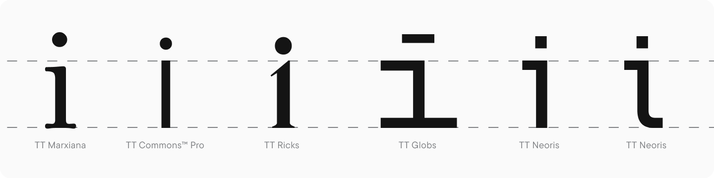
The letters « f » and « t » should be similar in proportions, form, and bar length. However, the terminals in these glyphs follow the logic of the entire font. The structure of the letter « i » may also vary depending on the font’s style. Even though the most popular form is the one consisting of a stem and a dot, this letter may also have horizontal bars, monospaced serifs, and other distinctive features.
Terminals
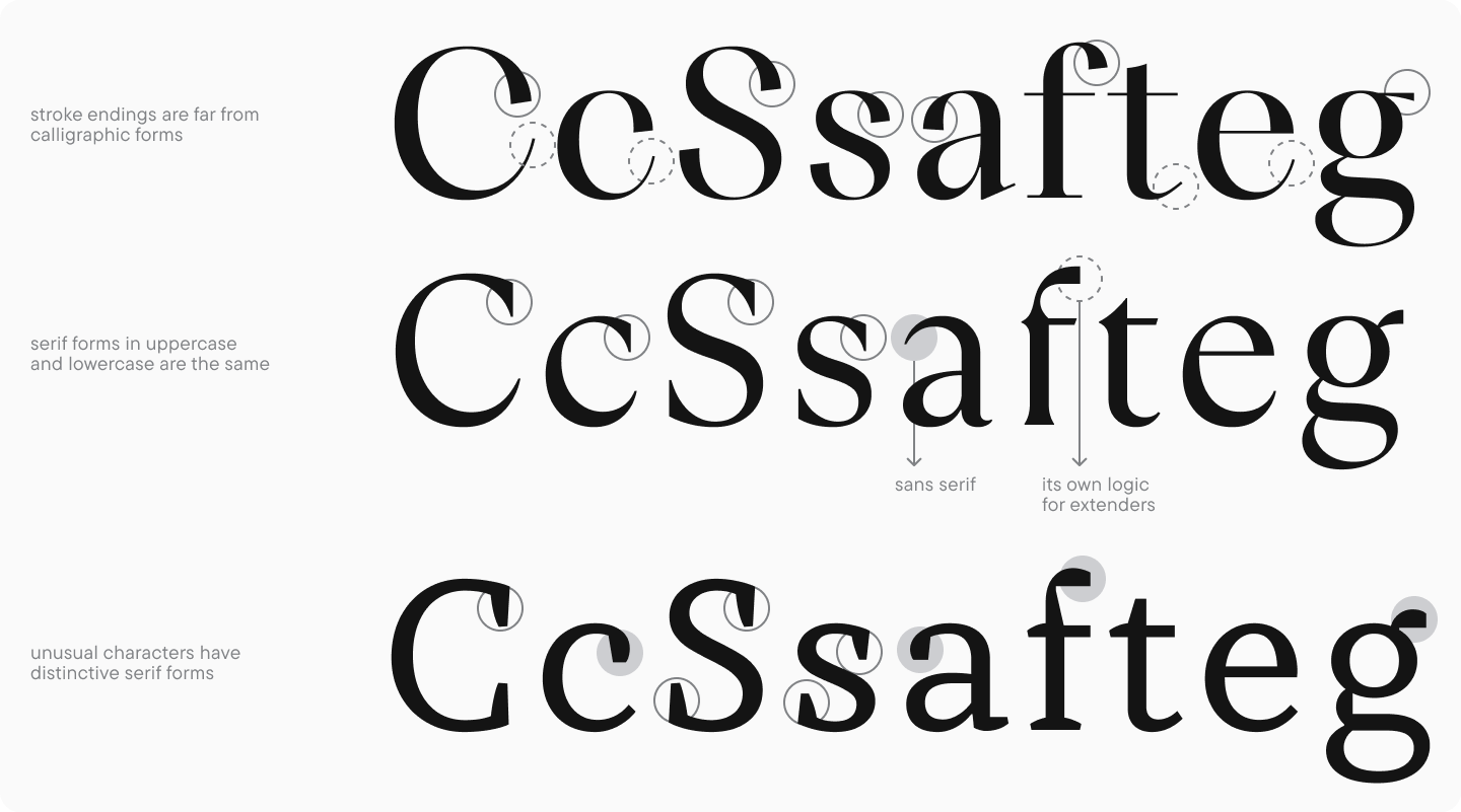
The approach to handling terminals in lowercase characters is the same as in uppercase but requires more attention. The lowercase set of Latin characters includes many glyphs with terminals, and their consistency significantly impacts the font’s aesthetics.
In sans serifs, terminal forms, and stroke ends often mimic the forms of uppercase characters. It is worth noting the correlation of terminals between uppercase and lowercase glyphs: how similar in character and meaning they are in these two lettercases. Lowercase letter terminals should be smaller and calmer than those of uppercase letters to maintain the amount of negative space inside letters.
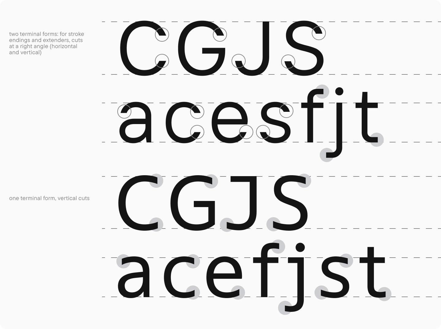
In serifs, working with terminals is more challenging. As you may remember, uppercase glyphs often feature serifs as stroke ends, and lowercase glyphs feature serifs and teardrops. These elements have a noticeable influence of a writing tool, and their forms may vary greatly.
In fonts based on traditional serif font classifications, stroke ends of identical forms are substituted across both lettercases. If an uppercase letter has a serif on the upper end of a stroke, a lowercase character will almost always feature a teardrop (of one form or another). The exceptions are the letters « s » and « z, » featuring serifs in uppercase and lowercase variants.
The teardrop forms are also highly versatile: the structure may range from the soft spill of a pen stroke to a crisp, clear circle. In historical fonts and the fonts based on them, the writing tool determines this form. The following letters feature teardrops: « a, » « c, » « f, » « g » (ear shape), « j, » « r, » and « y.«
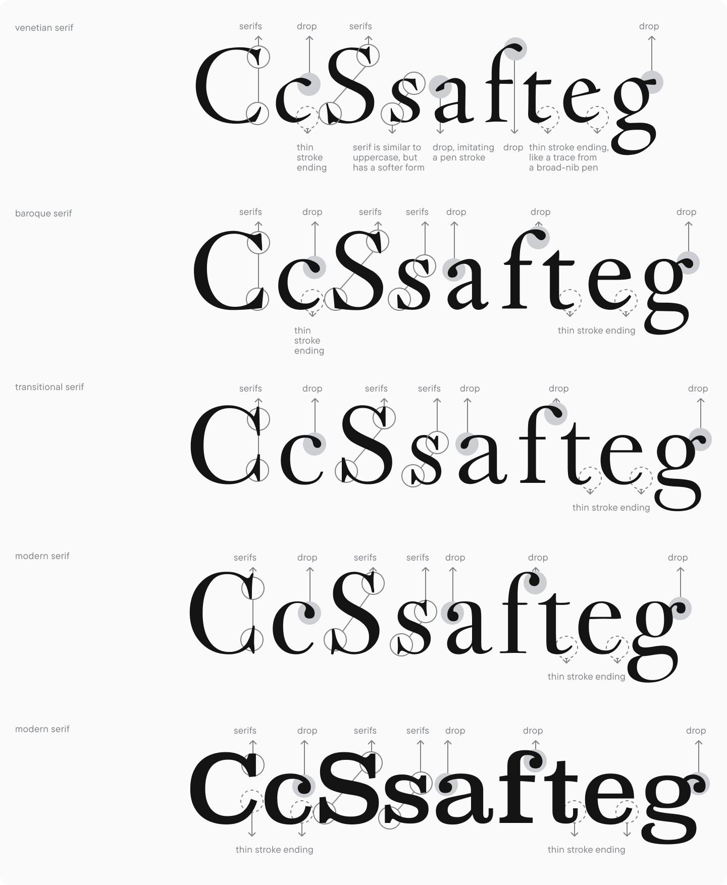
In modern fonts, teardrop and terminal forms progressively stray from calligraphic appearance and are mainly shaped by the author’s imagination.
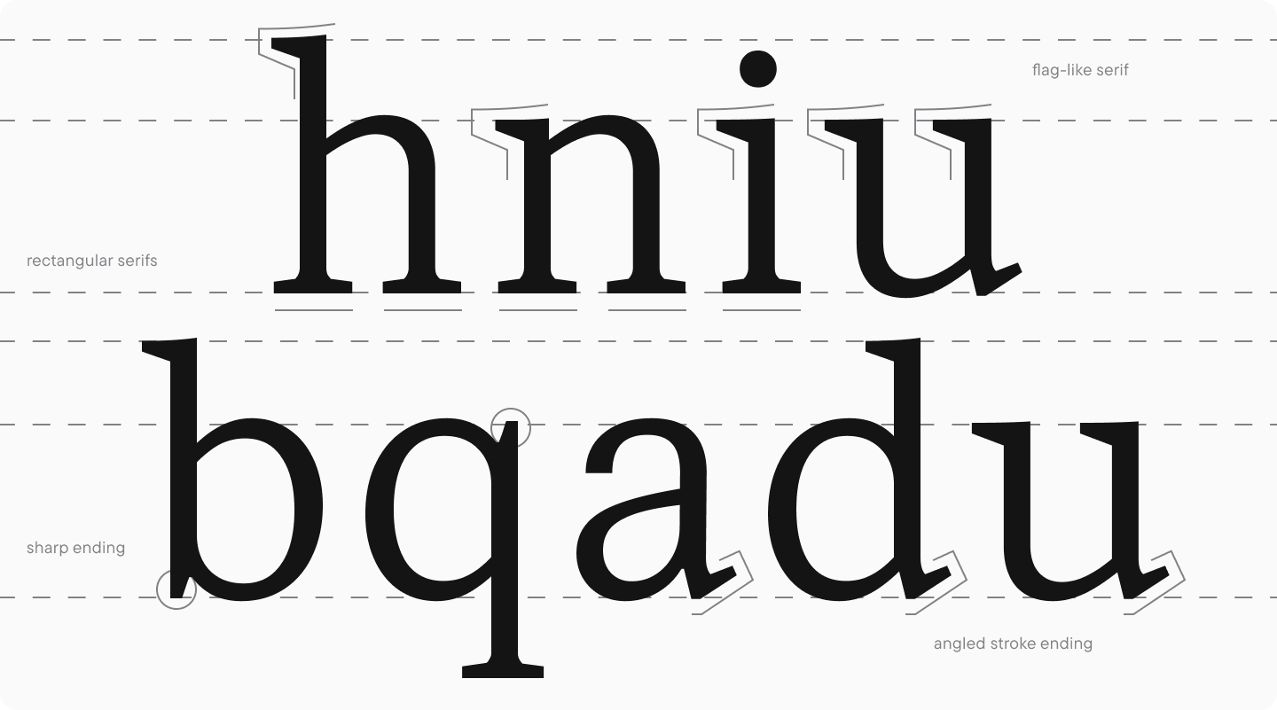
It’s also worth mentioning that the lowercase characters have more serif structures for stem ends. Such serifs in uppercase characters often feature two forms, horizontal and vertical, and in lowercase characters, stems with the same meaning can have different ends. This is most noticeable in characters with arcs, ascenders, and descenders, like « n, » « i, » « h, » or « u. » The serifs at the top of the letter may be wedge-shaped, while those at the bottom are more rectangular: this is due to the tradition of calligraphic writing and the influence of the writing instrument. The forms of the stem ends are also linked to the historical writing manner in the letters « a, » « d, » « u, » « p, » and « q, » where the terminal element ends with a serif that differs from the one in the letter « n.«
When working with serifs and terminals in serif fonts, it’s important to carefully consider each graphic decision, keeping in mind the font’s purpose and stylistic direction.
Glyph character
Basic Latin lowercase letters look very consistent and uniform in typesetting. This is the result of a long evolution of forms, first in calligraphy and then in font design.
Most lowercase characters fall into three main categories with identical graphic solutions: glyphs with arcs and round and triangular-shaped glyphs. A similar glyph drawing logic noticeably simplifies the work of a font designer while also being able to influence the font’s defining features negatively. If you want to make the font more expressive, I recommend adding a display quality to one of the main categories, with its intensity determined by the purpose. Each group contains numerous characters, so typesetting will visually transform even if the smallest details are added.
The same approach can be applied to frequently used letters that often repeat in texts and are capable of diversifying typesetting. Use this website to check character frequency for certain European languages.
The font’s idea is the cornerstone of glyph design. Design principles should serve as a support in bringing the idea to life, not limit the creative process.
Conclusion
In my opinion, glyph design is the most fascinating process of font development. However, all the other stages, such as preparation, research, planning, and sketching, are just as essential. They help you form the foundation of the theory your glyph structures will be based on.
After designing basic Latin characters, there is still a lot of important work ahead: testing, spacing, character set and font family extension, solving technical issues, and more. So far, we’ve only covered the first stage of font creation.
Here is a tip from me: don’t be afraid to revisit the finished characters because the design process is continuous, so you can improve your font’s visual features at any development stage.
In the next article, we will explore designing basic Cyrillic characters. Stay tuned! For now, let’s go back to our two main tasks—the modern serif and the sans serif for interfaces—and see how the basic Latin characters look in these two fonts. Using the drawn symbols as a foundation, we will proceed to transform ideas into a completed typeface.