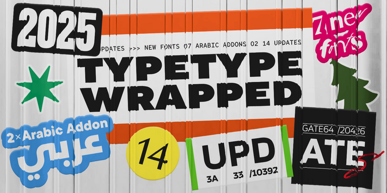
2024 has been an incredibly productive and significant year for TypeType. We released new fonts and updated existing ones, received awards, made our website more user-friendly, and shared knowledge about font design. In short, this year brought us numerous changes, and now it’s time to look back, reflect on our achievements, and outline plans for the future.
Let’s sum up the year!
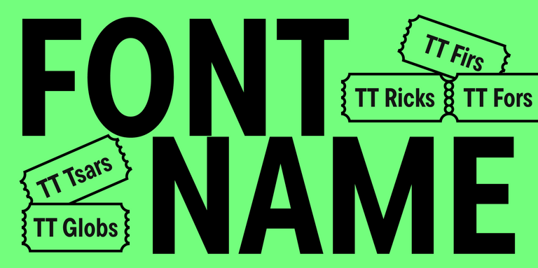
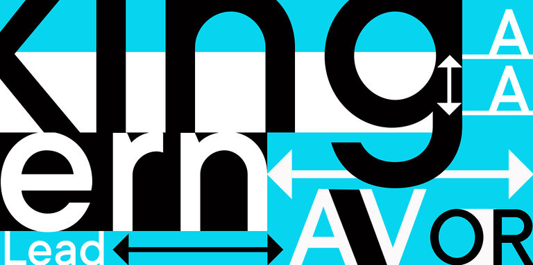
Fonts of the Year
New Fonts
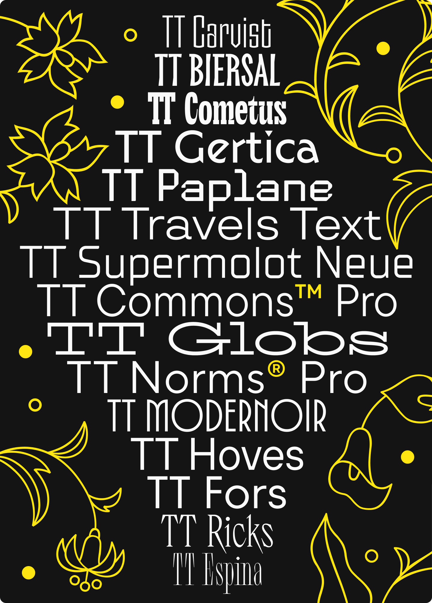
- TT Carvist is a modern experimental sans serif with extra narrow proportions and a gothic mood
- TT Travels Text is a stylish and versatile geometric sans serif with wide proportions
- TT Paplane is an experimental squared-looking display sans serif that looks like it’s folded from a paper strip
- TT Modernoir is an experimental display sans serif with dynamic proportions, inspired by 20th-century French typography and noir film aesthetics
- TT Biersal is an experimental display sans serif with a free-spirited, playful, and adventurous nature, inspired by German posters from the 1930s
- TT Gertika is an experimental geometric sans serif with a dynamic character and a dancing rhythm
Updated Fonts
- TT Supermolot Neue is an advanced, modular sans serif with a futuristic mood. To make the font even more functional and versatile, we expanded the character set, added more supported languages and OpenType features
- TT Commons™ Pro is a geometric sans serif, one of the studio’s most popular fonts. With the update, we expanded the character set, added new OpenType features and stylistic sets, improved kerning and hinting
- TT Hoves Pro is one of the studio’s bestsellers included in our core set of versatile fonts. We added a Mono subfamily, amplifying the font’s functionality
- TT Norms® Pro is a functional geometric sans serif for aesthetic design choices and TypeType studio’s bestseller. We expanded the character set, amplified the font’s functionality, and added new stylistic sets
- TT Fors is a geometric sans serif with a neutral personality and refined proportions. We added a new Condensed subfamily
Fonts with Cyrillic Support
- TT Espina is a display Antiqua with expressive serifs. We added support of Cyrillic alphabets, completely revised kerning, improved hinting, added new OpenType features and stylistic sets, expanded the character set
- TT Ricks is an expressive serif with an edgy temperament. We added support of Cyrillic alphabets, expanded the character set, updated kerning and hinting, added new OpenType features and stylistic sets
- TT Globs is a stylish, wide-proportioned slab serif with a friendly nature and summer vibes. We added support of Cyrillic alphabets, significantly expanded the character set and functionality
- TT Cometus is a modern slab serif. We added support of Cyrillic alphabets, significantly expanded the character set and improved the font’s technical aspects
Plans for 2025
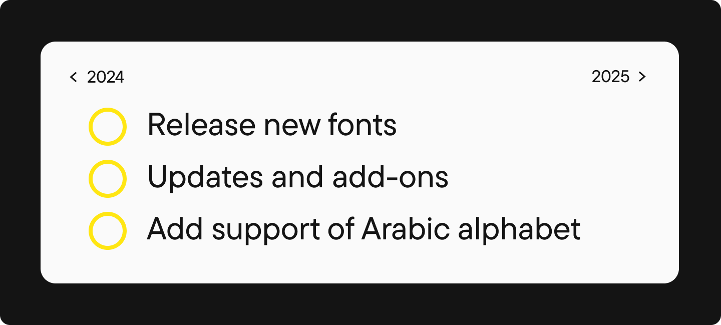
- Release new fonts: a sans serif, a high-contrast sans, and an Old Style serif
- Update: TT Ramillas, TT Interphases Pro, TT Fellows, TT Fors, TT Ricordi Greto, TT Modernoir, TT Ricordi Allegria, TT Biersal, TT Phobos, TT Barrels, TT Bluescreens
- Give a regular update to our bestsellers: TT Norms® Pro, TT Commons™ Pro
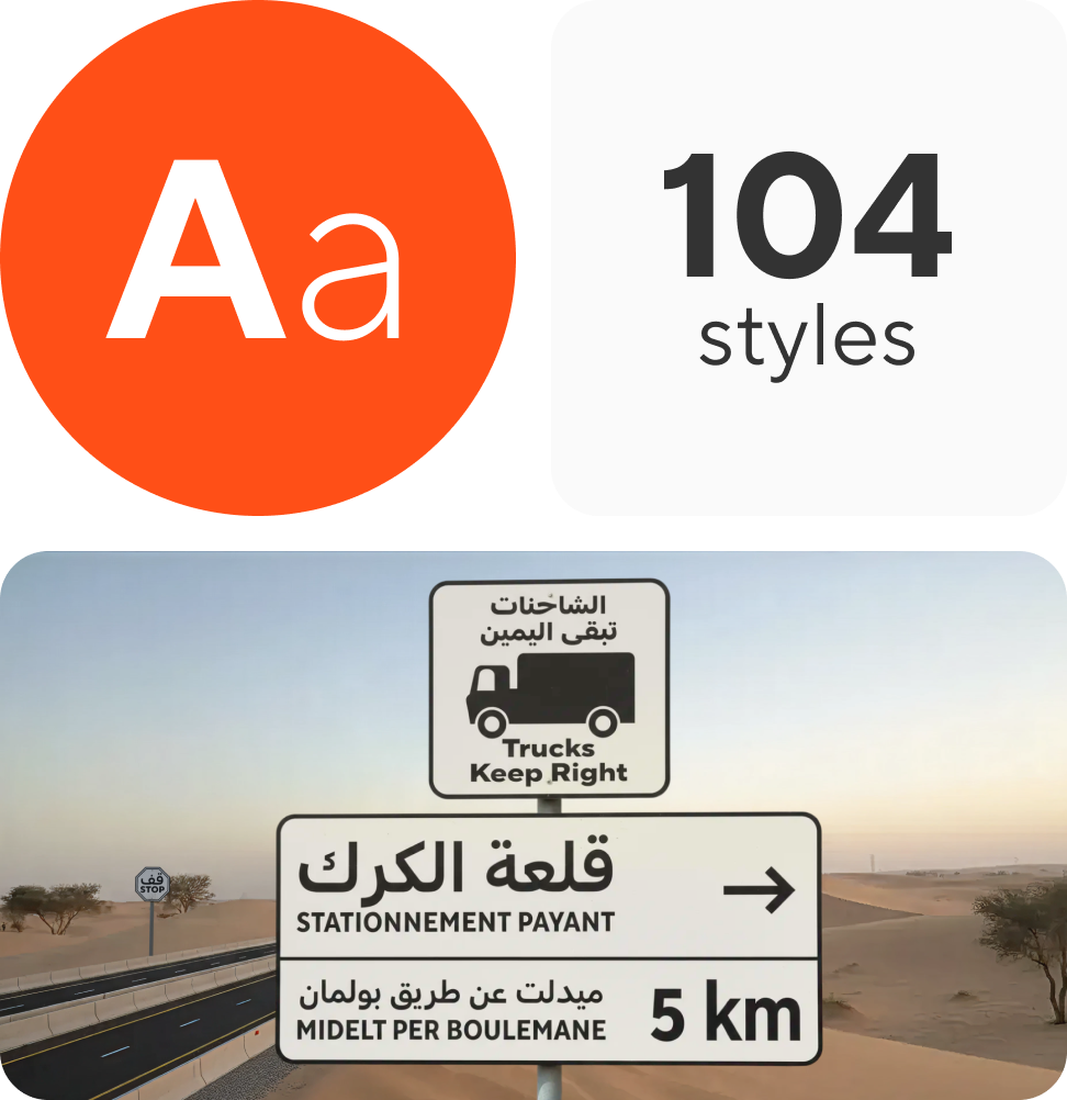
- Add Arabic script support to our bestsellers: TT Norms® Pro, TT Commons™ Pro
Awards & Recognition
- Red Dot Award: our enchanting TT Espina received the «Best of the Best» award
- Granshan Award: TT Espina won gold, and our versatile serif TT Norms® Pro Serif won bronze
- MUSE Award: IvI Sans Display won gold, the cosmic TT Cometus won silver, the transformer font TT Neoris won silver
- Indigo Award: TT Neoris won gold, TT Cometus won silver, IvI Sans Display won gold and silver
We’ve already started submitting applications for new competitions, so stay tuned for updates!
How Our Website Changed
- We launched website versions in German and Spanish
- Created a Font Dictionary where you can find definitions of key typographic terms
- Added an online shopping cart to the TypeType store, making purchases even more convenient
- The site now loads faster
And that’s just the beginning! We’re constantly improving our website to make your experience better. Stay tuned—we’ve got plenty of exciting features and new sections in the pipeline!
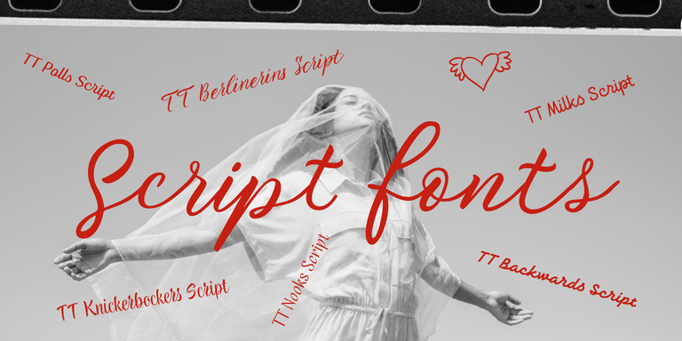
New Blog Articles by TypeType
- « Our Golden Font: How We Crafted the Ideal Neo-Grotesque TT Neoris. » A deep dive into crafting our next-generation Neo-Grotesque: from initial research and user feedback to the fine details of character design
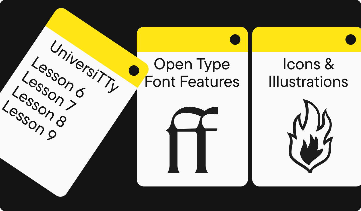
- Continuation of the « UniversiTTy » article series:
– Lesson 6. Designing Basic Latin Characters. Introduction
– Lesson 7. Designing Basic Latin Characters. Glyph Height, Contrast, Optical Sizes
– Lesson 8. Designing Basic Latin Characters. Uppercase characters
– Lesson 9. Uppercase Characters. Detailed Contour Refinement
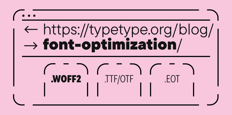
- « OpenType Font Features: How to Use Them in Design. » A comprehensive guide to unlocking the power of OpenType features in your design work
- « Icons & Illustrations in Fonts: What are they, and what’s their purpose? » Everything you need to know about integrating graphical elements into fonts: the why, how, and when
- « Branching out: How Scandinavian Sans TT Firs Grew and Found Its Font Pair. » The evolution of our beloved sans serif TT Firs Neue, the birth of its perfect companion TT Firs Text, and how it all began
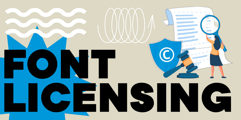
- « Font Licensing: Complete Guide for Designers and Business Clients. » Navigate the world of font licensing with confidence: from choosing the right license to understanding free use and legal requirements
- « On Opposite Sides: Wide and Narrow Fonts. » A designer’s guide to choosing and working with fonts of different widths
Want to learn more about typography? Follow our blog for regular insights and updates!
Entering New Platforms
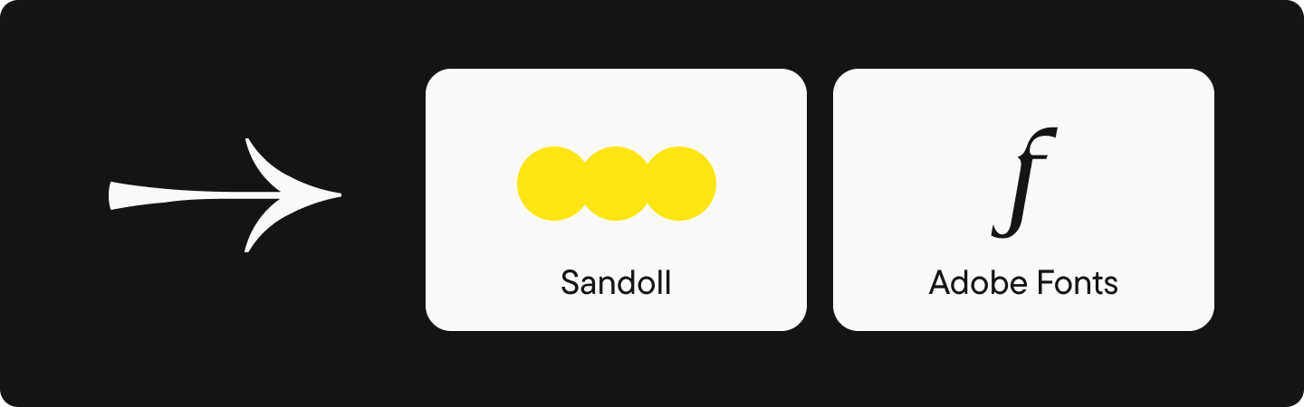
- Our fonts have been released on the Korean platform Sandoll
- Some fonts from our collection are now in the Adobe Fonts library
Conclusion
What an incredible year it’s been! None of this would be possible without you—our amazing community. Your passion for typography drives us to innovate, create, and share our knowledge. You inspire us every step of the way.
Thanks for being part of our journey!