


Associations et combinaisons de polices
Creating Contrast Without Breaking Visual Harmony
Contrast helps two typefaces take on different roles, but the strongest combinations are rarely built on difference alone. Successful font combinations often share proportions, rhythm, stroke character, or overall mood while differing enough in weight, construction, or style to create hierarchy. This balance makes headlines, supporting text, and secondary information easier to distinguish. The goal is to create clear visual separation without making the composition feel fragmented, accidental, or inconsistent with the wider design system.
Pairing Serif and Sans Serif Typefaces
Combining serif and sans serif designs is a reliable way to create contrast across branding, editorial, and digital projects. Good typeface pairing still depends on more than category. Compare x-height, proportions, weight, spacing, and visual tone to make sure the two designs feel connected. The strongest combinations clearly separate headlines from supporting text while maintaining a coherent overall character. This approach also gives designers flexibility when building hierarchy across websites, publications, presentations, packaging, and other communication formats.
How Type Scale Strengthens a Typeface Pairing
Contrast does not have to come entirely from different letterforms. Scale, weight, spacing, and line height can significantly change how two typefaces interact. A large display treatment may carry the main message, while a calmer style supports body copy or secondary information. Before rejecting a combination, test several hierarchy settings—the same two designs can feel much more compatible once their roles are clearly established. Adjusting scale can also help preserve consistency when the project needs both expressive headlines and highly functional supporting text
Choosing Combinations for Brand Personality
Typography contributes strongly to how a brand feels: precise, approachable, premium, energetic, traditional, or unconventional. When choosing complementary fonts, start with the personality the project needs to communicate. One typeface can establish the main character while the second brings balance and functionality. Test the combination across several touchpoints to make sure it supports the wider identity rather than only one individual layout. A strong system should remain recognizable across websites, campaigns, packaging, presentations, and other brand materials without becoming visually repetitive.
Why Readability Matters When Combining Typefaces
Strong font pairings should improve the way information is understood, not simply make a layout more decorative. An expressive headline style can attract attention, while the supporting typeface should remain comfortable in longer text, captions, or interface elements. Check spacing, character differentiation, and performance at smaller sizes so that visual contrast supports hierarchy without creating unnecessary reading friction. This becomes especially important in content-heavy layouts, where users need to move quickly between headlines, details, labels, and longer passages of information.
Testing Combinations with Real Project Content
Generic samples are useful for early exploration, but final decisions should be made with actual content. Test brand names, headlines, paragraphs, numbers, navigation labels, and other elements at realistic sizes. If you start with curated recommendations or a font pairing generator, replace the sample copy early. This helps reveal whether the combination works not only visually, but also in hierarchy, readability, and tone. Real content can also expose spacing issues, awkward word shapes, or differences in rhythm that may not appear in short specimen phrases.
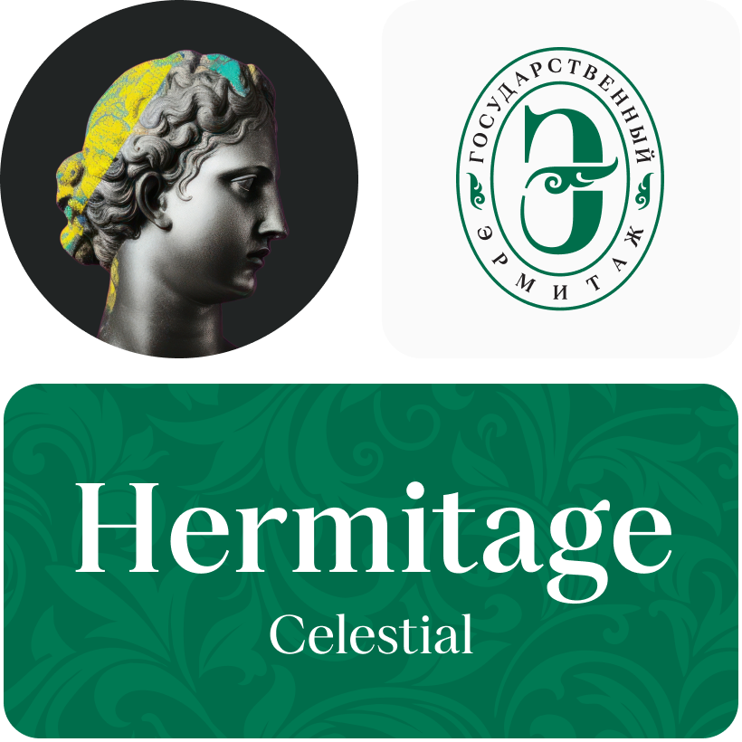
What is a font pair, and what does it serve for?
A font pair is a combination of two fonts within one text block. Most often, one of the fonts in a pair is a more expressive headline font, and the other one serves to communicate information. Such fonts complement each other and help designers solve various tasks, like highlighting key elements, adding emotional expressiveness to the project, or separating semantic blocks.
How to choose fonts for a project: Several general recommendations
To begin with, establish the project’s tone. Choose the fonts that stylistically match the main idea. After that, you need to determine the functions of each font in the project and their hierarchy: which font will complement the design and which one will serve to attract attention as the main element. You need to assess the difference between the fonts and decide what kind of information each of them should convey. First, we recommend choosing the base font you will use most, and then you can find a suitable pair for it.
Core principles of font pairing and recommendations from designers
The main rule you should follow when matching two fonts is that both similarities and differences must be visible between them. You can highlight the coherence of fonts by the following characteristics: contrast, proportions, width, openness of characters, individual letter shapes, and overall tone. Feel free to experiment with different combinations. We also recommend analyzing the projects you like: this way, you can enhance your visual skills, elevate your knowledge base, and gain confidence in dealing with typography.
What is a font pair, and what does it serve for?
A font pair is a combination of two fonts within one text block. Most often, one of the fonts in a pair is a more expressive headline font, and the other one serves to communicate information. Such fonts complement each other and help designers solve various tasks, like highlighting key elements, adding emotional expressiveness to the project, or separating semantic blocks.
How to choose fonts for a project: Several general recommendations
To begin with, establish the project’s tone. Choose the fonts that stylistically match the main idea. After that, you need to determine the functions of each font in the project and their hierarchy: which font will complement the design and which one will serve to attract attention as the main element. You need to assess the difference between the fonts and decide what kind of information each of them should convey. First, we recommend choosing the base font you will use most, and then you can find a suitable pair for it.
Core principles of font pairing and recommendations from designers
The main rule you should follow when matching two fonts is that both similarities and differences must be visible between them. You can highlight the coherence of fonts by the following characteristics: contrast, proportions, width, openness of characters, individual letter shapes, and overall tone. Feel free to experiment with different combinations. We also recommend analyzing the projects you like: this way, you can enhance your visual skills, elevate your knowledge base, and gain confidence in dealing with typography.