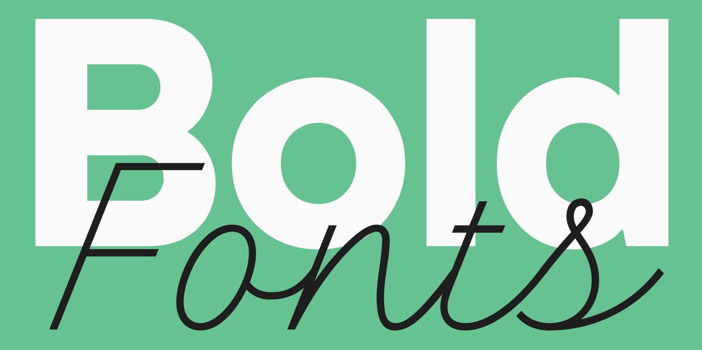
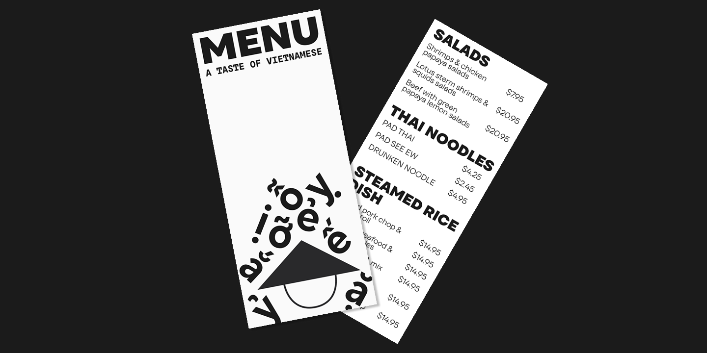
Font weight is a crucial characteristic that directly impacts the perception of an entire design. Bold weights immediately attract attention, creating a sense of confidence and importance, while almost any thin font typically appears light and elegant. When used correctly, they help guide the user’s attention, create emphasis, and enhance the emotional impact of a design.
In this article, we’ll explore where and how to apply bold fonts, the different types that exist, and look at some examples of such fonts from the TypeType collection.
What Are Bold and Thick Fonts?
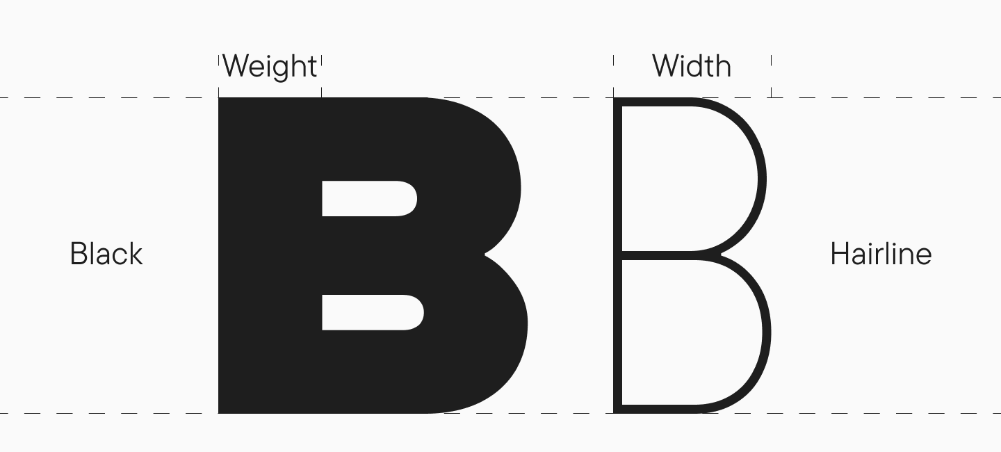
First, let’s clarify what font weight is. It’s a property that determines the boldness (or saturation) of a font—that is, the thickness of the character lines. Don’t confuse font weight with font width; they are different concepts. We covered wide and narrow fonts here.
Bold fonts are weights with increased stroke thickness compared to the base (Regular) style, professionally drawn by a font designer as part of a single typeface family. They can be named differently in various families. You will typically see weights like DemiBold, Bold, Extra Bold, Black, Heavy, and so on, with the boldness increasing from the first to the last. Bold is the most common of the heavier weights, typically used for highlighting sections of text.
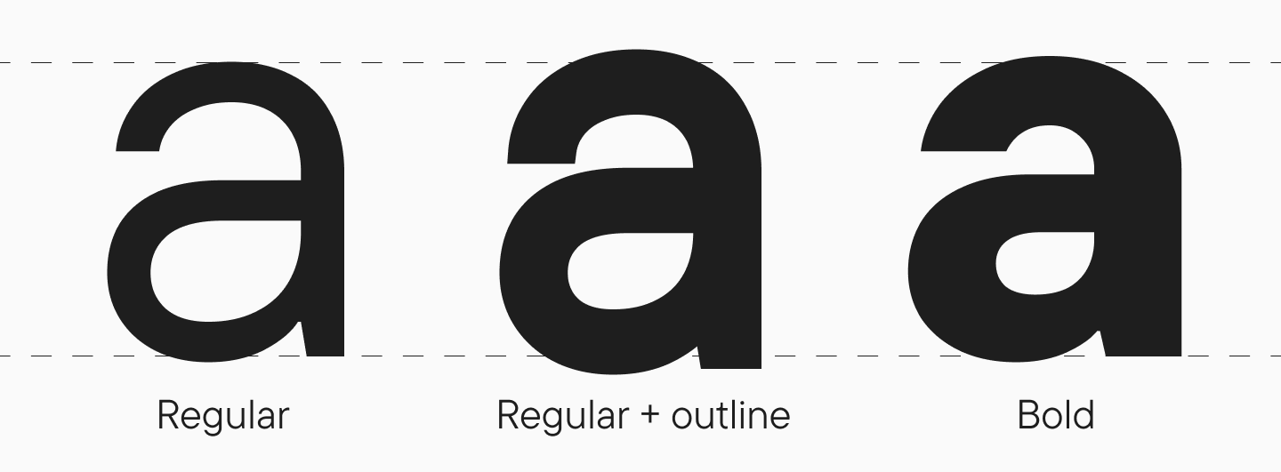
The term « thick font » isn’t professionally used in font design. It usually refers to fonts that have been artificially « thickened » in various programs, where boldness is added automatically without considering the font’s design and proportions. We strongly advise against such manipulations, as they will compromise the quality of your typography. If you need a bold font, you can always find a suitable option among professionally designed weights.
Main Categories of Bold Fonts
Let’s look at the most common bold font styles and see specific examples from the TypeType collection.
Bold Serif Fonts—Traditional and Expressive
A bold serif font looks striking while retaining a sense of classic elegance. These fonts are perfect for book covers and headlines and can be used on posters and signs.
TT Norms® Pro Serif Black
TT Norms® Pro Serif Black: An elegant and neutral bold serif font. Thanks to its short serifs and low contrast, this serif doesn’t look overloaded or massive, maintaining its grace and calm style.

TT Tricks ExtraBold
TT Tricks ExtraBold: A modern bold font with large serifs and a distinctly business-like mood. This serif font has a calm, elegant, and moderately strict character, even in its ExtraBold weight.

TT Ramillas Black
TT Ramillas Black: A stylish and expressive bold font with high contrast and small, flared serifs. This is an attractive serif with many interesting details in its design: for example, the Cyrillic letter « б » has a flame-like element, and the « Ээ » has a vibrant « tongue. »

TT Backers ExtraBold
TT Bakers ExtraBold: A fluid serif font. This is a display serif with a soft character. Its expressiveness comes from the medium contrast between its thick and thin lines and its forms that echo the logic of a brush stroke. This is a perfect example of a font with thick and thin lines.

Bold Sans-Serif Fonts—Modern and Concise
A bold sans-serif font, or grotesque, is suitable for more direct and minimalist designs. Depending on the style, it can look either neutral or daring. A thick sans serif font is a great choice for impactful headlines.
TT Fellows Black
TT Fellows Black: A humanist sans-serif with open forms and mechanistic motifs. This is a bold sans serif font with a soft and friendly, yet quite calm character. Importantly, this font is uni-width, meaning the layout won’t be disrupted when changing weights.

TT Runs Black
TT Runs Black: A powerful and self-assured bold font. This is a wide grotesque with unusual proportions that seem « inverted. » This is especially noticeable in the number 8 and the letters « K », « C », « S », and « R ». This decision gives the font originality and dynamism. It’s one of the best choices for sports-themed projects.

TT Gertika Black
TT Gertika Black: A decorative geometric sans-serif with a dynamic character and a dancing rhythm. This is a font that alludes to something ancient, even primal, yet feels modern. Its design contains many interesting details inherited from lettering on an American poster from the late 1930s.

Bold Handwritten (Script) and Calligraphy Fonts — Elegance and Style
A bold handwritten (script) font or bold calligraphy font can give a design a hand-crafted feel, making it authentic and « alive. » There are many different types of these fonts, and depending on their style, they can create a special mood—romantic, rebellious, festive, or carefree. A bold cursive font can add a personal touch to any project.
TT Marks Black
TT Marks Black: A bold italic font inspired by classic American hand-painted signs (sign painting). Its design retains a sense of being handmade: lively lines, a slight casualness, and a unique street charm. A great thick handwriting font.

TT Backwards Script Black
TT Backwards Script Black: A heavy bold script font inspired by the typography of the USSR from the late 70s to early 80s. Shop signs, posters, and book designs from that era were our inspiration. That’s why this font brings to mind the calligraphy from old school notebooks.

TT Nooks Script Black
TT Nooks Script Black: A script font without a slant. In its bold weight, its rhythm becomes very dense and dynamic, and the letter forms become more geometric. Other characteristic details include high-contrast strokes and open apertures.

Modular and Outline Bold Fonts—Attention and Emphasis
Modular (block) and outline fonts can help diversify your design, making it unusual, attractive, and eye-catching. Adding a bold weight provides even more emphasis. This style is a great thick fancy font.
TT Supermolot Neue Black
TT Supermolot Neue Black: A futuristic, modular grotesque. It’s a powerful and dynamic thick block font with a tech-savvy mood, which looks even more impressive in its bold weight. This typeface was specifically created for game interfaces, but its applications are much broader.

TT Smalls Black
TT Smalls Black: A decorative font whose design is composed of individual lines. The number of strokes increases with the boldness of the weight—consequently, the Black weight has the most. At the same time, the forms are concise and neutral, as they are based on a geometric sans-serif.

TT Milks Casual Outline
TT Milks Casual Outline: A soft and gentle typeface. The thick outline font styles included in the family look original and interesting. In addition to a simple outline weight, there is an outline font with a shadow and even a version with a cowhide pattern.

Bold Fonts for Small Sizes—Readability in Any Condition
If you’re looking for a bold font that will be easy to read in a small size, pay attention to the selection below. Often, bold letters can actually worsen, rather than improve, the legibility of text. Therefore, it’s worth choosing responsibly.
TT Livret Text Bold
TT Livret Text Bold: A bold text font (serif) with a calm character. Thanks to its proportional widths, oval-shaped round characters, generous spacing, and open apertures, this font is easy to read, even when used in a small size.

TT Rationalist Bold
TT Rationalist Bold: A functional and original slab serif with elegant trapezoidal serifs. It reads excellently at any size and looks particularly aesthetic on printed materials (books, magazines, brochures).

TT Neoris Bold
TT Neoris Bold: A concise Neo-Grotesque in a bold weight. This font has a neutral character yet looks fresh and original. Most importantly, it reads flawlessly even when used in small sizes!

Applications and Tips
Bold fonts are a powerful tool in design. They attract attention, create emphasis, and help guide the user’s eye. But to use them correctly, it’s important to understand where bold typography is appropriate and how to combine it with other elements.
Where to Use Bold Fonts?
- Headlines and Accents: Bold weights are perfect for headlines, subheadings, and creating emphasis in text (for which italic is also often used). They help create a visual hierarchy and simplify navigation for the reader.
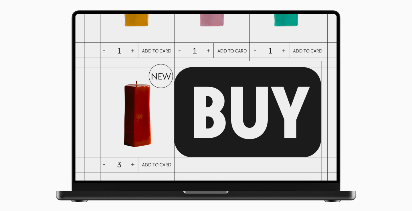
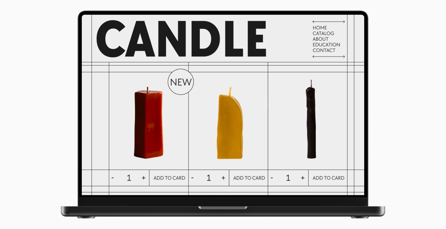
- Calls to Action (CTAs): Buttons or links with text like « Buy, » « Subscribe, » or « Learn More » need to attract attention, and a bold font is perfect for this.
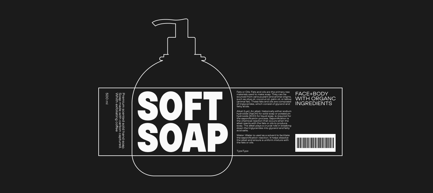
- Branding and Packaging Design: With the help of bold fonts, you can create an effect of stability, confidence, and solidity.
- Advertising (including outdoor): Large, bold letters will attract attention and be visible even from a distance.

- UX Design: The proper use of bold fonts makes an interface more user-friendly and easier to perceive. They help highlight key information, build navigation, and manage user emotions.
How to Combine Bold and Thin Weights?
To correctly combine different fonts, you first need to determine the role of each. It’s usually recommended to use no more than two fonts in a single project: one for the main text, the other for accents.
Bold fonts are used for emphasis, so they should be paired with more neutral weights. Therefore, very thin options are not suitable—they can be hard to read in blocks of text and are more often used as a unique design element. It is optimal to combine bold weights with a base (Regular) weight.
We’ve talked more about how to properly select font pairs here.
Examples of Bold Typography Use
Look at these real-world cases where bold typography design is used:
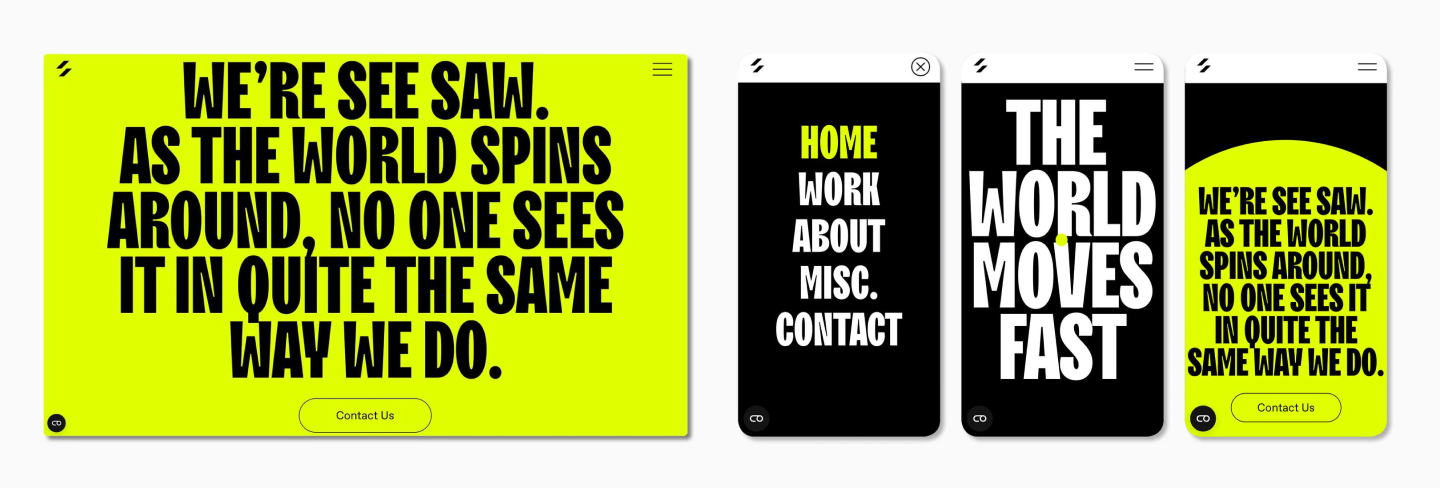
- TT Trailers as part of the branding for design studio See-Saw
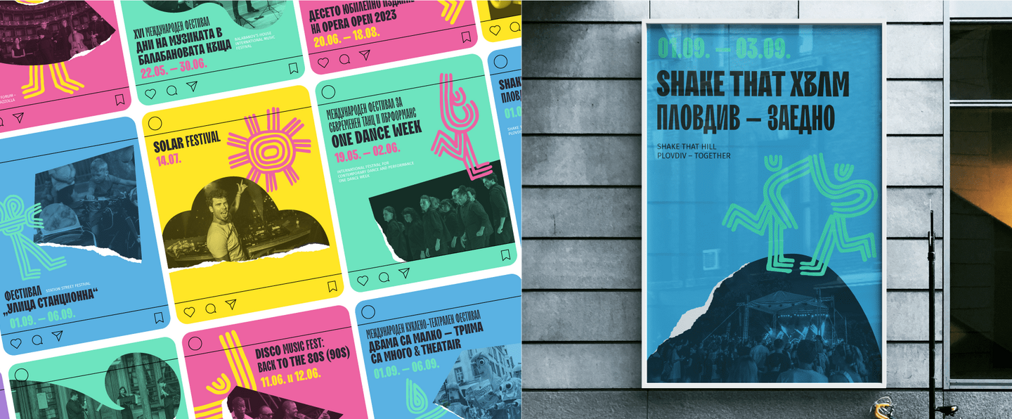
- Another interesting example using different weights of TT Trailers in the identity for the « Фестивално лято Пловдив 2023 » festival (Festival Summer Plovdiv 2023)
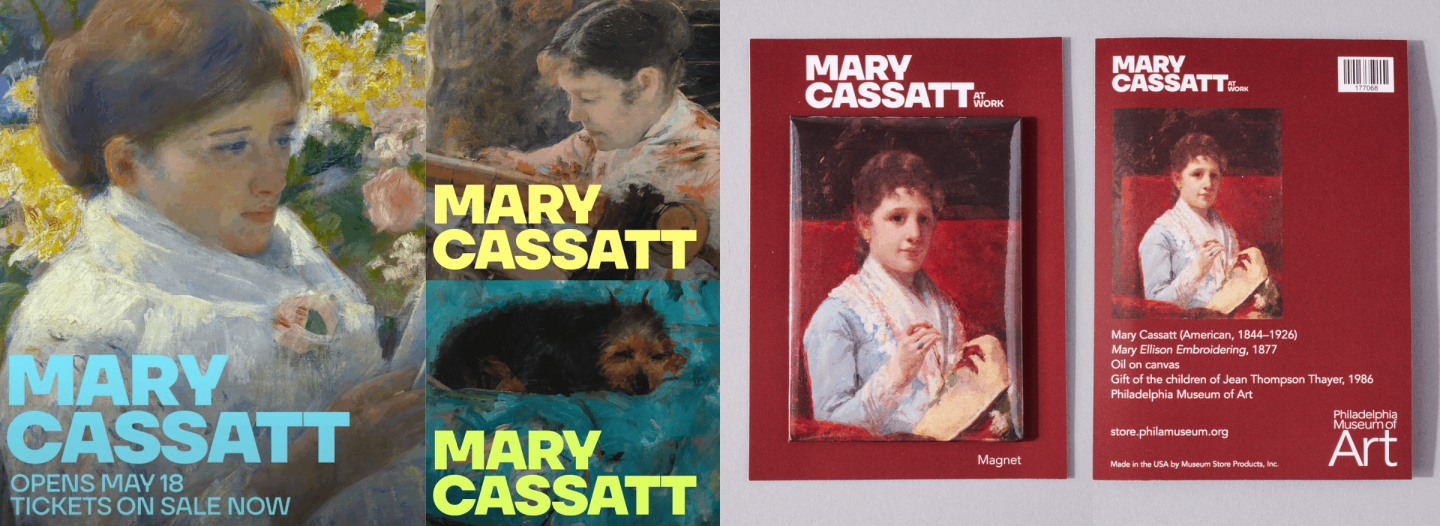
- TT Firs Neue in the identity for the Mary Cassatt at Work exhibition
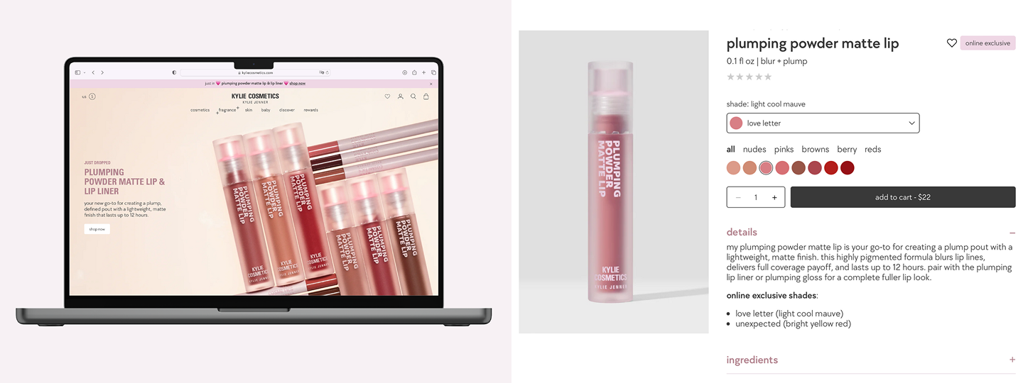
- TT Chocolates in the identity for the Kylie Cosmetics brand
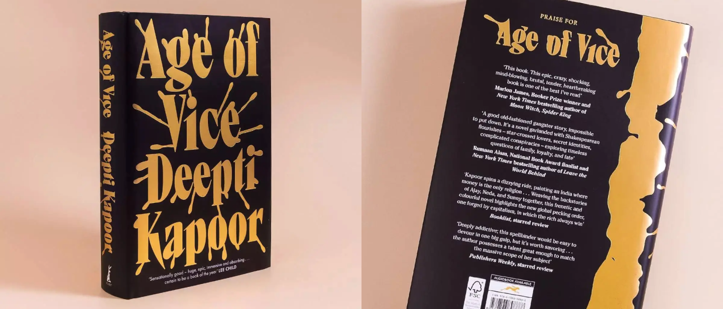
- And here is TT Ricks on the cover of the book Age of Vice
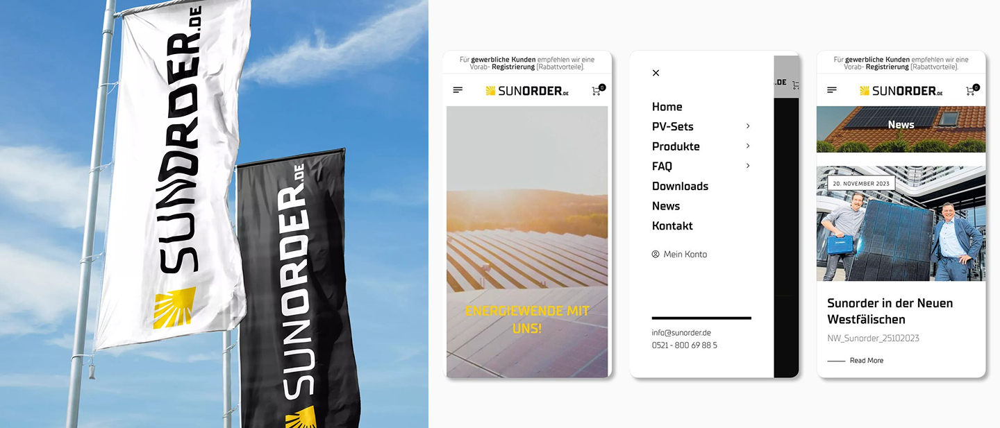
- Different weights of TT Supermolot Neue in the identity for trading company Sunorder
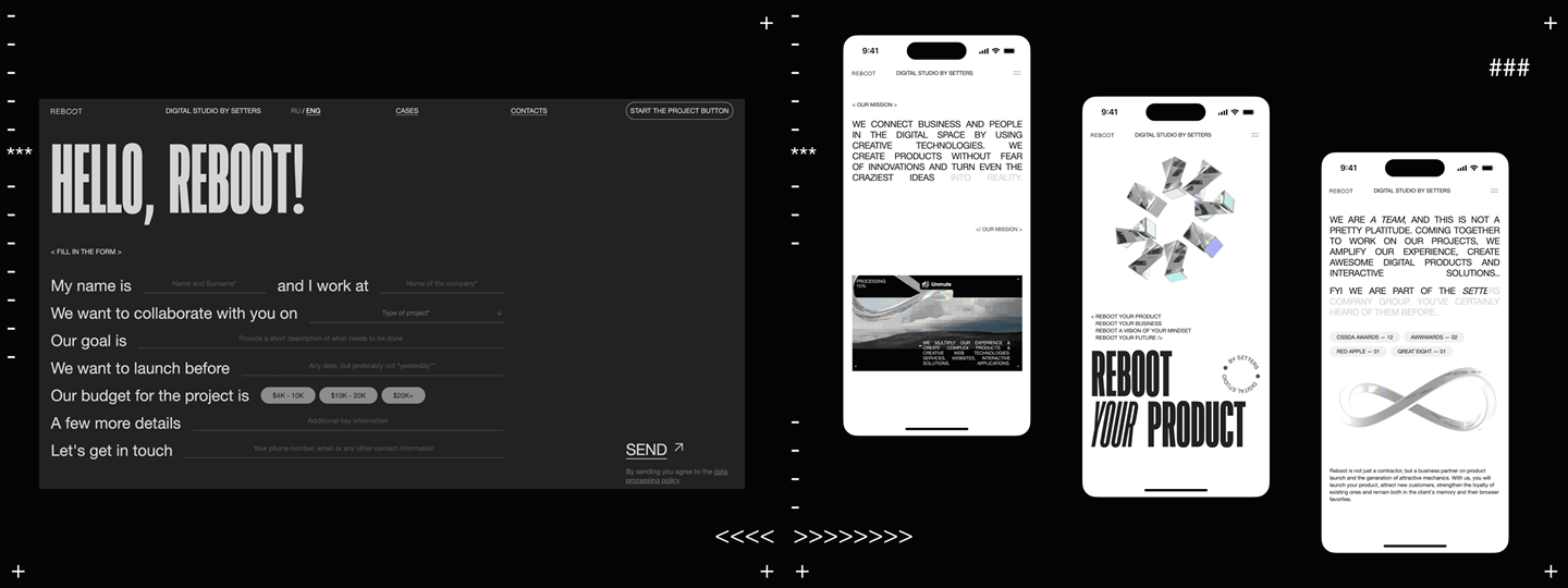
- TT Bluescreens Condensed in the identity for studio REBOOT.
Best Bold Fonts from TypeType Studio
Most fonts in the TypeType collection have bold weights. So if you didn’t find a suitable option for yourself in the selection above, head over to our catalog—there you will find decorative and universal bold fonts in various styles. All of them meet modern visual and technical requirements.
Conclusion
As you can see, bold fonts are an excellent way to make your design more interesting and easier to perceive. Psychologically, they are associated with reliability, strength, and decisiveness—which is why they are often used in logos, headlines, and calls to action. However, it’s important not to overdo it with bold typography, otherwise, the text will become « heavy » and difficult to read. Remember that moderation is key in everything, but don’t be afraid to experiment!