While we often discuss letters in our articles, numbers in typography typically receive less attention. However, this topic is fascinating and more complex than it might appear at first glance. That’s why we’ve dedicated this article entirely to numerals!
In this article, you’ll learn about different types of numerals, their purposes, the unique characteristics of each style, and where to find them in fonts.
Why are there different types of numerals?
Numerals are symbols used to represent specific numbers (numerical values). Today, Arabic numerals—symbols from 1 to 9—are used almost worldwide. The first Western references to these numerals can be found in the Codex Vigilanus from 976 CE. In the Cyrillic tradition, Arabic numerals were introduced by Peter the Great in 1699.
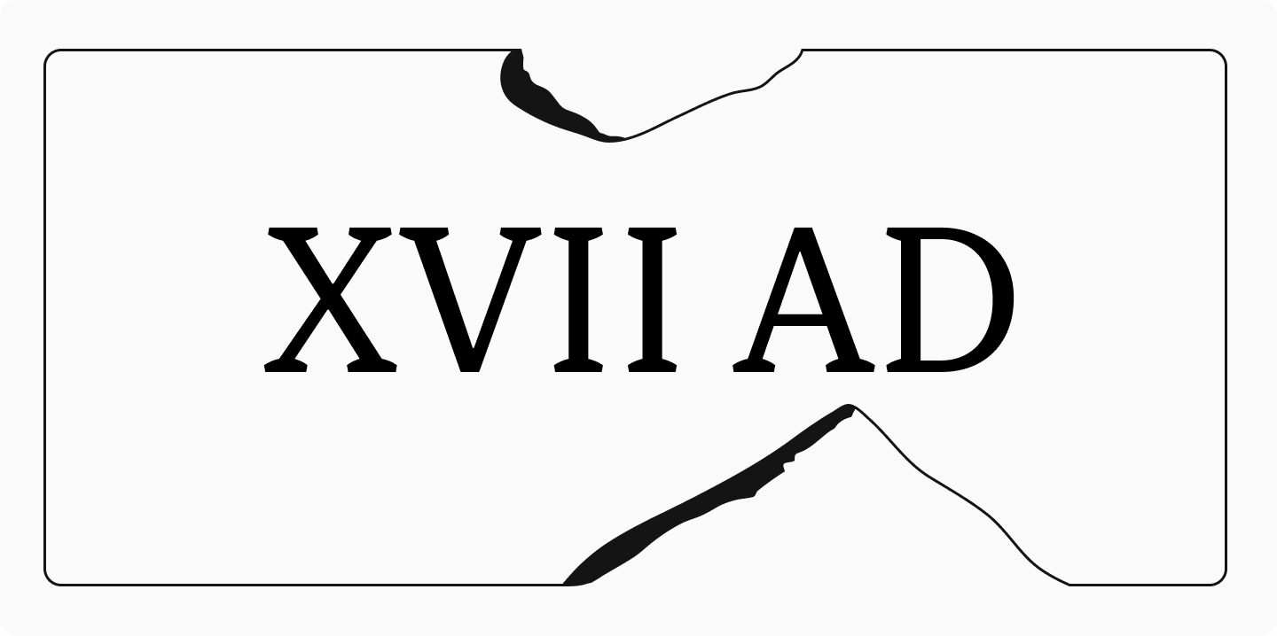
Roman numerals are still in use today, particularly for denoting centuries, millennia, and in book tables of contents.
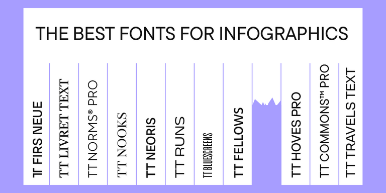
The most common type today is lining numerals (also known as lining figures, majuscule numerals, or titling figures). Let’s explore these and other types of numerals in detail.

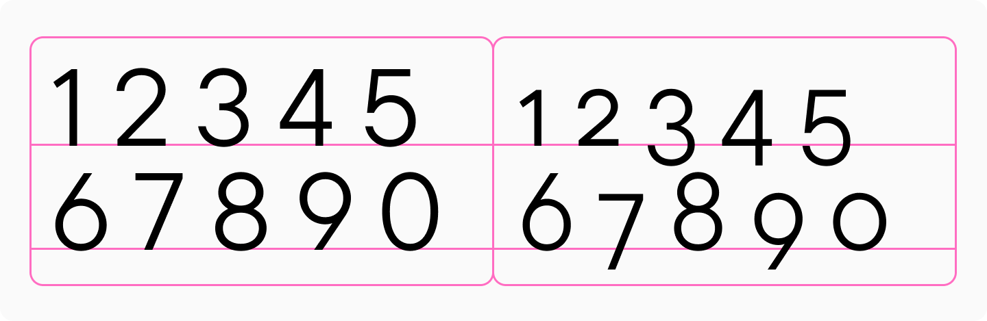
Lining (majuscule) numerals
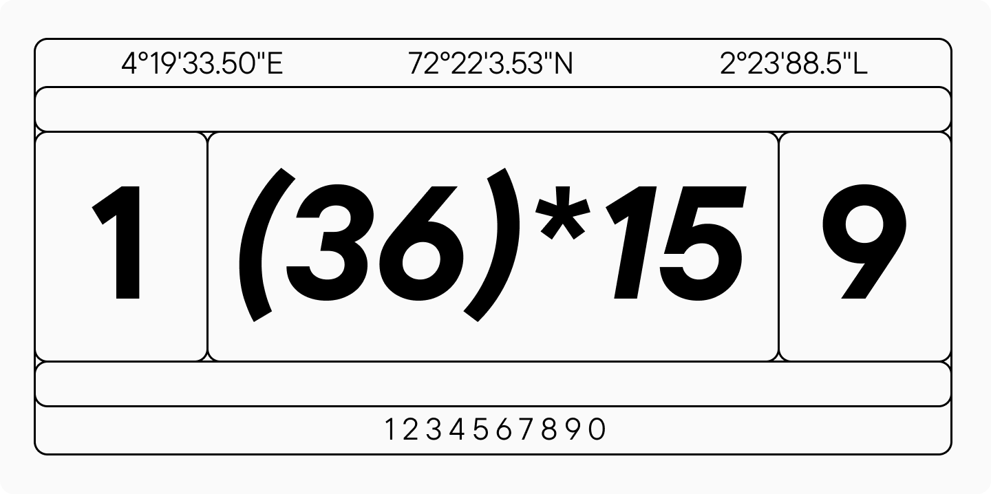
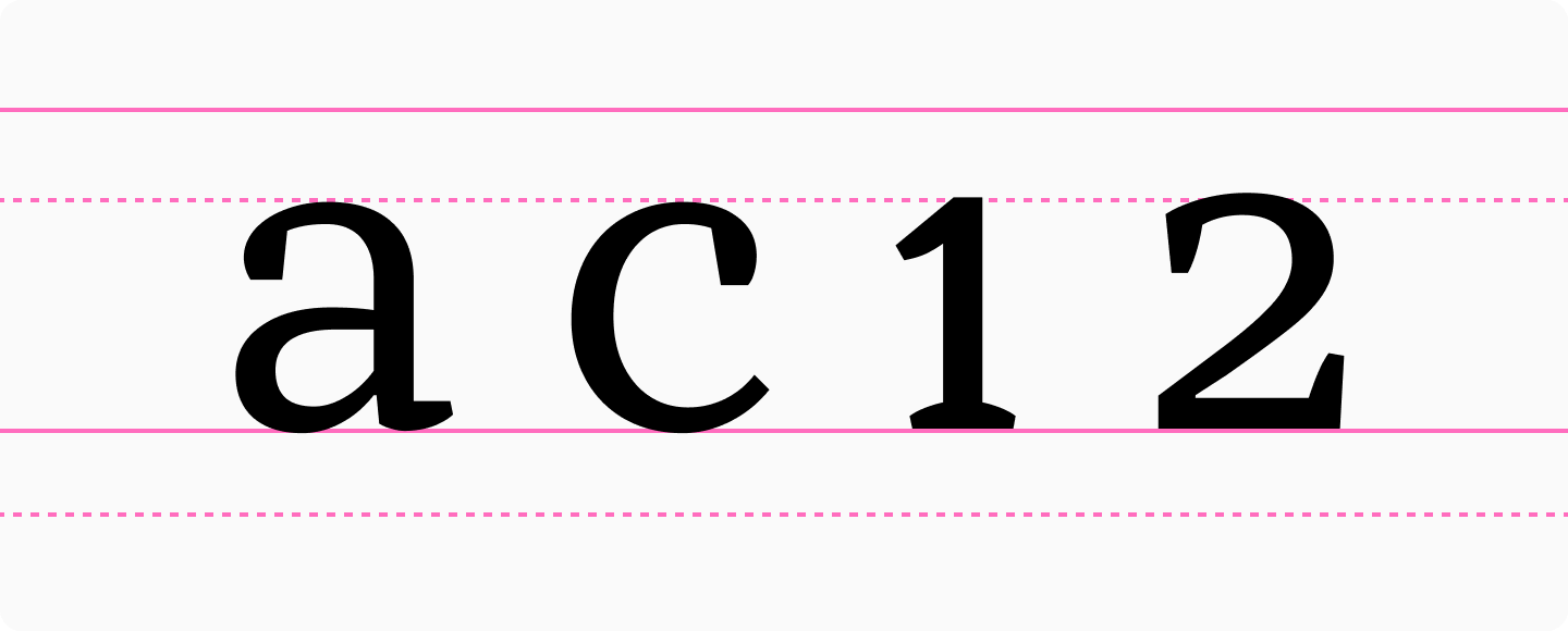
Lining (majuscule) proportionate numerals are numerals without ascenders or descenders, designed to match the height of uppercase letters. Their sidebearings follow the same logic as other characters in the typeface, meaning the width of each numeral varies. For example, the figure « 1 » takes up less space than « 9 » in the text.
Lining numerals are the default choice when there’s no specific reason to use other types of numerals, and they’re typically the standard set included in fonts.
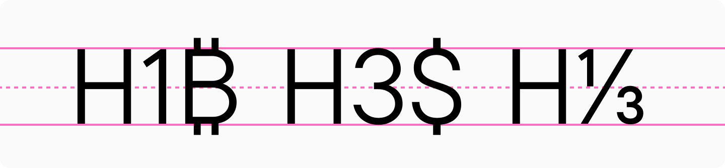
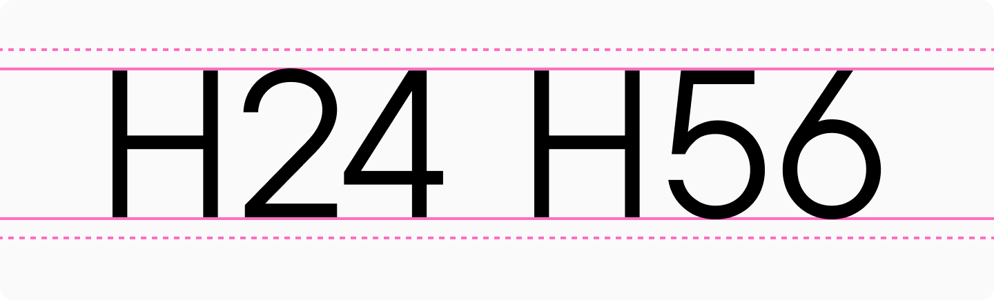
Oldstyle (minuscule) numerals
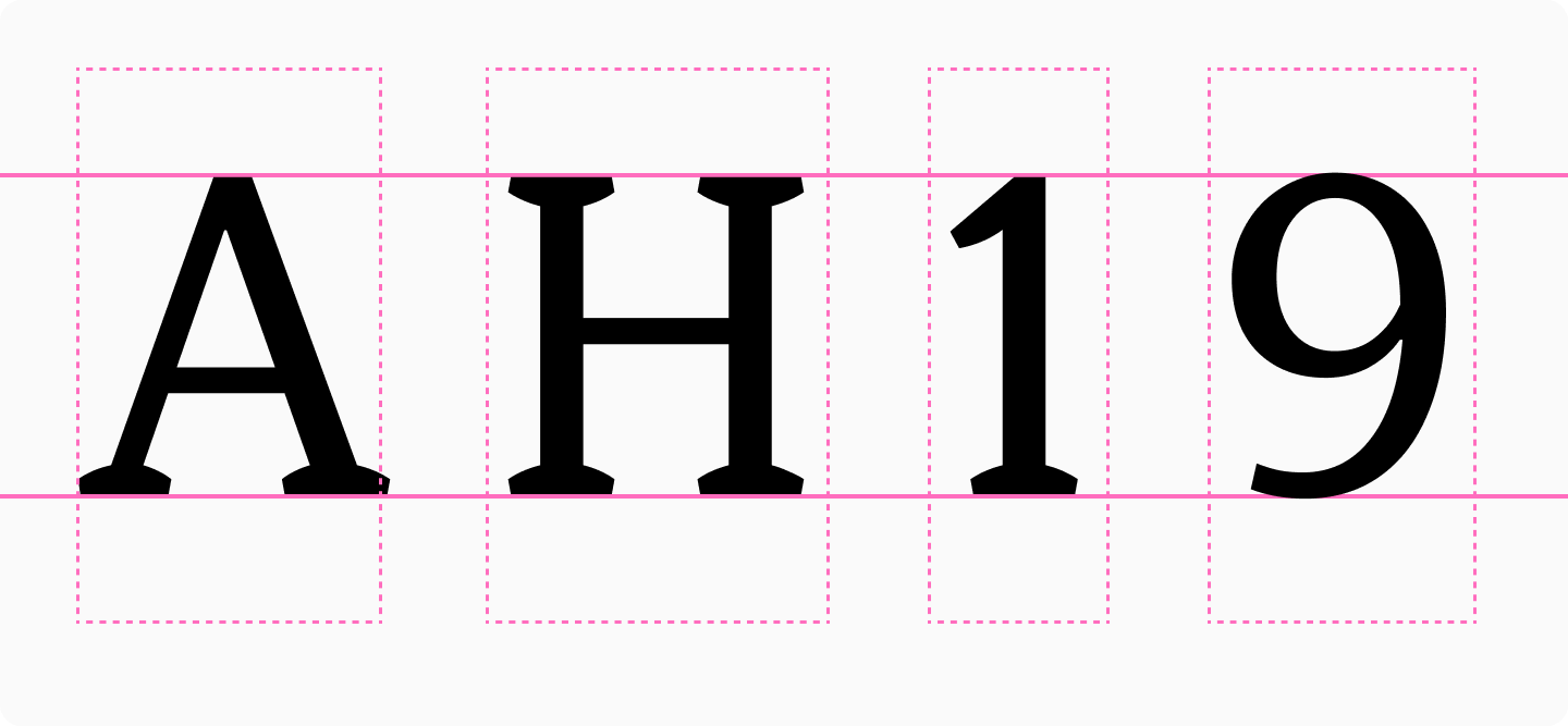
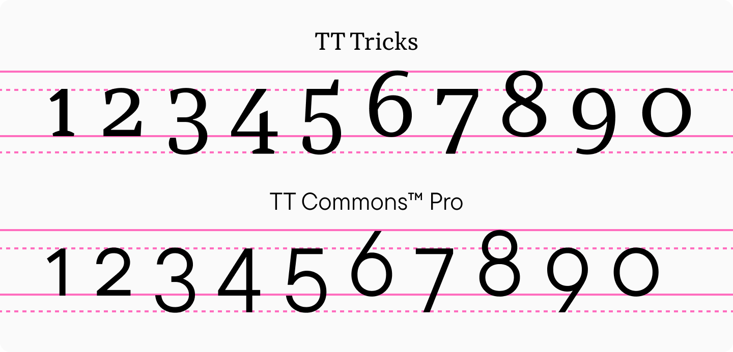
Oldstyle (minuscule) numerals, also known as old style figures or text figures (lowercase), first appeared in European manuscripts in the 13th century. In typography, they were introduced in 1788 when British punchcutter Richard Austin created a set of numerals three-quarters the height of capitals for John Bell’s foundry.
Oldstyle numerals feature ascenders and descenders, designed to match the height of lowercase letters or slightly taller. They’re specifically designed for use within body text, which is why they’re sometimes called text figures. Unlike lining numerals, oldstyle numerals blend harmoniously with the text, with each numeral effectively functioning like a letter in the line.
Typically, numerals 6 and 8 have ascenders, while 3, 4, 5, and 9 have descenders. However, alternative designs exist with different arrangements of ascenders and descenders, particularly for 3 and 5.
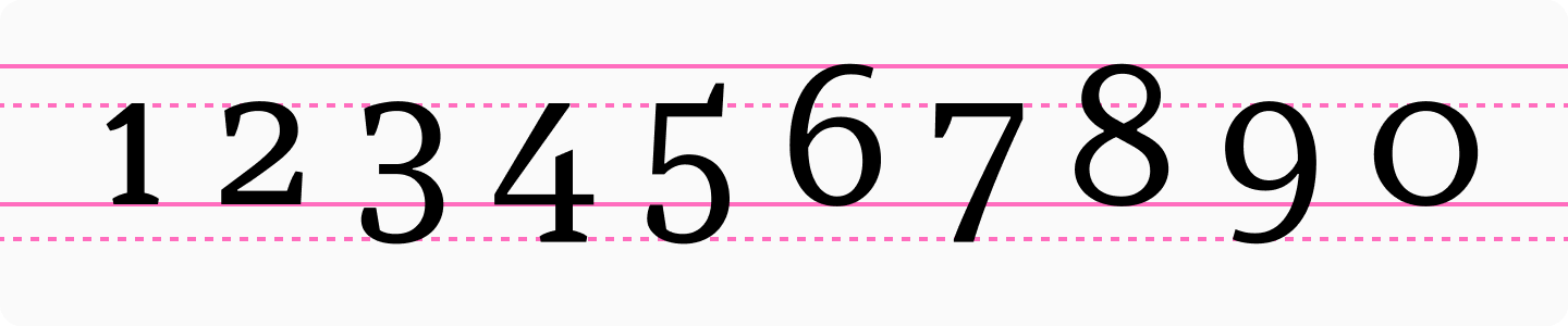
Interestingly, while oldstyle numerals were traditionally associated with serif typefaces, they’re now widely available in sans serif designs as well.
These numerals are usually included as an additional set in fonts and can be accessed through the OpenType Oldstyle Figures feature.
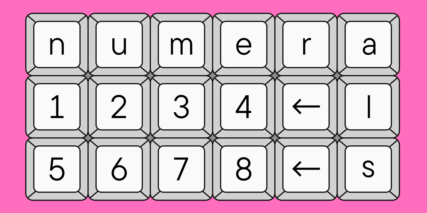
Tabular figures
If you’re familiar with monospaced fonts, you’ll quickly understand tabular figures. If not, we recommend checking our Font Dictionary or reading our dedicated article on this topic.
Tabular figures (also called monospaced figures or tabular numerals) are the opposite of proportionate figures. Each numeral occupies the same amount of space—the figure « 1 » takes up exactly as much width as « 9. » Tabular figures are available in both lining and oldstyle forms.
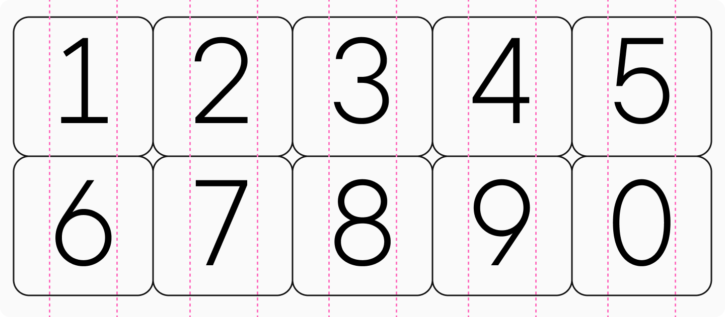
Tabular figures can be lining and old style. Their primary purpose is to align vertically, making them ideal for use in tables and financial documents.
The design of these numerals may either match or differ from their proportional counterparts, depending on the typeface’s concept and the need to fit characters within the fixed width.
Numerators and Denominators
Numerators and denominators are smaller forms of lining numerals used in the upper and lower portions of fractions:
- Numerators appear in the upper portion of fractions
- Denominators appear in the lower portion of fractions
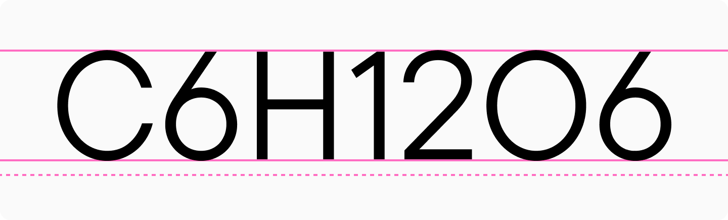
Superiors and Inferiors
Superior figures are smaller forms of lining numerals positioned in the upper portion of the line. They’re used for footnotes, mathematical expressions, ionic charges, etc.
Inferior figures are smaller forms of lining numerals positioned in the lower portion of the line. They’re commonly used in formulas, mathematical expressions, and chemical compound notations.
Circled figures or Negative circled figures
Font files often include circled figures in two styles: filled and outline circles.
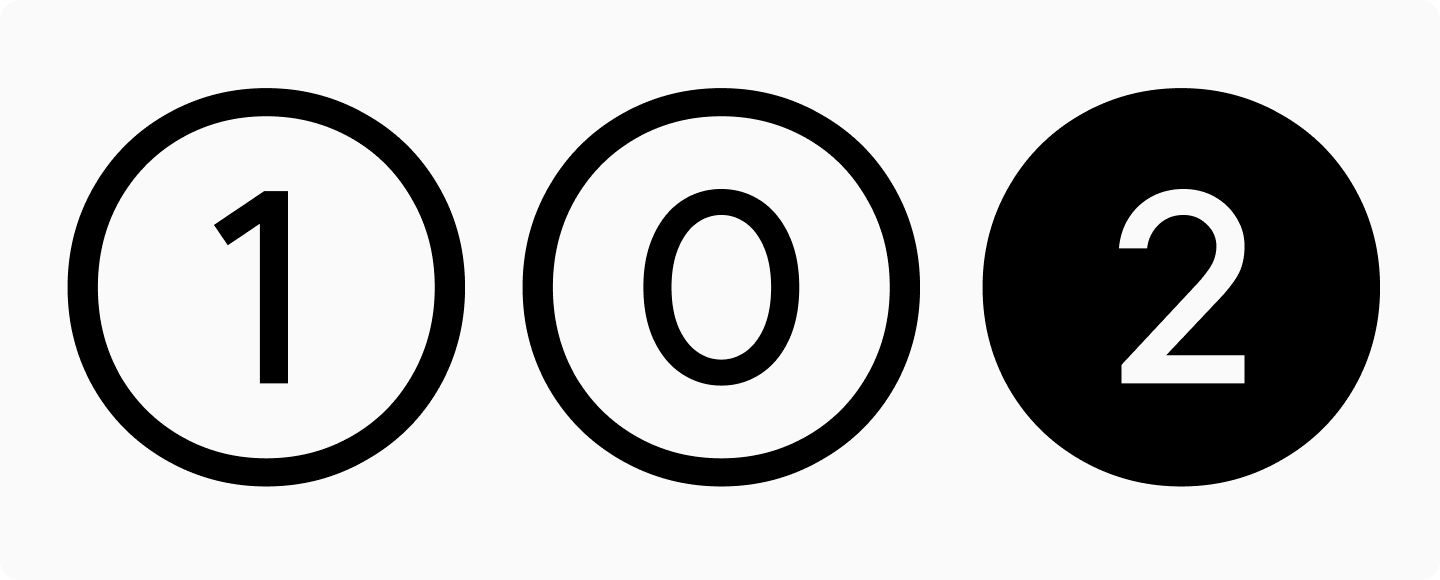
These serve decorative purposes, such as numbered lists or design elements, and are typically accessed through stylistic sets.
How to Find Different Types of Numerals in Fonts
All these numerical variations can be accessed through OpenType features, provided they’re included in the specific font file. For detailed information on how to find these numeral styles in different software applications, as well as how to determine which features are available in a font beforehand, check out our in-depth article on the topic.
Conclusion
As you can see, font files contain many interesting features beyond just letters! Explore all the possibilities of working with fonts, and follow our blog for regular updates on typography, fonts, and type design.