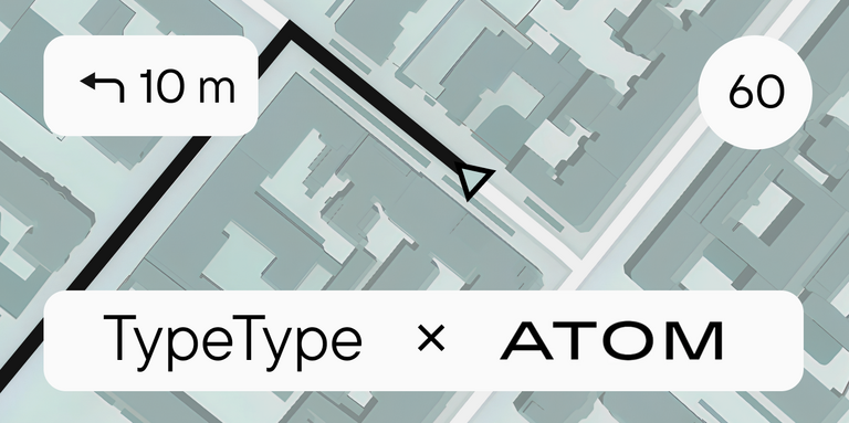
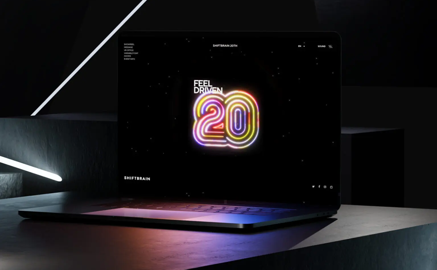
In 2023, the Japanese marketing agency SHIFTBRAIN launched an interactive website dedicated to the company’s 20th anniversary. For this project, the TypeType team developed a unique variable font capable of stretching to extreme horizontal widths. As a foundation, we used the bestseller TT Norms® Pro, which was already the company’s corporate typeface—you can see it on the main SHIFTBRAIN website.
In this article, we’ll take you behind the scenes of this unusual project!
A New Challenge
The project was named SHIFTBRAIN Norms. Our task was to develop a font with a variable Width axis based on TT Norms® Pro Regular, refine some glyph shapes, and adjust its size to match the Japanese font A1 Gothic Regular. We also had to integrate the company logo and 30 portrait icons of SHIFTBRAIN employees, which they provided.
When the SHIFTBRAIN project began in 2022, our sales department was still in the process of shaping its client interaction workflows. This was one of the first cases where a manager handled the entire client journey—from discussing the brief to overseeing execution in production. This format allowed us to identify bottlenecks in communication, such as approval delays or inconsistencies in technical specs. Thanks to this experience, we optimized our department’s operations by implementing clear protocols and reducing project timelines for our clients.
The SHIFTBRAIN studio wasn’t just looking for a font, but for an identity tool for their Japanese project, and they faced a problem: they needed a hybrid of Latin and Japanese aesthetic elements, but no off-the-shelf solutions existed. We had to combine Latin and CJK fonts (CJK is an abbreviation for Chinese, Japanese, and Korean) into a single project. It required perfectly matching the brand’s style without endless revisions and demanded seamless remote collaboration.
And, of course, the extreme width of the variable font was a new challenge for us.
« It was especially interesting to do something extreme with TT Norms® Pro, since it’s a fairly neutral typeface on its own. However, working with such wide characters is quite unusual and inconvenient, as only a few symbols fit on the monitor at a time, instead of a full line of text. Despite this, we focused on preserving the character of TT Norms® Pro even in its super-wide style.«
Marina Khodak, Design Lead at TypeType
How the TypeType Sales and Production Management Teams Worked
We transformed a complex request into a transparent process with a predictable outcome.
Stage 1: Deep Analytics
We held a workshop with the client to identify key parameters:
- A combination of the rigid geometry of Latin script with the smooth strokes of Japanese characters.
- Restricted character width for vertical text applications.
We then selected three potential base fonts from our library for customization to speed up the start of the project.
Stage 2: Detailed Brief and Planning
We created a visual map of edits with examples, showing:
- How to transform the serifs.
- Where to add a « Japanese » accent.
We established clear checkpoints, ensuring the client received sketches every five days.
Stage 3: Quality Control
Our managers consolidated feedback from SHIFTBRAIN’s designers and TypeType’s production team into a single document to eliminate misunderstandings. We tested the font in real-world use cases (logos, packaging) before the final rendering.
Stage 4: Final Result + Support
In the end, we delivered a complete package to the client:
- Four styles of the custom font.
- A usage guide (point sizes, leading for Japanese media).
- SVG icons designed to harmonize with the typography.
We also provided free revisions for one month after project delivery.
The Result for SHIFTBRAIN
- 30% time savings, thanks to a clear brief and the absence of a « game of telephone » effect between the teams.
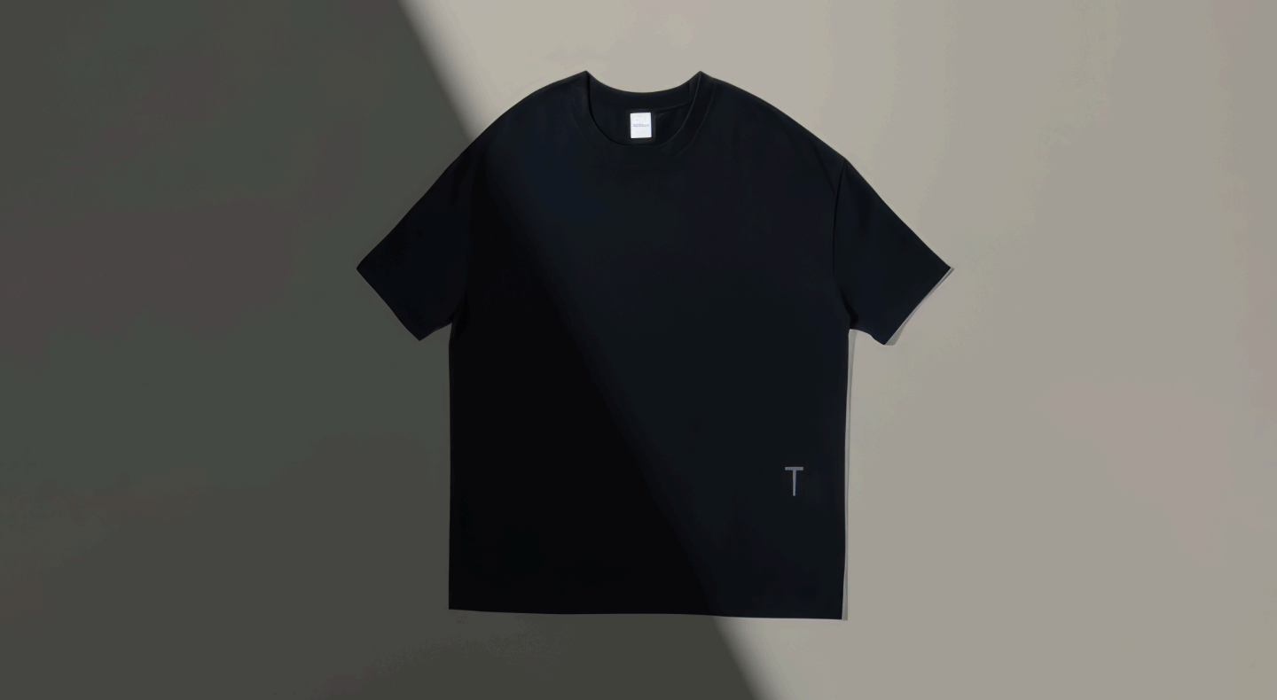
- The font became part of the brand identity and is now used in merchandise and digital products.
- Continued collaboration for the font’s localization for new markets.
Why Do Clients Choose TypeType for Customization?
- Flexibility: We work with any style, from sans-serifs to script fonts.
- Experience: Over 600 custom projects completed.
- Technology: Our own FontEditor and proprietary tools for kerning verification.
« TypeType doesn’t just draw letters—they design communication. »
— Feedback from the SHIFTBRAIN team!
Execution: The Production Department’s Work
The Variable Font
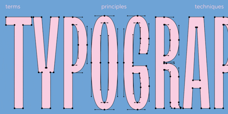
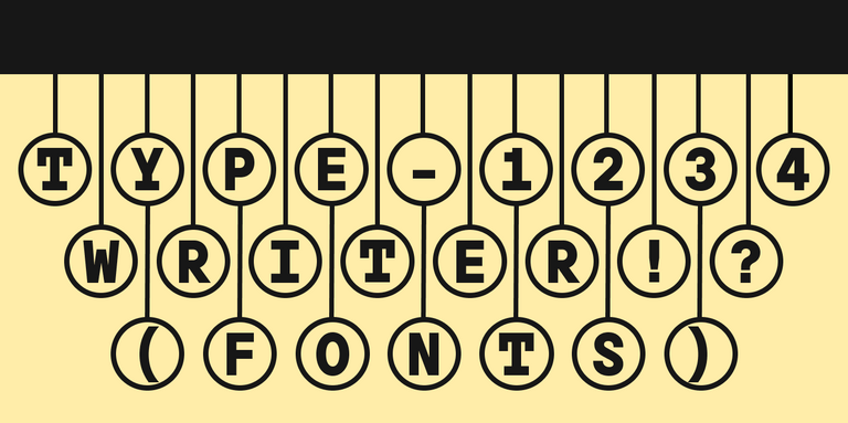
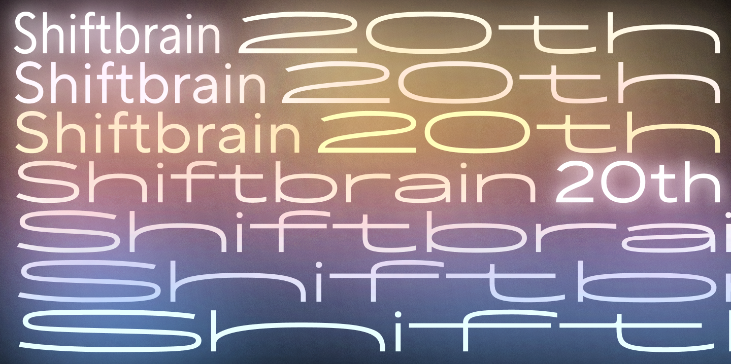
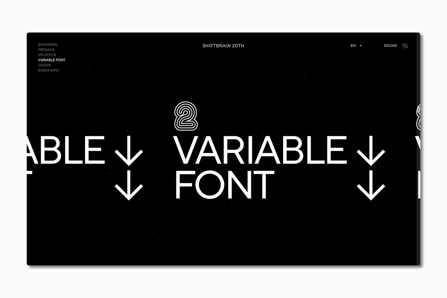
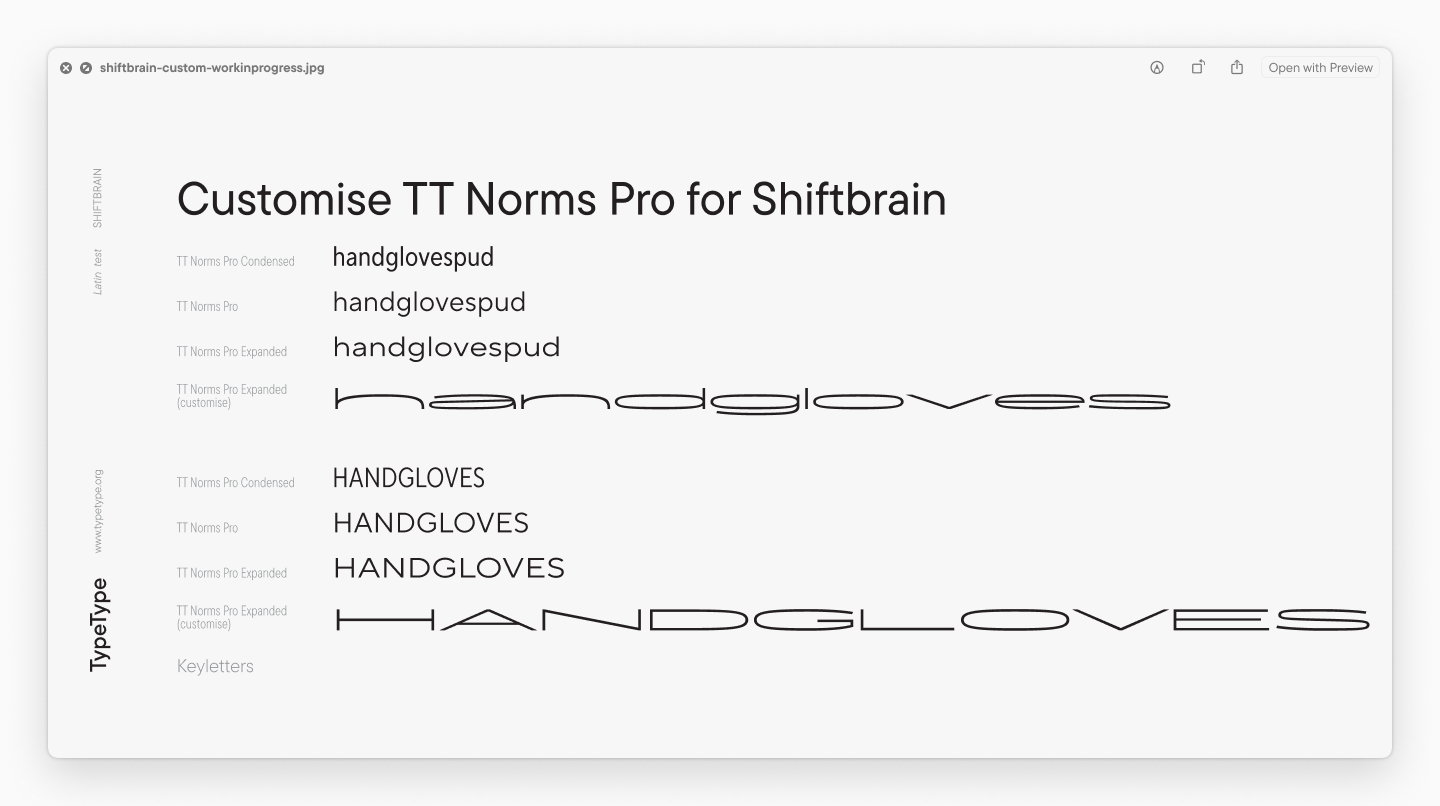
The main task was to make TT Norms® Pro vary horizontally from a Condensed style to a super-wide one—from 460 pt to 3480 pt. That’s a width increase of 7.6 times! For comparison, a typical expansion from Condensed to Expanded is about 1.5 times. We had never made a font this wide before.
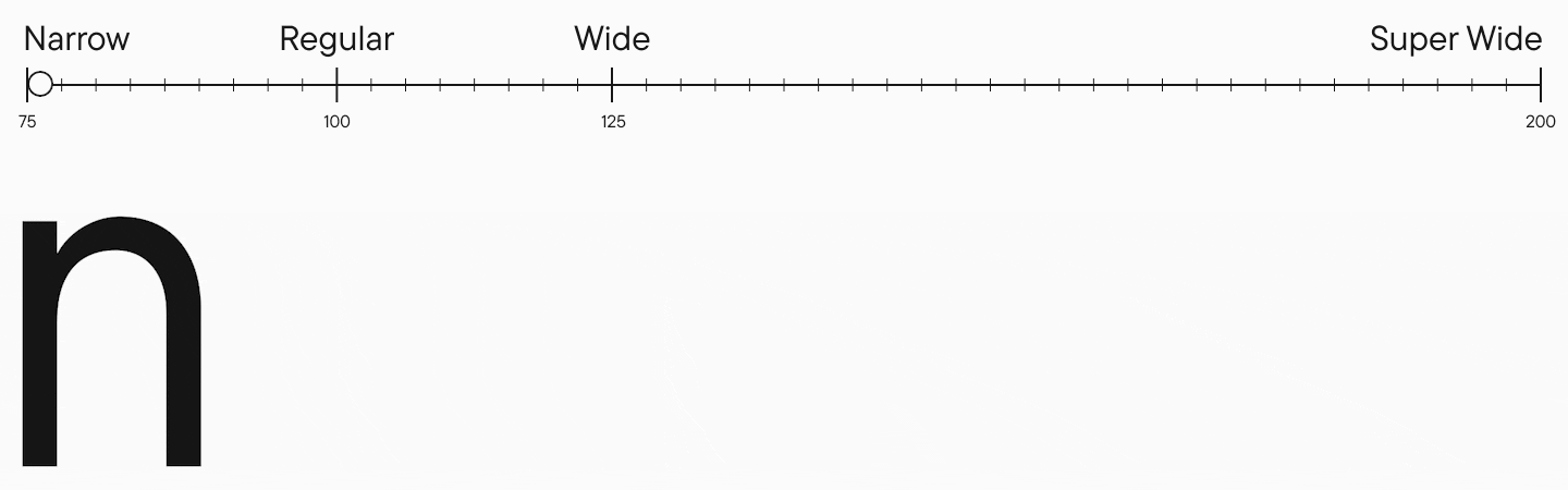
The narrow style retained the same width as the original Condensed, and we added an ultra-wide style at the right end of the Width variability axis. The font included only the Latin alphabet, numbers, and standard punctuation. For the Width axis, we initially used standard values:
Designing the graphics for the wide style was challenging: the letters were so stretched that it was impossible to assess how they looked in a text block within the Glyphs app window. This meant we had to export the file after every change and analyze a text block in a layout program. Despite the difficulties, we handled the task perfectly!
Technical Work
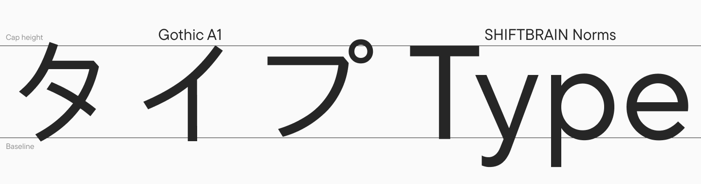
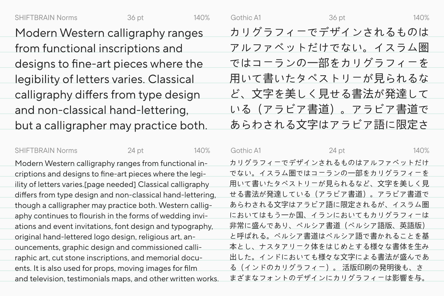
In parallel with the design work, we performed font hinting and other technical adjustments. On November 30, SHIFTBRAIN sent us the Japanese font A1 Gothic StdN Regular, to which we needed to match our font’s metrics. We had to adjust the leading and the baseline.
« The thing is, CJK fonts have different metrics from Latin and Cyrillic fonts. When you use them side-by-side, you get very loose, gappy typesetting. You can imagine any packaging on a Chinese product: you’ll see beautiful hieroglyphs, but the Cyrillic or Latin text will have huge letter spacing and other issues. To make everything look harmonious, you need to adjust one font to match the other.«
Marina Khodak, Design Lead at TypeType
At that moment, this was a very interesting and promising solution for us. On the one hand, it’s a relatively simple customization; on the other, it solves very significant design challenges.
« I scaled the font, increasing it to 107% of the original. The Em size remained at 1000 units, just like the reference A1 Gothic. We took the leading settings from the reference font and transferred the relevant parameters to our font. We also slightly shifted the baseline at the client’s request. We verified the match in Adobe Illustrator using Composite Fonts. Initially, the client provided the settings they used with the original font pair. Our task was to ensure the visual output was identical when using our custom font with A1 Gothic at default Size and Baseline settings. This allows the font pair to be used in applications beyond just Adobe Illustrator.«
Yuri Nakonechny, Head of the Technical Department at TypeType
Portrait Icons and the Logo
SHIFTBRAIN sent us 30 beautiful icons featuring images of all the company’s employees. The challenge was that an illustration’s outline is far more complex and detailed than a letter’s outline—it has more points that don’t meet font requirements. When exporting from .svg to .glyphs, some details can break. Therefore, you can’t just drag and drop a vector image into Glyphs. After an icon is imported into a font, it needs to be meticulously cleaned up and corrected.
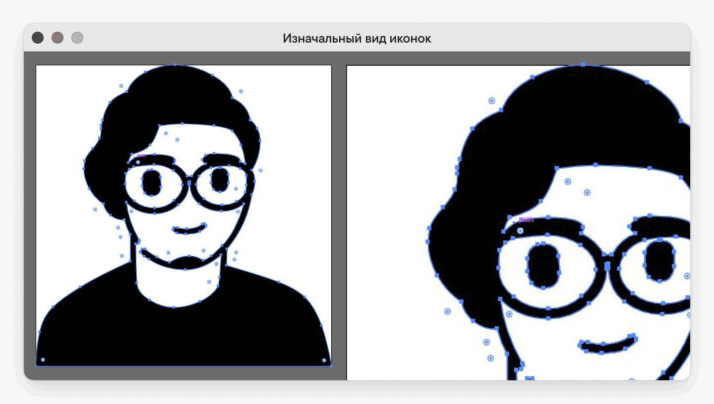
We integrated all 30 icons into the font after careful processing. However, after this was done, SHIFTBRAIN decided to redesign 15 of them to alter their proportions for a more generalized look. This meant we had to repeat the entire process for half of the icons. But in the end, it all came together perfectly!

We also embedded the company logo into the font and created an OpenType feature for it—when activated, the letter ’S’ is replaced by the logo.
Graphic Refinements
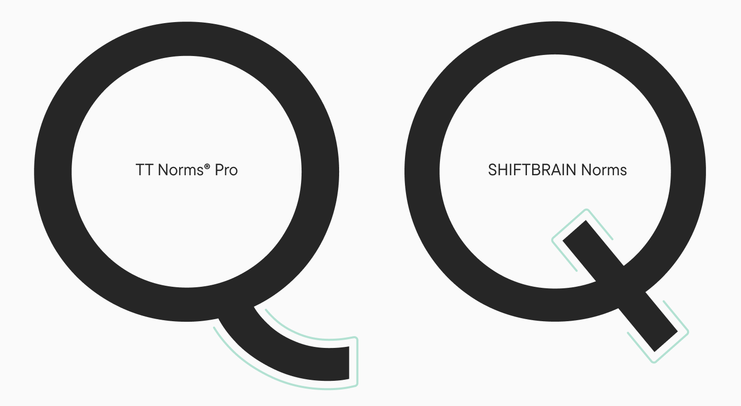
We also made minor changes to the shapes of a few characters. Specifically, we modified the ’Q’ and added an alternate ’S’ with horizontal terminal cuts. SHIFTBRAIN requested this shape because of its similarity to their logo.
The Final Result
The outcome was an extremely wide variable font with a set of built-in icons. See how original and striking it looks on SHIFTBRAIN’s anniversary website!
Thanks to the clear and coordinated work of the TypeType team, clients receive:
- A unique, turnkey font—without overpaying for unnecessary iterations.
- Transparency—timelines and budget are clear from the start.
- Support—a dedicated manager resolves issues before they become stressful.
Why does this work? We don’t just sell fonts; we design a brand tool. After a project is completed, 80% of our clients return for additional services (like icons or localization).
Want the same predictable process for your custom font? Let’s discuss your project! Send us a message describing your task, and we’ll propose a solution within 24 hours.