Sublimez vos créations avec les polices sans serif de TypeType. Leurs lignes épurées, leurs formes polyvalentes et leur lisibilité exceptionnelle en font un choix de référence pour les designers sur tous les projets modernes.
Pourquoi les polices sans serif sont populaires dans le design moderne
Aujourd’hui, les sans serif sont les polices les plus modernes et les plus populaires. Le plus souvent, les polices de ce style deviennent des polices d’interface pour des marques célèbres et des sites web populaires, et sont fréquemment utilisées sur des affiches, des panneaux publicitaires et des vitrines.
Simples à première vue, soignées et polyvalentes, elles ont conquis le monde et sont devenues la nouvelle règle du bon goût. Utiliser des polices sans serif modernes dans vos projets, c’est comprendre les tendances actuelles et inviter les utilisateurs au dialogue.
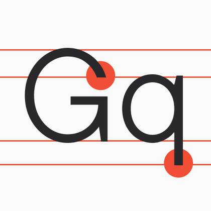
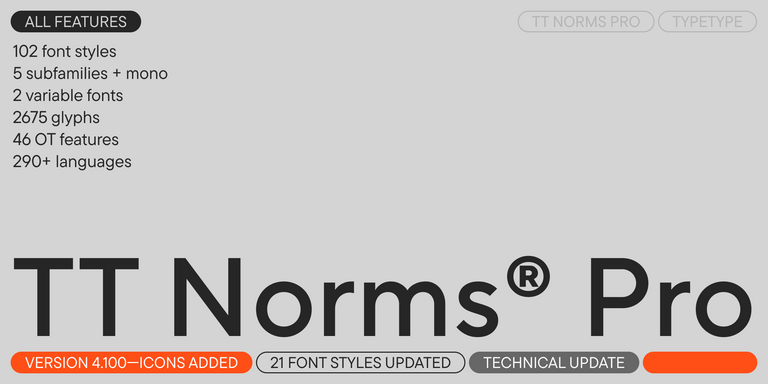
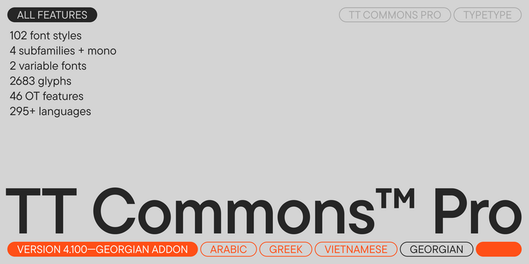
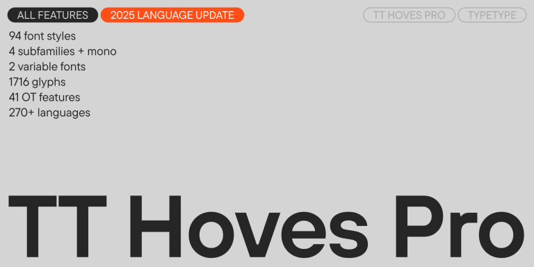
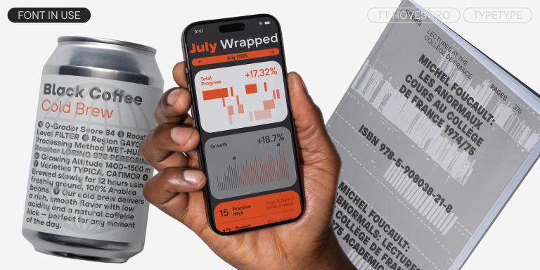
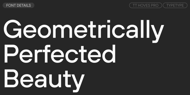
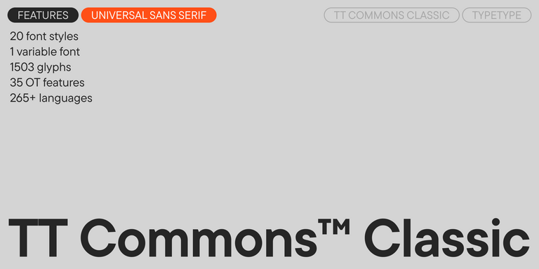
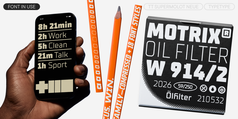
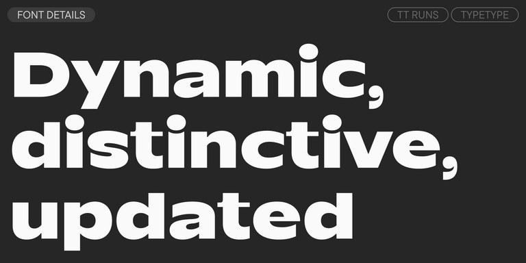
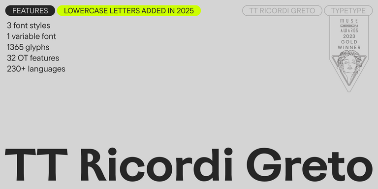
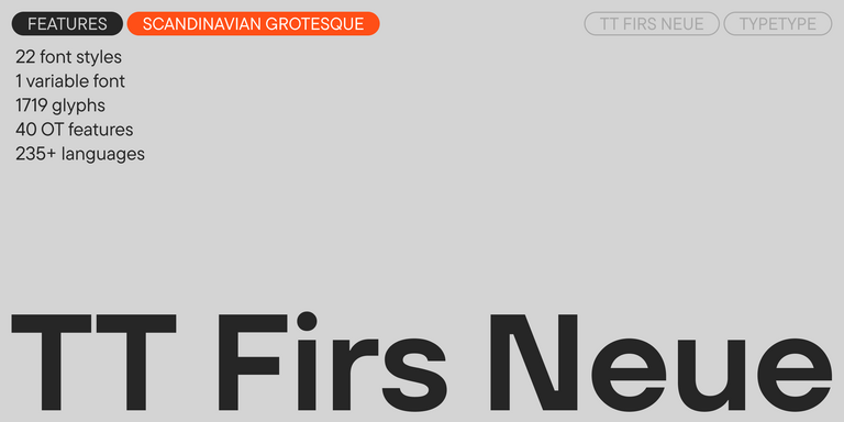
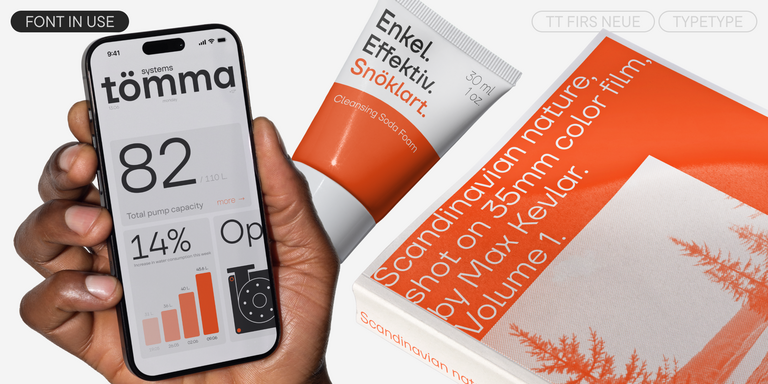
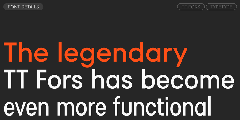
Sans surprise, dans l’immense collection de polices TypeType, les sans serif ont conquis le cœur de millions de personnes. TT Norms® Pro et TT Commons™ Pro, nos bestsellers, ainsi que TT Hoves Pro, TT Firs Neue et TT Fors, tout aussi populaires, comptent parmi nos polices les meilleures et les plus populaires.
Types de polices sans serif
Outre les polices géométriques, il existe aussi les polices Old Style, Humanist et Neo-Grotesque. Les caractéristiques communes à tous ces groupes sont l’absence d’empattements, un large éventail d’applications et une grande polyvalence.
Les sans serif Old Style sont les polices apparues à l’époque victorienne. Bien qu’elles n’aient pas d’empattements, ces polices avaient une apparence assez extravagante par rapport aux modèles apparus plus tard.
Les Neo-Grotesques sont apparues après les Old Style. Elles semblaient beaucoup plus sobres et strictes que leurs prédécesseures. Ces polices sont plus fonctionnelles et très adaptables. Les Neo-Grotesques sont généralement peu contrastées et monospace.
Les sans serif Humanist s’éloignent de la rigueur pour aller vers plus d’humanisme, comme leur nom le laisse deviner. Elles subissent une influence calligraphique et présentent des références aux serifs ainsi qu’un certain dynamisme. En règle générale, ce sont des polices à chasse variable avec un contraste de traits élevé. Elles possèdent de véritables styles italiques, dans lesquels les caractères ne sont pas seulement inclinés, mais changent aussi de forme. Dans la collection TypeType, les caractères humanistes sont TT Wellingtons et TT Corals.
Les sans serif géométriques sont les véritables outils polyvalents du monde typographique. Elles n’ont pas de caractère visuel trop marqué, ce qui leur permet de convenir à presque toutes les tâches. Elles offrent un rendu esthétique dans l’imprimé, sont idéales pour le web et conviennent parfaitement comme polices d’interface.
La polyvalence des sans serif géométriques provient de la forme de leurs caractères, basée sur des figures géométriques simples. Il s’agit le plus souvent de polices à chasse variable et à faible contraste. Ce type de police convient aussi bien aux titres qu’au texte courant.
La collection de polices sans serif TypeType
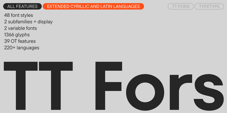
La collection TypeType comprend de nombreuses sans serif géométriques. Cette catégorie inclut les légendaires TT Norms® Pro et TT Commons™ Pro, ainsi que les très populaires TT Lakes, TT Hoves Pro et TT Fors.
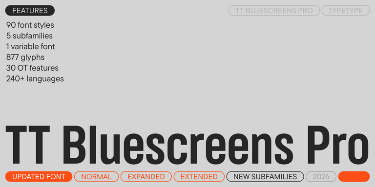
Chaque famille de polices de la collection TypeType possède une apparence originale et ses propres caractéristiques, tout en restant facile à utiliser et fonctionnelle. Chacune de nos polices sans serif propose un grand nombre de styles, ce qui vous permet de choisir celui qui convient le mieux à votre projet ou d’acheter une licence pour plusieurs styles.
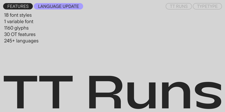
De plus, certaines d’entre elles disposent d’une police variable, comme TT Norms® Pro et TT Commons™ Pro. Cela vous permet de choisir la variation idéale de la police.
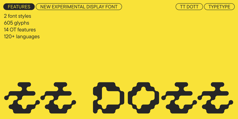
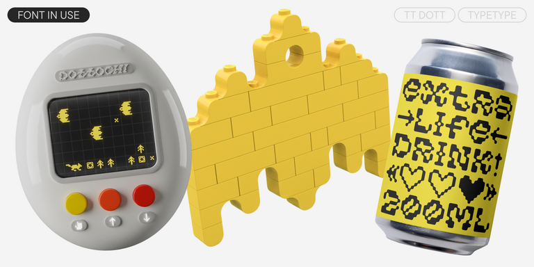
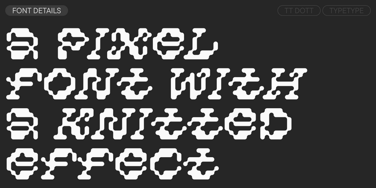
TT Dott is an experimental pixel grotesque where a circle is used as the base for the pixel. It is a fluid and unusual display font, evoking associations with embroidery and techno parties all at once.
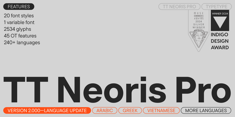
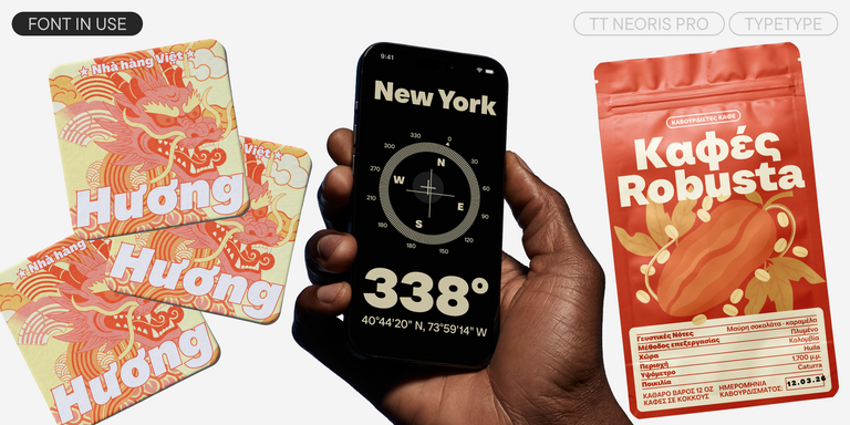
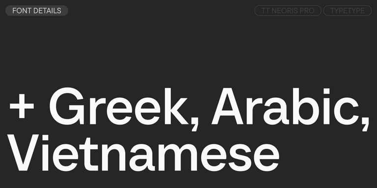
TT Neoris est une néo-grotesque élégante au potentiel illimité, une police qui répond à toutes les exigences modernes et aux attentes des utilisateurs.
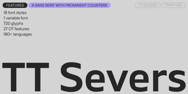
TT Severs est une sans serif géométrique aux éléments internes accentués. La principale particularité visuelle de TT Severs réside dans la forme inhabituelle de ses ovales intérieurs.
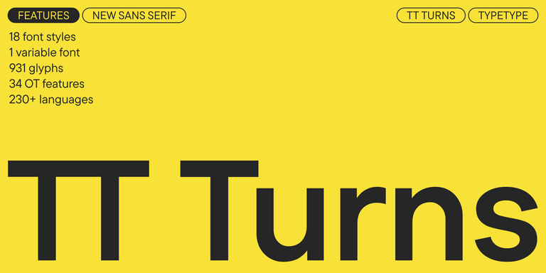
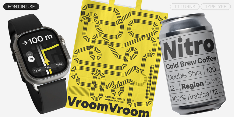
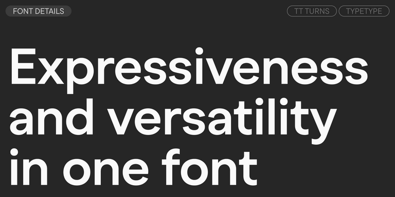
TT Turns est une sans serif géométrique expressive et percutante. Cette police polyvalente fonctionne parfaitement pour les textes courants et révèle un fort caractère display dans les grands corps.
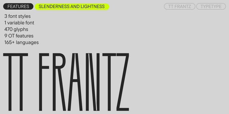
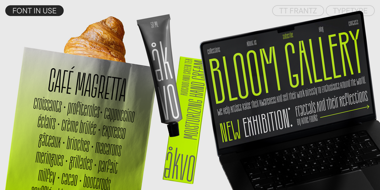
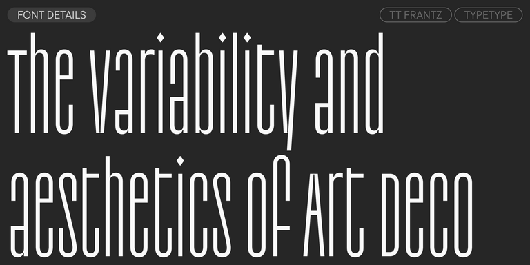
TT FRANTZ EST UNE POLICE VARIABLE EXPÉRIMENTALE QUI SE DISTINGUE PAR SA FINESSE ET SA LÉGÈRETÉ. LA VARIATION DE LA POLICE AGIT SUR LA HAUTEUR DE LA LIGNE MÉDIANE : EN DÉPLAÇANT LE CURSEUR DE L’AXE, IL EST FACILE D’AUGMENTER OU D’ABAISSER LA LIGNE MÉDIANE DE LA TYPOGRAPHIE.
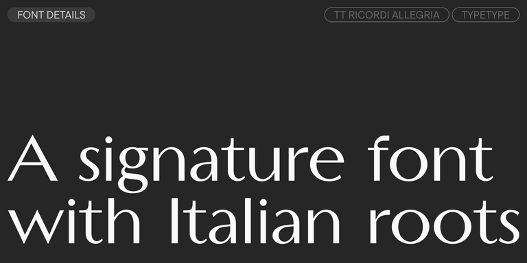
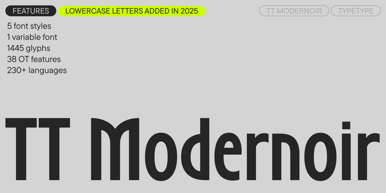
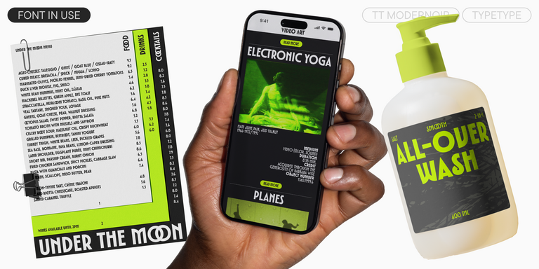
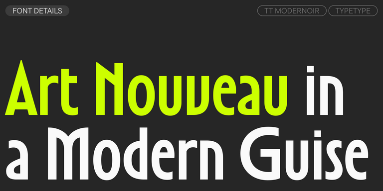
TT Modernoir est une display sans serif aux proportions dynamiques. Les lignes fluides et les délicates formes Art nouveau se mêlent harmonieusement au rythme et à la liberté improvisée du jazz.
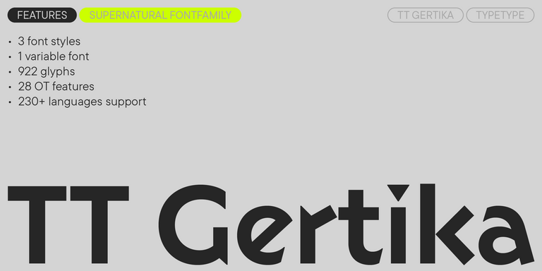
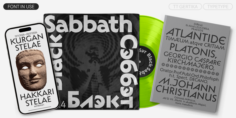
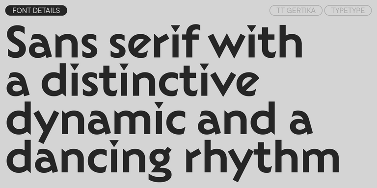
TT Gertika est une sans serif géométrique au caractère dynamique et au rythme dansant. L’idée de cette police provient du lettrage figurant sur une affiche américaine de la fin des années 1930.
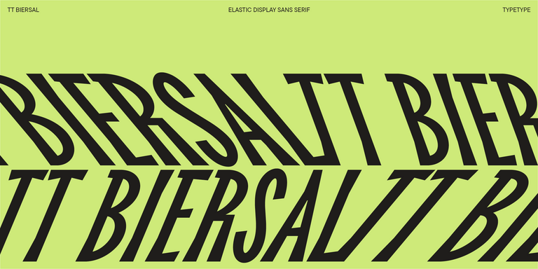
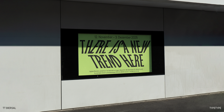
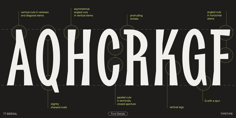
TT Biersal est une display sans serif au caractère libre, joueur et aventureux. Le concept de cette police a été inspiré par une affiche allemande du début des années 1930.
Il s’agit de polices sans les petits traits décoratifs, appelés empattements, aux extrémités des lettres. Elles ont généralement un aspect plus épuré, plus moderne, et restent souvent lisibles dans de petits corps et des mises en page simples. Cela en fait un choix populaire pour le web design, les applications, le branding et d’autres projets contemporains.
Quelle est la différence entre les polices sans serif et les polices serif ?
La différence essentielle réside dans la présence de petits traits de terminaison appelés empattements. Les polices serif comportent ces détails et donnent souvent une impression plus classique et traditionnelle, tandis que les sans serif paraissent plus épurées, plus minimalistes et plus modernes. En pratique, les deux conviennent efficacement à une grande variété de projets.
Comment associer des polices sans empattements ?
Pour associer efficacement ces polices, combinez des styles qui créent du contraste tout en conservant une harmonie. Choisissez des polices qui partagent une structure commune, mais qui diffèrent suffisamment en graisse, en largeur ou en tonalité pour créer un contraste. Une police de titrage forte et une police de texte plus neutre constituent généralement la meilleure combinaison.
Vous pouvez également associer une sans serif à une police serif afin d’apporter de la variété visuelle tout en conservant un rendu équilibré.
Les polices sans serif conviennent-elles aux logos et à l’identité de marque ?
Oui, elles constituent un excellent choix pour les logos et l’identité de marque grâce à leur structure épurée et à leur grande adaptabilité. Elles créent une apparence moderne et accessible, tout en conservant une bonne lisibilité sur différents formats. Ces polices fonctionnent particulièrement bien lorsqu’une marque recherche une esthétique minimaliste, contemporaine ou orientée technologie.
Comment les sans serif améliorent-elles la lisibilité et l’expérience utilisateur ?
Elles facilitent le repérage visuel du texte et rendent la lecture plus confortable sur les écrans numériques. Sans détails superflus, les caractères restent clairs à différentes tailles et résolutions, contribuant ainsi à une expérience plus lisible et plus conviviale.