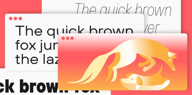

Special characters and punctuation marks are present in almost all fonts. These font symbols play an important role in the perception and readability of text, as well as serving auxiliary (and sometimes decorative) functions. For example, these symbols help organize and structure text, add additional meanings, and convey emotions.
In this article, we’ll examine the most popular and interesting symbols and characters.
Punctuation Marks
Punctuation marks are symbols that perform auxiliary functions in text. In particular, they are used to structure and divide text into meaningful segments, help set the tone, place emphasis, or express emotions. Among the most well-known punctuation marks are:
Period (.) is the simplest punctuation mark, which forms the basis of many other symbols. It is used to end sentences or abbreviate words.
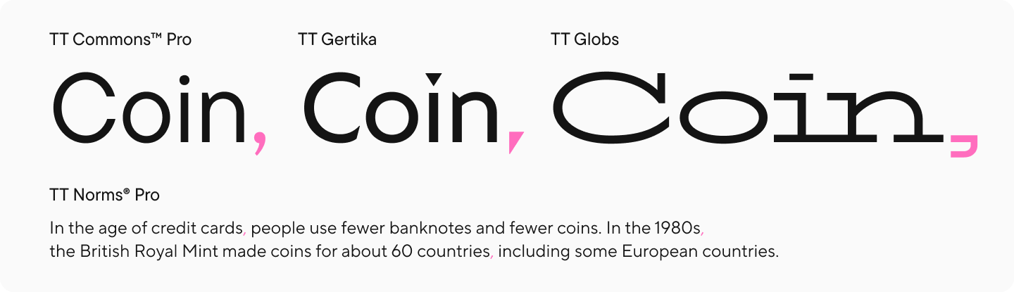
Comma (,) is used to separate and highlight parts of a sentence.
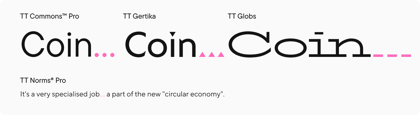
Ellipsis (…) is not just three periods, but an independent typographical mark. It is used to express implications, incompleteness, interrupted speech, to indicate a pause, or to omit a fragment of text.
Exclamation mark (!) is used to express strong emotions, surprise, admiration, excitement, and so on.

Question mark (?) serves to denote a question. It can be used as part of an ellipsis (?…) or in combination with an exclamation mark (?!).

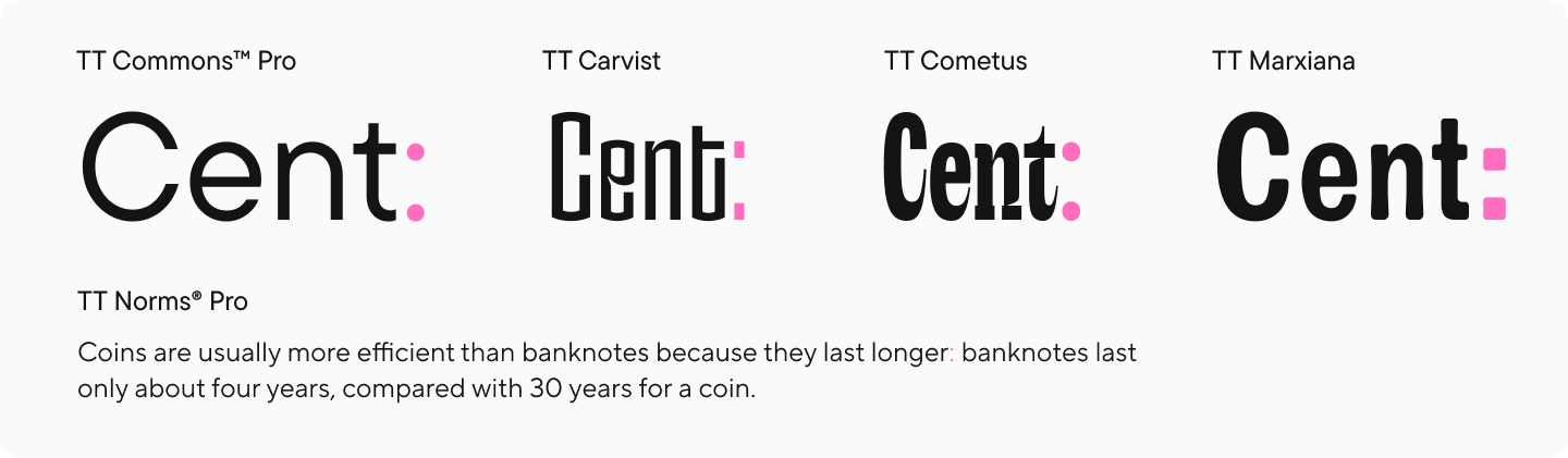
Colon (:) serves to indicate causal, explanatory, and semantic connections between parts of a sentence.
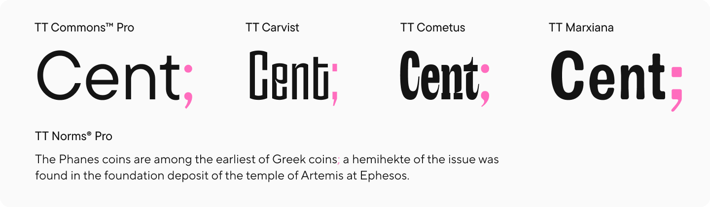
Semicolon (;) is a separating punctuation mark that divides parts within a sentence.
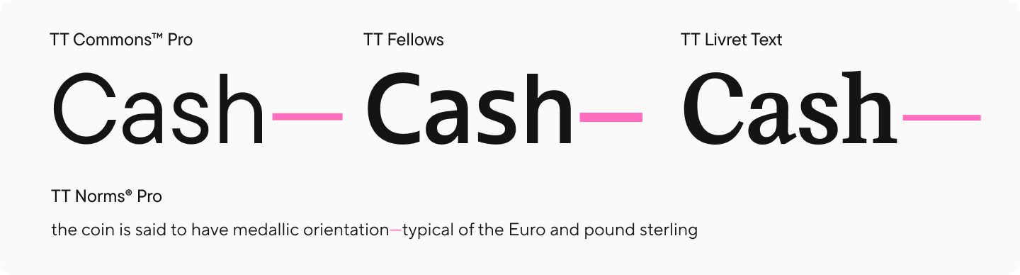
Dash (—) is used as compensation for omitted words or meanings not expressed lexically. It is often confused with a hyphen (-), which is not a punctuation mark because it is used within words.
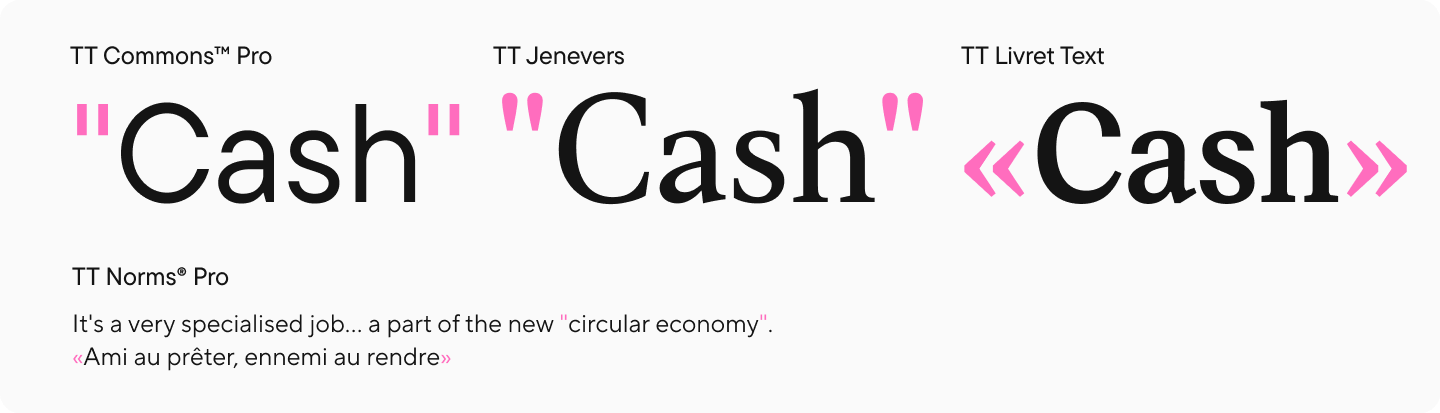
Quotation marks (« » or «») is a paired punctuation mark used to highlight quotes, direct speech, names, and words used figuratively.
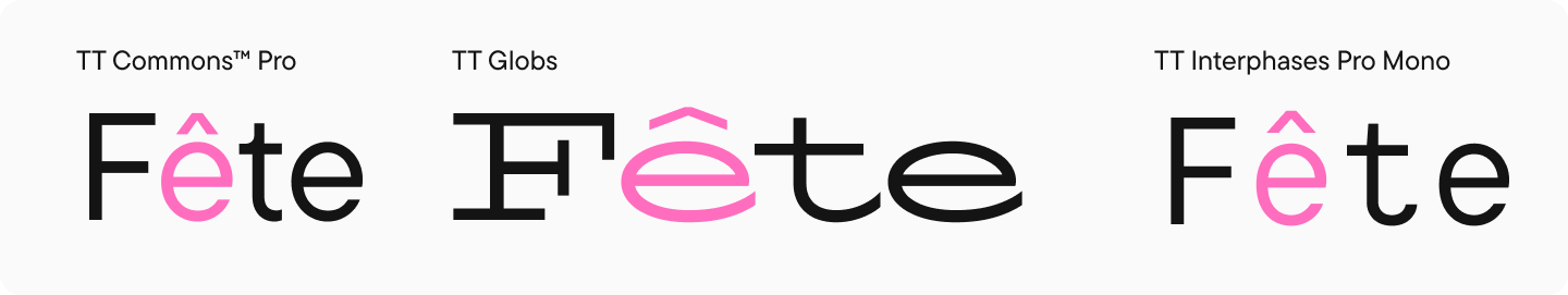
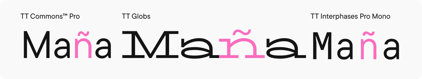
Diacritical Symbols
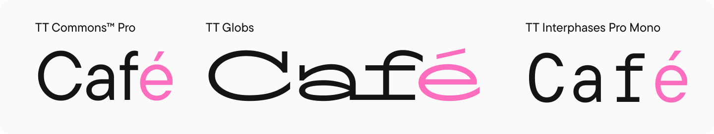
Diacritical marks are special symbols used to modify or clarify the pronunciation of other characters. They can be superscript, subscript, or inline.
Examples of diacritical symbols:
Acute accent (´) indicates logical or intonational stress.
Grave accent (`) is used in various languages as an intonational stress.
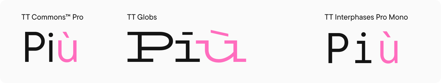
Circumflex (^) is used in several languages to change intonation in syllables and pronunciation of vowels.
Tilde (~) affects the pronunciation of certain sounds and is also used in dictionaries to denote (substitute) a word or part of a word when repeated.
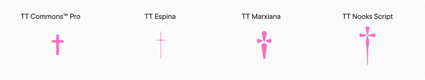
Daggers (Crosses)
A dagger, or typographical cross (†), is sometimes also called a „obelisk“ or „obelus“. This is a typographical mark that has been used in different countries and different periods of history to indicate the date of death, a questionable statement, a footnote, and other meanings.
Asterisk and Obelisk (Ba-Dum-Tss!)
Asterisk (*) is a punctuation special character that is a small five- or six-pointed star-shaped symbol. Used to denote footnotes and notes.
Obelisk (†) is the same as the dagger (see above).
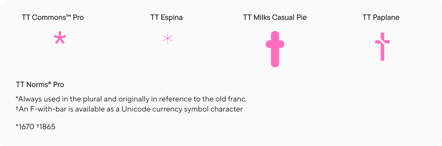
Interestingly, when placed beside years, the dagger was used to mark the date of death while the asterisk marked the date of birth.
The obelisk was also used as a second footnote after the asterisk.
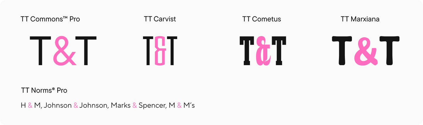
Ampersand
Ampersand (&) is a symbol (ligature) that is used to replace the conjunction „and“. Historically, the ampersand originated as a ligature of „et“, meaning it was formed from the Latin conjunction et („and“). Today, this symbol is often used in brand names.
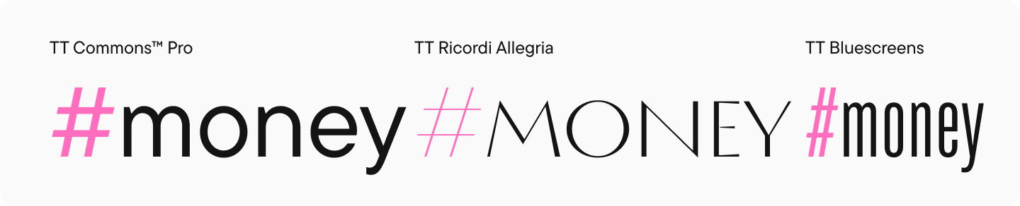
Octothorpe (Hash)
Octothorpe, or hash sign (#) is a symbol, also known as „hash“ or „hashtag“. The name „octothorpe“ comes from the Latin octothorpe („eight ends“).
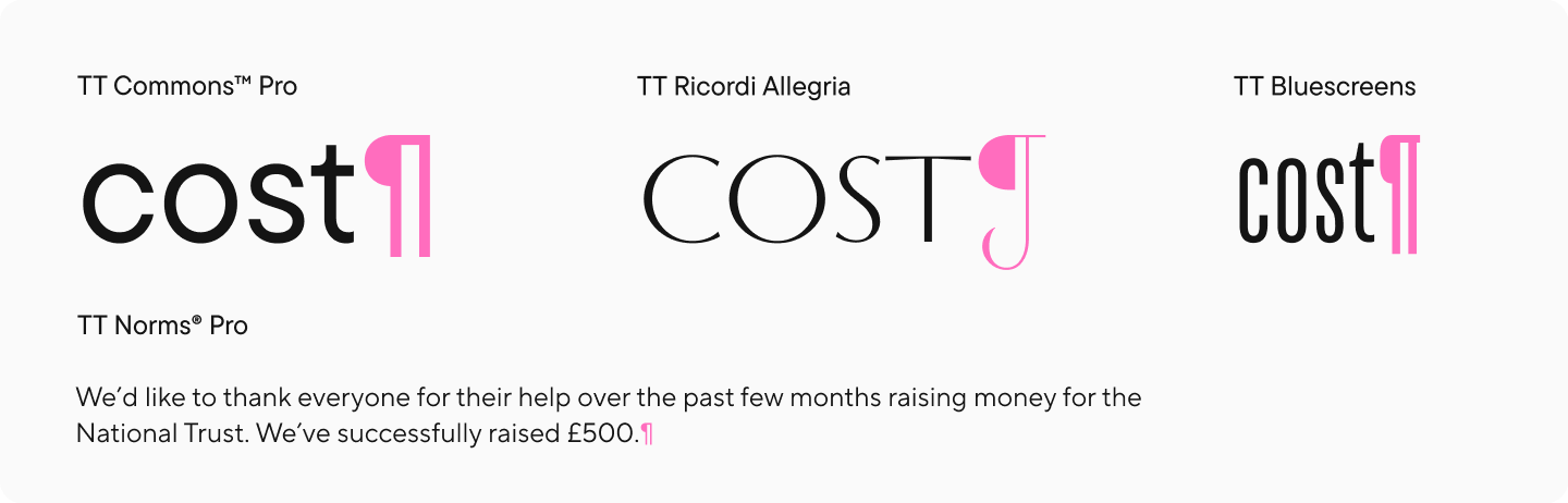
Pilcrow and Section Sign
Pilcrow (¶) is a symbol used to mark the end of a paragraph. This symbol presumably originated from the Latin letter C, more precisely—from the word capitulum, which in Latin means „chapter“.
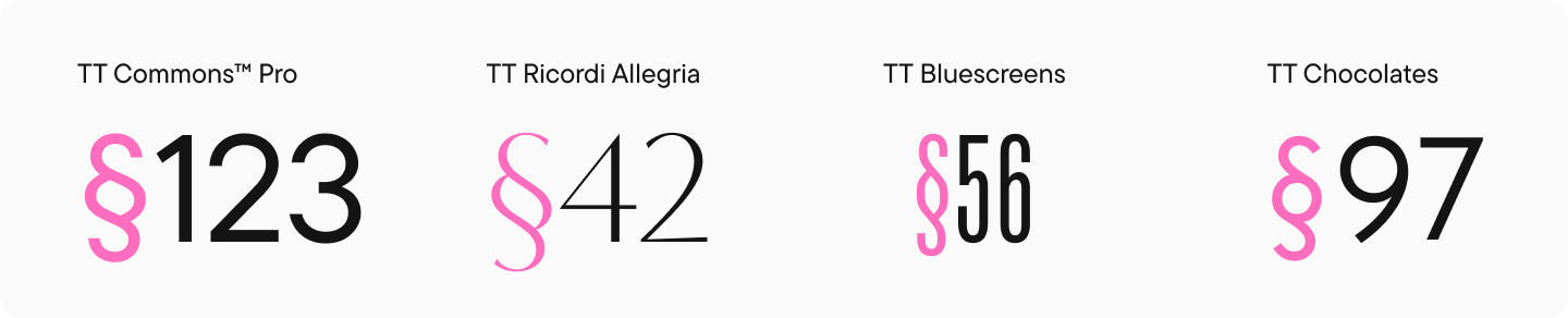
Section sign (§) is a typographical symbol used to denote sections in legal texts, textbooks, and documents. It is assumed that the symbol comes from the abbreviation of the German word satz („phrase, sentence“).
Commercial Symbols
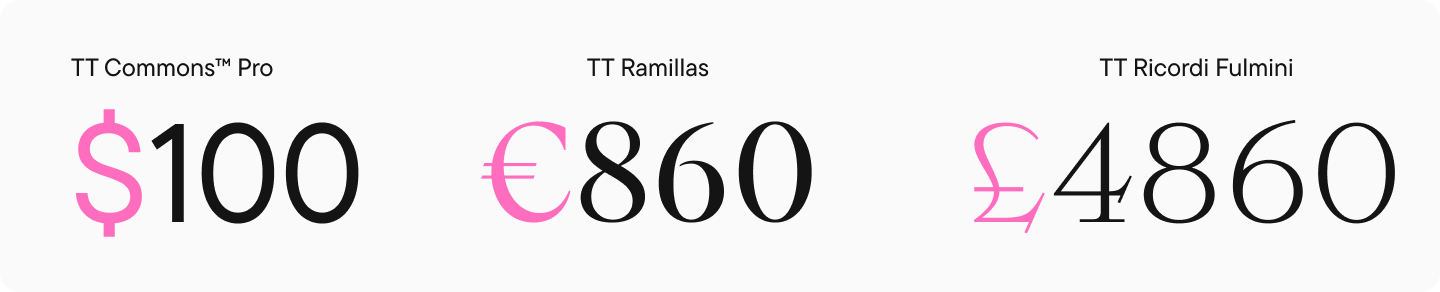
These are special characters that denote monetary units. A number of symbols with legal significance are also considered commercial.
For example:
- Dollar sign ($)
- Euro sign (€)
- Pound sterling sign (£)
Copyright
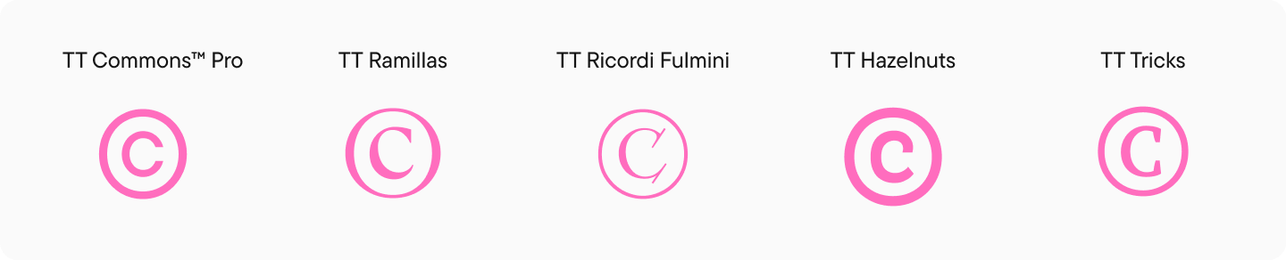
The copyright symbol (©) belongs to commercial symbols. It is a special symbol used as a mark of copyright protection.
Trademark, Registered Trademark
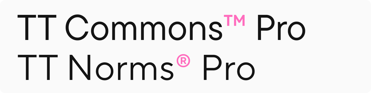
Trademark (™) or registered trademark (®) also belong to commercial symbols and indicate that the trademark is registered and protected by intellectual property rights.
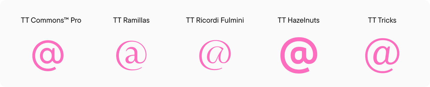
„At“ Symbol
The „at“ symbol (@) is another name for the „commercial at“ sign. This is a typographical symbol that was originally used in payment documents. Today, it is used primarily in network services to separate a username (account) from a domain name.
Conclusion
In this article, we’ve covered the most common special symbols and characters, though this is just a small selection of what exists. It’s worth noting that different fonts may contain different character sets—depending on what the font designer chose to include in a particular typeface. Furthermore, these symbols can vary in appearance, as their design is influenced by the overall character and graphic style of the font.