A business card is a seemingly insignificant yet important tool for business communication. Your first impression as a specialist or company representative depends on its design, particularly the font. The font on a business card isn’t just a means of conveying text but part of your visual identity.
But how to understand which are good fonts for business cards and which aren’t? What is the criteria?
In this article, we’ll explore what is the best font for business cards to enhance your professional image and you’ll find practical selection advice, examples of the best business card fonts, and top options from the TypeType collection.

What Makes a Quality Business Card
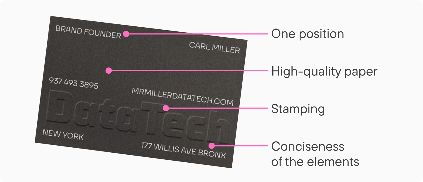
A good business card combines informativeness, concise design, and quality typography. Its task is not only to convey contact information but also to visually reflect the owner’s professionalism.
Here are important factors to consider for a professional-looking card:
- Quality paper stock. Even the best design and beautiful font won’t save the situation if the paper is thin, uneven, and tactilely unpleasant. To ensure your business card has the proper appearance, choose your paper carefully.
- Additional finishing. For example, lamination, embossing, foil stamping, etc.
- Harmony. This applies to everything—design, finishing elements, and the number of shades and fonts used. It’s important not to overdo it so the card doesn’t look cluttered or tasteless.
- One card per position. If you hold several positions simultaneously, don’t try to fit all the information on one card. Have several cards, each corresponding to one type of activity.
Types of Fonts for Business Cards
Let’s explore some common business card fonts and how they’re typically used in different industries:
- Serif fonts—add a sense of formality and academic rigor, look elegant, and are safe choices for traditional fields.

- Sans serif fonts—appear modern, are versatile in use, and appropriate in almost any professional environment.

- Script fonts—help add individuality to your card, but should be used cautiously, primarily in creative niches.

- Monospace fonts—look strict and technical, suitable for business cards of IT specialists and engineers.

- Decorative fonts—not suitable for all business cards, applied selectively—usually in logos or accents.

It’s important to understand: even a beautiful and quality font can ruin a business card if used in the wrong context.
How to Choose the Best Font for Business Cards: Practical Tips
To select an appropriate font for your business card, consider the following factors:
Appropriateness
The typeface should correspond to your professional field. For example, a strict and neutral font is suitable for a bank employee’s card. For an entertainment industry representative—a more friendly and light option. And unusual decorative fonts will be appropriate on business cards of creative specialists.

Readability
The main criterion. Regardless of your field of activity and card style, the text must be readable. Especially your name and contact information.

Visual harmony
The font shouldn’t stand out from the overall design—on the contrary, it should correspond to it and support the general style direction.

Correct appearance in print
What looks good on screen may look different in print. Much depends on the type and texture of the paper—for example, if it’s rough, very small text may become unreadable. Before printing the full run, always make a test print.

Best Fonts for Business Cards: Fresh Solutions to Highlight Your Brand
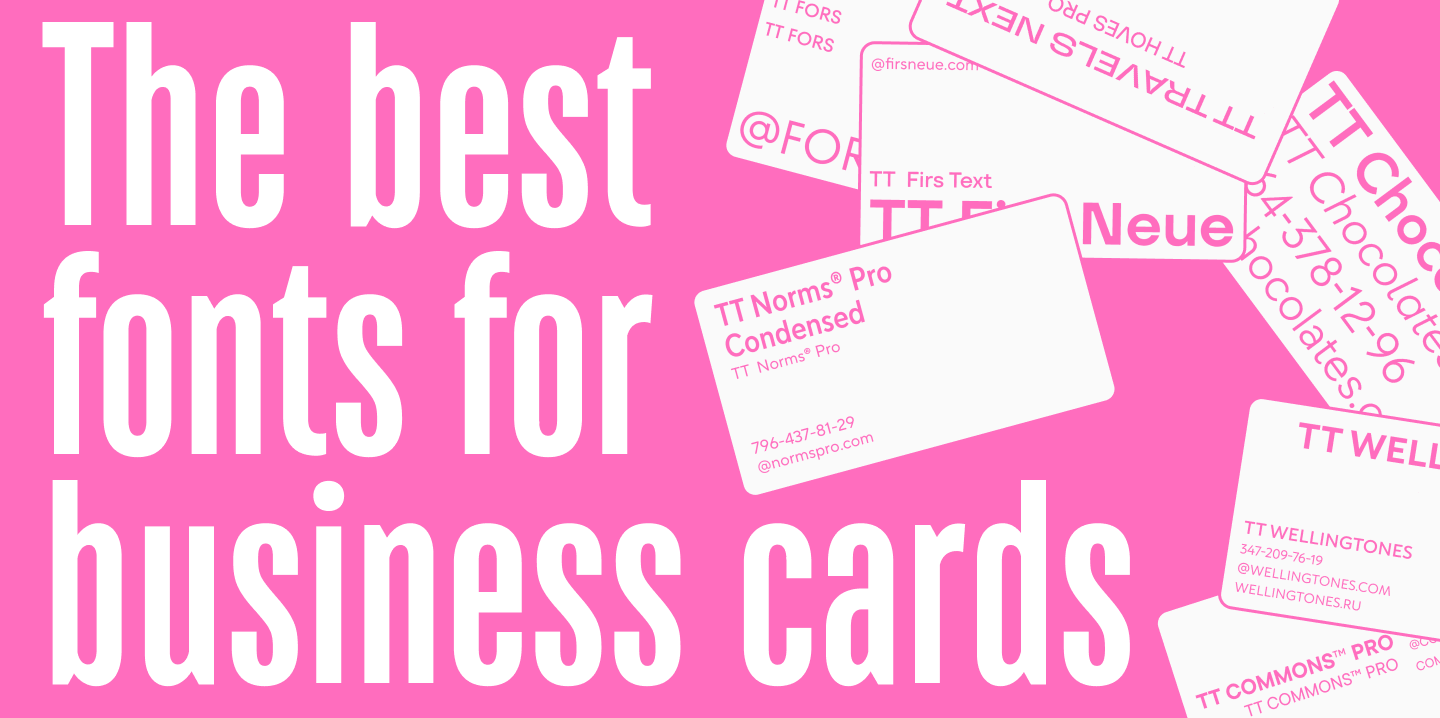
We’ve selected top fonts for business cards from the TypeType collection. They all meet the criteria we’ve described above and support various languages, including English and Russian. In this selection, you’ll find options for different professional fields. Download any font as a full trial to test it, and upgrade to a license for commercial use.
TT Norms® Pro + TT Norms® Pro Condensed
TT Norms® Pro is a versatile sans serif that’s a great choice for almost any business card. If you need a concise and moderately serious, yet stylish and modern font—this is a winning option.
The TT Norms® Pro Condensed subfamily, included in the main typeface, works well for accents. These fonts still look neutral and minimalist, but their narrower proportions help create emphasis.

TT Commons™ Pro
TT Commons™ Pro is a versatile and minimalist geometric sans serif. This popular font is suitable for any business card. To give the card a classic look with a serious and official mood, you can use it alone. In cards with more creative design, it can serve for setting the main text in combination with more unusual fonts, as its neutrality allows it to pair with almost any typeface.

TT Firs Text + TT Firs Neue
TT Firs Text is a font that combines neutrality with character. It’s a concise sans serif with recognizable Scandinavian minimalist aesthetics. It looks interesting and fresh, yet reads excellently and doesn’t draw unnecessary attention. An excellent solution for business cards of architectural studios, furniture stores, or interior designers.
To enhance the effect and create emphasis, pair it with the stylish Scandinavian sans serif TT Firs Neue with more expressive graphic elements.

TT Hoves Pro + TT Travels Next
TT Hoves Pro is a standard font with a neutral yet recognizable character. Thanks to simple geometric forms, it will be appropriate on almost any business card as the main font. To add a specific mood, you can use a more characteristic font paired with it.
For example, the experimental TT Travels Next will help add boldness and individuality to your card without making it tasteless. Event agencies, design studios, and creative specialists should consider this solution.

TT Fors
TT Fors is an aesthetic geometric sans serif with a neutral character and refined proportions. It looks, on one hand, neutral, and on the other—modern and stylish. Therefore, this nice font is another versatile option for any business card regardless of professional field.

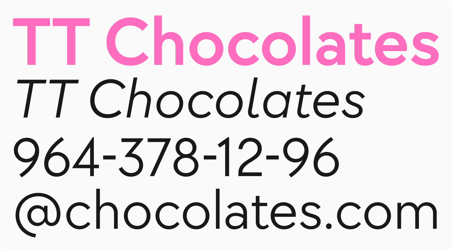
TT Chocolates
TT Chocolates is an elegant humanist sans serif with tight spacing and balanced proportions. It’s a highly readable, yet friendly and aesthetic font. It has established itself as an ideal font for confectionery products, and therefore can be an excellent option for business cards of confectioners, chefs, bartenders, and creative professionals.
TT Wellingtons
TT Wellingtons is a humanist sans serif whose forms reference the movement of a broad-nib pen. It’s a calm yet interesting font that looks lively and modern. It’s suitable for business cards of specialists in completely different fields while looking unique.

What Font Size is Suitable for Business Cards?
The optimal font size on a business card ranges from 7 to 11 points.
- Name or company name—usually the largest element, but it shouldn’t dominate too much.
- Contact information is optimally made slightly smaller, but you should ensure the text remains clear.
- For additional information, you can choose the minimum size from the specified range, but also monitor readability.
Using a font that’s too small is not recommended—it may be illegible when printed. Excessive size is also undesirable, especially on a card with limited space.
How to Combine Fonts on a Business Card
You shouldn’t use more than two fonts or styles on one business card. For a slogan or logo, you can use a more expressive font; for personal and contact information—a more neutral and readable one.

If you have a corporate font, use it in combination with a neutral and concise text sans serif. If the business card will feature a company logo that contains fonts, use them on the card itself. We talked more about fonts for logos in this article.
Many designers combine one premium font with a complementary free font for business cards to achieve a professional look within budget.
Poor Choices: Which Fonts Should Be Avoided in Business Card Design?
There are fonts that almost always look unprofessional on business cards. These include:
- overly elaborate decorative fonts
- illegible fonts
- visually outdated fonts
- excessively bold, thin, narrow, or wide fonts and styles, especially if they don’t scale well in small formats
- poor quality fonts that may display badly on different devices and become distorted when the design is sent to the printer
Conclusion
The font on your business card plays a key role in shaping your professional image. Whether you opt for an elegant, modern, or classic style, choosing a good font for business cards is essential for making a lasting impact. However, there’s no universal solution—it all depends on your goals, personal style, and industry.
We hope our ideas help make your business card a useful tool that really works.