Creating a good business presentation with a professional appearance requires not only interesting and meaningful content but also thoughtful slide design. If viewers can’t read your text, even the most impressive infographics or clever slides will remain misunderstood (by the way, we discussed fonts for infographics in detail here).
That’s why one of the key elements determining the success of a ppt project is choosing the right presentation font that will help convey information effectively, highlight important points, and create a cohesive design.
In this article, we’ll explain how to choose fonts for ppt presentations and combine them properly to make the slides stand out. We’ve also selected the best PowerPoint presentation fonts from TypeType’s collection.
Tips for Choosing Best Presentation Fonts
Default PowerPoint Font or Custom Font?
By default, PowerPoint offers standard (system) fonts. These are suitable for routine business presentations but might look commonplace and ordinary. Therefore, if you’re preparing for an important meeting or event, expect visible results from your presentation, or want to create a truly stylish and memorable ppt project, it’s worth going beyond the templates.
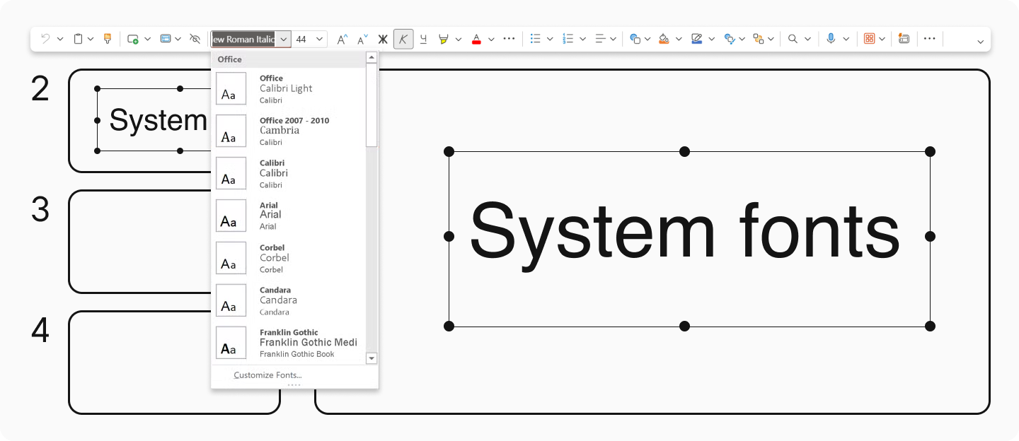
The best way to stand out is to use good presentation fonts from professional type foundries for your slides. This approach not only helps create a unique visual style but also saves you from potential problems that free fonts might cause. For example, our studio’s fonts support numerous languages, are adapted for use on any device, and are regularly updated to meet all modern requirements.
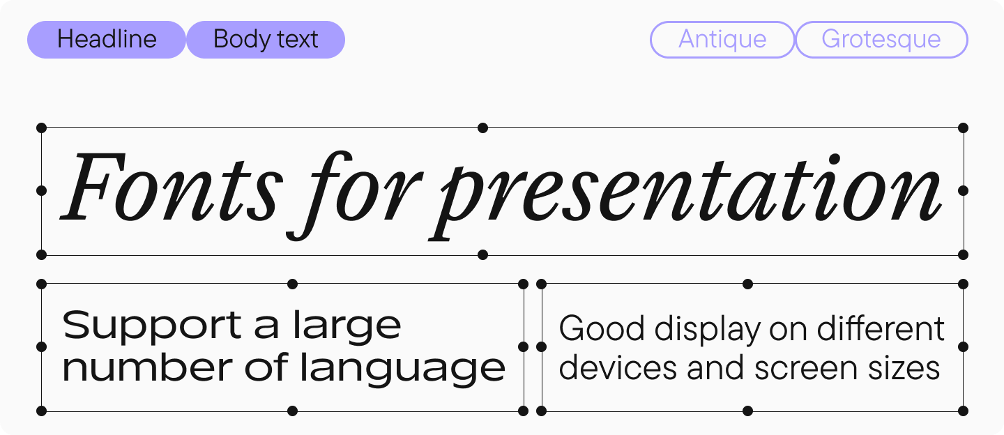
Properly Combine Fonts for Headings and Body Text
While many focus solely on images when designing powerpoints, typography is equally crucial for effective communication. First, let’s understand what function fonts serve in headings and body text.
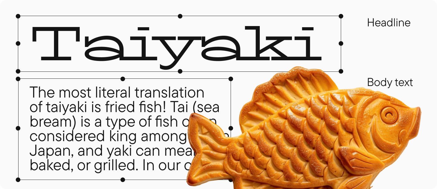
Headings are meant to attract attention to the slides, so display fonts are most commonly used for them. These are more vivid and distinctive than text fonts, with more decorative details. However, even in presentation headings, avoid overly decorative and elaborate fonts, as they may be difficult to read and draw too much attention to themselves. The main goal of presentations is to concisely convey information.

Text fonts (text typefaces), as you might guess, are designed for use in the main body text on the slides and their primary purpose is to convey information. They are concise and easy to perceive, making them comfortable to read. Text fonts can also be used in headings by simply changing the size and weight. Display fonts, however, are rarely suitable for body text.
Note: fonts in headings and body text should complement each other. Therefore, try not to use more than two fonts or styles in one business presentation, and follow the principles of compatibility that we discussed in detail in this article.
Here are some ready-made font pairs that are perfect for PowerPoint presentations:
Using All-Caps Fonts Is Not the Best Idea
Some believe that writing all text in caps (capital letters) on their slides will make a presentation cool and noticeable. This might work for logos or posters, but if you want your ppt presentations to look good, this approach will often hinder perception.
Text written in all caps will be harder to read, especially if it’s lengthy. Caps lock should be used sparingly—for example, in short headings or for specific emphasis.
Choose the Right Font Size for Your Presentations
Font size is one of the most important parameters in ppt presentations, as it may be viewed on different devices. And it’s important that the text remains readable regardless of screen size.
Text that’s too small will be difficult to read even on a large screen, especially in conference halls. Text that’s too large will disrupt the visual balance on the slides and make your presentation look overloaded.
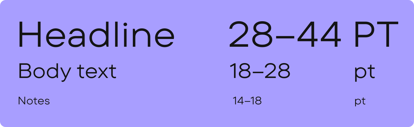
For a professional look, consider these font sizes for ppt presentations depending on the type of text and distance to the screen.
Headings:
- 28–44 points—easily readable even from the back rows
- When presenting in large venues, aim for font sizes around 44 points for optimal visibility
Body text:
- 18–28 points—minimum acceptable size for easy reading
- Aim for 24–28 points to maintain good visibility throughout your presentation
Notes or captions:
- Use 14–18 points sparingly, as text this small becomes difficult to read when displayed on presentation screens
Choose the Right Color and Contrast
Even the best font won’t be properly readable if the contrast between background and text is low. Black text on a white background is classic for business presentations, but you can experiment with dark gray, dark blue, or dark green shades.

It’s important to avoid combinations of bright colors (like red text on a blue background) or light text on a bright background without sufficient contrast. Such choices look unprofessional and impede readability.
Pay Attention to Accessibility and Readability
To reiterate, no matter how stylish your font is, if it’s not readable—it’s useless. It should be easy to perceive. Readability is the main criterion when choosing a good font for business PowerPoint presentations.
For more on which fonts are best for reading, check out our material.
Additional Tips
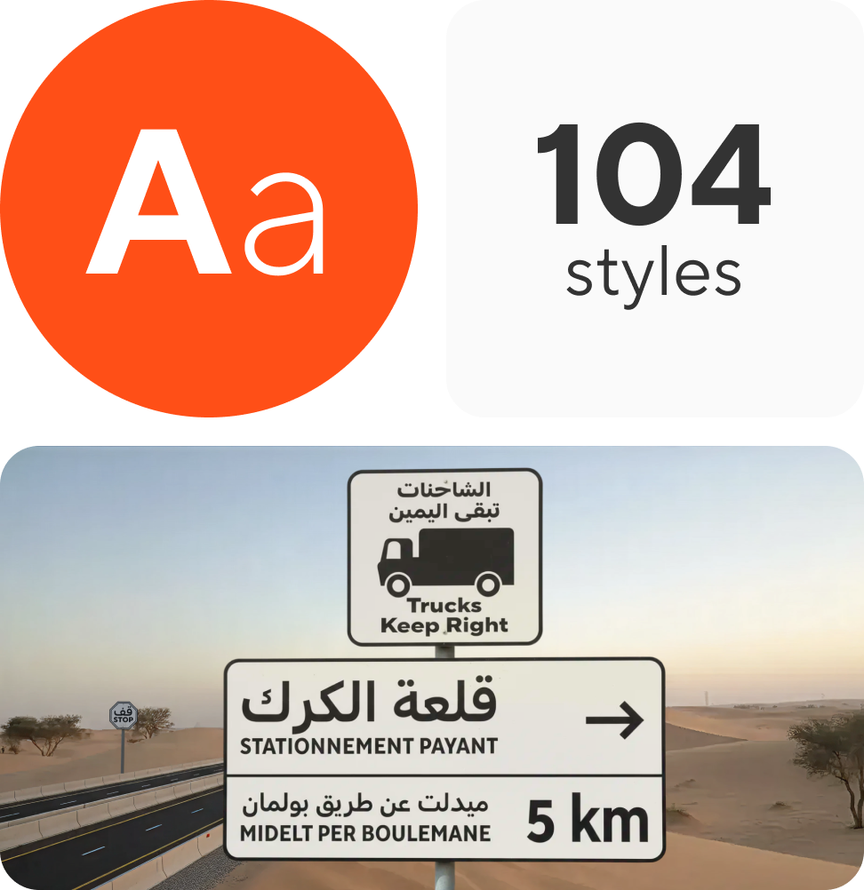
- Check language support. A beautiful Latin font might not have equally well-designed Cyrillic characters, which would be problematic for Russian-language presentations. Ensure your selected typeface fully supports all languages you’ll be using.
- Test on different devices. Poor-quality fonts may look different and display poorly on laptops, projectors, or professional equipment.
- Try to keep text concise. The fewer words—the better the slide is perceived. And a good font will only emphasize minimalism.
Professional designers often maintain a collection of reliable fonts specifically for their powerpoints, saving time when creating new presentations.
Best TypeType Fonts for PowerPoint Presentation Design
In this collection, you’ll find TypeType studio’s best fonts for presentations that convey a professional image for business or any other topic. All of them are highly readable and display correctly on any device, as well as support a large number of languages. The top includes both serif and sans serif fonts, text and decorative options. By the way, you can test any of them for free online.
Good Serif Fonts for Presentations
TT Norms® Pro Serif

TT Norms® Pro Serif is an elegant yet fairly neutral Antiqua that looks modern. This font can be used to design an entire slide: both headings and body text. It’s highly readable while giving your ppt presentations a prestigious, sophisticated, and professional look.
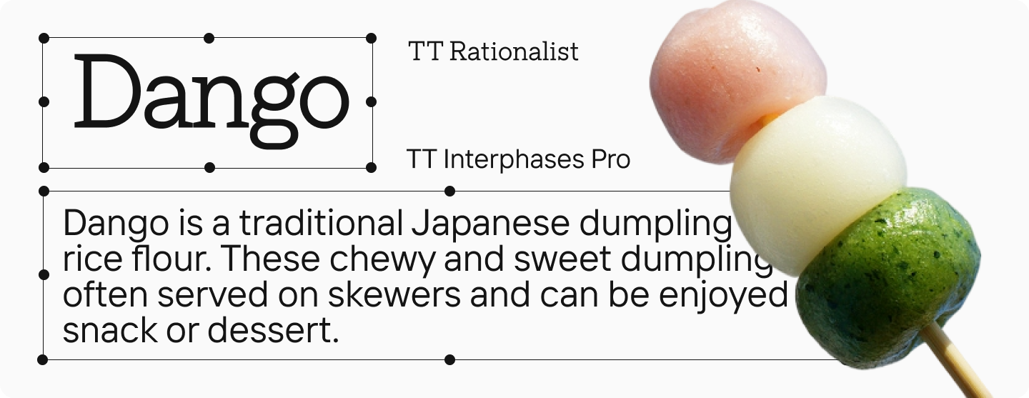
TT Rationalist

TT Rationalist is a slab serif font where each serif looks massive and solid, while the design itself appears modern and stylish. This font will add originality to your project without drawing too much attention to itself which is ideal for business presentations. Bold styles can be used in headings, while lighter ones work well for body text.
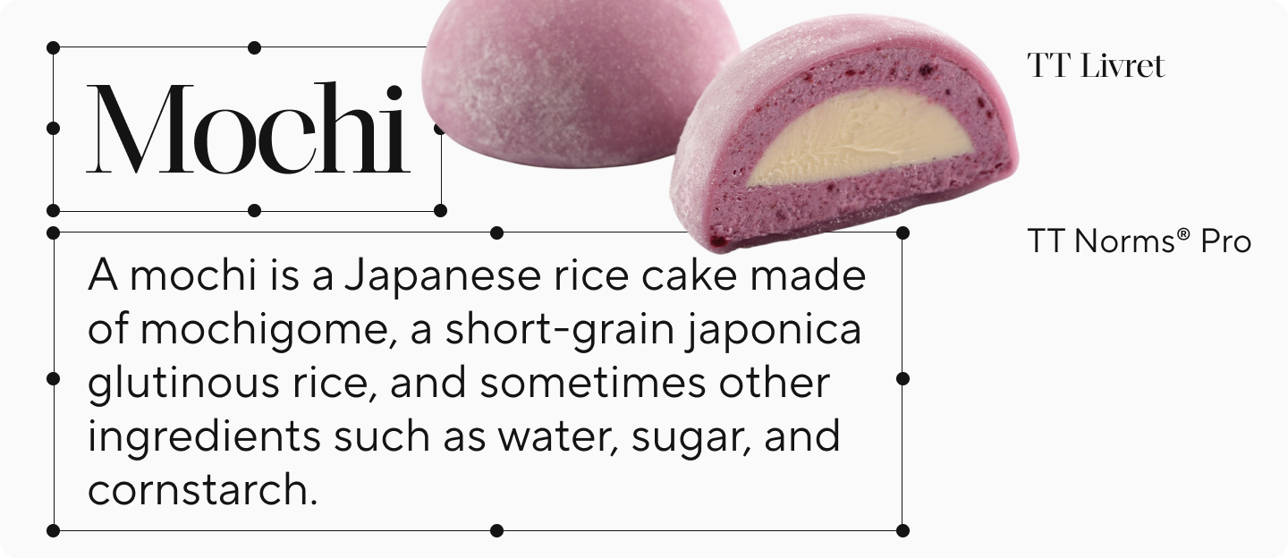
TT Livret

TT Livret brings together elegant modern design with distinctive historical influences. It offers two complementary styles: a clean, readable text subfamily perfect for body text, and a more dramatic display subfamily that shines in headings. This visually appealing serif will give slides of your ppt presentations a polished, aesthetic quality that stands out.
Best Sans Serif Fonts for PPT Presentations
TT Norms® Pro

TT Norms® Pro is an aesthetic and laconic geometric sans serif that’s suitable for any presentation. It’s our studio’s most popular font. It’s versatile and multifunctional: it can be used for both body text and headings. It’s easy to combine with other fonts. Your ppt presentation with this font will look stylish, and thanks to its high readability, slides will work flawlessly. This is a typeface for those whose business requires frequent creation of presentations.
TT Commons™ Pro

TT Commons™ Pro is a geometric sans serif with a versatile character. It’s a popular basic font that can work as a foundation for a professional look in any ppt presentation. If you don’t know which font to choose, or you need a neutral yet visually pleasing font that can be used in various projects—this is your option. Use it in headings and body text or combine it with more vibrant heading fonts.
TT Interphases Pro

TT Interphases Pro is a Neo-Grotesque specifically created for interfaces and works excellently in presentations. Text set in this font looks uniform, reads well even at small sizes, and appears contemporary—perfect for modern business presentations. It looks good in body text as well as headings and will make slides of your presentation stand out.
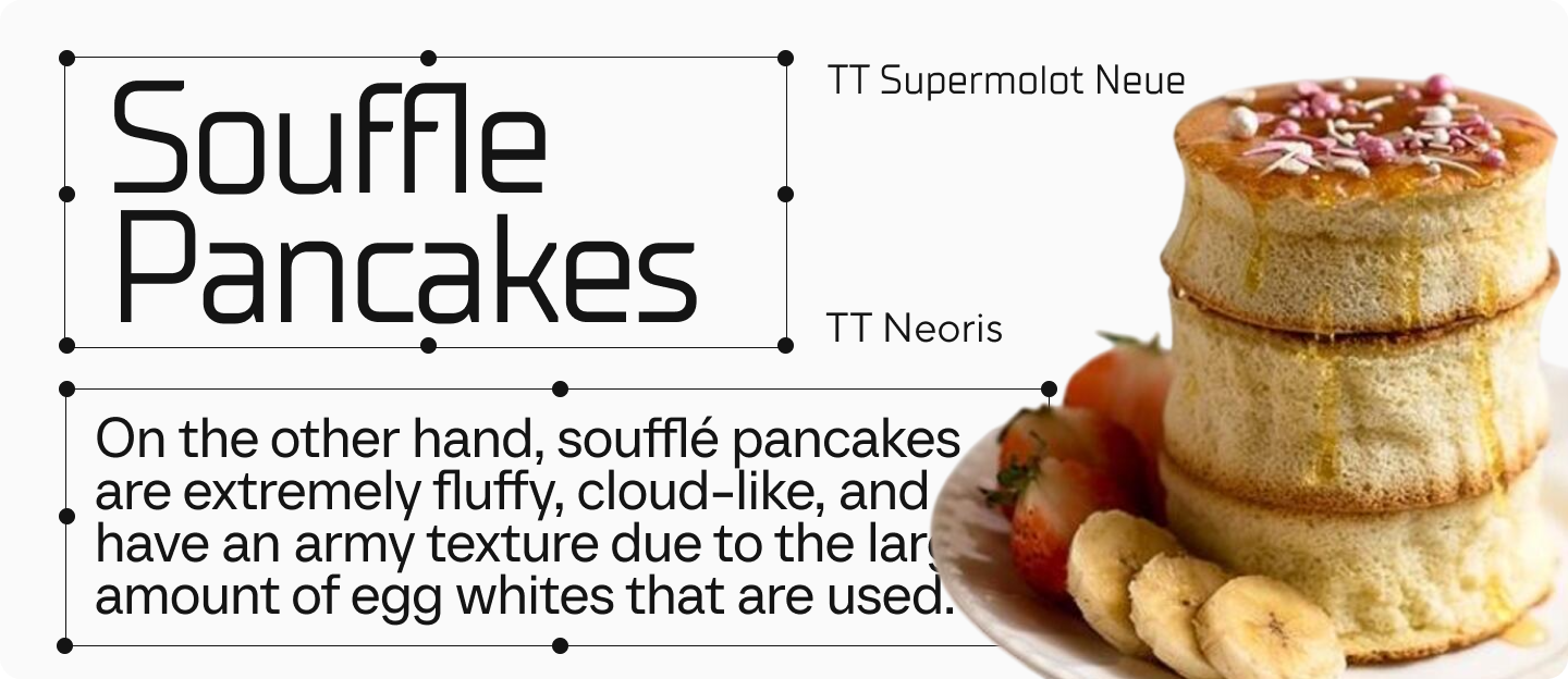
TT Neoris

TT Neoris is a concise modern Neo-Grotesque and a true transformer typeface. Thanks to its huge number of features, it can replace several fonts at once! You can independently change the character of the font, so it can be used for both text masses and headings. With it, your ppt presentation will have both a fresh and professional appearance.
Handwritten, Italic, and Decorative Fonts for Presentation Slides
TT Gertika

TT Gertika is a decorative geometric sans serif with a dynamic character and dancing rhythm. Its design references something ancient, even primitive, yet looks modern. If you want to make your business presentation look good, creative, and original, use it in headings—it will help create an interesting accent on the slides while remaining readable in large sizes. Combine it with neutral sans serifs like TT Commons™ Pro.
TT Backwards Script

TT Backwards Script is an experimental handwritten font inspired by typography and fonts of the USSR from the late 70s and early 80s. If you want to add retro styling to your ppt presentation, feel free to use it for accents—in large point sizes, this script is quite readable.
TT Biersal

TT Biersal is a display sans serif with a free, playful, and adventurous character. The typeface includes retalics and italics featuring extreme slant—from −40° to +40°. They allow not only to create bright accents but also to experiment with typography. For example, to create the effect of movement or shadow. In short, it’s a really cool and fun font for business presentations!
Choosing the Best Standard Fonts for PowerPoint Presentations
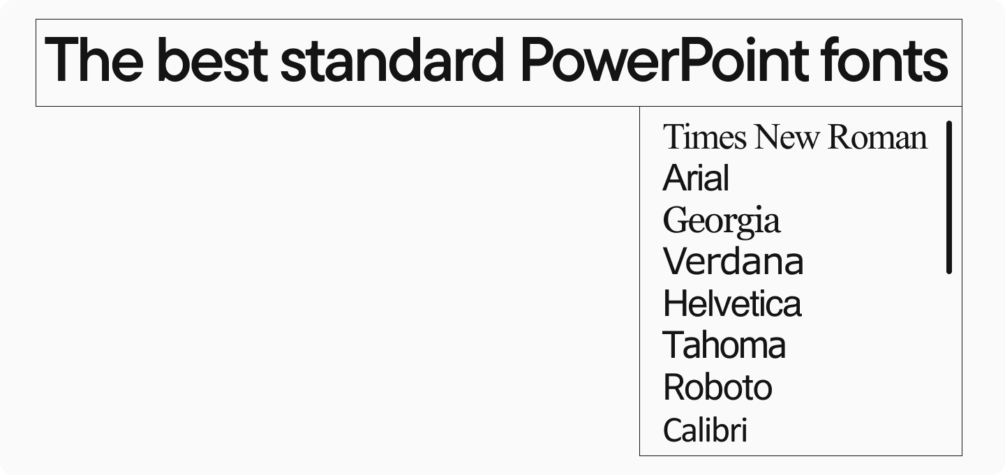
For more casual presentations or when working on projects with less critical stakes, PowerPoint’s standard font library offers several good options that get the job done effectively. Among the best PowerPoint fonts, you’ll find good old classics like Times New Roman and Arial, the web-friendly Georgia and Verdana, the designer favorite Helvetica, the highly readable Tahoma, Google’s versatile Roboto, and Microsoft’s modern default Calibri. While these fonts may not offer the distinctive character of premium typefaces, they provide good readability and professional appearance that works well for everyday business presentations.
Conclusion
Font is an important part of the overall visual style of a business presentation. The best font for PowerPoint is one that helps the reader quickly and effortlessly perceive information. Remember: a beautiful font doesn’t always mean that it’s a good one. The main thing is that it’s appropriate, readable, and emphasizes your professional approach.