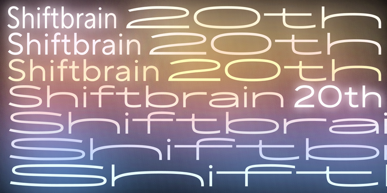
We often get asked how typeface designers come up with names for their fonts. It’s not as straightforward as it might seem, as each studio and individual designer has their unique approach. In this article, we’ll explore different aspects of font naming—from creative considerations to legal implications.
Why should you approach font naming with careful consideration? What criteria should you use, and what factors should you keep in mind? Let’s dive in and examine real examples from our typeface collection.
How a Type Designer Can Choose a Name for a Font
A font’s name is a crucial part of its identity and presentation. A well-chosen typeface name not only helps emphasize the design concept but also contributes to its successful promotion.
For instance, an original, creative name can draw attention to an experimental or unusual font family. Meanwhile, a simple and concise name can help users select your font for specific design tasks.
In essence, how you name your font can significantly impact its success. Let’s explore what makes a good font name stand out from the rest.
Criteria for a Good Font Family Name
While these criteria are subjective, at TypeType we follow several important principles when deciding how to name our fonts:
- Uniqueness
- Relevance to the typeface design
- Visual and acoustic appeal
- Designer’s perspective
Let’s examine each of these criteria in detail.
Uniqueness
Uniqueness is the first and most crucial parameter to consider when choosing a typeface name, and here’s why:
- It prevents confusion with other typeface families (we try to avoid names that look or sound similar to existing ones)
- An original name helps your font stand out and emphasizes its individuality
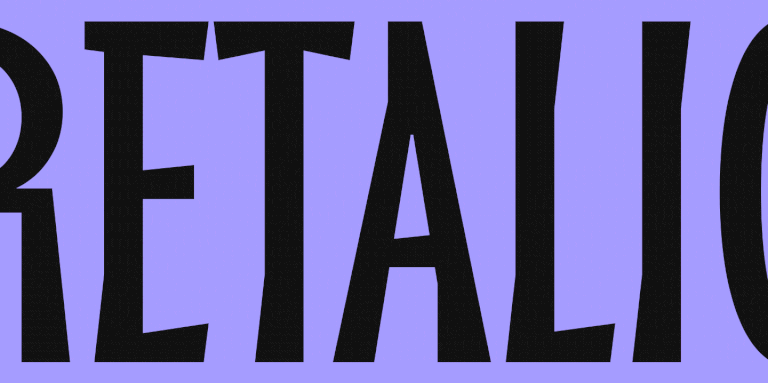
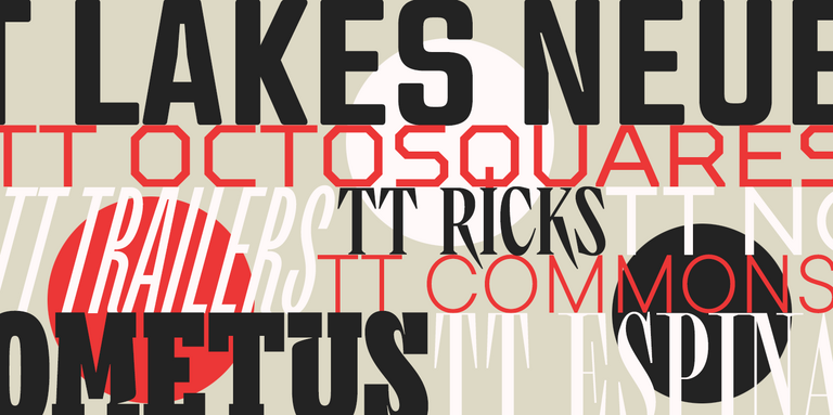
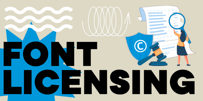
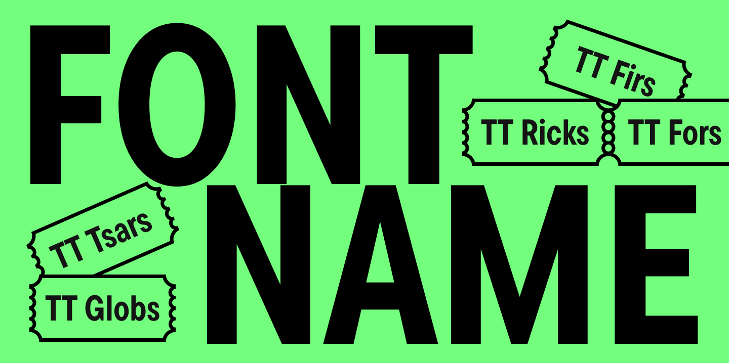
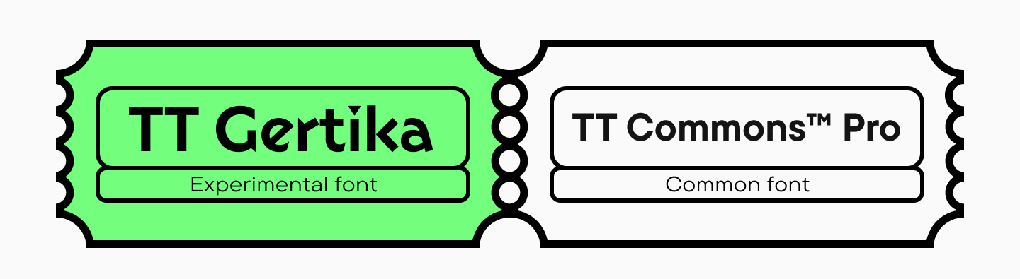
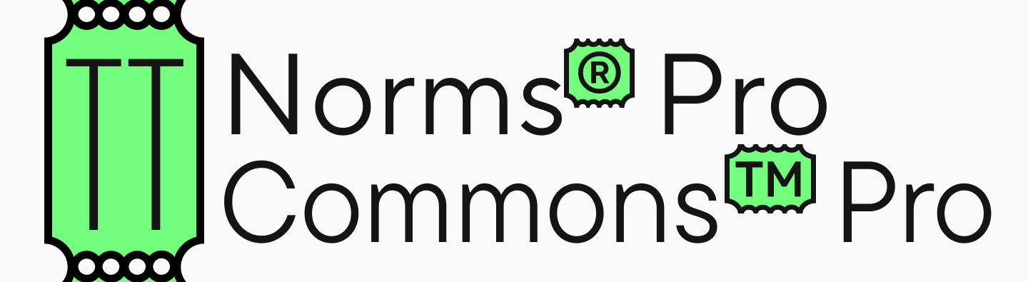
- Some typography studios register their font names, and using similar names could lead to legal issues. For example, at TypeType, we have two legally protected font names: TT Norms® Pro and TT Commons™ Pro
Speaking of “TT”: to make names unique and emphasize brand ownership, a type foundry can add their studio abbreviation to the family name. For example, TT (TypeType), FF (FontFont), PT (ParaType), and so on.
How to Check the Uniqueness of a Font Name
The main challenge you’ll likely face when choosing a font name is that many names are already taken.
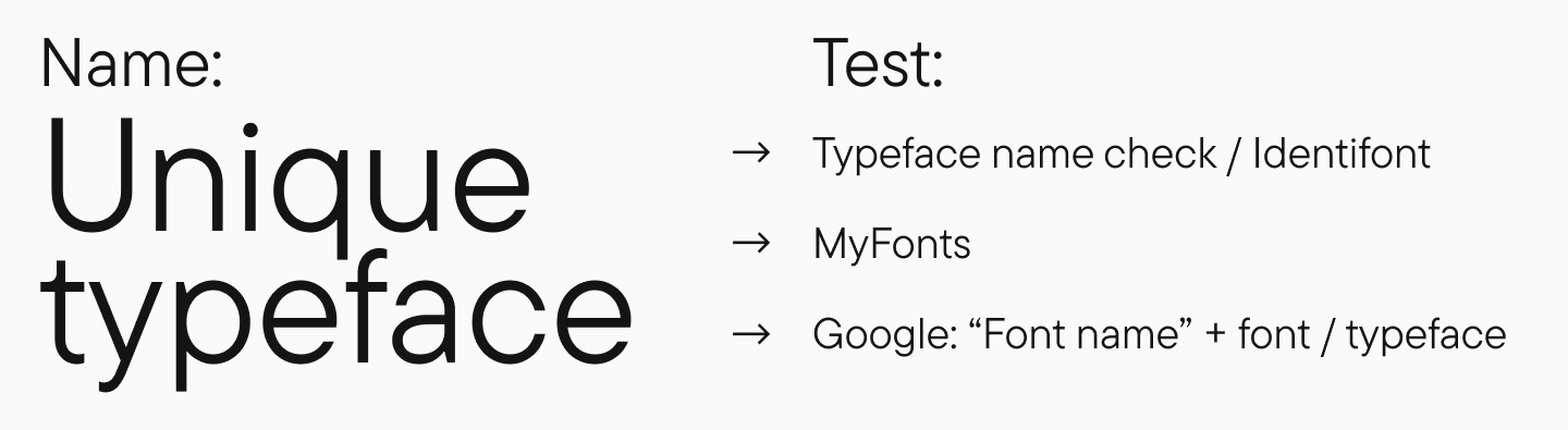
Here’s how to verify if your chosen name is unique:
- Check the name on Typeface name check and Identifont websites
- If no similar options appear, expand your search to font marketplaces like MyFonts
- Finally, perform a Google search using the format: [font name] + font or typeface to ensure the name isn’t used elsewhere
Relevance to the Typeface Design
The next criterion is how well the name matches the font family itself. It’s beneficial when the name reflects the product’s essence and helps users understand the typeface’s character and the designer’s intent.
When the chosen name helps communicate the designer’s concept, intended use, and application areas, it positively impacts the font’s marketing potential.
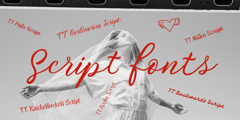
Visual and Acoustic Appeal
First impressions matter in typography too, and the name influences the overall perception of your font family.
When selecting a name, consider the associations it might evoke. Examine how it looks in writing, how the letters work together, its readability, and whether it sounds similar to any words with unfortunate meanings. Remember that both positive and negative associations can affect how people perceive your typeface.
An important consideration when creating a new word: verify its meaning—it might be used in slang, have negative connotations, offend certain groups, or have inappropriate translations in other major languages. A search engine or online translator can be helpful here.
At TypeType, we also try to choose font names that showcase the most interesting and unique glyphs from the typeface.
Designer’s Perspective
The final criterion, which we call “Designer’s Perspective,” leads us to how we name our typefaces at TypeType. Usually, the concept’s author is responsible for naming the font, aiming to reflect their vision of the project.
Let’s look at some examples of our naming approach.
What Logic Did We Use to Name Our Fonts: Real Examples
Since our studio’s foundation, we’ve maintained a consistent logic for all font names, giving them meaningful identities.
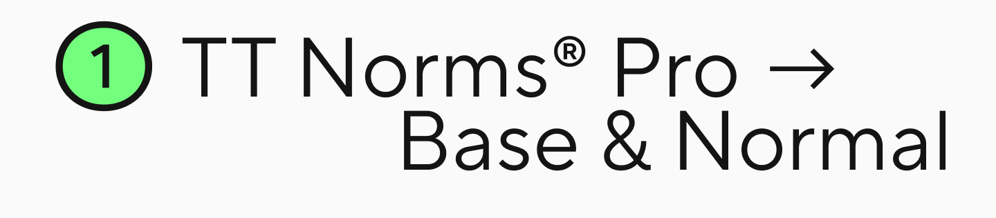
Our bestseller TT Norms® Pro got its name because it’s « normal »—standard and suitable for everything. It’s the perfect foundation for any project.
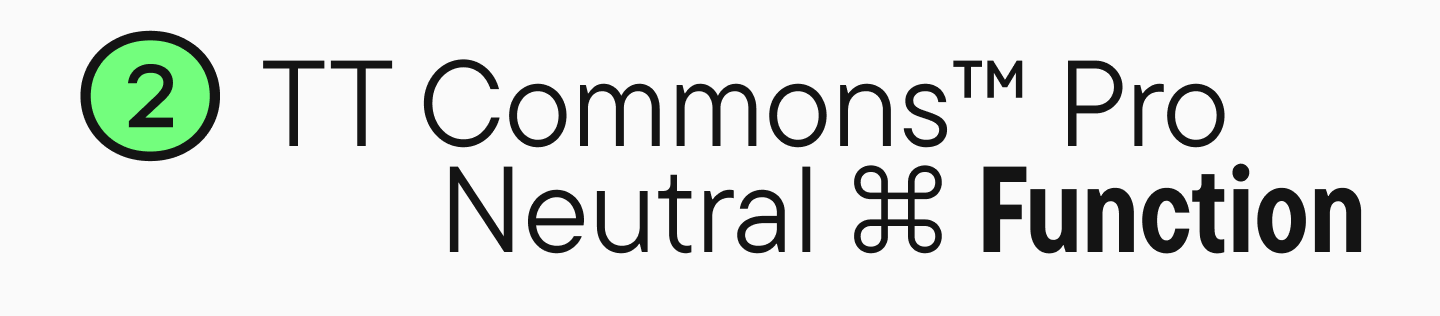
Another bestseller, TT Commons™ Pro, suggests that it’s « common »—neutral enough to work in any project or task. It’s a typeface that will reliably support your design from all angles.
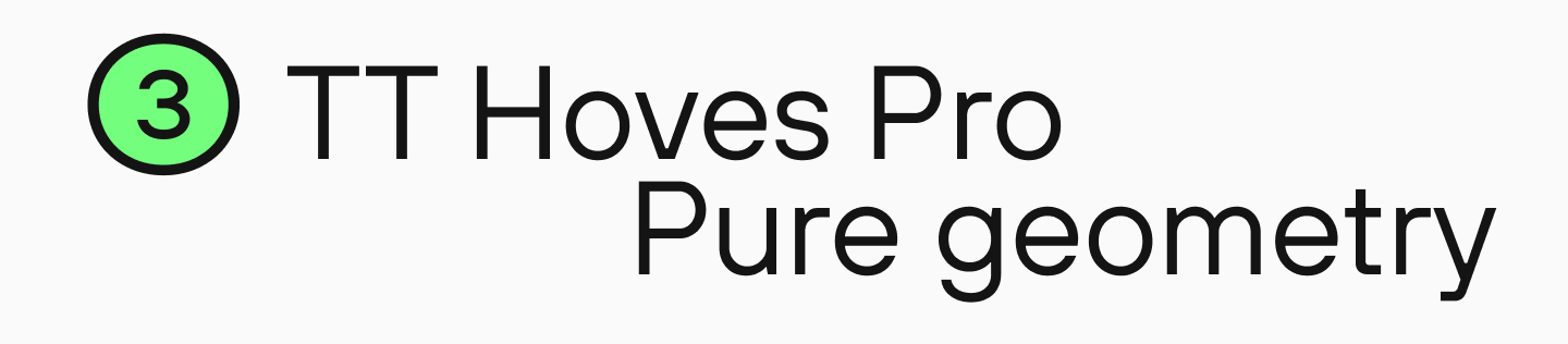
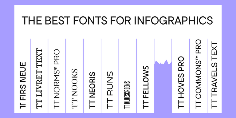
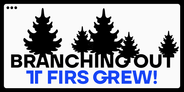
TT Hoves Pro’s name combines the first syllables of two words: horizontals and verticals. This geometric typeface emphasizes horizontal and vertical elements.
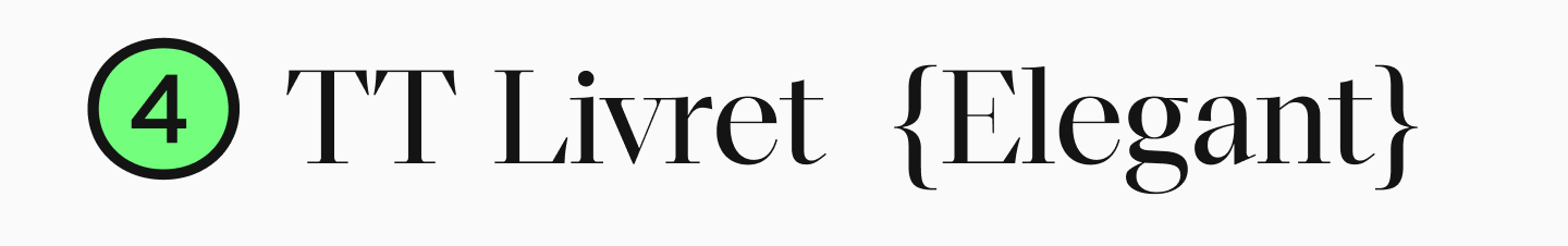
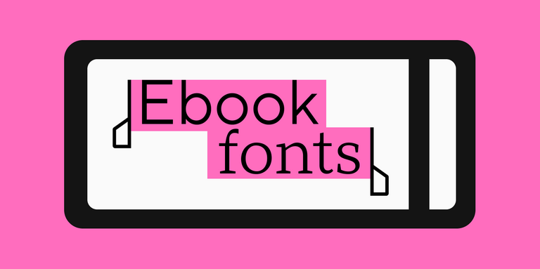
For TT Livret, designer Yulia Gonina wanted the font to be used in books, so the name comes from the French « petit livre » (little book).
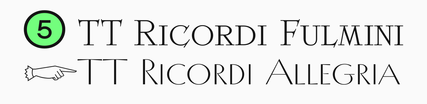
The TT Ricordi family features Italian names, as all these designs were inspired by historical inscriptions found on Italian stones and plaques. For instance, in TT Ricordi Fulmini,
« Fulmini » means « lightning » in Italian, while « Allegria » in TT Ricordi Allegria means « cheerfulness. »
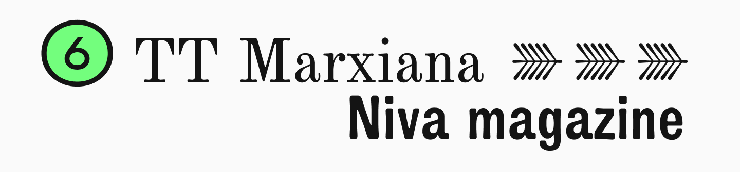
TT Marxiana’s name has historical roots too. This typeface family was inspired by fonts used in the 1887 « Niva » magazine, published by Adolf Marx’s publishing house. The name honors the publisher’s surname.
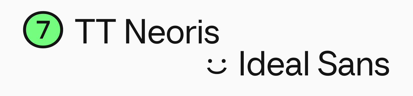
The Neo-Grotesque transformer TT Neoris combines two words: « neo » (new) and « rise. » These words reflect our modern approach to Neo-Grotesque typefaces, as we conducted extensive research to make it truly innovative.
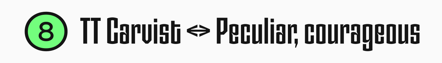
Senior Type Designer Alina Gabidulova shared the story behind naming the experimental TT Carvist. It all began with brainstorming associations for the typeface. This resulted in a list of associations: something Gothic yet Old Slavic, connection, bilingualism, folk, patterns, ornament, lace, stained glass, embroidery, weaving, labyrinth, and poster. Based on these associations, we used Google Translate to search for corresponding words and concepts in various languages. The finalists were « TT Cyrthic » and « TT A0, » which were both available and fitting in meaning. However, it turned out that search engine queries for « TT A0 » returned completely unsuitable results. That’s when the marketing department stepped in and continued the search. And so, TT Carvist was born—a name that references stone carving.

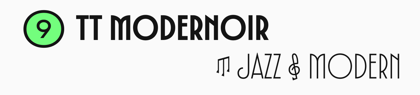
In our recent experimental project TT Modernoir, designer Toma Streltsova drew inspiration from French Art Nouveau typography and film noir aesthetics, which is reflected in the name of this typeface.
Conclusion
Now you can see the importance of choosing an original and appealing name for your font. We hope our experience and tips will help you in this challenging task! After all, if you’ve created an entire typeface, naming it should be the easy part!