top_banner_ttneorispro0426
Fonderie Blog Typewriter Fonts: From Retro Mechanics to Digital Classics

Typewriter Fonts: From Retro Mechanics to Digital Classics

Typewriter Fonts: From Retro Mechanics to Digital Classics

Typewriter fonts may seem like a thing of the past, but they continue to inspire designers today. Born in the age of mechanical typewriters, they have migrated to the digital world, preserving their unique aesthetic.

In this article, we’ll explore what typewriter fonts and typewriter style fonts are, trace their history, identify their key characteristics, and see how they are used in modern design.

What Are Typewriter-Style Fonts?

What Are Typewriter-Style Fonts?

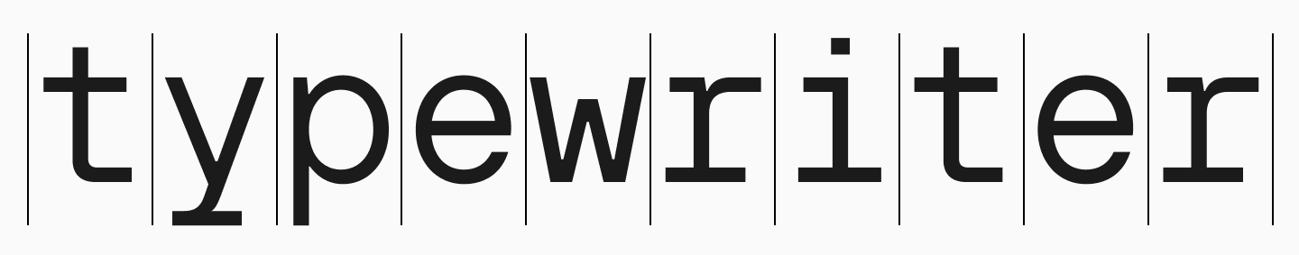
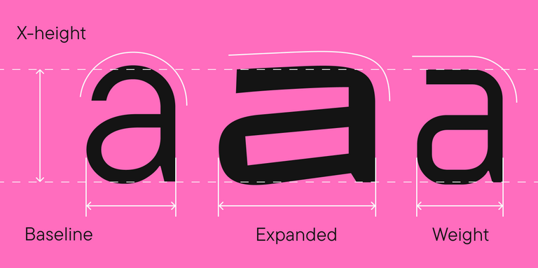
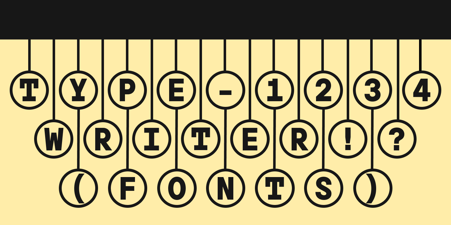
Typewriter-style fonts are typefaces designed to imitate the look of old, typewritten text from a mechanical or electric typewriter. Their main feature is monospacing: every character occupies an identical amount of horizontal space. Additionally, the outlines of these fonts are often made intentionally uneven, as such imperfections give the design an authentic, vintage feel. These fonts are based on classic typewriter typefaces, whose visual features were dictated not by aesthetics, but by necessity.

The History of Typewriter Fonts

The first mechanical typewriters appeared in the 19th century with a fairly simple operating principle. Each key activated a lever with a character slug, which struck paper through an ink ribbon. Due to mechanical constraints, all characters were made the same width—this simplified both the mechanism’s operation and text alignment. This is why original typewriter fonts were monospaced, and the letter forms were imperfect due to the way ink transferred to the surface.

The History of Typewriter Fonts

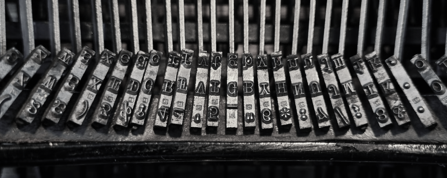
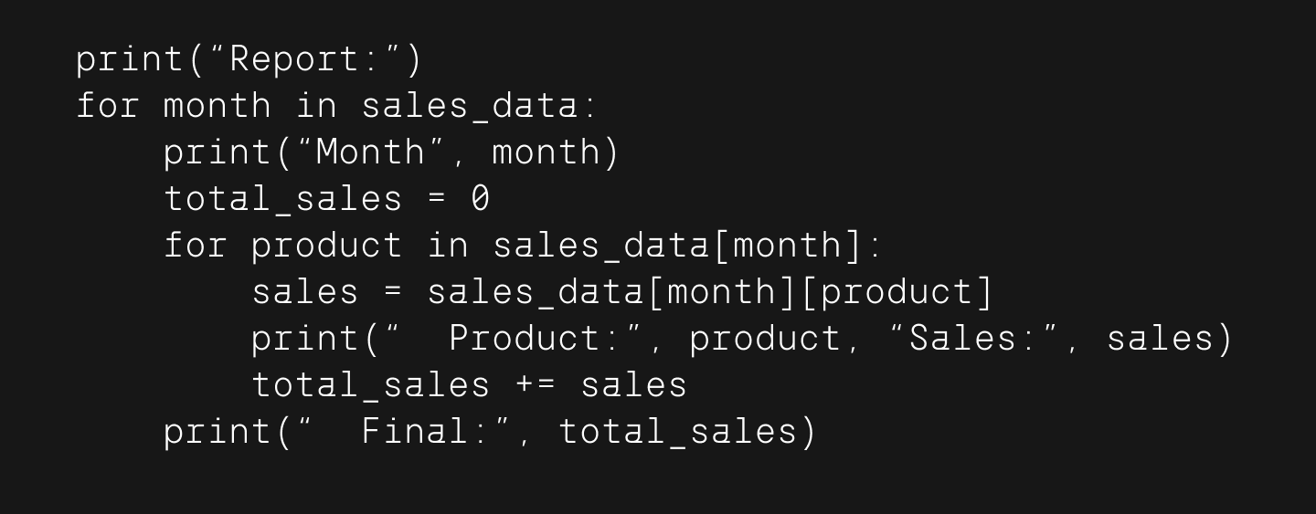
In the late 20th century, the typewriter began to give way to the computer, but its monospaced characteristic remained. In 1955, designer Howard Kettler developed the monospaced computer font Courier, based on a classic typewriter style. It quickly became the standard for business correspondence and found a new application in computer interfaces and programming, as monospaced fonts are ideal for writing code.

The History of Typewriter Fonts

With the dawn of the digital age, fonts that look like a typewriter became a stylistic choice. Designers began to create typefaces inspired by retro typography but built to meet modern visual and technical standards. This is how the best typewriter fonts were given a new lease on life.

Key Characteristics of Typewriter-Style Fonts

Here are the main features that distinguish fonts in the typewriter style:

  1. Monospacing: All characters have the same width.
  2. Uneven Outlines: Imitates the impact of a character slug hitting paper.
  3. Moderate Contrast: No extremely thin or thick lines.
  4. Softened Corners: Just like the letters on real character slugs.
  5. Worn Effect: Some fonts include texture for greater authenticity.
Key Characteristics of Typewriter-Style Fonts

These features create a sense of manual craftsmanship, which makes this type of font popular in designs with a nostalgic or vintage mood.

Why Use Typewriter-Style Fonts Today?

At first glance, it might seem that fonts imitating a typewriter are just a tribute to the past. But in reality, they remain relevant and in-demand across various fields of design and visual communication because they have a special character, atmosphere, and expressive power.

Here are just a few areas where you can usetypewriter-style fonts:
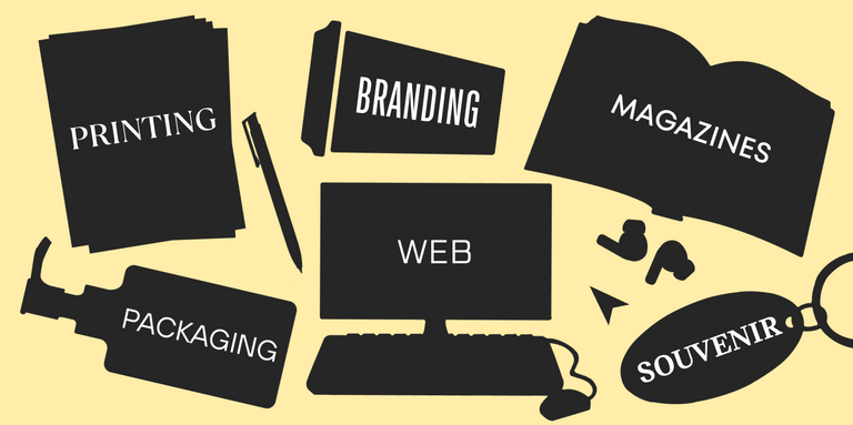
1. Graphic Design

1. Graphic Design

Typewriter fonts instantly create a feeling of something lively, real, and hand-made. They are often used where it’s important to emphasize individuality and add a sense of nostalgia.

2. Branding

2. Branding

Brands that want to highlight their vintage aesthetic, independence, or craftsmanship often use this type of font. They are associated with archives, letters, and old documents—things that feel familiar and evoke trust and warmth.

3. Web Design

3. Web Design

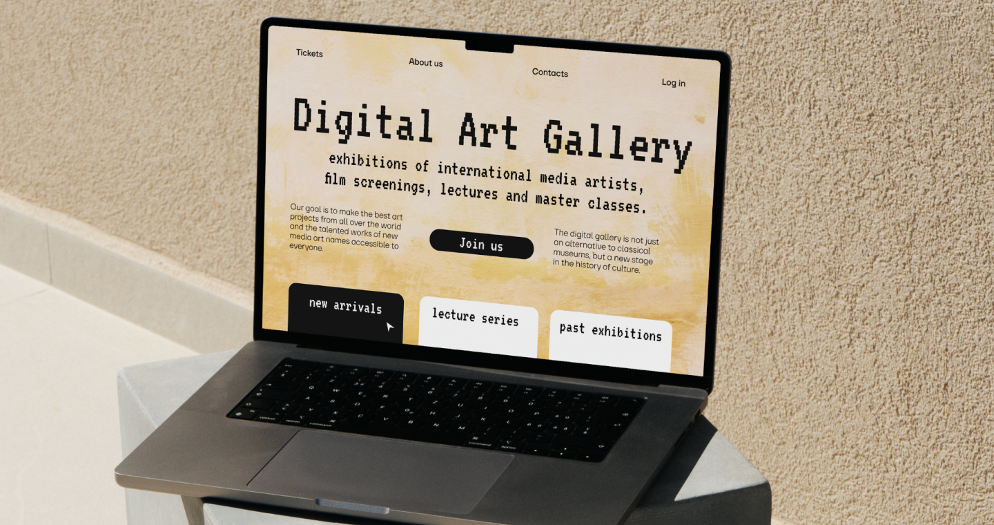
Typewriter style fonts are rarely used for the main body text of a website, but they work perfectly in accent captions, headings, and quotes. They help highlight a block of information and give the page character. They look especially organic in projects related to technology or digital art.

4. Magazines and Print Media

4. Magazines and Print Media

These fonts are often used in the layouts of magazines and books, especially if the topic is related to history or documentaries. They help visually enhance the mood of the text—as if you’re reading a hand-typewritten draft.

The Best Typewriter-Style Fonts Available Today

Here is a small list of fonts in the typewriter style, as well as some of the best free options you can use for your creative experiments. If you want to discover even more, you can browse various font libraries online.

The Best Typewriter-Style Fonts Available Today

Classic Typewriter Fonts

  • Courier / Courier New: A standard monospaced font created based on a typewritten original.
  • American Typewriter: A popular font stylized to look like a classic typewriter.

Free Typewriter Fonts

  • Special Elite: A good free font with a distressed effect that authentically mimics a typewritten text.
  • VT323: A stylized pixel font that evokes memories of the 90s and old computers.
  • Typewriter Serial / Another Typewriter: Authentic options with a touch of charming carelessness.

Premium Typewriter Fonts

  • Remington Noiseless: A stylization of 1920s typewriter fonts.
  • Olivetti Type: An elegant font with a European flair.
  • Tox Typewriter: A rough font with a hand-stamped effect.

Conclusion

Typewriter-style fonts are a bridge between the past and the present. They preserve the charm of a bygone era while remaining relevant in modern digital design. They are used to create a special atmosphere, evoke a sense of nostalgia, and emphasize individuality. These fonts remind us that sometimes, imperfection is the very definition of style.

Dernières publications

TypeType’s Year in Review: Looking Back at 2025

2025 was an incredibly productive year for TypeType: we released 7 new fonts, updated 14 typefaces, and added Arabic language support to two of our bestsellers. In addition, we won awards in type design competitions, explored new platforms, improved our website, wrote about type design in our blog, gave lectures, met with you at webinars, and created joint projects with friends and partners.

Voir plus
Typography in the Museum: How We Developed the Corporate Typeface for the Hermitage

The TypeType team, with the support of the Mantera Group, has created a new font family for the State Hermitage Museum—the Hermitage Type Family. The typeface will be used across all of the Hermitage’s digital content; you can already see it on the website and the updated launch page of the mobile version. And this is just the beginning of a major overhaul of the museum’s digital identity, in which the new font will play a pivotal role.

Voir plus
Proxima Nova Font: Alternatives, Pairings, and the Secrets of Its Popularity

Proxima Nova is one of the most recognizable sans-serif fonts in modern design. In this article, we’ll explore the history of the Proxima Nova font family, its graphic characteristics and composition, figure out what fonts go with Proxima Nova, what its best alternatives are, and what license you need to use it.

Voir plus
The Perfect Moment Is Now: Launching Our Creative Lab, TT Labs

We spent a lot of time thinking about how to find a place for creative freedom within this system, how to set aside time for small passion projects, how to step outside our usual boundaries, and how to give spontaneity a chance. And we realized that the perfect moment will never come unless you take the first step. So we took it—and that’s how the TT Labs creative laboratory was born. Here’s the story from the beginning!

Voir plus
What is Typography in Graphic Design: Key Concepts, Principles, and Examples

Discover what typography is, why it’s important in design, and how to apply its main principles, styles, and rules to create visually strong text.

Voir plus
A Font with a Wide Reach: A Special Project for SHIFTBRAIN’s 20th Anniversary

In 2023, the Japanese marketing agency SHIFTBRAIN launched an interactive website dedicated to the company’s 20th anniversary. For this project, the TypeType team developed a unique variable font capable of stretching to extreme horizontal widths. As a foundation, we used the bestseller TT Norms® Pro, which was already the company’s corporate typeface—you can see it on the main SHIFTBRAIN website.

Voir plus
Pangrams Explained: Meaning, Types, Usage and Complete List of Examples

If you’re interested in design, you’ve almost certainly come across the famous sentence about the quick brown fox and the lazy dog. Or perhaps one about a jived fox nymph and a quick waltz. These are pangrams—sentences that contain all the letters of the alphabet. In this article, we’ll provide a more detailed pangram definition, explain why these phrases are so important, and provide a list of the most popular pangrams in English.

Voir plus
Bold Fonts: How to Use Them in Design

Font weight is a crucial characteristic that directly impacts the perception of an entire design. In this article, we’ll explore where and how to apply bold fonts, the different types that exist, and look at some examples of such fonts from the TypeType collection.

Voir plus
Web Font Optimization: The Key to Instant Website Loading Speed

Since fonts are a vital part of web design, proper font optimization plays a key role in ensuring your website is fast and efficient. Let’s explore why web font optimization is so crucial and what steps you can take to ensure your fonts load faster.

Voir plus

Voir plus

10 Best Fonts for Cricut Projects in 2026

It’s important to choose your font for a Cricut project carefully—an unsuitable choice can complicate cutting, make the text unreadable, and ruin the entire design. In this article, we’ll explore how to choose the best fonts for Cricut and how to use them correctly in the Cricut Design Space app. Plus, a curated list of suitable fonts from the TypeType collection awaits you.

Voir plus
10+ Best Free and Premium Graffiti Fonts

In this guide, we’ll define what graffiti fonts are, break down major graffiti lettering styles, and review more than 10 strong options—from premium TypeType families with free trials to reliable free graffiti fonts found on Google and other platforms. You’ll also get usage ideas, a quick licensing reality-check, and practical tips for working with graffiti-style fonts in Canva, Adobe Photoshop, Illustrator, and other tools.

Voir plus
TOP-10 Fonts for Professional Designers

Over the past years, the type design studio TypeType has built a large collection of professional typefaces used by tens of thousands of companies worldwide. In this article, we’ve compiled a top 10 list of TypeType fonts worth paying attention to in 2025, and also analyzed the best free fonts available to designers and how to safely use them in commercial projects.

Voir plus
The Best and Most Popular Fonts for Memes: How to Choose and Use Them Correctly

Want to know which fonts are the best for memes and how to use them correctly in creating your own content? We will tell you about the most popular fonts for memes and offer some fresh alternatives to add attractiveness and uniqueness to your creatives.

Voir plus
10+ Best Fonts for T-Shirt Designs and How to Choose the Right one

T-shirts with inscriptions are always relevant, but not every print will look advantageous. The font and quality typography play a crucial role here. How do you choose the right fonts for T-shirts, and why is it important? We explain in this article and have selected 10+ of the best fonts for prints from the TypeType collection.

Voir plus
UniversiTTy: Lesson 10. Designing Basic Lowercase Characters

Welcome to the tenth lesson of our « UniversiTTy »! In this series of articles, we guide you through the process of font design step by step. Last time, we focused on the detailed development of uppercase characters. Now, it’s time to concentrate on basic lowercase ones.

Voir plus
Legibility vs Readability: What’s the Difference?

In this article, we’ll break down what readability and legibility mean, explore the difference between them, discuss what makes a font legible, and examine the factors influencing text readability. We explore why they are crucial and how to achieve the ideal balance with your chosen fonts.

Voir plus
10 Best Fonts for Professional PowerPoint Presentations in 2026

Check out and choose the best fonts for PowerPoint that will help elevate your presentations to a professional level. We’ve compiled a list of 10 outstanding fonts popular among PowerPoint, Google Slides, and Keynote presentation designers that will undoubtedly become your favorites too.

Voir plus
10 Best Fonts for Business Cards: A Professional’s Guide

Do you want to attract attention to your brand and impress customers with your business cards? Learn how to choose the best fonts and font combinations for business cards and check out the selection of fonts highly rated by print design professionals.

Voir plus