Modern typography offers hundreds of serif typefaces for projects of every mood and direction. Despite this, many designers are still cautious about serif fonts, afraid to make projects look outdated.
We promise that after reading this article, you will become more courageous in choosing serif fonts for work, because we have selected the best typefaces of different styles.
Let’s take a look at TypeType’s collection of the most aesthetically pleasing serif fonts together!
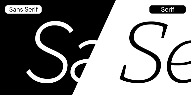
Serif fonts: What’s it all about?
Serif fonts is the general name for a group of fonts. As you may guess, serifs are the distinguishing and unifying feature of these fonts.
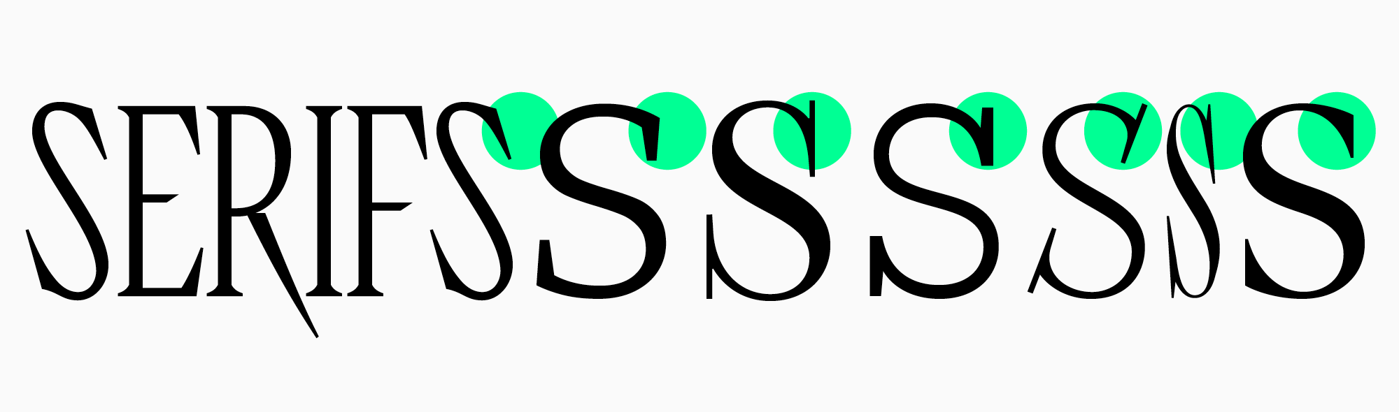
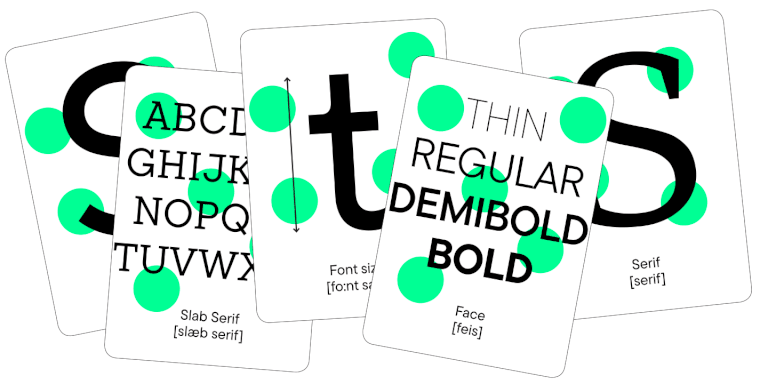
Most often, when we talk about fonts with serifs we mean slab fonts and serif (antiqua) fonts, which in turn are divided into several subcategories. In the article, you will clearly see how diverse this group of fonts is, whose unifying feature is serifs.
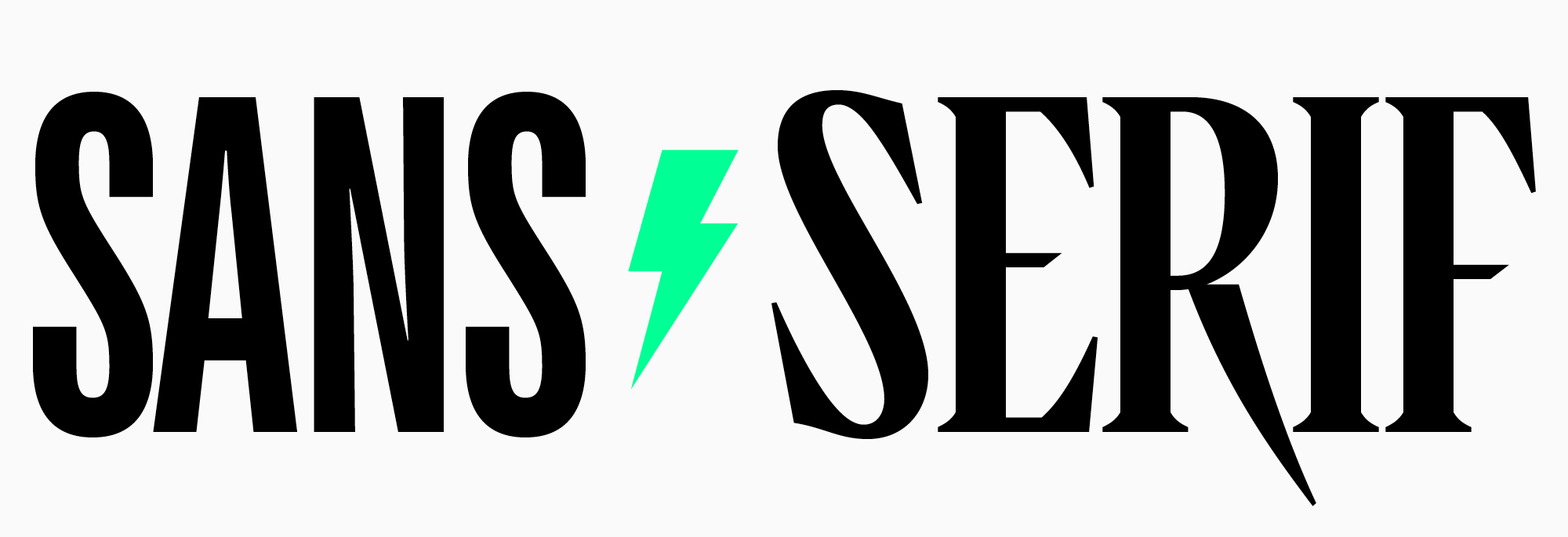
Traditionally, serifs and other fonts in this category are opposed to sans serifs. Antiquas often have a more pronounced character than neutral serifs, but not always. We will show that serif fonts can be versatile and modern as well as elegant or traditional.
The shape of serifs, the proportions of letters, and the contrast determine the nature and scope of the font, and among the huge collection of serif typefaces, there is sure to be a font suitable for your project.
When and where is it best to use serif fonts?
You can find serif fonts in article headlines, on your favorite bands’ concert posters, on shop and bar signs, in brochures and magazines.
Serif fonts are a classic choice in typography, so most of the books you read will be set in serif fonts.
However, the scope of serif fonts can be much wider, and increasingly such typefaces are found in films and TV shows, on websites and in packaging design.
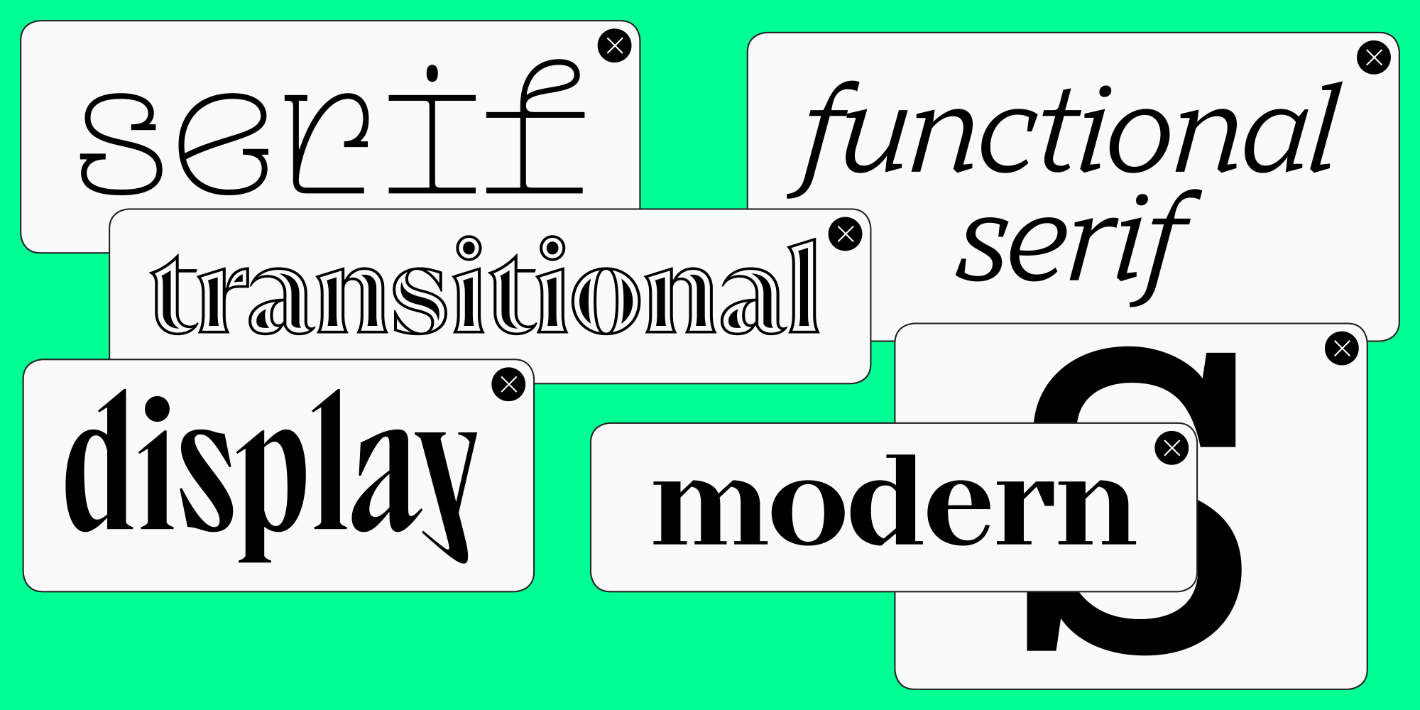
Best serif fonts-2025
To make it easy for you to navigate through the best serif fonts, we’ve divided the typefaces into categories. See all or jump to the one type that interests you the most.
Functional serifs
Functional serifs are fonts with a neutral character and a universal scope. Suitable for designing large text arrays, including on the web. These are fonts with a large character set and support for a large number of languages, with impeccable technical characteristics and a well-thought-out set of OpenType features.
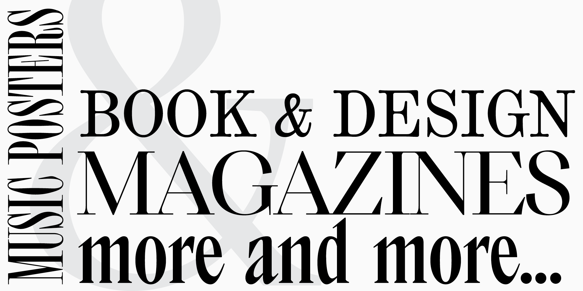
A highly anticipated font in the TypeType collection, released in 2022. A full-fledged text serif created on the basis of the popular TT Norms® Pro neutral sans serif designs.
This universal font includes 24 styles, each of which has 1236 characters.
You can read about how the font pair for the bestseller TT Norms® Pro was created in this article.

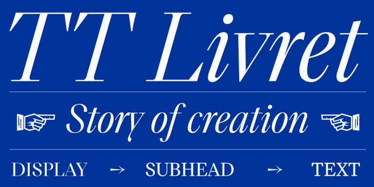
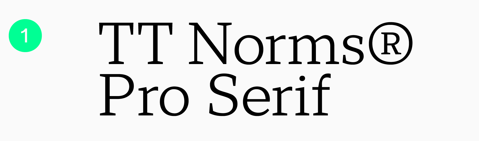
TT Livret is a modern serif typeface consisting of text, subheading and display subfamilies combined into one large font family.
The text subfamily of the TT Livret font has a calm and soft character. When typing with this typeface, you can be sure that the font will be easy to read in any size.
There are 10 styles in the text subfamily, each of which has 1031 characters.
We shared the story of the creation of this font in the article.

Transitional serifs
Transitional serifs are fonts that have features of new and old style antiquas, but still represent an independent group. These are elegant typefaces with moderate contrast and prominent graphic elements. Ideal for printed publications.
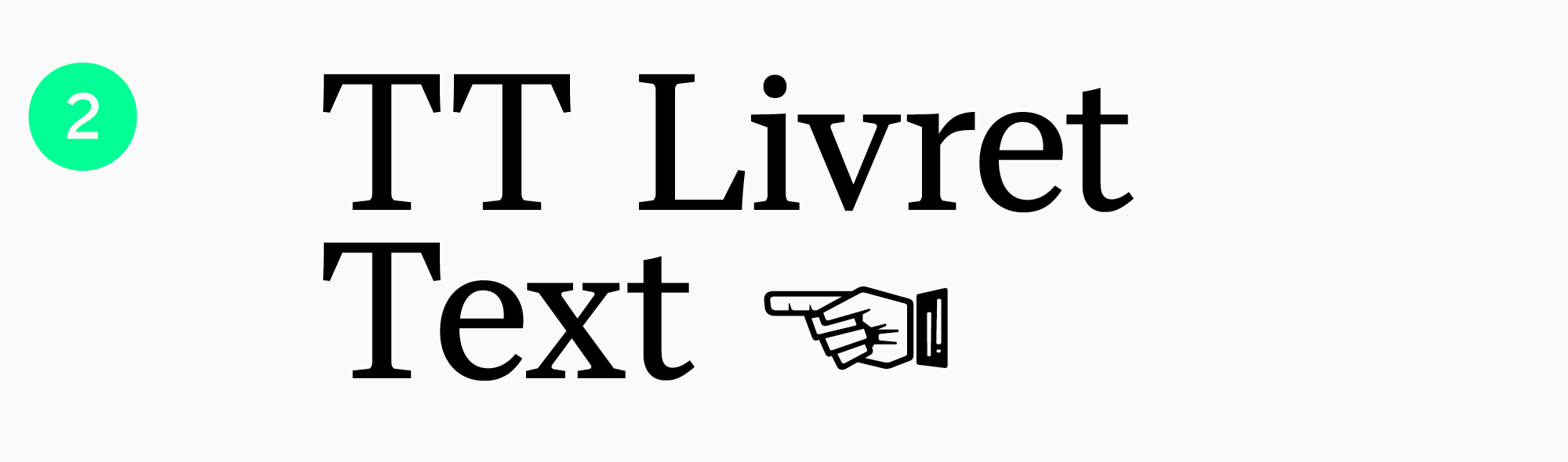
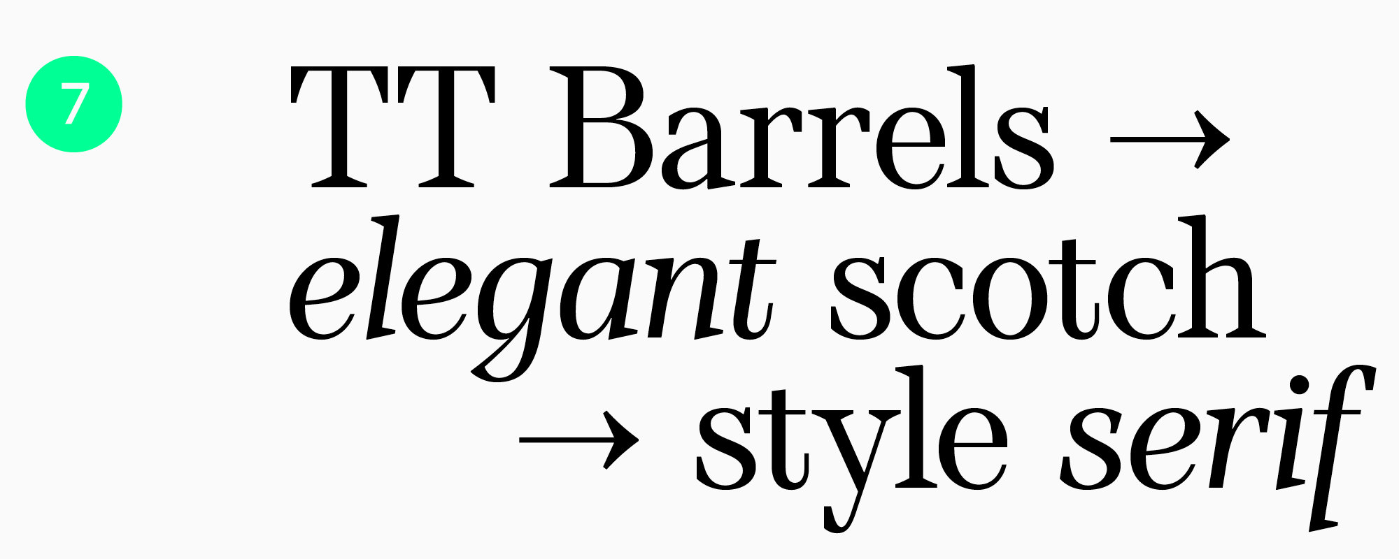
Serif with high contrast and memorable character, adapted for modern projects. Easily recognizable by the flared serifs and lack of drops, it is suitable for the fashion industry, branding of services and premium products.
Each of the 28 styles has 900 characters.
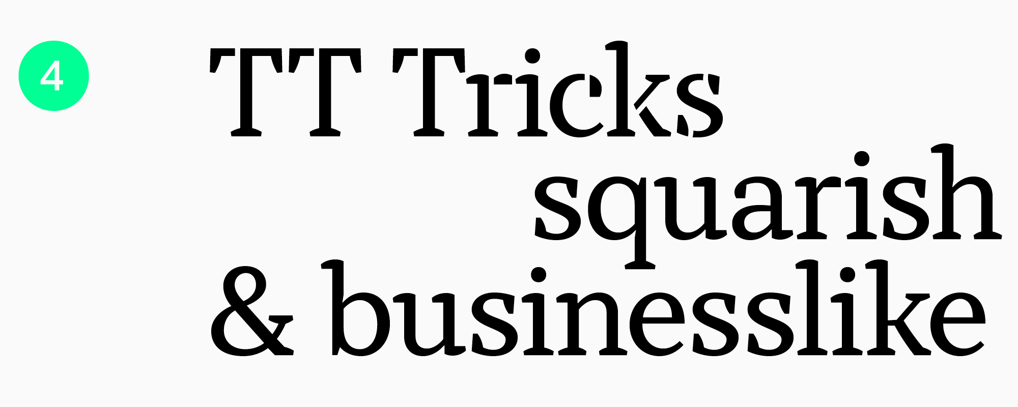
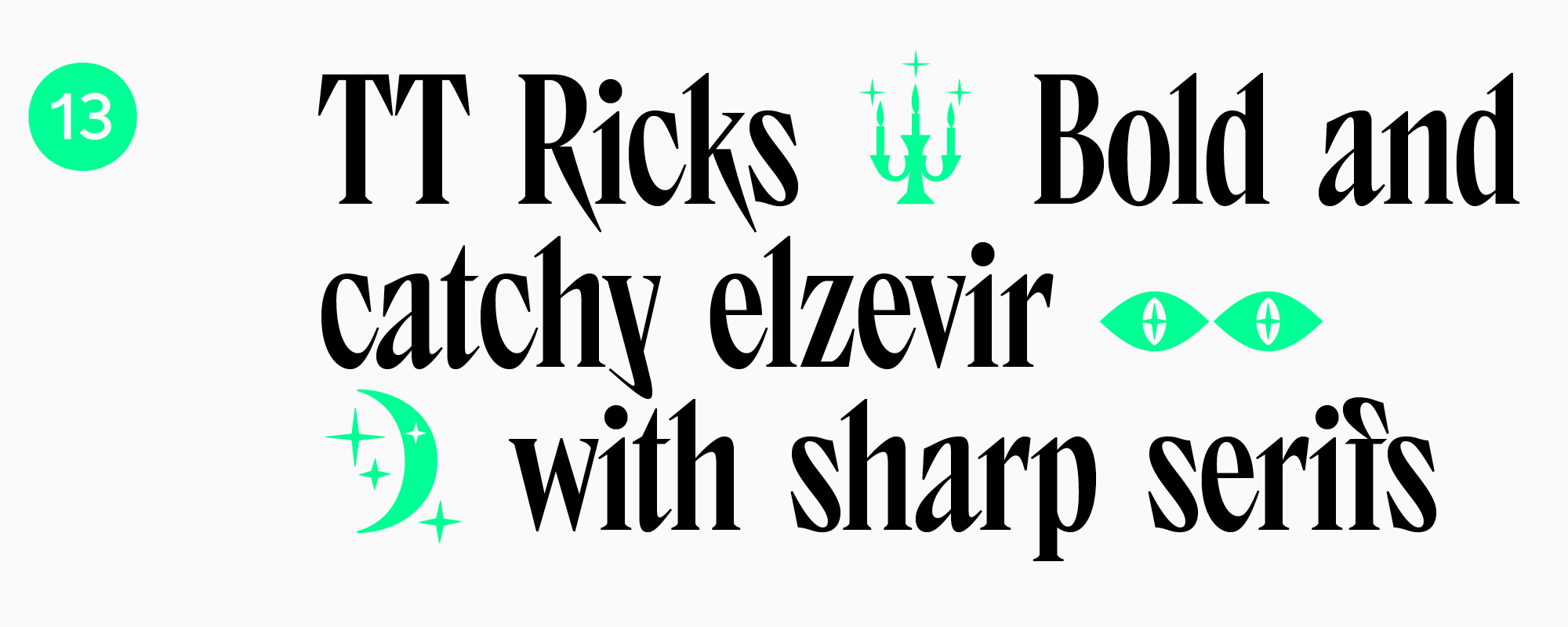
Another modern font referring to the style of transitional serifs. TT Tricks stands out with squared ovals, asymmetrical and large serifs. Can be used in large text arrays, suitable for the print industry.
There are 12 styles in the font. Supports over 70 languages.
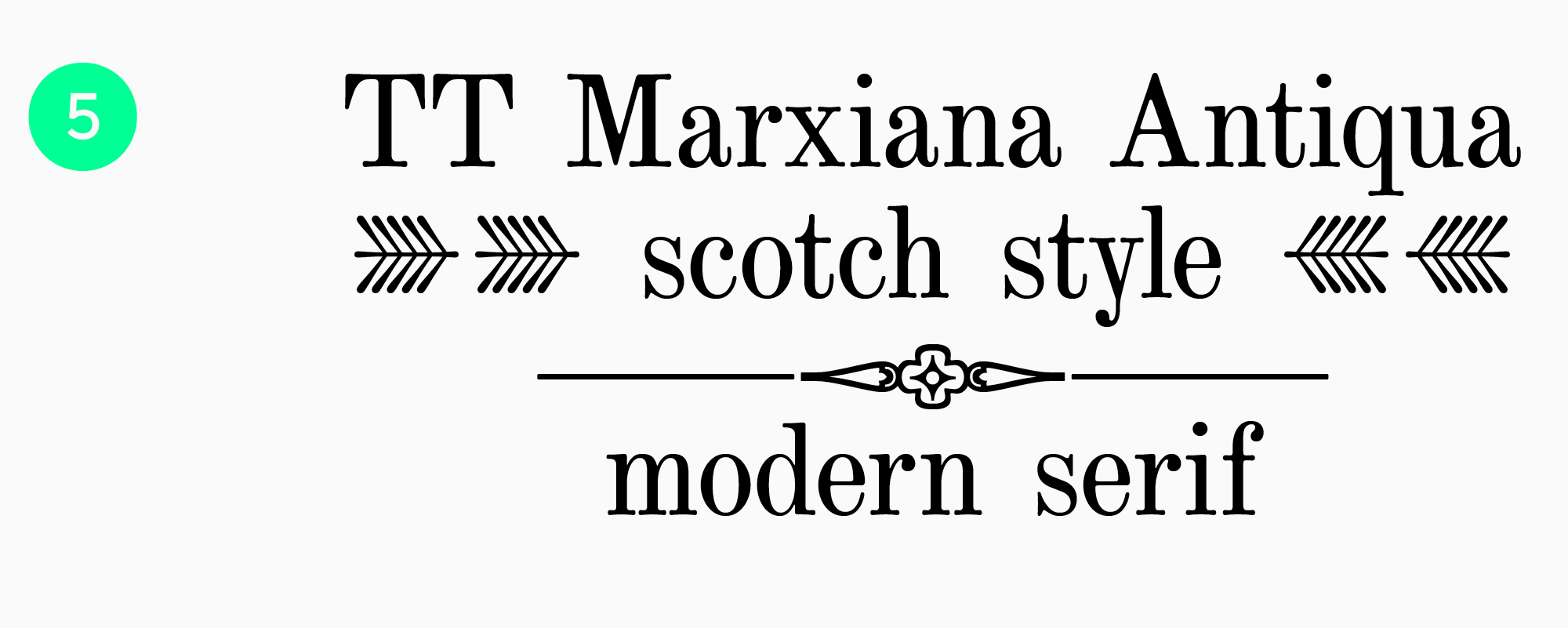
Perhaps the most unusual font in the TypeType collection. We have reconstructed the fonts that were used in the printing of a magazine in 1887, preserving the aesthetics of the printing fonts of that period.
The typeface includes several fonts, including TT Marxiana Antiqua, a serif typeface in which we tried to preserve all the visual nuances that characters acquired when printed on paper at the end of the 20th century, for example, a slight deformation of letters.
This is a font with a unique character that won’t suit every project. However, if you are looking for a font with a nostalgic look, TT Marxiana Antiqua is the perfect choice.
There are 586 characters in the font.
You can read about how the TT Marxiana family was created in a long and detailed article.
Modern serifs
Modern serif or Didone is the common name for serif fonts that emerged after transitional serifs. These are elegant, expressive and high-contrast font families.
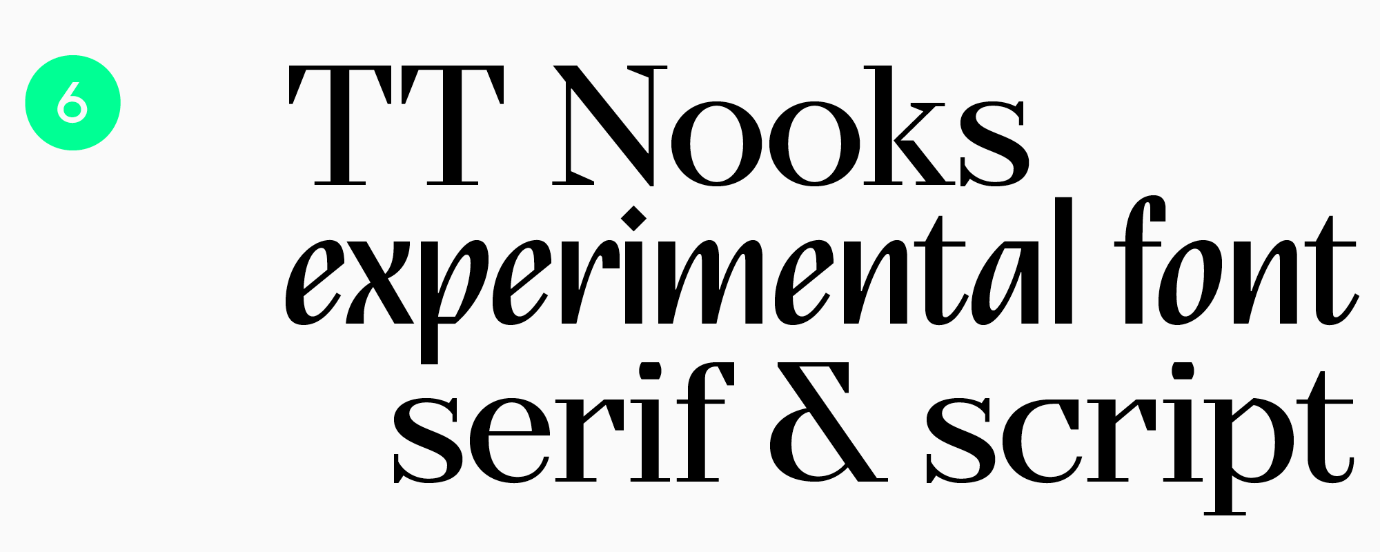
A stylish typeface with an elegant character, high contrast and geometric serifs. There are 8 styles in the font. The high-contrast serif is available in four styles, the other four styles are the upright italic TT Nooks Script.
Elegant serif with industrial accents in graphics. Despite massive serifs, the font is readable in large text arrays and can be used in branding and packaging design, as well as in printed materials.
Consists of 12 styles, each of which has 420 characters.
Slab fonts
Fonts with massive, heavy serifs, due to which the character can be more serious than other serifs. Slab fonts are often used in website design, printed products, and packaging design.
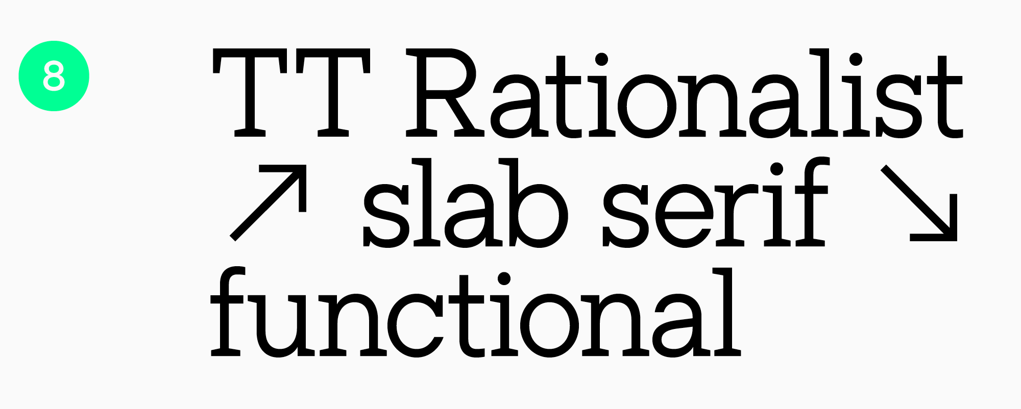
A functional slab typeface that makes up a collection of versatile typefaces along with the bestsellers TT Norms® and TT Commons™️. Unlike other slab typefaces, TT Rationalist has trapezoidal and delicate serifs that give the typeface a more modern character.
The font has 22 styles, each with 950 glyphs.
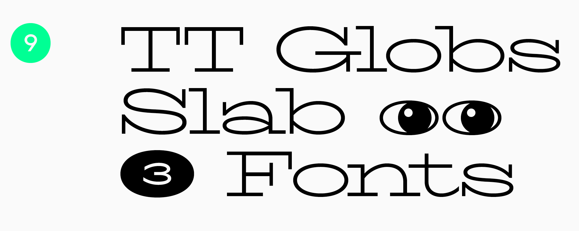
A stylish font with a reduced character set designed for headlines. Due to the long serifs, the text set in this font visually connects into a single pattern, and the flowing forms of the letters add dynamics to the character.
Consists of 3 styles, each of which has 625 characters. The font has no Cyrillics.
Display serifs
Display serifs are used for headings or for short texts. The nature of such fonts is more pronounced, which is manifested in more visible graphic elements, including serifs.
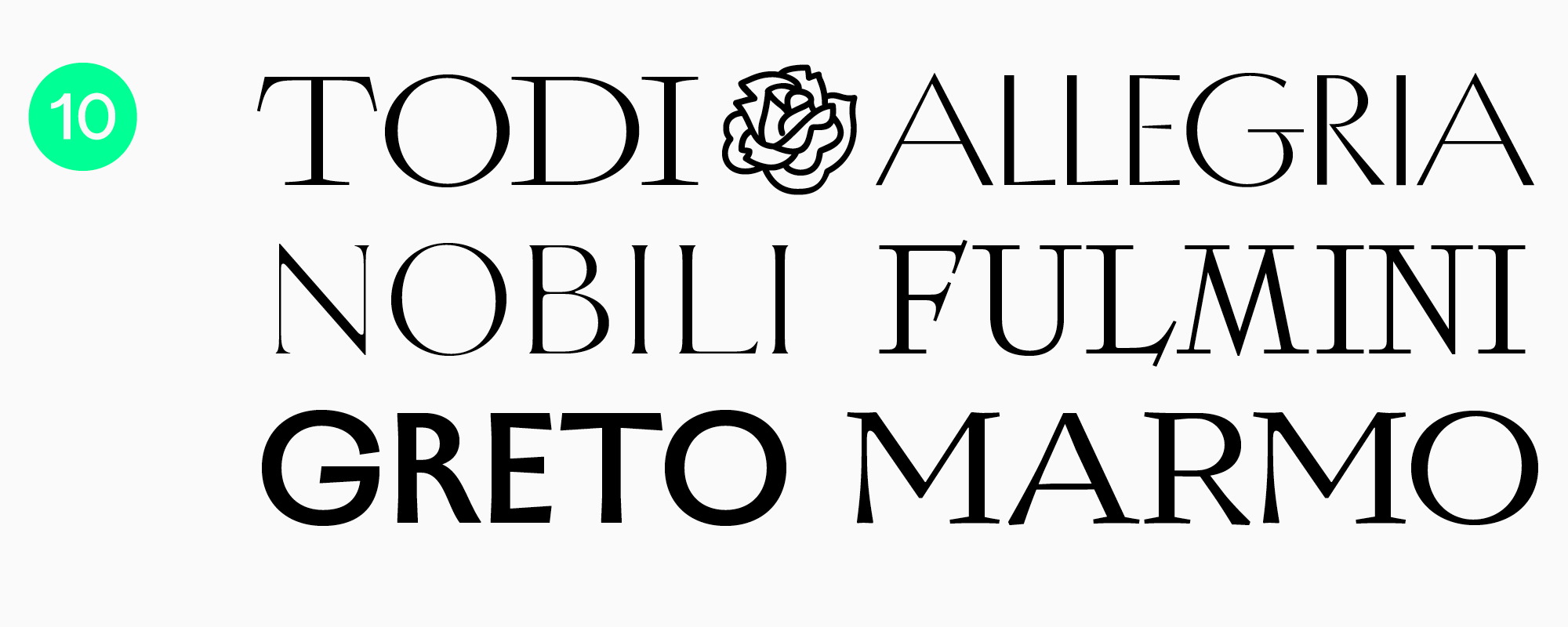
TT Ricordi is a collection of display serifs that includes 6 different typefaces: TT Ricordi Todi, TT Ricordi Nobili, TT Ricordi Fulmini, TT Ricordi Greto, TT Ricordi Marmo, TT Ricordi Allegria.
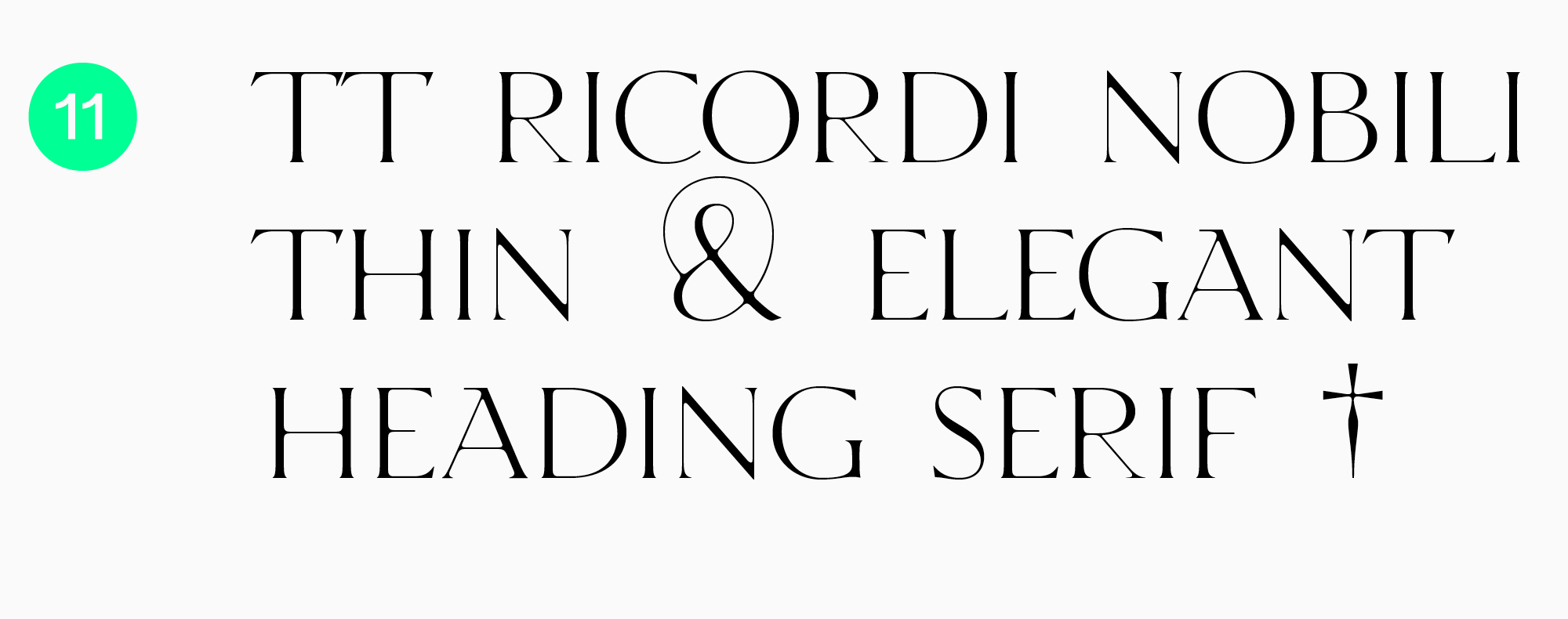
The inspiration source for this refined and elegant was an inscription carved into the stone floor of a cathedral in Florence. Thin font with high contrast for aesthetic titles.
There are 709 characters in the font.
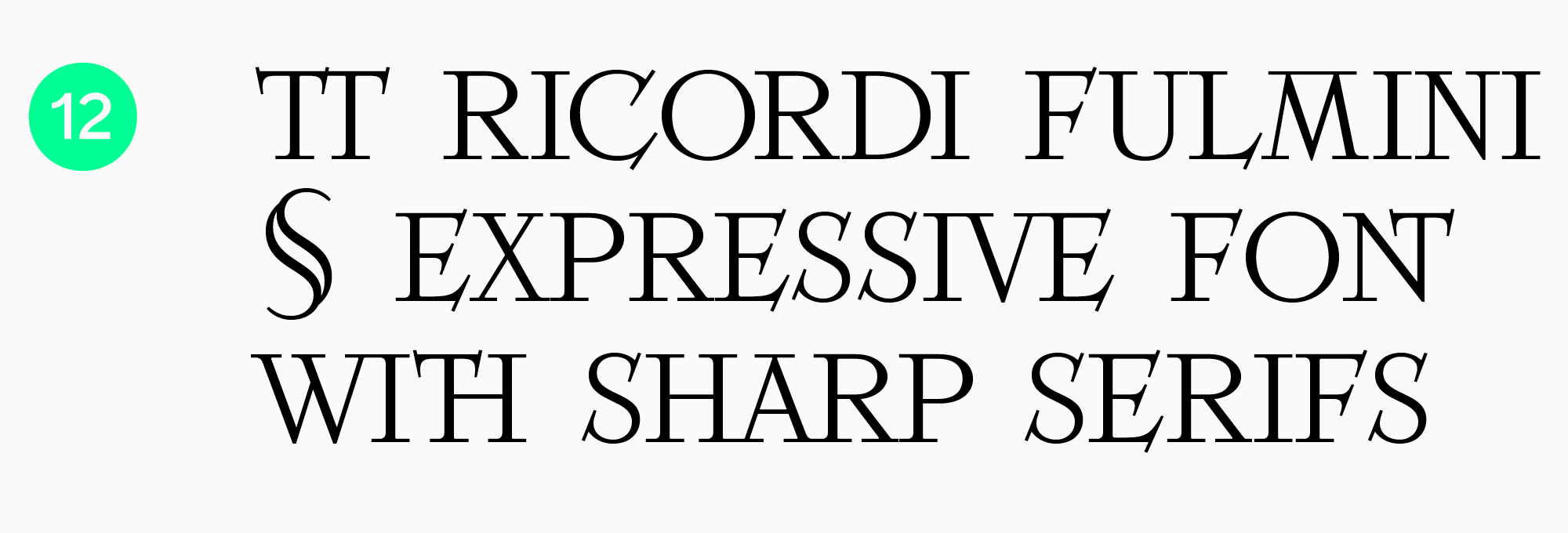
A contemporary serif with historical roots, inspired by an inscription in the National Gallery of Umbria in Perugia. This is an expressive font with sharp diagonal serifs, bright, but refined and delicate.
There are 793 characters in the font.
Bold and catchy typeface with sharp serifs and narrow letter proportions. Suitable for large or medium inscriptions in magazines and posters, book graphics and packaging design.
The font has 3 styles, each with 553 characters. Does not support Cyrillic.
Decorative display serifs
Decorative serifs, like display serifs, have a pronounced character and noticeable graphic elements. Used for headings or small texts in large and medium sizes. Such fonts attract attention, but are not suitable for setting large arrays of text. Used in packaging design, in the design of posters, exhibitions, or signs.
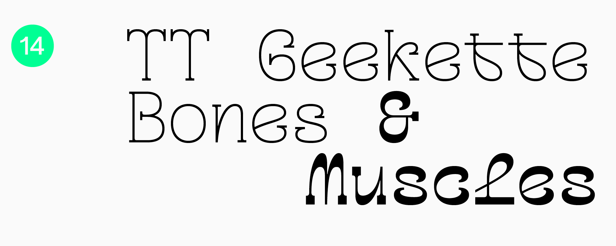
An experimental serif with a friendly and playful character. This is a monospaced font, meaning all em squares of the letters are the same size, which makes the font look especially stylish.
The font has 3 styles, each with 450 characters.
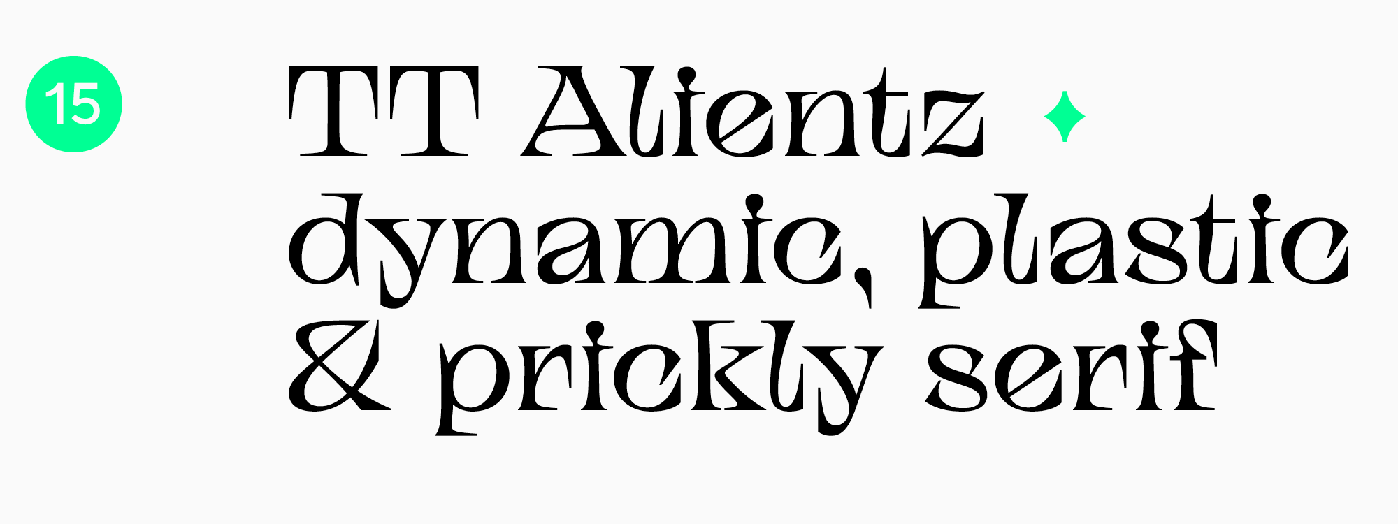
The font consists of several subfamilies, one of which is represented by a display serif: dynamic, flowy and prickly. Due to the unusual shape of serifs directed inside the characters, the font is memorable from the first heading.
There are 470 glyphs in the TT Alientz Serif.
Now you know about the 15 best serif fonts and you can create projects in any area!
Share your selection of your favorite fonts on social media and remember to tag TypeType.