
Créer sa première police est ce qu’il y a de plus difficile, car le designer ne connaît pas encore tous les détails du développement et ne dispose pas encore d’une intuition visuelle ni d’une expérience suffisantes. Lorsqu’on développe une police pour la première fois, on doit apprendre énormément en cours de route, en transférant les connaissances théoriques sur le design typographique vers la pratique, ce qui est toujours difficile.

Pourtant, c’est avec la première police que commence le parcours d’un spécialiste de la typographie. Pour devenir un designer expérimenté, il faut créer une première police, puis une deuxième, puis une troisième, tout en comprenant progressivement quels défauts des premières étapes doivent être corrigés.
Plus tard, lorsque le spécialiste gagne en expérience, ses premiers travaux lui sembleront incorrects, naïfs, mais susciteront malgré tout une douce nostalgie, car c’est avec eux que le parcours professionnel a commencé.
Dans cet article, nous allons vous expliquer comment commencer à développer votre première police, de quels logiciels vous aurez besoin pour travailler et à quoi il faut accorder le plus d’attention.
Bases théoriques
Avant de commencer le travail proprement dit, faites le plein de connaissances. Cette démarche ressemble à l’approche universitaire : d’abord un cours, ensuite seulement l’application pratique lors des séminaires. Cependant, ce n’est pas une règle stricte, car certaines personnes assimilent plus facilement les connaissances en travaillant directement et en étudiant les questions concrètes qui surgissent au cours de la création. Choisissez la voie qui vous convient.
Parmi les ressources qui vous aideront à créer une police, vous pouvez également sélectionner celles qui vous correspondent le mieux. Nous recommandons de vous appuyer sur différentes sources : livres, portails internet et conférences de spécialistes.
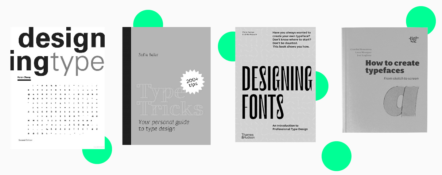
Voici les livres qu’il vaut la peine de garder sur votre bureau :
- Designing Type de Karen Cheng ;
- Type Tricks: Your Personal Guide to Type Design de Sofie Beier ;
- Designing Fonts: An Introduction to Professional Type Design (éd. Thames and Hudson) ;
- How to Create Typefaces. From Sketch to Screen de Cristobal Henestrosa, Laura Meseguer et Jose Scaglione.
Il est également utile de suivre des designers typographiques sur les réseaux sociaux, en particulier s’ils diffusent en direct et partagent des conseils sur le design typographique. Par exemple, chaque mois, le studio TypeType organise une conférence en ligne consacrée au design typographique.
Plus vous trouverez de sources différentes au début, mieux ce sera. Par la suite, vous pourrez faire le tri et ne conserver que les plus utiles et vos préférées.
Étapes de la création de votre propre police
Vous êtes donc armé de connaissances et prêt à vous mettre au travail. Vous aurez besoin du matériel nécessaire, c’est-à-dire d’un ordinateur ou d’un ordinateur portable, du bon logiciel et de l’envie de créer la plus belle police du monde.
1. Commencez par définir la tâche, ainsi que le jeu, le style et la nature de la police.
Pour une première police, il est préférable de choisir un jeu de caractères minimal. Répondez aux questions suivantes dans votre carnet ou dans un éditeur de texte :
- quelle police vous créez : sans serif, serif, slab serif ;
- où votre police pourra être utilisée : sur le web, en impression, en vitrine ;
- comment votre police se positionne : police ultra-moderne pour un projet élégant, ou police classique au caractère strict évoquant une certaine époque historique ou correspondant à une tendance précise ;
- à quelle taille et où la police sera utilisée : dans des titres, des applications, des affiches, ou uniquement en ligne.

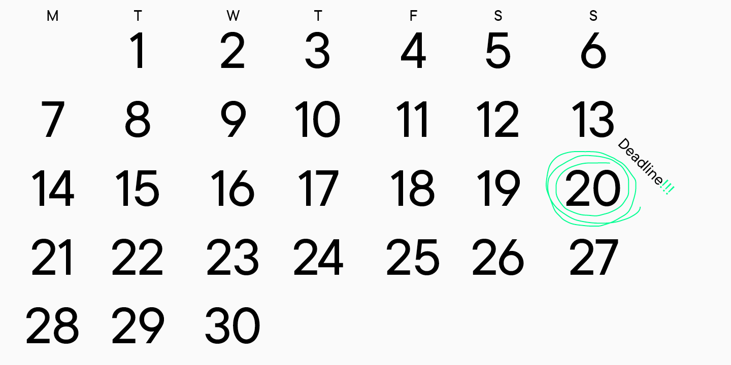
2. Fixez des délais.
Même si vous concevez une police pour un usage personnel, il est utile de prendre l’habitude de travailler avec des échéances.
3. Faites vos recherches.
À cette étape, il vaut la peine de choisir entre 3 et 10 polices proches de ce que vous prévoyez de dessiner. Bien entendu, il ne faut pas les copier dans votre projet, mais il est utile d’étudier leurs caractéristiques graphiques, leurs tailles et d’autres paramètres afin de comprendre leur logique de construction.
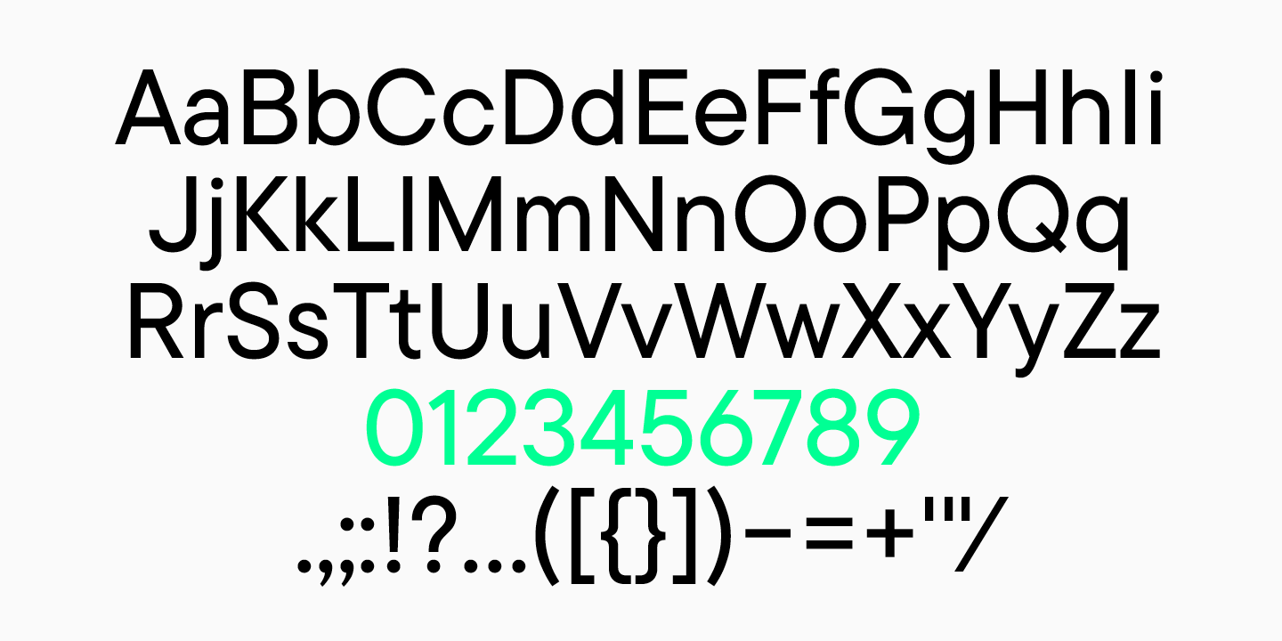
4. Déterminez le jeu de caractères.
Cela aurait déjà dû être fait à la première étape, mais il faut maintenant sélectionner en détail tous les caractères que vous prévoyez de dessiner. Il peut s’agir d’une seule langue, par exemple le latin de base, des chiffres et un ensemble de ponctuation.
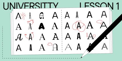
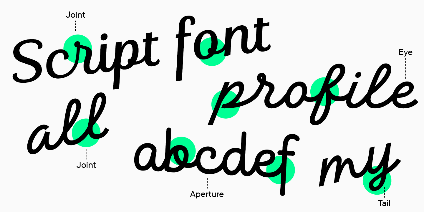
5. Travaillez avec des esquisses.
Esquisses
Une fois la recherche effectuée et l’idée de la future police formée, commencez à esquisser. Vous pouvez utiliser un crayon et du papier, de l’encre et un pinceau, ou un éditeur graphique.
Le but de l’esquisse est de définir les formes visuelles de la police.
Au début, vous pouvez dessiner quelques caractères pour poser les formes générales de la police. Une fois le style et les formes de base établis, passez au travail sur des lettres précises.

Vous pouvez revenir à l’esquisse lorsque vous hésitez sur la forme d’un glyphe. Par exemple, pour choisir entre deux variantes de la lettre « a », dessinez plusieurs formes et sélectionnez la bonne grâce à l’esquisse.
Dessiner le jeu de caractères
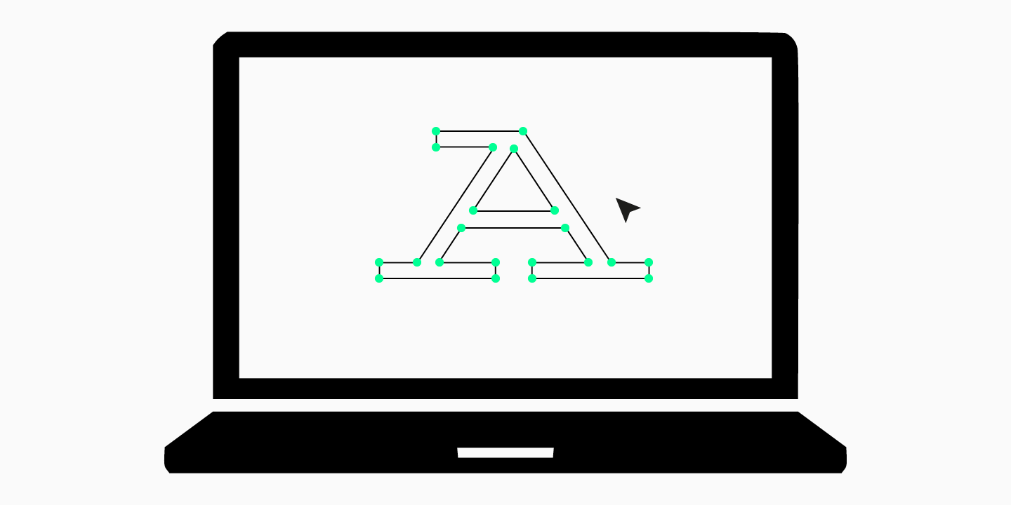
Lorsque toutes les étapes précédentes ont été accomplies, passez à la création de votre police dans un éditeur de polices. N’oubliez pas qu’une police n’est pas un ensemble de lettres isolées, mais un système de signes unis par une idée et un caractère communs. Les solutions graphiques qui composent le style de la police doivent être logiques et se répéter dans plusieurs caractères.
À cette étape, vous devez dessiner tous les caractères de la police : latin ou cyrillique, ponctuation, signes monétaires, fractions, caractères supplémentaires. Comme nous l’avons mentionné plus haut, commencez par une composition simple et basique afin de terminer la police dans les délais, d’acquérir de l’expérience et de ressentir la joie d’achever le projet. Dans les projets suivants, vous pourrez élargir le jeu de caractères.
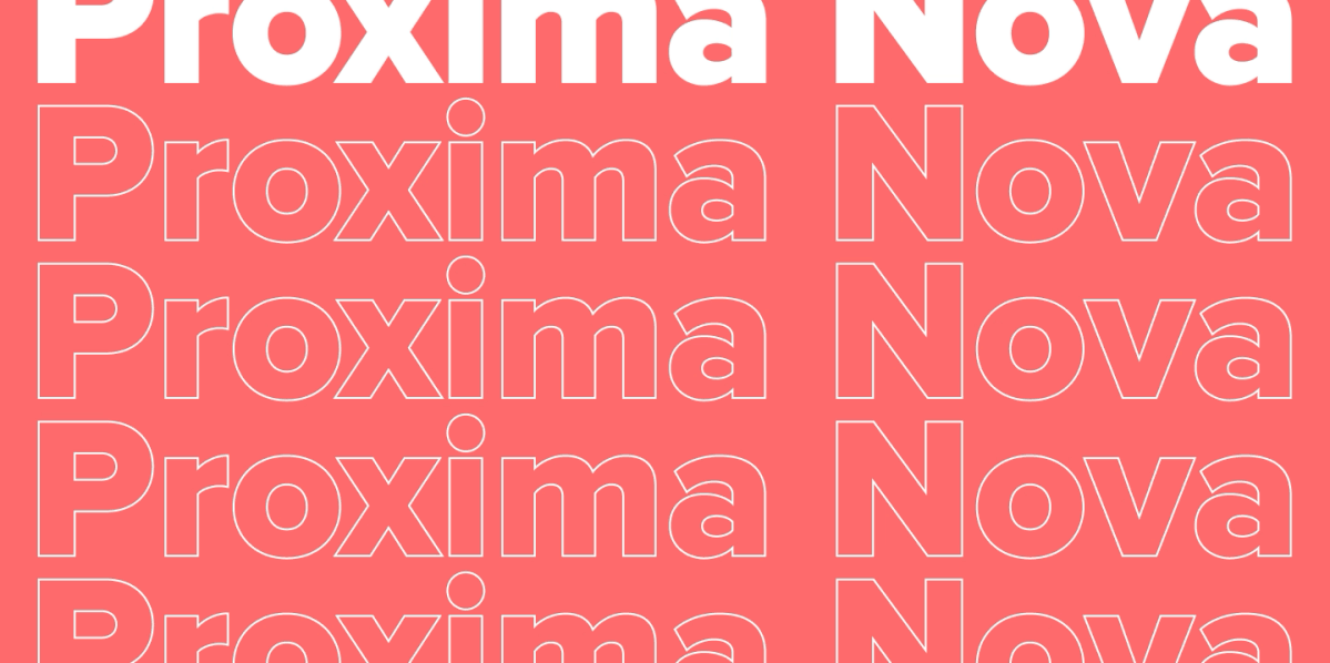
Une police peut avoir plusieurs styles, y compris droit et italique. Commencez par un seul, par exemple Regular ou Medium, qui sont les plus courants et les plus utilisés.

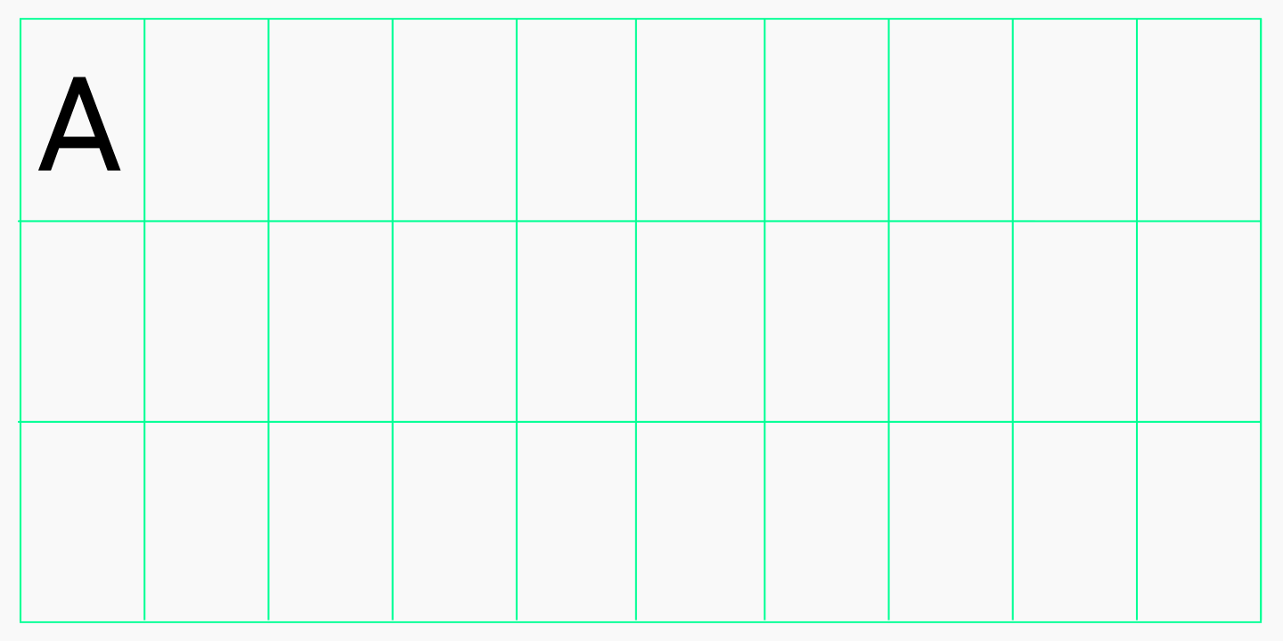
Lorsque le jeu de caractères dessiné est prêt, commencez l’espacement. À cette étape, toutes les lettres reçoivent les bonnes valeurs d’approche gauche et droite ; en d’autres termes, il s’agit du travail sur l’espacement entre les caractères.

Partie technique
Une police n’est pas seulement un ensemble de caractères dessinés, c’est aussi un produit qui peut être utilisé dans un logiciel.
Après la partie du travail centrée sur le dessin, commence l’étape technique. C’est elle qui détermine la qualité de fonctionnement de la police créée. Pour votre première police, vous pouvez vous associer à un spécialiste plus expérimenté qui vous aidera pour la partie technique du travail.
De manière conventionnelle, cette étape se compose de trois parties : le mastering, le kerning et le hinting TrueType.
Le mastering consiste à vérifier et corriger les contours, les composants, les diacritiques et les autres éléments d’une police. C’est à ce stade que sont créées les fonctionnalités OpenType et que sont remplies les métadonnées internes de la police.

Le kerning est le processus par lequel l’espacement entre les lettres est affiné jusqu’à la perfection. En termes simples, c’est à ce moment-là que l’on corrige les cas où il y a trop d’espace blanc entre certaines lettres. Cette étape intervient après le travail d’espacement.

Le hinting est le marquage visuel d’une police pour permettre un affichage correct des petites tailles sur différents systèmes d’exploitation.

Outils et logiciels pour créer des polices
Il existe de nombreux logiciels pour travailler sur les polices. Voici ceux qui sont souvent utilisés par les designers typographiques :
- Glyphs ;
- FontLab ;
- RoboFont ;
- FontForge ;
- Fontographer.
On peut sans doute distinguer Glyphs et FontLab dans cette liste, car la plupart des spécialistes les utilisent. Cela s’explique par le confort de leur interface, la variété de leurs outils et leur adaptabilité à l’utilisateur. Le studio TypeType préfère Glyphs, bien qu’il travaillait auparavant dans FontLab.
Nous vous recommandons de vous familiariser avec 2 ou 3 logiciels différents, d’étudier leurs fonctionnalités et de comprendre lequel vous convient le mieux. Beaucoup proposent une période d’essai, donc cela ne demandera pas beaucoup de ressources.
Ensuite, il est préférable d’en choisir un seul et d’y travailler durablement, en accumulant de l’expérience et en améliorant vos compétences en design typographique.
Conclusion
Créer une police pour la première fois peut susciter la peur de l’inconnu, car de nombreux débutants ont l’impression qu’ils n’y arriveront pas et que créer une police est extrêmement difficile.
Osez créer votre première police, car plus tard vous vous en souviendrez avec une douce nostalgie. Faites des erreurs, expérimentez, créez des polices imparfaites et modifiez-les — avec le temps, vous comprendrez dans quelle direction continuer.
FAQ
Quelles sont les principales étapes de la création d’une police ?
Le processus de création d’une police se compose de plusieurs étapes clés:
— Concept et esquisses: définir le style et dessiner à la main les caractères principaux.
— Numérisation: transférer les dessins dans un éditeur vectoriel.
— Création du jeu de caractères complet: développer les lettres minuscules et majuscules, les chiffres et la ponctuation.
— Métriques et espacement: définir les approches latérales et les paires de crénage afin d’obtenir un texte équilibré.
— Génération du fichier de police: assembler le fichier final dans un format comme OTF ou TTF.
Quels logiciels utilise-t-on pour créer des polices ?
Différents logiciels sont utilisés selon les étapes du processus. Pour dessiner les glyphes vectoriels, Adobe Illustrator et Glyphs sont des solutions populaires. Pour l’ensemble du processus de construction du fichier de police et de réglage des métriques, on utilise des programmes spécialisés comme Glyphs, FontLab ou le logiciel gratuit FontForge.
Que sont les métriques d’une police et pourquoi sont-elles importantes ?
Les métriques d’une police correspondent au système d’espacement et de distances entre les caractères. Cela comprend:
— Les approches latérales: l’espace à gauche et à droite de chaque caractère.
— Le crénage: l’ajustement de l’espace entre des paires de caractères spécifiques (comme « A » et « V »).
De bonnes métriques garantissent un texte régulier, équilibré et facile à lire.
Que sont les contours vectoriels ?
Les contours vectoriels sont les courbes mathématiques (appelées courbes de Bézier) qui définissent la forme de chaque caractère. Ils sont essentiels, car ils permettent à une police d’être agrandie ou réduite à n’importe quelle taille sans perte de qualité, ce qui est une exigence fondamentale de la typographie moderne.
Quels livres puis-je lire sur la création de polices ?
Voici quelques ouvrages à lire avant de commencer le processus de création d’une police:
— Designing Type de Karen Cheng
— Type Tricks: Your Personal Guide to Type Design de Sofie Beier
— Designing Fonts: An Introduction to Professional Type Design de Thames & Hudson
— How to Create Typefaces: From Sketch to Screen de Cristóbal Henestrosa, Laura Meseguer et José Scaglione
Que comprend l’aspect technique de la création d’une police ?
De manière générale, la partie technique se compose de trois étapes principales: le mastering, le crénage et le hinting TrueType.