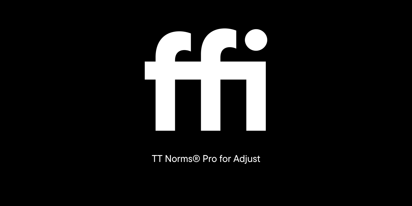
The German marketing analytics platform Adjusthas addressed TypeType with a request to customize the TT Norms® Pro font. Adjust provides services for company development all around the world.
They were completely satisfied with the license for TT Norms® Pro they purchased, but one inconvenience resurged in the testing process: standard ligatures of the font were turned on by default, which turned out to be inconvenient for Adjust while using the basic version of the font.
The company wanted the text set in TT Norms® Pro to look crisp without turning the ligatures on.
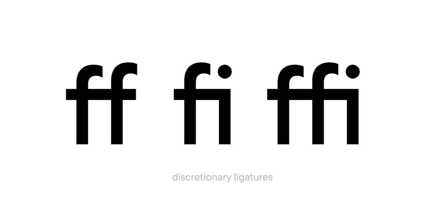
Such a task is no problem for TypeType because a client’s comfort while using our fonts should be at the maximum. TypeType’s technical specialists moved TT Norms® Pro ligatures from the standard ligatures feature into the discretionary ligatures one. Our team made the ligatures unavailable by default in all font faces, but if necessary they could still be turned on.
The customized version of TT Norms® Pro with the changed order of ligature display was then sent off to Adjust. The font has become more convenient for the company with the alternative display of glyphs on the screen and they could now use TT Norms® Pro to the fullest.
Below you can see what the changes to the font looked like:
2025 was an incredibly productive year for TypeType: we released 7 new fonts, updated 14 typefaces, and added Arabic language support to two of our bestsellers. In addition, we won awards in type design competitions, explored new platforms, improved our website, wrote about type design in our blog, gave lectures, met with you at webinars, and created joint projects with friends and partners.
The TypeType team, with the support of the Mantera Group, has created a new font family for the State Hermitage Museum—the Hermitage Type Family. The typeface will be used across all of the Hermitage’s digital content; you can already see it on the website and the updated launch page of the mobile version. And this is just the beginning of a major overhaul of the museum’s digital identity, in which the new font will play a pivotal role.
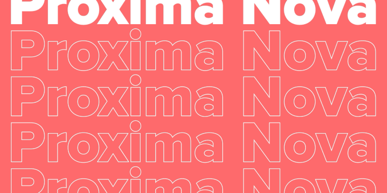
Proxima Nova is one of the most recognizable sans-serif fonts in modern design. In this article, we’ll explore the history of the Proxima Nova font family, its graphic characteristics and composition, figure out what fonts go with Proxima Nova, what its best alternatives are, and what license you need to use it.
We spent a lot of time thinking about how to find a place for creative freedom within this system, how to set aside time for small passion projects, how to step outside our usual boundaries, and how to give spontaneity a chance. And we realized that the perfect moment will never come unless you take the first step. So we took it—and that’s how the TT Labs creative laboratory was born. Here’s the story from the beginning!
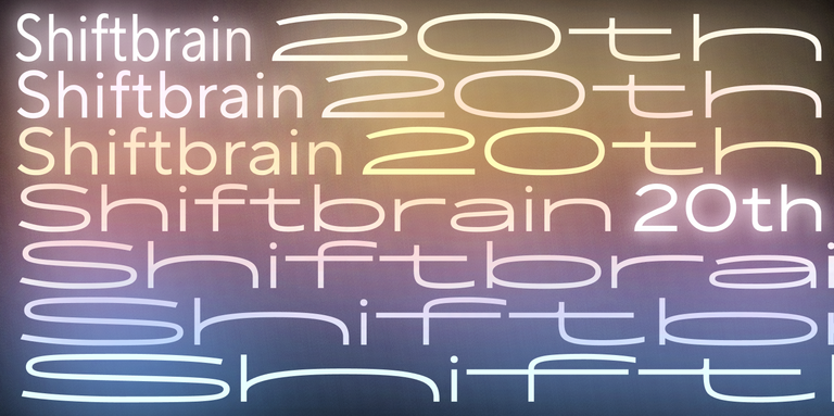
In 2023, the Japanese marketing agency SHIFTBRAIN launched an interactive website dedicated to the company’s 20th anniversary. For this project, the TypeType team developed a unique variable font capable of stretching to extreme horizontal widths. As a foundation, we used the bestseller TT Norms® Pro, which was already the company’s corporate typeface—you can see it on the main SHIFTBRAIN website.
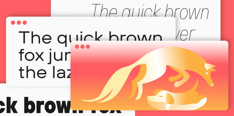
If you’re interested in design, you’ve almost certainly come across the famous sentence about the quick brown fox and the lazy dog. Or perhaps one about a jived fox nymph and a quick waltz. These are pangrams—sentences that contain all the letters of the alphabet. In this article, we’ll provide a more detailed pangram definition, explain why these phrases are so important, and provide a list of the most popular pangrams in English.
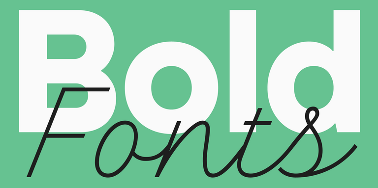
Font weight is a crucial characteristic that directly impacts the perception of an entire design. In this article, we’ll explore where and how to apply bold fonts, the different types that exist, and look at some examples of such fonts from the TypeType collection.
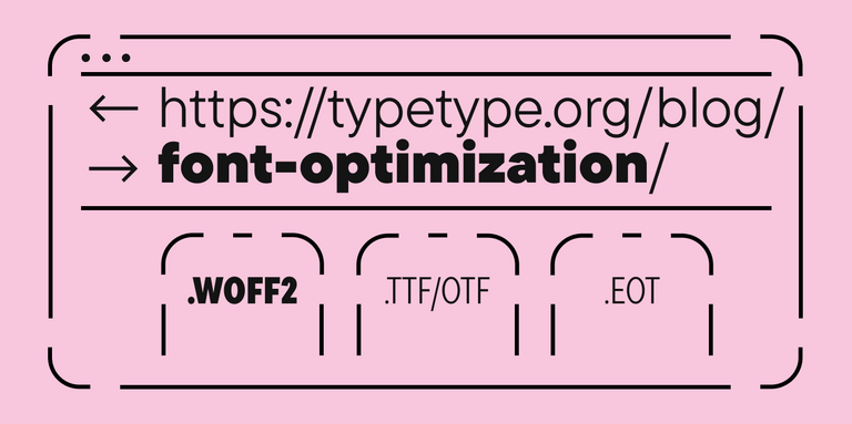
Since fonts are a vital part of web design, proper font optimization plays a key role in ensuring your website is fast and efficient. Let’s explore why web font optimization is so crucial and what steps you can take to ensure your fonts load faster.
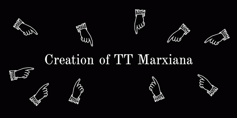
TT Marxiana is a pre-revolutionary font reconstruction project. These fonts were used in the layout of the “Niva” (nee-vah, “Cultivated field”) magazine published by the A. F. Marx publishing house in Saint Petersburg. In our project we decided to focus on a very specific set of fonts that were used in preparation and printing of the “Niva” magazine in 1887 — Antiqua, Antiqua Italic, Grotesque, and the Elzevir.
We decided to try to tell you about the creation of a complex font family TT Interphases at independent font foundry. We hope you enjoy our story and discover something interesting and new.