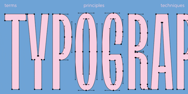
How often have you come across hidden kitties and puppies right in the letters? If never, do hurry to read this case.
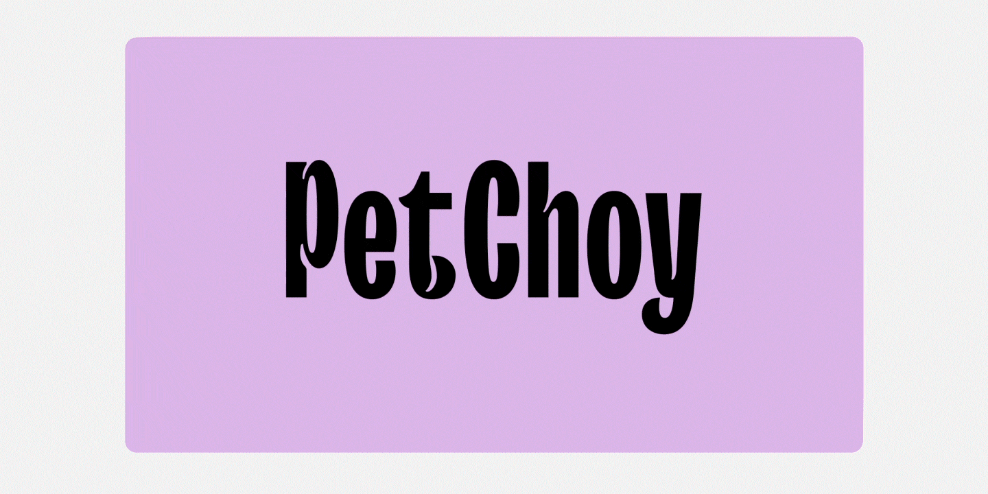
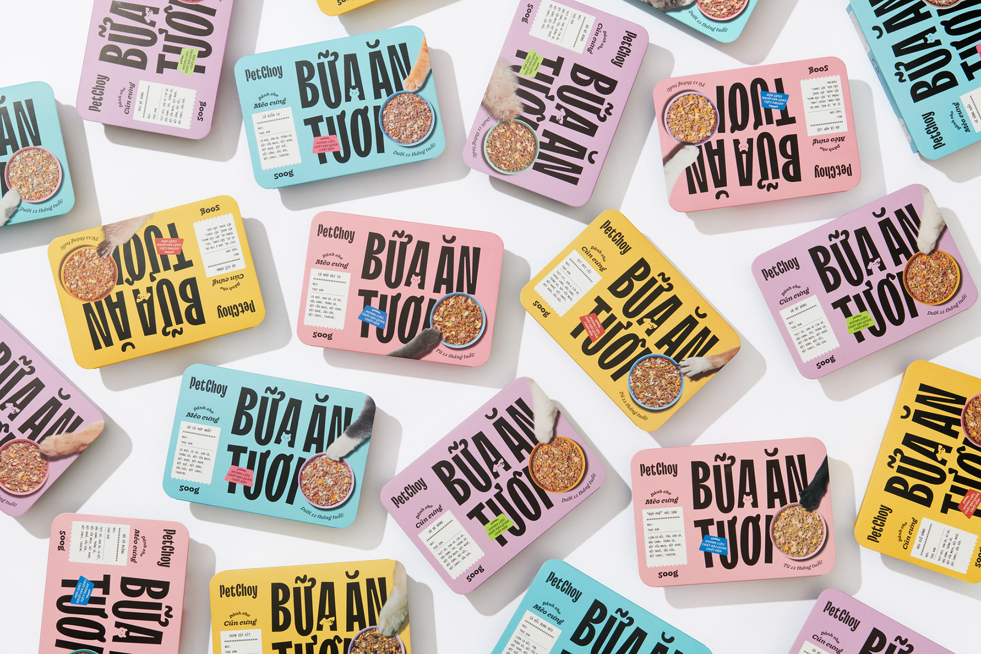
TypeType was approached by MO NO DESIGN CO to customize the TT Trailers Bold font for the Petchoy project. As you might guess, this is a pet food brand. And at that, not just some food, but fresh, nutritious and delicious.
There were really many tasks:
• draw and add Vietnamese to the TT Trailers Bold font file • add three sets of «pet friendly» diacritics for Vietnamese • hinting of new characters.
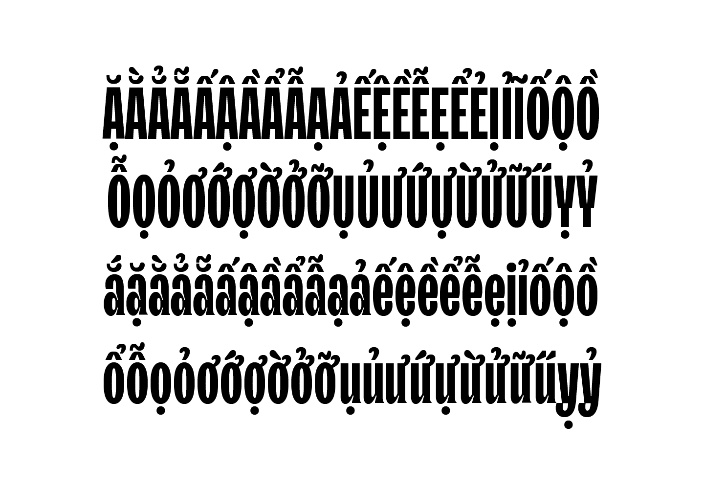
The TypeType team started by drawing a classic set of Vietnamese diacritics. A total of 92 glyphs were added to the font file.
Set of Vietnamese diacritics
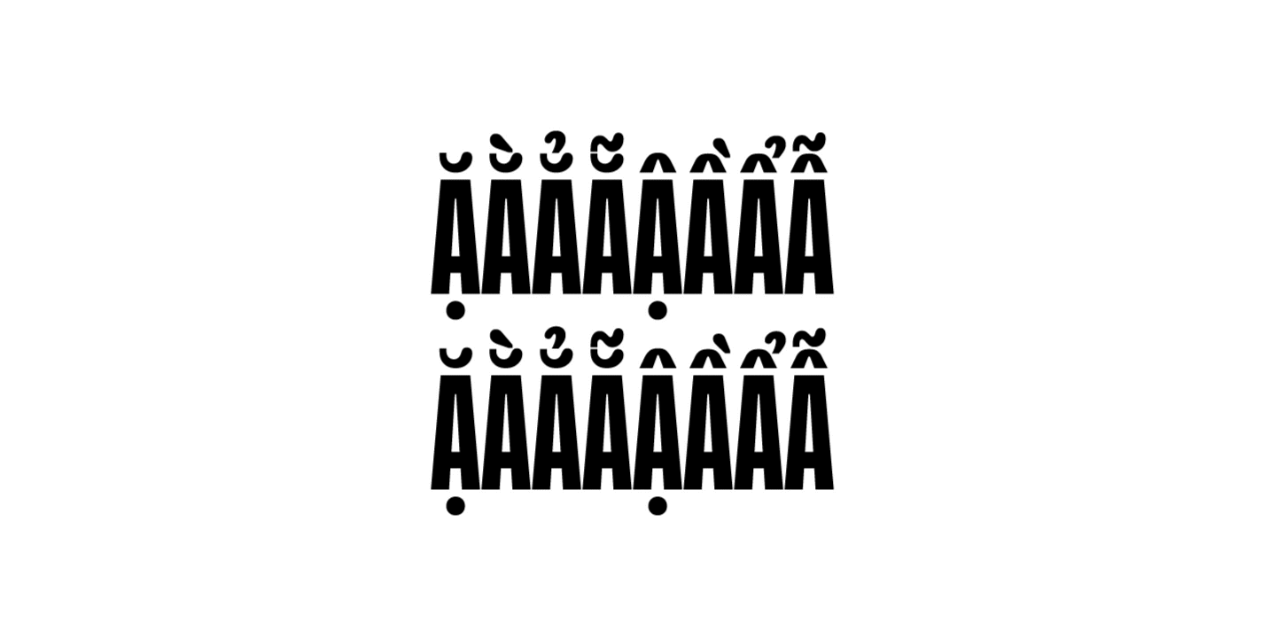
Then we started the most interesting task — integrating the silhouettes of cats and dogs into the graphics. We ended up with 4 stylistic sets with pet references. For these, we used the client’s sketches as a reference.
Adding pet-friendly elements
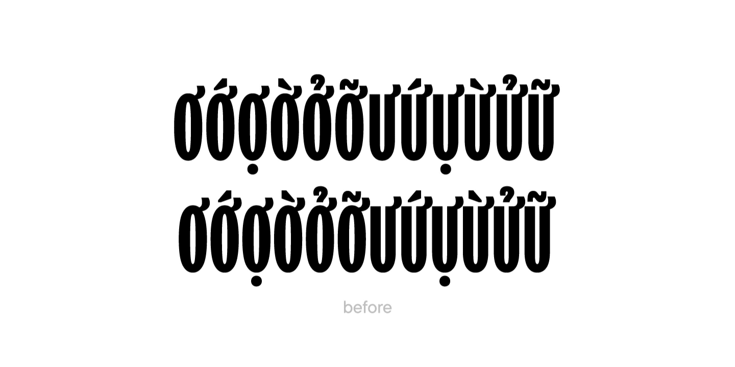
After that, the designers took up a new task — they replaced the diacritics with a more suitable one to the wishes of the client.
Replaced the diacritics
When all the characters were drawn, the team began to work on kerning so that all the letters fit perfectly together in the text canvas.
In the final stages, our technical specialists specified the font features and hintednew characters. The new font files were named TT Trailers Petchoy and TT Trailers Petchoy Display, one containing traditional Vietnamese diacritics and the other the unique pet friendly elements.
Product packaging with a customized version of the font
Both customized fonts worked well for the client who was able to use them for their social media and other forms of communication.
2025 was an incredibly productive year for TypeType: we released 7 new fonts, updated 14 typefaces, and added Arabic language support to two of our bestsellers. In addition, we won awards in type design competitions, explored new platforms, improved our website, wrote about type design in our blog, gave lectures, met with you at webinars, and created joint projects with friends and partners.
The TypeType team, with the support of the Mantera Group, has created a new font family for the State Hermitage Museum—the Hermitage Type Family. The typeface will be used across all of the Hermitage’s digital content; you can already see it on the website and the updated launch page of the mobile version. And this is just the beginning of a major overhaul of the museum’s digital identity, in which the new font will play a pivotal role.
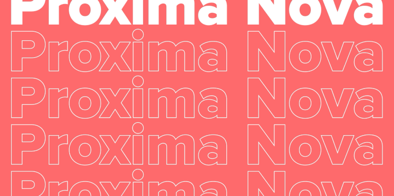
Proxima Nova is one of the most recognizable sans-serif fonts in modern design. In this article, we’ll explore the history of the Proxima Nova font family, its graphic characteristics and composition, figure out what fonts go with Proxima Nova, what its best alternatives are, and what license you need to use it.
We spent a lot of time thinking about how to find a place for creative freedom within this system, how to set aside time for small passion projects, how to step outside our usual boundaries, and how to give spontaneity a chance. And we realized that the perfect moment will never come unless you take the first step. So we took it—and that’s how the TT Labs creative laboratory was born. Here’s the story from the beginning!
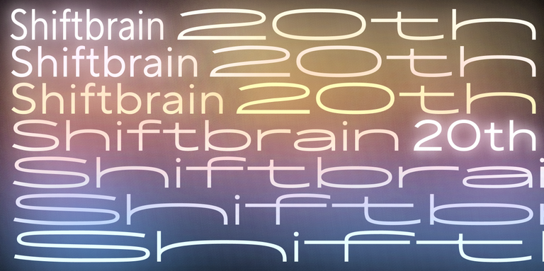
In 2023, the Japanese marketing agency SHIFTBRAIN launched an interactive website dedicated to the company’s 20th anniversary. For this project, the TypeType team developed a unique variable font capable of stretching to extreme horizontal widths. As a foundation, we used the bestseller TT Norms® Pro, which was already the company’s corporate typeface—you can see it on the main SHIFTBRAIN website.
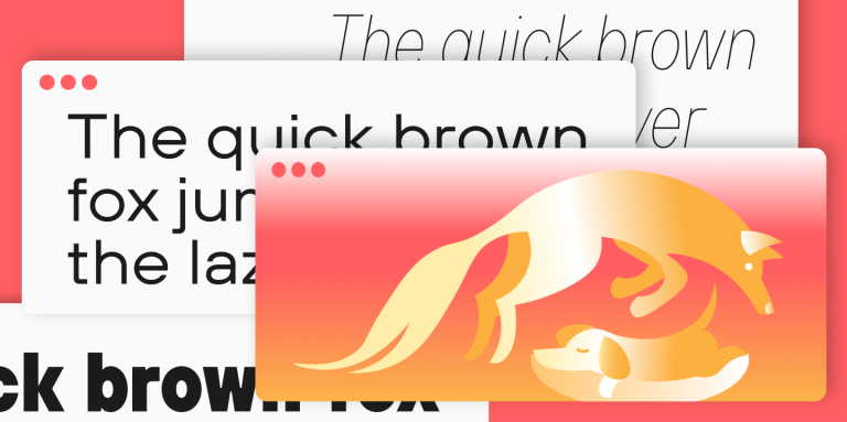
If you’re interested in design, you’ve almost certainly come across the famous sentence about the quick brown fox and the lazy dog. Or perhaps one about a jived fox nymph and a quick waltz. These are pangrams—sentences that contain all the letters of the alphabet. In this article, we’ll provide a more detailed pangram definition, explain why these phrases are so important, and provide a list of the most popular pangrams in English.
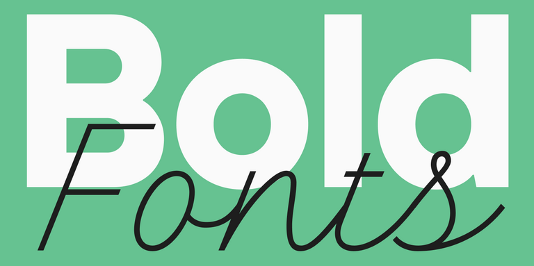
Font weight is a crucial characteristic that directly impacts the perception of an entire design. In this article, we’ll explore where and how to apply bold fonts, the different types that exist, and look at some examples of such fonts from the TypeType collection.
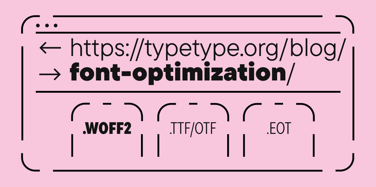
Since fonts are a vital part of web design, proper font optimization plays a key role in ensuring your website is fast and efficient. Let’s explore why web font optimization is so crucial and what steps you can take to ensure your fonts load faster.
TypeType received a font customization request from True Digital Ltd, a marketing agency from Great Britain. The company emphasizes a sincere and involved approach to brand promotion. They wanted to underline their concept by adapting a font to their corporate style.
Today we will share a fascinating story of creating a font family to set logos for one of the largest brands. We promise you won’t be bored: in this story, you will have the chance to have a look at all stages of the work and will learn more about font creation.
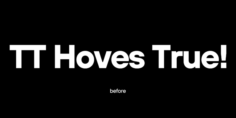
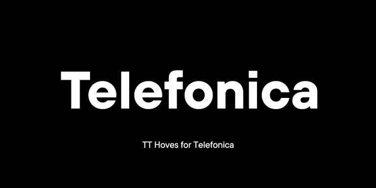
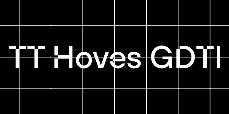
The TypeType team was approached by the Spanish telecommunications company Telefonica with a request to customize the TT Hoves font. Telefonica is one of the largest raditional and mobile phone companies in the world.
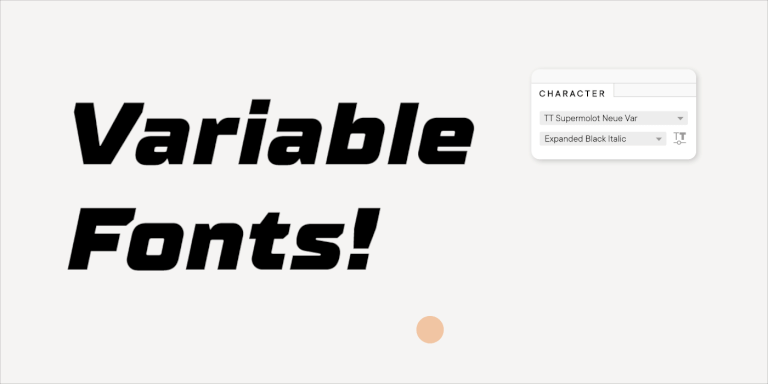
In this article we will tell you about variable fonts and what an interesting and useful, yet underrated instrument they are. We will also mention their disadvantages and nuances of working with them.
It often happens that existing fonts do not correspond to the needs of a certain project. But font is not a static instrument that functions only the way it was created. To convey the company’s individual style, the font can and should be adapted and customized to one’s needs that may range from simple changes like diminishing the character composition to complex design changes in all glyphs.
Monospace, a branding agency from Germany, creates corporate identities and designs for projects. The company believes that through design it is possible to create a brand though which customer interactions will be enjoyable and long-term.
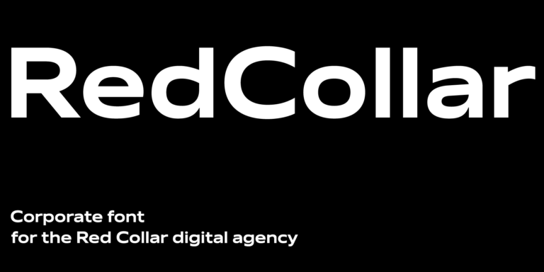
In this article we will tell and show how we created the corporate font for the Red Collar digital agency. The spirit that the client wanted to see in the font would be supposed to reflect the agency’s self-positioning: “It’s technological, but affordable; it is brave, bold, but fully responsible for the result”.
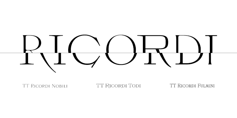
The TT Ricordi font family is a collection of three display heading antiquas designed to significantly diversify the traditional font palette. With that, all three fonts are close in thickness and similar in their character compositions and are featured in the uppercase set and the small capitals set, which replaces lowercase characters.
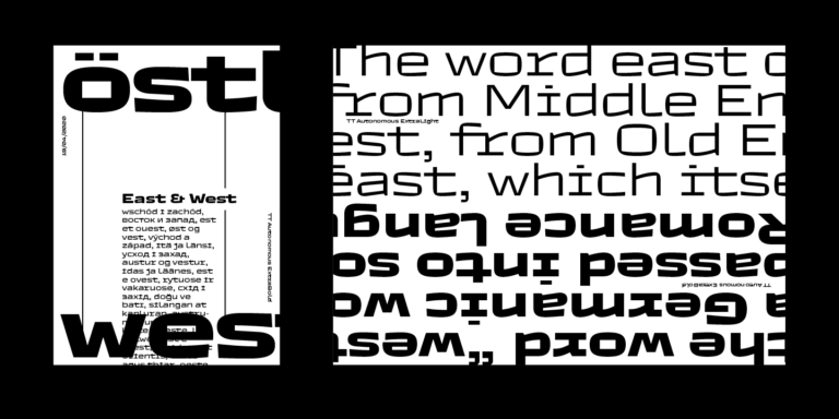
Today we want to share with you the short story of the TT Autonomous font creation. We’ll tell you what inspired the designers and what types of fonts are included in the family.