The gaming industry is the most prominent in today’s entertainment market and keeps evolving, leaving behind film distribution and music. One of the crucial success factors for popular games is design, where the font is an inseparable element.
A good video game font can significantly enhance user experience and gameplay, as well as play a pivotal role in establishing the game’s atmosphere, setting its mood, and adding to its visual aesthetics.
What are the most essential criteria for choosing the best gaming fonts? And what are the best fonts for your video game project in 2025? In this article, we share relevant tips on choosing typefaces and showcase a selection of commercial and free fonts for video games in different genres.
How to choose the best fonts for games: Essential basics and pro tips
Fonts are incorporated in both the game graphics and its identity, directly influencing the marketing of the gaming product. That’s why it’s important to choose the right font corresponding to your project’s goals.
To decide on the best typeface for your video game, you must answer several questions.
- What is the intended use of the font?
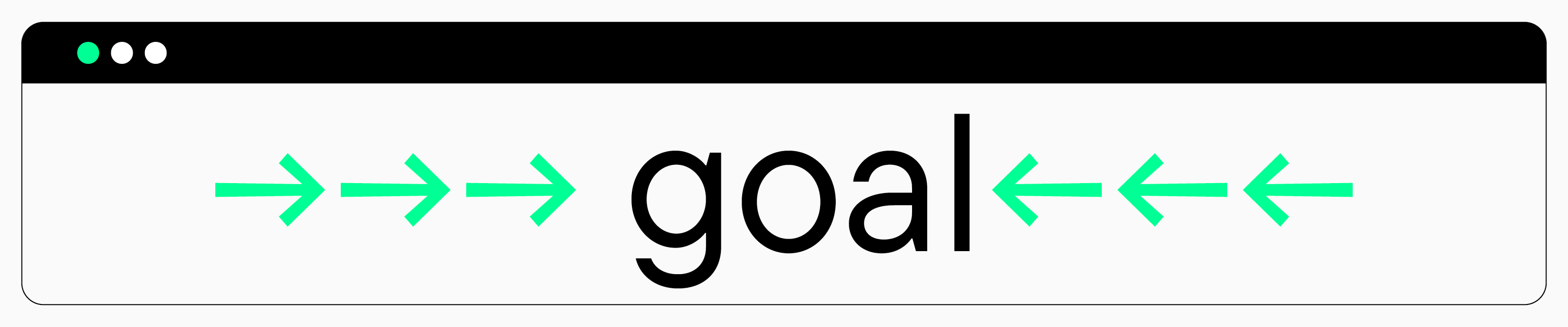
First, you must understand where you will use the font: your game’s identity (logo, title, etc.), headings in the interface, or main text blocks. For each of these purposes, you will likely need different fonts, which, by the way, may also be part of a single font family.
Tip: If possible, choose typefaces consisting of many font styles. This way, you can use one typeface for different purposes (main text, logo, headings, and your game’s promo) while maintaining your overall style.
So, the font used in the logo and focal text can emphasize your game’s mood and aesthetics. It can be simple and minimalistic or packed with details: everything depends on the product’s style.
The main text font serves more practical purposes; that’s why it must be primarily easy to read. When choosing such a font, you should avoid options with excessive decorative elements. Text fonts must have clean, well-defined lines.
We also recommend choosing high-quality fonts that will display equally well across various monitor sizes and different PCs.
2. Which languages will the game support?
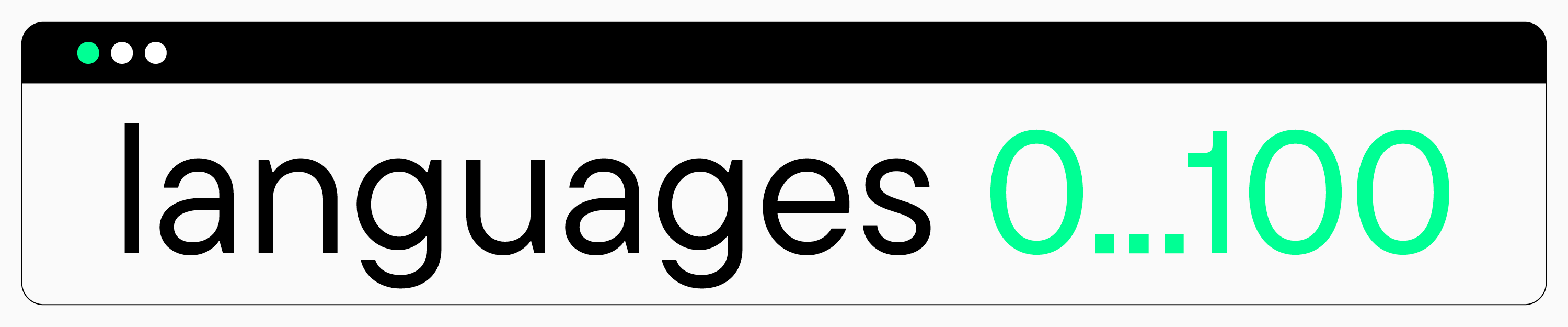
Are you planning to have only one language option in your game? Or will it be available in multiple languages for gamers from different countries? When choosing a typeface, you must pay close attention to what languages it supports and make sure this list meets your requirements.
3. What mood does your game have?
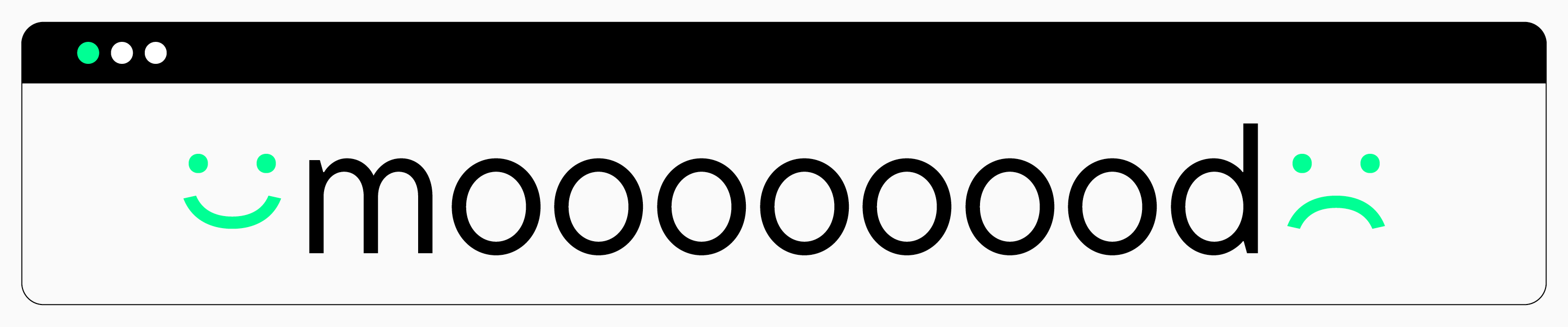
Choosing a font that aligns with your game’s style is equally essential. Experienced gamers exhibit well-developed watchfulness and visual taste, so they highly appreciate and value thoughtful, detail-oriented video game aesthetics.
Where and when does your video game’s storyline unfold? What’s the mood of your game: happy, romantic, intense, or unsettling? Answer all these questions and choose the font that conveys the necessary sensations or is based on the relevant historical references.
If you have trouble settling on the font’s style, try researching competitors’ products and choosing suitable options to analyze and find something that matches your own idea. Besides, every typeface has a unique story, so you may benefit from reading typeface descriptions on the font studios’ websites. This way, you can learn more about the atmosphere and key characteristics implemented into the font by its designer.
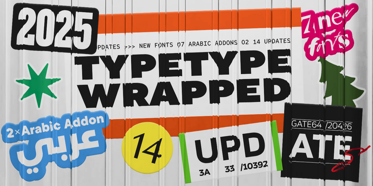
Top 25 best fonts for gaming
We compiled a selection of 25 best fonts for different video game genres. The list includes TypeType typefaces and other studios’ fonts. Here, you will find fonts for various purposes: main text in interfaces, eye-catching titles, logos, and identity. All these typefaces meet quality standards: they display well across multiple PCs, and many of them have comprehensive language support.
Best adventure/arcade fonts
The following awesome fonts are perfect for dynamic adventure or arcade games with a simple but gripping story.
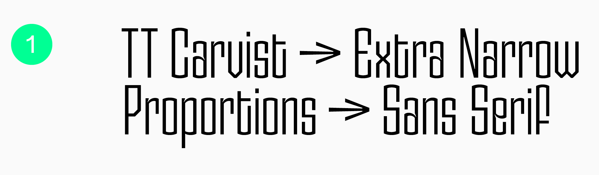
TT Carvist
This typeface is a modern, experimental sans serif with extra narrow proportions will help create a standout feature in your game. It can serve to design large-format headlines or logos. If your game features historical motifs, TT Carvist can highlight this aesthetic: its Cyrillic character set resembles ancient decorative lettering, and the Latin one embraces a Gothic vibe.
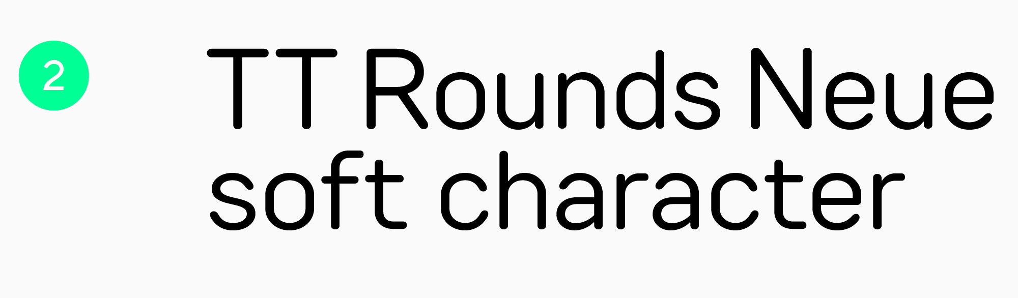
TT Rounds Neue
This font is a perfect match for vibrant, entertaining video games with simple stories for kids and adults. Its character is soft and friendly. TT Rounds Neue is convenient and easy to adapt for headlines, identity, game logos, and even main text, too.
Other studios’ fonts
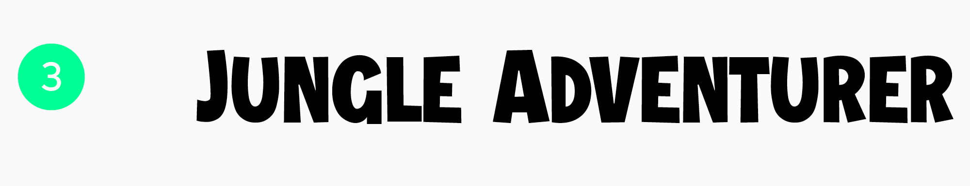
Jungle Adventurer — Gaming font
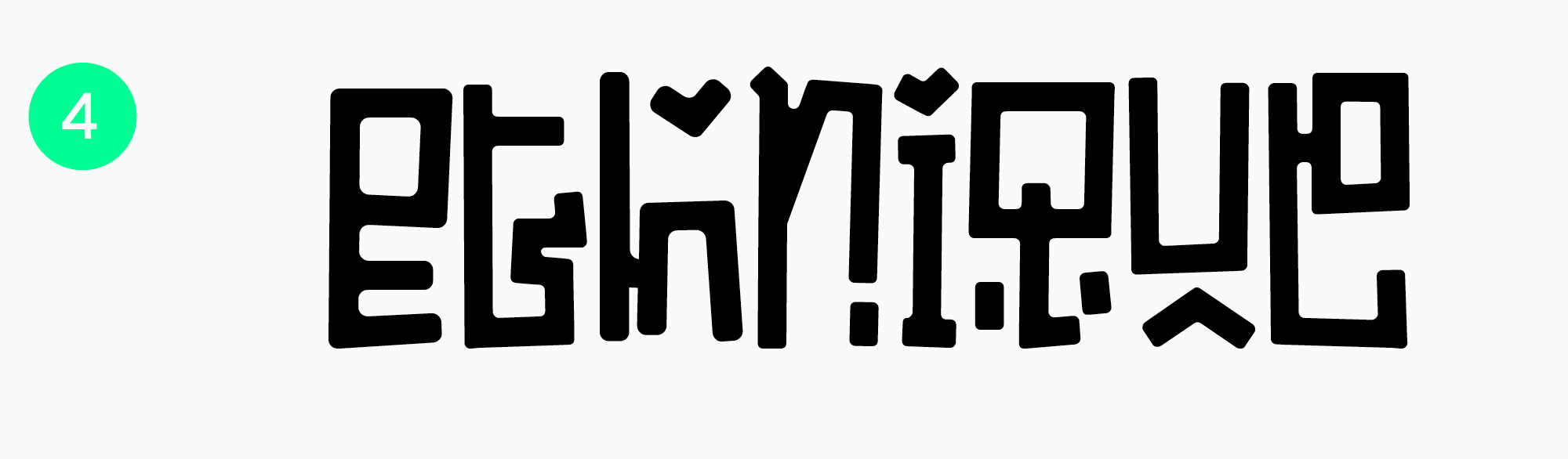
Ethnique — Ethnic Gaming Font
Technological and cool gaming fonts
Technological fonts stand out for their highly defined geometric forms, which convey the feeling of technological advancement. Such fonts are an awesome match for high-tech-style games.
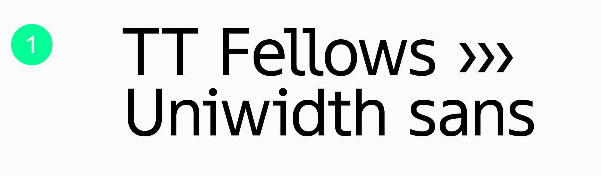
TT Fellows
TT Fellows is a convenient, functional, and stylish font for your gaming projects. This typeface is your reliable games font partner, suitable for main text blocks and large texts alike. The character of this font can change from soft and friendly to a tougher one, which makes it a versatile choice for games with different moods. By the way, this is a uniwidth font, so it’s highly convenient for layout design because the width of the em-space doesn’t change with the weight of a font style.
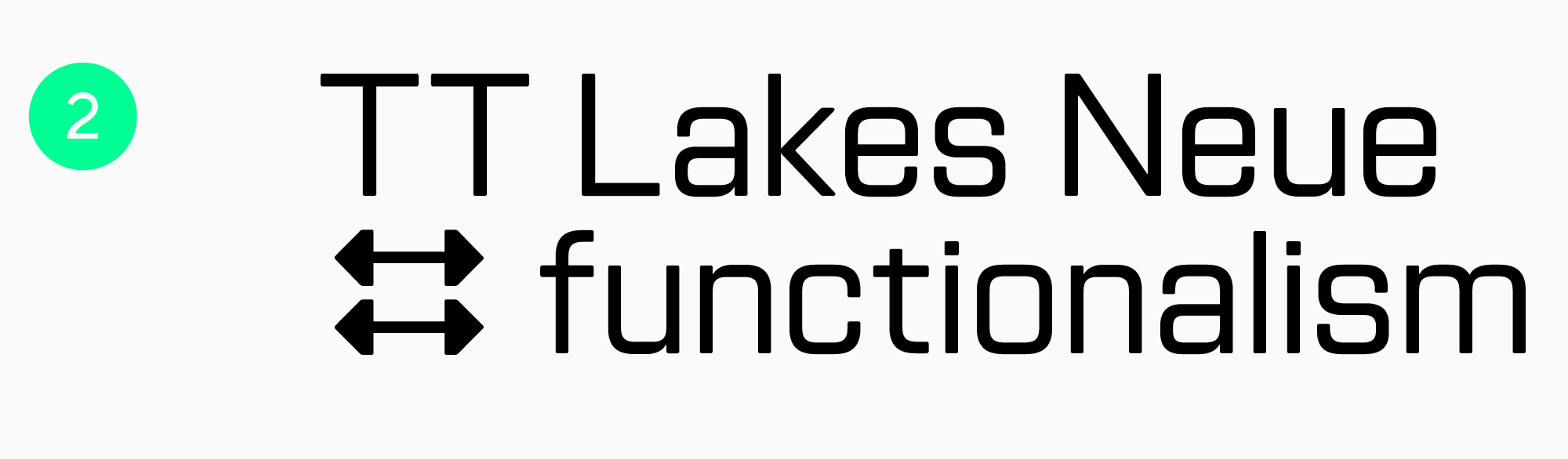
TT Lakes Neue
This geometric sans serif inspired by Finnish functionalism is an ideal tool for the gaming industry. It can adapt to work well in interfaces in diverse game genres. It can be used for eye-catching short phrases, crafting identity, and designing logos for gaming products.
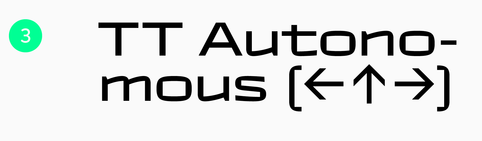
TT Autonomous
TT Autonomous is a robust sans serif with peculiar, squared forms and proportions leaning towards monospaced alignment. This typeface is well-suited for short focal texts and logos and will enhance the cool, high-tech mood of video games in the corresponding genres.
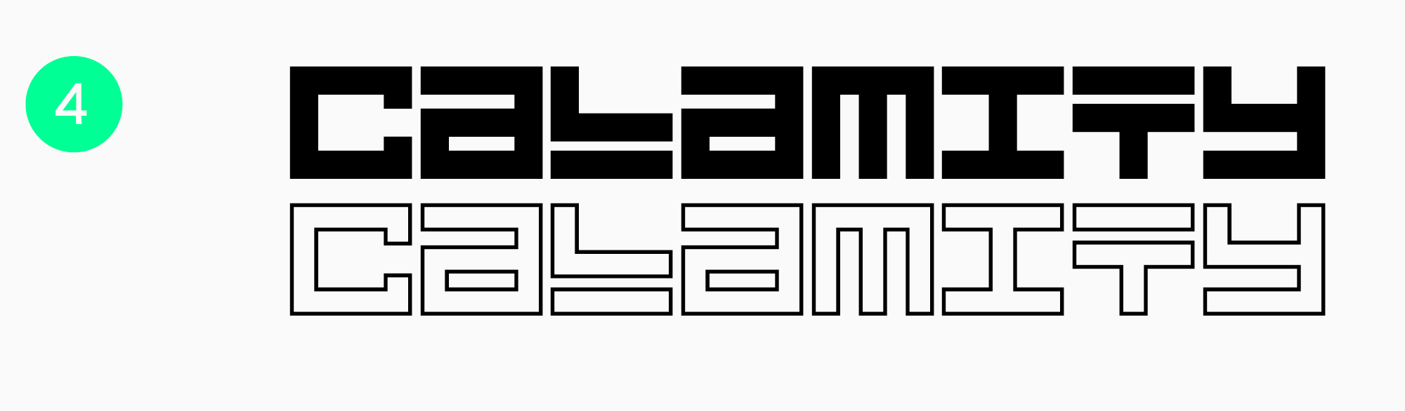
Other studios’ fonts
Calamity
Futuristic gaming fonts
Typefaces with futuristic motifs will harmonize perfectly with space-themed or dystopian video games. Such fonts stand out for their peculiar, sometimes even grotesque forms.
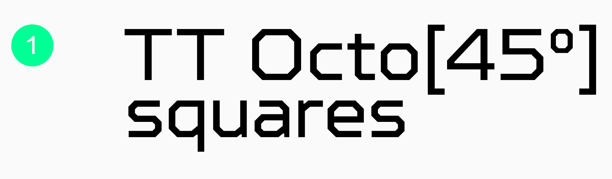
TT Octosquares
This typeface is an octagonal sans serif with a futuristic character and peculiar «mosaic» forms. TT Octosquares works best in large and medium point sizes, so we recommend using it for your game’s identity, like logos, and in large, short texts in its interface.
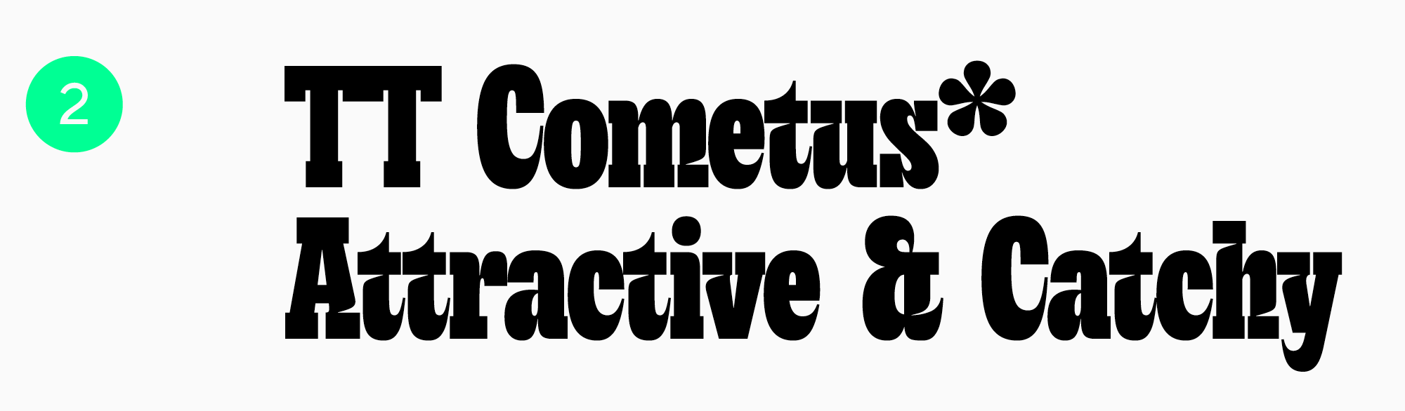
TT Cometus
This expressive and eye-catching font is best for space-themed games, which is implied by its name. TT Cometus is characterized by a friendly character, unusual serifs, and letter terminals tapered like a comet’s tail. It works best to attract gamers’ attention: in large, short texts, logos, and promo materials. TT Cometus shines best in large point sizes.
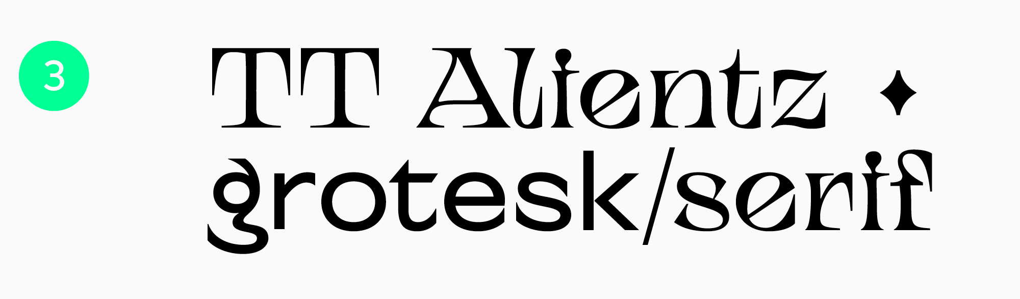
TT Alientz
Another «cosmic» font with an alien character, but a more audacious one. The typeface includes a calmer sans serif, an ultra-expressive, spiky serif, and a variable font. Thanks to this extensive set, TT Alientz can be used to design the entire game project, from main interface text and headlines to identity.
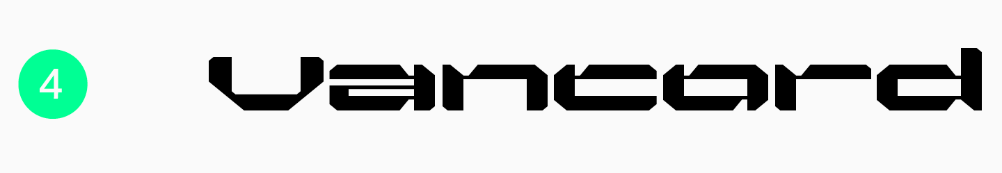
Other studios’ fonts
Vancord
Sports fonts for video games
Here are some dynamic fonts perfect for any sports-themed video game, from racing and fighting to sports simulators.
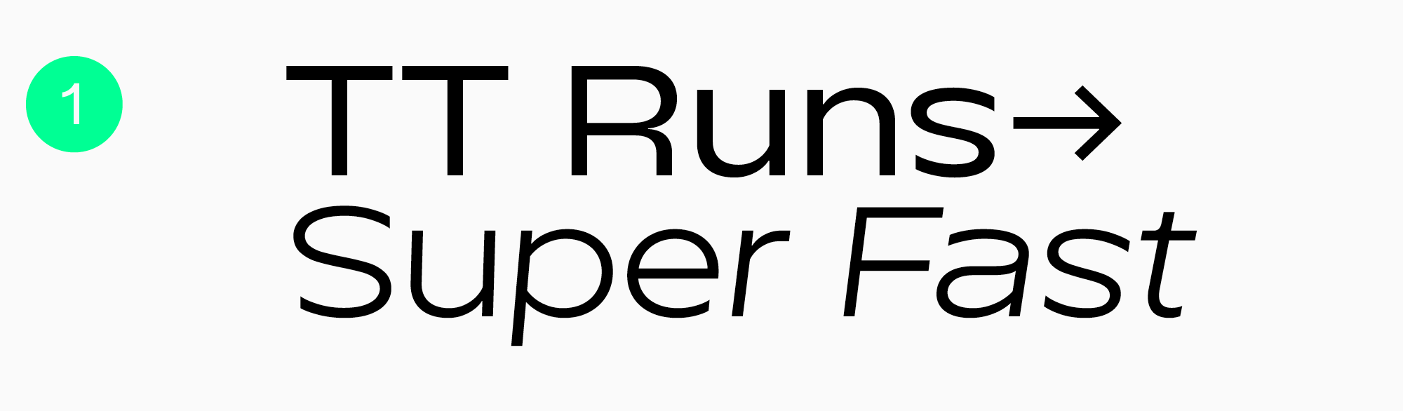
TT Runs
This wide-proportioned sans serif works especially well in racing games, as indicated in its name. TT Runs is a font designed for the sports industry. It stands out for its reverse contrast and unusual uppercase letter proportions, which make characters seem «flipped.»
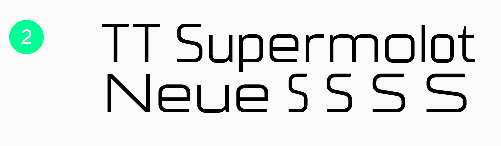
TT Supermolot Neue
This is our technological and modern sans serif designed specifically for the gaming industry. It will be a good fit for any video game, not just a sports-themed one. TT Supermolot Neue has a robust character while being flexible and dynamic. The typeface shines best in large and medium point sizes, but it maintains readability in small point sizes as well.
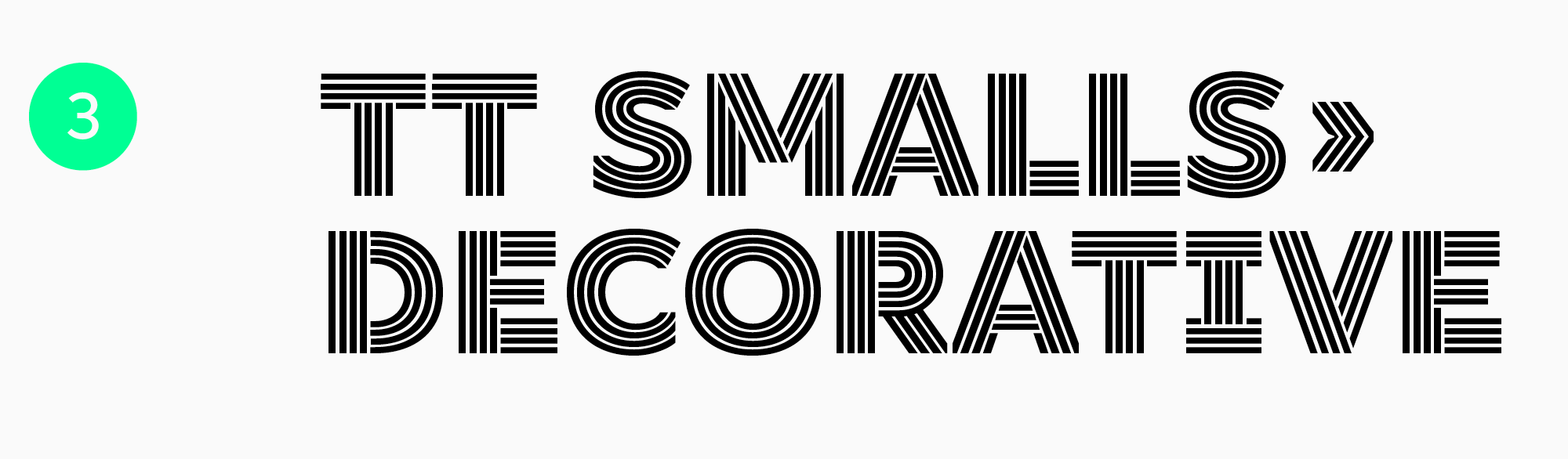
TT Smalls
This decorative typeface is perfectly suited for placing accents, designing headlines, and crafting logos for video games. TT Smalls’s unusual qualities will definitely draw attention to your gaming product!
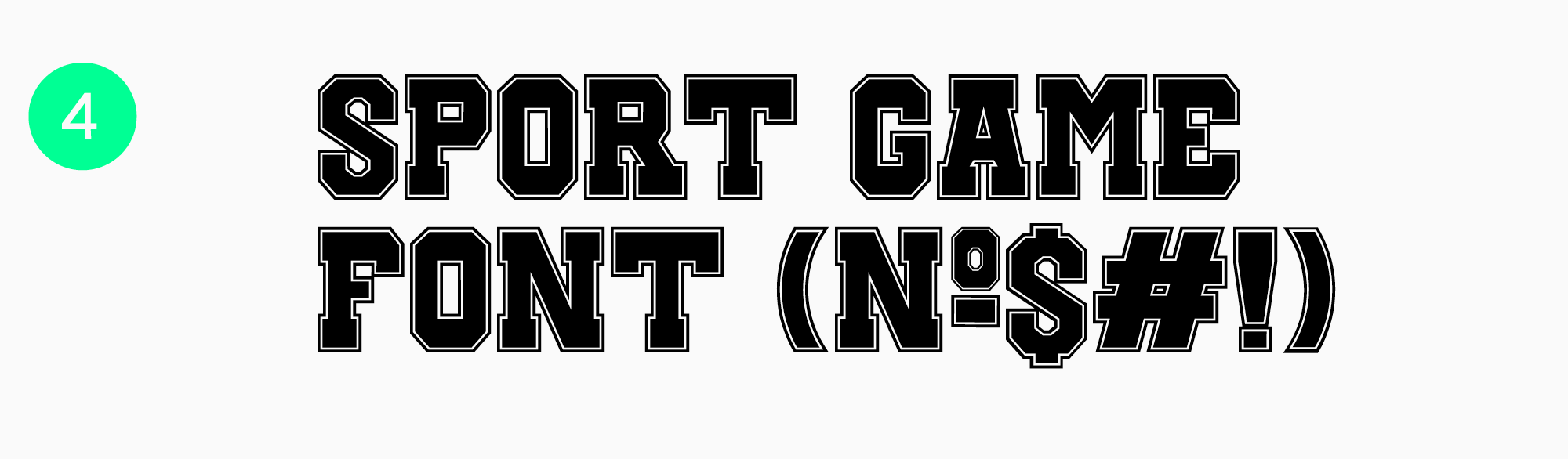
Other studios’ fonts
Sport Gamer Font
Handwritten and textured gaming fonts
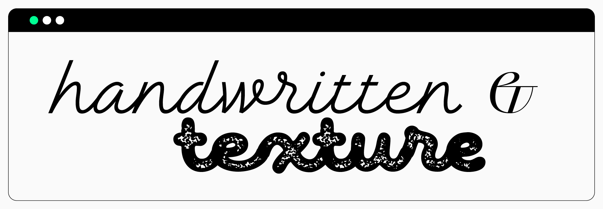
If you want a beautiful font to create a romantic, dreamy atmosphere in your video game, this list has the one you need.
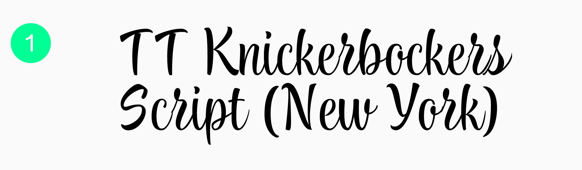
TT Knickerbockers Script
This energetic and dynamic handwritten font is inspired by life in New York. It will become the best option for designing headlines and logos in games like dating simulators and visual novels.
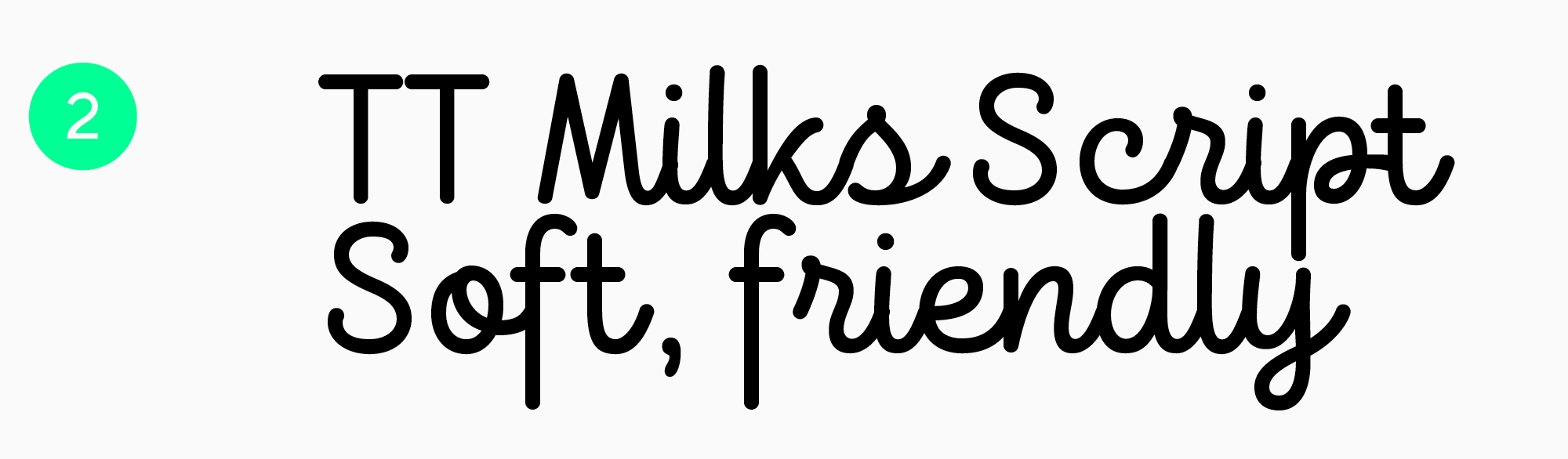
TT Milks Script
Soft, warm, friendly, carefree, and naïve—it’s all about TT Milks Script, which can infuse your video game project with the same mood. This font is an awesome fit for gaming product identity and works best in headlines and logos.
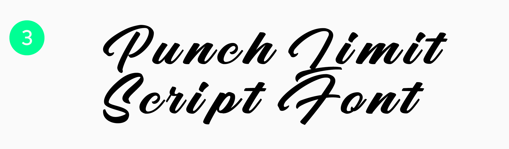
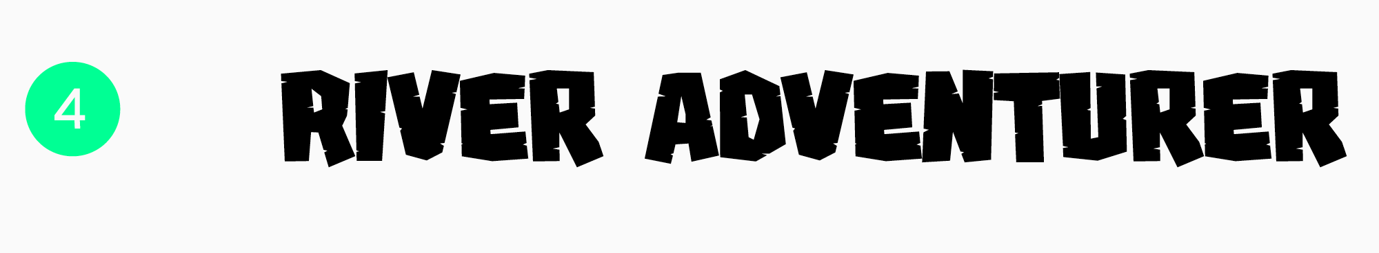
Other studios’ fonts
Punch Limit Script Font
River Adventurer — Block Gaming Font
Fun fonts for video games
Do you wish to add positivity to your video game? Fonts from this list will create a playful mood and fun atmosphere in your game.
TT Trailers
TT Trailers is a stylish and dynamic font with narrow proportions. It can become a focal point in games like exciting adventures or simulators.
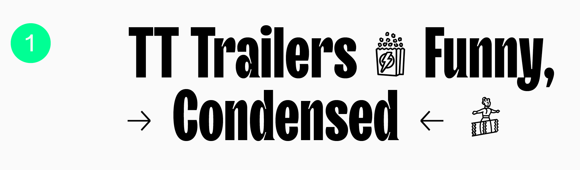
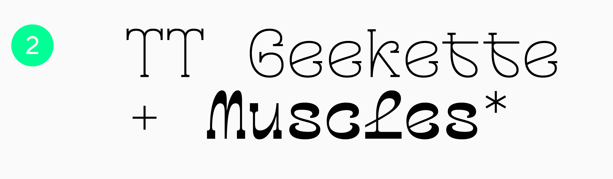
TT Geekette
TT Geekette is an experimental font with a friendly character. Original and distinctive, it will add a touch of uniqueness to your game’s design. It’s up to you to determine which gaming genre best fits this curious typeface!
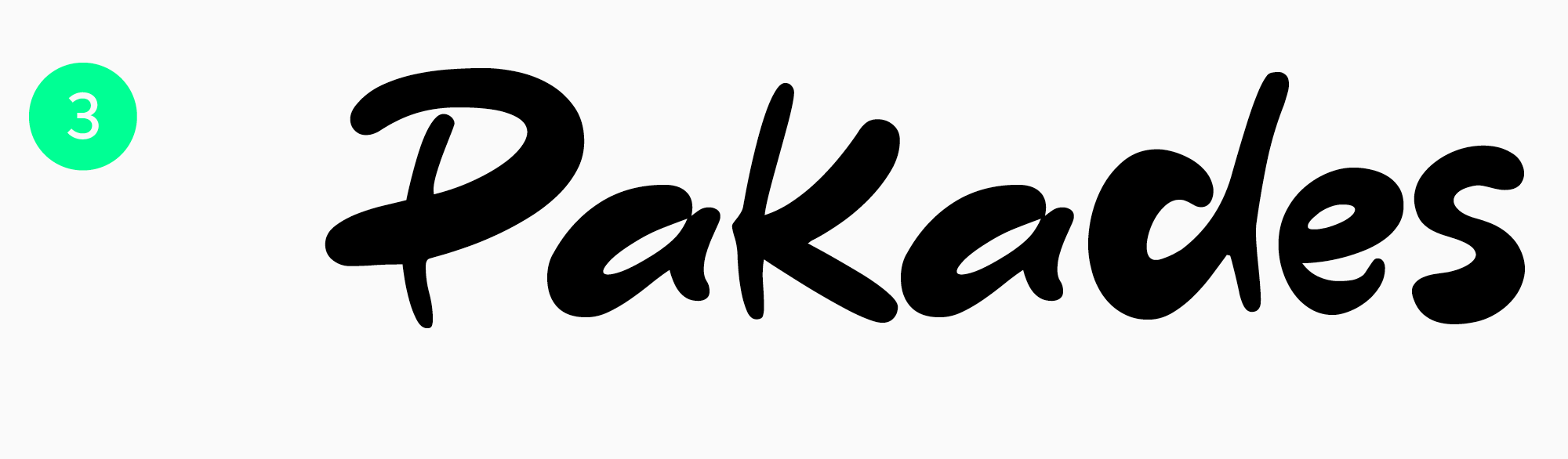
Other studios’ fonts
Pakades Fancy Font — Free Download
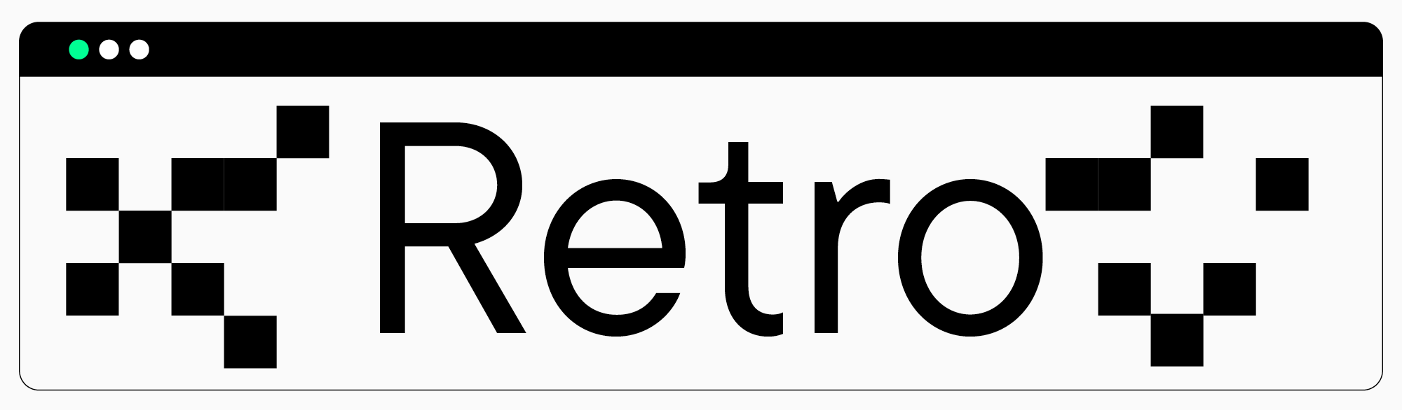
Retro fonts for video games
If you are looking to capture a retro aesthetic in their game, consider the following fonts:
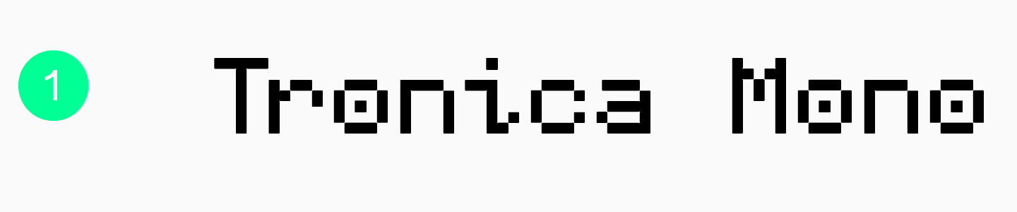
Tronica Mono
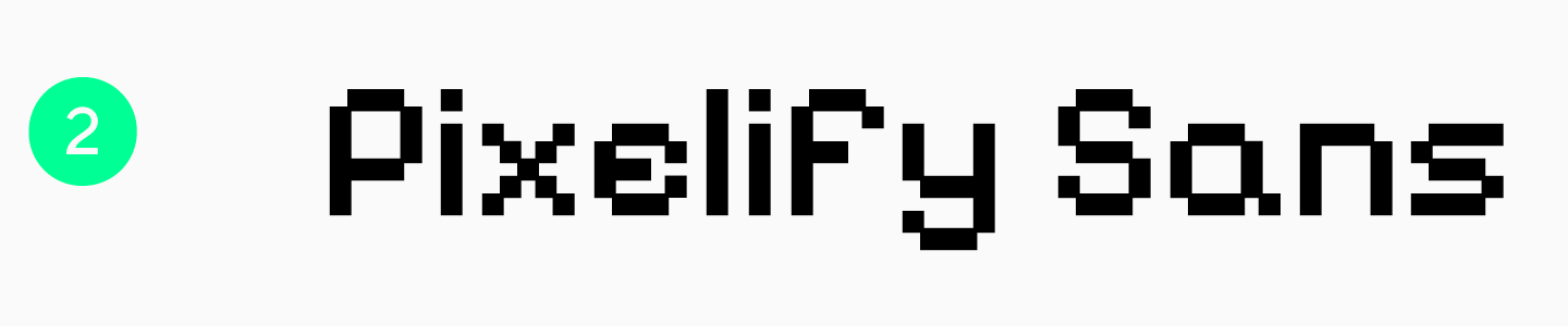
Pixelify Sans
Conclusion
Choosing the best video game fonts can be challenging, and we hope our article will make this task easier for you. Remember that a genuinely captivating design is always authentic, so develop your watchfulness and don’t be afraid to experiment!
__________________________________________________________________________________________________________________________________________________________________________
The list of fonts featured in the article is based on TypeType experts’ opinion.
FAQ
What are the best gaming fonts to use in 2026?
In the TypeType collection, you will find relevant solutions for different genres: for example, TT Carvist (bright headers/logos), TT Rounds Neue (adaptable for both identity and text), and TT Fellows (functional, convenient for layout).
What fonts are commonly used in video games?
Video games use a variety of fonts: from handwritten to futuristic. A font is needed for the game’s identity, UI headers, and body text; the main thing is that the typeface displays well on different PCs and supports a large number of languages.
What are the best fonts for gaming logos?
For a logo, the mood is more important: the font can be detailed or minimalist depending on the game style. TT Carvist or TT Rounds Neue are suitable for logos and large inscriptions.
Are gaming fonts good for UI and HUD design?
Yes, they are, but choose those that are legible and display consistently across different monitors. It is convenient to pick families with a large number of weights to cover both UI text and accents with a single typeface.
What fonts do streamers use for overlays and alerts?
For overlays, large, noticeable inscriptions are important, so display and character-rich fonts work best. We recommend TT Carvist for large headers and logo accents, while TT Fellows is a functional option.
Are there free gaming fonts for commercial use?
Yes, there are. However, for commercial purposes, you can only use those free fonts where the license explicitly permits it. Free fonts often do not guarantee support for many languages or adaptation for all devices. For game projects, we recommend fonts from proven studios. TypeType typefaces allow you to download a trial for testing before purchase.
What gaming fonts are easiest to read on screens?
Fonts without excess decoration read best: they have clean, distinct lines and no «noisy» details. For screens, it is also important that the typeface renders stably on different devices and sizes.
What fonts are best for esports branding?
« Tech » fonts with clear geometric shapes work well, creating a sense of functionality and high-tech aesthetics, such as TT Fellows.
Can I use Google Fonts for gaming projects?
You can use fonts from Google Fonts for game projects, but when publishing the game, keep a record of exactly which font you used and under which license it is distributed.
How do I choose the right gaming font for my project?
Answer three questions: what is the font needed for (logo/interface/text), what languages must the game support, and what is the mood. If possible, choose typefaces with a large number of weights—this makes it easier to maintain a unified style.