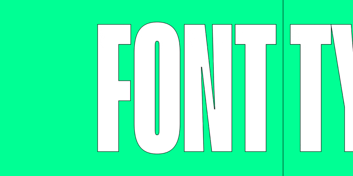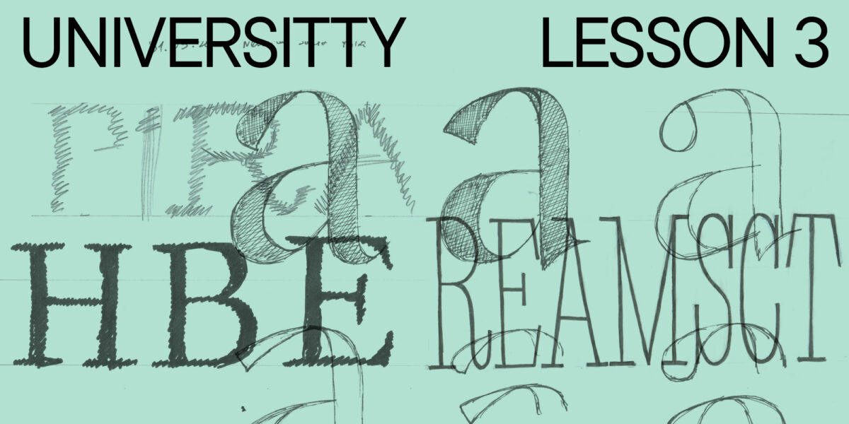
Schrift ist ein unverzichtbarer Bestandteil jedes Designs. Bei der Gestaltung von Etiketten und Verpackungen spielt sie oft sogar die Hauptrolle. Eine sorgfältig ausgewählte Schrift oder ein sorgfältig ausgewähltes Schriftpaar kann Ihr Design auffällig und funktional machen, das Markenkonzept präsentieren und das Produkt hervorheben.
Was sind also die Kriterien für die Auswahl von Schriften für das Verpackungsdesign? Das wollen wir in diesem Artikel gemeinsam herausfinden!
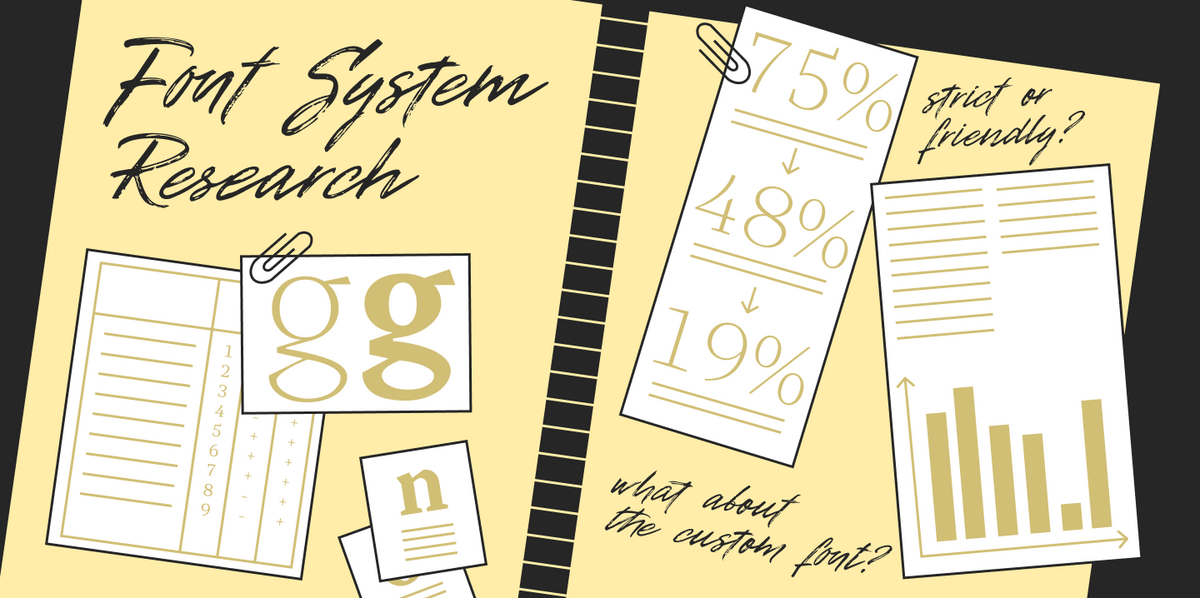
Warum ist Typografie für kommerzielle Verpackungen wichtig?
Was fällt Ihnen beim Einkaufen im Supermarkt zuerst ins Auge? Wahrscheinlich die Verpackung und der Text darauf. Das Verpackungsdesign prägt unseren ersten Eindruck vom Produkt, und die Schrift dient oft als Informationsquelle. Abgesehen davon, dass der Text mit uns kommuniziert und uns sagt, dass es sich bei dem Produkt vor uns um Brot oder Milch handelt, sendet die Schrift Signale an unser Unterbewusstsein und weckt bestimmte Assoziationen, denn jede Schrift hat ihren eigenen Charakter.
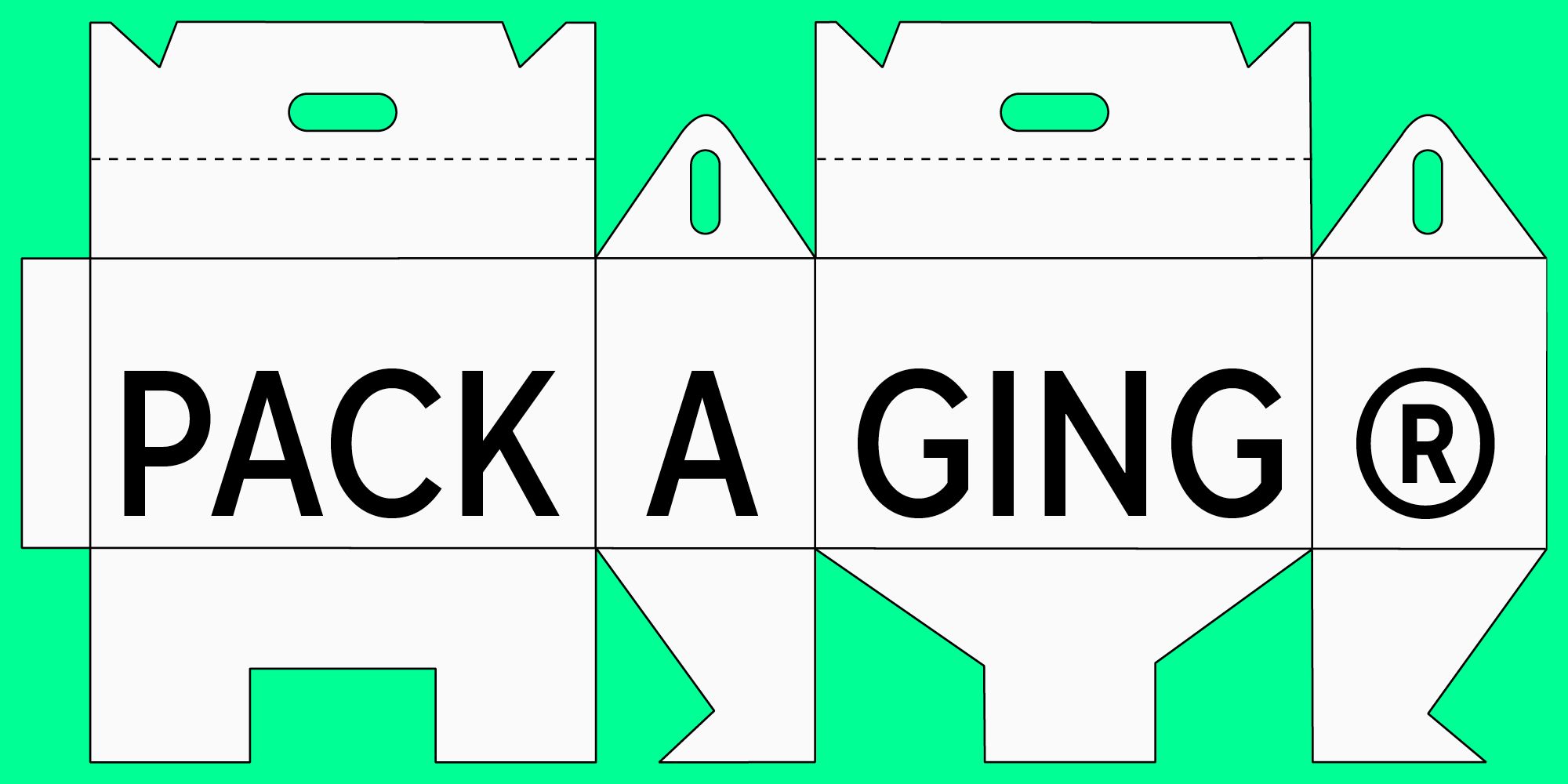
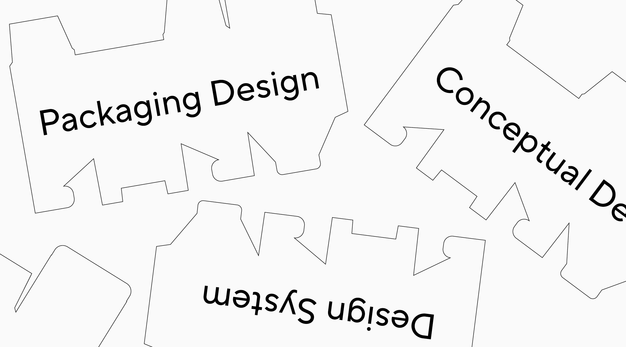
Verpackungsdesign ist ein komplexes und gut durchdachtes System. Das Konzept kann auf einer Illustration oder einer erkennbaren Farbwahl basieren. Aber ohne Schrift ist es nicht denkbar.
Text auf Verpackungen ist eine Form des kreativen Ausdrucks. Er kann den Raum dominieren, ein Muster darstellen oder Teil einer Vektorillustration sein. Manchmal kann sogar ein einziger Buchstabe für die gesamte Marke sprechen! Je nach Projekt können Schriften im Mittelpunkt des Designs stehen oder andere Elemente ergänzen. Wichtig ist in jedem Fall, dass die Schrift zur Idee des Projekts passt und diese richtig vermittelt.
Beispiele für die Funktion von Schriften im Verpackungsdesign
Um besser zu verstehen, wie Schriften im Verpackungsdesign eingesetzt werden können, sehen wir uns einige Beispiele an.
Solo-Schriften
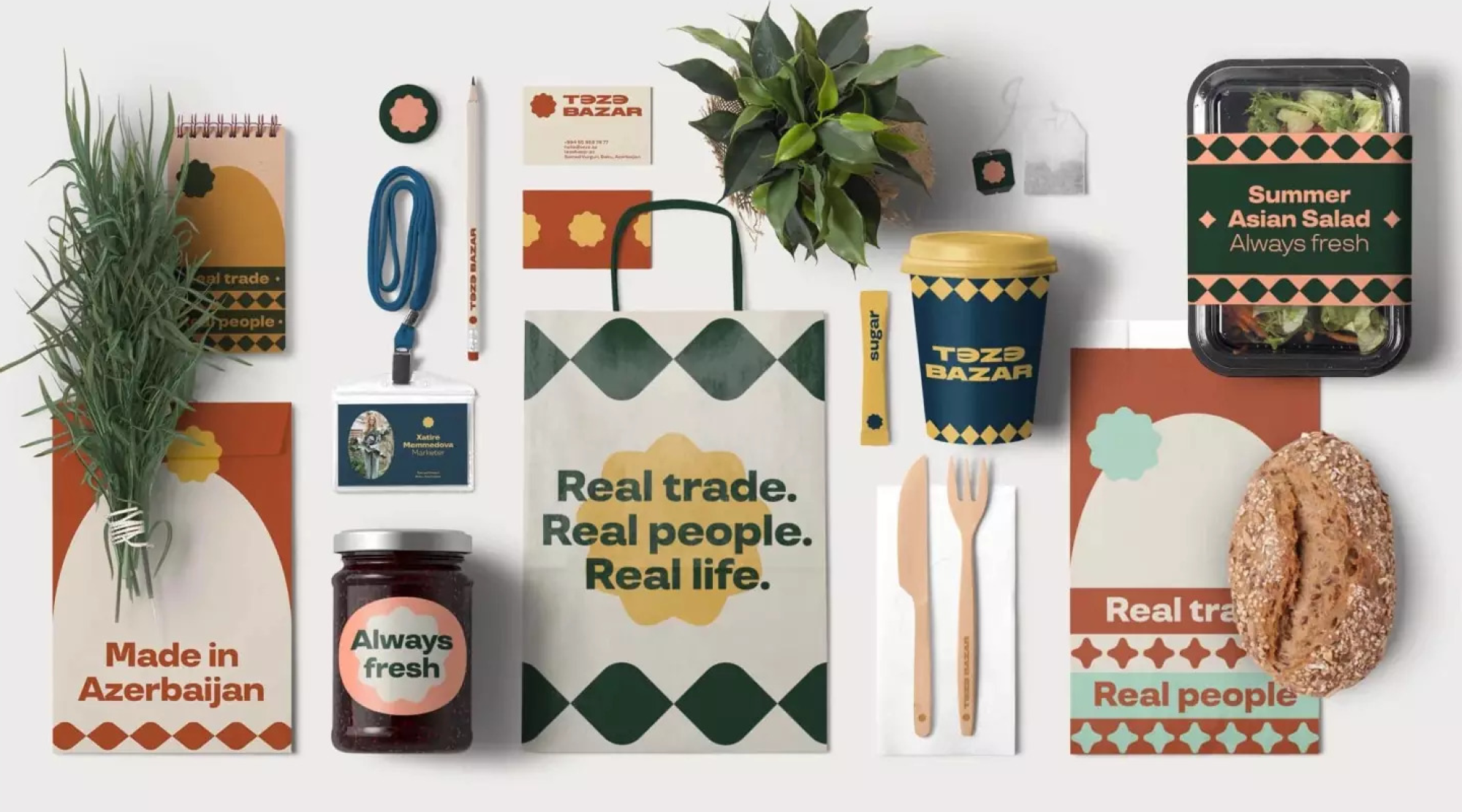
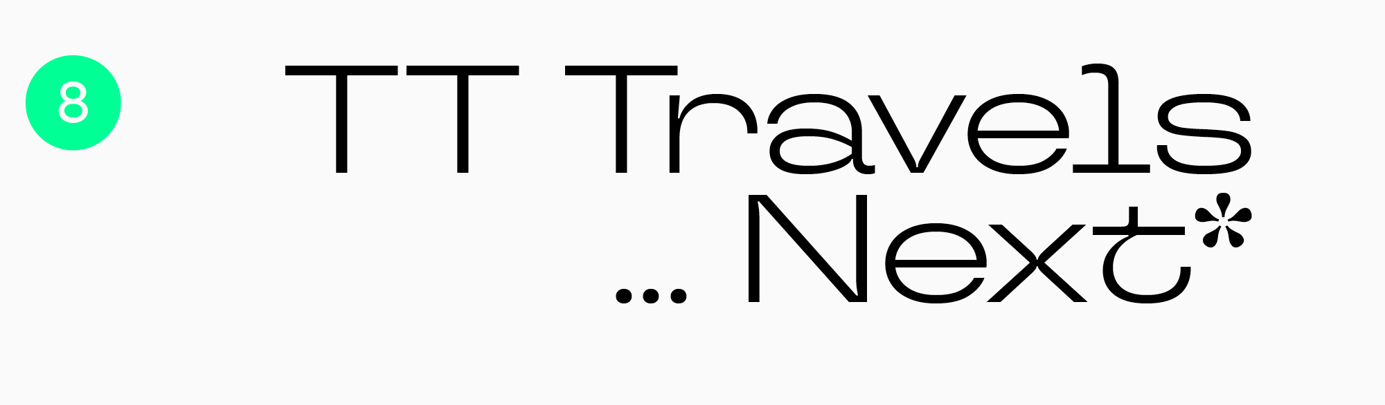
Das erste Beispiel ist eine rein typografische Verpackung, bei der der Text im Vordergrund steht. Je nach Idee kann die dominierende Schrift eine Akzidenzschrift, eine neutrale Schrift oder eine Kombination aus beiden sein. Die Schrift TT Travels wird beispielsweise für das Branding von Teze Bazar verwendet. Sie ist eine geometrische Serifenlose mit breiten Proportionen. Sie hat einen recht markanten Charakter und ist dennoch eine anpassungsfähige Schrift mit guter Lesbarkeit.
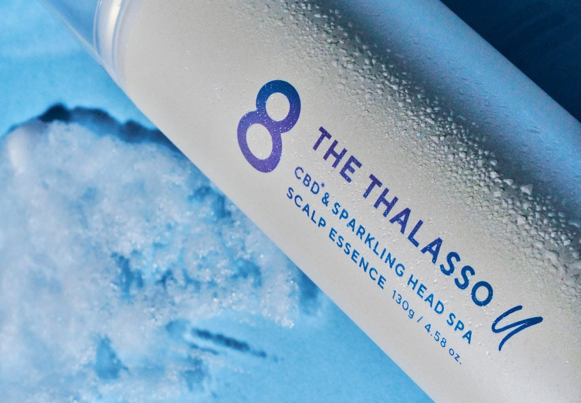
Ein weiteres gutes Beispiel ist das Design von 8 The Thalasso U, das eine neutrale geometrische Serifenlose TT Norms® Pro als Unterschrift verwendet. Das gesamte Design ist einfach und klar, mit einem Gefühl von Transparenz. Eine Displayschrift mit expressivem Charakter würde nicht zu diesem Konzept passen, da sie die Aufmerksamkeit auf sich ziehen würde. Eine einfache serifenlose Schrift ohne übertriebene Details wirkt in diesem Design jedoch sehr ausgewogen.
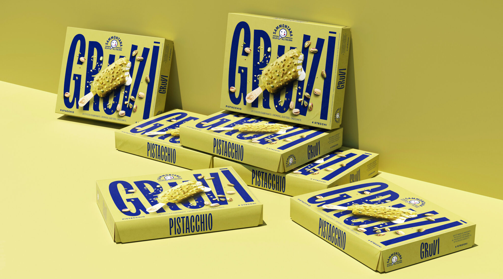
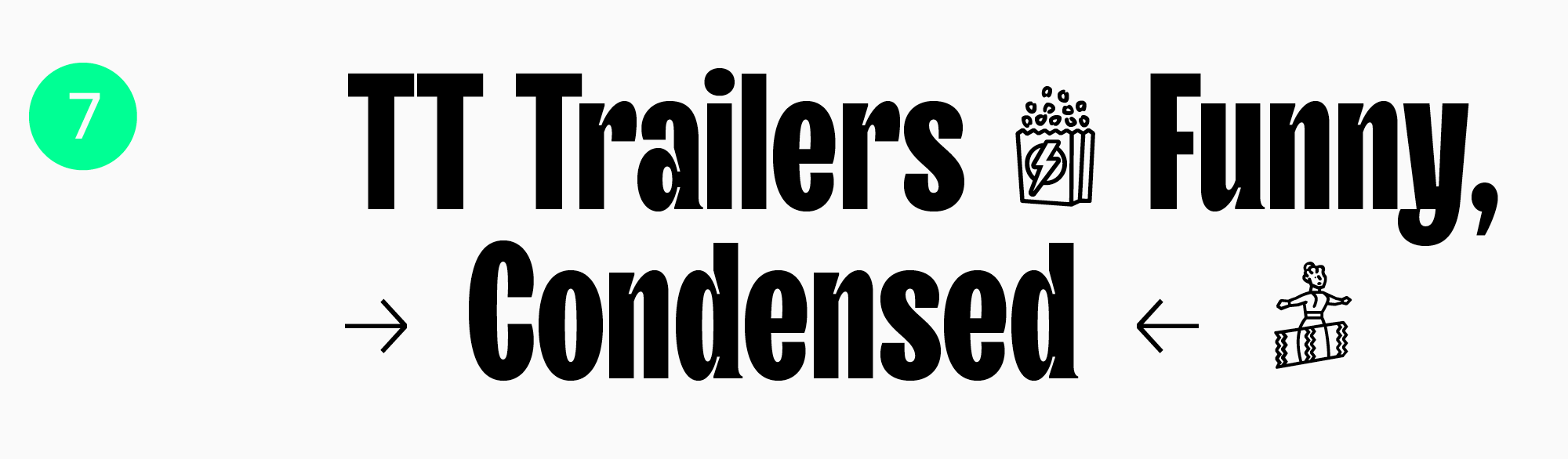
Ein weiteres Beispiel, diesmal für eine einzelne Displayschrift, ist die Eiscreme-Verpackung Sammontana Gruvi mit TT Trailers. Diese ausdrucksstarke, humanistische Serifenlose zieht die Aufmerksamkeit auf sich, da sie perfekt zu dem dynamischen und gewagten Design passt.
Neutrale und expressive Schriftpaare
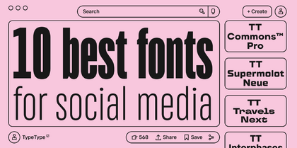
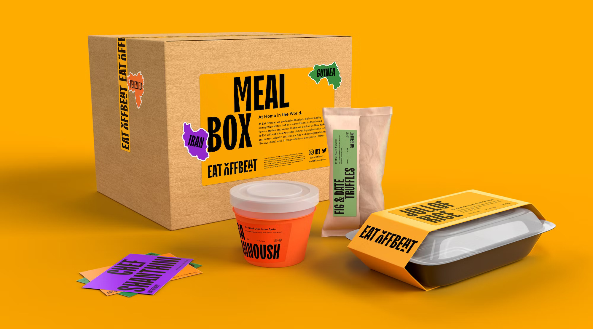
Die zweite Möglichkeit besteht darin, zwei Schriften im Design zu verwenden: eine Akzidenzschrift und eine Textschrift. Erstere setzt Akzente, hebt den Markennamen hervor und unterstreicht die Einzigartigkeit der Marke. Die zweite dient als Basis und gewährleistet die Lesbarkeit des Haupttextblocks. Diese Lösung wird in der Markenidentität von Eat Offbeat umgesetzt. Für das Logo und große Texte wird die lebendige Schrift TT Trailers verwendet, während der Haupttext in der anpassungsfähigen TT Commons™ Pro geschrieben wird.
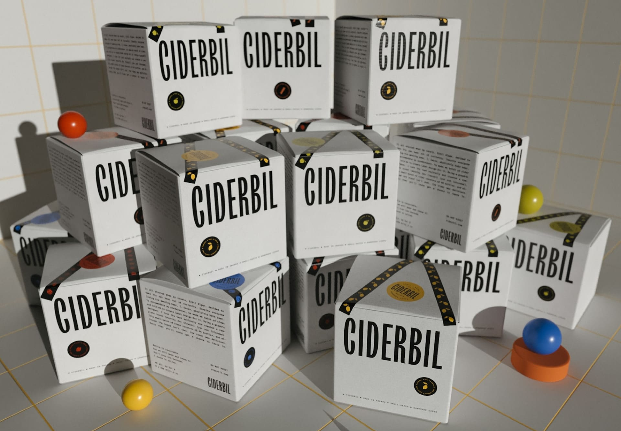
Ein weiteres Beispiel für ein gut abgestimmtes Schriftpaar auf der Verpackung ist die Markenidentität der Ciderbil-Getränke. Auch hier spielt unser Filmstar TT Trailers die Hauptrolle, während IBM Plex Mono von Bold Monday die unterstützenden Rollen übernimmt.
Welche Schriften eignen sich am besten für das Verpackungsdesign?
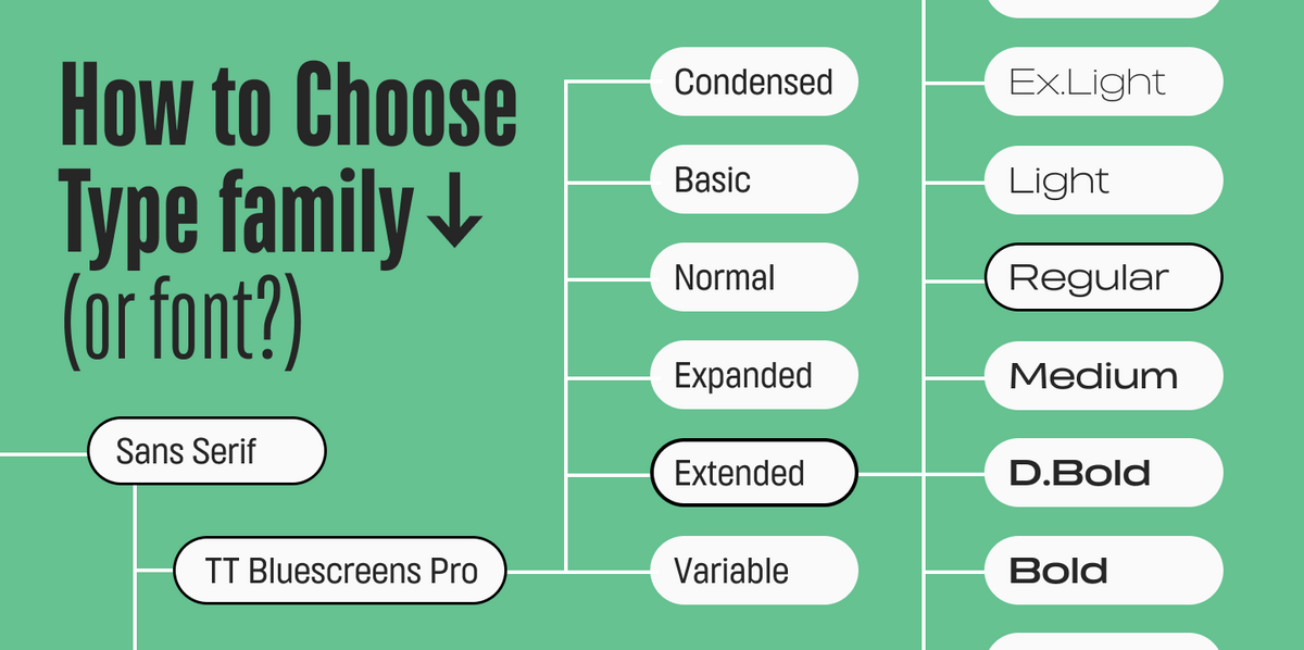
Nun, fast jede Schrift kann Teil des Verpackungsdesigns sein. Man kann die Schriften grob in neutrale Schriften und Displayschriften einteilen, wobei neutrale Schriften allein verwendet werden können, um die Eleganz und Schlichtheit des Projekts zu unterstreichen, oder in Kombination mit einer Displayschrift. Alles hängt also von der Idee des Projekts ab.
Es gibt jedoch einige Kriterien, die Sie bei der Auswahl einer Schrift berücksichtigen sollten.
- Lesbarkeit. Unabhängig davon, ob Sie sich für eine lebhafte und ungewöhnliche oder eine neutrale Schrift entscheiden, muss sie gut lesbar sein, damit sie für den Namen, das Produkt oder das Logo der Marke verwendet werden kann;
- Qualität. Vergewissern Sie sich, dass die gewählte Schrift von ausreichender Qualität ist. Für das Verpackungsdesign ist es wichtig, dass die Schrift auf verschiedenen Medien gleich gut aussieht, da alle Modelle gedruckt werden;
- Funktionalität. Um ein auffälliges Verpackungsdesign zu erstellen, benötigen Sie möglicherweise verschiedene Funktionen, z. B. die Möglichkeit, einzelne Zeichen zu transformieren. Wählen Sie moderne Schriften, die solche Möglichkeiten bieten.
Wenn es um Funktionalität geht, empfehlen wir Ihnen, einen Blick auf variable Schriften zu werfen. Damit können Sie eine Schrift auswählen und ihre Breite, Stärke, Neigung und vieles mehr verändern. Das allgemeine Erscheinungsbild der Buchstaben bleibt dabei erhalten, so dass sie immer noch leicht zu erkennen sind. Viele TypeType-Schriften enthalten variable Schriftschnitte.
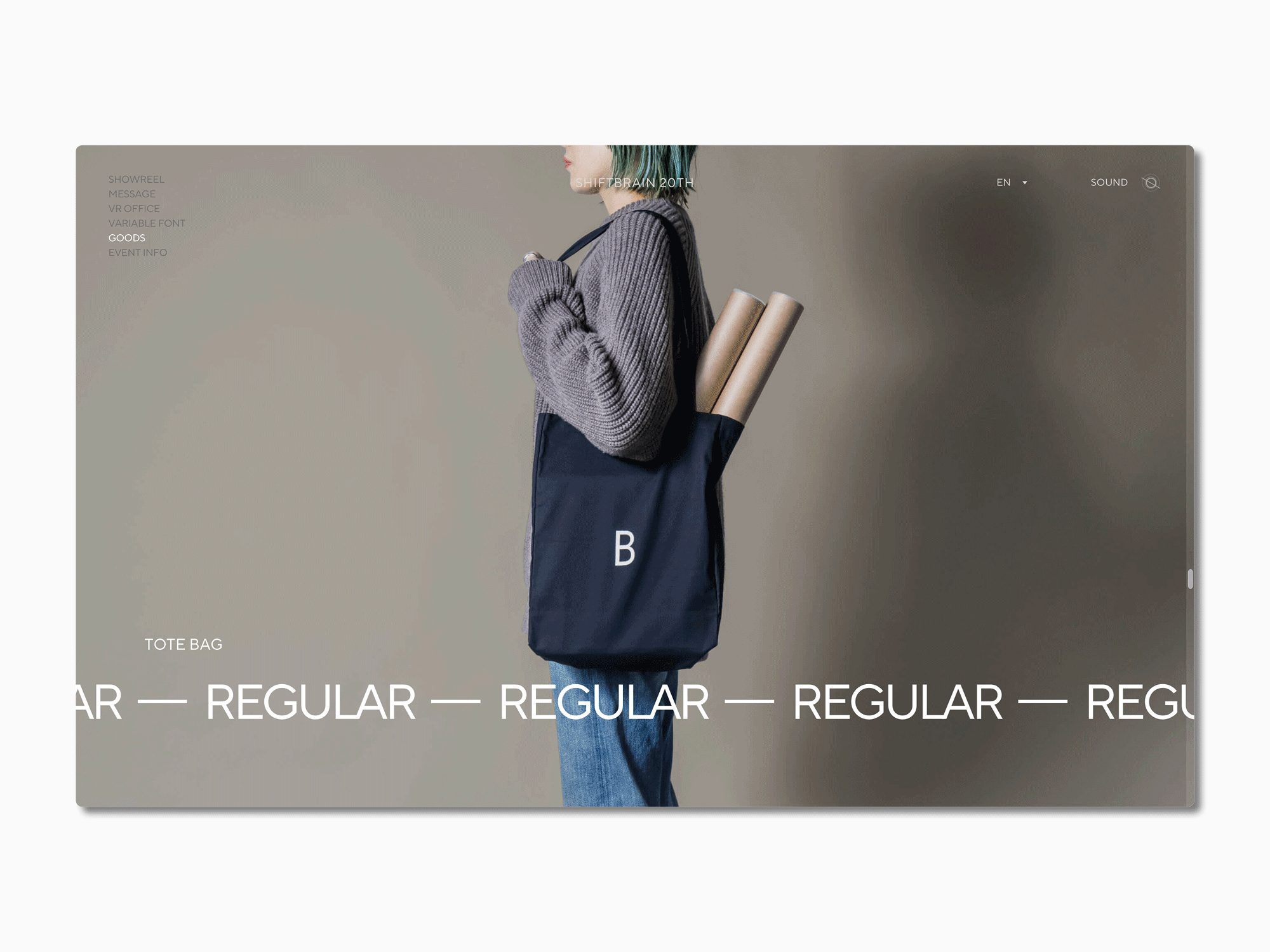
By using a variable font, you can increase your design’s flexibility and adjust the font to different packaging formats. A great example of this is the website of SHIFTBRAIN, which implemented a customized version of our TT Norms® Pro into their design to celebrate the company’s 20th anniversary.
Durch die Verwendung einer variablen Schrift können Sie die Flexibilität Ihres Designs erhöhen und die Schrift an verschiedene Verpackungsformate anpassen. Ein gutes Beispiel dafür ist die Website von SHIFTBRAIN, die anlässlich des 20-jährigen Firmenjubiläums eine angepasste Version unserer TT Norms® Pro in ihr Design integriert hat.
Eine Liste der besten Verpackungsschriften für Ihr Design
Wir haben die besten Schriften für Etiketten und Verpackungen aus der TypeType-Kollektion ausgewählt. In dieser Liste finden Sie sowohl ausdrucksstarke als auch neutrale Schriften für verschiedene Aufgaben. Jeder Font in der Liste erfüllt die oben genannten Kriterien und eignet sich ideal für ein hochwertiges, schönes und stilvolles Design. Die meisten Schriften enthalten variable Schriftschnitte.
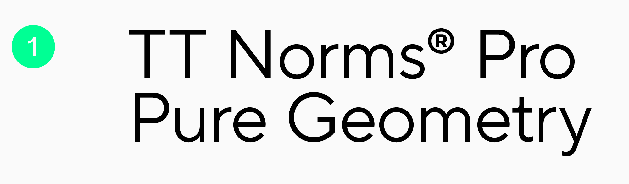
TT Norms Pro
Diese funktionale, geometrische Serifenlose ist sehr vielseitig und für jeden Anlass geeignet. Sie ist neutral und lässt sich gut mit Akzidenzschriften kombinieren. Die Schrift enthält den variablen Schriftschnitt TT Norms® Pro Variable mit drei Variationsmöglichkeiten: Gewicht, Breite und Neigung. TT Norms Pro kann als Basis für alle Experimente dienen und ermöglicht es Ihnen, bei jedem Projekt eine Vielzahl von Möglichkeiten für das Verpackungsdesign auszuprobieren.
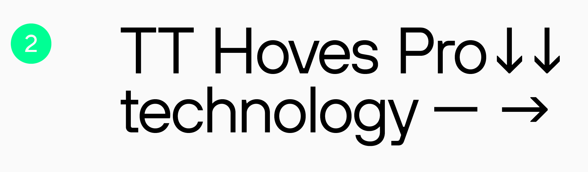
TT Hoves Pro
Eine weitere vielseitige serifenlose Schrift mit einem neutralen, aber unverkennbaren Charakter. Auch diese Schrift verfügt über einen variablen Schriftschnitt mit drei einstellbaren Achsen: Gewicht, Breite und Neigung. TT Hoves Pro ist eine ausgezeichnete Wahl für moderne Projekte.
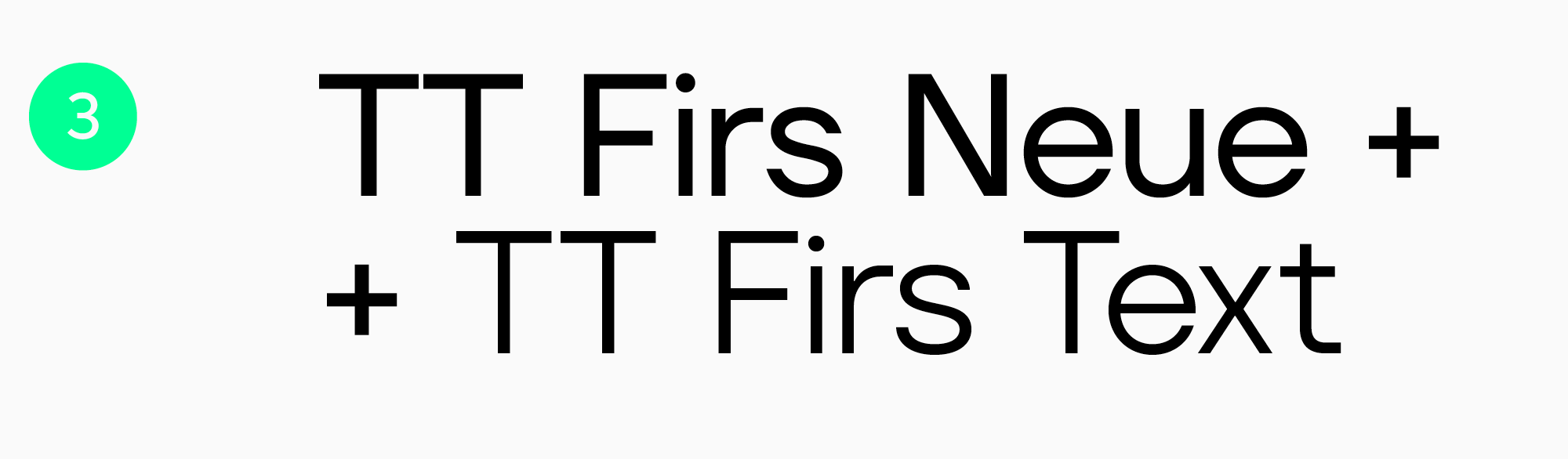
TT Firs Neue + TT Firs Text
Ein ideales Schriftpaar. TT Firs Neue ist eine skandinavische Groteskschrift mit ausdrucksstarken Elementen, TT Firs Text eine elegante Textschrift. Zusammen ergeben sie ein unverwechselbares und stilvolles Design. Beide Schriften verfügen über einen variablen Schriftschnitt mit zwei Variationsachsen: Gewicht und Neigung. Dieses Schriftpaar eignet sich hervorragend für Projekte, bei denen Minimalismus mit Ausdrucksstärke kombiniert wird.
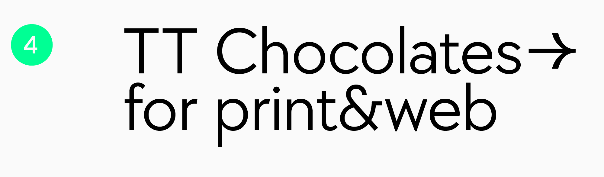
TT Chocolates
TT Chocolates ist eine elegante und auffällige humanistische Groteskschrift. Der Name der Schrift spricht für sich: Sie eignet sich perfekt für das Verpackungsdesign von Süßwaren. Aber das ist nicht das einzige Einsatzgebiet der TT Chocolates – ihr technischer Charakter lädt zum Experimentieren ein. Die Schrift enthält einen variablen Schriftschnitt, so dass Sie Ihrer Fantasie freien Lauf lassen können!
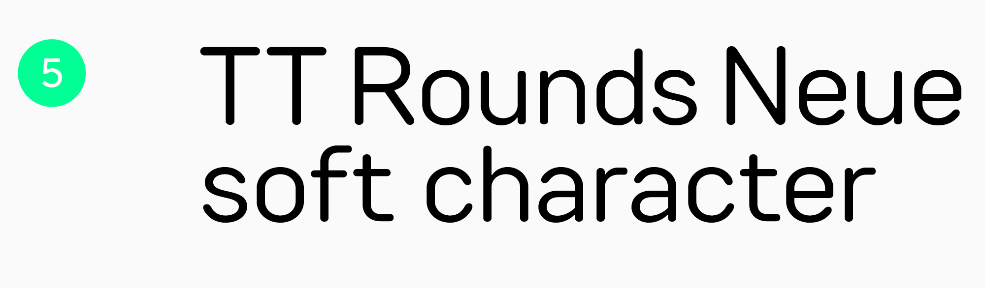
TT Rounds Neue
Eine bemerkenswerte Schrift mit runden Formen und einem weichen, verspielten Charakter. TT Rounds Neue eignet sich hervorragend für die Gestaltung von Verpackungen für Kinder, Lebensmittel, Büroartikel und vieles mehr. Die Schrift verfügt über einen variablen Strich mit drei einstellbaren Achsen: Gewicht, Breite und Neigung.
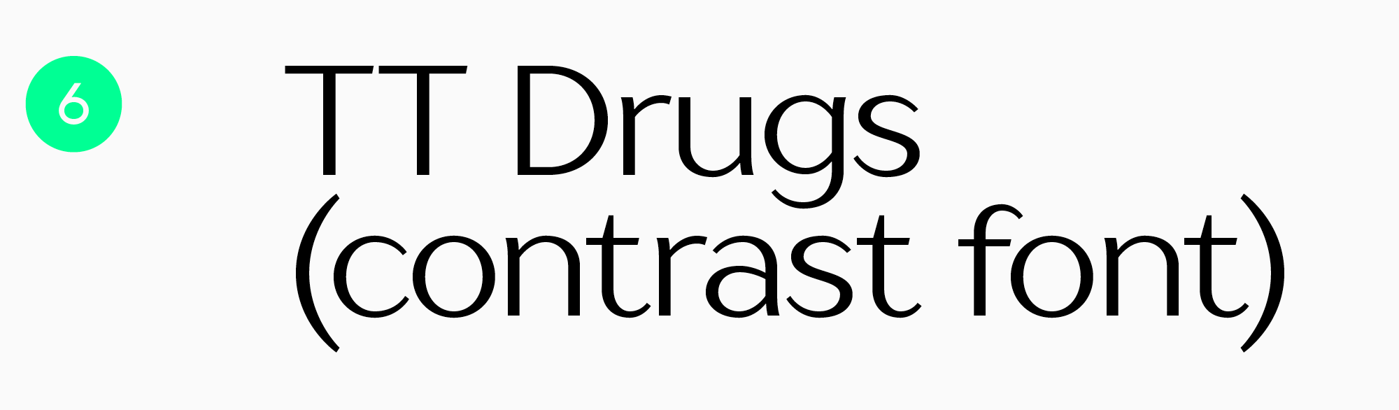
TT Drugs
Diese Schrift wurde speziell für die Pharmaindustrie entwickelt. Sie eignet sich hervorragend für die Gestaltung von Verpackungen für Reinigungsmittel, Haut- und Haarpflegeprodukte sowie Elektronik. Sie ist jedoch nicht auf diese Anwendungsbereiche beschränkt. Anspruchsvoll und modern wirkt sie auch auf Verpackungen von Süßwaren, Getränken und sogar Büchern. Lassen Sie Ihrer Phantasie freien Lauf! Die Schrift eignet sich für den Druck auf alle Materialien von Karton bis Metall.
TT Trailers
Eine atemberaubende und lebendige humanistische Sans Serif-Schrift, die definitiv Eindruck macht. Ursprünglich war TT Trailers als Schrift für die Filmindustrie gedacht. Ihr Einsatzgebiet ist jedoch viel breiter: Die Schrift passt zu fast allem, von Lebensmitteln und Getränken bis hin zu Kleidung und Accessoires. Die Schrift hat einen variablen Schriftschnitt mit zwei Variationsachsen: Gewicht und Neigung.
TT Travels Next
Diese serifenlose Displayschrift mit großen Proportionen ist ultra-stilvoll, einzigartig, experimentell und in der Lage, jeder Verpackung eine ausdrucksstarke und mutige Note zu verleihen. Die Schrift enthält zwei Outline-Schriften, die eine perfekte Ergänzung zu den Antiquaschriften darstellen. Darüber hinaus verfügt sie über einen variablen Schriftschnitt mit zwei einstellbaren Achsen: Gewicht und Neigung. All diese Eigenschaften machen die Schrift sehr anpassungsfähig und für nahezu jeden Anwendungsbereich geeignet.
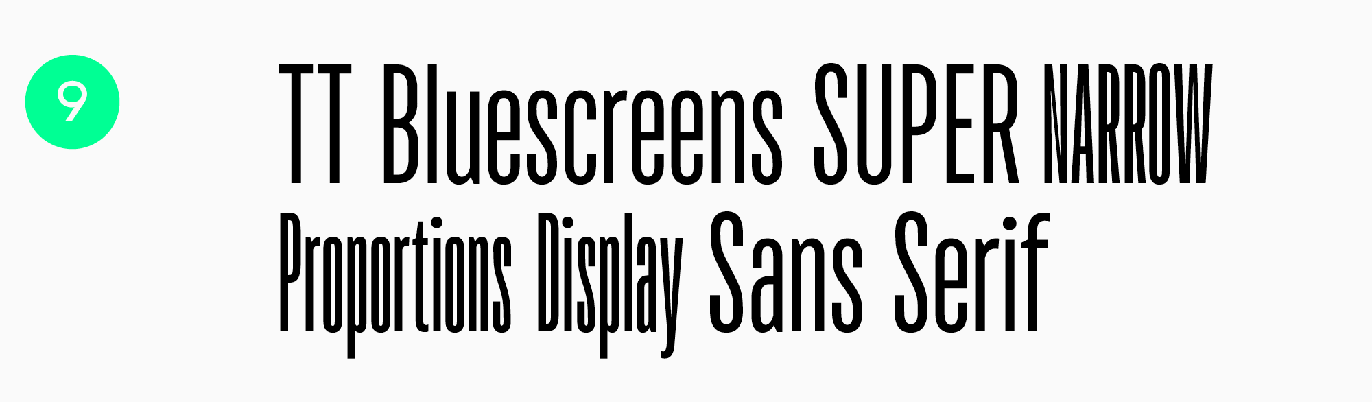
TT Bluescreens
Diese geometrische, serifenlose Schrift mit schmalen Proportionen hat einen hohen Wiedererkennungswert und eine neutrale Ausstrahlung, so dass sie sich mit ihrem auffälligen Charakter für die unterschiedlichsten Projekte eignet. Darüber hinaus verfügt die Schrift über einen variablen Schriftschnitt mit drei Variationsachsen: Gewicht, Breite und Neigung. Zusammen mit den „gestreckten“ Proportionen ermöglichen diese Eigenschaften die Anpassung der Schrift an unterschiedliche Verpackungsformate.
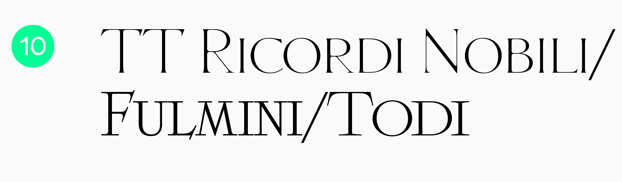
TT Ricordi
Diese Schrift besteht aus drei Display-Serifen, die von antiken Inschriften inspiriert sind. Jede Schrift schafft ihre eigene Atmosphäre, aber alle drei haben eines gemeinsam: Sie wirken modern, obwohl sie einen historischen Kern haben. Die Schriften der Kollektion TT Ricordi werden zu einem lebendigen Detail auf der Verpackung.
Fazit
In diesem Artikel haben wir die Möglichkeiten des Einsatzes von Schriften im Verpackungsdesign aufgezeigt und Beispiele für gut gemachte Fälle gegeben. Es handelt sich dabei jedoch nur um Empfehlungen und nicht um allgemeingültige Wahrheiten.
Es gibt kein erprobtes und absolut flexibles Rezept für ein ideales Design, und es gibt nicht nur eine beste Schrift für Verpackungen. Jedes Projekt ist einzigartig, und verschiedene Designer können dieselbe Schrift auf unterschiedliche Weise einsetzen. Experimentieren Sie ruhig, denn die Suche nach neuen Gestaltungsmöglichkeiten ist der faszinierendste Teil des Prozesses!
FAQ
Welche Schriftmerkmale verbessern die Lesbarkeit auf kleinformatigen Verpackungen?
Hilfreich sind offene Buchstabenformen, eine moderate Breite, ausreichend kräftige Striche und ein ruhiges, nicht überladenes Schriftbild. Auch die Abstände sind wichtig: Zu enger Satz in kleinen Größen wirkt schnell wie ein Fleck.
Wie beeinflussen Drucktechnologien die Wahl der Schrift für Verpackungen?
Beim Drucken kann Farbe verlaufen und feine Details können verloren gehen, besonders auf strukturierten Materialien. Deshalb sollte man zu dünne Striche und zu starke Kontraste vermeiden und vor der Auflage unbedingt einen Probedruck machen.
Welche Schriften eignen sich am besten für das Branding von ökologischen und nachhaltigen Produkten?
Oft funktionieren wärmere und menschlichere Lösungen besonders gut: weiche Groteskschriften, ruhige Serifenschriften und Details ohne visuelle Härte. Wichtig ist, dass der Charakter die Idee von Natürlichkeit unterstützt und der Text auch in kleiner Größe gut lesbar bleibt.
Wie beeinflussen Kennzeichnungspflichten und regulatorische Vorgaben typografische Entscheidungen?
Vorgaben zu Mindestgröße und Lesbarkeit zwingen dazu, die Hierarchie sorgfältig zu planen: Was muss groß sein, was darf in den Hintergrund treten und was darf nicht dekorativ versteckt werden. Häufig bestimmen gerade die Pflichtangaben die Wahl einer funktionaleren Schrift und passender Abstände.
Welche Schriftpaare funktionieren am besten auf Produktetiketten?
Ein bewährtes Prinzip ist eine neutrale Schrift für Zutaten und technische Informationen plus eine markantere Schrift für Produktname und Geschmacksrichtung. Das Paar sollte sich in Funktion und Ton unterscheiden, aber dennoch einen gemeinsamen Rhythmus haben, damit die Verpackung als Einheit wirkt.
Wie kann Typografie den wahrgenommenen Wert eines Produkts steigern?
Eine klare Hierarchie, ein sauberer Satz und gut gestaltete Buchstabendetails vermitteln den Eindruck eines durchdachten Produkts. Hochwertigkeit entsteht oft eher durch Luft, Ruhe im Schriftbild und präzise Akzente als durch laute Dekoration.
Welche Schriften sind für Lebensmittelverpackungen wirkungsvoller: mit oder ohne Serifen?
Darauf gibt es keine allgemeingültige Antwort: Groteskschriften wirken oft modern und sauber, Serifenschriften können Tradition und Vertrauen vermitteln. Entscheidend sind der Charakter der Marke und die Druckbedingungen, anschließend sollte die Lesbarkeit in realer Größe und auf dem tatsächlichen Material geprüft werden.
Wie beeinflussen mehrsprachige Etiketten die Schriftwahl?
Benötigt wird eine Schrift mit guter Sprachunterstützung und einem gleichmäßig starken Erscheinungsbild in verschiedenen Schriftsystemen. Ebenso wichtig ist, dass Ziffern, Zeichen und Diakritika vollständig ausgearbeitet sind, damit keine Informationen fremd wirken oder im Satz Probleme verursachen.
Welche Rolle spielen Kerning und Buchstabenabstand im Verpackungsdesign?
Auf Verpackungen sind Abstände entscheidend: Sie sichern die Lesbarkeit in kleinen Größen und auf unruhigen Hintergründen. Oft ist es sinnvoll, den Buchstabenabstand in technischen Textblöcken leicht zu erhöhen und das Kerning in größeren Produktnamen gezielt separat anzupassen.
Wie beeinflussen metallische Veredelungen und Prägungen die Lesbarkeit einer Schrift?
Reflexe und Reliefs können feine Elemente verschlucken und Buchstaben schnell in visuelles Rauschen verwandeln, besonders bei schrägem Lichteinfall. Für solche Effekte eignen sich einfachere Formen, etwas größere Schriftgrade und ausreichend kräftige Striche meist besser.