Einleitung
Die Wahl der besten Leseschrift ist eine Herausforderung, der wir uns öfter stellen müssen, als es zunächst den Anschein hat. Für große Projekte wie die Erstellung einer Website, die Gestaltung eines Buches oder die Entwicklung einer mobilen Anwendung kann eine gut lesbare Schrift erforderlich sein. Aber auch bei den kleinen Dingen des Alltags stellt sich die Frage nach der besten Leseschrift.
Welche Schrift eignet sich am besten zum Lesen? Was macht eine Schrift gut lesbar? Welche Schriften eignen sich besser zum Lesen von Büchern und welche besser zum Lesen am Bildschirm? Diese und einige andere Fragen sollen in diesem Artikel beantwortet werden.
Warum ist es wichtig, gut lesbare Schriften zu verwenden?
Stellen Sie sich vor, Sie versenden das Produkt, in das Sie so viel Mühe investiert haben, an einen Kunden. Sie haben eine schöne Verpackung gewählt und versprochen, es so schnell wie möglich zu liefern. Leider ist der Zustelldienst langsam und das Paket fällt unterwegs herunter und wird schmutzig. Der Inhalt des Pakets bleibt derselbe, aber der Kunde verliert Zeit und Geduld beim Warten. Der erste gute Eindruck wird durch ein schmutziges und ramponiertes Paket, das sich nur mit Mühe öffnen lässt, völlig verdorben. Der Kunde wird wahrscheinlich nichts mehr bei Ihnen bestellen.
Ein Schriftzug in dieser Analogie ist der Lieferservice. Sie hat Einfluss darauf, wie leicht und angenehm es für den Benutzer ist, die Informationen, die Ihr Text vermittelt, wahrzunehmen. Manche Schriften eignen sich zum schnellen Lesen, andere sind schwer zu lesen und lenken vom Sinn des Textes ab.
Das bedeutet jedoch nicht, dass einige Schriften eindeutig gut und andere eindeutig schlecht sind. Es kommt darauf an, wo man sie einsetzt: Eine perfekte Schriftart für ein Banner ist vielleicht nicht die erste Wahl für eine Website, und die beste Schriftart für Layoutdesign funktioniert vielleicht nicht so gut auf einem Schild.
Deshalb wollen wir zunächst herausfinden, welche Schriftarten für welchen Zweck geeignet sind.
Welche Schriften eignen sich am besten zum Lesen?
Alle Schriften lassen sich nach ihrem Verwendungszweck in Anzeige- und Textschriften einteilen.
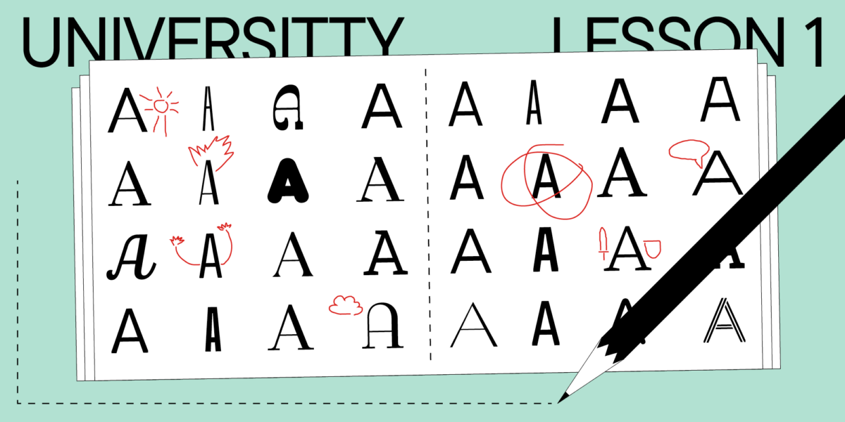
Akzidenzschriften sind lebendig und ausdrucksstark, ungewöhnlich und visuell auffällig. Sie ziehen die Aufmerksamkeit auf sich und werden zur Hervorhebung von Text oder Überschriften verwendet, weshalb sie oft auch als Headline-Schriften bezeichnet werden. Diese Schriften wirken in großen Einzelbuchstaben sehr auffällig, eignen sich aber nicht für ganze Textblöcke, da sich das Auge zu sehr auf einzelne Buchstaben konzentriert, was das Verständnis des Geschriebenen erschwert. Akzidenzschriften sind oft voller ungewöhnlicher Details, die in großen Schriftgraden faszinierend wirken. In kleineren Schriftgrößen sind diese Details kaum noch zu erkennen. Sie können auch dazu führen, dass die Buchstaben verschwimmen und der Text unübersichtlich und schwer lesbar wird. Eine der wichtigsten Eigenschaften von Akzidenzschriften ist ihr hoher Kontrast, der sie so ausdrucksstark macht, gleichzeitig aber auch die Lesbarkeit in kleinen Schriftgraden erschwert.

Textschriften hingegen sind genau für das Schreiben größerer Textblöcke gedacht. Sie sind neutraler und ruhiger, haben ein einfaches Design, einen geringen Kontrast und wenig Details. All dies macht sie in kleinen Punktgrößen besser lesbar und ermöglicht es dem Auge, flüssig über die Zeile zu gleiten, ohne von den Formen der Glyphen abgelenkt zu werden. Auch Textschriften sind in kleinen Schriftgraden gut lesbar. Diese besondere Kategorie von Schriften steht daher im Mittelpunkt dieses Artikels.
Allgemein wird angenommen, dass Schriften ohne Serifen besser lesbar sind als Schriften mit Serifen. Das stimmt nicht: Serifenschriften oder Antiquaschriften können problemlos für Texte verwendet werden, und Serifen selbst können die Lesbarkeit von Texten verbessern. Es ist daher wichtig zu verstehen, was genau die Lesbarkeit von Schriften beeinflusst.

Was macht eine Schrift gut lesbar?
Hier ist es wichtig, zwischen den Begriffen Lesbarkeit und Lesefreundlichkeit zu unterscheiden.
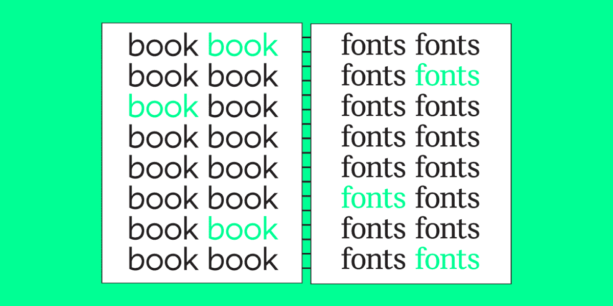
Wenn wir den Begriff Lesbarkeit verwenden, beziehen wir uns auf die Definition und Klarheit der einzelnen Zeichen und die Präzision ihrer Konturen, die beeinflussen, wie leicht verschiedene Buchstaben unterschieden werden können.
Die Lesbarkeit wird durch das Zusammenspiel der Zeichen beeinflusst, d. h. durch das Erscheinungsbild des Textes im Satz. Diese Eigenschaft gibt an, wie bequem ein großer Textblock gelesen werden kann.
Zunächst sollte die Schrift einfach genug sein, um lesbar zu sein. Die am besten lesbare Schrift ist einfach und eher neutral. Zu viele Elemente verwischen die Zeichen in kleinen Punktgrößen, und eine zu lebhafte Persönlichkeit lenkt die Aufmerksamkeit ab und stört das Lesen.

Optimal für die Lesbarkeit sind Schriften mit abgerundeten Konturen, da diese besser wahrgenommen werden als eckige Schriften. Der Konturenkontrast sollte deutlich genug, aber nicht zu stark sein. Die Proportionen spielen eine wichtige Rolle: Sie müssen neutral sein (wenn die Breite des Buchstabens der Höhe entspricht, mit einer dezenten vertikalen Betonung).
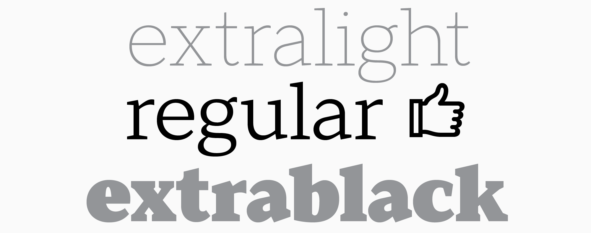
Auch die Strichstärke ist wichtig, denn Schriften mit normaler Strichstärke sind besser lesbar. Aus diesem Grund ist die beste Wahl für die Schreibmaschine die Schriftart Regular.
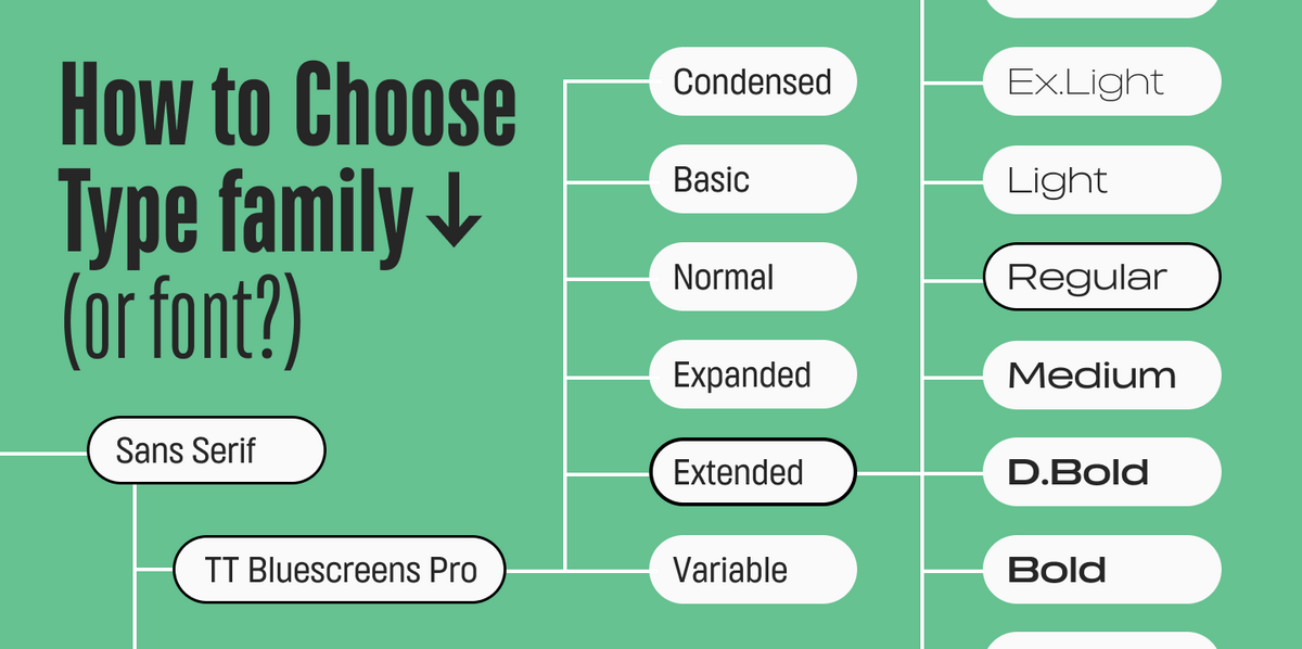
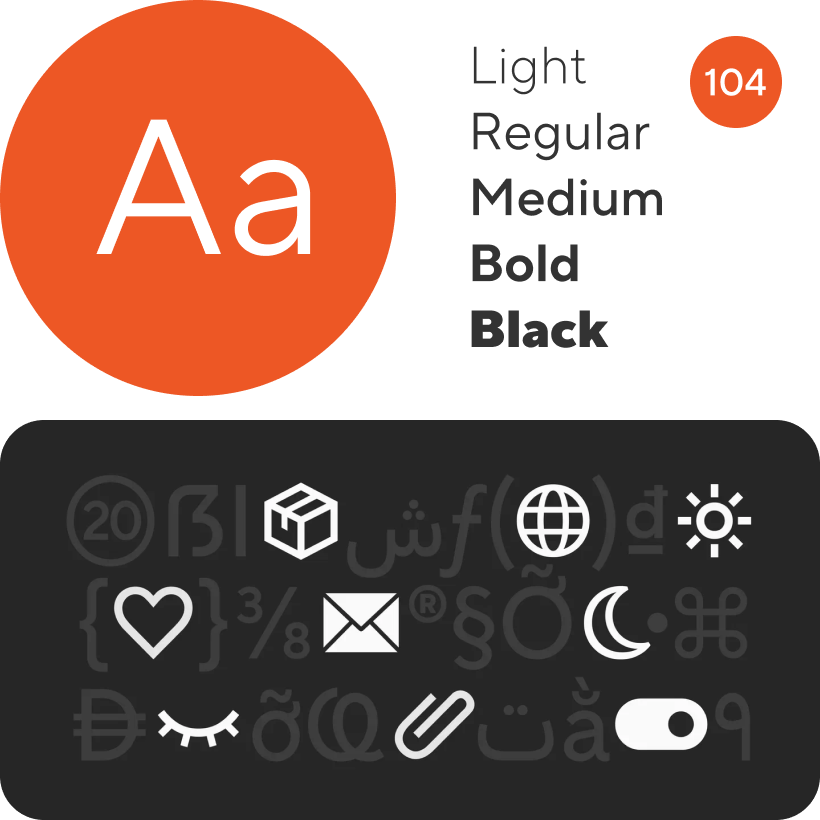
Auch die Zeichenbreite hat einen direkten Einfluss auf die Lesbarkeit, daher wird ein Mittelwert empfohlen. Einige der beliebten Schriftarten von TypeType haben mehrere Unterfamilien. Die Zeichen der Unterfamilie Regular haben eine mittlere Breite, die für die Textwahrnehmung am besten geeignet ist. Daneben gibt es die Unterfamilien Condensed, Compact, Normal, Expanded und Mono.

Eine weitere wichtige Rolle spielt der Zeichenabstand. Zu große oder zu kleine Abstände erschweren das Lesen erheblich.
Wenn Ihr Text auf einem Bildschirm gelesen werden soll, muss die Schriftart von hoher Qualität und fortschrittlich sein. Achten Sie darauf, dass sie sich auf verschiedenen Geräten gut skalieren lässt, so dass die Wörter auch dann noch gut lesbar sind, wenn Sie die Zoomstufe des Bildschirms verändern.
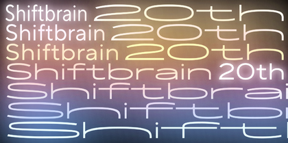
Die besten Leseschriften
Aus unserer TypeType-Sammlung haben wir unsere Top 10 Schriften ausgewählt, die für die Eingabe großer Textblöcke geeignet sind. Sie eignen sich alle gleichermaßen für elektronische Formate (sei es ein Telefondisplay oder ein elektronisches Buch) und für Text, der auf Papier gedruckt werden soll.
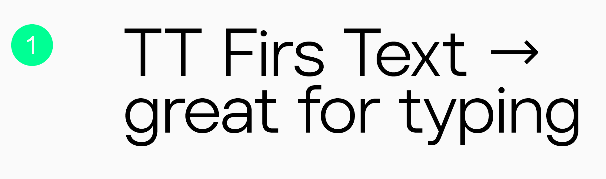
TT Firs Text
Die elegante, geometrische, serifenlose TT Firs Text wurde für den Einsatz in Textblöcken entwickelt. Das Design der Schrift basiert auf unserer beliebten TT Firs Neue. Die TT Firs Text behält viele Eigenschaften ihrer Referenz bei, wurde aber speziell für den Textsatz angepasst: Jedes Detail wurde berücksichtigt, um ein angenehmes Lesen zu ermöglichen. Dank der standardisierten Strichstärken bleibt die Schrift auch in kleinen Schriftgraden gut lesbar. Diese minimalistische Schrift eignet sich hervorragend für Websites und Buchgestaltung.
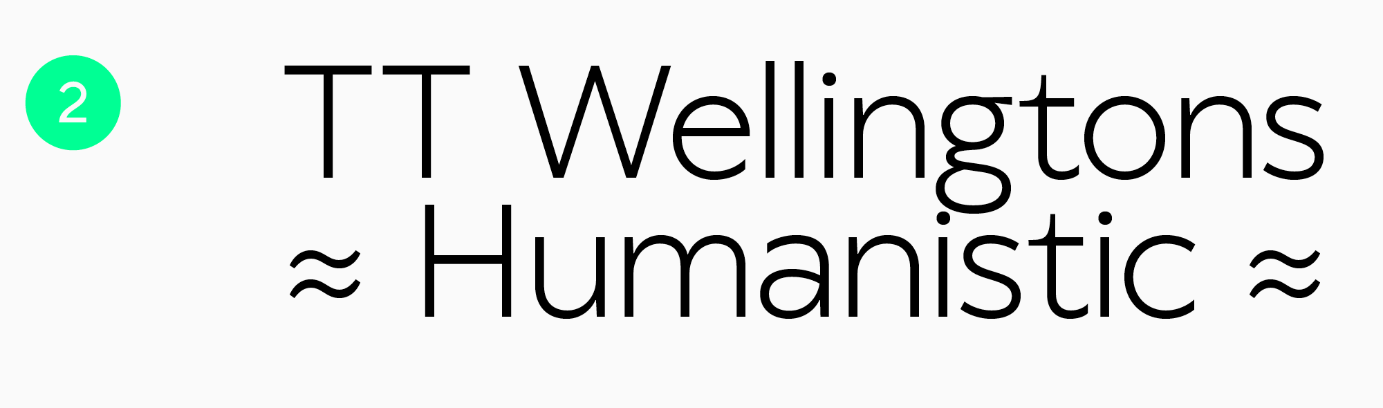
TT Wellingtons
TT Wellingtons ist eine humanistische Groteskschrift, deren Formen an die Bewegung eines Füllfederhalters erinnern. Sie verleiht Textblöcken ein ästhetisches Aussehen und eignet sich für Web- und Druckanwendungen.
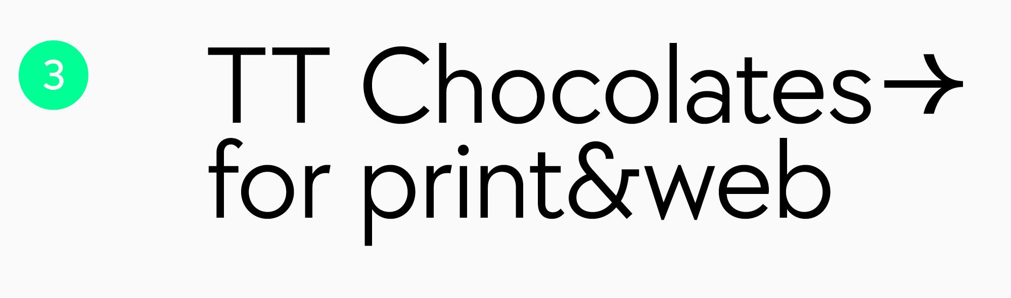
TT Chocolates
Die serifenlose TT Chocolates ist eine optisch ansprechende Schrift mit ausgewogenen Proportionen und einem dichten Schriftschnitt. Sie wirkt ästhetisch, freundlich und minimalistisch. Damit ist die TT Chocolates eine ausgezeichnete Wahl für den Druck und dank des manuellen TrueType-Hintings auch für das Webdesign.
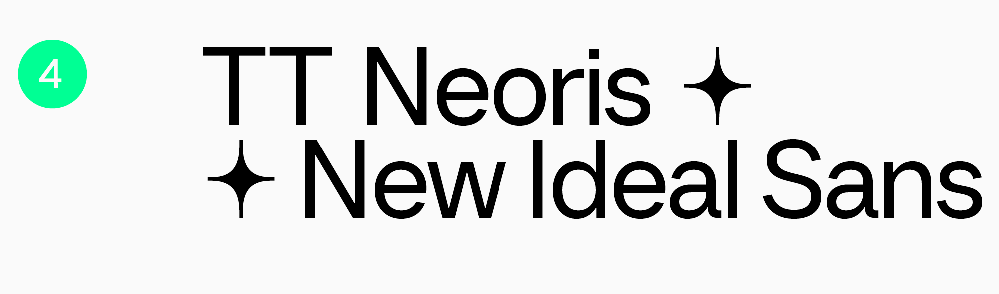
TT Neoris
Die neugroteske TT Neoris ist eine hochmoderne, funktionale Schrift für eine Vielzahl von Anwendungen, einschließlich der Texteingabe. Sie ist neutral und leicht zu lesen, wirkt aber gleichzeitig frisch und ungewöhnlich.
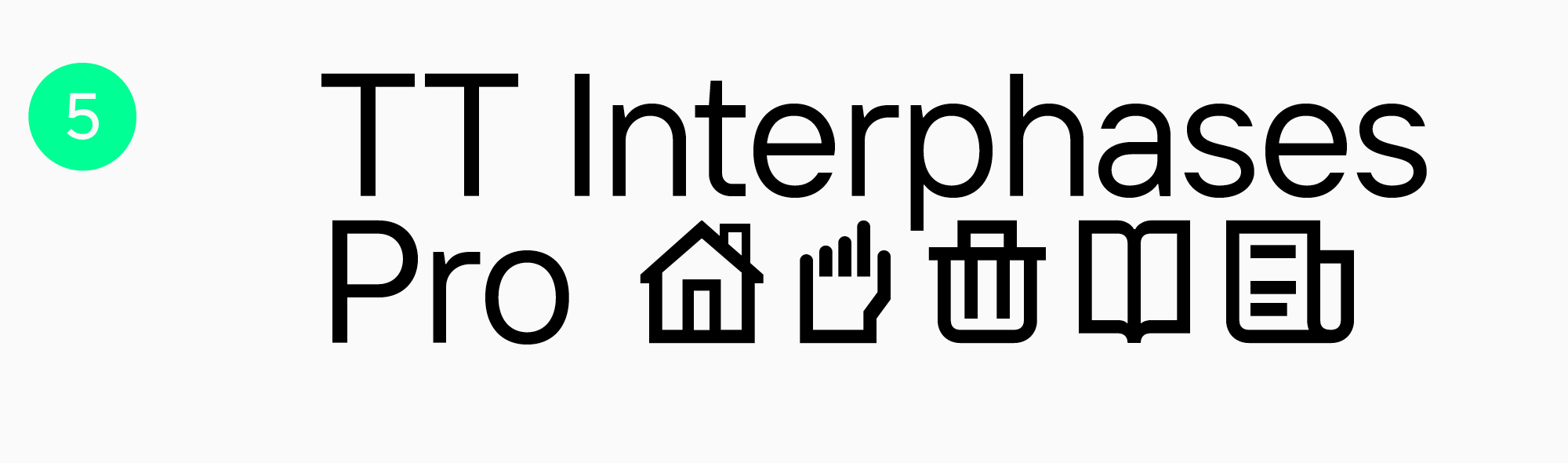
TT Interphases Pro
Die komfortable und moderne Neo Grotesque TT Interphases Pro ist die optimale Wahl für Bildschirme. Diese Schrift wurde speziell für den Einsatz in Interfaces entwickelt. Ihre statischen Proportionen lassen den Text fließend erscheinen. Die Lesbarkeit der Schrift auf Bildschirmen wird durch die Erhöhung der Kleinbuchstaben verbessert. Durch ihre neutrale Grundstimmung und die quadratische Form der runden Buchstaben ist sie auch in kleinen Punktgrößen gut lesbar und damit auch für den Druck geeignet.
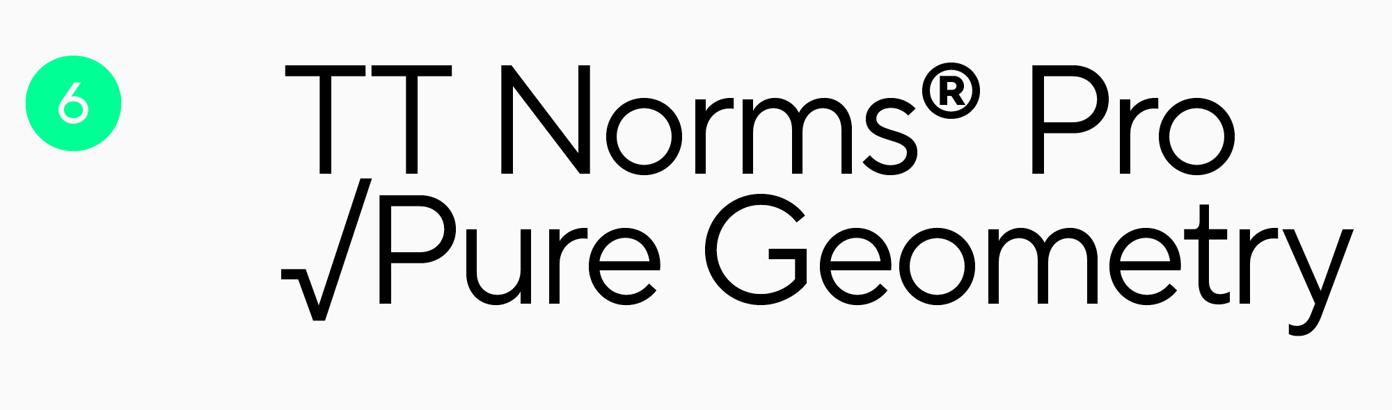
TT Norms Pro
TT Norms Pro, eine funktionale serifenlose Allzweckschrift, ist einer der Bestseller des Studios mit einem breiten Anwendungsspektrum. Sie ist benutzerfreundlich und eignet sich gleichermaßen für Web- und Druckanwendungen. Sie verfügt über eine große Anzahl von Zeichen, eine beeindruckende Funktionalität und unterstützt zahlreiche Sprachen. Die Schrift ist schlicht und ästhetisch zugleich.
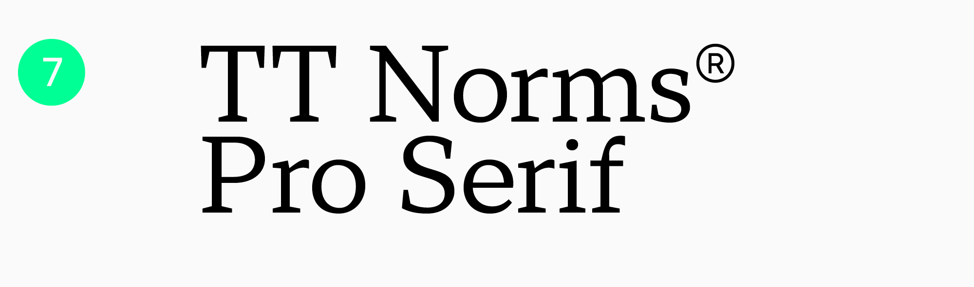
TT Norms Pro Serif
Die TT Norms Pro Serif ist eine funktionale Serifenschrift mit offenen, kontrastarmen Proportionen, die auf der TT Norms Pro basiert. Selbst kleine Texte in dieser Schrift sehen gut aus und sind leicht zu lesen. Die Schrift eignet sich für die Gestaltung von Websites und Drucksachen als eigenständige Schrift oder in Kombination mit ihrer Vorgängerin.
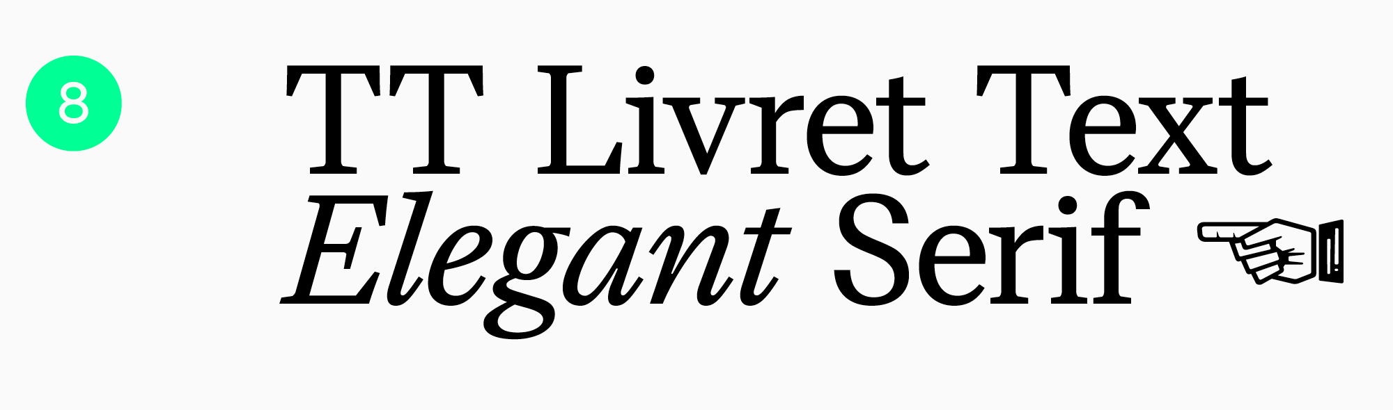
TT Livret
Die moderne Serifenschrift TT Livret hat drei Unterfamilien: eine kontrastreiche Display, eine mäßig kontrastreiche Subhead und eine kontrastarme Text. Der Name der dritten Unterfamilie spricht für sich: Sie eignet sich perfekt für die Eingabe großer Textblöcke. TT Livret Text hat statische Proportionen und einen ruhigen Charakter. Ovale Buchstaben, lockere Abstände und offene Öffnungen machen diese Schrift sehr angenehm zu lesen, sowohl am Bildschirm als auch auf Papier.

TT Jenevers
Die TT Jenevers, eine niederländische Serifenschrift im neuen Stil, ist sehr ausdrucksstark und hat ein ungewöhnliches Erscheinungsbild. Durch die großen Halbovale der Kleinbuchstaben sind die Buchstabenabstände jedoch fließend, wodurch sich die Schrift ideal für große Textblöcke eignet. Diese Schrift verleiht sowohl gedruckten als auch digitalen Publikationen einen Hauch von Stil und sorgt gleichzeitig für ein müheloses Leseerlebnis.
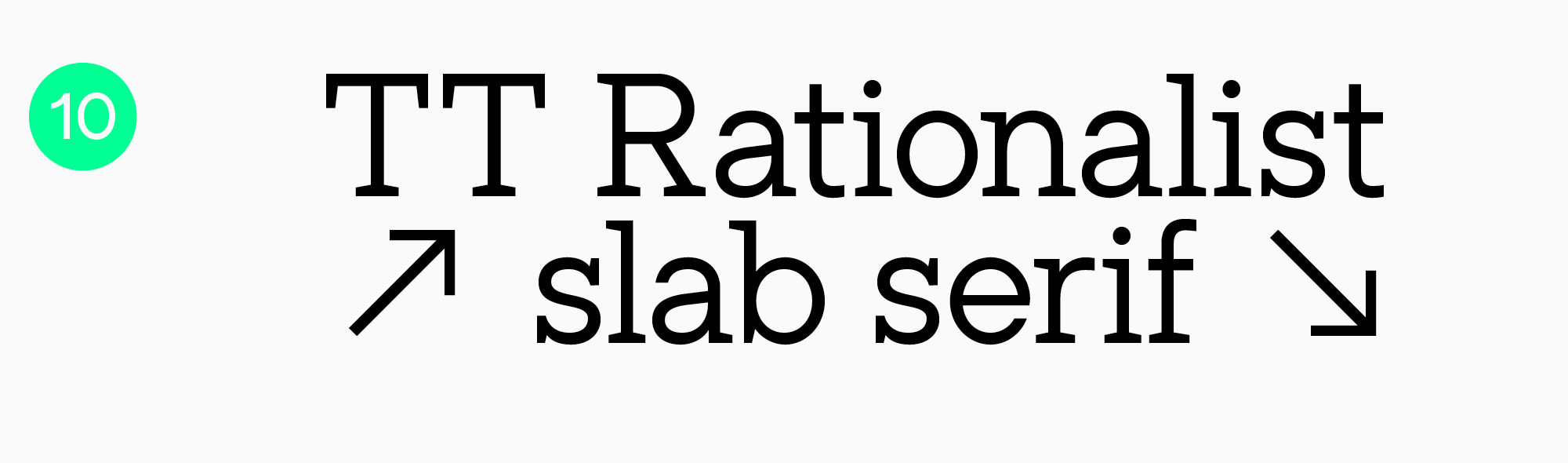
TT Rationalist
TT Rationalist ist eine funktionale und ansprechende Serifenlose mit eleganten, rechteckigen Serifen. Sie kann sowohl für Überschriften als auch für Textblöcke verwendet werden. Die Schrift wirkt besonders ästhetisch in Drucksachen und eignet sich auch für E-Books und Websites.
Fazit
Schriften begegnen uns überall: auf Websites, in Apps, in Büchern und Zeitschriften, auf Verpackungen, Fernsehbildschirmen und Bannern. Unabhängig von der Platzierung Ihres Textes sollten Sie sich für qualitativ hochwertige und gut lesbare Schriften entscheiden, wenn die Lesbarkeit im Vordergrund steht. Wir hoffen, dass Ihnen unsere Empfehlungen weitergeholfen haben!
FAQ
Welche Schriftmerkmale erhöhen den Lesekomfort bei langen Texten?
Für längere Texte sind ruhige Proportionen, klare Formen, gut unterscheidbare ähnliche Buchstaben und ein gleichmäßiger Zeilenrhythmus wichtig. Auch eine moderate Zeichenbreite und sauber abgestimmte Abstände helfen, damit das Auge flüssig durch den Text geht.
Stimmt es, dass Serifenschriften für gedruckte Bücher immer besser geeignet sind?
Nicht unbedingt. Serifen können zwar helfen, den Blick entlang der Zeile zu führen, aber entscheidend sind immer auch die konkrete Schrift, der Schriftgrad, das Papier und die Druckqualität. Für manche Anwendungen wirkt eine Groteskschrift sogar klarer und zeitgemäßer.
Wie beeinflusst die Bildschirmauflösung das Verhalten einer Schrift beim Lesen?
Auf dem Bildschirm zählt vor allem die technische Qualität einer Schrift: wie gut sie sich skalieren lässt und wie klar sie in verschiedenen Größen bleibt. Was auf einem Gerät perfekt aussieht, kann auf einem anderen in feinen Details auseinanderfallen, deshalb sollte man immer unter realen Bedingungen testen.
Welche Schriftgröße und welcher Zeilenabstand gelten als optimal für gute Lesbarkeit?
Eine allgemeingültige Zahl gibt es nicht, aber die Grundregel ist einfach: Die Schriftgröße sollte Buchstaben leicht erkennbar machen, und der Zeilenabstand sollte die Zeilen voneinander trennen, ohne sie zu weit auseinanderzuziehen. Am besten startet man mit einer angenehmen Grundgröße und erhöht den Zeilenabstand, wenn der Text dicht wirkt oder der Bildschirm klein ist.
Verbessern variable Fonts die Lesequalität?
Sie können die Lesbarkeit verbessern, wenn man ihre Variabilität gezielt nutzt, zum Beispiel um Gewicht und Breite an Bildschirm und Schriftgröße anzupassen. So lässt sich die Lesbarkeit unter verschiedenen Bedingungen konstanter halten, ohne zwischen mehreren Fontdateien wechseln zu müssen.
Wie beeinflussen Schriften die Lesegeschwindigkeit und das Textverständnis?
Je leichter Buchstaben erkennbar sind und je gleichmäßiger der Zeilenrhythmus wirkt, desto weniger Energie braucht das Gehirn zum Entschlüsseln und desto schneller wird gelesen. Komplexe Formen, enge Abstände und unruhige Strichstärken bremsen den Lesefluss und ermüden schneller.
Welche Schriften werden Leserinnen und Lesern mit Dyslexie empfohlen?
Meist werden Schriften mit einfachen Formen, gut unterscheidbaren Buchstaben und etwas großzügigeren Abständen empfohlen. Entscheidend ist aber immer der Test mit echten Leserinnen und Lesern: Eine universelle Schrift gibt es nicht, das Ziel ist stets, Verwechslungen zwischen ähnlichen Zeichen zu verringern.
Sind die standardmäßigen Systemschriften für lange Lesesitzungen optimiert?
Oft ja: Systemschriften sind für den Bildschirm entwickelt und werden in der Regel sauber dargestellt und gut skaliert. Wenn jedoch ein stärkerer Markencharakter oder eine besondere Sprachunterstützung gefragt ist, kann eine individuell gewählte Schrift die bessere Lösung sein, sofern sie technisch gut umgesetzt und sauber abgestimmt ist.
Wie hängt das Kontrastverhältnis mit der Schriftwahl zusammen?
Der Kontrast beeinflusst, wie kräftig die Striche wahrgenommen werden: Bei geringem Kontrast kann eine feine Schrift verschwinden, bei sehr hohem Kontrast kann sie flimmern. Deshalb sollten Schrift und Kontrast immer zusammen getestet werden, nicht nur in Überschriften, sondern auch in längeren Absätzen.
Welche Schriftmerkmale helfen, die Augenbelastung im Dark Mode zu verringern?
Hilfreich sind etwas kräftigere Schnitte, offene Formen und sauber abgestimmte Abstände, damit die Buchstaben auf dunklem Hintergrund nicht ineinanderlaufen. Sehr feine Schnitte und übertriebene Binnenkontraste sollte man vermeiden, weil sie häufiger zu Flimmern führen.