Die Begriffe „Schrift“ und „Schriftschnitt“ werden oft synonym verwendet. Dies ist nicht nur auf mangelndes Verständnis zurückzuführen – selbst unter Fachleuten wird der Begriff „Schrift“ als Ersatz für „Schriftart“ und „Schriftschnitt“ verwendet. Das Fehlen einer allgemein akzeptierten Terminologie verschlimmert die Situation noch, da alle Schriftgestalter auf unterschiedliche Interpretationen angewiesen sind.
In diesem Artikel werden wir die Unterschiede zwischen Schriftart und Schriftschnitt beschreiben und die Bedeutung dieser Unterscheidung diskutieren.
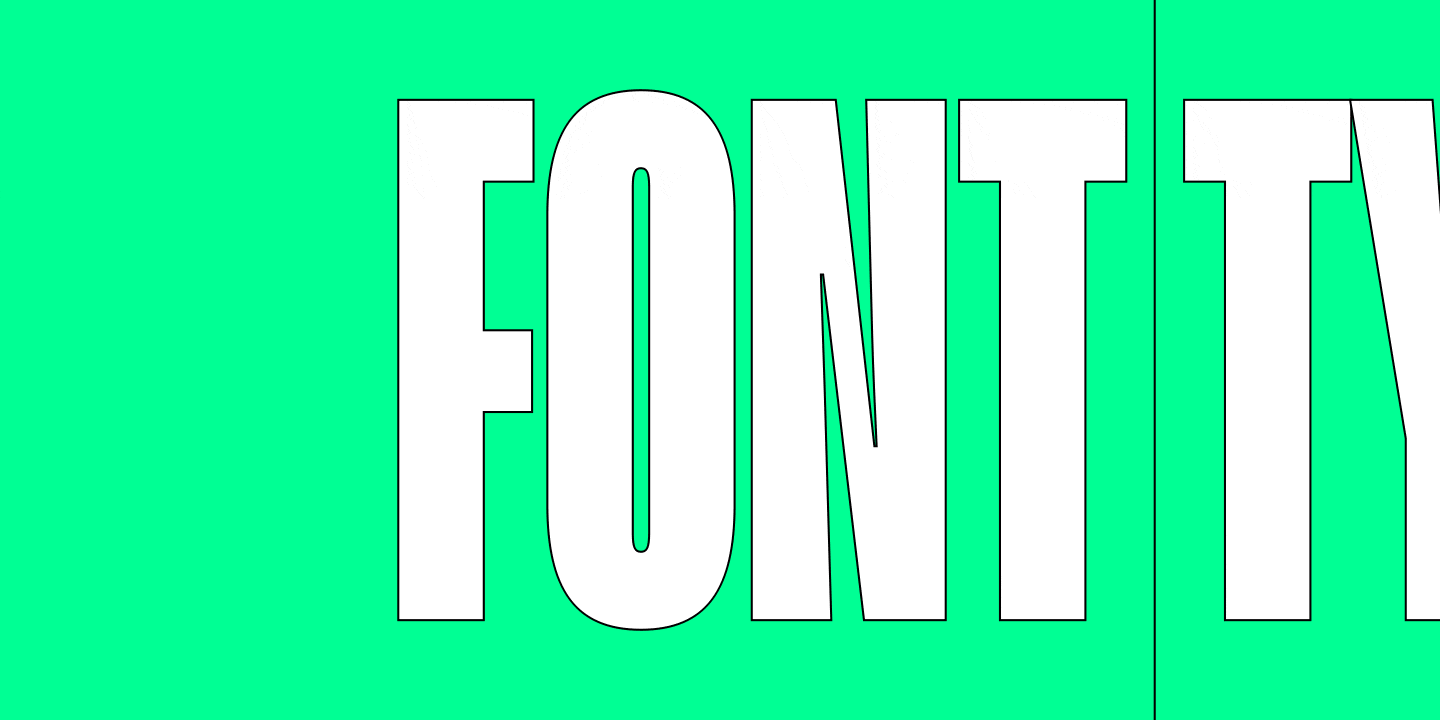
Font vs. Type: Ein tieferer Einblick in die Terminologie
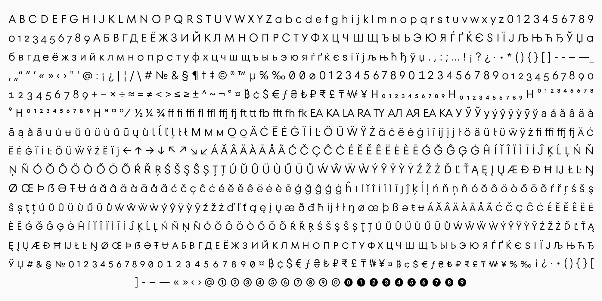
Eine Schriftart ist ein Zeichensatz, der Buchstaben, Ziffern, Satzzeichen und verschiedene Symbole enthält, die zur Gestaltung von Text verwendet werden.
Nach dieser weit gefassten Definition kann der Begriff „Schriftart“ als beides verstanden werden:
1. Eine Sammlung von Symbolen oder typografischen Buchstaben (aus Metall oder digital), die für den Schriftsatz benötigt werden;
2. ein Zeichensatz mit einer gemeinsamen stilistischen Identität und Gestaltung.
Der Begriff „Schrift“ wurde in der Typografie in den frühen 1900er Jahren eingeführt, als die ersten „erweiterten“ Schriftfamilien auftauchten, die von Morris Fuller Benton für das Studio American Type Founders (ATF) entworfen wurden. Diese Schriftfamilien umfassten Schriften mit unterschiedlichen Stilen (Breiten und Gewichtungen), die jedoch durch eine gemeinsame Ästhetik verbunden waren.
In modernen Schriften können sich Schriften sogar in ihrer Ästhetik unterscheiden, die allein von der künstlerischen Vision bestimmt wird.
Was ist eine Schriftart?
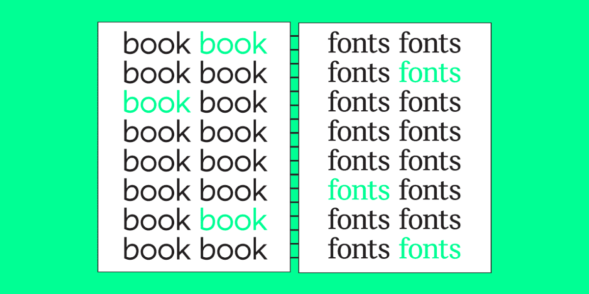
Ein Font ist das, was wir in einer Schrift oder einer Schriftfamilie finden. In der Typografie wird das Wort „Schrift“ jedoch häufig sowohl für eine Schriftart als auch für einen einzelnen Schriftstil verwendet. Ein Schriftstil ist die besondere Gewichtung und Neigung einer Schrift.
Wenn wir zum Beispiel sagen, dass TT Norms® Pro die Schrift mit der umfassendsten Sprachunterstützung unter den Schriften der TypeType-Kollektion ist, meinen wir die Schrift TT Norms® Pro. Und wenn wir vorschlagen, die Schrift TT Livret Text Regular als optimale Wahl für die Eingabe großer Textblöcke zu verwenden, beziehen wir uns auf den spezifischen Schriftschnitt.
Es ist also möglich, die Bedeutung je nach Kontext zu verstehen. Um jedoch den Unterschied zwischen einer Schriftart und einem Schriftschnitt zu verstehen, empfehlen wir die folgende Definition:
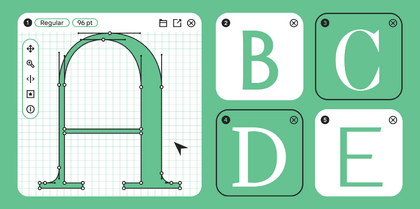
Eine Schriftart ist ein vollständiger Satz von Symbolen und Glyphen, die durch einen Stil zusammengefasst sind und für die Texteingabe verwendet werden. Es handelt sich also um eine Datei, ein Datenträger einer Schriftart.
Welche Schriftarten (Schriftstile) gibt es?
Wenn es um die Klassifizierung von Schriften geht, ist meist von Schriftarten die Rede. Deshalb werden wir den Begriff „Schrift“ definieren und die Klassifikationen später in diesem Artikel behandeln. Aber fangen wir erst einmal klein an und klären die verschiedenen Arten von Schriftstilen.
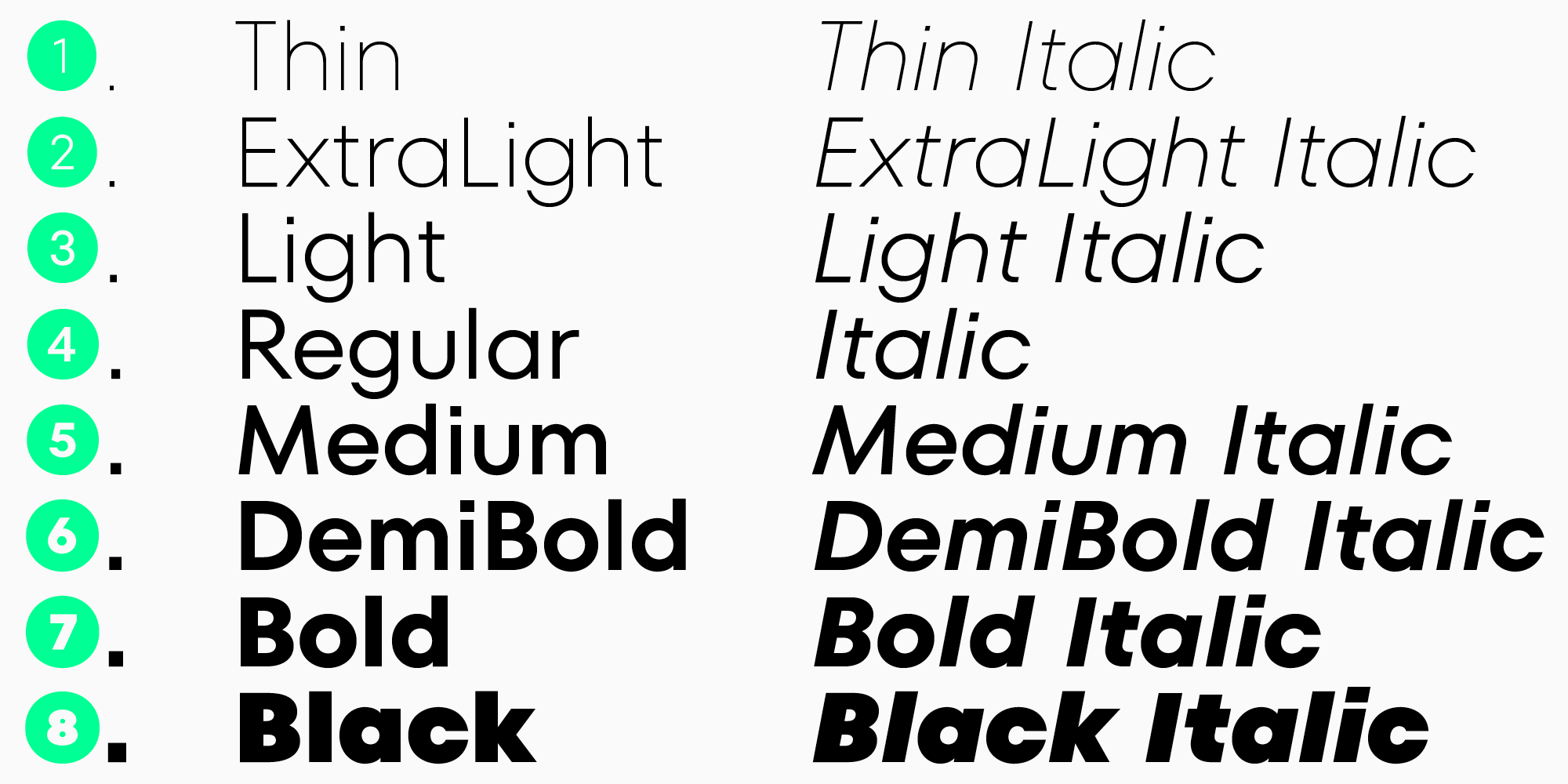
Ein Schriftstil ist die besondere Gewichtung einer Schrift. Sie können wiederum in ihrer Neigung variieren.
Eine Schriftart kann Roman- und Kursivschnitte enthalten.
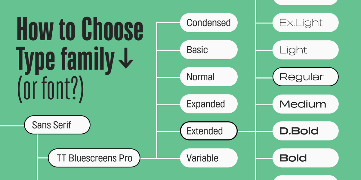
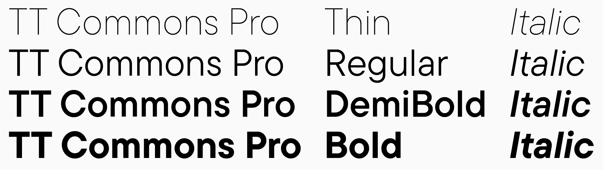
Die verschiedenen Schriftschnitte lassen sich in drei Kategorien einteilen: dünn, normal und fett. Die beliebtesten und am häufigsten verwendeten Schriftschnitte sind Thin, Regular, DemiBold und Bold. Verschiedene Studios können die Schriftschnitte nach eigenem Ermessen erweitern. So gibt es zum Beispiel häufig Schriften mit dem Stil Hairline.

Schriften mit unterschiedlichen Schriftstilen werden zu Schriftfamilien (Schriftstilen) zusammengefasst. Sehen wir uns an, was das ist.
Was ist eine Schrift/Schriftfamilie?
Zunächst müssen wir zwischen den Begriffen „Schriftfamilie“ und „Schriftart“ unterscheiden, auch wenn sie ähnliche Bedeutungen haben.
Eine Schriftfamilie ist ein System, das Variationen eines primären Designs (Schriftstile) umfasst. Sie sind durch ihren Namen und ihr Konzept miteinander verbunden. Gleichzeitig können sich die Schriften innerhalb einer Schriftfamilie in Zweck, Persönlichkeit und Stil unterscheiden.
Der Begriff „Schriftart“ kann sich sowohl auf eine ganze Schriftfamilie als auch auf einen Teil davon beziehen – dieser Begriff wird synonym zu „Schriftfamilie“ verwendet.
Es gibt aber auch eine andere Definition des Begriffs. Laut dem Google Fonts Dictionary ist ein Font der Kern eines visuellen Designs und einer Idee, die durch verschiedene Satztechniken umgesetzt werden kann, und ein Font ist eine dieser Umsetzungen. Mit anderen Worten: Ein Font ist das, was man sieht, und ein Font ist das, was man benutzt.
In diesem Sinne möchten wir noch einmal betonen, dass wir uns, wenn wir über die Klassifizierung von Schriften sprechen, speziell auf Schriften beziehen. Erfahren wir mehr über sie.
Welche Arten von Schriften gibt es?
Es gibt keine einheitliche Klassifizierung von Schriften oder Schriftarten. An dieser Stelle wollen wir uns nicht weiter mit diesem Thema beschäftigen. Stattdessen werden wir die Grundlagen behandeln, damit Sie den Unterschied zwischen Schriften und Schriftbildern besser verstehen können. Wenn Sie mehr über die Klassifizierung von Schriften erfahren möchten, empfehlen wir Ihnen, unseren Artikel zu diesem Thema zu lesen.
Die gebräuchlichsten Schriftarten sind serifenlose Schriften (Groteskschriften), Schriften mit Serifen (Antiquaschriften), Schriften mit Serifen in Druckbuchstaben und Schreibschriften.
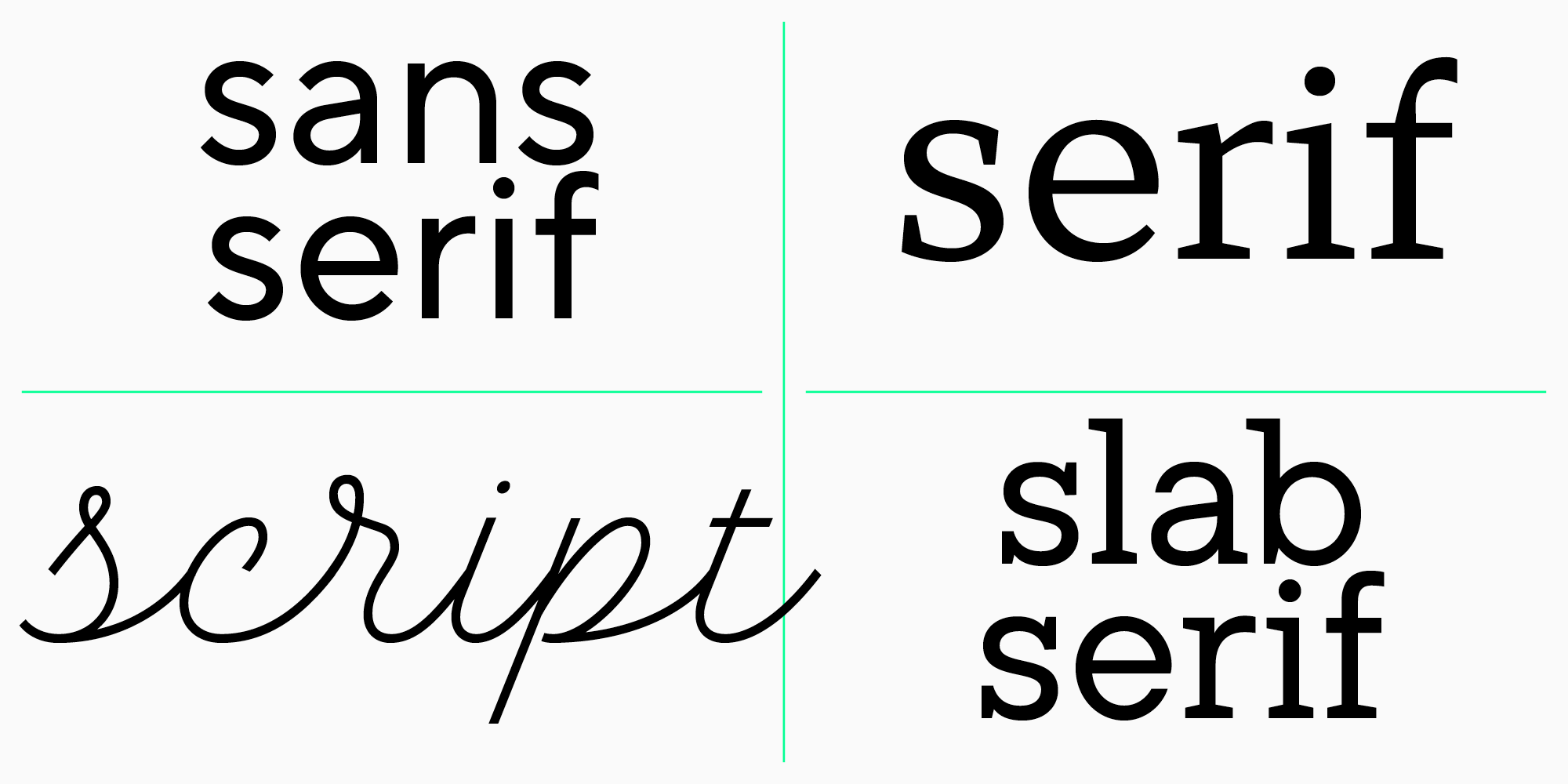
- Groteskschriften sind eine Gruppe von Schriften, die keine Serifen haben. Sie zeichnen sich durch einen geringen oder gar keinen Kontrast aus. Ein gutes Beispiel für eine geometrische Groteskschrift ist TT Commons Pro.
- Serifenschriften sind eine Gruppe von Schriften mit Serifen. Sie haben in der Regel einen hohen Kontrast. Die TT Ramillas ist beispielsweise eine Transitional Antiqua.
- Slab Serifs zeichnen sich durch schwere, rechteckige Serifen aus. Ein Beispiel für eine solche Schrift ist unsere TT Rationalist.
Alle oben genannten Beispiele aus der TypeType-Kollektion sind Schriften, die aus verschiedenen Schriften zusammengesetzt sind.
- Fonts imitieren Handschrift. Sie können auch Schriften bilden, aber wir trennen sie bewusst vom Rest der Liste, um noch einmal klar zwischen Schriften und Schriften zu unterscheiden. Zum Beispiel gibt es in der TypeType-Sammlung eine Schrift namens TT Lovelies Script. Sie wird als Font bezeichnet, weil ihr gesamter Inhalt ein einziger Schriftschnitt ist.
Schriftart vs. Schriftschnitt: Was ist der Unterschied in der Praxis und warum ist es für Designer wichtig, den Unterschied zu kennen?
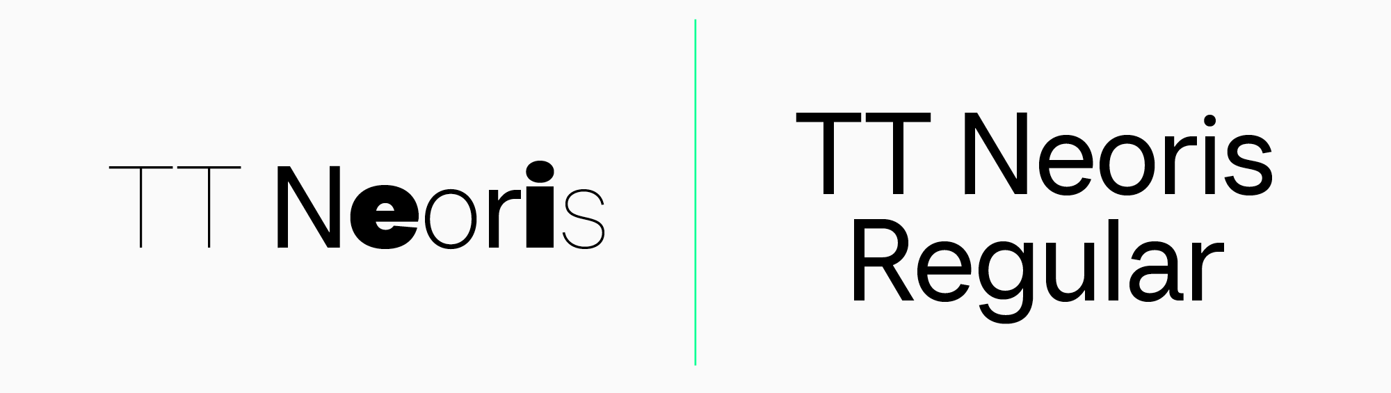
Sowohl für Designer als auch für Kunden ist es wichtig, den Unterschied zwischen Schriften und Schriftschnitten zu kennen. Dies kann die Projektentwicklung erheblich erleichtern. Wie Sie wissen, können Schriften innerhalb einer Schriftfamilie sehr unterschiedlich sein. Wenn zum Beispiel die Aufgabe eines Designers darin besteht, die TT Neoris zu verwenden, kann das resultierende Mockup völlig anders aussehen als vom Kunden erwartet, da diese Schrift sehr vielseitig ist. Wird die Aufgabe jedoch auf die Verwendung einer bestimmten Schrift wie der TT Neoris Regular beschränkt, kann eine solche Überraschung vermieden werden.
Fazit: Sind die Unterschiede zwischen Schriftart und Schriftbild entscheidend?
Die Terminologie des Schriftdesigns ist lebendig: Mit der Entwicklung der Typografie und dem Fortschritt der Technologie entstehen neue Begriffe. Es ist jedoch schwierig, die alten Begriffe zu kategorisieren und zu verstehen, da sie ein sehr komplexes System darstellen. Für diejenigen, die mit Schriften arbeiten oder sich einfach nur für dieses Gebiet interessieren, ist es unerlässlich, die verschiedenen Bedeutungen dieser Begriffe zu verstehen. Nur so kann man in die Materie eintauchen und sie verstehen.
FAQ
Was ist der Unterschied zwischen einer Schriftart und einer Schriftfamilie?
Eine Schriftfamilie (Typeface) ist das gesamte Design und Konzept der Schriftfamilie. Eine Schriftart (Font) ist die spezifische Umsetzung innerhalb der Familie: im Wesentlichen die Datei oder der Zeichensatz eines einzelnen Stils und Gewichts.
Ist Arial eine Schriftart oder eine Schriftfamilie?
Wenn man sich auf „die Familie mit verschiedenen Gewichten“ bezieht, ist Arial eine Schriftfamilie/Familie. Aber eine spezifische Variante wie Arial Bold Italic ist eine Schriftart (ein spezifisches Gewicht/Datei).
Welche Beispiele gibt es für Schriftarten vs. Schriftfamilien?
TT Commons® Pro und TT Ramillas sind Beispiele für Schriftfamilien (Familien), die verschiedene Gewichte enthalten. Wohingegen TT Livret Text Regular oder TT Lovelies Script Beispiele für spezifische Schriftarten/Gewichte sind (auch wenn es nur einen Stil gibt).
Warum legen Designer Wert auf den Unterschied zwischen Schriftart und Schriftfamilie?
Schriftarten innerhalb derselben Schriftfamilie können sich stark in Charakter und Zweck unterscheiden. Wenn eine Vorgabe nur den Namen der Schriftfamilie angibt (z. B. TT Neoris) ohne das Gewicht, entspricht das Ergebnis möglicherweise nicht den Erwartungen.
Sind Times New Roman und Helvetica Schriftarten oder Schriftfamilien?
Wenn Sie „Times New Roman“ oder „Helvetica“ als eine Gruppe von Gewichten unter einem Namen bezeichnen, sind sie Schriftfamilien/Familien. „Regular/Bold/Italic“ sind die spezifischen Schriftarten (Gewichte, Dateien) darin.
Was ist die Geschichte der Begriffe Schriftart und Schriftfamilie?
Das Wort Schriftart besteht aus zwei Wörtern. Schrift kommt vom deutschen Verb scriban („schreiben“, „kratzen“), entlehnt vom lateinischen scribere. Das Wort Kunst geht auf die altdeutsche Kunst zurück (aus der auch die englische Erde im Sinne von „Erde“, „Boden“ stammt).
Schriftfamilie ist auch ein zusammengesetztes Wort (Schrift + Familie). Familie kommt vom lateinischen familia (Familie, Haushalte). Dieser Begriff kam zu Beginn des 20. Jahrhunderts zur Typografie, als Designer begannen, nicht einzelne Schriftarten, sondern ganze Systeme verwandter Schriftarten zu schaffen.
Kann eine Schriftfamilie mehrere Schriftarten haben?
Ja. Eine Schriftfamilie ist ein System von Schriftarten mit verschiedenen Gewichten unter einem Namen und Konzept, und intern kann sie viele Varianten in Gewicht und Neigung enthalten.
Wie wirken sich Schriftarten und Schriftfamilien auf die Lesbarkeit im Design aus?
Die Lesbarkeit hängt davon ab, welches Gewicht Sie innerhalb der Schriftfamilie wählen: Große Textmengen benötigen einen Stil, Akzente einen anderen. Daher ist es wichtig, nicht nur die Schriftfamilie, sondern die spezifische Schriftart/Gewicht anzugeben.
Was ist der Unterschied zwischen digitalen Schriftarten und gedruckten Schriftarten?
Der wesentliche Unterschied liegt in Technologie und Optimierung. Digitale Schriftarten sind Dateien, die für Bildschirme bestimmt sind; sie skalieren ohne Qualitätsverlust. Gedruckte Schriftarten waren historisch physische Träger, obwohl sie heute digitale Schriftarten sind, die speziell für die Nuancen des Drucks angepasst sind.
Wie wähle ich die richtige Schriftfamilie oder Schriftart für mein Projekt aus?
Wählen Sie zuerst die Schriftfamilie basierend auf dem allgemeinen Charakter, der die Idee Ihres Projekts widerspiegelt, dann die Schriftart: das notwendige Gewicht, die Dicke und die Neigung.