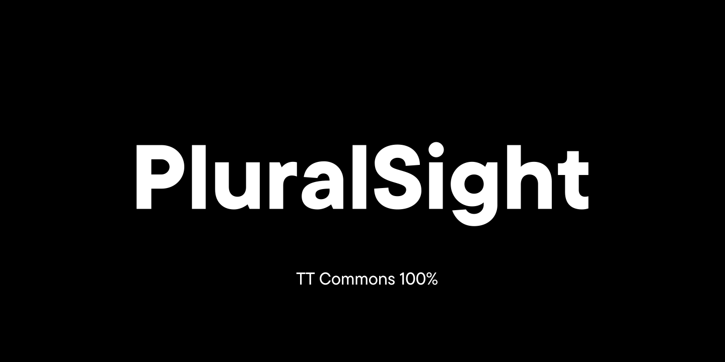
Das Bildungsprojekt PluralSight aus den USA hat es sich zur Aufgabe gemacht, technische Fähigkeiten zu entwickeln und sie zugänglich, verständlich und demokratisch zu machen.
PluralSight bat TypeType um Testversionen der Schriften TT Commons™ Classic und TT Interphases, um eine geeignete Schrift auszuwählen. Sie waren von TT Commons™ Classic angetan, aber die nicht standardisierte Größe der Glyphen machte die Schrift ungeeignet für die Verwendung in mehreren Richtungen.
Das TypeType-Team schlug vor, die Schrift so anzupassen, dass das Unternehmen eine ideale Version von TT Commons™ Classic für seine Projekte verwenden konnte.
Während der Diskussion ergab eine Reihe von Aufgaben, die gelöst werden mussten:
- Skalierung der TT Commons™ Classic auf bis zu 115%, d.h. Vergrößerung der Glyphen;
- Änderung des Parameters Zeilenhöhe zur korrekten Darstellung der vergrößerten Glyphen;
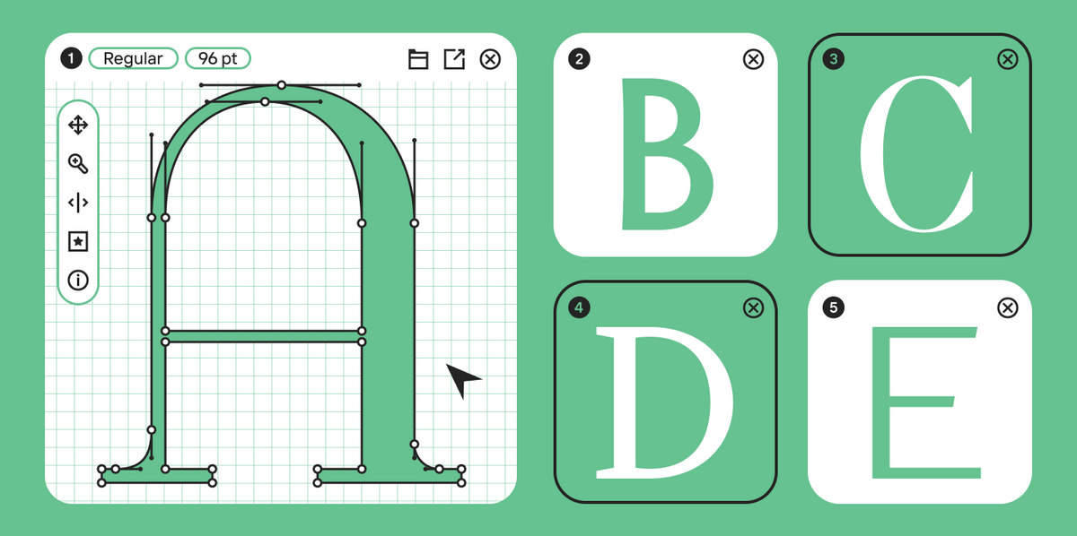
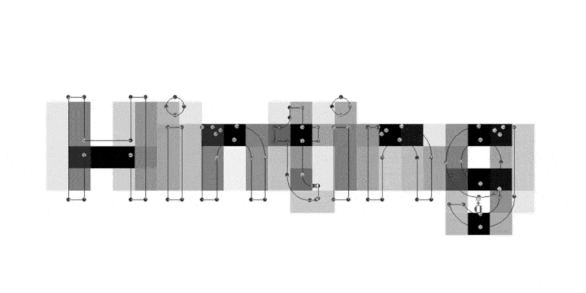
- Durchführung manueller Annotationen, so dass die Einsatzmöglichkeiten von TT Commons™ Classic für PluralSight nahezu unbegrenzt sind;
- Hinzufügen der Projektlogos zu den TT Commons™ Classic-Schriftdateien;
- Änderung des ursprünglichen Schriftnamens in PS TT Commons™ Classic.
Nach der Genehmigung machten sich die Designer und technischen Spezialisten von TypeType an die Arbeit.
Als Ergebnis änderten wir die Parameter für die Schriftgröße und die Zeilenhöhe, um die Anforderungen von PluralSight zu erfüllen. Anschließend wurde der Font manuell mit einem Hinting versehen, um sicherzustellen, dass die Zeichen in allen Anwendungsbereichen korrekt dargestellt werden.

Das Ergebnis war eine aktualisierte Version der Schrift mit dem Namen PS TT
Commons™ Classic, die für die Verwendung in der gesamten Kommunikation von PluralSight geeignet ist. Ungeachtet der geänderten Glyphengröße behielt die Schrift ihre Neutralität, Einfachheit und Benutzerfreundlichkeit in verschiedenen Formen bei.